Lessons
Lesson Info
White Balance
What white balance should you have? Okay, so I have a demonstration of this a little bit later to show you that white balance changes drastically depending on her skin tone. If I'm on auto and she has dark skin, it's gonna It could totally mess up correct white balance or when I change my modifier. Some modifiers give a warmer effect than others. And so, in other words, what you don't want to dio is you do not want to be on auto because auto changes like let's say that somebody walks in in a bright red dress on a black background, it reads it. And what it's saying is like, Okay, so I'm looking at this photo overall, and I see a lot of red. Well, read is warmer, so your camera thinks Okay, so this is probably not on purpose. We're going to cool it down. It's to read. I'm gonna add some blue. So what will happen is you'll have a really dull red dress, and you'll have really bluish skin tones. So all these different things make a difference. So you don't want to shoot on auto white balanc...
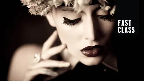
e. It just it will give you a lot of inconsistencies. And also, if the whole shoot, it's changing, that gives you a lot more Photoshop to Dio or a lot more work in light room to get it right. So here are some of your considerations, uh, on your camera and this is the ones I picked from from the cannon website. This is what it said. You have different presets. You've got a daylight preset, and this is just the whole thing. Color temperature. Just know we're trying to match here. You don't really need to know what it means for the purposes of this class. But, like this is one temperature for daylight. Flash is a different color. Temperature is going to show how your photo looks. It changes the color in your photo. Well, I looked up that my studio strobes the ones that I'm using here right now, it's like, kind of in the middle. It isn't exactly either one of thes. So we're going to talk about a couple things you can dio to get your white balance correct without just shooting auto. By the way, just so you all know, the lights that I'm using this entire class are pro photo d one airs. Um, I used these in my studio. Yes, they are more expensive, for sure. But do not worry. I'm going to be addressing, like the last day I have a recommended kit for $500 and a recommended kit for $1500 just getting started off. And also on Day two when talking about what to purchase, I also talk about Well, why would you want a more expensive brand? Do you really need it? And the answers? Some people? No, absolutely not. So I'll recommend something that fits everyone. But this is actually what I use in my studio. So I wanted to kind of demo what I use nowadays. All right, so I looked at this and I said, All right, well, it's not either. So if I set the preset, which one looks best? I personally when I shoot this particular stroke, this particular model I shoot with flash white balance because it looks a little bit warmer, but it's pretty close. This is what I'm happy with. But chances are not everybody has a particular light where the preset will look right. So here's a couple of things you can do to get your white balance ideal. The first one is to use a great card, and you do not, especially since this is a one on one class. You do not need to buy a really fancy or really expensive great card. There are a bunch of them that are like Last Delight makes a pop up, one that's on the other side of a reflector. There are just pieces of cardboard that are made for this purpose. What you don't want to do is you don't want to go to a Seymour Michaels hobby lobby like a craft shop and grab a great piece of paper and pretend it's a great card because it's a very specific gray and a lot of times like a neutral gray that we think looks neutral, has blue in it or has a different tones. You actually do need to go out and buy one of thes. It's not super expensive, so what you're looking for is some kind of neutral reference. It can be gray or like just little bit less than white. On what you'll do is at the beginning of your session, you'll take a picture, and here's one right here. You'll take a picture of this where your subject holds it right in front of their face and you take a shot. Okay? Okay. And by the way, I think this is an awesome example of what I wanted to tell you. You'll see. Can you see this down here? Like really, really barely at the very bottom. It's a little bit darker. So I think my camera I've shot at least two times the number of frames recommended for it to be alive. Still, like I think it's supposed to be last. So what? 60 70, frames, I'm like way into the 200 thousands for this camera. So eventually your shutters do start to have wear and tear on them, eh? So even though I'm totally within my think speed sometimes for cameras, it's just not quite right. So, everybody, I'm changing it to one. When 60th of a second just ended. That's going to go away. Okay, so what I'm going to Dio is I'm going to shoot on my flash preset because it's closest. But I know that it's not quite right. It's not quite what I need, and everybody else is going to be different. So when you take a picture of this, what you dio is in light room in camera, raw in whatever you're using, you use this as a neutral reference point. So this class is not going to get into this. But perhaps in light room, if you've used that, you've seen the little white balance eyedropper, and what you're doing is you're saying Okay, Photoshop light room. This is supposed to be completely neutral. No color cast whatsoever. And so what happens is when you grab that little white balance eyedropper, you say light room. This is neutral and it will remove any color cast created by in correct white balance or the color temperature of your life. So then it gets you perfectly, absolutely correct white balance that you can then apply to the rest of your photos. So this is the easiest way to go ahead and make sure you have correct white balance. But as all things in life, it's not that simple. There are other things that will mess this up. So I just wanna give this. Put this on your to be aware of list. Great card is a great place to start things that end up changing white balance is let's say I take a picture of her looks great. And then I switched to a soft box. Changing modifier will change what the white balance looks like, just the way it will shift the color temperature. So every time I change modifier, I'd have to grab another picture of the great card. Or if you started off like me and, you know, have toe. Okay, let's make it hold right there. Um, if you started off like me, I started off with a less expensive brand, which I shot it for years and got awesome picture. So it doesn't matter, but I start off with a policy buff. White lightning. Um I mean, I literally shot this for years and they were awesome. But I found that sometimes, depending on what power setting I was at, if I would shoot, get my white balance right. And then I turned the power way down. It changed the color. The color looked a little bit different. So just know there's a lot of variability. And if so, if you get your white balance correct, you take one photo and then you change the distance of your like change the modifier, change the power. And then later on, you're wondering why you don't have color, right? Because all those things affect it. Can you just guess and make white balance look right? Sure. The same ways you can guess and try to get the exposure right. But more variability means more chances to mess up, so we try to keep it all under control and get rid of those variables. Alright, so great card is in awesome and inexpensive tool to start with another. Um, another tool to get correct. White balance is actually let me jump ahead of this is a color checker. So this is on the other page of this. So this one you pay more for, um, there's a color checker made by X right? And there's a color checker made by Spider. So if for some reason you're noticing that your color is always funky, here's a couple of reasons. All right. Reason number one. What color are your walls in your studio? If you think you painted them a neutral gray because you heard you're supposed to paint things neutral gray chances are it is not neutral gay. It perhaps could be slightly blue paint, which means you might have your white balance. Right? Might have everything right. But the light bounces around. That room hits the slightly blue walls, and now you have slightly blue light. So that might be something that's not working out the Calvin temperatures. You don't. It depends on your level. You don't really need to know it. For the most part. Basically, it's on a scale. How warm or how cool your camera is perceiving light and each 100 step up is just a little bit increment warmer or cooler. You don't usually need to know it, Um, for the color checker E. Flip this down so the color checker is a little bit fancier way off, making sure you have the color, right, So we have to hold this in front of your face. Okay, so this color checker, what it lets me do is I can take a picture of it, and it has neutral graze at the bottom along the bottom here, but then also right where there's people's heads. I don't know if the camera able to do that, but if you take a look at it they have, like little pictures of people's heads in the second row, down each one of those are technically gray. But this one is a little bit bluer than this one, and what it lets you do is maybe the correct white balance that you're getting. It's correct, but correct isn't always pretty like sometimes a little bit warmer looks better for skin tones. So what this lets you do is when you do your little white balance thing in light room, or wherever else you're doing it, you can click on the first one that's totally neutral. It doesn't look good. Click on the next one that warms up the photo just a little bit more. Click on the next when it warms up the photo a little bit more. So it might just be that you want to use a swatch that's gonna make your photo a little bit warmer, which is more pleasing to skin tones. This is probably for a one on one class. The extent that you really need to know is that you have the neutral graze on the bottom. It doesn't really matter which one you choose, as long as it's not pure black or pure white, any of the grays in the middle or fine use that second row of swatches to change the warmth. But if you get all fancy like, maybe you become a fashion photographer, Um, what you do is you can take a picture of this and whether you get Spider or X right, they give you. There's a free plug in tow light room. So what it does is when I take a photo of this and grab a quick shot of this and perfect. So when it comes into light room, what it lets me dio is tell that plug in tow automatically detect that that little color checker. And then what we'll do is it will make sure that every red is the correct red and every blue. So it's not just about white balance at that point. It's about how every color looks, because I get a question a lot about how sometimes reds like a really vibrant, rich red. You look at your photo and it's not the right red. Sometimes our cameras struggle with that or oranges. It just doesn't look right, especially I've shot like oranges in sunlight. They look crazy So what this does is it takes a look and it says Okay, so this is what red, orange and yellow should look like red, orange and yellow there. And then it will actually shift and bring that read back into gamut. Bring that orange back to where it's supposed to be. For the most part, this really doesn't matter unless you need certain colors represented accurately. So just know that that goes a little beyond one on one. But maybe you're at that point where you're you know, that there's a certain color you shoot all the time. It looks wrong, and it will do it automatically for you with this plug in. So that is an extra passport color checker or the spider has a color checker on. I got one more for her because it was a perfect lead into the sixth your stages planned. I totally did. That s so the next one is after the color checker. We told you this, you can dio neutral warming up, cooling down skin tones. That's what it looks like. Um oh, also show you what it looks like. I'm not sure how well you can all see it But this was when I had the skin tone set, Um, Thio Auto. And then this is when I use the color checker. So it is definitely a more flattering skin tone for sure. If you shoot darker, warm or African American skin tones for me, my camera gets more confused by the skin tones. I don't know why. So I'm always using a color checker for those. Okay, so here is the last piece of that equation. And John, if you have this Oh, see, she's already prepared. Okay, He's the best. Okay, so the last thing that you could dio is you could set something called a custom white balance. And depending on what camera you have, it's a different logo or different symbol. And what is allowing you to dio is photographs, something neutral, actually photographed with light neutrally and say, this is supposed to not have any color cast set that as a custom white balance. And then all the photos will use that white balance right in camera. So there's not any post. It's making sure it's correct right away. So I was gonna show you this particular tool. Um, this one is called the Expo disk, and it looks like a filter with, like, funky, cool designs on the front of it, I'll show you how this is used, so All right, so I took an auto of this girl skin tone. Can you see how totally off that is? It's reading all the reds in her skin tone, and it made it very, very, very blue. All right, well, I could use my wipe. My, um, great card. But I can also set a custom white balance. And here's how I would do it. Okay. Can you see me in that photo? I'm going to demo this here. What you want to do with this particular tool is you actually stand where your subject ISS You put this do hickey on the front of it, and you take a picture of the light source with it flashing with it firing at this distance? No, At this particular distance, I'm gonna have to switch my camera over to manual focus, because first time shooting with something in front of it. But I'm also very close, so let's make sure everything's firing. I'll take a picture. Okay, So if you look at my camera and you do have to get the correct size. This is the size too small for this one. But I didn't bring my into John. Let me borrow hiss. But what you'll see is a grayish white ish enough. It should just be a grayish wayto screen. Shouldn't be anything. But what you'll be able to say is, this is supposed to be neutral. This is the light hitting my subject. So, camera, do your thing and make it neutral. Get rid of any color casts. Um, if you have a canon or a Nikon, it will change how you do this. So this is not exactly what this class is about. So I'm gonna point you to your manual. But just to give you an idea, Kev, keynote back. Sorry. So I will get something like this screen over here when I have the correct sized filter on. So it'll be kind of a gray, and I'm saying that should be the color that should be neutral for Canon. What I do is I can go into my menus and in back in the menus. There's a place where I say custom white balance and I then select that great photo. But just remember, if you change anything now, all those photos have that white balance in your camera. So you change your modifier, you change the power of the light like it could change other option or the other one is for Nikon. There's actually a button that you hit that says Pre. So it's saying You want a preset, a white balance, and when it's flashing, you go over and you take a picture and it sets the picture that you take with the expo disk. So there's two different approaches, so I just want to show you kind of what this ended up looking like for her. So this waas auto white balance flash white barons preset and then custom. But maybe you think this one's too warm and you like cooler, so there is a bit of subjectivity to it. It just happens to be some of us see color differently.
Class Materials
Bonus Materials with Purchase
Ratings and Reviews
Dennis Day
Awesome class. Lindsey Adler is an excellent teacher. She explained some basic concepts that I couldn't figure out on my own. The section showing 1, 2, and 3 light setups moves pretty fast. So I'll watch that again. This Fast Class was nice for me because I don't have time to do a full lengthy course.
Colin Cunningham
Great Course, Lots of great information through a variety of examples. Learned tons from this course, and loved the wide variety of lighting setups for Male and Female models as well as groups. Would recommend it to anyone new to portrait photography.
Student Work
Related Classes
Studio Lighting