Lessons
Day 1
1Class Introduction
09:10 2The Design Flow Basics
18:27 3The Designer as Co-Creators
06:48 4Get to Know Your Material
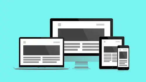
17:07 5Responsive Vocab: Floats, Flows, & Images
11:58 6Mobile First: Working Small
09:46 7Future Friendly: Embrace Unpredictability
14:17Collaborating with Your Clients
13:52 9Prioritize Your Users
39:42 10Best Practices for Defining Success
08:58 11Intro to Scrum
04:24 12User Stories & Epics
35:53 13Content Basics
27:40 14Defining the Visual Language
22:31 15Starting with Type
35:31 16Starting with Grids
15:40 17Gutcheck & The Product Brief
22:03 18Working With Developers
12:33 19Communicating with Developers
16:25 20Finding a Common Language with Developers
06:28 21Code Literacy
04:37 22Sitemap & Wireframe Basics
33:48 23Prototyping Basics
12:02 24HTML Prototypes
13:28 25Code Literacy & Developer Tools
11:46 26Developer Lingo
07:23 27Interface Personality & Behavior Galleries
17:27 28Designing for Performance
18:19 29Progressive Enhancements
07:00 30Designing a System: Discovery to Pattern Library
12:25 31Workflow Examples
20:25 32Applying the Style Guide to the Pattern Library
09:08 33Alternative Workflow
23:04 34Alternative Workflow Part 2
21:52 35Tech Requirements
21:53 36Retrofitting an Existing Site
12:15 37Project Cupcake: Building a Site from Scratch
24:08Day 2
Lesson Info
Alternative Workflow
So what I wanted to do now is kind of talk about an alternative workflow, right? So you'll notice with Jesse's workflow, there was no Photoshop comps. It was all happening in the browser. So for many designers, that's just a deal breaker, potentially based on fear or skillset. So what happens if you still want to kind of get into a tool to create a high fidelity comp? Maybe you're using Photoshop. You might be using Sketch. Those are two programs right now that I juggle between, and they both have kind of pros and cons, and they're both excellent programs to help make high fidelity comps. So let's kind of talk about how that might shift. So the first thing I just wanted to kind of get everyone's head around is this idea to make everything considered, not pixel perfect, right? We want to get it as close as possible, but as we have all these different breakpoints, there's all these different views. It's gonna be really hard to kind of get pixel perfect thinking on everything, which is ve...
ry different when I started and as you would kind of point out like, "No, that's often pixel, no, that's perfect," but think of how much stuff there is now to consider. So just making sure that everything looks like it was intended. You can tell if a button is right up against something else, and you're like, "That needs a little space." So that's kind of the thinking I want you guys to kind of get into. And the next one of course is to get to the browser as quickly as possible. So this still is going to kind of look at how do we get to that browser as quickly as possible, but we're gonna kind of do it in a little bit of a different way. So if we look at our kind of linear story, a lot of things are going to be very similar, right? So we're gonna, for us, we're gonna start off with a product- brief. Capture that knowledge. Make sure we have it. That's gonna kind of use this help inform user stories. We're gonna kind of keep going through that, and we're gonna dive in to all of that stuff. One thing that's really important here that I just wanted to emphasize is that because it's listed like this, it's making it feel like it's this linear process, but remember that we're talking about sprints. We're talking about kind of parallel tracks of stuff happening. So all this stuff is a little more kind of in cycles, right? It's a little misleading to kind of have this linear expression even though there is certain things that help inform other things. So, we still have user stories. We have a product-brief now, and we have some information to build off of. We're gonna start to capture stories. A lot of team members can start to capture them, and we're gonna start to be translating all of these stuff that's kind of, the requirements and the goals from the product-brief. Now, they're gonna be start to be more tangible dev tickets. Now one of the things that Jesse liked to do is kind of design in texts. I find, personally, I don't think as much in that way, but I still need content, right? Without this content, what am I even doing? So it's still really important to kind of think about it as far as, you have to build off of something. So it could look in different ways. I still use Google Docs and just try to capture that stuff. Give me something real to work off of, and this is great because this is Google Doc, you can share it with your client. You now hopefully are kind of starting to think of the structure of the site, right? So now you can have your clients start to add content to this stuff. So you're working together to create these documents to kind of give you a little of that meat of what the site needs. So then now we're gonna have a sitemap, right? So we're gonna start to even think of how to break up some of those Google Docs that are trying to house all that content, but now we can start to map them to maybe specific areas. We can start to kind of think about what is that overall structure? A lot of the stuff from what Jesse was doing is still very much the same. We still very much have wireframes. We're gonna be doing the same thing. There's nothing different there. We also have those content reference wireframes that we were talking about earlier. Now the thing with these that I find is I kind of find there's a playfulness back and forth between doing the wireframes that are kind of detailed and the content reference wireframes, right? Personally I have a hard time just going right to this, and I almost need to kind of design a couple wireframes first so that way, I can say, "Okay, I have an idea. "Here's definitely a structure that works. "So let me kind of go and capture that as one template "within those content reference wireframes." And then I've done another one, "This definitely deserves "to have another one," and as I keep adding a few more of these content reference wireframes, now I have more options to choose from so it's gonna be a tougher call. Do I really need to make another one now? Or is there one that I can already use? So as you start to kind of create more of these, you're gonna be like, "Hmm, I can already use "landing page one for that landing page. "I don't need to create landing page three, four, or five," but maybe all of a sudden, there's something so unique about it, something that's so distinguishing about that page, you're like, "You know what? "Now I need to make landing page three." Now you need to make article type two, because article type one just isn't gonna support it. So consider that playfulness. That's what I find really helpful for me. Go into a prototype. So we have those kind of static wireframes. We still want to get into a browser as quick as possible. So for this version, that's still happening, right? You're still working with your developer. You're handing him off some of those static ones. We've designed. Personally, what I like to do is design the extremes again. So maybe you're doing mobile. Or you might even call small, and you might be designing large, right? So instead of kind of thinking just about mobile, tablet, desktop, maybe you're thinking small, medium, large, right? Maybe you're thinking extra small as like where we go with watches, and extra large as where we're going with TVs. So you can kind of use them since there's such a blend now of what sizes are with resolution. Small doesn't necessarily mean small when it comes to pixels because they all kind of overlap now. However you want to do it, you can kind of talk to your team about that, but you're gonna want to get this into a browser, and I find it's helpful to give those extremes and then have a developer working with them. They're kind of then kind of figuring out the middle, right? They're figuring out the other points, and they're kind of flushing it out. We still have kind of that visual exploration just like Jesse. Now, I'm kind of putting it at this point, because this is really where it has to be in place before you start doing any Photoshop comps, but likely this has happened even in some of the earlier discovery process, like we were doing with the product-brief, or maybe it's even still trickling now throughout the process in parallel with, say, other team members working on wireframes, etc., etc. So there's some flexibility as to where exactly this visual exploration can go, but before you start designing those comps, remember you want to make sure you're headed in the right direction. So we may have a microscope exercise. We have a gutcheck exercise. What's amazing here? Look at that. You guys, shows the two that I put in there, and I didn't even change this deck. What? It's amazing. (laughing) So here's where things get really interesting. We have a direction. We have kind of an idea. We have a range of what we want to explore. We also have responsive HTML wireframes that our developer has been working with, and they're kind of based off the static wireframes. So now I can do, what I can do is I can use a tool like Pagelayers, and I can go and download a Photoshop file comp from the browser itself that is the structure of what my developer has created. So this is really cool, right? So here it is. From the responsive wireframe, you can kind of set within Pagelayers and you can basically create like, "Oh, I want a quick mobile Photoshop file. "I want a quick desktop file." And now I can start to add my layers, my visual language, on top of a structure that is informed by the way my developer has already laid out his structure. So there's even less confusion. It is mapping because it's literally his names. All of the folder names and all of the layer names get mapped to what your developer has decided. It's really really cool. Now there's one drawback to this that I want to point out. Because of the way it renders, all of the text would be kind of seen as images, right? So you're not gonna be able to just click live text and then go and start to edit something. So you can be like, "Ah! Blast it, "but I think it's still worth it. "I think it's still cool enough. "I'm gonna still, I'm gonna make it happen." Damn it! Damn it, exactly. But heres the great thing, right? So what have you been doing the whole time? What are those other files that you have? If we go all the way back up to the top, we have our sample content, right? So now you have all your sample content that's easy to copy and paste, and you can go and throw it back into that Photoshop file. So you're letting kind of the development process lead. That is kind of what's dictating stuff, and now you're kind of going through and starting to apply the visual language on top of those files. Pretty exciting stuff. And you jump back down here. I mean, exciting to us, because we care. Yeah, man, I was excited. I was pretty excited. You were, I was right there. This is actually another great tool for just taking screengrabs too. So if you want to take a screengrab of something, just same type of thing. You can take a screengrab, or you can kind of download a Photoshop file. Really, really useful. Now when I do this, I'm going to be, again, designing the extremes. So the way I'm calling them is small and large, right? So here we have kind of the two designs, and you can kind of see what gets created, right? So we're starting to kind of apply that visual language based on the build that we already had and kind of keeps evolving, and this is something that you can kind of keep going back and forth. So now all of a sudden, the designer is working with the developer. They're kind of going back and forth. There's a new version of the build. A couple things are pretty wrong. Let me download a new file, right? And let me just kind of upstate some stuff there and play with it. Now when you're playing with stuff, if things have evolved in the browser, you can catch back up with what was done in the browser by just downloading the latest version of the Photoshop file. You no longer need to be like, "Oh, man, that has evolved "so much from my PSD that it's gonna be really hard "to kind of just get to where the design is." So it becomes this great back and forth kind of tool. One of the things is you're gonna want to kind of ultimately create as few high fidelity comps as possible. And how many is really gonna depending on the size and say, what your client is expecting, but I think without, through this process, you're just gonna want to be educating them, and say, "You know what? "What we want to do is kind of show, get you guys "what you need as clients," and need to kind of have a couple visuals to sell up and show that progress is happening. Things are going along great, but ultimately, you're gonna try to shift away from that. You're gonna try to think more of these systems. So in order to do that, I create what's called a component guide. So this is a kind of separate Photoshop file that starts to house all of these elements. So it's gonna include things like colors, typography, buttons, form fields, very similar now to what we've already started to do from a style tile, right? It's actually just becomes the evolution of a style tile. You're building on top of it. You're extending it even further. So there's a lot of really great reasons as to why you might want to create a component guide. For one, all of the major elements and styles and components are now in one place. So let's just say, for example, you have done 10 different desktop comps of something, right, and you need to go and change something in them. Well, all as your developer needs to know and make sure he has is the right one. So don't go spend time updating all those 10 comps, because some thing in the navigation has changed. Update the one that's in the component guide and redeliver that. Your component guide has to be up to date, right? It then places a lot less emphasis on keeping all of those other comps that you've done up to date, because you have the one master file. That's where everything needs to be up to date and this becomes incredibly efficient, because how many times has a developer, you're working with them, and they're like, "That's not the latest file I have," and this kind of talks into the rules of what we were talking about with a designer's role within Scrum to make sure that the files are up to date. So simplify your lives. And this now becomes a master document. The other thing I found really amazing is so I'm doing a couple of these comps and I start to translate those into a component guide. I'm like, "Man, I have 10 different styles "here for this type," right? I have 12 different total styles. There seems like they're so close. I notice that a couple are just a couple points off. How can I simplify them? So you'll notice just by starting to bring over the styles into this one document, that you don't need as many. That it's gonna help simplify your other comps. I really started seeing the magic of this when I was working on some, and I would go in and have another page and be like, "Man, you know what? "I just need to, I'm gonna start working on this," and be like, "Wow, I created another style for my H1." I created another title style and I already had this one that totally will work, but me and my designer needed to get all crazy and clever and I got too clever, and actually, you know what, I can just use this as a little bit of a check yourself kind of moment. This also then becomes the staring point for the online style guide or pattern library, right, and that's the other kind of key thing, so this is what helps translate and bridge that gap between kind of the comps and the pattern library. This is something that Jesse didn't have and didn't need, because he was working directly, but when we have remote teams and we have different timezones, and we also like to work in some of these programs, this really helps us kind of bring everything together. Yeah and whatever adapters or pieces you need, again, that's why we describe each of the components of the workflow separately because how they go together, it changes every time. So the component guide is in a pretty great adapter as far as flow and styles, and I know that I have some friends at a shop here in SF who have some in-house resources that are working on a Sketch plug in that actually lets you save those files to a Sketch file and that will pull them out for you and then pull them into your pattern library. Which sounds amazing. It's pretty cool, so you can still, again, anything to let people use the tools that they already use but then create these translators that extract what-- Yeah, and there's a lot of kind of similarities with what you can do with Sketch versus Photoshop. Have any of you guys used Sketch at all? Have you heard of it before? Cool. So yeah, it's been one of those things that's kind of on the radar, be like, "Should I try it?" In some ways, you almost need a project to try it on and whenever you're trying a new project, there's always that ramp up, right. So it's a little hard to commit to it, and be like, "I don't even know what I don't know yet, "so what kind of problems am I going to come in to?" And a lot of times there's just too much risk to kind of get into it, but when you have a chance try Sketch out, because it's a really good kind of alternative to Photoshop, and we're gonna talk a little bit about somethings that it does a little differently in the next workflow, but some great ideas there. So what goes in them? Things like colors, typography, buttons, forms, and also all these major components. So all the navigation patterns, all of these kind of reusable elements. The way I think about it is it something that you might want to reuse, put it in there, and this isn't trying to say we're recreating every little thing that's in the website. This is trying to look at what are the modules that are likely to be reused in a way that's kind of going to really help us and so that way if another designer needs to come along and do another comp, well they can just grab those pieces and it becomes kind of your UI Kit, plug them together. This is something that Jesse started mentioning a little bit earlier, but I wanted to kind of talk about this a little bit. So I've noticed often in my design process. I'm doing a comp and I'm noticing that you know what, every time I kind of have text, there's about 12, 10 pixels between the top of my text to the edge of that container, and there's maybe 10, 12 pixels on the side all the time, and then on this other one I'm doing around the same measurements and then here, too, I keep using 12 a lot, right? Then all of a sudden when I get into components next to each other, I keep using 24, 20, or whatever it is. I keep using that a lot. So you start to notice in your designs, or at least I do, that I kept reusing these spaces over and over again, right, and you're like, "Huh, that's make sense. "We're designers. "We're trying to think in that consistent level." And this is independent of, say, the grids and stuff like that. This is just really kind of those fine spaces that you have between some of these units. So what I like to do is kind of take those and put those as kind of just default heights and widths. So if your developer has a question about what that spacing would be, because now we're trying to avoid doing crazy red lines where you're highlighting margins here and here's the space because again, we're not trying to get pixel perfect everywhere, but very quickly now, what we could do is kind of just identify some small, medium, and large heights and widths that if they have any question about what the spacing should be, start with those. Start with those, and then you're guaranteed to have a level of accuracy that's already closer than it might be to try to spend all that time and effort to try to do these very granular kind of red line documents. Now that doesn't mean that you're not gonna want to go in and start to tweak things because yeah, you know what, that one needs a little more, but that's why you jump into the inspector and kind of iterate and be like, "You know what? "For this one, I want to add a little more margin. "I want to add a little more kind of margin "on the left here, a little more top margin," whatever it is. We utilize on the code side of things a helper class system called Pad and Margins. So you can actually write in a class, Padding1, and that will globally give this first measurement of .75m to everything. You can call it Padding-2. We have a naming convention that's documented the pattern library. Again, takes what the designer found instinctively, codifies that, and gives you utility as a developer where you can begin repeating on that stuff, and we'll call the large one Pattern- even though it's not three times. It's three units. So that's how we sort of use this utility system. I remember when I kind of was thinking through this. I was like, "I'm so awesome! "I'm coming up with cool ideas "to make things more efficient, yay!" and I was talking to one of our developers, Efrin, and he's like, "Yeah, Andy, we already do that." He was basically, they already do what I was talking about but no designer had actually specified it for them, right? So you're gonna find often if you just talk that sometimes you're talking different languages but you're actually trying to do the same thing. So this is a way to empower the designer to kind of help set that up to make it a little easier. So we talked a little bit about kind of behavior gallery. Now you can kind of have a bit of a sense of we have things starting to come together. Let's start to kind of think about that motion, and again, this may happen a little earlier. It may happen a little later. It really kind of doesn't have to happen right at this point but don't skip this step. Start to think about animation, transitions, motion, and what that's going to look like for that product. Now we kind of dive into the pattern library, and now all that stuff starts to kind of shift over, and I'm not gonna bring that up again, but basically this is the kind of one we created, so we got to the same endpoint, right? We're at the same spot now. We now have this kind of really awesome pattern library that has all these pieces, but I had to use Photoshop because I wanted to. I'm comfortable with it. I can think in it, and probably many designers out there are still in that kind of same place. All right, great. The end product I realize that we didn't actually look at, again, all of us were getting to the same place. Pattern library is great and we want to get you guys thinking in terms of systems and not pages, but part of me still really likes to see pages so we took everything that we learned from all of our processes and we rolled it in to make sure that our responsive strategy worked. All of our thinking around what's gonna happen when I do this and what happens when I drop that over there? All of these independent systems, when we bring them together, we wanted to make sure that they actually worked and that responsive strategy is just as robust and sort of delivers something just as visually engrossing, immersing as a traditional or a graphics driven thing, so we wanted to make, we both got here. We both get to the same place. Again, your job is not to make one of these for every page. You make, and within the pattern library, you assemble a sample one and then the developers then take that work and then they spin out the rest of the pages. So it's you're still involved, but you don't have to get sort of engrossed into the whole thing. So I just wanted to take a second just because pages are the culmination of all these components and templates and thinking, and sort of just, and again, this is some of the bonus material that you'll get with the class.
Class Materials
Bonus Materials with RSVP
Bonus Materials with Purchase
Ratings and Reviews
CityGirl
I've already taken several web design classes, but there were still some details that I found confusing. Andy and Jesse did a great job of explaining things like; programming languages and how they interact to form the structure of a site, work flow responsibilities between team members and the blurry lines between them; and agile methodologies applied to work flow. They used case studies to illustrate how this all happens, where variations crop up, and how to address them. If you're new to web design, or just want to understand the functions of other team members, this is a great real world look at the whole process. I haven't found this in any other class, either on-line or local. Andy and Jesse are both very experienced working designers with current knowledge. They're very responsive to questions and seem to really enjoy teaching. Having two instructors is a great benefit because you get double the perspective, knowledge, etc.
Junko Bridston
I worked with Andy when he was a Creative Director at Funny Garbage, a design studio in New York City. I found him to be knowledgeable, articulate, and lovely to work with. I learned so much from him at the beginning of my career. In response to a previous comment: it seems silly to dismiss this class because Andy wears t-shirts with his blazers. If you think leaders only wear suits and ties, then maybe this class isn't for you. But if you want to learn from someone with loads of experience and a friendly manner, I really recommend it. You won’t be disappointed.
user-3d865b
I was looking for a class that would not only address the web design basics but also their place and function as part of a workflow. This class did not disappoint and Andy's and Jesse's engaging presentation style made it easy for me to follow along during the 2-day live session. By using real life examples, the presenters provide plenty of tips and strategies how to best work with clients and developers alike — the many, often intangible ingredients that go beyond technical expertise and can make or break a project. Highly recommended.
Student Work
Related Classes
Branding