Lesson Info
29. Progressive Enhancements
Lessons
Day 1
1Class Introduction
09:10 2The Design Flow Basics
18:27 3The Designer as Co-Creators
06:48 4Get to Know Your Material
17:07 5Responsive Vocab: Floats, Flows, & Images
11:58 6Mobile First: Working Small
09:46 7Future Friendly: Embrace Unpredictability
14:17Collaborating with Your Clients
13:52 9Prioritize Your Users
39:42 10Best Practices for Defining Success
08:58 11Intro to Scrum
04:24 12User Stories & Epics
35:53 13Content Basics
27:40 14Defining the Visual Language
22:31 15Starting with Type
35:31 16Starting with Grids
15:40 17Gutcheck & The Product Brief
22:03 18Working With Developers
12:33 19Communicating with Developers
16:25 20Finding a Common Language with Developers
06:28 21Code Literacy
04:37 22Sitemap & Wireframe Basics
33:48 23Prototyping Basics
12:02 24HTML Prototypes
13:28 25Code Literacy & Developer Tools
11:46 26Developer Lingo
07:23 27Interface Personality & Behavior Galleries
17:27 28Designing for Performance
18:19 29Progressive Enhancements
07:00 30Designing a System: Discovery to Pattern Library
12:25 31Workflow Examples
20:25 32Applying the Style Guide to the Pattern Library
09:08 33Alternative Workflow
23:04 34Alternative Workflow Part 2
21:52 35Tech Requirements
21:53 36Retrofitting an Existing Site
12:15 37Project Cupcake: Building a Site from Scratch
24:08Day 2
Lesson Info
Progressive Enhancements
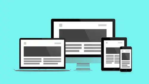
Progressive enhancement which, the philosophy that makes all of this stuff possible. We talked about it in the beginning in a previous segment. I recently read an article, Smashing Magazine, that I really dug that had this additional piece of vocab, Progressive Enhancement allows for pattern translations. So my core pattern is gonna translate itself as it grows. Mobile first thinking prepares me to consider each component as one instance of that component along the spectrum. Again, adding things as it grows. Some interactions that suit a breakpoint range over a larger space, might not suit the viewport boundaries for smaller screens. So, again, you're just not doing me any good by giving me options I can't use, I know you worked hard on it but it's not helping me out, so just stay off my site. So every design pattern starts with core content. That's what you're designing, that's what we're structuring that's what we started this first day on. This is what we're building off of. So let'...
s take a look at that in an actual example. It might clear some things up. Desktop first design slideshow, every client asks for them. Even before response to the design, they want this. And make sure, my own two cents about slide shows are people can't make a decision. So you have this whole board of stakeholders and one branch the operation needs this branch to represent it, this other branch of the corporation needs this branch, and they all can't make up their minds. I'm like, get a slide show, that way every two seconds I'm on top, cool, so I encourage people to make decisions based on the business rules and user goals and let that lead content decisions, rather than skipping ahead and doing these sort of more convenient I think things rather than making content decisions. So again the overhead of doing a desktop approach when it comes to slideshows is the file size, it's just bigger, you got lots of images, again, we're dealing with retina and all that stuff you can, so it adds up really fast. The Javascript required to make this happen is one more brittle piece of this chain that could break, we wanna take that stuff away. By the way, I don't need your arrows on mobile. I have something much easier, it's called my thumb, it does everything for me, and I don't need it, I don't need it, so just don't do that. So mobile first teaches us to start with core content. It's just the same totem-pole like user ladder we had before. Something has to be on top, something has to come after that, something else has to come after that. Decisions have to be made. As difficult as they are to make. And this is just so your most base user is always considered. The other thing that's gonna happen is this is going to make use of that alternate image size. Again, the desktop had these long 16 by 9 things, that doesn't do me much good on a small screen, so I'm gonna have this one by one aspect ratio the smaller version of it, so I'm gonna use different cropping, gonna load less bandwidth, and take the Javascript out, that's why we're doing the stack, no Javascript, one less breakage point. And then again you know what I'm also gonna do? Blow your mind, I'm gonna use base level font. I'm not gonna lose my font space until I get a higher breakpoint, again, just to consider leaning it down as much as possible, It hurts, (exhales) I know! It hurts when you say that. All that work we did on type yesterday. Man that was tough. Is it nice to have, no. So as touch comes online, we can allow for Javascript to kick in, we get our slideshow functionality, but we don't need our arrow, right? This is an Iphone, an edgecase, that has a retina display, so I have a retina version of my smaller proportionate. Big doesn't mean everything, like, it's still a different aspect ratio, but now I've added retina to the smaller aspect ratio, haven't added my arrows yet. I'm just allowing for touch to happen. Because I instinctively I just want sorta to do this, left and right. And so this is the first level of enhancement. After that, we enhance for desktop. Again, now we begin adding our larger format. Now we load click based arrows, now we load images as the screen allows and we can load our fancier font now. So again this is a process of documentation. Again, quick, sketching, bring it to the developer. Make sure they understand that there's a fall back. Their design isn't contingent on all these nice tasks. You've consider the content first, and make sure you have a discussion and you can prototype this stuff they can do a really low res version of this and mark-up to make sure there's a game plan before you take this into production. Again things to remember, websites are growing in size, be aware of your image asset options, the future is bright remember. Use a file format for it's strength, SVG for graphics, JPEG's and PNG's for more photographic elements, use compression tools, work them into your workflow, make sure you get rid of the cruft before you hand stuff off. We already talked about preparing multiple aspect ratios. Consider SVG when you can, learn to use and adopt tools, so that as a designer, like Andy said, you're not leaving stuff to the developer to take care of, because it's hard, like you can participate. SVG tools are more and more available. And when it comes to progressive enhancement, think small first and wire framed. Sketch that stuff out, have a conversation, prototype it, don't look at each component as a series of compromises. Think about, you're considering the breath and the reach of your design, and adding those nice to have as a service to clients who could actually use them.
Class Materials
Bonus Materials with RSVP
Bonus Materials with Purchase
Ratings and Reviews
CityGirl
I've already taken several web design classes, but there were still some details that I found confusing. Andy and Jesse did a great job of explaining things like; programming languages and how they interact to form the structure of a site, work flow responsibilities between team members and the blurry lines between them; and agile methodologies applied to work flow. They used case studies to illustrate how this all happens, where variations crop up, and how to address them. If you're new to web design, or just want to understand the functions of other team members, this is a great real world look at the whole process. I haven't found this in any other class, either on-line or local. Andy and Jesse are both very experienced working designers with current knowledge. They're very responsive to questions and seem to really enjoy teaching. Having two instructors is a great benefit because you get double the perspective, knowledge, etc.
Junko Bridston
I worked with Andy when he was a Creative Director at Funny Garbage, a design studio in New York City. I found him to be knowledgeable, articulate, and lovely to work with. I learned so much from him at the beginning of my career. In response to a previous comment: it seems silly to dismiss this class because Andy wears t-shirts with his blazers. If you think leaders only wear suits and ties, then maybe this class isn't for you. But if you want to learn from someone with loads of experience and a friendly manner, I really recommend it. You won’t be disappointed.
user-3d865b
I was looking for a class that would not only address the web design basics but also their place and function as part of a workflow. This class did not disappoint and Andy's and Jesse's engaging presentation style made it easy for me to follow along during the 2-day live session. By using real life examples, the presenters provide plenty of tips and strategies how to best work with clients and developers alike — the many, often intangible ingredients that go beyond technical expertise and can make or break a project. Highly recommended.
Student Work
Related Classes
Branding