Lessons
Day 1
1Class Introduction
09:10 2The Design Flow Basics
18:27 3The Designer as Co-Creators
06:48 4Get to Know Your Material
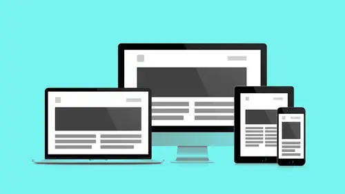
17:07 5Responsive Vocab: Floats, Flows, & Images
11:58 6Mobile First: Working Small
09:46 7Future Friendly: Embrace Unpredictability
14:17Collaborating with Your Clients
13:52 9Prioritize Your Users
39:42 10Best Practices for Defining Success
08:58 11Intro to Scrum
04:24 12User Stories & Epics
35:53 13Content Basics
27:40 14Defining the Visual Language
22:31 15Starting with Type
35:31 16Starting with Grids
15:40 17Gutcheck & The Product Brief
22:03 18Working With Developers
12:33 19Communicating with Developers
16:25 20Finding a Common Language with Developers
06:28 21Code Literacy
04:37 22Sitemap & Wireframe Basics
33:48 23Prototyping Basics
12:02 24HTML Prototypes
13:28 25Code Literacy & Developer Tools
11:46 26Developer Lingo
07:23 27Interface Personality & Behavior Galleries
17:27 28Designing for Performance
18:19 29Progressive Enhancements
07:00 30Designing a System: Discovery to Pattern Library
12:25 31Workflow Examples
20:25 32Applying the Style Guide to the Pattern Library
09:08 33Alternative Workflow
23:04 34Alternative Workflow Part 2
21:52 35Tech Requirements
21:53 36Retrofitting an Existing Site
12:15 37Project Cupcake: Building a Site from Scratch
24:08Day 2
Lesson Info
Sitemap & Wireframe Basics
So as we start to kind of dive in now and look at how to build the product, the website. Yesterday we learned a little bit about how to kind of look at content and use the content as a way to kind of help define structure. And Zinia, yesterday you were asking a little bit about like, why not just go right to wireframes? And you can, right? That's definitely an option. I would recommend if you do that, you still need sample content. You know, you have to try to work with real content. We'll talk a little bit about that. But this is probably, as a designer, gonna be something that's most familiar to us. This is a great quote. Wireframing is one of the most valuable parts of any web design project. But if done inefficiently, it can end up costing more time and can even create bigger headaches for both the client and the designer. And so I think that's something really key. You know, these are the blueprints of the house, so to speak, right? So, if we're not kind of communicating the right...
types of things here, then it's only going to lead to problems down the line. I wanted to start with a quick little story though. So, let's see about-- My son, Donovan, when he was about two and a half, maybe three years old. I saw him kind of on the ground and he was looking at the magazine. The magazine was flipped over and he was kind of like swiping the back page. And I realized that he was looking at an advertisement for an iPad. And it was really interesting to me because, for me I saw that as an advertisement for an iPad. But for him, he saw that as a broken iPad, right? So, what he had done was he had a very different kind of mental model that allowed him to kind of skip ahead where we would. Something that's kind of really interesting. I wanted to talk about the idea of mental models, right? So, Susan Weinscheck, who is the author of a really great book that I recommend, 100 Things That Every Designer Needs to Know or something along those lines. It's really fantastic. It's a great kind of read to just kind of like go through. She describes mental models as a representation a person has in their mind about the object they are interacting with, right? So, the object he was interacting with was first the iPad and that's why it was kinda not meeting his needs. And so we as humans, at the extremely fast pace of technology we keep kind of like setting the new bar for what our mental models are gonna be. You know, the generations before us are gonna have new mental models that are gonna kind of reset a bar as to what normal is. So we keep redefining normal which is really interesting. And that's why things somehow feel old or we're feeling like man I'm so behind on the times or they're like why that email is so old news. Who uses email anymore? That's crazy. Now as a designer, we kind of try to create conceptual models, right? So this is the actual model given to a person through the design and interface of a project. Now ideally these will match up, right? So the metaphors we use are often very similar. Which is why you know, if you remember kind of throwing things into a trash, we knew that it was gonna be deleted because it was the trash can and we know what that means. So our conceptual model mapped with our mental model. Now you still may want to kind of push things. It's not like we have to like kind of say like this is it. Like, what we've defined that's all we can work with. But if you are going to try to create a new conceptual model then the way that you're going to turn that into a mental model is by three things. You need clear messaging, you need kind of training, and repetition. And those three things over and over again are gonna finally get your users to learn. That's a really important thing because you have to make sure that they understand that it's not going to be a given. So although sometimes as a designer I wanna be clever. I'm gonna be like oh this is gonna be awesome. Ya know, like it's awesome to me and I've created that new idea but that doesn't necessarily have any meaning to your users. I think a good example of this is you know, think of like the unlocking on, say an iPhone, right? So the whole kind of keypad entering and then swipe to unlock, that was pretty new at the time. You know, something that we take for granted for now. So what did they do, ya know? Apple is brilliant at kind of being as minimalist as possible and yet they still found it worthy to say slide to unlock really big. Right, like let's just be clear you have to slide to unlock that. But now, once I learn that then I can use that in different ways. So now if I see kind of a message coming up with my other apps, I can slide to unlock those directly and I can go right into that piece of content, right? So that's something I was able to learn. So this is kind of really interesting and something to consider. So I have a quick challenge. Zinia, are you ready? Okay. So we're thinking about kind of, ya know, mental models and conceptual models. I want you to imagine that you have traveled back in time to the 1950s. And I want you to explain Facebook to a couple. Oh my gosh. (laughter) See, that's what happens when you volunteer. So what would you-- How would you even do that? That's more like, I don't know. The big book of the people with their large profiles with a photo. What's a profile? Yeah, that's bad explanation. (laughter) That's more like phone book but with more content. What's content? Of course I can call people. (laughter) Yeah, that's really challenging. So you know, the answers may vary, right? But the point is you have to kind of start with a reference point, ya know? Likely then maybe there's some understanding about kind of big, giant computers. So what you might need to do-- Let's assume that like there's a big, giant computer that they have a reference point. Be okay, so imagine this big, giant computer-- I'm not even sure if they had television. Well exactly so all these things are new, right? And so there might have been news about these big, giant computers that take up a room. Ya know, based on how they were starting to go-- So, if we have like a baseline. That's like say they understand that there's big, giant computers in a room. Cause, depending on the 50s, there's probably some talk about these crazy new machines that are doing things that compute and all this other stuff. So let's assume that the baseline is that they have an understanding now. They've seen pictures of this mysterious, big computer, right? And they understand that it's gonna do some type of complex processing. Ya know, imagine then maybe it's like okay. Well, imagine a much smaller, personal version of that. And with that now you can kind of connect to other smaller computers and through that now you can kind of have a way to communicate with each other. And I have no idea if this would actually work or not but this has kind of been in my head. Like how I was trying to explain it to that imaginary couple in the 50s. Ya know, kind of like starting from that one mental model that they have and keep building and building until maybe it's like okay now I can kind of get what you're talking about but still they'd be like. Yeah well just trying to explain the interface actually. You know, how the whole thing works. Exactly and even explaining interface, what is an interface? Right? So you know, it would take a while even to get to an interface idea so-- So many things that then you would get to so there's a lot of leaps. So what's interesting is that what does this class look like, ya know 50 years from now and explaining something that they're all familiar with and we're like what are you talking about, ya know? So it's really interesting to kind of think of how this stuff keeps going. Andy Ferret from the chat room says explain why we had Facebook to a couple in the 2180s. So they're kind of chiming in on this conversation too. Exactly, yeah. So you know, what the idea of that is so is we think of sitemaps and wireframes and we think of the importance of mental models. There's something called Interaction Design Patterns. And they're basically a way to describe solutions to common usability or accessibility problems to a specific context, right? So, why this is important is that when we kind of do our wireframes we wanna leverage a base level of knowledge that we're all comfortable with. And then make choices of whether or not we should kind of break those rules. And when it comes to patterns, they can happen on a granular level, something really small on say a component level-- So for example, maybe a rating system, right? So this might be a very familiar type of molecule that we're all used to, right? So here it is, it's like oh I know what that means. Like, I could show this to you and you probably already have an idea that this has something to do with rating because you're so familiar with it. So if you were to kind of see this again, you wouldn't have to explain to the user that maybe this is about rating. They're already gonna kind of have that basis. So, components can kind of be reusable patterns. But then you also have larger ones: navigation, layout, things like that. Especially in responsive design, right? So this is a page from Brad Frost's kind of Responsive Patterns and it's basically a collection of patterns and molecules for responsive designs. And so you can see there's a whole ton of different ones with different way layouts could work, different ways navigation structures can work. He's put a lot of time and effort into starting to catalog these things so that we don't have to reinvent the wheel all the time. Sometimes you may want to, sometimes you may not. And so I think as designers, as we get into sitemaps and wireframes, just make sure you're kind of considering your users and what they may know and what they may not know and then why it's important to attest because we have all these assumptions. Yeah, this is responsive. It's the URL for that resource and it's great. Again, as a designer you're not even looking at it for code samples at first, you're looking at it to see how this is done. Like, what does the desktop version and the mobile version of this thing look like so that I can make more accurate wireframes? So we're gonna group sitemaps and wireframes together. Cause again, in my mind, they're doing a lot of the same things. Again, there's another person who's not in the room now. We've been talking about developers all day, we've been talking about clients. There once was this unique creature called the UX person. They still exist. Well, they were separate-- They're very important. I know. I just find this skill to be merged into lots of things. But yeah, if your team has dedicated UX resources. More and more as a designer, I find some of these UX tasks assigned to and added to my plate. And so if you're-- I like to be at the table when a lot of these discussions are being had. The important thing with wireframing-- Whenever you're making a specific wireframe they're not always-- They need to be done at the fidelity that's solving the problem at hand. Again it's a question of resolution. You're gonna see this slide a lot in today's talk. Because we're constantly going from the large and sort of zooming in and then things get more crystal all the way back to Andy's exercise with the microscope where we're constantly sort of like zooming in, sort of looking at this atomic design. We're constantly kind of trying to find out what things are made of. The thousand foot view. The sitemap is a literal map, right? The way that I see them is, as far as like establishing a mental model that you might be more familiar with, it's how all these component parts go together to compromise the site itself. I see each of these counties as a page within my website. As I zoom in to a particular building, I start to use that metaphor and some of those mechanics of how I understand blueprints-- That's how I see a wireframe. This is a page that has various components in it. It's telling me how to move specifically within that page, how my eye moves within the page. So again, these are metaphors, mental models, conceptual models that I've learned-- that I have in me that if I can tap into them I can use those processes to help me make better decisions in the sitemapping and the wireframing process. And I can see they all correlate with space, right? They all correlate with sort of zooming in and out of actual landscapes. If we wanna use our atomic system from before where we were talking about user interface pieces and sort of apply it to the sitemap/wireframe component level, we can look at it like this. Here are all my pages on the left. This makes up my sitemap. As I sort of zoom in, a lot of these pages look the same. I'm gonna group these together as templates. As I zoom into my templates, I start to get my atoms of my sitemap. Those are my components. So again, this nesting logic carries through into the way that we sort of build our wireframes. So again, we're gonna look at three levels of fidelity. We're gonna zoom in from the sitemap level all the way down. We're gonna look at the sitemap first, then we're gonna sort of zoom in, we're gonna find these templates, and then finally we're gonna look at how we create specific wireframes out of templates. So the sitemap. So what are they? Sitemaps are a high-level diagram of our website. They identify and prioritize the hierarchy of the site. So again, just like we did with a static single page content, we're gonna be beginning to do this hierarchy process on that page site level. They allow us to identify pages and templates. Pages being unique instances of templates. Templates are I keep having a two-column grid on all these pages. I have galleries all over the place. That's a template. I have a video player with a description. That's a template. I'm going to begin to see this stuff from a high level and start to see oh well this is actually a unique instance where I'm actually putting a gallery and a news article together. That's a specific page because now I'm flowing very specific content into it. And then they also sort of identify the structure and the navigation. So as you're beginning to organize this stuff, we're beginning to see that a user actually has to move through it. So how do I like, pave the cow path so my user gets from the front door to where I need them to be? And it also allows us to maintain this balance between user needs and business goals which is constantly our job as designers. The best way to sort of like-- to understand what a sitemap is is to take a look at one. So here is a sitemap that we generated for the Ministry of Space. Again, we generated this by again reviewing our user stories but also taking a look at the industry as a whole. What is the standard way that once we've identified where the Ministry of Space fits, how is everybody else doing it? How can we make it unique to us? We chose specific menu items specific to our content, right? Cause we don't want-- We do wanna use the agreed upon structure at first but we don't wanna be so generic it could be anything. So again, we wanna use the structure that we learn and sort of change what we can to sort of dial in and key our users into what we're doing. And again, each one of these menu items-- this is where we collect our content, create our silos, and begin organizing the pages within our website. One quick comment I just wanted to make on that. So you'll notice with these there's kind of two things within each of those boxes that represent say a page. There is kind of the number value: 5.0, 4. and then there's also the kind of label of the page itself. It's really important to put kind of a number association with the name because you're gonna probably reference that as short hand and also sometimes names change, ya know. Maybe "about us" doesn't wanna be "about us" anymore. Maybe, you know, "exhibits" becomes bigger or "visits" becomes "visit us" and so all the sudden if you have that now you have kind of a frame of reference. So make sure you're not just putting names of it. Start to give it some labels as well. Cool. So templates, we're zooming in. And again, choose the right level of fidelity. You saw wireframes. They're boxes with words and numbers in them connected by lines. It's not super representational, ya know. So wireframes, I think a lot of people just gun it right here. They go right to the oh man I'm gonna do this and they actually try to put their fonts in their wireframes and really like dial it in. But before you get there, where does stuff go? Ya know, like really high level stuff. So this gets closest to our content inventory that we did yesterday in text. We start organizing. We use numbers that we've associated now with that textual content inventory and like Andy's saying, we have to use that number short hand to assign its order in the page, its order in the hierarchy. And we're mapping mobile and larger screens at the same time. We're designing for the extremes at this point. We're setting some goal posts on either end of the field. Somewhere to sort of contain it. And as an exercise as a designer, this really helps me to understand floats and flow too, at this point. Like even at this level, like what's a float? So if this is two columns here, what's gonna happen when I take float away? Where does it go? I need to understand that on a conceptual level so that these are accurate. So even that, like I'm not writing code. But again, my knowledge of the code is now informing my drawing. This is like really important, ya know. Like this is really the subtle stuff where cool stuff happens. Again, this is our content inventory. We're adding numbers to these values, to these organisms and molecules and those numbers relate to our wireframe. So two things that are content-- we call these content reference wireframes at this level templates, synonymous names. We use content reference because that's what they're doing. They're referring to blocks of content. So the first thing that content reference wireframes do is they establish our layout types. If I do one of these for every page I'll start to see oh I'm doing that a lot. Alright, I don't have to do that anymore. That's a template type. Doing that a lot, alright that's a template type. So again, we wanna sketch to solve a specific problem but once we see a specific pattern we wanna extract it and call that two-column layout, grid layout to sort of-- to get specific. The other thing that content reference wireframes do is they get us thinking about these breakpoints. How is this order gonna work? How is the linear logic of priority gonna scale up to desktop? So it has us sort of constantly thinking in both. So it might be desktop first but it's not-- I mean it might be mobile first but it's not desktop independent. Like you still have to know where you're going. So the structure, the content, is mobile first but you've gotta set a flag over here to know what happens when things get big. And again, this work is gonna-- Like, even more than your detailed wireframes this stuff is gonna quickly turn into HTML prototypes and we'll look at that shortly. It's quickly gonna-- You're giving a map to your developer or your front-end guy who can now go thanks. While you dial in all the stuff on the wireframes, I'll take this and I'll start the work that I need to do now. So you've given the front-end guy some momentum. So let's zoom in. Now we're getting into wireframes. Like the actual wireframes. Not content reference but this is the detailed stuff. Yay! We can actually do the things that we came here to do. So now that we're within a page we can start identifying and prioritizing content on the page. We can identify modules and components on the page level. Where's the repetition on the page level, on the component level? Not on the sort of template, sitewide level but again, at this scale. Where are the features and functionality and how do they relate to other pages and other components? We're gonna begin visualizing navigation architecture and layout. How does that mobile navigation affect-- how will that translate up to a desktop navigation? Where does that stuff sit on a page? And again, interplay. How do these components relate to each other? If I have accordions on my page and I'm collapsing and opening sections of content, how is that flow going to affect other elements on the page? We've gotta start to think about this at this level before we build something. It's really important to understand that these do not have to be pretty. That's why I used that beautiful font. These are designed-- These are like-- These are designed but they're not designs. I've actually presented Balsamic wireframes to a client who thought why are we using that font in that sketchy looking line. But usually it's pretty clear that that's not trying to be a thing. You are not giving them a picture of their website. It is a plan. It is a blueprint, separate. It is not making a set of decisions at this point. Strictly hierarchy, you're showing some discipline. You're making sure you get your ducks in a row before you begin painting things and really sort of like dialing that stuff in. And Jessie if we're, you know, kind of being honest and sharing I've presented designs where the client has preferred the wireframes. (laughter) I like that really minimal. So that makes you feel good as a designer so-- I like that really minimal approach we got going on. What's all this color? Let's go back to the wireframes. That's nice. It's really important that we use-- So the other reason we did plain text exercises before this is like, now we've shaped the content. I know an essay for an exhibit at the Space Museum is this many words. I know my headlines are this long and have-- Ya know like, I can now begin to make realistic real estate decisions when it comes to content within my wireframe. So this is why we-- It's a good idea to sort of work in text before we get to the block level. Again, Balsamiq, great piece of software. They have web versions as well as desktop versions. There's some UI/UX experience issues with the web version which I would love to talk to folks there about. And then but it's really nice to have both those options to work online and offline. The Balsamiq version-- the desktop version allows me to work quickly again and sketch and again we wanna work mobile first. I wanna begin to get all the items on the page and know what I need. And then once I have the mobile version drawn up I can begin drawing out these desktop versions. And again, when I work in Balsamiq I work across the board left to right. I'll start over here with my sort of content reference but as my brain's working I'm kind of like-- I mean I work with all three. I know people who work with two and then design three but at this point I feel pretty comfortable with all three sort of open at the same time. Like, making-- Cause making decisions here are kind of affected by stuff that happens over there. So again, I've laid it out and structured it this way but at this point I feel pretty comfortable going back and forth. Suggestions on how to proceed with wireframes. I always start on a project with what makes this client unique. What makes this content unique? What is the core content type of this project? So with the museum I look at that as that's the exhibit, right? About pages are everywhere. Home pages are everywhere. This-- Their commodity are these exhibitions. So if I design the exhibition and design the brand around that core brick, that core module, the brand kind of takes flavor from that. It's what makes them different than everybody else. What's their primary sort of distinguishing piece of value that they bring? So this is where I start. I start out of a single view of the core content type. That's the first wireframe that I use to begin fleshing out sort of like the brand patterns. And if you don't mind me jumping in, Jessie, the wireframes that you see on the screen right now are actually part of the bonus material. The next thing that I do after I do the core content type is I actually look at a generic page. Cause I've had some ideas and I'm like well before I get too fancy and I design some sort of brand specific stuff I'm just gonna do an about page. Something that kind of just doesn't require a super special layout. Again, just to feel out the kind of pallet that I'm working with. Next, now that I'm comfortable in the brand I'm like well this is responsive. This is kind of fun. So I try to find a page where I can play and kind of do something unconventional. So I tried to experiment with breakpoints. What can I really do here as the screen changes size? So this is a photo landing page. It's similar to the example we showed the other day I think that was one of the top winners which was like photos and text, photos and text. So what happens in the linear sense is this totem pole of picture, text, picture, text, picture, text. But what happens with source order with these objects as I expand the screen? Well I guess I could do some pretty fancy stuff. It starts like-- If I'm thinking in blocks, this linear block now turns into a horizontal block. Sort of imagine that snapping into place. And like I can imagine doing variations. This is as easy as a float-right, float-left property. Like again, this is because I've dug in enough into the code to understand what's technically possible. I can begin to make like this tech feasibility stuff and go well that's not gonna be too hard for the developer to do because I know that there's just a single property, a float-left, float-right where I can determine where the content goes associated with the image. And again, images as they scale up-- Remember max-width? I need to make sure my text stays contained but I want those images to get super big. So I include that into the wireframe. Alright, texts stay, images get super big so I can have this immersive, photographic magazine experience but not create a really uncomfortable reading experience. Homepage last. Don't you dare-- It's the first page that every stakeholder wants to see. But the unfortunate thing is it's the page where there will be the most contention around what goes there and it's the page that's gonna change most of the time. So I do it last because it's gonna learn from everything else that I've done. It's gonna learn from these isolated, singular efforts. The content type, the standard page, the breakpoint playing, ya know. It's gonna learn from that stuff and then all the best pieces can float up to the homepage to create something that's truly dynamic. And you know I think for me, realistically, instead of thinking as homepage last, think of it as homepage not first, right? So it might not be able to be last because your stakeholders, your clients, they're gonna be very eager to kind of have that image that's gonna show what that new experience is gonna look like but talk to them in the process about why you wanna dive into some meatier pages first because that's gonna help establish some of those kind of reusable components where sometimes on a homepage things are a little different. They're a little unique. So homepage not first maybe is where I like to think. Sure, sure. Nice. So after all this work, again we sketch, we've made a mess. I encourage you, everybody, to make messes first before you organize. Systems come out of like, enthusiastic mess making and then you turn the other half of your brain on and then you go clean up the pieces. So after I've made all these wireframes and now I begin to process. I have my coffee and I sit back and look at them and go well that's the same and that's the same and that's the same. And I start picking these things out of my wireframes and these are my components. I've got my menu. I start with mobile because again, the simplest thing is to copy and paste. So you've just-- And then that relationship will trickle up into desktop. So I grab my menu out, I grab my footers out, I start looking at primary and secondary content. And again, this is a process of just reviewing lots of things. I have a separate file open in Balsamiq. It allows me to copy, paste, bring stuff over, and sometimes I'll bring again, like the post it notes and the user stories. Similar things go I think that's the same component. Can they stand to be merged? Sure, they merge these two components and make a singular component. That satisfies all of these things. So this is a whole process. Again, after you've done a lot of content-specific decisions you can then go back and find out what repeats. And this component inventory again, you wanna hand that to your friend and developer like super quick cause he's gonna be like thanks. Cause while you're still working he can leverage what you're generating and start going. So this whole time by the way, we wanna be collaborating. We wanna be working with others so the whole time you're making these files you need to put them online where somebody can get them. Google Docs and Dropbox are great because they add features that allow people to make comments directly on the files like this changed, that changed. So we're gonna look at Invision in a minute here. And it's a software of one of our sponsors that'll allow you to upload your wireframes directly online and then add comments directly on the drawing itself. And say this module doesn't make sense to me or this component looks like that component. Or can you explain to me where this button goes when I click this button? So, instead of comments existing over here, comments can exist in context of your wireframe. So you can have those conversations. And what's great about something like Invision and those other tools, we're seeing more and more of this kind of contextual dialogue, right? So the comments are happening and there's different types. So you have private comments that might just be between certain team members. You can kind of group comments where everyone, especially if the client has access to the project then they're gonna be able to kind of see all that, you have developer notes which will be specific ones which you could write as user stories and write on top. So if you didn't wanna use a tool like unfuddle and the project was small enough you can kind of do that. And then you also have new types of comments called tour comments. I'm just gonna break all the rules. Oh boy. That allow you to really kind of dive in and just write some specific-- Say like hey this is how I'm imagining this, this is how I'm imagining that, and just gives a little bit of contextual overview. So through that you can have a lot of types of communication. So yeah, so this is Invision. I've launched a sample project that I've created. When you login to Invision you're greeted with all your projects. When you click into a project you're given all the screenshots associated with that project. If I click into a specific screenshot, I'm presented with some options here at the bottom of the screen. One of them is comment mode. I'm gonna select the comment mode. I don't agree with the name of this label. Wrong name for name. I'm gonna post my comment. Now again, like Andy said, maybe that's not a comment. You can actually edit the type of comment this is. Like that's gonna offend somebody. I'm gonna make that private and send that to somebody specifically. Or maybe it's a technical observation. I'm gonna make that a dev note so only the devs see it, not the stakeholders. They don't need to see it. And then there's tour point. So we use Invision in two ways. We'll use it as first, just a place to kind of post designs for feedback in general. And starting with wireframes and then even some key designs so that way there's a link for clients and team members to go to. And then we'll also use it as a way to prototype which is kind of what we'll get into next. Cool. So yeah, I just wanted to show you since we had it open for the prototyping segment how that works. So things to remember. Sitemaps, 1000 foot view. We're gonna zoom in, we're gonna make these blocking models. Content reference, assign where content goes within the flow. Finally, we get to dial in and make some wireframes where we get to sort of do some designing stuff but they're not designed as much as they are a design. Wait, does that make sense? You've said that word too many times. And then finally we're gonna create a UI library which is gonna make our front end developers life a whole lot easier.
Class Materials
Bonus Materials with RSVP
Bonus Materials with Purchase
Ratings and Reviews
CityGirl
I've already taken several web design classes, but there were still some details that I found confusing. Andy and Jesse did a great job of explaining things like; programming languages and how they interact to form the structure of a site, work flow responsibilities between team members and the blurry lines between them; and agile methodologies applied to work flow. They used case studies to illustrate how this all happens, where variations crop up, and how to address them. If you're new to web design, or just want to understand the functions of other team members, this is a great real world look at the whole process. I haven't found this in any other class, either on-line or local. Andy and Jesse are both very experienced working designers with current knowledge. They're very responsive to questions and seem to really enjoy teaching. Having two instructors is a great benefit because you get double the perspective, knowledge, etc.
Junko Bridston
I worked with Andy when he was a Creative Director at Funny Garbage, a design studio in New York City. I found him to be knowledgeable, articulate, and lovely to work with. I learned so much from him at the beginning of my career. In response to a previous comment: it seems silly to dismiss this class because Andy wears t-shirts with his blazers. If you think leaders only wear suits and ties, then maybe this class isn't for you. But if you want to learn from someone with loads of experience and a friendly manner, I really recommend it. You won’t be disappointed.
user-3d865b
I was looking for a class that would not only address the web design basics but also their place and function as part of a workflow. This class did not disappoint and Andy's and Jesse's engaging presentation style made it easy for me to follow along during the 2-day live session. By using real life examples, the presenters provide plenty of tips and strategies how to best work with clients and developers alike — the many, often intangible ingredients that go beyond technical expertise and can make or break a project. Highly recommended.
Student Work
Related Classes
Branding