Lessons
Class Introduction
11:34 2What is Interaction Design?
05:21 3Goal Directed Design
11:44 4Context
07:26 5Mental Models
19:02 6Affordances
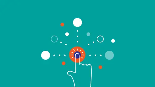
07:52 7Micro Interactions
25:02 8What are Heuristics?
03:12Make it Clear Where You Can Take Action
17:36 10Help the User Understand What's Going On
14:41 11Stay on the Same Screen
19:30 12Invite Users To Do Things
06:12 13Use Semantic Motion to Aid Understanding
13:49 14Design Research
27:21 15Personas
20:53 16Scenarios & Frameworks
17:09 17Wireframing
21:51 18Interactive Prototypes
12:55Lesson Info
Stay on the Same Screen
So now I'm going to talk about the heuristic rule of giving appropriate feedback, and you do that, you know, when you're using an interface, how do you know what just happened? From the feedback that it gives you. So, you know, in the real world feedback often happens instantaneously. Right, you bounce a ball and it bounces back up. But in the computational world, we're designing what people see and what they hear. So, it's not always easy to provide good feedback. But we can do this with heuristics, and the first one is to show the system status. So you want to show the person what is going on with the system at any point, right? And you'll notice this sounds kind of familiar, right? Something that we talked about earlier? Does it? What does it sound like? Microinteractions, yes, of course. And, so you, and how you show the status depends on the response time. So, if the user triggers something, and the response takes less than a second, just show the result right away, right? Like yo...
u click something in the Google box, you click "Search," and it shows up in less than a second. If it takes one to five seconds, it's good to have some kind of indicator of status, so you know that the computer isn't stuck, right? Because imagine if that little spinning wheel wasn't there, and you were just tapping something and then it took five seconds to show up. That would be kind of, and then it suddenly showed up. That would be kind of choppy, kind of weird. You're not getting feedback on what's happening. If it takes longer than five seconds, show a progress bar, because that way you're indicating where exactly in the process you are, right? In order to make sure see if the action is completed or not. Another example of this is this. So this is interesting for two reasons. There's two types of progress bars here, right? You'll notice at first there is a progress bar giving indeterminate feedback, right? So it's just showing, "Hey, something is happening, and then as soon as it starts loading the page, it turns to a progress bar that goes from left to right, and shows you how long it takes, what's actually happening on the page when the page is done loading. This is really cool for a lot of reasons. What I like particularly about this is it almost doesn't feel as if you're waiting, right? And that's not a default reaction. You could have just put a little spinner here and say, "Loading page," right? But instead there is this motion happening. There is this constant feedback happening, and it feels as if the interface is constantly in motion. One thing to remember about progress bars is that they don't need to always be linear. They can have the shape of a circle. And they do in a lot of cases. The point is just that you're showing progress. Yeah, so if it takes longer than five seconds, show a progress bar, whether it's straight or circular, doesn't matter. If it takes longer than a minute, it's good to show a timer, in part because progress bars don't always proceed linearly with respect to time, right? I mean everyone who starts up their Macbook knows this. So you want to know how long this interaction is going to take, if it takes longer than a couple seconds. The same thing you're doing for time you can show for space, right? So if your web mail system shows you how much of your inbox you've used, that's nice, because as you get close, you can start to decide to do something about it. If all of a sudden it just tells you, "Sorry, mailbox full," that's really frustrating. What you also want to do is, a lot of times when people are using a site, they don't know what to do, right? So you need to show them what to do, and show them what the next step is. So what's cool about this one is once you've entered your email address, it doesn't just say, "Hey great, thanks for your email," I mean it does say that, but it also tells you what to expect next, right? So that's really, really important, especially for users who are just browsing your site, with fragmented attention. You know, their phone's going off, their TV's playing. You want to give people a clear order of steps to follow, and you always want to show when something has been completed. It doesn't have to be with a big orange icon, but whenever, you know, if you think back to microinteractions, you think back to trigger, rule, feedback. Once the action has been completed, you want to give a feedback that the action has been completed. And here it's in the form of a big, big orange button. In the example I showed earlier with the webpage loading, the feedback is that the webpage is loaded. Finally, you want to prevent errors before they even occur. I guess I really love, like if you do this one well, it makes such a huge difference in your designs. If you can design in a way where it's impossible for people to do something wrong, they will always have a feeling of success, right? Makes sense. Great example of this is the Apple Lightning Connector, right? You cannot plug this in the wrong way. No matter which way you plug it in, it's always right, compared to the old connector, where it was almost impossible to tell without like touching it onto the phone if you even plugged it in the right way, or I guess there was a little icon on the front that gave you an indicator, but it wasn't as clear as just having something that you could plug in each way. Another great example of this is Twitter. If you put in a Tweet, and you start hitting the 140 character limit, so this number counts down. First it's a green number, and then when it goes to the last 20 characters or so, it starts turning red, like uh-uh, you're about to hit your character limit. An error is about to occur, right? And then when you go over it, it shows you exactly by how much you've gone over, with two forms of feedback. So then you can write your Tweet, and then you can, you know, maybe turn the "you" into just a "u," or remove the space to make sure that you get the message out. And that's not a default response. That's something that took some thought and engineering effort to realize. The default response was to just put a little code in there that says, "140 character limit," and as soon as you reach it, like that takes like five seconds to do, and as soon as you reach it you just can't type anymore, right? You keep typing, but the cursor just stays there. Having a functionality like this, like that was pretty hard to implement originally, but the payoff for it is so worth it. That's one of those examples, that's an example of a really good microinteraction. That's an example of the difference between a product that you'll tolerate, and a product that anticipates your needs. Another great example of this is in this contact form, if you put in the phone number, it automatically puts, like, you don't need to put in parentheses. There aren't parentheses there that you need to like, type into and then put three numbers in and then type into the next field and put another three numbers in. You just type in your ten-digit number, and it automatically adds the right format. That's another example of the computer doing the type of heavy lifting that they're good at doing, and that they should be doing. Some more Google examples where, you know, if you mistype "olympic," first of all it gives you immediate feedback. Secondly it gives you the right feedback, the feedback that you expect. And, you know, if you attach a file, if you forget to attach a file, you get that notification. And what's also cool about this is that it's relatively intelligent, right? It doesn't just respond to "I've attached." It also responds to "I have attached," or in this case to "Find attached," right? That's something that someone had to think of. Those are rules that some engineers at some point needed to establish. An electronic system does not have this intelligence unless there are some people imbuing it with that intelligence. Of course, password indicators always a great example of preventing errors before they happen, getting immediate feedback of whether your password is good or not. So, if you design well, you can prevent probably 80 to 90 percent of errors before they ever happen, by putting in that extra effort by front loading the effort like that. But errors will happen. People are human. Things go wrong. Sometimes people get lost, and in those cases, you want to make the problem clear and provide a path forward. So, for example, in this field, if you type in your password or your user name wrong, the feedback that you get is "Invalid user name or password," but you don't really know which one is wrong, right? Maybe you have multiple user names. Maybe the user name wasn't your email, but it was actually some other name. Maybe you only use the thing once a month and you just forgot. So it's not really helpful feedback. Also, there's no way to, you'll see it in the next example, but even if you've forgotten something, there's no way to open up a dialogue that tells me how to recover my user name or how to recover my password. It's just telling you, "Sorry, you messed this up. Try again." It's kind of rude, lazy. Better example, by MailChimp. You know, depending on what you type in there, I mean, it's better on a lot of levels, right? So, it's better, the wording is better, right? Because something went wrong, so this is an opportunity, this is a moment where people are frustrated, right? So the system is polite but direct. "Sorry, we couldn't find an account with that user name, and then it gives you a path forward. "Can we help you recover your user name?" and it's clickable. It also shows you with marking the box red where the problem occurred. And also offers specific feedback based on what went wrong. So, you know, if your user name is wrong it'll tell you that. If your password is wrong, it'll tell you that, and it will also give you ways to correct it. Great, great example. Another good one is if you're signing up for Facebook, those few people that don't have a Facebook account yet, and you just click "Submit" without entering anything, it puts an exclamation point around everything. It gives you two indicators of where something went wrong, but it never actually tells you that you did something wrong, right? So it's giving you really good feedback, but it's also doing it in a way where it doesn't make you feel stupid, because one of Alan Cooper's key rules of good design is that good design doesn't make the user feel stupid, right? You never want to make people feel stupid, so in this case, it marks everything that's wrong, and then it puts a little marker here telling you where to start. And it's like, "What's your name?" and you can answer it. Really, really, really well done. It gives you like a nice on-ramp to get going. Here, this dialogue box, I mean this is not a type of message that you like to see, but it does a good job of telling you what to do next, right? It's like, "Hey, something went wrong, but, here are the next few steps that you need to take in order to remedy this. So it gives me a path forward. This is a cool example too. If you put in a search term on Amazon that doesn't have a lot of results, it would be very easy to just show a page with one result on it, right? But going the extra mile, thinking one degree further out, and giving people a path forward, right under the most relevant result, it just starts showing you results with one term removed, or with the term corrected, right? So people can keep browsing. You never want to, and the reason they do that is because people when they're browsing through your site, they're doing it with half of their attention, sort of like how our parents used to just zap through TV stations with half attention, that's how we scroll through our phone, with like kind of a half attention. And it invokes a kind of a flow, right? And when you get an error message, or you get something like, oh, there's only one result for this thing that I entered, it interrupts that flow. And as soon as that flow is interrupted, it's more likely that people go somewhere else. And you never want to do that. You never want people to go somewhere else, except somewhere else on your site. You know, some errors and problems might maybe be even things that we don't realize, right? That's the challenge of phishing on the web, when people are just trying to get your passwords. So, it's a really nice job, like this is I think Firefox, or no this is Safari probably, but they do a really good job of communicating, like if you go to a site that's been reported as a bad site, and you don't realize it, like Microsift instead of Microsoft, right? Then it'll flag that site as a potentially bad site, but at the same time it provides a path forward, right? "If you know what you're doing you can just ignore the warning, but hey, we just want to let you know something is going on here." The other component of providing help is to provide useful help, right? So in this case with Etsy, you have this really great help page that gives you topics, some of the most used topics at the top. Some of the most frequently asked questions at the top, but also a way to search for certain topics that you're trying to figure out. Or if you're going through Google Chrome, and you type in "help," and you put in "suggestions," it automatically shows you suggestions from your bookmarks, but also certain help topics. But there's a way to find help, right? An example of how to not do it is end-user license agreements. Like these almost feel as if they were intentionally designed badly, right? Because no one, you have these contracts that are actually really important, but they're hidden behind this big form that no one is ever going to read, and it kind of forces people to just click "Next" and click "Accept," because otherwise they can't use the software they're trying to use. A much better way of doing this is showing people, in a human, readable version, showing them a summary of what's going on, and then giving them access to the full thing if they need it.
Class Materials
Bonus Materials with RSVP
Bonus Materials with Purchase
Bonus Video: How To Get Better As An Interaction Designer
Bonus Video: Interaction Design Career Advice
Ratings and Reviews
NeeLee
After viewing this course, I have a ton of ideas to bring back to my current projects, and how I can improve my past projects, as well as best prepare for the future. Jamal's extensive experience and real-world comparative examples, helped paint the picture on how to put this course content to good use in my day-to-day design activities. I appreciate Creative Live's layout of limiting 2 questions per segment. This allowed for more time for content and I'm able to write down my questions to address and connect with Jamal offline. I'm also grateful that Jamal/Creative Live organized the course segments in a timely way that the course went fast but stayed memorable and understandable. The bonus materials are such an invaluable source of information! Jamal conveys his knowledge and passion for interaction design easily. You can tell he genuinely cares about paying his experience forward, by how he expresses his design approach and how he really listens when he's asked a question. He takes his time to think before he speaks in order to address the questions clearly so everyone can benefit. Thank you Jamal and THANK YOU CREATIVE LIVE!
Veronica Reyes
I really enjoyed this class. I've had some previous experience and training with interaction design, so this in depth course helped to re-instate core concepts and techniques as well as introducing more examples, tools, scenarios and resources that all in all made me more confident and excited about interaction design. Creative Live organized a seamless event, had delicious food, snacks and refreshments throughout the day and were very nice. Thank you CL!
Daniel Bell
This course was so much fun to watch. Jamal is a very engaging speaker and went into great detail while still being direct and to the point. The bonus videos are great! They feel like a behind the scenes look and he really goes off script to give detailed answers to questions like how to design your portfolio site. Great class!
Student Work
Related Classes
UX Design