Lesson Info
9. Make it Clear Where You Can Take Action
Lessons
Class Introduction
11:34 2What is Interaction Design?
05:21 3Goal Directed Design
11:44 4Context
07:26 5Mental Models
19:02 6Affordances
07:52 7Micro Interactions
25:02 8What are Heuristics?
03:12Make it Clear Where You Can Take Action
17:36 10Help the User Understand What's Going On
14:41 11Stay on the Same Screen
19:30 12Invite Users To Do Things
06:12 13Use Semantic Motion to Aid Understanding
13:49 14Design Research
27:21 15Personas
20:53 16Scenarios & Frameworks
17:09 17Wireframing
21:51 18Interactive Prototypes
12:55Lesson Info
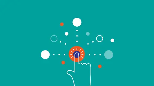
Make it Clear Where You Can Take Action
First rule is help the user understand what's going on and you do that through consistency, familiar metaphors and language, and clean and functional design. So what consistency means is that you have a consistent layout, you know, the logo is always where you expect it to be, the search bar is always you expect it to be. Then consistent naming of buttons and links, right? So not that on one screen, the button says cancel and then on another one it says stop and they both do the same thing, right? So in links and buttons, you have consistent naming and then features should function in a consistent way from across the site. Or to phrase it in Nielson's words, "User's shouldn't have "to wonder whether different words, situations, or actions "mean the same thing," which is totally obvious, right? But when you're in the thick of coding this thing and you're running out of time, a lot of times, there will be some oversights, so it's important to verbalize this. We build our mental models ba...
sed on our experience and our expectations and therefore, it's important to be consistent both within your software and compare the other software that people may have experience with, right? Consistency is done well most of the time, actually. It was a really problem 10 years ago, but consistency has been well most of the time, but you still see some examples here and they are worse than badly. For example, here on the Xfinity website, on the homepage, you have this header, right? Then, if you click on TV, it shows you this header where not only the color has changed, but also the background has changed, but the color of the logo has changed and even the name of shop in the original header is changed to Shop/Upgrade in the second one. So search bar looks different too, so it's like an entirely different site. Then, if you tap on My Xfinity, it takes you to another different part of the site that looks totally different from the other ones, and it's not even super clear how to get back to the original site. It's like, three different products and it's really, really important to stay consistent, particularly with navigation, right? The parts of the site you use that exist solely for people to get around and find things. Those really need to stay the same because the rest of the page is changing all the time, so there needs to be some kind of anchor there that anchors in peoples' consciousness, oh, there iss something that's the same everywhere. Another example of inconsistency is on the BBC website (laughs). Highest Rated has an arrow pointing down and Lowest Rated has an arrow pointing up, which is kind of weird, right? It's not what you would expect. On this contact form from a major mobile phone provider, say, if you want to send them an email, the names of the subtopics, they're not names that users associate with the products and they are not names that are used anywhere else on the site. So they're probably names of like, the units of the departments, right (laughs)? Mobile Web Department, National Access Department, but people don't have that mental model, right? They're just trying to get their modem serviced, right? So if they're trying to get their modem serviced, they don't know. Oh, do I do that under Broadband Access? Do I do that under Mobile Web? Where do I go? So it's important to use not only consistent language across your site, but also language that resonates with the people that you're designing for, which bring us to the next thing of familiar metaphors and language. So a "system should speak the user's language "with words, phrases, and concepts familiar to the user "rather than system-oriented terms." So I mean, does this sound familiar to anyone? Does it sound like anything that we may have covered earlier in the course? Of course, right? This whole idea is designing based on user's mental models and you know, classic metaphor. The desktop, we've already talked about that one. Now it's something that seems self-evident, but when that came out, it was a revolution. It was a total game changer. If you're using a music player software like Spotify, they're using language in there that you're used to from the physical world. Play, stop, pause, skip, cue, right? So those are metaphors that we're already familiar with from the physical world. Then we're taking into the digital. And of course, going shopping online. Shopping cart, check out. Those are terms that we're familiar with from shopping in stores all of our life. There's not actually a real shopping cart that you're placing things into physically, but in order for people to make that connection, oh, this is where the things go that I'm trying to buy. I mean, they're calling it shopping cart. They could call it something else. They could call it, I don't know, item repository or something, I don't know. But instead, they use an analogy that resonates based on peoples' experiences and that's the whole idea of the heuristic. You always want to design with the language in mind of the people that you're designing for. Same goes for kid sites, too. And not just the language here, but also just the style of it. Those colors pop a little bit much for an adult, but for the audience that they're targeting, it's just right. So the idea there is, again, designing based on people's mental models. Take something that people are familiar with for them to make it easier to make that cognitive leap to the new concept that you're trying to introduce. Next thing is clean and functional design, which basically means you add only as many elements as are absolutely needed to get the point across and have users accomplish their goals, which sounds obvious, but again, it's one of those things that only sounds obvious when you put it onto a screen. When you're out in the real world, you'd be surprised at how rarely it's done. And all of the top design professionals agree on this. Nielson says, "shouldn't contain information "which is irrelevant because each extra unit of information "competes with the other units of information." So basically, the more stuff is there, the more stuff you have to be distracted by. Alan Cooper says, "No matter how good your interface, "it would be better I there were less of it." Dieter Rams phrased it even shorter. "Less, but better." So your layout should be driven by what people want to do not by what you think is cool or by what the current trends are. In fact, I think most of the time it's not a good idea to follow trends. If you follow trends, you're a follower, but if you focus on the goals and what people are trying to accomplish, you automatically design solutions that stand the test of time. So some examples of this, of how to be clean and functional is above the fold, signal to noise ratio, and removing unnecessary functionality. On this example of the weather channel, when you come above the fold basically means that you place the most important things closer to the top of the page, right? So even though the Weather Channel has a ton of information on it, they know that the primary goal of people coming to that site is to check the weather. So what they do is they put this big thing that tells me the weather in one of the most important spots of the screen. People read from left to right in F-shaped pattern. We know this because Nielson Norman Group has done a ton of studies on it. So they placed it in an area where they know based on data that people are mostly likely to see it. Next thing is signal to noise ratio. So this is a Google Feedback form, I think, for AdWords and what you'll notice here is that all of these lines, they serve no purpose. What's really important is filling out the data and because of how our brain works, we automatically follow lines. and if you draw something on the wall, we're automatically gonna follow it. So these lines are, plus the white space in the form, the copious white space will lead to people looking here first instead sort of trying to scan the page instead of focusing on the things that they're trying to do. So you want of remove unnecessary elements. As an example of something that I did, a design that I did when I was in college, and as you can see, I kind of just threw everything at it, right? I mean, you don't even need to understand the language. You just need to see that I've got gradients, I've got reflections, I've got shadows, I've got colors everywhere. I've got, there's no emphasis here. There's no hierarchy. Instead, I'm just like, experimenting with a whole bunch of different elements without consistency while missing some fundamentals like you know, line length, size of text, making it readable. And that's something that a lot of people do. We get carried away with what we think is cool instead of focusing on the basics of what people are trying to do. But at some point, a couple of years in, I was looking at some of the masters in their respective, creative fields, the top music producers, the top architects, the top designers, and I noticed in all of them they're actually not doing that much. So a lot of the top music producers will have just, they don't have that many instruments on their tracks, but every instrument that's there has a lot of room to breathe and a lot of impact. And the best visual designers, the best UX designers, they do the same thing. They add only what they need and then they emphasize what's important based on what they know about what people are trying to accomplish and they emphasize things with making it bigger, giving it a color, and placing it in a place where people are more likely to look. So after I figured that out, my designs went from this to this in like, seven months. And again, you don't need to even understand what it says, but you need, you can just see the hierarchy, you can see that I'm only emphasizing things that are important, you can also see that it's still kind of a beginner because I was just using one color and thinking okay, what's important, whatever's important, I'm gonna make it red. But I'm not adding anything else either. And if you focus on the fundamentals in that way, your designs will start looking as if you've been designing much longer than you actually have and that's how you end up getting designs. This is almost a decade old, but it's still pretty solid, right? It could launch tomorrow and it would still be all right because I focused on the fundamentals and I removed a lot of functionality. So again, only add things that are necessary. You don't want to, it's a common mistake, again, when you're inside a company and you have a job and you sort of have to justify why you're working there, there's a natural instinct to add more and more features to say that you did something. It takes real courage to take things away and because when you're on the inside of a company, it feels as if we add just this one more thing, people will like it even more. But in fact the opposite is true. The more choices people have, the less likely they, well, up to a point. There's a point where more features improve the experience because they aid people in accomplishing their goals, but then past that point, when there's too many options, the satisfaction curve starts going downward again because people are like, which one of these 500 options do I choose? So it's just important when you're designing, be very ruthless about taking things away. Something I've also noticed when I'm designing. Sometimes you're designing something and there'll be this one piece and no matter what you do, you just can't seem to get it to work with the rest. It's like ah, I really want it to work but I've tried 10 different variations, it's not really working. Take it out. If you've tried to get it to work for three hours and it's not working, take it out, see if it works without it. You want to, especially when you're launching something new, you want to have the absolute minimum amount of things in it, right? So you take one more thing out and then it's broken. You put that thing back in and then you have the thing that you should be launching with and later on you can add more stuff. Questions so far? You mentioned how consistency kinda helps the user figure out what's going on and how to accomplish their goal. Do you have some tips or guidelines for balancing innovation with the consistency that the user needs? (sighs) Innovation and consistency. Does innovation have to be inconsistent? Probably not if it's done correctly. I think that a lot of consistency, well, there are some things. It sort of ties back into mental models and some of the stuff that we talked about in the past. If you're gonna change something that people are used to, make sure that it's a lot better. So make sure your innovation really improves upon a current situation. Then the other thing to think about is I don't think that consistency and innovation are mutually exclusive. When we're talking about consistency and the respect of heuristics, we're talking about the rules inside of your app are always the same. So if you have something super brand new that's never been there before, make sure that the rules, that it works in a self-contained way and it works that way every single time. Because then that way new associations can be built up.
Class Materials
Bonus Materials with RSVP
Bonus Materials with Purchase
Bonus Video: How To Get Better As An Interaction Designer
Bonus Video: Interaction Design Career Advice
Ratings and Reviews
NeeLee
After viewing this course, I have a ton of ideas to bring back to my current projects, and how I can improve my past projects, as well as best prepare for the future. Jamal's extensive experience and real-world comparative examples, helped paint the picture on how to put this course content to good use in my day-to-day design activities. I appreciate Creative Live's layout of limiting 2 questions per segment. This allowed for more time for content and I'm able to write down my questions to address and connect with Jamal offline. I'm also grateful that Jamal/Creative Live organized the course segments in a timely way that the course went fast but stayed memorable and understandable. The bonus materials are such an invaluable source of information! Jamal conveys his knowledge and passion for interaction design easily. You can tell he genuinely cares about paying his experience forward, by how he expresses his design approach and how he really listens when he's asked a question. He takes his time to think before he speaks in order to address the questions clearly so everyone can benefit. Thank you Jamal and THANK YOU CREATIVE LIVE!
Veronica Reyes
I really enjoyed this class. I've had some previous experience and training with interaction design, so this in depth course helped to re-instate core concepts and techniques as well as introducing more examples, tools, scenarios and resources that all in all made me more confident and excited about interaction design. Creative Live organized a seamless event, had delicious food, snacks and refreshments throughout the day and were very nice. Thank you CL!
Daniel Bell
This course was so much fun to watch. Jamal is a very engaging speaker and went into great detail while still being direct and to the point. The bonus videos are great! They feel like a behind the scenes look and he really goes off script to give detailed answers to questions like how to design your portfolio site. Great class!
Student Work
Related Classes
UX Design