Lessons
Class Introduction
11:34 2What is Interaction Design?
05:21 3Goal Directed Design
11:44 4Context
07:26 5Mental Models
19:02 6Affordances
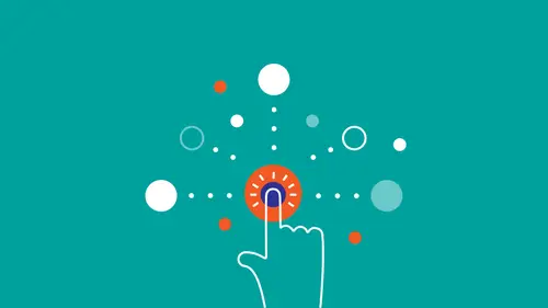
07:52 7Micro Interactions
25:02 8What are Heuristics?
03:12Make it Clear Where You Can Take Action
17:36 10Help the User Understand What's Going On
14:41 11Stay on the Same Screen
19:30 12Invite Users To Do Things
06:12 13Use Semantic Motion to Aid Understanding
13:49 14Design Research
27:21 15Personas
20:53 16Scenarios & Frameworks
17:09 17Wireframing
21:51 18Interactive Prototypes
12:55Lesson Info
Micro Interactions
A microinteraction is a contained product moment focused around a single task and what that means is that if you're using your iPhone's silencing feature, someone thought of that, right? Someone thought of how will we silence a phone. How important is it? And how are people going to go about that? And we decided that it's so important that it's one of the five physical buttons on the iPhone, right? Because it's something that we know people will want to do quickly. Someone had to think of that. A Pull to Refresh functionality, when you're going through your feed or something. Someone had to first think about that this makes sense to even do, then be like, okay, when I pull that down first there'll be a loading icon, it'll say loading, then it'll go back up, and then it'll refresh. That's a microinteraction. And someone had to think in detail about those steps. But it's not just limited to the digital world, right? If you have a faucet that activates as soon as you place your hand to th...
e sensor, someone thought of that. That's a microinteraction. Or something as simple as adjusting the knobs on your stove, right? That's one single thing you can do with that knob. You twist it, it goes click, and it goes on, right? But still, someone had to design that. So microinteraction is about really honing in on the individual details of a design. And that's how it's different from the macro. A macro-interaction is just a feature, right? So it's something that's complex, it takes time, it has lots of different things that you can do with it. While a micro-interaction is something small and brief. So, for example, a music player is a feature, right? Like iTunes is a feature of OS X. Adjusting the volume in iTunes, that's a microinteraction. So it sort of follows out of that thought process of microinteractions, that every product is made up of features, and every feature is made up of a series of tiny interactions, right? So something that is... I'm really, really happy that Dan Saffer took the time to really verbalize this concept, right? Because it's something that designers were doing instinctively, but now it's been verbalized. Now it's part of the public consciousness. And these microinteractions matter even if you don't recognize them consciously. People can tell if you care, right? And microinteractions, doing them well, is a sign of caring. It's not just my opinion, it's the opinion of the best people in the world. If you... A lot of times if you're dealing with an interface that is sort of just slapped together, you can sense it. So the difference between a product that you love and one that you just kinda tolerate is, a lot of times, these tiny, single-point interactions that you have with it. I got a good example, it just came to me. When I was making this slide deck, I was using Keynote, Apple Keynote. And in Keynote, every time you create a new text box it shows up in a certain default typeface and a default color and it's always the one that I don't want. Right. (Speaker and audience chuckle) So same with those shapes, right? Why, after creating 100 rectangles, is it still giving me a blue rectangle with a shadow? So then I have to go over and click No Shadow, Color Fill, not Pattern Fill, and change it to something. So why can't the system just sort of anticipate my needs? That's an example of putting thought into the individual interactions. There's three components of a microinteraction: The trigger that initiates it, the rules that determine how it works, and the feedback that shows you how the rule is being executed. So let's start with the trigger. Trigger's what initiates the microinteraction. So what this basically boils down to is you wanna make the trigger something that people understand, right? That they understand that they can interact with it, maybe with an affordance based on their mental models. So the most simple example of this is the good old-fashioned light switch, right? The trigger is press a switch. But when you're in the digital world, things can quickly get more complicated than just pressing one switch. On this screen there are a ton of triggers that all activate individual microinteractions. So when we're talking about triggers, we also have to differentiate between manual triggers and system triggers. Manual triggers are what we just talked about, right? It's when something, it's when a user triggers something because they want to do something. While system trigger, like for example, if I wanna make a new email, I hit Compose and then the window opens. That's a microinteraction. System triggers, on the other hand, are triggered when the system recognizes, oh, something happened that's important, let me trigger this. For example, if you got new emails, you get a notification: hey, there's a new email. But if you got a notification every time the system checks emails... 'cause in order to determine if there are new emails, the system has to check maybe like every five minutes or so if there's new emails. And if you got a notification every five minutes and half of the time, three quarters of the time it said no new emails, you got a notification telling you that you don't have anything new. I mean, that's just pointless, right? Waste of time. So something to remember about system triggers is that even though they might not be activated by the user, you wanna give people a way of adjusting them, right? That's the first thing I do every time I start a new job is I shut off those email notifications because I find them distracting. And if there weren't a way for me to do that I would be quite, quite distracted, quite frustrated. That's just something to keep in mind. You always wanna give people a sense of control. So yeah, affordances are used to create manual triggers. Next up are the rules. So what happens after the trigger? Probably the most important part of the rules is the goal. Goal-directed design, right? So before you even design the rules, you need to determine, in the simplest, clearest terms, what is the goal here of this microinteraction. Other than that, you talk about how does the microinteraction respond to the trigger? What control does the user have while the interaction is in progress? So, for example, if you're downloading a file or transferring files from a thumb drive. And then the interaction is you pull it to a thumb drive, and then a box opens. That's the feedback. And maybe you want control while it's transferring. Control would be a cancel button, right? In which order do the rules play out? What's the feedback? And what happens when it ends? And does it repeat? So coming back to the light switch example, in a basic light switch, you press the switch and the rule is the light stays on until you press it again. But these rules can quickly get more complex. If you have a motion sensor, now the rules are check for motion every three seconds. Is there something there? If so, turn on the light. Once the light is on, is anything moving? If not, keep checking, and if not then check-- It can get complicated really quickly and even more so in the digital world where there's a ton of triggers. And if you, for example, decide to tap the comment button, the rule is we're gonna switch to a new screen with a comment page, then on that screen we're not gonna show the comments though. What we're gonna do is open up the keyboard first and then, in this little field, it'll say Write a Message and the cursor will already be blinking so you can just go straight to typing a comment. Someone had to think of that, right? That doesn't happen out of nowhere. That was the designer focusing on what's the best way to do comments here and focusing on every minute step. Them's the rules. Coming back to interaction design to the core idea that it's a conversation. So Dan Saffer in his book does an amazing job of breaking down all of these conditions under which rules are formed. I highly, highly recommend you check that out. But remembering all of these rules, and if you're not good at rote memorization it's very tough. So it helps me to come back to this original idea of that interaction design as a conversation. So if you design your rules based on what would be a great conversation, and then also you've looked at a lot of interfaces in your life, you have a lot of knowledge to draw from, you almost automatically make good decisions. So if you remember earlier on, in Cooper they talk about the best interactions are smooth, the best interactions are what a considerate human being would do. I would take that one step further. I don't think that a considerate human being is the pinnacle of interactions. 'Cause someone that's considerate can still be kind of annoying sometimes. It's like, you know they're nice but they're still kind of too much. (audience chuckles) So when you think about what the best interactions are, the best interactions are smooth, they're wordless. You feel understood, because this other person understands you so well that you don't even have to say what you want. So one way of accomplishing this in the digital world is with this rule of not starting from zero. So you always know something about the people that you're designing for. So after a user applies a trigger, you create your rules based on the information you have about them, right? So like what platform, what device are they using? What's the time of day? How long has it been since they last used it? Are they in a meeting? So basically context questions. Some great examples of this are Google. If you mistype, Google will make an educated guess on what you were probably looking for, and they are right more often than not. So that's a great example. That's something that someone had to think about, right? The default response would've been: sorry, no results for Wats UX desgin. But instead, it automatically corrects. Another great example is if you write "I have attached" in an email and you don't attach a file, you get a notifier. It says, hey, did you wanna send this without a file, because you wrote "I have attached", right? It's amazing, right? Another great example is in the new Uber app. So in the new Uber app you have these three little action buttons at the bottom that show you places that you've been in the past. But what's cool about this is that these suggestions, I've noticed, they change based on the time of day and based on what day. So Sunday 4 p.m. I open up Uber and it recognizes, oh, he's gone to the laundromat a bunch of times around this time, let me surface laundromat. And on Tuesday 2 p.m. it'll show me something else. Fantastic. Also, if you do end up having to search for something, the suggestions are based on places you've visited in the past and also based on time of day and also on your location. If I'm currently in Oregon instead of Oakland and I type in Act, it's gonna give me a different suggestion than Acts Full Gospel Church because I'm not in Oakland anymore. What's also cool about this is, if you look at the icons on the left, the icons are communicating in another way that these are different types of suggestions. So the first one has sort of like a clock and an arrow backwards, which suggests that this is something that you've frequented in the past, while the other ones just have location pins. So yeah, man. Uber's new app is really, really good. You can say a lot of things about Uber (audience chuckles) but you can't say that their app is bad. An example of how not to do it is the classic country drop-down, right? If I'm in the United States, why do I have to click this drop-down and have a drop-down open that's as big as the screen with 180 countries, and I have to scroll all the way down to find my country because it starts with the letter U. Why can't-- If I'm on Amazon.com, the US representation of the Amazon site, why is US not the default choice, right? You don't even need to get a person's location for that. 'Cause you could say, oh, there's a location, there has to be the step where the user allows you to get their location, but if you're on Amazon.com, you're probably gonna be in the US. Show it as a default, and if it's wrong people can change it just as easily. Finally, the third step of microinteractions it the feedback. So feedback helps users understand how the rules work. So if the user pushes a button, something should happen that indicates that the button's been pushed and what happened as a result of it being pushed. This is Twitter's password field I think. And this is really cool, because as you type in more characters it gives you an indication of how strong your password is on the fly. So this is a great example. It's also kind of like something that would happen in real life, like if you type in six characters the person would be like, actually, can you make it a little bit stronger than that? It's kinda weak. Okay... alright, good. Right? In this example of the music app, of a music player app called Deezer, if you tap on these three dots over here, first it opens up this window, it blurs the background, opens up this window, and then when you tap again to download the album you get this feedback bar. It's this bar, this progress bar, that shows you how long it'll take for the entire album to download. And downloaded albums have a little green dot next to them to illustrate which ones have been downloaded and which haven't. So feedback should occur after someone has done something, then after a system trigger that initiates a substantial change. Not you have no new emails, but you have five new emails. Sometimes if, for example, if an error is about to occur, you want to prevent errors before they happen. If, for example, you wanna upload a file to Instagram but you can't because you're not connected to the internet. If the system can't execute the action, there should be some feedback that it can't execute the action. And of course to indicate progress. So feedback is one way to inject personality into a microinteraction. Here, in this example of Siri, you ask Siri, "Tell me a joke" and Siri tells a bad joke. I mean, someone had to think of that. That's not a default response, right? The default response would be sorry, I can't answer that. Instead, it's actually trying to give you some feedback with character. Another example is 404 pages. So 404 pages are pages when say you type something into Google, you click on the link and that page doesn't exist anymore, then you get this error message of 404. And designers run wild with ways of making these pages look fun, because it's one of the few places where you can really just, where you don't have any restraints. One example that I really like it the way MailChimp did it. 'Cause they don't even call it 404, because they know that 404 doesn't mean anything to people. They say, whoops! Well, this page seems to have disappeared, and then you have like a half-disappearing chimp, so you're still injecting the brand and you give people one thing that they can do after that. So errors or frustrating moments are always a good time to insert personality. It relieves some of the tension when something goes wrong. And it doesn't always have to be visual, although most of the time it is but it can be a sound, it can be a vibration. But probably 80% of the time it's visual. Okay, so in order to get better at microinteractions, really, now that you understand the concept, just look at a lot of user interfaces. Just look at them for like two hours a day, everyday. That's what I did for a couple years, and eventually it just sticks. And every time you're doing it, ask yourself what kind of microinteractions are there? Why did the designer make these choices? A cool thing to start with is there's this Twitter account called Little Big Details and it focuses specifically on those little details. So if you follow that one, you will get brand new, fresh microinteractions in your Twitter feed everyday. And, of course, the book on the subject. It doesn't happen often these days anymore, that someone brings out a book in the design field that really introduces a concept, an important concept that no one has thought about out verbally before. And Microinteractions is one of those books. I highly, highly recommend it. Like, right alongside About Face, right alongside Design of Everyday Things. It's a great book. Okay. Questions? Question in the back, go ahead. Yeah, I love the Turn Off Your Phone feature of the iPhone, especially 'cause it vibrates. What would you say is, for doing research, would be a fun way for designers to-- 'cause it's a physical thing, you know? Not just looking at digital products, but what would you recommend for physical products, physical interactions for us to sort of practice and look at. Is there something you do in your practice not just looking at digital things but physical things as well? Well, my specialty is the digital, so I can't give you super clear guidelines for how to approach the physical world. What I can say, though, is that a lot of it is just exposure. So looking at a lot of objects, looking how they work. I don't like reading instruction manuals because I like to see how the product communicates with me. Because whatever someone has made, they put some thought into how it's been placed and I try to see how well it communicates with me. So... I think you'd probably have to ask an industrial designer who focuses on hardware for a more detailed response, but my speculation is that it's analogous to the digital world in that a lot of it is just exposing yourself to a lot of different objects and understanding why they were designed that way. And just by going about this practice consciously, the next time you're confronted with the task of designing something, you'll be able to draw on all of those conscious connections you've made.
Class Materials
Bonus Materials with RSVP
Bonus Materials with Purchase
Bonus Video: How To Get Better As An Interaction Designer
Bonus Video: Interaction Design Career Advice
Ratings and Reviews
NeeLee
After viewing this course, I have a ton of ideas to bring back to my current projects, and how I can improve my past projects, as well as best prepare for the future. Jamal's extensive experience and real-world comparative examples, helped paint the picture on how to put this course content to good use in my day-to-day design activities. I appreciate Creative Live's layout of limiting 2 questions per segment. This allowed for more time for content and I'm able to write down my questions to address and connect with Jamal offline. I'm also grateful that Jamal/Creative Live organized the course segments in a timely way that the course went fast but stayed memorable and understandable. The bonus materials are such an invaluable source of information! Jamal conveys his knowledge and passion for interaction design easily. You can tell he genuinely cares about paying his experience forward, by how he expresses his design approach and how he really listens when he's asked a question. He takes his time to think before he speaks in order to address the questions clearly so everyone can benefit. Thank you Jamal and THANK YOU CREATIVE LIVE!
Veronica Reyes
I really enjoyed this class. I've had some previous experience and training with interaction design, so this in depth course helped to re-instate core concepts and techniques as well as introducing more examples, tools, scenarios and resources that all in all made me more confident and excited about interaction design. Creative Live organized a seamless event, had delicious food, snacks and refreshments throughout the day and were very nice. Thank you CL!
Daniel Bell
This course was so much fun to watch. Jamal is a very engaging speaker and went into great detail while still being direct and to the point. The bonus videos are great! They feel like a behind the scenes look and he really goes off script to give detailed answers to questions like how to design your portfolio site. Great class!
Student Work
Related Classes
UX Design