Tool 5: Using Capture One for Advanced Color Toning Work
Lesson 7 from: Creative Application of Color Through Post ProcessingPratik Naik
Tool 5: Using Capture One for Advanced Color Toning Work
Lesson 7 from: Creative Application of Color Through Post ProcessingPratik Naik
Lesson Info
7. Tool 5: Using Capture One for Advanced Color Toning Work
Lessons
Lesson Info
Tool 5: Using Capture One for Advanced Color Toning Work
I would just love a quick run through of changing her skin tone to just warm it up. A dad, of course, because I really struggle. I'm a portrait photographer, and it's, you know, if you're not in the right lighting condition, just getting that skin tone is just always such a bear. And I know you already touched on it before, but I just like to see it one more time. Absolutely. In fact, um, what I want to show you something Interestingly, show you two ways. If you're in photo shop and there's no way to go back into the camera hostage, okay? With the raw file, I like to use what is known as the Hugh Blend mode. I have a hard time saying that you you know, you Hugh blend mode. Okay, the hue blend mode. And basically this little category here controls saturation, obviously luminosity color and Hugh Hughes very special. I'll show you why. Let me think of the best way to talk about this. Let's say we have this really bright orange color or yellow. Sorry, I'm I'm blind today, yellow color, and...
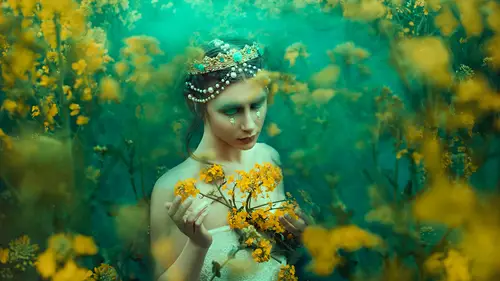
I'm going to bring this up for that's too high okay by default, it's obviously set to normal. And what happens? As you know, if I paint, it's just gonna be that color, right? The reason why those blend modes exist down there is if we slept color. You'll notice that it took the properties of that painting thing that we did and applied everything except for luminosity. So it kept how dark the arms were. It kept with shape of the arm because you can see the actual crease over here from the back of the arm, you can see how dark and light those areas were before underneath it, but the problem is, it still kept the saturation of it. It's still that bright yellow okay, but what if we kept the saturation of the underlying layer? Because what happens with this color blend mood is sometimes if we decide we like a tent of a color, but it's too bright. You have to get that saturation to match perfectly. It's really hard sometimes. So what can happen is if you use a hue blend mode, it keeps the saturation of the underlying lier and just take that tone. Okay, so it makes it really easy to color correct. So let me show you the real world application. This specific image has a blue A tent at the bottom. Okay, so I can go to Hugh. I can say with my brush over here, I can sample this color the arm, and I can brush over here. And what tends to happen is he found a warm it up just a bit. I can keep it to Hugh instead of color. And so it doesn't take the saturation of that color that I selected. It just takes the tone of it so it can shift any tone you want on the skin without affecting the saturation of that area, so you don't have to worry about it. The color blend mode is really great if you have an air that's really decide rated and a different color, so if you have like gray skin, then you can do that way. So in this case, I think color might work even better because the fact that the area around the arm is also would be saturated so I can go into blank, clear set to color. I'll do the same thing. I'll sample. You know, the color over here And if I start painting with a low flow of up 2%? No, sir. Brushing this up and down really quickly, Mr 10%. Really quick. You'll notice that that arm warmed up and also shifted the color a little bit. So what happens is if you have an area that you want to quickly change, you can start with the color blood moon. If you're not sure. And if you realize that Whoa! What I painted is really saturated now or de saturated now just changed to Hugh and it's gonna match the original saturation of her normal skin Another way to do it. And I was going to talk about this anyway, which is a good point. You brought us up because it's a good Segway is in capture one, which is what I used to process my roughhouse with. And they have a lot of color tools. Uh, available. What happens is sometimes you get red fingers and extremities and capture. One has an area which allows me to adjust color specifically for skin me. And although this is not a capture one specific class, um, I have done in class. If you're going to upset at solstice tree touch dot com. I have a whole class dedicated to capture one specifically and color toning there, so I'm not going to spend a bunch of time talking about this. But when it comes to skin tones, they have what is known as a skin tone tab in the color editor. What that basically means is that I can select a color, any clothes that I want that I like, and then match the rest of skin tone to that color as close as I want to. The other thing capture one does is also includes layers, so this tool over here is also available in the layers panel. So if I go to say my layers panel, I'll give you an example. I'm going to select a new layer. I'm gonna call it skin tone skin to skin tone by default, which is opposite of photo shop is every new layer starts with a black mask. Okay, so I'm just going to right click invert Basque. That way you can see the changes I'm going to do. I have a color editor here. Same thing skin tone. Step number one is there's a color picker, so guess what that's gonna do. Big the color, right? Okay, so I'm going to say, Let's go with this like neutral color because this image has quite a bit of color that's similar across the image. That's why we use that masking because I wanted mask just the fingers. Once I've selected the color that I like, that's what it's doing it saying Please tell me the color that you like and you'll You'll see that because there is a little dot over here and that's a calorie selected. This outer line area is everything in selected as well. It's saying, Pick the color that you like along with neighbouring colors so you can see here it's selected like reds selected more yellow tones. So anything neighboring, right? Not just that one color. So I did that. Let's put that back in there now, actually, pull that out for a second. Now it has what is known as a uniformity is lighter. Guess what that does make single uniform right? It's pretty self explanatory in that sense, So the uniformity slider is great because it makes uniform. So as as you notice, most of this is much pick and slide it's not that complicated. Could a new layer you pick? We slide when I start sliding. Now, if I go all the way, you'll notice that the fingers are not read anymore. So if I go and say new variant so we considered before and after really quick, you see the fingers we've taken that read out of the fingers. But we've also shifted everything else. But that's what mass kings for. We could easily just hide that mask again. We'll go back into the local adjustments, will invert mask. And then now, with a regular paintbrush, I will just say, Always display mask, actually, no only display mask, win drawing. And then we have our size and flown opacity, and we're going to quickly do this. We'll just bring it back here. And the best thing is you don't have to be super precise because it only picked the skin tones. It didn't pick like the background or anything like that. So we can pick just the fingers. And if you know what if we decide that that was way too much, I can simply bring it down. I can also shifted some like you know what? I uh want to change that color to something else. I could do that. I can also change the saturation of it so I could be saturate that area that I picked. The uniformity area also has saturation and lightness. So, for example, maybe the fingers were saturated on top of being different. I can then make the saturation the same as a color that I like, so it makes it really easy for me to do. And then, from there you can begin retouching. Or maybe as another example. You've already retouched an image like, for example, we have these tiff files that we've already finished. You can still work on them in the program so you can bring it in. You can import it. You can adjust the skin tones really quickly and then just exported again and save it and you're done. So no matter what step of the process you have these issues with, there's photo shop with its raw processing, you could do in both stages, but I found this easier than doing it through layers because sometimes people have a bit of issue doing that way. But again, in photo shop, simply start out with a blank layer said to color, you pick the skin tone that you like and then, for example, maybe the nose a bit to read. But we kept that they're intentionally you know why? Uh, no. Because normally, when you shoot an image with a high megapixel camera or high resolution, you expect nuances in the face. If you make everything 100% identical, that's when things become manic and looking. You want to leave some of these natural elements in the frame because although we have the power to do so to make everything one color, you don't do that because yes, you know, you may have kept the skin texture, but you may have even out the skin too much. You may have even out the colors too much. You want to keep a little bit of that natural blood flow Grand cross image, because that's what keeps us human right? For doing a class on how to keep a human, That's great, but yeah, so, like I mentioned a blank layer set to color option key sample. And then if I start painting, what happens is the redness will go away, and when I turn on and off it will subdue it. You can see what it also did was the nose is a little bit saturated as well. So the color blend mode take saturation and the tone. If I go back and go back to Hue, you can see the saturation. The bother in bottom of the nose comes back because the hue blend mode doesn't change a saturation. It just changes that tent of that color with that tone. So again, if you're not sure what to do, start with color and you feel like things got too flat. Go over to the huber and mood, and vice versa. You can also change the opacity. So if he was too strong, maybe you want some of that original readiness still there. You can just suggest your passage. Same thing goes for lips. Maybe you have a you know, a tent of lipstick and you want to change it. If I started with the color blend mode on new layer, let's say that Ah, I go over and you want to change it to more of the eye color like this. If I started the color blend mode and I started painting, what happens is it's going to change the saturation as well. Okay, but like I mentioned, if you don't want the saturation to change, just go to Hugh. And so what it did is it kept the saturation of the original lips, but just changed that tint or that tone or whatever you want to call it. I don't even know you get the idea. Those are very powerful tools now, obviously, they also have saturation and luminosity, both saturation. It just change the saturation of the destination to whatever situation you like. So, for example, let's say you like these little gold pellets, okay? But you want to be a little bit more saturated, but you're not sure how saturate to make it. But you know, you like the saturation of something in the image. Let's say, for example, that we want to use this bright yellow as an example. We like the saturation of that bright yellow. If I go to new blank, clear and I go to saturation, what happens is if I start brushing over that area. It takes the original color of that object and increases of saturation to match whatever saturation of color we picked us. Even if I start painting over the I. You see it keeps that blue, but it saturates it to how saturated this yellow waas. So you're basically using properties of colors to adjust the properties of your image. And that's really good if you artistically minded, because some people don't get sliders and and curves and things like that. But they can grasp how to use specific colors and using their properties to apply to the image. This also helps. Oh my gosh, Looks like the Terminator. Now let's pull it back. This also helps if you're trying to make saturation levels harmonious across the image. Maybe if using jewelry, whatever it ISS and you want to make things more even. Okay, what percentage of colors honing to usually do in raw before you take it to photo shop and you ever finish it in there all processor and not need to go to photo shop for color specifically, you know it depends because sometimes what happens is the client specifically is they have their own work flows. Sometimes they prefer to color tone an image before sending it to me, and then what happens In that case, what they'll do is they'll similar all the filer PST file. Retouch it if they want me to take it further while doing a photo shop, and the reason why you want to in photo shop is that you can go back. The color is the one thing that I would recommend not being decisive with. If you have clients, because if they hate it and you re touch everything after color toning, then it's a problem because you can't really go back. So for that purpose, I would recommend keeping after. But if you are, say, maybe, ah, documentary photographer, photojournalist or anything like that where you want to specifically process Ah, look before the retouching. The raw file is always a better stage because the fact that just like exposure, you have a lot more information because you have a lot more information. You can fluctuate the colors more readily. For example, let's go back in to capture one. Let's take a look at another raw file your real quick. Let's say we take a look at this image. No, if we go back into some of these color balancing tools, right, The reason I am using this program specifically for this example, is because the other programs don't have this method of color. Tony Um What? This is a three way color balancing tool. It's kind of like color grading in cinema, where you can decide what colors you on your highlights, shadows and mid tones just by moving around little sliders. And I waited to treat his last because it's the easiest way, and I want it to your attention to be on some of the harder principles. Let's say that the highlights. I want them to be a little bit warmer. I can simply drag it up to the code that I want. And it the benefit is that the fluctuations, the shifts that happened with the color is more natural because using the raw data, I should I should. I apologize. It was the wrong file. This is the tiffen. But if we did use a raw file and we want to push it back, it still does the same thing in the sense where it uses the raw data to pushed the yellows out of it. It's kind of like white balance for specific regions. Another really cool tip is that if you decide that you know what? I don't like the white balance. I don't know what temperature it should be. I sometimes come here to the master tab and do a quick white balance adjustment based on the clothes that I want. It happens a lot. Sometimes I'll shoot in, um, cloudy, but indoor situation where it's like a weird cast, and I don't have a great card. I'm not getting the exact, you know, called that I want. I'm not moving the sliders right way. I'll come in and adjusted to the color that I have preference over. And just like that, I'm able to quickly balance it out. And then again, you can go back into your highlights and then to independently from the whole color caste. You can then do mid tones. You can then do shadows. You also have layers. You can stack them and adjust different intensities in different areas and masked them different ways of adjusting. That way, I was wondering about color filters if this would be helpful for adjusting saturation, and when you use color filters in lighting, like as a as you were saying, you know, shoot for what you want to do. Yeah, so this would be helpful for it would because you're already pre decided pre deciding the colors you using with filters with the jails, right? Assume. And then you can go back and then decide. You know what? I want this gel to be that and immediately just selected and then go from there with eye color each. I think that was a lot of what I want to talk about. Um, especially because when you like, I mean, she when it comes to color, right, we have, um, let me actually go in and load up Bella site because she was the one that allowed us to demonstrate some of the images. And you notice a lot of same principles being talked about as we work today, for example, you know, when you look at the scene over here, you'll see that what we basically did waas use the idea of what we're going to shoot. The location, the dresses, the model's hair, the skin tones and made them more harmonious. We made the dress. Color is similar to the amber's and reds and environment. The green and subdued tents. We added a little bit to the dresses. Even the whites have a little bit of complementary colors in contrasting colors going on, so you really have to pay attention before post processing is what's the scene going to be like? We knew we were going to shoot in the woods, so we used a subdued color for her hair to complement the scene, so it pays attention to what's happening. So keep those things in mind before color toning because again, these are all suggestions and different tools you can use. But ultimately you have to decide what you want to do. But hopefully these will help you to apply your vision to reality.
Ratings and Reviews
Amy Vaughn
Pratik gave a nice range of tips for ways to color images creatively. I especially liked that he went over a workflow with Photoshop and CaptureOne, since that's my workflow too and it's sometimes harder to find those classes. His tips for adjusting skin tones were especially useful and something I'm always thinking about now when I edit photos of people. I also appreciated the way he explained the differences between hue and color, and I even learned a couple of new tricks with blend modes. His teaching style was engaging and I'd love to see more classes from him.
a Creativelive Student
basic info but nice artist, enjoyed the work flow