Lessons
Class Introduction
03:26 2Advantages & Pitfalls of Printing
17:41 3Demystifying Color Management
14:12 4Understanding Bit Depth
13:59 5Best Color Space to Work In
21:33 6Importance of Image Capture
24:59 7Live Shoot: Natural Light
12:31 8Live Shoot: Studio Lights
21:21Why Calibrate Your Monitor?
15:30 10Choosing the Right Monitor
12:56 11Calibrating a Monitor
05:06 12Color Management Policies in Lightroom
13:04 13Color Management Policies in Photoshop
02:13 14Color Management Policies in Camera RAW
06:47 15Luminosity Masks in Photoshop with the Print in Mind
25:09 16Shape the Image in Photoshop with the Print in Mind
17:47 17Edit Skin in Photoshop with the Print in Mind
25:02 18Black & White Conversions in Photoshop
23:28 19Retouch Skin in Photoshop to Optimize the Print
28:16 20Dodging & Burning in Photoshop for Black & White Images
11:40 21Split Tone Color in Photoshop for Black & White Images
05:38 22Gradient Maps in Photoshop for Black & White Images
07:35 23Choose the Right Paper
23:45 24Mechanics of Printing
05:12 25Choose the Right Printer
09:49 26Live Demo: Create Custom Paper Profile
31:16 27Scale Images with the Print in Mind
09:11 28Sharpening Workflows in Photoshop
31:10 29Soft Proofing an Image in Photoshop
22:22 30Print Through Lightroom
08:25 31The Importance of a Print
10:54 32GraphiStudio Albums and Prints
08:00 33Best Practices for Printing
12:24 34Power of the Print: Student Engagement
12:21Lesson Info
Choose the Right Paper
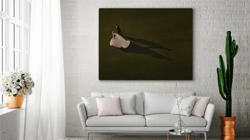
We're getting to that point where we're almost ready to print, but before we do, we need to understand paper and we need to look at the world of printing in a very, very different way. So we've reached the section called the print. We've covered so far the capture, the stage of the printing process, and of course the editing stage, and now we're up to understanding papers in our road to success when we start printing our images. Now, for me, it's all about printing archivally, that's one of the selling points that I have with my clients of course, and it's about the longevity and it's about printing your legacy, et cetera, et cetera, and I want my clients to enjoy their prints for generations to come. That becomes a good selling point. And certainly, if you're printing landscapes because you're a landscape photographer that is really more important to you than ever, because if someone's investing in your art and they're investing a lot of money, you don't want that image to fade anytim...
e soon. You want it to be around for 100, 200 years. So you want that real, incredible archival permanency. And there's a couple of different ways that we achieve that. When we start to look at print permanence, longevity of a print is affected really by a lot of complex interactions and a combination of factors. There isn't just one thing that you do that makes it archival. Number one, we begin with what type of ink is used in your printer. And not all printers are equal. You know, you gotta get the right printers that will print a certain type of ink that will make your prints archival, of course. And also the type of inkjet and inkjet media you use. In others words, the type of paper that you use. There are certain properties that we're gonna discuss very soon on what makes paper archival. And then, of course, the environment in which your prints are being displayed a very, very important factor. Obviously we know what happens to our drapes at home when they are in full sun, okay? So the conditions in which we display our prints are gonna be very, very important for the print permanence and longevity of our artwork. And then, of course, we look at how the print is protected from UV light, light, ozone, and humidity, and there's a lot of factors there, okay? So, how do we measure print research? A really, really good source of information, and they do all the testing really is the Wilhelm Imaging Research, which conducts accelerated light exposure aging tests. I mean, all of the sudden inkjet technology has come in and we're talking about archival permanency of 100 to 200 years, but how do we know? Inkjet hasn't been around that long, so how do we make up these numbers? Well, this imaging research facility conduct what they call accelerated tests to simulate aging of papers. They determine the comparative life expectancy of inkjet and other digitally printed photographs as well as that of traditional black-and-white and color photographs, so check out Wilhelm Imaging Research to find out a lot more about archival permanence of prints. Meeting clients' expectations, as I said earlier, if you're paying thousands of dollars for a printed photograph, art prints, expect those prints to last for generations. That's what we're about, you know? We want to print, and why do we wanna print? We wanna print because we have that image forever. We want it to last forever. Especially, once again, bringing it back to the domestic market, you know? It's about preserving the history of the family and passing it down onto generations and generation. Expectation of the domestic photography market is maybe different to the commercial, fine art market, where we start to sell photographs for a lot of money. Choosing the right paper for fine art printing. For fine art printing, the substrate, in other words, what I'm talking about, the substrate I'm talking about the paper itself, all the paper used must be archival, and what makes it archival? Well, number one, it must be acid free and 100% cotton-rag base, okay? That is one of the biggest factors, okay? It must also be free from optical brightness additives, OBAs. OBAs are things that they add to a lot of detergents to make your clothes appear brighter, but also, a great example of optical brightening additives is newspaper print. I mean, we buy a newspaper today and it's kind of, the paper looks fairly bright, but what happens to newspaper in a couple of months time, or even a year's time? It goes very yellow and very brown. That is because of the optical brightness additives they add to the paper to make it appear white and it's basically a cheap way of whitening paper, if you like, okay? It's very nasty stuff, if you are printing photographs with paper that has optical brightness additives in it. And it's gotta be compliant with a certain standard, when we talk about archivability and that standard is ISO9706, which we'll talk about a little bit later on, of course. Okay, for long-lasting results, prints should be printed with pigment inks using ICC profiles specific to the paper, printer, and inks. When we talk about pigment inks for longevity, we're talking about prints especially that you're gonna be displaying on your walls that are gonna be exposed to things like UV light, et cetera, et cetera. Framed behind glass. Certainly, dye prints can also have a very long-lasting effect, provided they are stored in dark places. So dye printing is very good for books, provided that you're not displaying your books out in full sunlight, and not many people do. But in case you do, don't, because it'll fade your book if it's printed on the dye-based inks. And then, of course, printing with the right profile. Printing with the right profile for the paper, which, there's a couple of different ways to go here with profiles, you can download profiles from paper manufacturer websites or indeed, can be custom-made or you can get them made for your specific printer, and that is very important. And we're gonna show you how we create paper profiles a little bit later on, okay? When we talk about choosing paper, provided we know that we're looking at archival papers aesthetically, okay? We need a paper that suits the image, and there's a couple of different papers, well actually, there is more than a couple, there's a myriad of possibilities of what you can print on archivally, but really, it comes down to what is the image need, what does it need? I hear a lot of photographers that have a favorite stock, one particular stock and that's all they ever print or will work on. I only print on Canson Platine, because that's my favorite paper. Okay, but does that mean every image is printed? Yes, that's exactly what I want. Only to find that some images don't really suit the paper because of the characteristics of the paper, okay? So you've gotta be malleable with your choice of paper and make a real artistic decision as to what's gonna look best based on the color pallette, the mood, and the message that you're trying to convey with your printed photograph, okay? So it is about completing your vision as an artist. Remember, when we print, it's final, yeah? When we print it's real. It can't be changed by your client, it can never be altered, so it is about you completing that vision and bringing it to life in print. Part of that vision is selecting a paper that complements what you're saying about the image. Now, we start looking at papers, and the first paper I'm gonna talk about is the fiber-based Baryta papers, okay? The Baryta papers get their term from a chemical compound used to coat the surface, which is basically Barium Sulfate. The aesthetic feel is similar to the original F-Type darkroom, fiber-based papers that we used to use, okay? And I love it, because it gives me that really nostalgic look when I look at a black-and-white photograph. This image here was printed on that type of paper. This is printed on CANSON Platine and it's got a nice, beautiful satin finish. It is archival, because it's on a rag base, okay? And there is a sheen to it. Now, the advantage of these type of papers, of course, is that they produce extremely high Dmax values. In other words, really good blacks. And certainly, this image has that, okay? When you look at this image, what do we have? We got a point here, which is a nice, big, solid black. So the black here is forming a compositional element that I need to be strong so that it conveys the message that I wanna covey, okay? And then, of course, you've got the beautiful, rich, dark, dark shadows of the bride onto the wall, and then this gradation of tone that runs from the mid-tone through to, again, a very solid black. This, for me, had to be printed on a coated stock like the Platine, because of the nature of the shot and the strong, bold tones that we were displaying in the image. The whites are clean, the mid-tones are nice and creamy, and it's giving me exactly what I want. And when you look at it, and you come real close to it and you feel it. And if you ever printed in the darkroom, and if you ever printed fiber-based papers in the darkroom, you know, it brings you back there, because it has the same look and feel of those original darkroom paper. The gamut is also extremely wide. In other words, what happens with the wide gamut, if we are printing very vibrant colors, we can certainly print on paper like this. Now, earlier in this course, when we did the color management section, I compared a profile of this paper against the ProPhoto RGB color space, and in the greens, the greens were able to print even beyond that, beyond what the ProPhoto RGB color space was. So imagine working a file in that big color space and then being able to translate all those amazing tones onto paper, this would be the type of paper that would be able to do that. Unfortunately, though, the coated papers are also less forgiving for image defects, like noise, so if you're shooting very high ISO and you haven't done your homework as far as exposure and it's slightly under exposed and we're amplifying that noise, we assume they're gonna see it on a paper like this. If you over-sharpen or anything that is wrong with the image or your retouching isn't quite up to scratch, your blending isn't quite as smooth as it needs to be, this paper will not hide a thing. It will show everything for what it is. Unlike the matte papers, which we're gonna talk about in a minute, where they absorb ink very differently and they smooth out anything that isn't quite right. The cotton fiber papers, which are these ones here and there, which I'll talk about in a sec, there is a variety of surfaces and finishes from smooth, from very, very smooth to slightly textured, to really heavy textures, like the Aquarelle papers, you know? These are the most expensive papers, unfortunately, but the highest grade of fine art matte papers on the market. They are a pure cotton rag paper and they do have a lower Dmax, in other words, blacks aren't gonna be as rich as what you'd get on something like a coated stock, because, as I said earlier, they are more absorbent, so when we look at something printed on that we can see the blacks. The blacks are still blacks, don't get me wrong, the blacks are still blacks, but if I was to print that on that paper, these blacks would be really deep, they'll be strong and the contrast of this image would be a lot higher, because we have a higher Dmax, so the blacks are richer, the color saturation is richer and so on and so on, okay? And then something like this, where you have a textured cotton rag, slightly textured, once again I chose the textured image because of the softness of the image, et cetera, et cetera. And then you've got resin-coated photo papers, okay? Which are just your everyday paper, if you like. They are the least expensive and most common papers on the market, they are not archival, I'll tell you why in a minute, because they're made from wood pulp base, enclosed in two layers of plastic polyethylene, coated with an inkjet-receptive emulsion, okay? In other words, to make the surface white, there's a lot of optical brightening agents in there, and they're not gonna give you a lot of archival permanency there. The surfaces range from luster to glossy to semi-gloss, pearl and satin, and they're certainly great for printing your everyday work, you know? Especially if you're just gonna do folios and things. You will get some sort of level of archival permanence, but not to the level of the fine art papers, okay? They are waterproof and scuff and scratch resistant, more so than the art papers, which makes them good, but for me, personally, they do lack the fine art look and feel. They're not really fine art papers, because they look like papers from a mini-lab, or papers you get at Walmart. So it's not really an amazing fine art look or feel to the image whatsoever. It's definitely not archival, and they are a lot thinner than the art papers, giving us the perception that they're quite cheap or inexpensive, and the fact is that they are more inexpensive than the art papers. Okay. Paper choice, as I said, Canson Rag Photographique, because of the smooth finish, the rag surface, giving me that softness, okay? That's this image here, as I held up before. You've got this nice, beautiful, velvety base being nice and smooth, and the fact that it's a rag base, you got that absorption of ink, it's giving you that nice definition, right? But at the same time, it's not giving you that richness in blacks, and it suits the image, okay? So this is why I chose this particular paper for that image there. The Canson Platine Fiber Rag, the advantages of that are here on the screen, as you can see the richness the blacks, the whites, the mid-tones, et cetera, et cetera. Is the paper strong enough to stand on its own or do you attach the paper to a backing board, and if so, how do you do that? The paper is definitely strong enough to stand on its own. These are attached to a backing board. Okay. So for display. And when you mount prints, okay? We'll talk about mounting in a couple of more sessions. Okay. We'll talk about mounting, and we'll talk about archiving, we'll talk about all that sort of stuff. You definitely need to mount your prints and you need to store 'em accordingly. But the paper is quite thick, so 310gsm, some papers are 500gsm, so it's quite sturdy, yeah. And what are the benefits of papers on a roll or on sheets? Purely economics of how you print and the type of printer used. For me, at Captured to Print, we're printing on wide-format, 44-inch Epson printers, and if I'm printing a 60 by 40-inch print, the conveniency of roll for the print to come out and be able to be rolled within itself is great, and also speed. Sheet, if I'm doing sheets of this size and it's a one of, then sheet is great, you know? But it really depends on the type of printer that you have. Generally, if I'm framing, which is 99.9% of the time, roll is good, because even though you got the roll curvature, that gets ironed out in the mounting process and it's good. So there really is no difference in paper quality, but it's just really has to do with the type of printer that you have and how much printing you have to do. If you got a lot of printing, roll is great, because you just keep on feeding paper, paper will cut, and off you go. Cool, we're getting a couple questions about the specific paper type for the image type. Could you just quickly recap that, the depth of the blacks. Yeah. And what paper for each type of print? Okay, once again, it's an aesthetic decision that you make, okay? So only you can make that decision, okay? So, coming from a darkroom background, and coming from the fact that I used to print fiber-based prints, every time I think of a black-and-white print, I think of this type of paper, because the blacks are really deep and they're really strong, and I'm able to get a lot of information out of those blacks even at the low points of the curve, in other words. And it just has an increased perception of sharpness, okay? And an increased perception of depth in the print, okay? The paper has a slight sheen, so anything that has something like this. In other words, strong lines, rich blacks, full tonal range, in fact, later on, we'll print on some of this paper and you'll see what it's going to look like. I would go for this type of option, always. Then we get the textured, fine art papers that aren't coated, and you notice this image here is quite a soft image. It has a nice, beautiful softness to it. If I was to print this on a paper like this, number one, the shine is going to, or the sheen on that type of paper is going to effect how I view this image, okay? Because of the subtleties in tone, I need to dodge the light to be able to see exactly where the tones are. With this paper, I don't have to. I can view it from any angle and I get the image for what it is. And the image here is soft, it's beautiful, and the slight texture in the paper, also the paper is quite warm, in the base itself, so that's adding also warmness to the highlights, organically, through the print, and it gives me that kind of feel and look. The midpoint between the two is this type of paper, which is still rag paper, cotton rag paper, but instead of the slightly textured feel of this one here, this is the PrintMaKing Rag by Canson, this is the Rag Photographique by Canson, which is a smooth paper, okay? This still is gonna give me that nice sharpness, because of the smoothness of it. It's gonna give me that nice, clean look, it's gonna give the velvety look, but because this image does have a lot of strong lines, I wanna be able to print it on something like this, which is smooth. Where this image here, I wouldn't print this on that type of paper, once again, because of the slight sheen. And I've got very subtle detail here in the whites that I wanna preserve as a viewer. So you gotta think about how these prints are being viewed as well. And we'll talk about the types of papers to use when you're framing as well, because once you start adding glass to this, it does give you another perception, okay? Of how framing goes. Textures or slightly textured, smooth finish, and then we go to something like that, which is a coated stock of paper with a slight sheen to it, but really, at the end of the day, aesthetically, only you can make that decision of what looks good and what you think looks good and how the paper is gonna express that final vision of the image. We've got a question there from the back. So we have all the tonalities in a print, right? We talked about that. Then we have all these paper styles that we talked about, the Dmax and all this, so in general, Rocco, what, in your eyes and in your opinion, makes an actually really good print? Is it Photoshopping the tonality? Is it choosing the paper? Is it the sheen versus the matte, versus the... What in general, when you look at a print you say, "This is a really good print," in your opinion? Yes to all those things. (laughing) Very good question, Roberto. Okay, what makes a good print? Number one, what makes a good print, it starts with really good capture. Number two, it starts with really good editing. In other words, preservation of detail in highlights, through to mid-tones, through to shadows. But then again, it depends on the message of what you're trying to say, whether shadow or detail is important or not. I mean, certainly here, we have an area of black up the top here with no detail, but that's good, because I want that, because this becomes a graphic element that leads your eye in. So really that is subjective. But you want, basically, a good tonal range. Now, when I look at a print, and as a print comp judge, and I've been doing that for many, many, many years, what I look at first and foremost is, besides the impact of the image and the image content and the story, which is important, of course, but then when we come down to print quality, I look at the message of the print and what it's trying to say, and how that paper is translating the tones, okay? Does that make any sense? So, in other words, if the shadow detail is an integral part of the story, but I can't see shadow detail, in other words, shadow detail is falling short, in other words, you started showing me shadow detail, but then as it gets to get to the darker areas it goes really muddy. Well then that's not a good print, okay? It's not a good print not because of the paper, just because of the way the printing process, perhaps, has been handled. The same thing, if I'm looking at a print which has nice, beautiful, soft qualities about it and you can see it in the retouching and it's a very delicate image and it's printed on something like a coated stock or something that has even more sheen than this and I'm struggling to see the finer details in the highlights, because of the reflective nature of the paper, then I don't think that's a good print, because the characteristics of the paper, and as an author, or as a photographer, the choice, once again, is aesthetic, but then, as you're trying to communicate a message or a notion or an idea through a print, you gotta speak the language, you gotta be able to communicate that across. So a good print, for me, has to display the vision of the artist. It has to convey that message across. And, I guess, at the end of the day, it is subjective, but good shadow detail, good mid-tones, good color. I wanna be able to look at an image and lose myself in the image without thinking about is there something in the shadows or are the highlights there? Being distracted by that, I don't wanna have those questions I just wanna enjoy the image for what it is. I wanna be absorbed into that image. And if I can do that, then it's a good print. But it's not a clear-cut answer, because there's a lot of factors here at stake. Number one is a factor of aesthetics, number two is how the print is being displayed, where the print is being viewed, the tonality of your image, how that is being interpreted by the paper. These are all things that we're gonna get to a little bit later in this course, and we'll show you how we can take a tonality of an image and make it fit within the paper, so we are getting beautiful detail in blacks right through to mid-tones, right through to highlights, even when we do a print on something like these papers here, we can still make it look as interesting as possible, okay? But very good question.
Class Materials
Bonus Materials with Purchase
Ratings and Reviews
Roberto Valenzuela
I honestly consider many courses to be great, but optional. However, this course by Rocco Ancora is a MUST! It helps the photographer complete the circle of being a photographic artist. Our job doesn't end at the edit, it ends with the print. When your clients can hold and enjoy your creative vision physically, that is when the magic of being a photographer happens. I have been so fortunate to travel the world teaching and meeting some of the best photographers in the world. That being said, I can say with confidence that nobody can teach this combination of Photoshop retouching / fine-art printing better than Rocco Ancora. I believe in this class so much, I traveled to Seattle to attend this course to be part of the live studio audience. I have never done that before. But that's how important I consider this material to be. I am so happy I took the time to go and learn from the man himself. Now, I will get this course to watch it, dissect it, study it, and practice it. Very excited to see how the knowledge in this course will propel my career further. --Roberto Valenzuela
a Creativelive Student
I was fortunate enough to attend this class in person and got to experience Rocco's prints in person. The quality is absolutely breathtaking and a game changer, Learning these skills will really help my business in a number of ways. In the past, I have had a difficult time convincing clients to purchase typical lab prints through my studio, as opposed to buying them through Walmart or Costco where the quality was "close enough." Rocco's method that he shared in this class creates three dimensional images of unmatched quality and images that just jump off the page. The knowledge from this course will empower me to help run a sustainable business and thrive as a photographer. You would be foolish to not learn these methods and incorporate them into your business. Highly Recommend!!
April S.
I have invested time into learning Lightroom and Photoshop, my own gear, and my particular photographic style, but the one thing I am really lacking is a solid understanding about preparing an image for print, and the various print options (e.g., paper types). When I saw this course come up on the CL schedule it caught my eye immediately so I RSVP'd for the live broadcast. I was at work when it started and couldn't watch at that time. I do listen in from work sometimes, but after 2 minutes of listening to this course I realized it was one I really needed to watch closely and focus on. So, I stopped the stream after a couple minutes and bought the course. I have never done that before. I always wait and watch as much as I can in the initial broadcast (or rebroadcast) to decide if a course is one that I really should spend for. I knew right away though that Rocco was presenting the very information I was lacking and needed, and I wanted it! In addition, it was clear to me after looking him up online that he's a consummate professional with lots of experience and his delivery style even in just the couple of minutes that I listened reflected that. I already have X-rite ColorMunki Display and Colorchecker, a good monitor, and I have a photo printer (Canon Pixma Pro-100) but I'm lacking that technical understanding of color and know I'm not using my resources to their fullest. I use my Canon Pixma to test-print images before uploading to the print service I use. My method isn't ideal since the service uses different printers and ink, and paper depending on what I choose, but at least I have a much better idea of what my image file will give me in print form. After Rocco's course I believe I will be much better equipped to prepare my images and choose the options best suited to each image. I'll still test print if only because it's fun to see something on paper, but I expect the results I get from the print service to be much better once I really know how to put this knowledge to work for me.