Lessons
Lesson Info
Building the Structure in Illustrator
I think what I want to do is I want to carry out this one, um and rule maybe we use a font. Um, maybe will illustrate that from scratch. Or we could do it by hand. I have a lettering course that will do all of that stuff to show you in detail how we normally do that. But for the sake of the process, let's, figure out a quick way. Ah, a quick way of doing this burden this upside down triangle burden. So we're sick and back to my principles of where I think the t shirt needs to go in the shape of the t shirt. So let's, get on the computer and I will show you how I build this thing. So when I start a graphic, I start at a sixteen by twenty campus. Well, usually create a background layer, which is whatever color I think the shirt's gonna be. Okay, so let's, get into building this thing. I think the first thing I want to try to dio is at least take a look around my fonts and see if I have anything that's gonna give me the vibe that I'm after. Then I usually never mess with way it's displaye...
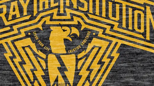
d but so I have these style sets again everything you do you're gonna have to figure out some way to make it quicker for you so if you have thousands of fonts you don't want to search thousands of fonts you need to start saving them so I have, um, seventy's fonts that I think look kind of seventies like a real retro looking thing which could work for jenna's um son looking thing the circle shirt eitc sarah gothic gothic black is a jam ace so that some of these can really get the eighties idea across this atomic sushi looks like it could even work for what I want todo this one looks like it could work funk of desperate pyrite. So I've learned that you could spend hours scrolling through funds. What do I have? Twenty three thousand seven hundred and fifty three fonts that's a whole day. Um arts and crafts got one fun. Yeah, that touching baseball. So I called this baseball because this this fun here becomes really cool to make the initials with with, you know, um these are all some like baseball team fonts, bauhaus type fonts sometimes they mean different things to me that they mean to the majority um I like this part okay, maybe this could work this could work because I could take some elements and make him pointing and kind of do what I did in the sketch there's a lot of good fonts in here um I've spent a lot of money on a lot of good fonts but it's totally worth it and of course you write that sort of thing off you needed for your business that's how I justified at least this one that betrayed the institution eagle design that we use for the course graphic for this course was based on this phone here so a foundry called letterhead fonts thought called state street it's a jam but I feel like I've already wasted too much time and by the time I'm doing this if we're in real time how I really do a project I know brand you just got to get out of here and do what you gotta do so let's get to the meat of it where we say punk flyer case of these punk flyers sort of have that vibe but I want something sharp I think I'm gonna go back to okay? So we have this this by calling biker because you know who would sons of anarchy arched over back something like that? I want to go to this element usually what happens? I'll find one that I like and I know that I'm not going to stop thinking about that one I'm gonna do this element german word okay so that's activated my fault program is fun explorer ex pro I like that program because it tends to be the best that managing a large catalog of fonts so what's good here and design the thing so we could go much deeper into the idea of manipulating an existing font in my other course on lettering but for the sake of this was going to get it done so this isn't necessarily exactly like my sketch my sketch is a little bit sharper it seems like I could probably do that with the pin tool which if this doesn't work out I'm going to abandon it and go on to messing with the pen tool and I need to know that quick so that I don't waste my time but this is sort of a base thing that I'm that I'm gonna base everything off of is this first sketch I did create outlines now what I want to dio I'ma scan this and so we have a reference now I don't normally scan my sketches in just because I can look there but I like you guys to see this uh my reference image so that we can sort of reference it as we go along kind of see the basic violin trying to recreate but I don't want to be so dictated by the sketch because the sketch isn't in stone at all it's in pencil so we'll just drop it here beside I was put in here just so we can remember the base yeah, I see that all right, okay, so we know we want to be in the end to come down far this is a different type of end then I drew and I think this font is basic enough that I could probably, um you know, manipulate it tio tio act that way but let's just first try to do this we're gonna take this out I know that that angle there's gonna be a little odd so let's take this anchor point and drag it down like that so I'm gonna hold downshift and hit the eric he just so I can have a consistent um how much I'm moving it down so one, two, three, four, five, six, seven I'll do that a bunch of times and just keep counting how many times I'm doing that and then I want to take this little area and move it down and there's an effect called, um warp um lower arch arch low or something like that which I use a lot, but since there's somebody straight lines in here I don't want any of these lines toward so I'm gonna go and do this step by hand it was going to kind of build this arch by hand and I'm ok if it looks a little bit inconsistent um I don't need there's something about this that for some reason I don't think it needs to be perfect this is gonna be tricky because I'm gonna make this bottom thing slant and it may not work so obviously this got messed up so I just need to take that anchor point up which makes these kind of want come up also so we could take this whole thing go down I think that angle is still not right we'll just do that believe it for now and then we'll see if we need to adjust it when we get back so you would lose a lot of time if you went through your entire font library and tried to find a fund that looked exactly like this we need to work quickly and this is a waste of time trying to find that I'm sure I just like that general vibe and I would rather create something awesome then create something accurate to my sketch nobody nobody sees my sketch doesn't matter to select those so I'm using the wreck selection tool now this tool helps me manipulate existing fonts I think of that guys bothers me and I have to personify all these little anchor points because they're my friends so I give them names and I say that guy okay burden so I want to bring that all the way down to meet the bee was the be too low I like where the beers and the thing about this too is this angle gets a little more intense the further down you get it's not like there's one consistent angle that's gonna work you do have to eyeball this stuff. Okay? I like this. I want to take the b and e a little higher than the others give it a bit of a I want to kind of take that d and put it up I'm gonna do something probably undo it no, go back down there I was in to see if that one would want to go across but then I don't think I'd like the gap that was left there so let's, get rid of these guide because I hate all the guides and things that are always on my desktop or the on my workspace now there's some optical turning that has to happen. So with these going out, we leave more negative space in between here so the weight of that is a little bit different so you just have to get in here and mess with all these things um to get it to get it right because it's it's not always gonna be right gonna join these up now let's, just make a graphic out of it let's say that this is the, um clothing companies logo again use points when you use an offset path in the quickest way to do that is to make a ruler and then right click the ruler and get the points then get rid of the ruler so object path offset path twelve I wanna go thicker so right now I'm being informed by the thickness of the letters on how big of an offset path I'm gonna put around it okay, so what I want to do now is I'm just gonna test this out with a stroke on the outside applying the stroke to the outside so now we're going to get some cool little lines there gonna happen with all the little parts of the shape and for this I'm actually kind of cool with it um I'm going to take out some of these anchor points so what's gonna happen is the outline is gonna be perfect to the um to the interior shape but for the way I'm doing this I just think it's okay it's like getting rid of this is okay getting rid of that maybe isn't as okay let me just see what happens said it might be a basic shape in there that we want to get that could be cool. It could be cool to do that for the whole thing um but I'll stick to what we had and another thing I've learned is that you got to make quick decisions you know? You can't just sit there and second guess every little thing you do there's something about over complicating your work that um kind of like devalues it you know like uh I don't know like over complicating work shows that you're not confident in what you made in the beginning and uh you know I have said before that simplicity takes courage so it takes something to be like I know that all these lines are perfectly aligned but for what I'm doing I really think it works well and I'm and I'm sticking to that I see all these little notches and stuff like that but for what I want to do I think it's kind of cool I'm sticking to it because I'm not afraid okay so that's twenty to forty is probably going to be the correct spacing no let's drive fifty that is almost I think forty eight is probably right okay that's too much to get rid of that let's just take the shape I was talking about before let's see if uh see if there's upside down triangle it really does work you know what let's make the let's make a chain like tyler suggested I'll direct path outlined strokes that stroke that I made turns into a shape so that's too thick for a um chain so let's let's put a black line on the outside of it just oh so now we're a little closer and we can put a little bit more uh care into getting it right I think that's good object path outlined stroke it's not gonna take that stroke and subtract it from the shapes now we're left with that so like I was telling tyler we have this if this thing starts taken if that would be like that maybe like that maybe we would put it this we're not necessarily designing a logo here um you know that we're trying to get the graphic t idea there but I think this might be anything to explore real quick just a cute little a cute little chain happy little chain so that went to the that went to the middle because we you know that was ah a line to this election so let's put some lines uh put an offset pathan so as opposed the reason knowing the difference between a stroke in an offset path um the stroke can go on the outside on the inside who are right there in the middle ofthe set path is always going on the outside um but offset pat has a little bit easier to control because what happens with the stroke is it um it's always just an outline offset path is kind of like a margin to felt the whole thing so instead of using stroke where you probably would try to use an offset path and see if you don't get a better understanding of how it works so putting off set path on this little quick logo ten point maybe let's do ten point make those black phil black so let's move these over so they're not gonna fight too much I think I might be able to make him be logo out of this so I am going to use my pathfinder tool divide all that stuff up see if I can turn this thing into a b or somewhat resembling a be okay so that's that needs to go over further music racer it will just get right in the middle of those two because they're kind of giving me a problem so that needs to be white this needs to be black this needs to be white when you use the racer told us to break out that little spot I think a lot of times an illustrator we don't want to use the race or tools and the scissor tools and stuff they seem like photo shop tools but man they really really do a lot of awesome stuff if we let him uh let's go this way is this now that's gonna look too much like a sea so we don't wantto detract from what we're trying to dio so this is going around this has got to come up so that's got to be black black this way and again um I'm going to destroy this stuff when I get it in the photo shop so some of these little jagged lines here and there didn't really bother me that much because I know that once I get in there I'm gonna kind of blur all this stuff out and it's gonna have one consider can cohesive feel to it all everything is going to feel like it's from the same time. So let's, just use this for now as a logo um just to keep it clean. Let's have a new canvas. Select same phil color. Join that. Copy it. We'll come back over into this. So now we have a cool little logo to just use kind of a placeholder logo it's filler. But it's there now there's not still not enough spacing, so I want to put some black stroke on it. You know what I like about that it's? Kind of like a load of that would have been made for, like a punk band like it's just sort of like it does the job triangles are hard, teo center on each other because it's not like you can just enlarge it and it's right on time. So you kind of have to kind of have to get it perfect visually keep going to turn that the only way I could turn that as if I brought the triangle up. Okay, let's do it that's. Why they're same with as that sent back ok now everything's likely perfectly centered, so I just got a deal and I think that's kind of cool I don't mind it I don't need it to be perfect I really don't because that's not the reality of how a lot of these t shirts were made okay let's use this this looks like a t shirt design let me see if covering up this little white hole makes us feel better about our lives when was this established? What year? Nineteen eighty nine was that when you were established I don't need the details of that uh do something basic gotham is a good solid basic fun right there and it will work for what we need I hate to say when in doubt use gotham for winning doubt here's gotham alright that's I'm gonna leave it there so look look at that all the stuff I did what's the title called untitled five so if the power went out that thing's gone and I wasted my time so save do as I say not as I do um burden work so it's going to photo shop so I have another course to get really involved and you know creating brushes and another course to get really involved in applying vintage and the stress effects we'll just kind of gloss over brushes and vintage distressed effects on this but to make this thing work let's just apply a little personality to it so I'm gonna merge these layers do my whole thing what you can learn about in my vintage into stress affects class uh what you some precious now for this I don't want there to be much they're so I really want to take a lot of the way because this is all blur anyway in the goal of this is just rough up the original image not necessarily to be the official distress of the whole thing we'll blur that stuff out a little bit and once we combine it all together we can give it enough contrast that we can separate it so now those rough little I just come in to play so select any other white select similar I said command j over the black layers and I have a black on black so I usually just in burt sewing play another one of our fax crank the contrast up so as soon as I finish this um I'm ready to take questions from you guys want to take questions from everyone online? Um I'd be happy to answer all this stuff this is what I do with my life all day every day and whatever you want to know I'd be glad to answer out a little I think that that distress is a little too fine so I'm going teo always dust and scratches to kind of loosen that up a little bit and kind of move around this little preview square they give you just to see what it's doing yeah all that for that and I dig it so what we talked about before, sometimes all that people were drawn to our color, his color, anyway. So I think we could get a couple colors out of this. I think that, you know, from a from a t shirt design perspective. I like two colors because it's, cheap and that's. Why I designed that way. So I'm gonna take this and separated from the other part. Um, maybe. Okay. Said let's. Just test so like this is what would happen if it's to color. I think maybe that this logo that we made it should probably be we don't want any feather on it. Make that white also and then take it away from the background where I hit it three times. I don't need it at one time, but that happens. Okay, so let's, make this red. I found a cover. Overly, really is the quickest way to make something of color. I do color overland and harassed. Arise it so there's red. But let's, bring down the saturation a little bit. Let's, make this yellow. Okay, so, there's, a ton of color ways we can do with this. But I'm going to save this. This is the t shirt design burden.
Class Materials
Bonus Materials with Purchase
Ratings and Reviews
Andrew Shim
Excellent teaching. Best of all, he took a random word from a participant and built a truly awesome band logo for tshirt right before your eyes, going from sketch to final artwork in something like 15 minutes. Of course, his vast experience and skill must surely help him speedily come up with inspiring ideas, but nevertheless, he is truly inspiring. Much, much , MUCH better trainer than most others I have had the misfortune of watching.
Hilary Slaughter
Great class! His work is top notch and he shows a lot of integrity in his designs and how he communicates with clients. I do believe he combs thoroughly through shirt design elements and how to apply it in Illustrator and Photoshop. I think you should already have some working knowledge of the software to follow the last portion, otherwise take good notes and rewatch if necessary!
ARNK
Excellent stuff, I'm no pro but I found the course useful. It's good to see what can be done so you have the idea filed as you work towards the ideal.
Student Work
Related Classes
Design Projects