Lesson Info
3. Photo Edit and Test Prints
Lessons
Shooting for the Print
18:50 2Why Print
03:17 3Photo Edit and Test Prints
10:07 4The Big Print
04:17 5Calibrating Your Monitor
06:58 6Choosing Your Printer
02:40 7Choosing Your Paper
05:47 8Printing Italy
10:40Lesson Info
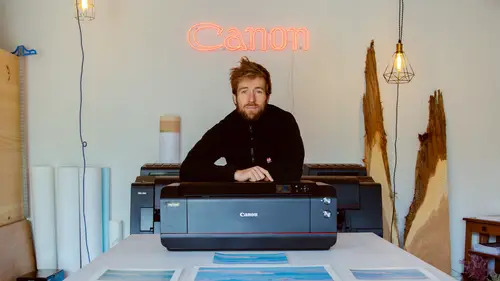
Photo Edit and Test Prints
now let's get into it. So I finished the edit on the photo. Nothing crazy. Let me show you before and after. Here is the photo at import. That's where we are. Now now it's time to soft proof it. Soft proofing just means that I'm getting a preview of the printed photo on the selected paper. It's not perfect but it's close enough so to do that on lightroom used it? S a soft proofing here or you just when you're in this window here you can hit this little box, you know sometimes and it's gonna ask you if you want to make a copy of the image for the soft proof I do because sometimes I alter it so my soft proofing here I can choose the paper I'll print on. So I've already selected the paper luster here. I'm gonna do all my Canon profiles are here, some commuters down there. But for our purposes we make sure we pick the right profile for the right paper. So you wanna make sure it's perceptual, which is what you use for photography relative. It's I don't find it as accurate. So I recommend yo...
u rock with perceptual and then simulate paper and ink. Then you can just toggle back and forth between the two here to see what it's gonna look like. So you see we lose a bit of brightness and a bit of we lose a bit of detail in the shadows but very slim. So, you know, one thing that you can do here for example, if you're noticing that you're losing a bit of brightness is here. I can add a bit of more light to the Canola field here with the luminous tool because I know that. So now I'm just editing the preview literally. They were good to go okay print the print module here or command p if you're into shortcuts. So this is my test print for the test print I'm not gonna go 13 by 19, that's the final size I want to do. I'm gonna go to a smaller size us letter 8.5 11. Got my printer selected here, landscape scales looking good. Okay um this is good for here. I'm not zooming to fill. I don't need an identity plate. Print resolution. You can go all the way to 300 if you want. Print sharpening low so because it's not a huge photo, I can actually go to standard. My media type is neither matt or glossy but I'm gonna go with glossy cause luster is closer to glossy than matt. um 16 bit output some images. It does, it's beneficial but I don't think it makes a huge difference from my experience here and then what's important to use color management. You don't let the printer manage it, you do it yourself here with your profile and then this is some adjustments at the last minute. I don't mess with this. Usually I like to get it right before but it's a nifty little tool. You know you can add more brightness to the print. Okay my printer you know make sure you double check everything. My paper is loaded and I've selected everything good and then I'm just gonna hit print Okay with the pro 1000 with the program 1000. Actually turn it on two spots where you put the paper. This is the top loading area for your standard sizes. If you have a custom paper size you come back here Bernie, this is where you put the custom paper, see if your computer or the printer tells you put it in the custom loading area. Custom standard A. K. A. Top. So this thing is turning on I'm gonna use like I said last year in 8.5 11 fairly good paper and affordable and I think luster will look good for the time of day we shot. So I intend to make maybe 23 test brings just pick two sheets of paper. Um make sure it's on the right side. So printing surface up towards you get it in there. Close the guides you go now it's trying to find the paper. Okay And he's going here Just in case for later for the Big one. All right printing that was the best moment. It's kind of waiting for popcorn in front of the microwave there. She is got the final result. Always good to look at it in daylight. So the garage door is open which is very convenient. Yeah I love printing, see like now I'm noticing things. I didn't see when I was editing like these farm lights, they're a little blur. It's either cool or distracting. I don't know yet and I love that we still have to sky there. Get some of that sunset light. The darks are fine. They're not underexposed. An old change. Yeah the blacks are fine, they're not underexposed excel information just in here. But that's just the nature of the black came back at the desktop. So what I'm saying first glance is that pretty close. Really happy about that. The I'm seeing differences between the hue of the canola here. Here's a little cooler, here's a little warmer. But man look at the on the screen you see the candle as a lot of texture on the print just completely smooth. Almost like somebody did a paint stroke. That's pretty cool. It's one of these images that looks better on print. Actually think all images look better on print otherwise the darks are fine. I got my screen brightness when I do this comparison between four and five because obviously if you do this and it just does not even resemble real life. So four and five, I feel like it's pretty accurate. So now I'm just gonna work on the heat of the canola. Maybe make it a little less warm. Well I kinda like it like I said earlier printing informs you editing and I feel like I didn't do that on the edit. But the print did it. So let me just change the edit now to reflect that that's it. That's my adjustments, let's do them. That here is a referrals. Okay back to develop module, this is still rolling. So me chill out that hue on the canola a little less yellow. So I give it a little coolness here with the H. S. L. Otherwise the blue of Pete's jacket kind of lost a bit of saturation in the print. I'm gonna bring it back so I'm gonna give a little more saturation than I should also saturating the sky. You gotta be careful about that. And um man were there I'm not gonna bump up the exposure by two stops. Yeah they go 2.5. I feel like my dark. So good enough I don't have to touch that. And then now we're gonna do another test print we're doing another test print on 8.5 11. Looks good. Happy I got big size. Okay and the second prints come out let's have them side by side. Now Canola looks better here. Think less saturated the blues of pitch jacket. Sky is good. Yeah so Bit brighter on the 2nd 1. More enjoyable. I think I'm gonna delete bound. I think I'm gonna down one notch though because the gravel is a little too right on this one but I can do that on the on the big print. Yeah I'm happy good to send a big friend now.
Ratings and Reviews
user c7bdd5
Thank you. Lots of good information. Well done.
Isaac Johnston
Through and also to the point! Well worth the watch, and I feel confident to print on my own now.
fbuser 517642fd
I would recommend it for anyone trying to understand the print process better but, I think Alex needs to work on speaking a bit clearer and maybe slow down a bit when he is moving his cursor around in LR as was difficult to keep up with him and to see what he was doing.