Adjustment Workflow: BW, HDR, & Panoramas
Lesson 12 from: Adobe Lightroom Classic: The Complete GuideBen Willmore
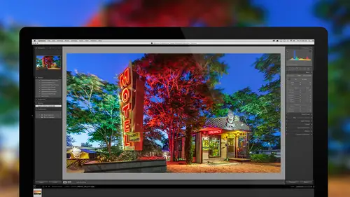
Adjustment Workflow: BW, HDR, & Panoramas
Lesson 12 from: Adobe Lightroom Classic: The Complete GuideBen Willmore
Lesson Info
12. Adjustment Workflow: BW, HDR, & Panoramas
Lessons
Bootcamp Introduction and Overview
1:22:40 2Import Images and Customizing Lightroom
1:41:15 3Understanding Catalogs and File Management
1:08:26 4Baseline Raw Image Adjustments
1:29:20 5Creating Finalized Files and Printing
1:28:55 6Organizing Your Images And Managing Projects
1:19:03 7Making Your Images Searchable With Keywords
50:35 8Fixing Isolated Problems
1:39:09Image Adjustment Techniques
1:17:56 10Fine Tuning Your Image
1:14:01 11Facial Recognition And Map Viewing
38:45 12Adjustment Workflow: BW, HDR, & Panoramas
1:16:49 13Organizing Your Keywords
49:24 14How To Find Any Image Quickly
55:41 15Showcasing Your Work: Slideshows and Books
1:26:38 16Image Adjustments: Start To Finish Workflow
1:07:18 17Lightroom To Photoshop And Back
1:02:26 18Basic Troubleshooting
55:48 19Advanced Tips and Tricks
1:03:21 20Workflow Refinement And Final Summary
1:01:45Lesson Info
Adjustment Workflow: BW, HDR, & Panoramas
Welcome back to Lightroom Classic, the complete guide. Today let's first start by thinking back about what we've done thus far. 'cause we've been talking about Lightroom for quite a few days now and some of you are just tuning in today. Well you should know that there's quite a bit we've covered thus far. In the first week we talked about kinda the big picture of Lightroom. We talked about how to think about Lightroom catalog files. What are they made up of? How do you rename them, move them? How do you setup your folder setup? So it actually changes the way you think about your images. How do you get your images into Lightroom, and how do you get them out if you need to deliver them to someone else? Then in week two we got into organizing and adjusting our pictures. That's where we talked about doing some light retouching, we talked about making our images searchable by adding keywords and refining the image by doing things like noise reduction. Then this week the first day of the wee...
k we ended up doing facial recognition where if we can educate Lightroom about just a few faces within our images, suddenly it can automatically remember those people and find them in future photographs that you take. We could also put our images on a map, so it's just a completely different way of thinking about our images. Well, that means that right now we're 11/20ths done. Well what's important about that? That means we're just over half way 'cause there's 20 days total in this class and we just made it over that halfway point. So today what we're gonna get into is we're gonna talk about the process of converting to black and white, merging multiple images into what's known as a high dynamic range image, and stitching panoramas, 'cause all of those things can easily be done in Lightroom. So, let's just jump into Lightroom and get started. (clearing throat) First let's talk about taking a color photograph and converting it to black and white. Sounds like a simple process, maybe it's just a simple menu item you might choose, but actually there's a little more involved. Here I have a full color image and I'm gonna take it over to Lightroom's Develop module and when I do I have my basic adjustment controls here, but if I scroll down a bit in this section called HSL you'll find the choice right over here for black and white. If I click on that heading it will convert this image to black and white and it will bring up the settings for black and white. And what's nice about these settings is we're not stuck with the initial end result that we have. If I first off wanna see it back in color again so I can compare, all I need to do is click away from the word black and white here and over to the letters HSL and I'll see it back in color again. And so if I just look at this and remember that we had a blue sky and I see kinda some yellowish, bluish and, I don't know if I'd call it reddish buildings, but you can see that color range. When I go over to B and W for black and white now I can fine tune all of those areas by moving these various sliders. So we had a blue sky and I think there might have been a blue building here on the end. So if I move this slider I could darken that or brighten it up. Whatever it takes to make it separate from its surroundings so it looks distinctly different. Then some of our buildings in here I believe were yellowish or orangeish so one of these two sliders will do the job there lightening or darkening those particular areas. And then I believe the closest building to the camera was a little bit warmer. It might have been considered red, magenta, something like that. So one of those sliders should be able to get it. It's not magenta, that's not targeting it. And it seems to be red. Now you see how I've been somewhat guessing at which slider to use from my memory of what the picture used to look like. There's no need to really guess because in the upper left of this area there's something that looks somewhat like a donut and if I click on that now I can move my mouse on top of my picture, and if I click within the image I can then drag up if I wanna brighten or down if I wanna darken, and what it'll do is look at what color this area used to be and it will highlight over here on the right the number for whatever slider it thinks would effect that area the most. And if I click within the picture and drag up or down, it'll actually move that slider, but because this building was not blatantly orange, it might move more than one slider. Whatever it thinks would best target this. So when I click on this and move it up or down you'll see it's not only the oranges that are moving, it's also the reds. So then I can really dial this in exactly how bright I'd like it. I move down to this area and I see it thinks it's yellow because it highlighted that number. I could click on the image and again move it up or down. And I continue doing that for all the other areas. But it is doing this based completely on the original color of these buildings. So if there are two buildings that are similar in color I won't be able to isolate one from the other using this. Instead I'd have to go to my adjustment brush, which we talk about in a different lesson, to be able to isolate something and adjust its brightness. So anyway I'll just come in here and try to fine tune this until I like the general feeling for what we have. Let's say I like that. So just remember all we needed to do is right here is the letters B and W, I simply clicked on them and then I'm moving these sliders to fine tune the end result. There's also an Auto button here, and if I click on Auto it's gonna move all these sliders for me and it's gonna try to figure out what it thinks would be best and that may not be a bad way to start but regardless of what it gives me I almost always click on that little donut there and then go on top of my image and fine tune the image. If you wanna see before and after, another way of doing that is there's a little light switch that's found to the left of the B and W area and if I turn that off you'll see what it looks like before and turn it back on you'll see after. In this case this image, let's see, I'm actually surprised 'cause usually it would end up coming back to color. My guess is that there's a setting up above that is changing that. So instead if I go over here to HSL we'll see color, go to B and W and we'll see it black and white. Now, let's work on some other images and let's add in some other enhancements where if we've already converted the image to black and white then how can we further enhance the image. So here's a black and white picture, but it's not purely black and white. I'll press the letter F to bring it full screen and if you just kinda get a feeling for the image you might notice that there's a sky in the image and that sky seems to have just a hint of coolness to it. Then the area here where I can see some light falling on an object actually feels a little bit warm. So in this case this is an image that's been converted to black and white, but then afterwards a hint of color has been added. You could call it a toned black and white image. So if after you've converted to black and white you wanna add a little bit of color back in then I would visit this area called Split Toning. Now we covered split toning in more detail in a different lesson, but here I just wanna make sure you know about using it for black and white and give you a few extra tips. So first, I'm gonna turn off split toning, and I can do that by turning off this little light switch to the left of its name. Then I'm gonna see just the pure black and white result where there is no color added. Any color you happen to see might be your display not being perfectly neutral. Instead every single thing you ever see on that display might be warm or cool because of the display. But this is truly neutral. I turn split toning back on and you can see that little coolness going into the sky, a little warmth going into the building that's here. In case you don't know what's going on here we're looking up a bunch of stairs and at the very top of the stairs is my wife doin' a yoga pose and then we have a over class sky which we can see in these other areas. Well, if I wanna put a cool tone into the sky and a warm tone into the building, I'm gonna do it through split toning and here's how it's done. First, I'll reset these settings so it looks like it will for you if you've never used split toning before. To reset things I'm double clicking on the names of various headings. So I double clicked on Highlights, Balance, and Shadows, and that brought everything down to zero. Then here we have a setting for highlights. Highlights means the bright portion of the image so I'm gonna move this slider over to the approximate color I'd like in my sky. I want my sky to be cool so I'm gonna go over here to kinda the blues. You won't see the image change at this point because the Saturation slider below that determines how strong the change is, and if it's at zero it means zero change. You can preview though the color you're choosing here if you hold down the Option key, Alt in Windows. When you grab that slider called Hue because then it'll act as if the saturation was maxed out as high it could go. So, you'd see it at full strength. So I could pick the exact blue I want. I want kind of that tone. Then I can go down here to Saturation to determine exactly how strong should it be. And you know, move it up too far and then back off, figure out exactly what you'd like. Below that we have a different color we can add to the dark portion of the image. And again I can hold down the Option key to preview this at full strength and then if I grab this slider I can preview exactly what color would be put in the darker portion of the image. And in my case I'm gonna get this nice little warm tone in there. And then just like with the highlights we have a Saturation slider which determines how strong the change is. And so I'll bring that up until I like the look that we're achieving. Finally there's a choice called Balance. And balance determines where do the highlights end and the shadows begin? And so if I were to move this slider to one side you would find that in this case the shadows are extending across the entire image. So it's considering everything except for maybe white to be a shadow. If I move it the opposite direction now you're gonna find just about everything is cool in the image and that's because it's considering just about everything in the image except for solid black to be a highlight. Then if you move it in between you're going to change exactly how that's defined. Now I find it easiest to adjust this if I again hold down the Option key, Alt in Windows, because that's gonna act as if the Saturation slider's been turned up all the way, so it will apply intense colors, and it's usually much easier to figure out when have I actually isolated that sky from the rest of the image by getting just blue there. See here I can still see some up in that round circle. Even if I continue going, once I get to about here I've gotten it up to where only the sky is blue and everything else has that warm tone. I was holding Option while I was dragging that. So that is our split toning and I use that all the time when it comes to black and white pictures. One thing I find to be useful is instead of just trying to pick colors off the top of my head and guess at what I think would look best for a picture, is I'll actually get on the internet, I'll go on to any search engine and I'll just type in toned black and white. Or I'll type in warm black and white, or cool black and white. And I'll look at other photographers work and just get an idea of what it looks like with various colors applied. Then if I find an image I like I'll simply reduce Lightroom's window size by grabbing the corner of it and pulling, and then I can view Lightroom right next to my web browser and then I would be able to compare my results to what I'm seeing in the browser. If you're not able to change the size of your Lightroom window, that's because Lightroom has various screen modes where it can fill your screen in various ways. You can cycle between them by typing Shift + F. So what we need is we need Lightroom where it's got a little title bar across the top. In order to be able to resize its window. Otherwise it's kinda stuck being in full screen mode. So if I do Shift + F, Shift + F, right there I got the title bar at the top. That little gray bar. And only when I have that can I sit here and resize this. Therefore, I could view my web browser and this at the same time. When I'm done and I've set this up to match the look of another photograph, then if I wanna go full screen mode again I can do Shift + F to get that title bar to disappear. Now once you've created a look for your image then this is usually something that I might wanna use again and again. Especially if I'm gonna do a series of images and I'm gonna show that series together. I might wanna have the colors be the same between all those images. And one way of easily doing that is to go to the left side of your screen and there's an area in here called presets. And so you can create a bunch of different presets that store these settings. And here I already have a lot of presets that I create, 'cause I use a lot of presets. But I wanna just show you how you can create your own and then how to use them. So what I'm gonna do here is at the top of the presets area I'll hit this little plus sign, then right here it says that I can put it in a folder and if I don't already have a folder made here I can choose New Folder. I'm gonna name this folder CL for CreativeLive, just so I remember why I created it, and I'll call it black and white toning. I hit Create and that made a folder. So that's about where I'm gonna save this. I'm gonna look at my picture and decide what would I call this preset? And so I might call this something like Highlights Blue, Shadows yellow, or come up with a naming convention where you don't have to type the full word highlights and shadows. Maybe h colon for highlight, and therefore it's actually a little easier to read if you simplify it. And I might replace that little comma with an and. So, there we have highlights blue and shadows yellow. Down here we need to tell it exactly which settings within the Develop module should it save into this preset. We don't wanna go down here and check all because then the cropping on this photograph would be in that preset, and every single time I apply it other images would get the same cropping. Any retouching I've done to the image would also be applied to other pictures and I don't want that. So down here I would end up choosing Check None and then if you want to there's two choices that are here related to black and white. One is this one, black and white mix, that means the actual panel where we moved the sliders to control how bright or dark the various colors are, and then the other one is called split toning. And split toning is all I want right now in this particular preset. Therefore if I apply this preset to another image in the future, the only thing that will change on that picture are the settings in the split toning area of the Develop module. All the other settings will be untouched. So we'll do that, we'll hit Create. And now you can see over here on the left side of my screen we have a folder called CL B&W Toning, and it says my highlights will be blue, my shadows will be yellow. We can double check that that works. Over here in my Split Toning I'll double click on the word Highlights to reset it. Double click on Shadows to reset it. Double click on Balance so everything's zeroed out. I come over here to my preset now and I just click on it and you'll see that it loads in everything that's there. Now here I have an existing folder that I've made previously and here you can see various choices. These would just be some examples. One thing that's nice about it, once you've created a few of these is if you expand this area up here called the Navigator, this will actually give you a preview of your preset if you hover over without clicking on the presets. So if I come over here and hover over these I can see that the image changes dramatically as I go over each one. And I could try to choose whichever one I like. Maybe this one in this particular case. Only if I like the look of the preview do I actually click on the preset. And only clicking on the preset is what causes it to apply. So if all I'm doing is hovering over this I'll preview them and I just might never apply them. Click though, and I'll have that applied. I'm gonna choose undo 'cause I like the version we created more than that, but all I would say is that each time you make a tone black and white, if it looks truly good why not save it as a preset. Then if you end up with a folder where eventually you have two dozen toned settings for your split toning, then it might take you a lot less time after you've converted an image to black and white to get it to be, have some color in it. But if you are doing this as like your first time toning a black and white, one little suggestion would be if you plan on printing this image, anytime you get into a new feature, new to you feature, usually there's a novelty factor where you're like this is cool, I can add color to my black and whites, and I personally find for me, I usually overdo it. It's the same thing when high dynamic range came out. I did these over processed images and then once I get used to the settings for HDR then I started mellowing out on it 'cause it was no longer had a novelty factor, it was new to me and therefore I was excited about applying it. Well when it comes to tone black and white I find that people usually over tone their images, meaning their saturation sliders are up too high. So if anything I try to under tone my images instead of over, but it is a personal style choice. And some people love them really colorful, so it's up to you. So there's our toned. Now let's look at a couple other special ideas we could use when working with black and white. If you want really dramatic looking black and whites, and here a few that I consider to be somewhat dramatic in that there's a good amount of contrast in these black and whites and oftentimes that's what some people are going for in their black and white. Well, I often process my black and white images differently than I would a color one. And there's a few different concepts to think about. In this particular case everything starting with this image and continuing to the last one that I showed there, used a special technique in Lightroom. Let me show you what it is. I'll end up going to the Develop module, I just press the letter D to get there, and under this area called Effects is a setting called Dehaze. Dehaze is designed for hazy images. Imagine an image that looks like it's foggy. Where there's, if you do have a picture where it's foggy you can't really see to the darkest portion of the image. Instead of looking black in that area it might look like it's only 75% gray and wherever there would usually be white in image, oftentimes it looks a bit dull, where it didn't really get all the way to white. Bringing up dehaze will usually add a tremendous amount of contrast and what it does is it concentrates on the dark portion of the image, pushing it closer and close to solid black. Once the dark area gets really close to solid black, it starts thinking about a little bit brighter of an area and concentrating on that. So, let's see what it would look like here if I turn dehaze off. I'm just gonna double click on the slider for dehaze and then I'm also gonna go up to this area called Basic and I'm gonna change one other setting and that's Contrast, 'cause it's been lowered. This is the normal contrast of this particular picture. If you look at the adjustment sliders that are here only the blacks and whites have been changed a little bit. If you want to I could reset those as well so you can see what the image looked like completely unprocessed. It just looks like a kinda light looking image. Well if I wanted really high impact black and white one thing to consider is to go down to this area called Effects, take the setting called Dehaze and max it out as high as it can go. You're gonna have a pretty dramatic looking image at that point. Oftentimes it'll be way too much so usually have to counteract increasing dehaze by reducing contrast. The two kinda can balance each other out. So I'd just bring dehaze up as high as I can, and then here I'll adjust contrast to actually control the final contrast of the image. And sometimes they end up lower, sometimes higher, but most of the time they're moving in opposite directions. Dehaze is being increased while contrast is being reduced. And by doing so I get a much more dramatic picture. I might also bring up clarity here to have the details come out. But if I do, then that contrast will probably be too high. And then I can adjust my whites to control exactly how bright your brightest portion of the image is, and my blacks to control exactly how dark are the darkest. Be careful though when adjust blacks and whites, it's very easy to blowout the detail in the bright portion of the image and end up with a large area of white. Most of the time in my black and whites I want a little bit of detail in the highlights and here's how you can tell if you have it or not. When you go to the Whites slider there's a hidden feature in it. If you hold down the Option key, Alt in Windows, and click on it, it'll show you if anything's white in your picture. If you see any white on your screen then those areas have no detail and are solid white. In this case I can tell there is no white. If I were to move this slider higher, eventually I'd start seeing white and that would indicate I'm getting so bright that those particular areas have no detail whatsoever. So most of the time I try to avoid that. So this would be about the brightest I'd wanna go to without losing detail. Now I can let go of that Option key and just know that plus 30 is my kinda maximum without losing detail. And then I can move this around just looking at my picture, deciding what I like. And when I'm done I just glance and make sure I'm not over plus 30, 'cause I know I'd be losing detail if I went that far. You can do a similar thing with blacks. If you hold down the Option key and click that slider it's gonna show you what's black in the image. But if you've used dehaze, most of the time you will have black in your picture. Let's see where it is here. I just don't usually want it to be a huge area unless I really planned on it being that way. So, I don't usually move this until I lose all those blacks, I just usually try to be educated about where is the image black and is that okay? And if not I'll back off on the blacks by increasing it, but I think it's actually useful to have areas of solid black in my picture. Let's look at a few other examples of this. I'm just gonna switch to the next image by using my arrow key on my keyboard. And let's go down here to this area called Effects and notice Dehaze turned all the way up. So if I double click on Dehaze to bring it down then I'll have to come up here to Basic and bring down Contrast and Highlights, Clarity, this is kinda the original version of the image. Looked rather dull. So, Effects, crank up Dehaze. Then go to Basic and I can use exposure for overall brightness, and contrast for my overall contrast. But in this case I need to move 'em both up. And then I can fine tune things. Be careful with clarity. If you bring it up it'll be a much more dramatic when you have dehaze turned up. These images here you notice that all these sliders are actually zeroed out as if I haven't made a change, but I betcha under Effects there's Dehaze. If I double click on Dehaze it just doesn't have anywhere near as much contrast and if I were to compare that to just doing my normal contrast control, it's usually not quite the same. Here's normal contrast on 100%, double click on it to get it outa there, and here is dehaze instead. See how much more dramatic it can become? Now if you see me artifacting up here I can see some, looks almost like posterization. Most of the time that's because Lightroom is not showing you a high resolution version of your picture. It's trying to make it fast to do your adjustment, and so it ends up using a smart preview. If you actually click to zoom up then it will actually render that area and you can see what's actually there. In this particular case there's a good amount of noise, so I'll probably have to do a little noise reduction. But just so you know if you see anything that doesn't look smooth, zoom up on your picture to make sure it's truly part of the image. So that's one trick, is dehaze. And what I do is I create presets, and over here if I were to scroll through enough of these, one of my sets of presets here will be right there called contrast plus dehaze. And if I open that up I have a bunch of presets and the ones I use the most are right here. See how this is gonna bring up dehaze and bring down contrast an equal amount to kinda counterbalance each other. And I'll often use those so here I'll just use my navigator and I'll hover over them to see what would it do to the picture and I can see exactly what I would achieve and try to decide which one might be useful for this particular image. It's nice with presets because it's moving two sliders at once whereas doing that manually in Lightroom I can't see the end result until I get both sliders moved. So it's really harder to preview different settings. Also with black and white sometimes it can be nice to actually have a noisy black and white 'cause it gives it more of a vintage feel and so if you want a noisy black and white under the choice called Effects there is something called Grain. And Grain is gonna add texture into your image that makes it feel more like an old black and white photograph. And in order to see this though you'll have to click on your picture to zoom in. I don't know if this is the best picture to show it 'cause this was already relatively a noisy picture, but as I bring this up you can see that appearing. I'll bring it up really high just because on video with compression it's not always easy to see. You can then control how big is the grain, or do you want it really fine grained? And how rough or random the grain is. But I'm gonna back off on that, I might turn it up really high just when I'm adjusting size and roughness. And then I'll bring it all the way down and slowly bring it up and decide exactly how much would I like. That's something else that is great with presets. To save a buncha different settings for your grain. All right, well that's how I think about converting to black and white, and now let's talk about a different kind of processing. Let's talk about high dynamic range, or HDR. When you walk into a scene your eyes can see a much brighter, or much wider brightness range than your camera can. So you walk up to a scene like this one and when you do I have no problem seeing what's inside this building. I can tell if there's people in there, I can tell if there's tables or whatever happens to be there, and, at the same time, I have no problem seeing the detail out here on the sidewalk. But, I take my camera and I point it at the same scene, press the button, and I'm disappointed. And that's because my camera has a much more limited dynamic range. Dynamic range simply means the brightness range it's capable of capturing detail in. So, when I point my camera at the same scene, I instead get this as one option, and with that particular exposure I can see what's inside the building. That's great, but look at what's outside the building is way too bright. This area's blown out to solid white. Well, I can adjust the settings on my camera. There's a setting called Exposure Compensation, I could lower it to, say, darken the exposure. And I can press the shutter again and I could end up with this version. Well, in this version I can see the sidewalk that's here but if I try to see what's inside it's almost solid black. Now with an image like this I can most likely adjust it. We have a shadow slider and we have an exposure slider and I betcha I can actually see what's in there after processing, but the problem is in the dark part of your image is where all the noise is hidden. And so if I were to brighten up that area from this one photograph it would be very noisy and I'd have to try to deal with that. It would be less than ideal. So I could instead change my exposure and try to go for something in between. And I just have to careful with do I blow out any detail and I might be able to adjust this image to get the best of both worlds, but regardless if I try to brighten up that interior it's going to look noisy. So why not take all three of those pictures? My camera has a setting called Auto Bracketing and if I turn it on I can tell it to take these three pictures just by having me press and hold the button. This would be three exposures and the difference in brightness between the three is two stops. That's a setting I can use on my camera. Well if I were to do that and end up with these three separate pictures all I'd have to do is press and hold the button and it can shoot 'em off. Well then I'm gonna select those three images. I clicked on the first image, I held Shift, and I got the last image. Then, here in Lightroom I can go to the Photo menu and I'm gonna find a choice called Photo Merge. And there I have the choice of high dynamic range. So if the dynamic range is the brightness range your camera is capable of capturing, all of those shots are, you could call it standard dynamic frames; the standard amount you get outa your camera. When we feed Lightroom three or more of those exposures and we tell it to combine them together into a single picture we then gonna end up with high dynamic range which means the brightness range in all three of those combined. So I'll choose HDR. When I do it'll take it just a moment 'cause it's starting to combine all three images together and while it is you can look on the right side for the settings that are here. I'm gonna turn off a few of them here. We'll talk about those in just a moment. Up here though we have Auto Align, and that allows me to shoot handheld. As long as I'm holding my camera relatively still. If there was any motion between those shots it would be able to line them up. It will use the same technology it uses for lining up panoramas when you stitch multiple images. Then there's a setting called Auto Settings, and what that does is it goes to the Develop module and it moves the sliders around for you to make sure the image doesn't look too dark. If that's turned off then the image won't be lacking, I shouldn't say lacking, it will have too much contrast where you won't be able to see into the shadows or the highlights. So Auto Settings helps you kinda preview your end result. So, I almost always have Auto Align turned on. It's, boy I'm just trying to think of when would I turn it off. If I was in a hurry and I knew my camera was on a tripod and I didn't bump my camera between exposures I could turn that off, and it would speed up the process. But other than that, most of the time I'm shooting a lot of these handheld and then I always need that on. Then down here we have an area called Deghost Amount. We're gonna cover that on a different photograph because it has to do with motion in the scene. Like if somebody was walking through here. Maybe if there was somebody inside the restaurant and in one shot they're in the window, in the next shot they're in this window, and so on, how would it deal with that? But since in here I don't believe there's any motion I shouldn't have to deal with that setting. In the lower right you see the button called Merge and if I click on that it's going to combine these three images together, it's gonna create a brand new file, that file will be in DNG file format, and it should save it in the same folder as this. And I just saw it show up over here and I see on the right side it added the letters to our filename HDR. So this is the same as one of our file names that we merged together and then HDR to indicate it is the result of merging multiple images. Now when you do this it's not always gonna show up right next to my picture like that. It all depends on your sort order. If I go up here to the View menu we have a choice called Sort, and if I have this set to I don't know, doing it by rating or doing it by some other setting, it could be that this ends up being at the bottom. So, sometimes you need to scroll down to see it. But if you're sorting by filename, the filename should be the same at the beginning as the other files, so it should end up nearby. Now I'm gonna take that image, and this image contains the full brightness range of all three of those pictures. And now I can go to the Develop module and I can process this image like I would any other. And the only difference is that I'm gonna have a tremendous amount of highlight detail and it's gonna be easy to get shadow detail out of the image, and when I brighten up the shadows it will not be full of noise because we actually ended up with a brighter shot that was used for that. So what I usually do is you'll find that these sliders will not be zeroed out and that's because we had a checkbox turned on called Auto Tone, you remember that one? Well that's what caused the sliders to all be at something other than their defaults. If you wanted to you could double click on the headings for each section and you would see what it looked like if you didn't have Auto Tone turned on. What I usually do for processing is I just start out by taking my highlights and turning it all the way down, and taking my shadows and turning it all the way up. I'm not saying I'm gonna end up with those settings but that's where I start. After doing so I adjust the exposure to get the overall brightness where I want it to be, and then I can start to fine tune. I can say maybe I don't want my shadows quite as bright as they are, so I could darken 'em down if I want to. Or maybe I want it even darker in here overall, because our highlights are turned down as low as they can go so we can't get this any darker with the highlights slider, again so I might bring exposure down until that area is the brightness I want. There we go. Then we have contrast and contrast is how big of a difference is there between the dark areas and the bright areas. Well, if I want less of a difference between those two I could bring it down or I can increase it. So I could fine tune that. But, processing this is no different than any other image other than you can move highlights and shadows to an extreme without having issues with noise. So I might come in here now and make sure the bright portion of the image is close to white. Usually I end up looking up here at the histogram and seeing if there's a gap on the right or left sides. If there are gaps on the very ends it means you don't have white or black. So, I could bring that up and I'm just gonna fine tune this. Maybe bring up my clarity to get the detail to pop out, and I could adjust white balance. I'll grab my little white balance eye dropper. We have a white wall I could click on and try to fine tune it. So if you compare this image though, go back to our grid view to the three exposures it was created from. Here's the difference. Here's our end result so far, whereas this is what my camera was trying to deliver to me and I think this one is where I really can get that detail. Now one thing about this though is when I go to my Develop module if I'm gonna end up bringing my highlights way down, you're usually gonna find that there's no really bright areas within your picture, and it's really what gave me all the detail that's here in the sidewalk. I find in order to get an image to really look good with HDR, if I have my highlights and shadows at these extremes I usually need to grab the adjustment brush and make sure nothing's dialed into it to begin with and I just bring my highlights up. Sometimes to 100, sometimes I'll have to tone it done, and I'm gonna paint into whatever area of the picture that I think should be nice and bright or just think about are there any bright areas that look rather dull right now? And to me the wall that surrounds these windows looks rather dull. So I'm gonna maybe turn on Auto Mask so it will help me with my masking and I'm gonna paint on that wall and as I paint it should brighten up. I notice it's not brightening all that much and that's because if I look at my settings down here at the bottom there's a setting called Flow and it's only putting in 25% of what I'm asking. I'll bring that up to 100, then I should see a much more dramatic change in my image. But if you end up with your highlights turned all the way down and you're applying it to the entire picture you're gonna find the brightest portions are usually gonna be rather dull and so I need to look at where would it be useful to get it to be in the highlights even brighter than the end result. That's when I grab my adjustment brush, crank my highlights up, and paint across those areas. And I found that before I figured out the concept of doing that I had a lot of dull HDRs where I needed to have that setting low for one particular area of the picture like where this sidewalk is, but other areas suffered. And most of the time it was something like I have a picture of a waterfall and in order to get the sky to have detail in it I had to move the highlights way down. But when I did the waterfall looked like a dull gray mass, so grab my brush, bring the highlights up and I painted just on the waterfall. Brought it right back, looked great. In this particular case to me that wall just has a hint of blue in it. So I might bring my saturation down a little bit too, in this case. If you wanna see where I've painted I hover over this pin and I can see if I've gotten to all the areas on the wall or not. Looks like I missed an area in the lower right, and possibly an area right next to the door in one spot near the very top. So I'm gonna paint right here, I'm gonna paint right up there, and I think there was a spot over here. But I was just hovering over the pin to see where I'd painted. And those are the areas that I'm bringing back. If you look at where the chairs are do you see where I got over spray onto the like sidewalkish area? So there is a choice down here called Erase and then I could come down to the bottom and remove it from that area. Although since that's really a shadowy area, it probably doesn't matter in this case. It's just nice to double check your work. I'll get out of my adjustment brush. All right now let's see if we can find anything that might have a little bit of motion to it. Well here I have a scene and I think this might be the end result because when I look at it we have detail in the sky and we also have detail here in the darker portions of the image whereas when I pointed my camera at that scene this is what I would've gotten if I got detail on the sky. Do you see how dark the dark part of the image is? Well if I try to brighten up the dark part of the image here it's gonna look very noisy. Take another shot, great but you're starting to lose detail in the sky. Still not seeing what's in the real dark areas. So take another shot we're just starting to see what's in the dark areas enough, but the sky is completely gone. So, that's when we wanna use HDR. So let's take these three images and again we choose Photo, Photo Merge, HDR. And in this case there are people walking through the scene. If you look do you see all the people standing in the scene. Well they're not holding still and this was back when I used a camera that I think could only do, I don't remember if it was three or four frames per second, which means it was easy for these guys to move around. Well in that case I'm gonna leave the settings up here the same. Auto Align to make sure if I'm handheld that if there's any movement in the camera it compensates where it lines up the objects that are here. I use Auto Settings because if I don't it looks more like it came out of the camera where you can't see the detail in the shadows or highlights, so that's nice to have on. And now here we have Deghost Amount. Well if I were to zoom up on this picture I might notice some oddities in the image. And if I need it to be able to compensate for it, sometimes it looks like there's a person kinda half showing up and here I'm gonna turn on deghost. I'll turn it on low to begin with. It'll take it a few minutes to analyze the pictures, but it's looking for movement between the various frames and if it finds any movement it ends up picking the area where it saw movement from only one of the frames instead of being able to use all three. And there is a checkbox at the bottom called Show Deghost Overlay and if you turn that on or you type the letter O for overlay then it'll put red on top of your picture to show you where exactly it thought there was motion. So, as long as the red that's on my picture is where the motion was and it got most of the motion handled, then low could be fine. But let's say that even at low there was a person over here and they're kind of half showing up. Well, if that's the case I might need to bump it up to medium. I don't actually see that issue on this image, but I could bump it up to medium and when I do you're gonna find that they'll be more red on the image 'cause it's gonna be more aggressive. This isn't just for people walking through a frame, this can also be a flag flapping in the wind, could be tree branches moving, or if you have a river the stream itself moving around. And if I bring it up to high you're gonna find even more of an area covered in red. What you usually wanna do is go for the lowest setting that handles the job because the higher the setting is, the more large of an area it's gonna be where it uses only one exposure and if that happens to be one of the darker exposures those areas will have noise in them. So, in this case there wasn't any motion here. So obviously I don't need high. And I think the setting called Low was fine because it seemed to cover the vast majority of the people that were moving in the scene and there was one woman over here that was just holding still for the length of the exposures. But that's the checkbox Show Deghost Overlay, that will only be available once you have this set to something other than None, and then just like before I'll hit Merge and now it is combining those three images together and eventually I should see a new image, has the letters HDR at the end of it. You'll see a progress bar up here so you can tell when it's done. So once this progress bar is done, if you don't see the image really close to the ones you had selected then just scroll down it's probably at the bottom of the list 'cause you're viewing by creation date and since that image was just created it would be at the bottom. But it's right there, can see the letters HDR. Hit the letter D to go to Develop and now I can process it. And you process it the same way you would process any other image that you work with in Lightroom. I'm not gonna spend the time to really process this image because we're talking about HDR not about processing so much. So if I took a picture like this one and it's windy. Definitely need deghost turned on. But you're gonna find there's a limit on how much it can handle and so you need to be careful. Here I'm gonna show you one other example 'cause there's a few other adjustment settings you might wanna know about. Here I was having lunch with my wife who's sitting in a chair there, and in order to get any detail in the sky this is the brightness of my exposure, so that's obviously not gonna work. So I got another one a little bit brighter. Startin' to lose detail in the sky, but still Karen's not bright enough. Take one more and she's starting to get bright enough where I think if I adjusted it and even brightened it a little further I could get her to look okay but our sky's completely gone. So, let's take those three images and by the way here's the end result after merging. But I wanna show you a few special adjustment techniques for this. So I'm gonna take those, HDR, since there's a human in the scene I'm gonna make sure I at least have low deghosting turned on and if it was windy where there might have been, I think there was some little bottles hanging like their light fixtures, if they were moving in the wind I might need to experiment and go for medium or higher. But when we're done what I'm gonna do is I'm gonna head over to the Develop module and we have the normal adjustment sliders there, but oftentimes they're not enough with HDR. Remember how I maxed out the highlights and the shadows on a few of these images? Well, if that's the case you do have another spot you can go to in the Develop module where it's equivalent to having a duplicate of your highlights and your shadow sliders so you can fine tune your work a lot more. So let's see if we can take a look. And instead of waiting for this to finish processing, 'cause it will eventually show up. You can see it creating here. I have a finished version and we'll just work on that so we don't have to wait for it. Head over to Develop and notice here my highlights and my shadows they're maxed out, can't move 'em any further. So if that's the case you might wanna consider coming down here to an area called Tone Curve. And in that area called Tone Curve if you don't see these sliders that are here then you need to click this little icon 'cause there's two different ways of adjusting a tone curve. One of those methods is to actually add dots to this curve and pull on 'em and it'll look like this with no sliders at the bottom if you're in that mode. And then you'd have to click that icon on the right to get back to this. Now here we have, again, highlights and shadows. But they're zeroed out. So even if the ones applied to the main image are maxed out, we can go further with these. And so if I need my highlights to be even darker this should be able to control that. We also have something else called Lights which will work on a little bit darker of a range. And I can work on my shadows if I need to bring our more detail with that. Not gonna be able to move these anywhere near as far as the normal highlights and shadows sliders though, 'cause you can start getting a rather odd looking images if you move it to their extremes. Now with this I find that I often need to come in and selectively paint. Like for me this area right over here looks a little bit odd. And so in that case because there's no black in that area what I might do is grab my adjustment brush and in this particular case last time we maxed out our highlights this time I might either bring up contrast or bring up a setting called Dehaze. Then I'll have Auto Mask turned on and let's just see. I haven't tested this or anything but that should bring a lot more contrast back into this area. I didn't mean to hit the water that's there, so what I might do is choose Erase and try to get it off the water. And after I paint I would just guessing at the settings I needed to use I'll back off on those settings and just now say does that need a little bit of dehaze to get the background to have more contrast? And do I need to make it a little less colorful maybe? Or other things. In this case I've been really sloppy with my adjustment and I'm not saying that that's the best, I'm just tellin' you if you have an area that looks rather dull, low contrast, contrast or dehaze is something that you could put into the image. Here it's too sloppy of a paint job, and here since this is my previously done image you can see that I've isolated my wife with the adjustment brush and I sometimes do further adjustments. Had I not put that in, I hit the Delete key to get rid of it and you can see she was just a little bit on the dark side. So HDR is about capturing more than one exposure of a scene. Usually in your camera you'll find a setting if you look deep enough in the menu system called Auto Bracketing. And if you're gonna shoot handheld most of the time taking three frames that are two stops apart in brightness is the kinda starting point for HDR. But sometimes you need to take more. It all depends on the brightness range of the scene. If you're in a cave and you can see out the end of the cave to the bright sun, and inside the cave is darn near pitch black, then three shots might not be enough. You might decide to end up taking five or even seven in order to get the full brightness range of that scene. When you evaluate the images, you review them on the back of your camera, what you wanna do is look at the darkest exposure you ended up with and just make sure you have highlight detail. You know, whatever the brightest are of the picture is. As long as it's not white than you're good when it comes to that darkest exposure. After doing that you'll look at your brightest exposure and you say, is it bright enough? Can I easily see what's in the dark portion of the picture? And if the answer is no, you should take more than three shots. Take a fourth, a fifth, or however many it takes so that you have highlight detail in the darkest shot and you have shadow detail in the brightest. Then you know you have enough. All right, then let's move on and talk about another way of merging multiple images together and that would be into a panorama. If the lens you have attached to your camera is not wide enough to get the entire scene in a single shot, well then I'm gonna take one picture on the left side of the scene, I'm gonna pan over a little bit, take a second image, pan over more, take a third and keep going until I have the whole scene. When I do that I try to make sure I have at least one third of the image overlapping the previous shot that I took. So here I was at the Albuquerque Balloon Fiesta and there's all these balloons in the air but there's no way I can get 'em all in there and to make it look good, so I ended up doing a panorama to capture them all and I stitched together that into a single shot. Here's another one. I was in Burma and there's this area where in the morning you get a lot of fog and they're also actually making bricks to make these little temples which makes it so you have some smoke in there, and I'm up in a hot air balloon. And in order to get the whole scene I ended up doing a panorama where this might be one, two, three, four, about five shots. Here I'm in Iceland and to get that full, nice wide view I needed to do the panorama. Another one from Iceland. Here I'm in California and there was a fire in the area which is why you see this kind of purplish gray. And here's Seattle. Really wide view. What's nice about doing a panorama is that if I had a lens that was wide enough to capture this full scene then the size of the file that I would end up with would be whatever the resolution on my camera is. My camera if I remember correctly is 42 megapixels. So I'd have a 42 megapixel shot of this. But then to make it feel like a panorama I would have to crop in to get rid of the massive part of the sky that would be included and whatever foreground there was, and by the time I cropped in to make it feel like a really wide image, I'd take a 42 megapixel image and crop it down to maybe something that is I don't know, eight or nine megapixels because I'm throwing away the majority of the picture to get that wide view. But, take a 42 megapixel picture and make it so you're only capturing a small portion of that scene then pan over a little bit and take another, pan over and take another, so that if this ends up being 20 exposures, 20 42 megapixel exposures by the time I merge all those together instead of having a very low resolution picture which is what I'd have if I got in one shot and cropped it down, I'm gonna have an extremely high resolution picture. I could print this the entire length of a garage and it would still have detail because this height is the full resolution that my sensor is capable of delivering to that. And so this is a much higher resolution file. So let's figure out how to merge panoramas using Lightroom. First here's my panorama. I know that part of it doesn't look exciting, but here we're near Marfa, Texas and if we pan over and pan over some more, there's a Prada store and it's in the middle of no where. So, of course I had to a panorama because if I just take one shot this is what I get. And you're okay, there's no stores to the right or left but you're assuming there's one just outside the frame. But if i keep panning over you'll see there's nothing there. So I'm gonna click on the first image, I'll scroll down, hold Shift and click on the last image and then I go to the Photo menu, go down to Photo Merge and there we have Panorama. Now there are keyboard shortcuts for both of these commands and just in case you're not familiar with this particular symbol, that's the Control key on a Mac. So Control + H for HDR, Control + M for Panorama. I'm not sure what the keyboard shortcuts are for Windows, but if you go to this menu hopefully you'll see them listed on the right side so you can figure out for yourself. So I'm gonna choose Panorama and when I do it's gonna take all those images and it's gonna start to try to align up the contents to see where do we have the same contents in two pictures and it will put them together. Then we have three settings over here for how you can do that stitching. So if I choose the top choice called Cylindrical then I believe it acts similar to if you took the images and you pasted 'em together and you wrapped them to the inside of a soup can. You know how they could bend that way? And then straighten it out. Whereas that would be the choice called Cylindrical. The choice called Spherical would be as if you had a globe and you are pasting them to the inside of a globe once you are done you flattened it out. But it's just different ways of being able to bend the photographs. And the last way called Perspective I think would just able to adjust the four corners of the image and reposition them. So if I switch between these you'll find slightly different end results and on occasions some of these just won't work, it'll say it just can't do it. Like right there. So you wanna switch through these and see which one gives you the best view and in this particular case I notice that when I'm on the top choice I think I can actually see a line right here and another line right there where the image doesn't quite line up. If I zoom up a little bit, can you see that little kinda line on the edge of the road there? And do you see the brightness of this is a little darker than the brightness there. It just has kind of a seam in it. When I go to the middle setting that stuff seems to be largely resolved, at least it's a little bit smoother. Still a little lighter in the middle, but I think it's a better alignment. Now you notice the end result is not a rectangle, and that's because it had to bend the photographs in order to get them to line up. So there is a choice down here at the bottom called Auto Crop. And Auto Crop simply means let's crop this into the largest rectangle it could make so when I turn on Auto Crop you'll see that it crops into my picture and we also have a choice called Boundary Warp. In order to see what Boundary Warp does, it's best to have Auto Crop off to begin with. What it's gonna do when I turn up Boundary Warp is it's actually gonna bend the picture starting on the edges, so that it's gonna stretch out these edges to get 'em closer and closer to filling the rectangle that contains this result. So watch what happens as I bring up Boundary Warp you'll see it warping those edges, bringing 'em out closer and closer. If I get it all the way up it'll be a perfectly rectangular image with no cropping. If you do that you just gotta make sure the image is not too distorted. If there was any important information that extended all the way up to the edges it might end up not looking good. But if it's just simple sky or dirt that's there, you probably won't notice that it's been transformed in that way. I'll bring Boundary Warp back down and watch what happens when I have Auto Crop turned on. If I turn Auto Crop on and then adjust Boundary Warp it just seems to open up my cropping further and further. So often times I do have Auto Crop turned on so then I just bring this up until I've got enough of the image. Maybe I don't need that much so I could back off on the distortion that it is applying. I like it about there. Then at the bottom we the choice called Merge and that's when it actually does the work 'cause it was working on a little bit lower resolution version of my picture and in the upper left you see a progress bar. Just gotta wait for that to finish and when it does we'll get a brand new file, it'll be in DNG file format, and if my original pictures were raw files then the end result is also in general, a raw file. It has the same qualities as that raw file. And what that means is it doesn't matter if you adjust these pictures before you stitch 'em or after because you're gonna get the same quality in the way Lightroom works. So here's our result. I can hit Spacebar to make it fill our screen. And I'm just gonna go over to the Develop module then and I could process this. I wanna see more shadow detail 'cause this is kinda dark, so I might bring this up. I might mess with Contrast a little bit and Clarity and make it a little bit more colorful. And get it a little bit cooler because the road feels a little warm. And so on, but you process this the same way you would process a normal picture and oftentimes I do need to go to the crop tool afterwards and when you do you can see the full curved image. Just be careful 'cause when you're in the crop tool there is a choice, it's called Constrain to Image. If you have that turned on it won't allow you to extend the cropping up into this zone where you have emptiness that looks white. And so it'll limit you to staying within the image. And if that's off I can bring this all the way up here because sometimes I'll end up needing that extra space and I might use Photoshop to do some retouching to fill in that space that looks white. So on this case I'm gonna crop it up where it doesn't look quite as wide 'cause I want your attention to be a little bit more towards the middle, and there we are. Now Lightroom is not always the most ideal program for stitching panoramas. Sometimes it will have issues. In this particular image I think it does have some issues. Do you see right here this line does not line up. It became a broken line. Same thing happened over here. So I don't think this is all that great of a result. Right in here in this area it also feels brighter where the road is. So on occasion I take the same images and I'll see if Photoshop would do a better job stitching it because Photoshop uses a different process for stitching panoramas. If you choose to do that then you go up here to the Photo menu and instead of choosing this choice, which is what we used a few moments go, I would instead choose Edit In and here I have Merge to Panorama in Photoshop. Now if I choose that choice it's important to adjust your images ahead of time because you don't end up with an end result that is the same as a raw file in general, and here's the options that you get when you merge. You still have perspective, cylindrical, and spherical along with a few other choices. Most of the time I'd leave it set to auto. This is just a list of the files that I had chosen and so if there was a file I accidentally had in there I can hit the Remove button, but in general I can just leave that alone. And down here at the bottom I just need to use these at default settings but it's Blend Images Together is what's making it a seamless panorama. There's a special choice in here called Content Aware Fill Transparent Areas and that means if I end up with an image that's not a rectangle, remember how it was curved on the edges? It could fill in those white areas automatically for me. So then I could click OK here and it's going to try to stitch these together in Photoshop and it's not a guarantee that it's gonna do a better job, but it's another option. Just know that if you're gonna do it this way, since the end result is not the equivalent to a raw file it's important that you preadjust your images. At least get the brightness in the general range you want because if we end up brightening it up afterwards it's not gonna be as smooth. So this'll take a little while to do then we can look at it and see if the road happens to be better. Just because you're sending it to Photoshop doesn't guarantee it's better, it just means we have two options if we have Photoshop. And here it has finished and you'll find a selection around the edge. That selection represents where Photoshop invented new information and filled in where we didn't have information from the actual image 'cause we ended up with a panorama of the size of the inside of that particular shape and if we zoom up let's see if it's any better. There's no guarantee. And it looks to me like we still got a slight break in that line. Still a slight one here, I think it's a little bit less than what we had before. There are other techniques in Photoshop where we could get those things to be fixed, but that's beyond the scope of this particular class because this class is concentrating on Lightroom. So let's head back over to Lightroom and you should know that you can also do vertical panoramas. So in this particular case here I took a shot of my wife, Karen. We're in Antarctica here and we do a series of images on yoga poses and in this case we happen to go outside and I had my lens set as wide as it could go. Meaning that my lens was a 70 to and my focal length was at 70. Meaning I'm zoomed out as far as I can go. And I couldn't get both the top of this area in the background and my wife in there fully, so I took this shot and then I just panned down and I took that shot, and now I can take those two images and I can merge them into a panorama. And then I'm just making a wider view of that scene. And that's something I actually do on a regular basis. In this case it's rather a mellow version where I can get the top of the mountain in there and I can get her shoes in as well. But sometimes I'm doing it for a special effect. And here's what that special effect would be. I'm not gonna wait for that to finish we already saw the result in the preview. But, if you want to get a background that is out of focus, that is really soft, for instance you look at this image that I shot in Africa. You can't get an out of focus background like that when you have a wide angle lens. The wider the angle of the lens the more the point that is called infinity where everything suddenly goes in focus, is really close to you. If I had a wide angle lens where I could completely cover the scene that I wanted to, anything that was about maybe eight feet in front of me or beyond would be in focus regardless of where I set the focus point. That's just how wide angle lenses work. As you get longer and longer lenses that point that's known as the infinity point where suddenly everything becomes in focus becomes much, much, much further away. And so in this case I have a really long lens. It's a 500 millimeter and I'm trying to remember it's either F2.8 or F4.0, I could find out if I go over here into my, it's an F4.0. So I'm shooting at a 500 millimeter F4.0 lens. This is a lens that might be about this long or even that long and with it I can end up capturing something with a really narrow depth of field. And so here is a panorama that I captured. Notice how soft the background is. Right, so there's our panorama. It's, I'm only able to get that soft background because I have a long lens. That's when soft backgrounds are easy. So now I'm gonna select those images, hold Shift to get that first one and I'm gonna merge them together into a panorama and now I should be able to end up with a wide view but a narrow depth of field. Meaning a very limited area that's in focus. And that's something I can't do by just changing the lens up and taking the shot. Look at that, a really nice wide view, soft background. If on the other hand I grabbed a lens that would allow me to get that full range in a single shot, the entire background would be crisp because it would be what's known as at infinity. Only with a long lens am I able to get it so that that background is really soft. And with stitching panoramas I'm not even gonna click Merge here I'm just gonna click Cancel 'cause you just need to see the preview. You can also do more than just one row. I could do a grid. So I go across up here near the sky, then I pan down and do another row, pan down and do another row, and so it's actually a large area that you're capturing. It doesn't have to be a single row of pictures. And you don't have to even shoot them in order because it will figure out the correct order. So that is stitching panoramas using Lightroom. Now let's look at one other concept. Let's combine two ideas together. We had HDR which allowed us to capture a wider brightness range that we usually can get in a single shot, and then we have panorama which allows us to get a wider view than we can usually get in a single shot. Well can we combine both those concepts together so I get a wide view and a wide brightness range at the same time? So if you wanna see an example here I have an image if I remember correctly this was either Washington or Oregon, and in here I have detail in my sky which means that I had an exposure that was quite dark to maintain that detail, and I can also see detail in a good portion of this left area here and that means I actually have an HDR image, but the lens that I was using would not be able to cover this full range. In fact I think I rotated my camera so I was taking vertical shots and this is actually three pictures where I pan over it's a panorama. So this is an HDR panorama. How do you do that? Well, I'll give you the general idea for how it's done. In this case each one of these shots, here's the general composition of the first shot, here's the general composition of the second, and here's the general composition of the third. Those are the three that I'm trying to put together. Well, if I had separate exposures for each one of these and I took more exposures than I needed 'cause this is my dark exposure for one of these, but I got little detail in the sky, then I went brighter and brighter and brighter and brighter, and brighter. I don't know if I went any brighter than that. Nope, went to the next one. So that's an HDR. Well what I would need to do is take all those exposures, and I don't think I need it to go quite as dark as these, but we can still use them. I take all those exposures, I go up here and I say Photo Merge, HDR. I let this combine them together, and if there's motion I have to choose the appropriate setting. But I'm not gonna worry about that for now. And once this is done I'm just gonna hit Merge and then I'm gonna do the exact same thing for the second set of exposures. And then the exact same thing for the third set of exposures. Therefore, I'm gonna end up with three DNG file format images. I'm gonna have one for the left side of the scene, one for the center of the scene, and one for the right of the scene. Three DNG files. Well then I can take those three DNG files, select them, they're the results of merging all those exposures together, and with those three DNG files selected I go back to the Photo menu, I choose Photo Merge and then I choose Panorama. So we first combine them in to individual images so that our HDR exposures are a single composite image. Then we take those three composites that we ended up with and we stitch 'em as panorama. I'm not gonna do that here on screen because the amount of time it takes to watch a progress bar go by I think is just too great. It's mainly just knowing the concept that you first merge the individual sections of your panorama. So if you have multiple exposures for each, you merge that into HDR, then you take the results of those, ignoring the original files, taking only the DNG results that came out of creating your HDRs, select those and you can stitch 'em as a panorama. And the whole process still ends up with the equivalent to a raw file so it doesn't matter if you pre adjust those images or just wait until they're all stitched together because the end result will be this which is an HDR panorama. And so here I can adjust this and get my highlights to be wherever I'd like them to be. I can mess with the contrast if I wanna get more detail out of the shadows, remember I mentioned going to the Tone Curve and I might come over here and say hey do I wanna see what's in there? Maybe see what's in the slightly darker area. But also remember the other tip I gave you which is once you're done you might find that some area looks dull so that's when you grab your adjustment brush and here I came in and I painted right there where the waterfall is and what I often with the waterfall is right here, it's the adjustment I painted in, just bring it up a little bit 'cause I still wanted good detail on the waterfall. But just like when we had the image of a building with a white wall, something in your image will usually look dull and then I could work on other areas of the image like over here. In this particular case I just made that area less colorful. And so I do fine tune this. I do combine all the ideas we talk about throughout class. I might talk about things in isolation where here's what I do for HDR, but then I incorporate anything else we've talked about in any of the other sessions to really fine tune the image. This just happens to be the end result. Well your homework for tonight is to actually practice doing HDR images and stitching panoramas. But what happens if you don't have enough of your own shots to do that with? Well, if you purchased the class you get practice images and in this case the homework for today is to stitch panoramas and merge HDR images and I give you the images. So, we have seven lessons left. And that means we're still gonna be talking about things like slideshows, making books, tips and tricks, and troubleshooting. We've got a lot left to cover in those seven lessons. Tomorrow we're gonna talk about organizing your keywords so they have a structure to them. And that means we're going to in the end be able to tag an image with a single keyword and suddenly have it be searchable using a dozen different terms. And therefore it's gonna really expand what we can do with keywords. You won't really understand what I'm talking about until you actually see the lesson. So be sure to tune in tomorrow. But before that why don't you go on to Facebook and if you go to the web address listed at the bottom we have a private Facebook group there where you can ask questions and you can communicate with other people that are in the class. Now you should know if you purchase the class you get a lot of extra stuff. First off you can just pause me, rewind me, play me back as many times as you want, at your leisure, but you don't always have to watch the videos. If you've already seen them once, you get a PDF workbook, and that workbook reminds you of what was covered in each lesson and it usually has enough detail where you don't usually need to playback the video. So sometimes it's just faster to glance at the PDF file the next time you wanna reproduce an effect. You also get a lot of practice images. If you see me use an image on screen to adjust you most likely will have it if you purchase the class so you can practice on the same images. You also get homework assignments and many other extras with purchase. So, consider that. Now if you wanna find me online my main website is DigitalMastery.com, but you can also find me on these social media outlets. This has been another day in Lightroom Classic, the complete guide. I hope to see you tomorrow.
Class Materials
Bonus Materials with Purchase
Ratings and Reviews
fbuser 199e5619
Just wow! Ben is such an amazing instructor - he is able to explain everything very succinctly and in just enough detail that your eyes don't start glazing over. I've used Photoshop for over 20 years and have been afraid (and didn't really want to learn yet another program) of using Lightroom, until I've heard how awesome it is from my fellow photographer friends. This course is extremely comprehensive and if you're a more experienced user, you can skip some of the lessons and just watch the ones you want - but even experienced users might get at least a few nuggets of information that they didn't know in every lesson. Highly recommend! And thank you, Ben. P.S. You're wife and her yoga poses are amazing. I just got into yoga a few months ago and can only hope to be half as good as she is! :o)
user-3a4b8a
I was taking a lightroom course from another provider and decided to give Creative live a shot as I wasn't happy with the other class. This class blows that one out of the water! I love the detailed instructions, he goes at a good pace and I love the transcription (I didn't even know that was there until I scrolled down). I would definitely recommend this class to anyone wanting to learn lightroom. Thank you Ben for giving this great class!
user-9d5e9f
I have been searching for something to help me with my images. I am fairly confident with my ability to take nice photos but sometimes they need help. I might actually enjoy editing now!