Lessons
Class Introduction
03:04 2Brush Management
12:17 3Brush Options
19:33 4Brush Tools
03:45 5Stamp Brushes
16:31 6Concept Brushes
27:59 7Impressionist Brush
30:03 8Impressionist Brush Settings
03:03Paper Choices, Patterns & Textures
07:11 10Hair & Fur
14:09 11Small Details with Brushes
03:26 12Create Your Own Brush
29:12 13Smudge Vs Mixer Brushes
16:00 14Blender Brushes
08:08 15Mixer with Layer Styles
08:21 16Brush as Mask
10:06 17Leaf & Grass Brushes
23:05 18Lisa's Favorite Brushes
07:25 19Oil Painting Brushes
07:47 20Water Color Brushes
16:42 21Brush on a Path
11:49 22Brush Settings
12:53Lesson Info
Impressionist Brush
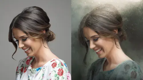
All right I wanna take this moment to talk about overwhelm. These brushes are really overwhelming, there is a lot of data. So here's gonna be my suggestion. We're going to start moving into some color and how the brushes work. It's a lot. All of this is a lot. It's a lot for me, it's a lot for you. My suggestion is, you take these in sections. Watch a little go away, try some stuff out, and then watch a new section. And I would actually really consider them sections. Like okay, we're going to talk about impressionist brushes as a painting tool, not as a blending tool or a mixer tool, but just as a painting tool, and just do this. Give yourself an assignment and try it out and then move on. Come back and do it again. Now these are brand new brushes. I love these brushes. They are absolutely gorgeous. Kyle made them. And what he has done, he's made like a Cezanne look, a French sharp block look, he's got Pissarro, he's got Seurat, and he's really done an amazing job at collecting the loo...
k of these artists. It's just amazing, and in addition to that he's got this analogous color. It will pick up analogous color and we're gonna talk about analogous color and how it does it, and it's simply a setting. The craziest thing about all of this, is that this was always in Photoshop. He just figured out how to do the settings and packaged it up so you didn't have to go through those 17 boxes and figure it out. So they're absolutely amazing, we're gonna go through it. I also want to take a moment to start talking about icons. Do you remember at the beginning we said, there's brushes, there's mixer brushes, there's blender brushes or smudge brushes? In the new Photoshop you're gonna see these icons, and those are gonna help you pick what you want. Now even in the Cezanne brush or the, the impressionist brush in general, look, you got a lot of choices here, and I'm gonna keep saying this all day. When you're doin' a job, pull out what you use and put the rest away. It gets too overwhelming. So let's say that this whole beautiful illustration, and then you wanna come back and match it, well I know I used a Cezanne brush, but which one did I use? You might not know. So save your brushes out, okay? So we're gonna take a look at this color, and we're gonna talk about the analogous color and how it looks, and what we're gonna do on every brush section that we do, I'm gonna use a little illustration, and use those brushes, and you have them on the handouts and those handouts by the way, the companion guide, is actually really high-res, so when you open it up on screen you will see the brush differences and you can actually see the difference and you can take a look at how the impressionist looks versus the oil, and the watercolor. All right so what we're gonna start doing now is we're gonna slow it down a little. And we're actually just gonna do a brush demo. So I'm gonna go through and paint through this and show you how these brushes work and, and what kind of effects you can get using a base photo. Look, it's the bubble brush gal. She's been recycled, become a watercolor. And I think you can do some pretty fun techniques with this. I do want to call your attention to the fact that I've labeled the layers with the brushes. All right, for the most part. You're gonna see there's some notes on there like, oh it's that brush but I've sized it up. I've done that for you guys so that you guys on the handout, you have these brushes. You have all these brushes when you download 'em from Adobe, and you can see which ones I used. And what I've said on 'em is if I've sized 'em up or reduced 'em out, or done whatever. So let's go ahead and take a look. First we're gonna talk about this. So these brushes, when oh, this might be a good time to talk about this. While I'm doing the brush sample, you're gonna find often there is gonna be a, image in the upper right hand corner and because we're painting, what I like to do is I like to actually keep a sample reference so I can grab the color from it as I'm working, and you'll see it in almost every file I have. And I just think it's kind of a handy trick to, to pick what you want. I mean some folks are really comfortable picking out images and colors and me, uh, I need a little help. I need a little help now and again. So, I think what I'm gonna do here is I'm just gonna do a quick demo on some of these brushes and then we're gonna go through and take a look at, at the results. So, on these files what you will see is I've used the Cezanne number two, the Cezanne and the Pissarro, doesn't really matter, I'm just gonna go ahead and put those in a folder. Do you guys know if you shift click on your layers and then click on the Add A Folder icon, it'll automatically put that in a for for you? And I'm just gonna call that old sample. What I do when I'm doing sketching, because as we've discussed a hundred times in this course, I suck at drawing. I just really do, I'm not very good at it. So I like to put a line drawing on top and then I draw underneath it, to put my colors. And this is just a black and white image of a, a star, what do you call it, sunflower, that I just pulled a channel on. To make it a little tight, and I'm just gonna leave it on top as a guide. So let's start painting. So what we're gonna do is start investigating the Cezanne brushes. Now, do you remember I said get rid of all your brushes? Oh, do I have my brushes? Oh you know what, I'm a smart cookie, I have some brushes in here. Oh, I only have some of the brushes in here. Are these good enough? Perhaps. This is the illustration I'm trying to prove, that do you have your brushes segregated, or do you start from the beginning? So in this one I have already picked out what are they, six, eight brushes that I want to use. When you guys come to the impressionist section and you wanna do some work, just close this, just wanna remind you, you have all been, very smart as we've discussed, and you've already loaded up all your brushes. So, as you see in my job folder I have impressionist demo brushes but then I have the entire impressionist catalog. Okay, the entire one, just so I can go, okay, do I want any more? Go back to your brushes. I don't need that one, let's get rid of that one. I do need the fur one, cuz we're gonna talk about fur. We're gonna talk about fur in here later and it's very fun and exciting. All right, look. Now I have all the impressionist brushes if I want to choose from. So when I'm working on the painting section what I like to do is have the full catalog. I keep it closed, and if I need to go back in there I can. Because did I mention overwhelm? It gets a little overwhelming doesn't it? I mean look, you're lookin at a whole sea of brushes. This way you just have a few to look at. I wanna remind you, you can also lower the size of the brushes and you can make this smaller. You can put it on the side screen, you can put it in your little dock, you can put it anywhere you want. I'm just gonna stick it here. I'd like to also take the opportunity to tell you what I have found really handy lately, is because there are a gazillion million thousand brushes I like to keep some default brushes here, because sometimes don't you just want a plain, masking brush, and you've got oh it's a watercolor one, oh it's a fur one, uhhh... This way I just, can easily click on that, and have that default brush ready, ready at my side. All right, let's start painting. Okay. So I'm gonna pick a Cezanne, a standard Cezanne. And boy when they came out with this, this was so exciting. I'm gonna pick a color, option click on the item I have. Here in the upper corner, and I'm gonna start painting. Now, what you're gonna notice, on this brush, is I picked a single color, I picked an orange color, but do you see how it's giving me, a triage, a triage? A triad of colors. It's giving me the whole analogous color spectrum from where I'm at. So it's giving you the color to the left of it, and to the right. I'm gonna pick a new color, I'm gonna pick yellow, over here in the corner, and you see it's doing the exact same thing only now it's doing it for the new color I've selected. All right? Do another one. I'm option clicking to select a new color. Option clicking, keep in mind when you're option clicking it's gonna select everything, so I do have that line up there, the black lines, so if I click on the black line area, it's gonna give me that and you might not want that, especially for this piece. So as we're going, and start over, I wanna talk about why this is giving you this analogous color. So here. Paint that in. Why is it doing it? What has this man done? It's the simplest thing. That's all it is. It's a hue jitter. He's got this setting, that's all it is, it's the craziest thing. When I saw this this brush and I was like, ah it's awesome. I mean don't get me wrong, the tip head is awesome. And what I mean by the tip head is like if you look at what he did, that tip head is really cool. And that's where he's really a master of, of finding the right stroke to get you the file. But let's go back to the brushes, go reset. Cezanne. Do you see what I just did there? Maybe I should discuss that. I went into the brush settings and jacked them all up. I didn't want them all jacked up, I just wanted to see what this tip head was, it's no big deal. You just go back to Cezanne and reclick on the original brush. I haven't saved anything, we're all cool. No panicking. And the cool thing is if you totally mess up these brushes you have them loaded up in your job folder. You can always go back. you haven't ruined anything, you're not crying. Not yet. Anyway, let me just paint down a few more strokes here and go back to the settings. So where this guy has earned his bacon a 100% is he's figured out this. If you just have your hue jitter on, just 11% and he has a brightness jitter of 3% that basically makes an analogous color wheel. Isn't that awesome. I'm wondering if he has a complementary color and if you I've actually played with this before, I put this at 50% and I'm like, okay, well that should make a complimentary color, well it kind of does but it kind of doesn't, because it kind of does too much. If you had complementary colors you'd have red and green, right, but it's doing extra and I don't know why it's going a little further so I throw that out to the internet, I'm sure someone knows how to make this a complementary color brush as well. But it's pretty cool. Now that was the Cezanne. Now do you know, see, and you're not gonna do this, because you're taking this class, you're here with me, you're hearing this, you are not going to leave a layer called paint. You're never gonna do that. You're never gonna do that. What you're gonna do is double click on your name, command c, to copy the name of your brush and you're gonna do Paint and you're gonna do Cezanne so you know. Now as I said, before, these names are a little cuckoo aren't they? It's Kyle's Paint box Cezanne. You don't need to know that, do you? You just need to know it's a Cezanne brush. A little unfortunate thing about this brush right now, this whole brush palette, you cannot do a search for a brush in a brush palette. Say it with me internet, argh! One day, hopefully you'll be able to do that. I know right? Wouldn't that be awesome? Well see, maybe in the next upgrade. So in lieu of that you wanna definitely name your layers. So in that spirit, I'm gonna encourage you guys when you're practicing, do a command shift n, and do the next one. So let's just try the, Seurat. In fact you know what, I'm not gonna do that. I'm gonna pick the brush first, let's go to Monet. Double click on the name. Copy. Make a new layer then, paste it. Why don't we do that, isn't that much better? And let's just do a little experiment real quick. Let's pick that color, and turn Cezanne off. Now Monet, his work was a little more smoothy softy, wasn't it? I'm sure Monet loves that I said his work is smoothy softy. I think he's really appreciating my art history, but isn't that gorgeous? Look at that. It's a beautiful brush, beautiful brush. And let's look at the settings, cuz in this class for as much painting and talking about the brushes, I really want you guys to get a handle on what these brushes do, okay, my goal in life. I know it's thick and it's a little heavy. Now look at these setting here, his hue jitter, he's got a hue jitter on it, but it's slightly less, it's only 10% and the saturation jitter is less, it's 1%, and the brightness jitter is the same. So the Cezanne brush, if you looked at it, it was brighter, wasn't it? And a more extreme difference between the two colors? The Monet is, not only is the brush itself softer, the color shift is softer. I went to school for art history, I did. San Francisco State, I did. I know a little bit about this. Anyway. I just want to share with you that those are the kind of changes but, look at that, it's beautiful. And for someone like me, I gotta tell you, I wish I was good at a brush. And I wish I had the patience to fill a paintbrush with yellow and then splatter it with orange and then splatter it with red on top but I'm not but I can certainly pick a Cezanne brush. And let's take a look at that Cez- that Seurat, excuse me. Photoshop has a pointillism filter, that totally sucks, and now you don't need it. I love Photoshop, you know I say that with love. Because now you can go in and paint with this. Right? So pretty! Am I the only one? Am I the only one thinking oh my god it's so pretty? This actually makes me like Seurat style painting better than the Photoshop pont- have you guys seen it? That pointilizing filter in Photoshop? It's kinda poop. So this way you can create your own work, and let's take a look at why it's doing what it's doing. Now you're starting to get the gist of it I think, right? Hue jitter, even less, it's even less than Monet. It's very subtle, and what's gonna happen on his texture and his transfer, and we're gonna talk about this more later as we go, here's his shape dynamics and he's got texture. He's got texture inside his brush and if you look, look at the stroke. See how splatty it is? Let's go back to the other brush. Let's go back to Cezanne. Look at his. See his aren't splattered away from each other, his are going closer, it's more of a smudgy. And then let's go back to Monet. Do you guys notice I keep picking my brushes from different areas? I just want you to, to constantly realize you can go up here to your toolbar option or you can go to your brush settings and click on that, so where's Monet, where's my friend? So there's a Monet, which one did I use? I just Monet regular. All right. There's, I'm not sure why he didn't call Monet one, then call Monet two, maybe he only thought he was gonna do one, but then he ended up doing a two, who knows. All right. So there's some Monet. So again it's, it's smudgier, but it's still got a little splat to it. Cool? You guys kinda getting the gist of it? Excellent, let's go to another piece. And, um, before I continue I would like to suggest for those who are into practicing, I would suggest you consider doing this. Get a single line art drawing and try every single brush on it, and give it a go, and much like in the filter class we talked about having a file that had brushes, excuse me filters, attached as smart objects so you could see it later. I don't know, it might be handy to hae some palette samples where you actually save a layered file and it's got the brush name on the painting style and you can see it, just as a visual reference for later on. Okay. You can go goodnight. Girl, in a field. All right. So let's check her out for a second. So as I said before, I like to leave a sample in the upper right hand corner. And I wanna talk to you about how I've chosen to go through and do these samples. Again I'm gonna say it for the one thousandth time, I am not an illustrator and I wish I was. I signed up for school to go as an illustrator, and they kindly told me, I should make a different career choice. So what I like to do is, I'm sorry I'm trying to do something while I'm talking to you which is not kind. All right. So I will start with a base image, and then what I like to do is do a line drawing. Now there are filters in Photoshop there are filters in Photoshop that will do line drawings for you, sketch effects and what not. And they're okay, but for me they're not exactly super duper fantastic, so what I have is a third-party action that I purchased for six dollars. I'm gonna pull this drawing out, and it's an action I use, and you can get it on Graphic River and it's called Photo Sketch, and this is gonna take just a second to run. And what it will do, well it might take two seconds cuz this file is a little big. This base file is 86 megs, and yeah I like to work full size, I don't like to work small sorry. The brushes will work differently by the way. They're pixel based, so size matters. However, whatever, if you took an image that was a five megabyte file and use those same brushes on a 80 megabyte file, even though they're both 8x10 inches, the brushes will be totally different, so, if you're doing a series you wanna be consistent on your document size. I'm gonna say that you trust me that this is what this sketch effect does, and I'm gonna cancel out of that. Well, there she is, there she's done. And I used that as a, a file on top so I put her on top of my drawing, very much like that flower we just looked at, and I put it on multiply. And when you put a black and white image on multiply, black hides white reveals. Pardon me, black shows and white disappears, so you're effectively left with a line drawing. So here, let's look at our file construction here. What I have is the original underneath, I have a full white layer I made, and then I started painting. Now. I didn't quite start painting, I lied. What I ended up doing was, I took a copy of the the gal, and I blurred her. Now why did I do that? I did that because I am a 100% not an illustrator. I'm gonna say that again. I am not an illustrator. I'm trying to dock her, hang on a second. Come on my love. There you go. I'm not very good at painting. So I get a little intimidated. I'm presuming perhaps some of you guys might get a little bit intimidated and so what I chose to do was blur the original so I can kind of start smudging on top and painting on top just as a base. I didn't even blur her that much, you could blur her more. I blurred her 25, keep in mind she is a 80 megabyte file, maybe I'll blur her 10 more just for giggles, so I'm really feeling like I'm not cheating. And then what I did is I made a brand new layer and I said, okay start painting find a brush. Because I know I have to change the name. Why do I have to change the name? Cuz I told you, you've got to name them with your paints. So as you see here I started with something called this French Sharp Block. So why don't we go do the same thing? I'm gonna go to my brushes, and I'm gonna go look for that brush that I called French Block, come on sweetie you're right here. I'm gonna take a second to talk about these names. Do you remember I said his names are really long? Not only are his names really long, they're so long that you actually can't see the name of the brush. So why don't we say we love Kyle, and his name can disappear, and let's do it that way. Now I just clicked on the name, made it what I want. I'm gonna copy the name, I'm gonna go back to my layer, I'm gonna name it before I paint. I think some folks at home might think I'm being a little anal retentive here, but I'm telling you, when you get down the road you're gonna have wanted to do this because it's a nightmare otherwise. So all right. Let's start painting. I'm gonna option click to pick a color to start painting and I'm starting to paint. I'm gonna turn her off. Sometimes I will do this when I'm painting. Okay, I got my little cheat, now I'm gonna turn her off. Aw, look how pretty this is. I'd like my guide on and then I can start painting. And then I might turn her back on, cuz I'm cheating, option click to get a new background color, option click, I'm just painting, she's safe underneath. I can turn her off. I can turn her back on. I do this back and forth cuz sometimes I wanna see the original, sometimes I don't. Option click, option click. Do you see when I'm option clicking, how it's changing really quickly what color I do? So just keep repainting. It's painting, right? There's a little delay here, don't worry. I'm not worried about painting over her face, because do, oh sorry, did you see what I did, I actually painted on her layer? It's always good to have a demo where you can show what not to do. Sorry about that gang. History brush is your friend. I'm just going to go back in the history palette. When I realized what I was doing, I was painting on my surface blur layer. So be careful, make sure you're on the right layer. Let's do that again, all right. So I'm just gonna real quickly fill in. You can, if you paint over her face, just option clicking, I'd like some of that little dark bit there, option clicking. If you paint over her face, do you remember what we showed earlier behind? There's that clear. You can go in and say, oh I just wanna get rid of this. And what I'm doing, turn this off so you can see, I'm effectively erasing, with the same brush that I painted in. Can you see how handy that is? That way you don't have to go to an eraser tool, you don't have to mask, you can just use the same brush. Honestly, most underrated layer mode ever. Clear. That's my verdict for the day. All right. So, as you go through and do this, what you then can do is just pick out some different brushes and I kinda want to talk about some of the characteristics I found in the brushes so the next one I used was the Round Robin, and then oop, stop myself, stop yourself stop myself, and we look at the brush. Round Robin. Oh look and it looks like I didn't save the name. That's not a problem because, I'm gonna find it. I realized actually I'm gonna have to admit to something here, are you ready for this? All right. There's a little secret going on out there in this world. Kyle, has been doing these brushes forever. He's been selling his brushes. You can no longer buy his brushes online. He sold his brushes online. He actually had a whole series of real watercolor brushes called Round Robin, all sorts of brushes. So in the names you're gonna see when it says Kyle's real watercolor, Adobe didn't buy those brushes. But he's not selling them anymore. So maybe I shouldn't show you that brush. You can't get it. You can email Kyle, maybe he'll give it to you. But the Kyle's Paintbox, the fat, French fat bristle, and if you can say it 10 times fast I'll give you a dollar, you can use that one. So let's try that one. Did I just tease you with something you can't have? That's like having cake and not offering it to someone else. Oh, don't do it. Don't name the layer first, don't name the layer first! All right, let's look for the fatty, here's the fatty. While you're here, cuz we're all friends, I'm gonna go ahead and get rid of that extra long name. Okay. So, I can tell you for those of you who already own all these brushes, and if you've owned Kyle's Paintbox brushes from before you can still load them in. So for example, that Round Robin that you guys can't have? It's still available if you've already bought it. You can get it somewhere else. So I'm gonna option click on the color here, right here on the surface blur, and then I think it's too small, so I'm gonna go ahead and res it up. And I wanna talk a little bit about the quality of the brushes, so I'm gonna just for a second fill a layer with gray, underneath, and I wanna talk about what's going on here. All right, so you've got some directional shifting, you've got scattering going on, both axes, the lighter I push the lighter the paint. The harder I push, the more the paint. I mean this guy really thought of everything, it's really amazing. So light, hard. Light, hard. And now let's take, why is that happening? All right. So. He's got pen pressure on, he's got directional on, he's got scattering on, as I said both axes, he's got color dynamics on, and all I think you're gonna find every single one of these impressionist brushes are somewhere between eight and 15 on the hue shift. He's got his transfer on, and then once again, pen pressure but ooh, his pen pressure's way up. I'm gonna reduce that to 31, and now I'm gonna put that back up to which is I believe where it is. So perhaps when you all are painting what might be fun, is change one or two of these things. Not, not a hundred of 'em, change one thing. Go in here into shape dynamics and go okay, well what happens if I turn the pen pressure off? And I'm just gonna real quickly delete all this. Let me put the gray back on. I forgot what I turned off. Right here? Awesome. On. Off. I have to tell you, okay there's a big difference there. It jumped, I know you guys can't see how hard I'm pushing, or not, so this is what I would suggest you do. Go in and do a little bit, a little bit, try one thing, try another. But then, okay this isn't very exciting is it? We're just painting blobs. Then say screw it, I'm not gonna worry about the blobs, and then go in and start painting. Make a piece. I'm gonna show you just some, I'm just gonna layer this on and off and show you what I've done. Do you mind if I leave the cheaty one on, the Round Robin? Hope you don't mind. All right. So I started with the French block, cuz that French block is gorgeous. It's like wallpaper painting, really pretty. And then I did a little piece around the edge. I did this block, I actually started with this, with this fat bristle, and then I kinda went, well that wasn't so nice. And rather than erasing it, I just decided to paint on top, and that's what I kinda liked about this process is it's not like oil paint, at some point you're gonna have a big old mess, right. But with Photoshop you can keep painting on it, and it's not all blending. I'm gonna put her, her layer on, just so you can see, her, her guide. And then I did a little natural edge texture on her. Hers is more like a wash. It's just a little wash. On top. And then okay, so maybe I'm not done. Or maybe I want to go back to that setting up top that sample of her, and what I used a natural edged texture. I'm gonna go pick that brush and I'm gonna finish this off. So I'm gonna go up to my brushes I'm gonna find natural edge texture which is right here. Select that brush. I'm gonna go ahead and select the color on her face. And I'm just gonna zoom in real quick on her face. And then zoom out, and slide over. And then just start lightly painting. And do you see how kinda, I don't know kinda watercolory it is? You can paint a little, you can paint a lot, you can go oh that color's terrible, I'm gonna pick the color next to her and paint it back? And just go back and forth. And I hope you find the guide handy, the guide on top, I think it's kinda useful. I'm just gonna paint white. Now I don't normally do this as a retoucher. I'm literally selecting white and painting the color white to get rid of what I did. As a retoucher I'm used to masking that out, you just mask out the mistake and it's kinda like oh no, you gotta figure out a different way of doing it. Now, where I found I got in trouble with this is, I got really excited and I'd be like, oh I wanna start painting a different section, and if I switch brushes I often forgot to switch layers. And I don't know with painting if you need to, I'm on the same brush so I feel like I'm okay with this layer. On a professional job, that might be a little problematic. So, as we've talked about in other classes, the illustrated look, or painted look, is getting really popular with films and gaming, and with magazines, and whatnot. So more and more clients are gonna be asking for this kind of effect. And while I'm sure many of us are gonna wanna have fun and just play, and just do these, play. I have to say I'm always hovering around the professional world and going, okay. If I'm gonna do this and I need to work, how am I gonna reproduce it? So what I wanna stress right now, is not only do I suggest you name your layers, with the brush that you're using but you try to stay consistent with keeping your layers separate and try to do different areas with the same one so that you can follow the technique later and that's only if you're gonna do this on a professional level. Cool?
Class Materials
Bonus Materials with Purchase
Ratings and Reviews
Sean
Knowledgeable Lisa is the best teacher. She makes learning Photoshop fun. Great course. Lisa has a great teaching style. She mixes in a great speech cadence, great voice up and down and pausing, jokes, and is extremely knowledgeable and fun to watch. Awesome course. Really helpful course for getting my feet wet with brushes.
Fotomaker
This is a comprehensive overview of Ps CC Brushes, what they do, how they work and how to control, manage & modify them. I found it extremely useful to learn about the functionality/features that Ps CC brushes can provide even though I'm a photographer and not an illustrator or painter. I will never ever be able to employ everything Lisa explained & demo'd in the class - she covered a wide gamut of info. But she served the purpose, in this class, of being essentially what I'd call an 'idea sparker'. Once you see how she works with brushes and you find out how you can adapt (or create) brush tools to suit your personal artistic style the options for creativity are unlimited. I might re-title this class "Oh the Places Brushes Can Go" (apologies to Dr Seuss and his classic graduation gift book 'Oh, the Places You'll Go...'). Keep in mind a few things about this class (& back away from it and your credit card if you don't note a few key facts...): (1) It is called 'Advanced Techniques' - it is for intermediate to advanced Ps users, not newbies unless you're a child prodigy who picks things up really fast, (2) This is not a 'Paint with Lisa' class - we don't all paint a butterfly like a color by numbers together. Rather we learn about Ps brushes, how they work, what they look like and how to modify them and change their dynamics for different types of artistic/retouching/post-processing uses. Each person will have to experiment - there's no one 'this is it' formula that can be provided, (3) Lisa talks and thinks fast and has a pretty amusing patter too (she's clearly very intelligent!) - so be prepared to hit the Pause button. She repeatedly advises during the class, don't overload your brain with all there is to absorb with regard to Ps Brushes. Take breaks to try the info she shares & see what works for you before going on to a different section of the class. Don't buy this class thinking you'll whizz through it in 15 minutes & figure out how to complete a job you've committed to deliver in 2 hours, (4) There's a large packet of material that comes with a purchase of the class (descriptions, definitions, brush settings, drawing examples, etc.). Item #4 is the only thing I'd ding this class on. While the handout material contains lots of really really useful info it is - sadly - microscopic print. The text is exceedingly difficult for my poor old eyes to read. I value that there's plenty of white space on the pages to write notes as Lisa talks - I've done so prodigiously. But the print in that accompanying brushes class guide needs to be larger. I honestly wish I could enlarge the print in some way (unless it is a PDF that I can alter & I haven't figured it out). If there is a way to re-print with larger type font sizes someone please let me know! Bottom line: I highly recommend this class to more advanced Ps users who want a comprehensive overview of Brushes and working with them. It's definitely not a class for someone who wants a linear, step x step, "do this then do that" type of recipe class. As I've noted above, it's best as a way to learn about richly varied Ps tools you may have only had superficial exposure to previously; and get enough new knowledge to make you dangerous (and, dare I say it, boldly creative!).
Skye Taten
Lisa is the BEST teacher!!!!! Everyone should take this class!!!!!!! This class is utterly phenomenal!!!! Lisa is so knowledgable and so very talented. She is incredibly smart, super funny and so very helpful. This class contains so much valuable information, and at this price it's a complete steal. This class has forever changed my life!!! I'm so happy to have a new skill set. Thank you Lisa from the bottom of all of our hearts you are completely incredible and have touched all of our editing in photoshop lives forever!!!!! You are so very talented thank you so much for sharing your incredible skills and knowledge with us, you are a true beautiful talented soul. xoxo, Skye