Quick Portrait Smooth & Sharpen
Lesson 10 from: From Shoot Through Photo Editing: Wedding Portrait Retouch in Lightroom and PhotoshopPye Jirsa
Quick Portrait Smooth & Sharpen
Lesson 10 from: From Shoot Through Photo Editing: Wedding Portrait Retouch in Lightroom and PhotoshopPye Jirsa
Lessons
Class Introduction
02:07 210 Tips and Techniques for Shooting Wedding Portraits
22:14 3Shoot: Groom Portraits
21:28 4Shoot: Bride Portraits
25:07 5Shoot: Wedding Couple
10:58 6Post Processing Workflow Tips
11:51 7General LR Base Tone Recipes and Batch Processing
27:42 8Cloning and Simple Compositing in Photoshop
13:17Lesson Info
Quick Portrait Smooth & Sharpen
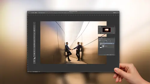
This is our next cheat. Check this out. I'm gonna not save this. I'm gonna close it out. Let's go back to Lightroom. I'm gonna grab this image. Let's go ahead and just do a little bit of a quick edit on this. I don't know what Lightroom is doing. What are you doing right now? Transferring files. It's still tethered transferring. What, what? What is this? You're crazy. Alright. So let's look at this image. I'm gonna go ahead and let's manually process this. So what we're gonna do. I'm gonna brighten up the image. By the way, is it interesting that I like to reduce contrast? Most people are usually boosting contrast. I like to actually reduce. I'll add my contrast back via Tone Curve, via Shadows and Blacks and you can selectively choose where you want Contrast. This guy puts it all over the place. It's a very just kind of unrefined tool. So let's pull back our Highlights. Pull back the Whites a little bit. I'm gonna bring up a little bit of Shadows but now I'm adding the contrast back. ...
I can just target the Blacks and add Contrast with just the Blacks. Look at my histogram filling out. Have so much information here and this all comes back to shooting it right so you have as much information as possible. Okay. Let's grab a White Balance selector tool by pressing W and I like to this little trick where I'll select something that's relatively neutral. The cool thing about the White Balance selector is you don't need to find something that's white. You need to find something that's devoid of color. Okay. A dark suit. Dark suits sometimes have color in them but a charcoal or black suit works. The whites of our eyes have a tint but they're still fairly close. A white wedding dress is fairly close. These will all get you close. So if you click. See how it takes me to a neutral tone. Right away so press W, click. I get to a neutral tone and this is all based on you. This is where you add back in the temperature, the color that you want, right? I like my stuff a little bit warm. So I'm gonna bring it back to around 4400 Kelvin. Okay. I like the tint where it's at. I'm gonna brighten up a little bit. Cool. I'm gonna reduce a little bit of that Clarity just to kind of soften things up. Look at this. We haven't even gotten past this section up here and we're already, if I press before and after, it's already pretty dang good, right? Let's keep going. So I'm gonna hit my Tone Curve. Check this out. We're gonna go ahead and do our Matte Curve. I'm gonna boost a little bit of the Highlights. Pull down the Shadows. Matte finish the bottom end. Add back a little more Blacks. Again, this is targeting the areas that I want Contrast. I want more Contrast in the faces a little bit. Right about there. This is awkward reaching over my Wacom tablet. Just thought I'd say that. In case you were wondering. Okay. Cool. Now I'm gonna do some local adjustments in a second but let's keep moving down. I wanna tackle all these things. Check this out. Grab this little picker, our color picker. Okay. With this selected, if you're in Hue, Saturation or Luminance. So what is Hue changing? Color values. What is Saturation changing? Brightness, I'm sorry. Saturation is changing our actual color like the saturation of that color, right? Luminance is changing the brightness values. So just think of what we want to target. Right now I want to target Saturation. I kind of don't want these blues to be as poppy. I'm just gonna grab them and pull down a little bit. So what I'm doing is I'm toning down his jacket so it's not grabbing visually. When we edit stuff like this, we look into the color scheme of what they're wearing and so forth, and we say, okay, I love the blue suit. I just don't want it to be as blue because it draws a lot of, our eyes naturally get drawn to things like highlights, strong colors, patterns. Those are all visual weights. I want the focus to be on her. So the next visual weight right here is this. See the yellows and the greens in the bouquet, I'm gonna shut those down. We're gonna go to Hue. Now I'm gonna start doing some color grading. This stuff is so much fun. I love this stuff because this is color theory. So what I'm gonna do now is I actually want the entire image to have a sort of warmth to it. So we're gonna get that by shifting the blues more towards the aquas like the green side. We're taking everything to these different directions that are closer together on the color wheel. So everything has more of a matching tone to it. We're gonna take the aquas down. We're gonna bring the greens a little bit more towards the... Check this out. So the blues start dropping towards this teal, right? The greens, if you go to the right, they go to teal. So if I pull the greens to the teal and I bring the blues to the teal, I'm shifting those two tones together. Isn't that cool? So, there we go. Let's do the same thing with the yellows. I'm gonna bring the yellows and the oranges. Or I'm gonna bring all my hues on my oranges and reds all towards the right side, a little bit kind of blending. Okay. We don't really have much purple or magenta in here. Now we can target Luminance and what I can do is put the reds with the oranges. Do you see the skin tones? Look at the skin tones. Look at this. Do you see that? Do you guys see that little shift? So watch. You can shift tone a little bit. Cool. Shift tone, shift tone, shift tone. All we're doing now is adjusting the brightness of skin tones. Cool. Okay. I'm gonna pull down the blues a little bit. I want the blues and the aquas darker. Everything darker. Awesome. Cool. Okay. So this is by the way, a great tool when are you photographing like a mix race couple. Like we have a lot of couples who'll have a Black and a Caucasian person together. When you have different ranges in the skin tones, and this is a situation that everyone's gonna... If you're a portrait photographer, you're gonna be in this situation. This is the magic sauce right here because you can adjust their color values of skin tone and the brightness levels of skin tone. So you're gonna be working a lot in your HSL to blend and to balance things together. Does that kind of make sense? So I bring up that joke because it's not really a joke. You're literally gonna be shooting those scenes. We have tons of mix race couples and that's your tool. Cool. Okay. To tie everything in together, I'm gonna do this. I'm gonna cool the image down just a tiny bit. I'm gonna go down to my Split Toning and I'm gonna add in my warmth into my Highlights. Let's go to 60 and 10. Let's add in that teal into the shadows. I'm gonna go teal but more towards the blue side. Around 240. Let's go 10. Whoops. Scroll back down. There we go. Balance this. What the heck just happened? Undo that. I think I was on temperature still. Okay. Balance this over towards the Highlight side. Perfect. Now go back and adjust your temperature as needed. Okay. This is looking fantastic. Okay let's do a couple targeted adjustments. I'm gonna go ahead and select my adjustment brush. So remember, adjustment brush can do anything. Watch. I'm gonna just take the highlights down. Remember we said skin tone highlights are in the highlight range? So all this does is it targets highlights. I'm just gonna drop this right across the front of his face right there. Okay. Now if the other areas aren't being affected, then all that happens is we get a little bit of a shift. Now if it looks like this area might be more towards the whites 'cause it's so bright. So let's pull down the highlights and the whites a little bit. Okay look at that on and off. You guys see that? The beautiful thing is I'm still working with my mouse right now, and we're still inside of Lightroom right now. We haven't even done anything. If we wanted to do color shifts. Wanted to do everything. Wanted to paint something. We can do that all from this area. Now the last thing I'm gonna do is I'm gonna go ahead and put in a Radial Filter with an Exposure Burn. Let's pull this out. Okay. I'm gonna burn in. Now I'm gonna burn quite a bit but the one thing I'm gonna do is I don't like my burns. You notice how her arm right here is kind of darkening down towards the bottom? I don't like that look over skin. So what I usually do to balance that out is I'll add one additional dodge. So I'll flip this to a .5 dodge and just pull a Graduated Filter up from the bottom. So now we still burn the rest of the image but we kind of just kill that little piece right there. We kind of that natural brightness. So here's our image. Okay. Let's take this into Photoshop. Any questions on what we've done so far? Is the HSL thing not the coolest thing for like balancing skin tones, creating flattering skin tones. It's freaking awesome. So this is from Voice Prince, back when you were doing Content Aware. Does the use of Content Aware, or the healing brush, alter the native pixels enough to affect the printing of larger sizes? Yeah. So what you want to do is, whenever you're doing Content Aware, again we kind of talk back to what you're enlarging to, right? Right. So once we do that it would be a zoom on your screen to like, let's say a 20 by 30 blown up, and then you're still gonna look in that area because just because you have Color Adaptation turned on doesn't mean it's gonna be perfect. It means it's gonna be better, but it doesn't mean it's necessarily perfect. So when you zoom in, if it's like still having issues, you need to do a little bit more healing to make sure the texture and everything looks good. Thank you. Okay. Let's blow your mind. One more time. Cool, so we're inside of Photoshop. I'm gonna press control, zero, command, zero just to make this larger. Larger is better. Okay. So this next tip, what I want to do is I want to show you guys. I got from the left image to the right image without touching anything. That was an action that actually ran. That means that I can do a retouch like that without even touching my photograph. The way that we do this is via Portraiture. What I would do is, I would create an action for this and we have an action. We'll run it over the entire set of images when it's all done. So it's essentially a quick retouch that looks fantastic. Yeah, well, you'll see it. Okay so what we're gonna do. Let me just make sure that I have... Yeah. Good. I actually installed Portraiture on this machine. This isn't my working machine, okay. So, what we're gonna do is let's jump the background to a new layer first. I'm gonna label it just for the sake of this tutorial but I don't generally name it. So I'm just gonna save this as our Portraiture layer. I'm gonna do that with the weird spelling like that. Let's go like little children. Portrait, this is how my daughter and son. There we go. With a back slash. Be sure to name things just like that when you guys are naming. It's important. (laughs) Thumbs up. Okay. So what we're gonna do is, I'm gonna select filter, Imagenomic and Portraiture. (laughs) Portraiture. What this is gonna do is bring up this little filter window. I'm gonna set everything up to the maximum. Okay. Just so you guys can see the effect a little bit easier. I just want detail smoothing basically. I don't need anything else. Let's just do that. Let's turn up the Threshold a little bit. Just so that it's not effecting like literally every single area of the photo. So the threshold is what's gonna control what detail is being enhanced. Now I would recommend, I'm running at like 720p, so I can't really see my screen too well. Zoom in and just make sure you get the right settings. Okay. I'm gonna keep it heavy handed because all we're gonna do is this. Go okay, it's gonna apply that Portraiture to our awesomely named Portraiture layer. Okay, now watch. If we zoom in, do you see how soft it got? Can you guys see that? Okay. So all we do now is back this off to let's say 60%. Watch this. Jump this to a new layer by pressing alt, control, shift, E. We're going to go up to Other, High Pass. You guys heard of High Pass sharpening? Go to a fine radius, just to highlight the detail areas. Press okay. Shift this over to Linear Light. Now look at this. If I hold down alt or option and click the first and the last. Let me zoom in so you guys can see that even better. Whoa! (laughs) Whoa. Let's go to, like, right here. Watch this. Alt or option, click the background layer. Look at this. You want that sharpening layer a little bit reduced. Adjust it down a little bit. Is that not the coolest, quick retouch ever? What we would do is we would say that was an action. We'd batch it. So we would take everything. All you go is File, Automate, Batch. You create an action that did just exactly what we just did. That's fairly simple. I think that a lot of people have taught this week on how to create actions. So I don't want to repeat that. Just create an action, select it right here, choose the folder of images that you want to do it. So, after you export, you just select a folder, run the entire thing. It will automatically smooth and then sharpen. What's cool about this is if you look at the hair detail, most people are like, oh but I loose a lot of detail, right? No. Look at the hair before and the after. Do you see how we increased detail in the hair while also making her skin look more silky, smooth? Cool? Boom. Boom. Speed, people. It's all about the speed.
Class Materials
Bonus Materials with Purchase
Ratings and Reviews
Pamela Richardson
I would absolutely recommend this class. I watched this class by chance on the rebroadcast, since I am not a wedding photographer. However, I learned so much that I was amazed. I do take many many photographs of friends, family, and at events, although my professional speciality is landscape. I will be able to improve my photographs of people substantially thanks to Pye's course, because I learned so much about how to pose subjects, how to work with a variety of backgrounds, lighting, and then the photo editing. I can apply the photo editing to all of my photographs, not just portraits. I really liked Pye's comprehensive explanations of each step that he was demonstrating, for both the portrait session and the photo editing. I really appreciated Pye's clear demonstrations of how images of people can be improved, and am eager to apply his examples to my own work. I appreciated Pye's absolutely outstanding presentation skills, as he had slide show already prepared, with the list of tips and associated mini tips for every step of the process. I learned so much about equipment (such as lighting and flashes), additional software, printing and publishing services, and more. Pye's presentation pace allowed me to make notes and absorb what he was saying. My friends and family will also appreciate my increased skills at retouching photos of them!!!
user-a2f1eb
loved this class! lots of good info and it was great to see a small version of his normal shooting process. He presents it in a very fun and entertaining way making it not just educational but also enjoyable to watch!
Sean
A+ Fantastic course. Quick work flow is a real weakness of mine. Pye did a terrific job. I must admit, sometimes I fail to appreciate the top caliber of talent CreativeLive gets. There are a log of great Instagram photographers that don't make money. CreativeLive gets top tiered working photographers, which is key. I know I'll need to re-watch so I can implement what Pye taught.