Lessons
Day 1
1Class
1:11:27 2Q&A
35:31Day 2
3Basic Introduction
04:30 4Paint and Paint Properties
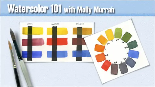
35:33 5Understanding Color
08:06 6Hue: The Color Wheel
14:16Mixing Colors
15:56 8Other Color Terms
17:07 9Light and Shadows
03:14 10Layering and Glazing
06:19 11Homework
07:47 12Q&A
08:15Day 3
13Watercolor Papers
23:36 14Paper Characteristics
34:12 15Watercolor Brushes
19:15 16Basic Brush Techniques
32:32 17Putting It All Together
09:28 18Q&A
07:08Day 4
19Drawing for Painting
1:03:45 20Proportion and Perspective
06:41 21Good Composition
29:16 22Last Class Preparation
05:40 23Q&A
09:10Day 5
24Introduction
06:29 25Creating Textures
19:45 26Other Fun Techniques
33:13 27Reserving Whites and Lifting
53:13 28Things to Remember
21:54Lesson Info
Watercolor Papers
We're in week three I can't believe it we're more than halfway there by the time this class is over it's just goes so fast I just can't believe it so I say this every week, but you can see that I'm a fairly realistic painter it just seems to be where I go when I sit down to paint my mind just sort of vacates and I start moving into the part that I like to do the most and rendering is something I just really, really enjoy, but you truly khun do anything from the most realistic, all the way down to the most abstract in watercolor and everything in between. So no matter what kind of a painter you want to be, this medium is still good for you. I just, you know, I can't encourage it enough now. Last week we talked about color, color and paints, and I found this great quote by hands hoffman, who was who I showed at the very beginning of our slide and he said in nature, light creates color in the picture color creates the light and it's really true out in nature color is completely dependent ...
on the kind of light that's going on at the time, but when you're in the in the studio, no matter what kind of light you're working with, you can create light and your picture by choosing the right colors so keep that in mind they sort of work in reverse in studio and out so this is our five week course? Oh, first of all, I want to say thank daniel smith for sponsoring this class and providing all the art supplies for the in studio participants I you know, we just can't thank you enough it was a natural fit they make the only kind of paints I use and uh they're just a wonderful, wonderful sponsor for this class and we actually have someone from daniel smith in the class so uh there will be times when I turned and asked deb for some information because she knows more about it than I do not watercolor painting though okay week one was our overview of watercolors and just in general the challenges setting up your space your supplies for certain reference links things like that week too was last week we talked pigments, paint properties, the color wheel color terms mixing, layering blazing. All the types of things that you'll hear about want to know about when you work in watercolors this week is paper and brushes and we're going to talk about paper surfaces the different kinds of ways the paper uh characteristics and how they paint uh brushes diff'rent strokes techniques how to get certain edges with your brush next week will be drawing in composition and it will be three different styles of drawing but I'm not going to teach you how to draw I will say this every week you're gonna have to figure out your own style of drawing and uh but I will teach you how to transfer you drawing onto a piece of paper and will use various methods that you could do that with we'll talk about composition, the rules of third's, how you create visual with flow through your painting and lead a viewer's eye down through the painting so that they see the whole place and don't just get stuck on one aspect of it. And then in week five, which we skip a week between week four and week five uh that friday the twenty seventh thie jasmine star workshop is going to be going on so our class will miss the twenty seventh and will return again for the last class on september the third friday september the third and that's the fun week there's hardly any keynote presentation at all. We're just going to be talking techniques and special effects and we'll use masking fluid and salt and we'll learn how to do some different ways of text during and things like that so that's going to be a really fun week so this is our flicker group flicker dot com slash group slash watercolor one or one and these were a couple of things that were posted between last week's class and today's class and this was posted by someone who's handle is a baps man eighty eight and I love what he did with my my palate drawing that I gave you in the exercise files he actually went, found the colors and fill the colors in and I just think this is fabulous that he did that he did such a great job of it and then he did exactly what I do he put it in a plastic container, a plastic protector and taped it on the on the lid of his palate and then on the right he did look of his ten value scale. They're amazing, absolutely amazing. Did a much better job than I think I could have. I mean, really, really good job. So he and his five values is fabulous too. So he just did amazing job. He's working undercover? Yeah. He's a he's a professional artist already, huh? Well, he almost could be from what I've seen so far and these were a couple of others. The one on the left is from seattle. Siouxsie and the one on the right is from j u twenty five and I love what seattle suzy did. I mean, she sort of got all of her tests on one piece of paper and I just thought it was wonderful you know, she played around with her color wheel in there lifts and tested our value scales and did her little mouse ears and I mean, she just, you know, had fun on one big piece of paper, which is really great and I encourage people to paint as soon as you feel like you could move into large paper go for it you know, we're sitting here working on these little eighth sheets or quarter sheets move into your large sizes this sudanese she can yield you'll really enjoy it it's a lot of fun and then jay, you did a color wheel and the only place that I could even see any issue with it and it could be just the way it was photographed also because everybody's got different lighting conditions but where his red would be is still verging mohr on the orange orange side and so there's not a lot of difference between the red, the red orange and the orange and that seems to be an area that everybody has trouble on the warm color wheel. So, um, you know, j u twenty five you are not alone, but anyway, I love to get thes so please post between this week and next friday and and the ones that I think will support the class the best and talking I'll put them up okay, so we're going to talk watercolor papers okay, so I always like to start with a quote. Well, this is me. This is my quote, you can create an unsuccessful painting on good quality paper, but it's close to impossible to create a successful painting on bad quality paper, and I really can't stress that enough. You know, if you're going to spend your money anywhere, I would say, spend it on good paper and you can have the best daniel smith paints in the world. But again, if you're painting on bad paper, those paints will be diminished in how they show on the papers. So get yourself some really good quality paper. So there's, so many papers out there, you know, there's so many papers and they're all different colors. Each one of these is is labelled a white paper, but as you can see, they look very, very different. I mean, the saunders waterford watercolors very, very creamy it's, a very dark sort of creamy eggshell white and, uh, the one in the middle of the, uh, arches watercolor hundred forty pound. I don't always use bright white, but I almost always use cold press, and so that piece of paper is pretty much my favorite paper. The arch is one hundred forty pound cold press, natural white or bright white durable paper probably the number one page paper in the world most everybody uses it, and, um, you can't go wrong with it, but if you're looking for a different kind of a fit like the one on the far right yue po white, one hundred forty four pounds that's the plastic paper that I mentioned last week and it paints like plastic you're painting on a piece of plastic it lifts beautifully, the paint does not soak into the paper, it produces a very characteristic type of stroke. You can hardly miss a u po painted paper, uh, painted painting because the the strokes a very characteristic and I've got a really good sample of it later on don't forget the color of your paper will affect the color in your painting, so if you're painting on a cream color stock you will have even if you use cool colors on top of it, you will have a slightly warmer tent to your painting than if you paint it on the white so there's rough, which is very, very rough paper. It has deep wells for the granule ations of the of the paint to sink into there's cold press often called not, which means it's not rough uh, hot press, which is a very, very smooth white paper uh, and a lot of people love hot press it's a produces a characteristic brushstroke too, and I'll show is so show you a sample of that later and then there's a paper called soft press, which is between cold and hot press and eso it's ah it's not totally smooth but it's not that has a grainy surface either it's somewhere in between sizing is what keeps the paper from being to absorb it like rice paper if you paint on rice paper this paint just the minute you put that paint down, it just soaks right into the paper. The sizing on the paper is what keeps that from happening, and but the amount of sizing on the paper depends on the manufacturers, so I really encourage you to try different papers. The different paperweights are ninety pound one hundred forty pounds, two hundred sixty pound and three hundred pound ninety pound is the one ninety gram weight one hundred and forty pounds is the three hundred gram weight two hundred and sixty pounds three hundred and fifty six gram weight and three hundred pound is six hundred thirty eight gram weight so you can see it's really more than twice as much twice a stick uh paper can be either hand made mold made or machine made and handmade is just like it sounds and you're going to pay more for it but the twin rocker makes a handmade paper that's just luscious, I mean it's just you just feel like you're painting on satin or something? Uh, I've only tried a small sample of it. I've never bought a whole sheet and painted a whole painting with it again because I'm just stuck on the arch is, uh, mold made paper is has a consistency between handmade and machine made machine made is the most predictable it's put through a a machine and every sheet comes out looking like every other sheep mold made paper comm pines a little bit of the consistency of machine made, but with more of the character of hand made. Not every single piece of mold made paper is exactly like every other single piece arches that I use is my old paper and so that's that's what I prefer mold made papers have a smooth or what they call a felt side, and monsieur and machine made papers have a I'm sorry, and they then they have a rougher what they called the mold side, and the reference side is really literally a grating where the paper fibers have been soaked and pressed in between two I don't know what you're platinum's or something like that one of them has a screen on the bottom, and the other one just presses down the paper fibres and that's how you get that look to it uh, texture and color can depend on the manufacturer and let me just read off a few names of some of the manufacturers arches that I use fabbiano kilimanjaro cinelli a lana carell daler round he makes a wonderful paper called the langton prestige saunders waterford strathmore cancer in twin rocker and there are more so if you go into an art supply store and they have a bunch of different samples like the art supply, the daniel smith and bellevue just has all different site kinds of samples of paper mounted on their wall. You can go in and see one that you like and buy a single sheet and go home and take it out and test it. Make sure you always get acid free paper because it's the only kind of paper that will archive well if you don't get acid free paper than the acid in the paper will degrade the quality of the paint. It will literally change the color and that you also need to whenever you're going to frame a painting, you need to absolutely make sure you get acid free backer boards never just frame with a piece of corrugated cardboard has acid in it it will hurt your painting so your mats, your backer boards your paper all acid free really important okay, this is it this is a full sheet size twenty two by thirty the standard matt sizes that go with the third twenty two by thirty are thirty two by forty, thirty by thirty eight and various size openings for your live area. Now you're live area is the part that's cut out in the middle of the mat so you can get those in different sizes like I do a lot of sixteen by twenty paints, but I have maps that have an opening of thirteen and a half by ten and a half, and I have a man that has an opening of fourteen by eleven, so but the outer dimension is still sixteen by twenty, so figure out what your inner dimension is going to be before you do your painting, because you don't want to go out and have to have cut custom mats all the time. It's way too expensive uh, shit paper comes and sheets, pads, blocks and rolls sheets are what I paint on, but you can also get sheets and a spiral bound like our little travel notebook that daniel smith supplied to us and that susan is painting on right now and then it comes in pads. You can get twelve to fifty sheets to a pad, depending on the weight of the paper and that comes in various sizes blocs usually have anywhere from fifteen to fifty sheets and it's glued along the edges but has a a little opening where you can stick in an exacto and cut it off here. I'll show you a block. I have a block paper with me. This is a block. See how the paper? Well, that piece just came in to see how the papers all is all glued on the edge. But right here, you can get your, um, exacto underneath and cut it off and licked it all around. This is great when you're out traveling on the road and you just want to be able to hold a block on your lap and you don't want to have to set up an easel and all that kind of stuff. This works really well for that. Does it also do the job of basically stretching it? Yes, it does. It does. It does, but I will tell you I've painted on several different kinds of blocks, and it just paints differently. I'm not sure why, but it just does. And and I have a slide that actually shows you that coming up, um and then rolls rolls khun b forty four to sixty inches wide and they usually come around ten yards long, something like that thirty feet, these are very economical if you have a big studio space. You khun by roll paper you pay a lot for the role, but you get a lot of sheets of paper out of it if you can figure out a way to cut it yourself in your own studio if you have big enough space um don't forget your hands really must be clean when you're handling your pure watercolor paper because oil marks especially on the pope will transfer and then you go to meet later and you've got a big thumbprint or something on your paper and you can't get rid of it but you can't use alcohol uh on the yue po you probably can I've never never tried it, but I would say I would imagine that on the you poet but it would do a good job of cleaning off the prince I and I don't think that since it's plastic paper I don't think it would do anything to the sizing but you know it's it's just worth experimenting with. So this is a half sheet fifteen by twenty two the standard matt sizes for have sheets are twenty two by twenty eight and twenty by twenty four this is up keep holding my down too long this's a quarter sheet standard matt sizes are sixteen by twenty fourteen by sixteen eleven by fourteen and quarter sheet is the one I paint the most of that uh, you know, with a sixteen by twenty very common. What size that cactus is? Yes. That's the size of the cactus that I brought in. Uh, this is an eight sheet now in our kit and and in a lot of the papers that you got that paper that daniel smith supplied and cut for you that's quarter sheet size we've when I did the exercises, I tore the paper and supplied you with eight sheets. Uh, standard matt sizes for that or twelve by sixteen eleven by fourteen nine by twelve eight by ten that's when you go into the you know ben franklin or someplace like that, they've got all those mats on the side that's usually for some things around a eighth sheet size so let's tear a piece of watercolor paper so that you can understand how that happens. Him only with getting your your paper out. I have a question here. Uh, about aqua board. Are you familiar with that? About what? Aqua board? Yes, I'm I actually am I'm going to show you something painted on aqua board and also one of the pros and cons of using that particular well, aqua board is this is aqua board it's literally on a piece of masonite it's paper mounted on a piece of maize tonight, and jess owed or something, it has a it has a coating on it it's a very it paints very intensely this is a little study I did of my son when he was just a few months old. There we go and you can see how the colors really retain their vibrancy once it's down it's very easy to lift and, uh it it it's it's fun it's kind of fun to paint on again. You don't even have to use a backer board when you paint on aqua board and then you frame it because it's already on something that you know that's hard and fairly thick ladies better nature eighth of an inch thick er on a piece of masonite this is arches, watercolor board, not aqua board but if you see now this woman on the right is I just made her up. I didn't even have anything to look at it, I think actually thinks she looks a little bit like jessica biel, but anyway, you can see the difference in how the paint took to these two paintings. The one on the left of the baby is ever so much more vibrant, the one on the right, the inks and nothing's but the paint's soak into the paper, but a little bit more this one paints mohr like regular watercolor paper than this one does, which is what makes me think that this one has some kind of uh coating on it I actually in the slide that we come up with later I actually have instructions about that that I'll get to when we get there. So so I'm going to tear this piece of watercolor paper so that you can understand the best way to do it. What I do is I figure out which is my right side or which is the side I want to paint on and usually that's the smoother side and in this particular case I don't know if you could see it the arches watermark is right reading down in the lower right hand a corner I don't think you can see it on the camera so that's the side I want to put in first because if I'm going to be tearing and anything is if I have any oil or grease or anything like that on my hands I want this protected while I tear the paper so the side with the watermark is considered to be the side you want to paint on normally normally but not all water marks are on the right side of the paper the right site what I would call the quote unquote right side of the paper is the smooth aside that's the felt side the rougher side is on is usually what you consider the back but again it depends on what effect you're looking for in your painting if you're going to be doing a lot of dry brushing, you might prefer to paint on the rough side of paper because that would enhance the dry brush technique so then what I do is I folded over and I hold it down really well and then I again usually rule of thumb start in the middle you know don't start up here because it's too easy for your paper to sort of get skewed and then I just run my nail from the middle out top to bottom and I used my nails and I burnish that you can also use a burnishing tool I have a wooden burnishing tool at home that I've had for so many years I have had it longer than my son's been around so and he's been around a long time so then you turn it over and you do the same thing again and you keep flipping back and forth from one side to the other until you break the bonds in the paper because these fibers have you know there fibres and you have to break the fibers where you wanted to rip keep doing it until every time you turn it over and fold it it just feels very easy you could tell you khun see how the paper is sort of broken on the edge there I think that should be good enough so that when you want to tear it start a little tear on one side now. I had a dream about this that I just hear when else cute, you know, so wish me luck. You know, you don't want to go too fast and you have to really pay attention. You can feel where you're tearing, you can feel where you are in the tearing process kind of gives you a photo heckled, edged. Exactly. Is there a reason you would tear instead of just? Well, if you just like that, so deck allege, a lot of people paint on paper and then they don't they don't put a mad around the edge, they paint right off the side of the paper, and then they just put this whole thing and mounted usually raised a little bit on top of the bath, rick backer board and that's what they do and I mean, if you don't want to carry yeah, if you don't want to carry scissors around with you or you don't have an exact oh to take with you, you don't want to use a straight edge or anything like that. This is a very easy way to tear your paper. It works really well, just, you know, be careful, do it right, do it the right way, and you'll have an easier time of it every time.
Class Materials
bonus material with purchase
Ratings and Reviews
user-9ba4d8
I would also recommend this class with some hesitation. This course is a broad and sweeping overview of watercolor painting. It is a good reference course and I will probably be treated like a reference book for watercolors. The skills we covered were valuable. It was beneficial to hear about the watercolor artists that Molly enjoyed and to have a list. The exercises were appropriate. I would recommend this course to someone who likes to know all the details of things before getting started. If you are someone that wants to jump right in this may be frustrating. Obviously, I am the latter. A few suggestions from my perspective....limit the product pushing. The references to Daniel Smith were off putting. I will try to avoid purchasing their products at all costs even if they are the best. It was very difficult to get access to the paint colors that she wanted us to have as some of the names are slightly different than what is available to me locally. I have already taken a beginner color watercolor course which I loved!! If I had not taken that course I probably would have been lost here. In that course(also online) we finished a project for every 10 minute lesson. I learned the basic technique's and it was FUN! I wish this class had more projects to practice that can be completed by a beginner and intermediate. Portraits seem like a large undertaking and it would be helpful to build confidence with smaller and simpler projects. I just felt a little discouraged. Molly is very talented and the work she shared was very thoughtful and showed incredible skill! I am very thankful that she took the time to teach the class and share her knowledge.
a Creativelive Student
This course was fabulous. Molly is a great artist/teacher. Her instruction has really unleashed my creativity and given me confidence to create.
jennymak
Looks like a really fun class! I'll take it soon!
Student Work
Related Classes
Mixed Media Art