Lessons
Day 1
1Class
1:11:27 2Q&A
35:31Day 2
3Basic Introduction
04:30 4Paint and Paint Properties
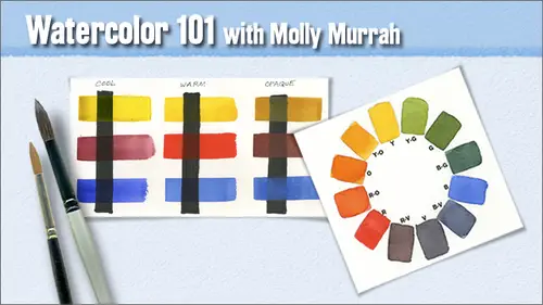
35:33 5Understanding Color
08:06 6Hue: The Color Wheel
14:16Mixing Colors
15:56 8Other Color Terms
17:07 9Light and Shadows
03:14 10Layering and Glazing
06:19 11Homework
07:47 12Q&A
08:15Day 3
13Watercolor Papers
23:36 14Paper Characteristics
34:12 15Watercolor Brushes
19:15 16Basic Brush Techniques
32:32 17Putting It All Together
09:28 18Q&A
07:08Day 4
19Drawing for Painting
1:03:45 20Proportion and Perspective
06:41 21Good Composition
29:16 22Last Class Preparation
05:40 23Q&A
09:10Day 5
24Introduction
06:29 25Creating Textures
19:45 26Other Fun Techniques
33:13 27Reserving Whites and Lifting
53:13 28Things to Remember
21:54Lesson Info
Good Composition
Now we're going to move on to good composition and here is a quote I found an after drawing comes composition a well composed painting is half done and that really is true uh I I've seen so many articles with famous artists who are jurors and shows you know, in these juried shows that are out there everywhere it's how it artist gets their recognition and always when somebody asked them what is it that you look for when you're a juror in a show every one of them puts composition of the top every one of them absolutely crucial and this is from frank webb really well known watercolor artist I loved his stuff composition is the gravity that holds the painting together and it really is so I can't stress enough how important composition is so there's a really well known artist out there watercolor artist named tony couch and he wrote a book called watercolor you could do it and I found this book but very, very helpful when I was starting out and he he talks about seven elements of design one...
of a miss shape and that means that one shape should be so somewhat dominant in your painting because it will hold the interest and shapes if they sort of a repetition of each other in other words, if you have three sunflowers and a painting, don't have them all the same size and don't have a I have an odd, uneven number always try to put three flowers and not to it's just a rule of thumb and painting, and I've seen paintings that don't follow it every time, and some managed to be successful, but the rule of thumb is to usually have an odd number of of objects obliques, air, usually more interesting than straight up and downs or straight lefts and rights. It just depends on what the subject is, they imply movement, and they imply cannon place in reply speed, so that seems to be a little bit more interesting and also try to overlap your shapes don't have two apples just touching each other, just like this, you know, get a little bit of overlap tried it because that's what's going to create your depth and in the dimension that you're looking for, uh, size we talked about that vary the sizes of your objects for greater interest. Uh, when it comes to the line and your painting there's usually some sort of line that runs through the painting, it can be straight or curved, but try to make one style of line more dominant than another direction. Horizontal, vertical diagonal. You want to figure out a way in your composition toe, lead the eye of your viewer. Through the painting you don't want them to get stuck in one place and not go anyplace else, so creating movement in the painting through line direction um is a good thing to do texture try to vary your textures I mean if you can uh it just creates it from a more interesting painting if you do if you could do that now there are certain paintings that don't have that at all and it doesn't make that much difference but texture can add a lot to the design of a painting into whether it's a good composition or not would has ah well think of this you can create texture in various ways you can do it went on dry went on wet dry brush dry on dry wood has a different texture from the surface of an egg so when you're your object that you're trying to paint obviously you're not gonna paint wood on the surface of an egg so create learning how to create your textures will help a lot in uh identifying your objects color try to make sure that you have one dominant temperature in your painting now that doesn't mean that you should have an all blue painting without elements of red or orange in it those elements of red or orange can add a lot of excitement to a painting, but in general one dominant color one temperature color should be uh in every painting and then your values we talked about values a lot they create the visual interest they create the drama they create all the done dimension values are absolutely crucial so you need atleast your five values so this is a painting that I did that that I think pretty much follows those seven elements of design all of the shapes are different although there is a dominant shape in there uh the sizes are all different the line there's a sort of an s curve that starts in the upper left and goes down through the middle and sort of flows off the lower right so there's and then there's another line that that this is actually a cruciform so like it starts up here goes down through the middle, goes off to the right and then there's another line that goes this way and it crosses over across the middle those lines is a cruciform is sort of a classic design shape in composition, shape and painting and it worked here it I put it in and it just worked like an ex. Yeah it's kind of like an x yeah and in different ways and you can angle um and it's never just a you know you could but it's called a cruciform and it's ah you'll see it it'll it'll be president you'll see it in a way a lot of paintings if you start to pay attention to that kind of stuff you can see it uh I know a lot of artists who use that convention in their paintings all the time you're planning that you're thinking yeah, yeah, when I did when I well, when I see something that I want to paint like a photograph that I take or when I'm out there taking my photographs, you know, when I line it up and I go, okay, that's, right? Then I bring it back and I bring it in and I take a look at it and usually these elements that I'm telling you about our in the photograph that I took because that's, what made me want to take that photograph to begin with. So for the most part, especially if you take your own photographs, um, you'll end up with these elements in there because you're going to take the most interesting photographs that you see if you take a photograph that you stand off and you just go oh, well, now what was I thinking of their say, you just took a barn and it's smack dab in the middle of your photograph and you go that doesn't look good then start working with cropping and and if you sometimes you can have a really a shot that doesn't move you at all, but if you take a little a little piece of paper and cut a square or a rectangle in it and just move it around on your shot and you play with it and you go own up that I could paint because you cropped out all of the information that wasn't interesting to you and focused in on what waas so all of these little tools and things like that don't don't just throw stuff away, play with it until you find something more interesting that it that makes you want to paint more. So then there's texture and here, obviously down in the hole bottom portion of this painting down here, this is all salt that's all that salt effect, and I talked about this in the beginning about how that's, very salt is very important to know on timing if you put it in too soon, it it'll just disappear and you won't see it if you put it in too late, it will hardly have any effect at all. So in order to get the effect you're looking for, you have to start start to play around with it. We're going to do some of that in the last class and then color my colors are pretty simple, and here I have a juxtaposition of warm sand cools, but even my blues up in the top have a lot of yellow in them, so this is predominantly obviously a warm painting and then values have got every just about every value in there too so it wasn't that interesting a subject but I think it made for an interesting painting one of my girlfriends bought this painting now tony couch also talks about creating a painting and there's certain things that you just absolutely look for you look for balance in the proper weight of your objects you look for harmony between the painting's elements gradation now and watercolor it's hard not to have gradation you almost always have it in every painting but it adds a lot of visual interest everything that you do variation vary your elements throughout obviously we talked about that very the sizes the shapes the textures keep it from being boring dominance of one element over another we talked about that dominant temperature dominant objects shape unity something that ties the painting altogether if you have a aa red color up here put it someplace else in the painting couple of other places to tie the upper left corner to the lower right and all the way throughout so unity needs to be there and I think this painting sort of does all of that it has like mostly the flower leaf shapes or sort of a dominant it's got the balance of things it's got harmony between colors it has uh variation in there between the sizes of the shapes it's got unity because you there's a line that ties through its got greens in the upper right greens in the lower left so this sort of seems tohave all of those elements in it and I really like this painting this painting that bowl down at the bottom that holds the flowers was about three feet away in the photograph, but I liked the leaf shapes on the right and then I liked the container with the flowers in it, so what I did was I went in with an exacto and I literally cut around the flowers and the bowl and I moved it over on the painting next to the leaf shapes and taped it down and that's what I painted so my photograph didn't start out great, but by the time I rearranged it and played with it, I got something that I like well, I have a question from a chat room um one person was asking about leading your eye off the page is that something in composition that you want to try toe void or is that ok? Well, we I'm actually getting to that little bit later in the presentation there there is some interesting ways to play around with that that actually create very interesting paintings and I don't I don't necessarily think it's a bad idea and well before we get to the end of this presentation will be talking about it so put your center of interest off center now this is a portrait of a little girl I know well a photograph of a little girl I know and she's adorable and I thought no one that's acute photograph she looks really, really cute butt what are you saying? What are you trying to say and are you trying to create some drama? And I thought, well, you know she's too centered I don't like that that's too boring so look at how much more of an interesting painting it is it will be when you crop it differently and she's looking off the paper now I could have moved her over to the right so that she was looking back into the middle but I liked the diagonal that her shoulder in the light and everything on her shoulder created so I moved her and had her staring off the paper so that's not a normal convention but I think this will make for a very much more interesting painting then to do it just her plopped in the center like that. I seem to recall some of the ted nettle paintings that you'd shown in the past classes where they're cropped really interesting they definitely pushed your eye off the paper yeah, I mean ted not all did up did a painting once where where let's go over hit the person was here okay? He was on the first half on the right hand side looking off this way and this was all just plain background here and what he did to balance to create the balance in the painting was he just went in with a square brush and he painted like just a square on the wall behind the guy so there was a square here and the guy's head here looking off that way anyone a major major award with that painting you showed us that yeah, I did I showed it to you in the first class so if you want to create highlights around thing is to highlight certain areas you could do it with more contrast, you could do it with bigger shapes you could put more color in it you khun gray out around it often ted not all in order to make it's his figures pop forward will do these very neutral tone backgrounds sometimes he'll paint a warm color background and then they'll paint over it glaze over it and cool and then he'll let that dry and he'll go back and glaze over it warm and he'll go back and forth between warm and cool cold colors in five or six glazes until one of them goes okay that's it that's what I want that's what I'm looking for um play display so these air to guidelines for your centres of interest the one on the left here is called the rule of thirds and what you do is you take your paper and you figure out you do three sections top to bottom and three sections left to right and where those sections intersect, where I show the gray circles that's where you put your center of interest never smack dab in the center but those are the but sort of primary places that your focus should go in your painting that's called the rule of thirds. Now this is another compositional element that is, uh, works again on the diagonals and where the circles are there would be where you put your centres of interest. Now they're like the one up at the top is still centered left to right, but it's not centered top to bottom and vice versa either one of these uh, sort of classic layouts we'll come up with the painting that has some visual interest in it, especially if you create a composition around it and around your center of interest in that position that works well. However, sometimes centering can work like this is a painting I did, and I just put that base smack dab in the center down at the bottom and all of the all of the weight all of everything is right in the middle of the painting now I saved it by running all of those elements off the paper that's how you khun you can counter act the centering of something by shoving the weight off in a different direction in certain ways. But this painting turned out to be one of my favorite paintings. And, uh, and, you know, I didn't mind it. The fact that the vase is centered was not a huge issue for me. It kind of worked here often times you'll see beginning painters, uh, you know, they just take up, they try to do a portrait of their granddaughter and it's just a head smack dab in the middle of the paint paper that if you see something like that, you're probably looking at somebody who just started painting. So paint objects off the paper edges this's a black and white study I did of my son about, I don't know six, seven years ago. And, uh, I mean, he it was from a photograph that was already cropped like this, but this cropping was just very interesting to me. I mean, you know, he has no head, but I loved the diagonal. I loved the way he was. He again is sort of looking off the paper. This made a very interesting little portrait study to me and is another thing you don't want to do is you don't and I talked about this before you don't want to but objects up either write to each other or right to the edge of the paper you don't want to do a perfect ball that the edge of the ball touches thie edge of the image you want to run it off a little bit keep your four grand simple this is uh a biggie whatever you want your center of interest to be you don't want your foreground if you're talking dimensional painting you don't want your foreground to compete with it because you're four grand has a tendency to take over anyway so if your center of interest is back in the background like the sunset waas I didn't want anything in the foreground to compete with it so keep your foreground simple place your horizon above or below the centre line never ever just do a horizon line right in the middle now I have seen paintings done that way and some of them have been pretty successful but if they were successful on ly because there were other things that were so dominant of interest in the painting that it took your attention away from it but you don't want your horizon to be to cut your paper in half it's not a good it's just really not a good thing to do so try to follow your rule of thirds you know my horizon line here is about a third of crop closer than you would think you know let your objects run off the paper also there's something pretty interesting about this if you take a look at this painting up here because I cut just the tip of this off when I went in to do the background I didn't have to do this entire background all at one time I could wet this area and do this part then wet this area and do that part and sometimes when you're doing backgrounds on paintings they're awful big and if you're doing a wedding toe wet approach if you have to paint an entire background because you've left a nen tch around the top it's difficult to do so it it's it's just easier to paint this way too helps a lot when you're getting rammed to painting your image okay now this is an exercise where I'm going to ask people to crop drawings in a different way and this is where I'm going to talk about cropping and a different way than you would expect to be this would be a photograph that somebody just took oh there's a bird let's put the bird in the middle of the photograph so this is would be what I would call that sort of beginners dead center problem you know where the center of men choose to smack dab in the middle so what I did this is how I cropped this image now the last time I cropped this image, I did it in a completely different way. Adam, if we can have an overhead on this, it would be great this is how we cropped it last time and this is where the bird was sort of more classically looking into the center of the of the image, but this time I wanted to do it the other way, so this is the way we cropped it this time, so let's just do a little drawing just a real quick little drawing and do this really quick. I mean, don't take a lot of time doing this just don't eat. I wouldn't even put in your points of reference just start drawing somewhere and try to get that's this bird on this paper, I think people will be able to see that, so I'm just going to start right up here gonna go down. I like to put my reference points in as I draw along so there's a sort of bend so there and go for years so I'm I'm up on the back of the bird's head down over his beak I'm too far over there, I probably shouldn't even a race because it doesn't make one bit of difference now we're not putting down any reference points or anything, and yet just having the grid just having the lines can give you a great indication of where you need to draw where you need to put your pencil and if you learn your coordination between your eye and how fast you move your pencil on the paper you can get to the point where you're hardly even looking at your paper when you draw you're looking almost exclusively at your at your image that you're trying to execute and it gives a lot of character to your drawing I think hey girls doing okay body short tail yeah his head's too big I love to draw I don't do enough of it every single night I should sit and sketch you know, just sketch my tv or the books on the table or if you get into the habit of doing that on any kind of regular basis I mean your drawing skills will improve so fast it you'll just amaze yourself start drawing your feet again yeah you're not nearly as pretty now as they were back then. Now this is not perfect at all but like I say it really doesn't make one bit of difference I would really say that about the only thing that it really makes a big difference in whether you render it perfectly or not is um in portrait painting that's about the only thing I can think of that would make a huge difference in whether it's rendered just right so what I'd like the online class to do is to take this image and crop it differently. Crop it even differently from the way I did. If you want to crop it the way we did last time, go ahead and do that painted, maybe try to paint it in the sort of ah, see peotone kind of thing rather than, uh, full color like this is this is a sweet little image, sweet little bird, he's worth giving it a shot, maybe changed from a cardinal to ah, luce. Okay, now, one thing, I probably would do the thing that's so I find so interesting about this bird, is that the are the highlights and shadows on his feathers, so I would probably indicate those would go in and put in this marking, and I would probably go in and indicate those for sure, because they're very distinctive and will make for a much more interesting painting if they're in there. Okay, not bad. A little drawing either. And see how fast you can do that. You can do well, fast. It can be done. Okay. Okay. That's, that's better, I guess. But I mean, yet it and like I say, it doesn't have to be perfect, and then I didn't even bother putting in the the the greenery in the background or anything like that because you go in and do that with the paint later, and I would probably even go in and raise some of these lines. I mean, some of my didn't even put in. I mean, I didn't even finish. We're drawing in the rest of this because it's just not yet, you know, it's not necessary, because you can go in and do that with just with your paint later. Why do you worry about how hard your pencil touches the paper? Well, darker lines are well, it. Remember what I said. Let me see if I can show it. I'm gonna put some really dark lines over here. Okay, see how dark those are you, khun, take your needed a racer, flatten it out and put it down on top of those lines and left most of it out. See how the bottom parts of those lines a real dark, but the tops are very faint. So even if you get dark lines in there like this is kind of dark right here we'll let you khun go in and lift thes lines out by just putting your kneaded eraser down on top of the paper. But again, I like to see drawing in paintings, and so if you, if you develop an interesting drawing style. If you develop a drawing style that has character to it, it adds to the painting, and so you don't want it to disappear. You really don't their artist there one wonderful watercolor artists out there who paid a watercolor and then go in with a black liner, uh, like a rapid, a graft, an outline, every shape in the painting, every shape in the painting, the outline. And that makes a very interesting painting, too. It's. Just what you what, what would be your personal preference, where you don't do any shading with pencil? No, no, you do your shading with your paint.
Class Materials
bonus material with purchase
Ratings and Reviews
user-9ba4d8
I would also recommend this class with some hesitation. This course is a broad and sweeping overview of watercolor painting. It is a good reference course and I will probably be treated like a reference book for watercolors. The skills we covered were valuable. It was beneficial to hear about the watercolor artists that Molly enjoyed and to have a list. The exercises were appropriate. I would recommend this course to someone who likes to know all the details of things before getting started. If you are someone that wants to jump right in this may be frustrating. Obviously, I am the latter. A few suggestions from my perspective....limit the product pushing. The references to Daniel Smith were off putting. I will try to avoid purchasing their products at all costs even if they are the best. It was very difficult to get access to the paint colors that she wanted us to have as some of the names are slightly different than what is available to me locally. I have already taken a beginner color watercolor course which I loved!! If I had not taken that course I probably would have been lost here. In that course(also online) we finished a project for every 10 minute lesson. I learned the basic technique's and it was FUN! I wish this class had more projects to practice that can be completed by a beginner and intermediate. Portraits seem like a large undertaking and it would be helpful to build confidence with smaller and simpler projects. I just felt a little discouraged. Molly is very talented and the work she shared was very thoughtful and showed incredible skill! I am very thankful that she took the time to teach the class and share her knowledge.
a Creativelive Student
This course was fabulous. Molly is a great artist/teacher. Her instruction has really unleashed my creativity and given me confidence to create.
jennymak
Looks like a really fun class! I'll take it soon!
Student Work
Related Classes
Mixed Media Art