Lessons
Day 1
1Class
1:11:27 2Q&A
35:31Day 2
3Basic Introduction
04:30 4Paint and Paint Properties
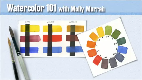
35:33 5Understanding Color
08:06 6Hue: The Color Wheel
14:16Mixing Colors
15:56 8Other Color Terms
17:07 9Light and Shadows
03:14 10Layering and Glazing
06:19 11Homework
07:47 12Q&A
08:15Day 3
13Watercolor Papers
23:36 14Paper Characteristics
34:12 15Watercolor Brushes
19:15 16Basic Brush Techniques
32:32 17Putting It All Together
09:28 18Q&A
07:08Day 4
19Drawing for Painting
1:03:45 20Proportion and Perspective
06:41 21Good Composition
29:16 22Last Class Preparation
05:40 23Q&A
09:10Day 5
24Introduction
06:29 25Creating Textures
19:45 26Other Fun Techniques
33:13 27Reserving Whites and Lifting
53:13 28Things to Remember
21:54Lesson Info
Class
Well, good morning, everybody. I'm so excited to be here doing this the second time we had such a blast the first time and I made new friends and I've been keeping up with them, and the facebook and twitter and flicker even has an account with where people have been doing paintings every week and posting them and it's just been a lot of fun. I've really, really enjoyed it. So this is our overview class. This is, uh, one a watercolor wanna one week one, and as you can see, I'm a fairly realistic painter. I tend to paint things as I see them. My my challenge always is to bring in light and bring in dimension and try to put some life into my subject. And if I feel if I have done those three things, I feel like I've been successful and that if you do those three things, whether you're a realistic painter or an abstract painter, I think you've been pretty successful in your job. I always try to find some sort of quote that explains what what I'm doing here, and one of the things that I orig...
inally started out when I designed this class was I was thinking that the creative, live audience is pretty much a digital audience and so I wanted to explain that there are joys in life from doing things with your own brain in your own hands and so I found this quote with the most proven primitive means the artists create something which the most ingenious and efficient technology will never be able to create and I believe that's true uh jason hoppy and I did a painting face off between photo shop cs five and me painting oranges side by side and at the end of it I still like my orange is the best so what can I say so this is our five week course and this is the overview in the over get view will talk about why watercolors is so exciting we're going to talk about the challenges that you will face when you do watercolors setting up your space your supplies that kind of thing references artist links in week two we talkabout pigment it's paint properties color wheel color terms mixing layering glazing these are all terms that you will come to know if you stay it within watercolor week three is paper and brushes we talk about paper surfaces the various kinds of brushes how to do different kinds of strokes certain techniques how to get stroke edges from your brushes and in week for its uh drawing and composition and I'm not going to teach drawing it's I'm going to be explaining several different ways that you khun transfer your drawing to your paper so that you can get an image on the paper and begin to paint it and uh we'll talk explain to you about how to use a grid, the rules for composition, visual flow, that kind of thing and week five is the fun stuff that's where we're going to do techniques were goingto throw salt and use masking fluid and figure out ways to get various textures and special effects and things like that and that really is a fun week. We had a blast in that class last time, so my watercolors well, I just think watercolors is are there just a magical medium? Certain effects are unique to watercolors that not even acrylics khun match and krilic zahra fluid medium also and even oils khun b a fluid medium if you if you thin them down with the right materials but there's just something about water and watercolors there's certain things you could do with just plain water when you drop him into wet watercolor paints that you didn't just don't see happen in other places and in this particular shot you could see all kinds of things you can see wedding toe wet you can see uh, very hard sort of strokes with a calligraphy bush you khun sea water the color the paint scratched out of the background with the end of a paintbrush they're all sorts of techniques in this and there's a little bit of everything in here and I think this bank painting just turned out real will now with watercolors I believe you view life in new and exciting ways uh just becoming a painter in general I think does that for you uh you bring a painter's eye to life wherever you go and like I said the first time I took did this class that I put a little camera little digital camera in my purse and I take it with me everywhere I go now and if I see something that moves me then you know I take out take out my camera and take a picture of it but seeing life in new and exciting ways I explain the first time when I made this painting who would have ever thought that putting bright red into an eye would be a good thing to do? And yet to me the bright red in this person's eyes are what make her eyes so magical and so interesting to look at it's not real you normally don't see that but you can make things up in watercolor and those things that you make up are often the most significant parts of your painting painting helps in other areas of life now I know this is a pretty generic statement but it's improved my thinking because when you put a painting together you have to you think of strategy you have to think of your composition you try for the most part to plan your colors ahead of time you have to think about lights and darks and making sure you put in all of the values that you need to create for little drama and the painting you have to think about the light whether it's warm light or cool light and so it just helps in other areas of life because all of these skills are skills that I bring to my work their skills that I bring to my friendships their skills that I bring to my home life it helps in all of those areas you start noticing things that just create a richer experience of life I believe it's that certainly what happened to me so what's so exciting about watercolors, transparency and luminosity of the paint is amazing in watercolors because it's a transparent medium for the most part and you put down layers of paint and you can see through them from the top player all the way down to the bottom layer and that creates a visual experience that's very very rich take a look in these white areas of the painting that's actually the paper shining back through and then the other colors air layered on top of it and it creates a very, very luminous you know type of painting and I don't I don't think any other medium is better at it at doing this than watercolors, watercolors move, flow and mingle. Um, the williams can be deluded, deluded, but water is the magic ingredient. That's what what I said previously you can mix water in acrylics, but they really need to have a medium and, um otherwise they sort of shrink and contract and sometimes they can crack and and water I was explaining before the class you khun drop plain water into a wet water color background and create very effective blooms, and it pushes the paint out of the way. It's just it's just amazing and I find water colors on this painting here, down in that lower area where you see the mist and the fog. I just went in with a brush and created some textures in the background to see if I could get a mountain going without doing much work. And then I dropped in some color and it bled, and you can see the blooms up there in the upper right of the mountain and down below. In the foggy areas. I just dropped pure clean water and it pushed the other paint out of the way and kept the bleeding the, uh blended edges and it just created exactly what I was looking for, so the unique qualities of the pigments are are also really exciting about watercolors. There are transparent pains there are semi transparent opaque staining and granulated paints and you use all of these different pains at different times to create different effects on this painting in the upper right hand corner the paint's up there granulated so you get some texture you get some dark spots and some light spots and you get some real texture down in the middle between the two flowers on the bottom that sort of awkward green color that sustaining paint that's one what they it's a combination of halo blue and yellow green and that is a very deep deep rich combination of paint and halos are your darkest colors you need to have some sort of they low on your palette if you want to get really good rich dark colors without making mud out of uh heavier colors and heavy your pain's there completely transparent paints in here there are semi transparent pains just about all five of the of the types of paints that I mentioned are in this painting you can get depth and dimension with water colors that I think it's just really extraordinary and that's because of the luminosity of the paint and the fact that you can paint layer on top of layer and as you paint layer on top of layer especially if you use the right colors warms will bring I objects to the foreground cools will move objects to the background and you do that with blazing and you get depth and dimension that I think is unparalleled see how those pairs just pop forward and then everything of the in the background looks like it's in the background. It's cooler, it's, darker and there's some depth in there you can build your values with glazing also, I mean, you khun glaze as many times since you want to, as long as you use the right paints to do it now they're a unique painting processes in water color, you can paint dry on dry, which is almost straight paint out of the tube on dry paper, you can use straight out of the two paint and put it on wet paper, and when you do that, you get some very you'll get a very heavy concentration of color in the middle, and then it'll just sort of bleed out, you know, it'll be it's very interesting what can happen there you, khun do wet on dry, which is very, very common way paint the leaves I was painting in the beginning were basically went wet paint on dry paper and you can paint wet in tow wet, and I've got an example of painting that I did later that's strictly went into wet I mean, the whole thing was went into it, so, um, and then there are certain specialty and treated papers there's something called u po which is a plastic paper. You could do a treated paper technique where you take watercolor paper and you coat it with some sort of acrylic gel medium or some court ordered acrylic glass medium and it creates a paper that operates like plastic paper because none of the paints soaks into the paper surface itself and can be wiped away with a brush so that you can almost get back to straight pure white this painting has a little bit of everything in it is well it's got wet in tow wet it certainly has went into dry the leaves of the flowers were wedding to dry sort of painted each leaf individually and then put in the darker areas while that was still wet down in the water at the lower right hand corner of the flower I dropped in salt to get some of that texture. You do that when the waters at a certain surface tension on the paper this painting has a little bit of everything in it. Okay, so this is the painting that I was just mentioning I just finished this painting it's not done this is just stage one in the painting I'm putting in three stages for you to see every single thing that I did in this painting I did with with pouring paint out of out of a paper cup so this is the first pouring this is what it looked like after I poured it first now I don't know if you can see but I did a drawing in the background and what I did was I figured out where my light areas my medium areas, my medium dark areas and my dark dark areas we're going to go and then I drew just a simple line outline and once that was done I completely wet the paper and started pouring the pain I didn't blot out any but what I did was in the second stage see everything on her face and shoulder that's in yellow I don't know you can even see the light sort of reflecting off of her off of her shoulder that's masking fluid so I went in with masking fluid and I covered all the areas that I wanted to be really, really light and then I poured paint again and this was a second, second and actually a third pouring then after this you have to let it dry completely in between you can't put masking fluid on top of wet paper but you have to let it dry completely in between then I went in I put more masking fluid to cover up the areas that I wanted to remain medium in tone and then I poured my next siri's of pains and this is the final painting now when I was on stage two of this painting and everything was sort of red and gold and orange I really didn't know I was going to end up with this but I knew I wanted it to be more on the cool side and I wanted her highlights to bounce off on the warm side so I just kept pouring more blues and more cools and and, uh I'm very happy with this painting I had no idea what this painting was gonna look like when I started absolutely none not magic yeah, but that's the magic so those are the things about watercolor that I find so exciting and hopefully you due to I I think it's an amazing medium so now we go to the challenges of this meeting and there is certainly plenty of those some people really have trouble with the lack of control. I mean, if you put your paint in too soon and your background hasn't dried you go oh boy that's not what I wanted to happen and you really have to it takes a lot of practice to get used to what what surface temp temperature and the tension of water you have on your paper to know when to add color and when not to in this particular painting all of those dark clouds I put in too soon and they really bled out and and and I don't know I just went oh boy that's not the effect I wanted but once I let it sit and dry I went back and looked at it and I went well, you know that's not so bad I don't mind that and so I left it and it just worked out for me I decided to turn a problem into something that was okay accidents happen and in this painting which I did in an hour and I did not have a photograph to look at I just sort of made this one up out of my head and I was painting went into wet and I went the whole sky background or at least I thought I did but where the biggest blocks of white clouds are I didn't get the paper wet and I was painting so fast I didn't notice it so then when I went in and dropped in the blues and purples, there were certain areas where the paint bled up to it but then didn't cover up the the painted area and I went well that's not what I was looking for either, but then I thought, well, I'll just take a tissue and I'll blocked some of the paint out and I ended up with those great clouds and this sky is actually one of my favorite skies and yet it was a complete accident timing is everything and this is really true uh this particular painting I did something that a lot of artists don't necessarily do. I painted all of the foreground flowers and left all of the background completely white. Then I used something called miss get film, which is like a plastic paper with a little bit of ah adhesive on the back of it and I cut out well, I drew on it, the shapes of the flowers and everything like that and I cut that out and I put that down and pressed it down and then I sealed off the edges with masking fluid because this ah miss kit paper doesn't really stick too well, but I sealed off the edges, so I completely masked out the flowers and got them out of the way. Then I was able to go in and completely soaking so wet the background and drop in the colors at the top and dropping the colors at the bottom, but I also knew that I wanted some real texture in there and so right when the timing worked out just right for this, I dropped in salt and that's how you get the model texture down at the bottom, the salt will soak up the paint around the crystals of the salt and you can use several different kinds of salt because they all have different effects and that's something that we're going to play around with in the last week so another challenges problems can really be very obvious in watercolor because it is a transparent medium and that's what scares most people that's certainly what scared me to death about it for years I mean, I wanted to paint in watercolors but I was really scared about it, so I don't know if you can look on the upper portion the upper top third of this painting or of the screen shot anyway, that whole area up there I painted it six times I scrubbed it out five times and painted it six times and it shows if you take a look at the mast in the upper right hand corner is very, very fuzzy you can't paint on watercolor paper six times without completely removing the sizing. So what you have to do is you have to paint it and then you have to let it completely dry and then you go in and you scrub it out with a scrubber or in this case I used to toothbrush you scrub out the paint, then you let it completely dry and then you go in and paint again and I did this a number of times until I finally got to a background that I was okay with and I am okay with it but the problems are obvious when you get up and look at it close, you can see it overworking the paint's. Okay, so every time I see this painting, I cringe. This is a painting that was done, my son, a few years ago, and I just overworked and overworked and overworked, and I had this photograph that had that tree in the background. And so I went, well, the trees there, I have to put it in my painting, so I put it in, and I just didn't think about it. I just went in a painted and overworked and got much, and then I decide, okay, I don't like this, so I said to decide and I thought about it, and then I went back to it a few months later and painted it again and that's what? I ended up the second time. So it's, it's, it's, it's a process. I I painted several paintings more than once, especially in my first class with my teacher, we always painted every painting four times before we actually went well three times before we end to actually went to the fourth version, which was the full color version, and it teaches you a lot about your subject to paint it that many times, if possible, to avoid mud, mix your paints on the paper as opposed to on your palette if you start mixing on your palette and you put in one color here and then add another. And then you add a third and then still not right. You add a fourth, you you run the risk of really muddying up your colors and and making the light refraction inside the paint. Ah ah, very high number. And then that means that the light from the paper doesn't refract back to your eye. And it's just changes things. So try to mix on the paper if at all possible, if you can. Now I said also, I this is my biggest challenge, and I still don't do it. Well, I do it, okay, but I don't do it well because and michelle, you relate to relate to this as a graphic designer. Also, as graphic designers were trained to mix colors perfectly. So we sit there and go ok, I see this color that's ten percent scion and thirty five percent magenta and seventy yellow and and we're trained with our eyes to mix things perfectly. But if I mix colors perfectly on the palate and I put them on my painting, they will, uh, dry forty to fifty percent lighter. And then you go back and go. Oh, I have to paint over that again and and I do this in every single painting. Now I've had a teacher who is just magnificent and putting colors down perfectly the first time she never goes back in and paints on top of something that she's painted once uh she's a more representational painter than I am but she's magnificent and I have a slight of some of her work in here I have I have decided to start trying to reap green I knew my attitude about myself is a painter and say well I'm a glaser I'm somebody who plays his paintings a lot and because I have the line control I can do that without turning it into a complete mess although in the beginning when I started painting if you take a look at this every single square inch of this painting has was painted three four times and it looks it it's a mess and I didn't know what I was doing then I wasn't I hadn't defined my style at all I was trying to be more representational but but it's kind of a messy painting and uh and it was because I didn't mix my colors properly okay so unintentional results and I found a quote that that uh where was my quote from bob ross I found a quote from bob ross that I thought was just really great and it was what did I do with it he said there are no happy accidents I mean no he said there are no accidents just happy accidents and he is true here it is. We don't make mistakes here. We just have happy accidents. And that was a bob ross quote. So this was a painting that I started out. I didn't even draw this man's face. Well, this isn't the painting. This is the photograph I was using, I did not draw this man's face. I wanted to see if I could just paint him directly on the paper, and I was specifically wanted to see if I could capture his skin tone. So I started painting and, you know, I'm going along in about halfway through, I realized it wasn't working at all, and I thought, well, I'll just keep on going, you know, who knows what I'm going to end up with and that's what I ended up with, which, you know, just what can I say? It doesn't look anything like him, and but you know what? This is a cute little painting, and I like it, and I ended up with something that I was pleased with. So, uh, you never know, and you have to be willing to take what you get so let's talk about setting up your workspace. I built a studio into my graphic design office and I had the top made in the l shaped and then I went out and just bought very inexpensive cabinets to put underneath and it's just very, very important to have good space to paint that has a good energy to it. For years I painted on my dining room table, and that was not conducive to painting because I had to. Every time I stopped painting, I had to put everything away. Otherwise I had a cat who drank toxic water full of paint, so, you know, it was just it was not easy flow for me to get in there, and now I'll start painting and I'll be painting and I'll get tired and I want to go get something to eat and I'll go in the living room and I'll sit down, I'll come back forty five minutes later and I'll pick right up where I would left off. It is very, very nice to have a space that you dedicate to your art and this is my easy to use painting area in the middle there the wood is a small table easel, and most of the time I paint flat, but a lot of the times when I want things to be wed on wet and I want things too, run down and bleed, sometimes I even like like the girl in the beginning of the of the presentation, I call it red because she has bright red hair, she had all these drips and things dead coming down her front and I wanted those drips, I liked him, so you know, I painted that up it and angle off to the left is my collection of brushes off to the right is the palate that I use, which seemed to be a you know of great interest to people when in the first class. So I actually have in the exercise classes for a week to which people can download pretty soon I actually have the layout of my palette and the paints that I have on my palate and these air paints that I love and I'm comfortable with because I started out over the years using one, teachers set of paints. Then I went to another teacher's set of paints than I took from another teacher, and she had her own set of paints, and so I've ended up with a collection of colors that I like and that I use a lot. And so I've put a slide in the er exercise files that explain what I have in my palate. Make sure you have a water container, paper towels you need spray bottles, there's a bottle of masking fluid there that little blue bottle in the upper right hand corner masking fluid of a variety of tools in the background. These are the things you need close at hand in order to uh you know, paint and have everything near you that you need then I also had good storage built and these were very, very inexpensive I had tops made I had very, very cheap those white units on the bottom I made out of just really, really rough um plywood and painted him and you know and then I add a good light I have good light in the studio and one windows five feet wide and the other one's eight feet wide and so that getsem good light in there and a floor that you can wash that's kind of important too. So let's talk about your basic tools your paper is one thing that I would really advise you not to scrimp on because you can paint a great painting but if you paint a great painting on bad paper you will not end up with a great painting. I mean you can put all the skill in the world in world into it but the painting paper really really makes a difference. It takes the paint differently, you can get streaks if you want things to run and bleed together your paper can impede that from happening it depends on your style I mean there's some papers out there like hot press is not something that it shows strokes more easily than cold press paper for and so it just depends on the style that you want to paint in these are various different papers that that are very popular and a lot of people use my favorite is the one in the middle the artist watercolor hundred forty pound I don't necessarily use bright white but I do use cold press sometimes I use bright white sometimes they use the natural white uh and you can also see there are so many different colors I mean basically all of these air considered white paper there's so many different colors it's like when I went to greece and the minute died I was in greece they said there are a thousand different colors of white here and that's really true you confined that in in watercolor papers as well and on the far right the one that's labeled you po white that is thie plastic paper that I was telling you about that is not real paper it's not made from pulp it all and they're out I actually shows some artwork of someone who paints in the u po paper in the paper and, uh, brushes week of the class so your paints I would suggest getting really good paint like I would suggest getting daniel smith pains because they are magnificent I started painting and daniel smith and I haven't ever left them they have an amazing range of colors they're just high quality paints and and and you go to any daniel smith store and everybody there is an artist and they know they're paints inside out so this is our these air are three choices for our cool primaries we're doing three different sets of paints were doing cool primaries, warm primaries and and what I call the opaque so although they're not really opaque but I column opaque because they act more like opaque colors than the other two sets do so the cool part primaries or oriol and yellow eliza in crimson and ultra marine blue and I'm going to let you know you will find people who disagree with me about ultra marine blue being a cool blue but I I am going from the fact that when we grew up and we learned the spectrum the spectrum went red orange, yellow bling green blue and to go on violet and those with a warm too cool colors and so a lot of the artists I know uh regard ultra marine blue is a cool color and a lot of them are regard ultra marine blue is a warm color because they they they consider warm to have more red in it I consider warm to have more yellow in it, so that was just the way I learned and that's the way I'm more most comfortable with it but you will find people who disagree then our warm primaries are new gambo, jp ira, ll scarlet and fellow blue green shade and these are the ones that have some kind of yellow in them and these when when mixed with each other, you always will have that third color if you use like blue and red. If you mix blue and red in this group, you will always have some yellow in the mixture which, as you see when we get ready to do the color wheel, will not allow you to get a good strong purple as as thie tertiary color between yellow and blue. It will give you something that has a little more of a brownish tint to it. And then there are the what I call thee ope aches and that's, yellow poker, indian red and cerulean blue. All of these paints and supplies that I talk about, by the way are on the daniel smith website in a special supply's page for this class. And if you go to the daniel webs daniel smith website down at the very bottom of the left hand navigation bar all the way down at the bottom there's a little icon down there about the class. If you click on that class, you will go to the course description page, and there are links on the course description page for the class advise page so it's daniel smith home page watercolor one o one course description page and then there's the supplies page and all of the supplies on that list or specifically the ones that daniel smith supplied for are in class participants. Now these opaque ce are like I say, like daniel smith's yellow okker is not considered in a paint paint it all but when I do my take aah paint tests with it it paints pretty opaque for me so you know you have to experiment around with it, but I tend to think of it that way because it's a it's, a earthy color and it's made with an earthy mineral and all of the earthy mineral color ds tend to have earth tones to them and they tend to not be as transparent as thie other colors. So this is the little palate that I suggested you get it's very, very reasonable that has a thumb hole in it that you can hold it up in your hand. A lot of people loved to paint that way, especially playing their painters who paint outdoors. They stand there and hold the palette in one hand and the brush in the other and they put their painting on an easel and they just pain away. This is a very cool little palate it's got the little mixing trays and in the upper left hand I would suggest putting your cool primaries next to that at least one or two uh wells away I should have probably put a second well in between would be your warm primaries and then down on the bottom or where I put my opaque primary so that I could keep the ones that look a little bit alike together on the top and the opaque ce down on the bottom and these are the brushes now these air great brushes these air all made by daniel smith one of them is a a one inch flat the other one is a number twelve round the one the one inch flat is on the far left next to it and these go down in size number twelve round there's a number eight round theirs the the little skinny brush it that has long hairs but not very many is called a rigger some are some people also call him a liner brush and that's where you can get some of your kala graphic strokes you can get the limbs on a tree and things like that and I can demonstrate that a little bit later uh that's for kala graphic strokes and then right next to that I didn't include the scrubber in the brushes palate last time but since since in its included as a in our kit I decided to put them on the palette this time that is not a brush that you paint with that's a brush that you lift away with. So, in other words, you put paint down on your paper, you let the paint dry. I mean, it has to be when you go in and scrub, you've got to scrub from an absolutely bone dry sheet of paper. Otherwise you will scrub up the pulp and you'll start getting little paper pills and things like that, and it will be very hard to paint on your papers, so it must be bone dry if you're going to scrub out. But that's, what that is that's a scrubber punt brush. Now these air not very big brushes you're one inches is a decent sized brush, but the's air not huge brushes, but as a beginning painter, you're probably not going to start out painting on full sheet full sheets of watercolor, which twenty two by thirty you're probably going to start painting on a quarter sheet size and some of the exercises we do in the class who just an eighth sheet, so these brushes are as big as you need to get going in in the class and to do your exercises so let's, talk about everything else you'll need some sort of bored and stiff surface to paint on, I use gator board and daniel smith has gator board for sale uh, online, most art supplies of doors can't get the black gate aboard that I like to paint on because I don't like to see all of the paint sort of dirty up the edges of the board and things like that, I find that kind of distracting so I I got mine from ah, a sign shop supplier, you know? And you, khun you khun get gator board that's made for sign shops and and you could get black that way um, it's about a half an inch thick it's a good, strong surface and yet it's lightweight if you get centra and you get aboard that's a decent size and it had its a half an inch thick, pretty heavy. And when you start lugging your suppose supplies around with you, you want to keep things. This light is possible. You need a brush holder to protect your brushes. You don't, but you have to be very careful of your brush hairs and your brush tips you you want to make sure that the end of every class that you reform them you, those that are round you want to re shape him into a point, those that air flat you want to clean off, reshaped them into their nice flat size, and then you need to carry them around in some kind of brush holder that will protect the ends you need a water cunt, a container and spray bottle now daniel smith has for the class has supplied these wonderful water containers that I like a lot uh but you know, I I use it a cover that goes on a cd stack and I used yogurt containers and you know, I have lots of them and some of them I have dirty blue water in him and because I want that water to clean out my blue brush, I can't use another one for dirty red water, so you want to start comtech couldn't, you know, keeping your plastic containers and things like that and a spray bottle is necessary to spray on top of your paints because they will they will skim over, they will form with skin on top that gets hard and dry and you need to soften that up when you go into paint every time and you can also use spray bottles to spray water on your painting and you can get some really nice effects with just drops of water splattering on your painting, you'll need some sort of paper towel or tissue. I have both I also use old wash rags and and I'm actually going to show you in the banter up front and one of these classes a a a sort of water sponge it's not a sponge it all but it's oh it's soaks up paint beautifully and you could make it yourself. I'm going to show you how to make that in the class. You'll need some kind of tape to tape your paper down to your board because once you're painting, especially if you, uh well, if you're going to paint wedding toe wet and you want to soak your paper completely first, then you're going to need a, uh, an industrial stapler, not one of those just little desktop staplers that you use in an office to staple your papers together. You need something like staple gun and, uh, what you do is you completely soak your paper front and back, you lay it down on your board, you make sure they're no bubbles, no air underneath, trapped anywhere that way, the paper is soaked really good, and then you, uh, staple it all the way around the edge, and then you set it out to dry and as it dries it when it's wet, it expands when it dries it contracts, but once you've stapled it when it's wet, it doesn't, it won't ever expand again more than what it expanded when you read it the first time, so it keeps your painting absolutely flat while you're painting on and that's a good thing to do in the meantime, we'll just use drafting paper here uh, drafting tape here because we're not going to paint. We're not going to soak paper, and we're not gonna do that kind of stuff here. You'll need it to be pencil. Uh, not too hard. Not too soft. You don't want to scratch your paper put deep in dense, and it needs to be seen underneath the paint. You'll need a kneaded eraser, some kind of pencil sharpener. I would suggest some very soft toothbrush that doesn't have very depth bristles on it. You wanted to be a flat, soft to toothbrush for scrubbing and a soft sponge. I use those sort of greek sponge asian, all those very soft sponges that come from under the sea. They work very well, and then you'll need masking fluid and the tools I use often I use a quill pen to put basking toe masking fluid on with you can also use a ruling pin, which works quite well. You can use a brush, but you don't want to use any of your really good brushes, especially if you have sable brushes or anything like that. Because if you don't get to clean your brush very well at the time that you're using it, the masking fluid dries in the brush and then it's almost unusable after that, I did find something called goo gone that will take masking drop pretty dr masking fluid out of a brush and uh but you really have to work at it I mean you have to work at it you just swish it around in the goo gone and wipe it off and swish it around and wipe it off and wash it with soap and water and then come back and swish it around again but you can it will eventually clean your brush so if you want if you prepare prepare push if you prefer to just use a brush and and then toss it just get really really cheap brushes that you dedicate on ly two you're masking fluid so when it comes to painting you need to their certain things that are just absolutely basic to your skill one of them is composition the composition of the painting is absolutely essential uh you can paint you can execute a painting beautifully you can have a subject that's very engaging but if you don't render that subject on your painting in a compositionally savvy way, then you won't end up with a good painting and basically composition is probably the number one thing that you should pay attention to we will be going over that in the class for drawing and composition and I will actually give you in the course files the exercise files a couple of different layouts on how to compose your paintings that generally create pleasing paintings if you use thes tools so composition is essential line line both in drawing and in the in the line that flows through the painting both kinds of lines are the foundation of a painting a really good drawing is the foundation of a painting and and good line flowing through the painting is also a foundation and there's such a thing in in water colors and in other painting styles as well called what they call lost and found edges and that's where you take a area of one painting that maybe on one object and a nair area oven of the painting that is a completely different area all together like a a man wearing a hat and his neck or thie edge of somebody's arm and the background that he's sitting in front of. And if you want, if you want to lose the edge between those two surfaces, you create a lost and found it, and I found it very helpful in painting too not even draw in that area to remind myself that I want a lost and found ege one thing you don't want to happen in watercolors his things to look like they were painted cut out and glued down because everything then nothing relates to each other so lost and found edges or a great convention for letting the painting elements in the painting tie together color that's the visual excitement color obviously is very important and everything that we see in life has color in it and it has lots of colors. It doesn't have one flat color either, so color creates your visual excitement values you get drama through contrast and I only go I only pay attention to five values a lot of artists try to put ten different values in there, painting all the way from zero percent through ten twenty, thirty all the way up to one hundred I'm not so sure that I even sees all ten values I mean, it does if you look hard enough and usually if you're going from dark to light in a color, you're going to span those values anyway, but I like to see five discernible values, and one of the things that I do when I get ready to paint a painting often is I will bring an image into photo shop, and I will literally sort of posterized the image in photoshopped to weed out grade values and to get my values to wear it and and then I look at it and I go okay, my darkest darks are here in this shape, and my lightest lights are over here and, you know, graphic design skills or any kind of image editing program skills were very helpful in watercolor they'll help you plan your paintings if you have that now form there are basic shapes in nature I mean, everybody knows what an egg shaped issue can paint an egg shape bright fuchsia and somebody still going to say that's an egg so you know, there are certain forms there are cones and spheres and pyramids and they're they're all instantly recognizable and their natural shapes and so you can use that in your paintings to free up your color creativity if you want to and still be able to convey okay three eggs on a plate with a cone in the background you know you can paint those eggs any color you want and somebody was still get the intention of your content concept and then dimension and perspective these are very important things too. I mean unless unless you are very happy being known as an abstract painter dimension understanding dimension and understanding perspective is pretty important so these are what I would call the basics and and in the very first class that I ever taught I was talking with craig ahead of time and we were sort of going through the but this light presentation craig swanson and he came up with something that I thought was just great he said learn the scales before playing the concerto and if I were you I would use each of these different things these different basic concepts and plan out exercises for yourself that concentrate perhaps only on one do a painting where all you care about it's color that's all you're trying to do is achieve your bright, vibrant colors in warms or cools or whatever you're trying to do use thes as your exercise platforms so before you start painting I would suggest you choose a subject that you like I mean I'll go to a class and and and I still take classes I mean, I just I like to learn I love the women in my class it's a nighttime class I loved the teacher we have a great camaraderie we give advice to each other we help each other it's just a great environment to continue learning so but she'll come up with the subject that she wants to paint one night maybe it'll be a a flower and I don't want a painful hour I painted a flower day before yesterday so I want to do something else so it's important it's important to choose a subject that you like determine your format is it going to be vertical? Is it going to be horizontal? Is it going to be square? Ah, you might want to think about your mat sizes I when I first started painting I didn't pay one bit of attention to the size I made my painting and then I finally ended up with a painting that I wanted to frame and it didn't come anywhere close to being a normal matt sighs and so when I framed it it was one hundred fifty dollars as a foes as opposed to forty dollars you know? So go out check out the various matt sizes that you can get already cut check out the various frame size is that you can get you know premade and plan your sizes that way now luckily full sheet have she quarter sheet eight sheet watercolors have frame size is that a red of readily available so it's? Not that difficult, but go to your local art supply store check your online check daniel smith and see what sizes they sell frames in and those would be what I would consider standard sizes plan your strategy and in the painting that I showed over earlier that was all poured that was my concept was to do a poured painting. Okay, so then in order to do that, and in order to get the lights and the mid tones I had to plan that painting. So plan your strategy so you know where you're going and you know your various steps are going to be as you go through the process, design your composition think about the rules of composition, pay attention to the fact that composition is essential certainly michelle, you know this as a graphic designer I mean, that really is everything it really is everything do a value study. I explain to you one of the ways that I do a value study. I had a teacher who would do a little like she would just hand draw a rectangle on a tiny little sketchbook, and she would stand in front of a house on a corner with a, uh, just a jet black magic marker. And she would do a value study with her magic marker, you know, should feel in the darkest darks, all the way filled in and when she wanted something that wasn't quite so dark, shed space the lines out so that she would give an indication to herself what was gray, what was light grey. What was dark, grey. What was jet black? What was white? You can do a value study and paint, you know, use actual black paint and paint your value study. I'm going to show you one of those in this presentation that effect it's the next line, but it will help you make sure your composition is right. It will help you make sure that you flow through the composition the way that you should. It's a valuable thing to do? I've done so many of them now at this stage of the came and because I'm savvy enough in photo shop, I know what I'm looking at on my monitor and stuff like that. I could do my composition and figure out my values without having to paint it first, and once I once you do that, you want to just jump right into your painting and that's what I usually do transfer your drawing to the paper now again, and then the drawing class. I'm not going to teach you how to draw, you'll have to, you know, do some online research and do some practicing for your on yourself on your own time for that. But I am going to help you give a teacher ways to get your drawing on to you, your paper, and we'll talk about that in that class, so that would be a next step and then decide on your color scheme do is this a moody painting? Do you want it to be a slightly depressing so you would probably use blues and grays? Do you want it to be warm and sunny and happy? You wanna paint happy little trees like barbra's does decide your colors? I had a time, so you know where you're going to go. So this is the black and white value study that I did of a painting that I'll show you in a couple of slides and this was just pain and I actually painted this entire painting on abutments this was a full sheet watercolor uh painted it the black and white value study I did on the half sheet and that way I said I solidified my values in my in my mind and I got to look at it at that point and and go ok I think this is gonna work now and now I have to translate it into color and this was it this was the teacher that I had where we actually painted every every still life she would set the's still lifes up in her in her studio over this summer and lead them up all year and we would go in and choose a still life and stand in front of it and paint it until we were done and then we would move on to another one that freed up and she would take her all summer to set these things up and I mean I can see why she always had some sort of a you know, objective in mind like round shapes this one had a lot of curved shapes and things like that in it and she that these had sort of warm colors and stuff like that so she always had some sort of objective but learn but painting each painting that many times each still like that many times taught us a lot. It really did. Um, we always did a black and white value study. Then we did what's called a velazquez palate paint painting, which was done with three colors and three colors. Only those colors were burnt sienna, which is sort of an opaque mineral color ultra marine blue, which is a cool blue, and then the yellow that she used was raw sienna. You could also do yellow poker and those that that would give you paintings that had the colors in and that alaska's old ballerina siri's had in them those warm tones and the blues, but muted and just lovely and we would do that. Then we would do something called a flat, which uh uh later on, I'll show you. I'll show examples of flat painting where you didn't pay any attention to dimension at all in what you just put flat color next to flat color next to flat car and you would end up with something very and abstract, and then you moved into going to your full color. So these are just the basic steps to go through in the print painting process. If you want to paint uh with a piece of stretched paper, you would soak in, stretch your paper first and get that and set that aside. If you're painting went into wet, you can start painting right away if you want. If you haven't drawn anything on your paper first, I usually put my drawing down first. If I'm going toe, so can stretch the paper. Uh, if you wantto paint wet into dr, when you put that painting away, you let it completely dry and you test it by touching it with the back of your hand. You don't touch it with with your fingertips because the oils and things like that from your fingers can get on your paper, but your back of your hand is very sensitive, and if that paper is still even remotely cool, if it's cool to the touch, then it's still wet and so you you might not get a hard, crisp line. If that's what you're looking for, then once it's completely dry, you mask off the areas that you want to save with your masking fluid or your miss kit film, or whatever it is that how you wanted to do that, I usually work light into dark. Now, if you have a painting that's really confusing and you need to set some anchor points in it somewhere you might consider working dark into light, uncertain few areas just so that you can anchor your visual guides and then go back and paint light but if you do that, you have to make sure you don't use paints that when covered up with water again will lift off the paper otherwise you'll as soon as you try to glaze over it or anything like that they'll lift up but usually you work light to dark because of the transparency of the paint in oil is it's just the opposite you work dark to light make your correct paint mixtures and again I was suggest taking all of your paints and doing a little tests with them and I'll show you some of those I think those air coming up in the presentation uh where you do little swatches with your your paints and you figure out what kind of combinations of colors they can make put him on a piece of eighth inch watercolor paper a I'm sorry eighth sheet watercolor paper do little blocks label what they are put you know I was about fifty percent red here in about fifty percent blue label the colors that you used if you'd do that, you'll learn a lot about the color and then you'll have your own handy reference guide to go back and say, oh, I want come one what kind of color do I want there? And you've got your little guide I did pages like that for mixing yellows and blues and reds and blues and reds and yellows and and it's been very helpful to me overtime developed shadows on your planes now there are they're a rounded planes you know curved planes they're upright planes which are the planes that are vertical and then they're flat plains which are the planes that lie horizontal ah, the kinds of shadows that you paint on those different planes are all quite different and it's it's helpful to know uh at least in some sort of intellectual way in your head what you should be doing there because sometimes if you do just what you see it's not quite as dramatic as it would be if you did what you knew you could do and so it's it's helpful to understand that repeat your colors throughout your painting you don't want a bright red spot in one corner of the painting and not show up anywhere else if that happens your eyes going to go right to that spot and stop there it's going to be like a red stoplight so try to repeat your colors throughout your painting in various areas so that you tie the whole painting together with your colors that's pretty important to layer and glaze there's a wonderful painter here in seattle named tom hoffman he's ah very abstract painter the very abstract he's he paints very, very simple shapes but he's wonderful with color and he says never ever put more than four layers and a painting now I've certainly done more than four layers and a painting and I know lots of other other painters who do uh but the more layers you put in your painting the more you have to be working with transparent colors and the more you have to have the control because if you had a few painting one single area you have to be able to go and paint just that area again, which means you need finer hand controls and things like that. So you know, think about layering think about layering and photoshopped what happens when you put colors one on top of each other in various layers that's what glazing that's what the term glazing means glazing is putting a thin layer of paint over paints that are already on the paper and you could do that took adv depth to the painting you can do that to make something more warm or more cool you can do that too tone warm down by painting it's compliment on top of it and you wanted to gray it back and move it into the background that's what glazing use used for and it really it literally is a glazing term it's like putting colored glass on top of your painting and then this is a step back off and it's called the rule of ten ten every ten minutes step back ten feet and I find this very, very important because when you're up close and you're working on your painting you only see what you see and you're you just don't see it if you step back ten feet you can see things happening in the painting that you just don't see up close so rule of ten ten every ten minutes step back ten feet now here's thea full color final of that painting that I did the black and white and the values pretty pretty closely match and it made a pretty successful painting I'm very happy with this painting turned out pretty well now if you start from a black and white photograph this was aa aa aa a stock photo shot that I actually purchased online and so I wasn't doing a portrait of anybody riel or that I cared about to make her look like who she needed to look like but I turned to into into a black and white and then I threw the color away because I didn't want to look at the color really and then I greeted her off. Now this is how I do my grid and drawing I I I knew that the composition was good cause I liked the composition uh I greeted her off you do half line horizontal and halfway across vertical and then you translate that grid onto your paper by doing the exact same format on your paper and gritting off the paper. And then you put in your anchor points on your graded paper and you start drawing between those anchor points and it helps you a lot. You don't have to be a great drawer to transfer a painting onto your paper, so this helped me figure out where I wanted my darks and lights and just try to figure out what to do. And this is the finished painting, and like I say, she doesn't really look like the girl, but that that wasn't what I was cared what I cared about, what I cared about was getting a skin tone that looked ethnic in character and trying to get some life and some some of the drama into the painting that I saw in the photograph and it's it's different I didn't go is dark on the side of her face, as the photograph did, but I'm happy with the painting and turned out quite well. Starting with the black and white also frees you in your color choices. You know, if you sit there and you see an orange on the painting injury, you try to batch that orange perfectly, you know, make it red, make it fuchsia, make it anything you want to and using a black and white will free you and your ability to do that. So a little bit about me I always loved to draw when I was a kid growing up, and I always knew I had some artistic loves in my life, you know, and I I used to sit around and draw my parents feed while we were watching tenor and dinner after after watching tv after dinner, uh, then I went to college, and I was I was very good at math when I was a kid, and I would started out as a math major in college, but then they they just told me I couldn't take any more math courses any more art courses because I had to take only math courses in order to finish my degree, so I switched over and became an art major. I was a production artist at various new york city design companies for a number of years, and then I moved out to seattle and worked for a couple of years at a company, but then went out freelance twenty five years ago, and I've been freelance every since, and I I work in a studio in my home and and, uh, I've been very happy is a freelancer, um, I avoided watercolors forever because they I just heard they were so hard, and I I thought, oh gosh, they are so hard every time I tried to figure out how they were done at an art gallery, I had a very difficult time, but my problem was it's my favorite medium, you know, they were also the paintings that iced stood and stared at the longest. So I went to greece with caroline buchanan, who is lives up on one of a small private island up in the san juans, and she took people degrees every year for twenty years, and I went on one of her very last trips, and that was the very first time I ever painted watercolor, and I didn't come back from that trip with anything that I'm even remotely proud of. But what I learned was that I could sit and paint all day and be so engrossed in it that I lost complete track of time. I mean, you know, I painted one day for eight straight hours. I didn't even get up to eat, you know? I had a couple of bottles of water with me, and I just sat there and painted in the next thing I knew was four thirty in the afternoon and where did the time go now you can see carolina's ah, xi. She's a pretty basic painter when when she sent on her supplies list for a greek trip, she said no brush is smaller than a number nine so she would the number eight that were getting in our said she wouldn't have even allowed on the trip because she she doesn't like to see fine detail and things like that she wants you to concentrate on basic shapes and bake it basic color she's great a color mixing she knows colors beautifully but like I say she doesn't pay attention to the details so I took this one trip with her and she got me started although I must admit when I came home from greece I didn't paint for four years I was so intimidated by but I also felt I also knew I loved it and I knew one day I would get back to it then I took with d n lemley and dan lemley is the one that I said earlier in the bander is just an absolute master of color she's the one who never ever puts color down more than once unless she is putting down a bright color and wants to run a shadow over a portion of it or something like that she mixes her colors perfectly and puts him on the painting she's a pretty representational painter she does very loose sketch and but she's great a composition and she's great at light and she was the one who did all the setups and her studio master of color, I'm still taking with kay barnes. Kay barnes is also amazing color big sink a barnes actually has her own set of of paint at daniel smith, her own palate of paints they that they sell in there kay barnes, watercolor set and she's, a wonderful human being and she's a great painter. And and I really enjoyed her classes, and like I say, I still take with her, uh, this particular painting that I'm showing you is a painting that she did on treated paper, which is one of that one of those that she treats with, like the acrylic polymer, a mulch, krilic, gel, gloss medium, and then she paints on top of it, and then you can go in and lift the colors out, and it creates for some really you'd get some great textures you'd get deep, deep, deep, rich colors you can get back to your whites, whites, it's paints it paints like it would plaint paint on a piece of plastic and that's basically what it is, this guy is ted nuttall, and I love the way ted paints he he has a very unique style. Which I hope you can see he always paints with an easel completely tilted up so he there isn't a single painting that he does, where he doesn't have like these drips of paint dropping down through it, and he does this thing called sloppy dots. I don't know if you can see some of the dots that just dabs of paint, he just takes his paintbrush and goes, where sticks a dot on there? And then it goes over here and he puts another one, and he uses them as color bridges, you know, a sometimes he'll see that putting a sloppy dot right where the where the net joins the shoulder, creates a bridge between those two areas and draws your attention to it. So he's a master of that and and I love his work, I just love this work. I've taken three workshops with him, all portrait workshops, and I just think he's fabulous. Now, the other thing I want to say, if you do go out and start to take with the teacher is make sure you get a teacher that's really good at critiquing. I can't tell you how important that is, uh, you need somebody who who who can stand over your painting and not just sail that's wonderful, well, you know, they need to say, if you put a cool color here it'll tie this in you need some more of this color up here you need to crop the painting off here because you got too much, you know get somebody who will be a kind but artist are an honest critique er because I think it's really important you learn the more you'll learn the most that way okay, so here's some links of my favorite artists and ah, they're just amazing the one in the upper right? Uh, well, first of all, the one on the and the four in the upper left are the ones whose our have been my teachers in the past and I would suggest going and checking out all of their websites and they're the ones that I showed samples of their work in the ones on the right or other artists that I can just go to their websites and, you know, hang out there for a couple of hours uh need a angle up at the top is probably my favorite painter in the whole world, although I haven't least six people I say that about, so you know, I'm not I can't even tell you she doesn't even teach anymore she started out as an illustrator back in commercial art back in new york city like fifty years ago and she just came out with a new dvd which I would I have to save up my pennies for because it's about two hundred fifty dollars but it's many, many hours of instruction and she is amazing and she has written a book which I'll show on the next slide called how to make a watercolor paint itself and if you get no other book you I would suggest getting this one just to see the possibilities in this medium uh there's another guy in there charles reid he's one of the most famous watercolorist in the world frank webb is another one er tom hoffman I mentioned him hoffman watercolors shirley trevena judy tremaine christopher seeing this guy alvarado custom yet amazing painter and he just paints so fast and he gets he portrays light and atmosphere better than anybody I've ever seen he's and he pretty much uses one brush that's one thing I meant to tell you about ted nuttall he uses one brush and one brush only he doesn't use any other brush he comes in with a tiny little white jar full of water and a tiny little folding palette that he holds in his hand a big sheet of paper on a huge easel and one brush and that's all he paints with amazing and then there is a flicker group that is going to be probably up and running next week craig mentioned that earlier so I don't have a girl for that yet um and then there is a facebook group called creative live watercolor fans, and that is set up for people to post their works and to stay in touch with each other on facebook. And then my email is down in the lower left it's, molly, murrah dot com and you can email me at info at molly mara dot com so all of these links and things like that will be in the set of dvds, and so I'll leave it up just a few more minutes in case you want to scribble down a few more, but it'll all it'll all be there, and then these air favorite books and publications, some of the books, these are the ones that I've looked at the most, and I spend a lot of time hanging out in and need angles book is there, and everything you ever wanted to know about watercolor is a big book, and they're all sorts of well known famous artists who have contributed to that book and there's just lots of before, you know, demos where they do step one step two, step three, step four, and they take you through, and they take different shots of it. You can learn a lot that way in the middle is publications, there are three really great watercolor magazines, watercolor artist, american artist, water color and the artist magazine and they you know the artist magazine is artists in general but has a lot of really great tips about painting and one of my favorite favorite magazines is this book called art calendar and our calendar is all about the business of art I mean you can let you learn how to take digital images there's always a section in there on working with digital cameras to capture images well how to approach a gallery with a portfolio how tio you know, learn how to use social media facebook and twitter to post your paintings and what the ends an ounce of of working with that copyright law and how to protect yourself from being stolen from and things like that you know how to charge how to set up your books in your business I mean it's about the business of art and it's very, very helpful and then of course, daniel smith down at the bottom art supplies there are other places online that you could go to, uh for art supplies but again I I suggest you go to the best and enclosing these air just a few simple things to remember be inspired by your subject if you're inspired by your subject, you'll be an inspired painter it really helps a lot keep things especially in the beginning keep things simple for your style don't get so caught up in painting every eyelash on the eye that you ferg get to pay attention to your values you forget to pay attention to your proportion you forget to pay attention to those things start out a simple is you can leave out as much detail as you can when you're starting you can always add the detail later but it helps you learn your subject better if you keep things simple for your style be bold and you know I heard somebody say this once and it was a light absolute lightbulb moment for me it's on ly a piece of paper it's nothing to be frightened off and you know if you if you use good paper you can turn it over and pain on the back or you have a good piece of scratch paper to test your colors on later it's just a piece of paper it's nothing to be afraid of and I and I guarantee you if you do a painting that you don't like you learned something in doing your first unsuccessful painting that will help you create your successful painting next time so don't be sprayed keep practising and painting absolutely keep practising and painting that's what it needs I mean, I've been painting for twelve years and I still have a ways to go but the more I paint the more excited about it I become because I'm at the place now where I don't I don't care if I end up with a bad painting I also know, for the most part, I could turn it into something that I could probably sell, you know, because somebody else would be pretty happy with it. So it just keep on practising and painting. And, above all, have fun. You have to have fun in this meeting, like anything. You won't stick with it if you don't, so make sure you don't set yourself up to fail, make sure you don't beat yourself up. If you don't achieve what you're looking for the first time out the chute, I guarantee you it won't happen. Give yourself the slack, tto, learn and grow, and just keep on going. Okay, that is the presentation and that it's the overview of watercolors.
Class Materials
bonus material with purchase
Ratings and Reviews
user-9ba4d8
I would also recommend this class with some hesitation. This course is a broad and sweeping overview of watercolor painting. It is a good reference course and I will probably be treated like a reference book for watercolors. The skills we covered were valuable. It was beneficial to hear about the watercolor artists that Molly enjoyed and to have a list. The exercises were appropriate. I would recommend this course to someone who likes to know all the details of things before getting started. If you are someone that wants to jump right in this may be frustrating. Obviously, I am the latter. A few suggestions from my perspective....limit the product pushing. The references to Daniel Smith were off putting. I will try to avoid purchasing their products at all costs even if they are the best. It was very difficult to get access to the paint colors that she wanted us to have as some of the names are slightly different than what is available to me locally. I have already taken a beginner color watercolor course which I loved!! If I had not taken that course I probably would have been lost here. In that course(also online) we finished a project for every 10 minute lesson. I learned the basic technique's and it was FUN! I wish this class had more projects to practice that can be completed by a beginner and intermediate. Portraits seem like a large undertaking and it would be helpful to build confidence with smaller and simpler projects. I just felt a little discouraged. Molly is very talented and the work she shared was very thoughtful and showed incredible skill! I am very thankful that she took the time to teach the class and share her knowledge.
a Creativelive Student
This course was fabulous. Molly is a great artist/teacher. Her instruction has really unleashed my creativity and given me confidence to create.
jennymak
Looks like a really fun class! I'll take it soon!
Student Work
Related Classes
Mixed Media Art