Lesson Info
24. Intro & Top Color Palettes: NYC Showhouse
Lessons
Day 1
1Class Introduction
10:02 2Color Models 101
26:46 3Color Schemes 101
45:39 4Debunking Color Fears
44:02 5Debunking Color Fears Pt. 2
25:23 6Evolution of Tobi's Color Style
42:37 7Evolution of Tobi's Color Style Pt. 2
44:12To Trend or Not to Trend
12:47 9Color & Design Trends
31:36 10Color & Design Trends Pt. 2
25:37 11Tobi's Color Inspirations
22:09 12Tobi's Color Inspirations pt. 2
23:29 13Using Inspiration Boards & Q&A
19:43 14Psychology of Color
36:34 15Color Meanings
17:04 16Psychology of Color Q&A
12:55 17What to Consider Before Choosing a Color
26:20 18The Right Color: The Entry & Living Room
19:27 19The Right Color: Family/Dining Room & Kitchen
21:19 20The Right Color: From Bathrooms to Outdoor Spaces
20:05 21Pairing Textile Elements for Success
28:49 22Pairing Wall Color, Pattern & Texture
24:42 23Floorings, Furnishings, Art & Lighting
19:04 24Intro & Top Color Palettes: NYC Showhouse
24:41 25Top Color Palettes: Hampton's & Richmond Showhouses
21:31 26More Top Color Palettes
33:46 27Layering Color Palettes in Your Home
38:16 28Transitioning Color Palettes in Your Home
28:08 29Historical Overview of Color in Design
16:47 30History of Color in Design Examples
43:59 31History of Color in Design Examples Pt. 2
16:32 32Color Mistakes to Avoid: 1-6
31:20 33Color Mistakes to Avoid: 7-10 & Final Q&A
40:06Day 2
Day 3
Lesson Info
Intro & Top Color Palettes: NYC Showhouse
Most people are out, you know, doing other things out in the world that air fun, I'm at home, creating color palettes going, what could I put together that no one has ever seen before? S o that's, we're going to look at a little bit today, so a tiny bit of a recap from some of the things we learned yesterday, but why it could be important to create unique color palettes for us on to keep us excited and energized in our own spaces is because we spent so much time indoors these days and it can really effect, as we now know, because of learning the psychology of color yesterday, our relationships, how fulfilled we are, how inspired we are, it can affect our health right on, and it also communicates to the entire world, just like our wardrobes, who we are, and I love seeing what each of your wearing today, because it tells the world a bit about who you are even noticed your blue nails, which kind of speak to that throw that you showed me yesterday, I was ready to curl up in it on wish I ha...
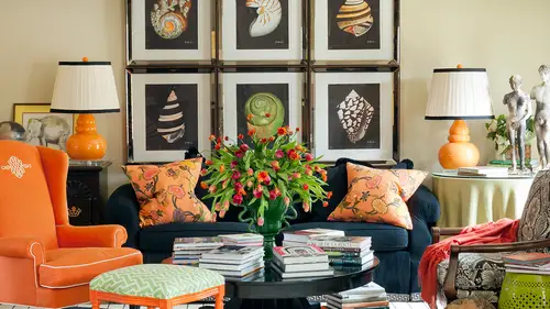
d it in my own home, so we're going to see how you convey build color palettes and your space is now that you're starting to know sort of what colors, maybe love or what colors create a mood for you and we're going to see exactly how much percentage of each of those colors you might want to put into your space so let's take a look now I am showing you pictures you've already seen before for a reason because now it's fun that we've seen these for a few days and we'll look at him at a glance but now we get to really peel them apart, pull back the layers and say oh, how interesting that she placed this color here or how much of it eyes in the space and what that does for a room so let's take a look at some of these today so I love this project I told you yesterday it was a show house project in new york city and part of my initial motivation was to create something that I thought was a little more new york the fun thing a little tidbit about this I was telling the lady's yesterday is this ended up in a music video of a very popular musician that a lot of us follow so you'll have to keep an eye out and see if you can find it not the whole space with the wallpaper you're going to notice it's really kind of fun and I think that's because it was so striking and bold and glamorous it made the perfect backdrop for thie theater and it is a little theatrical, innit but again, not so overwhelming with color that people couldn't feel really comfortable in this space for long periods of time and the the new york population visitors, people that came to see the show house responded to it so well and even said, oh my gosh, toby, this is the most chic thing I've ever seen you do, and I think that's because they are used to a little less color on the wall and a more subtle kind of nuance of color in a space so let's kind of break this down, so the the inspiration behind this room was fashion and really looking at things like couture detail ing like you can't really see in this image, but you will in a minute, there's some bank hits with a little channel back detail, that's contrast welt and the grow grain on the sofas in black and the embroidery that I had embroidered on this silk drapery to match the wall covering and the little tiny hints of gold on the tables in the stool so again, getting really into detail like fashion does, and even those lamps are like the jewellery of the space, right? They're vintage, we're murano again, there's gorgeous, emerald green, and they just pop like you could imagine a jule or a big emerald ring on your finger. Certainly the idea of black and white and this is when I started breaking down these color palettes you're going to say this is when I really realized how much I used black and white in my work but looking at different percentages you'll see in a minute really makes a big difference because this room is primarily white right? The floor is all grounded in black and there's a few black details but for the most part it's really on the light side of the color palette I was looking for a sophistication by layering in different shades of white so the walls were slightly more white than the wall covering which is a grass cloth with that pattern on it the sofa is slightly more cream as are the drapes but you don't really notice when you glance at it all looks like it's essentially the same color and it's that little bit of depth and you even see those the cream finished on the table even a little richard but its tiny little little changes in color the blush pink chairs to the tiny bit darker are a little bit bolder pillow down to the leather that's on the stool and also remember our conversation yesterday about content fabric content so even just in this image going from wool here to silk here toe leather here and seeing what that does to create and enhance the depth and the interest in this color palette and it's, it is it's. Not hard to do. You just have to pay attention and think about how those little shifts and changes can really start making a difference in in the space. Even looking at the difference in kind of the muted black of the grass cloth black in the artwork, a matte black book, and then a shiny black on the on the fireplace in a lacquer finished so much layering happening in this space and then let's think about kind of the percentages. So maybe seventy percent of the room is black and white, but really it's more like almost seventy percent of the room. Miss white, right, maybe sixty, but that's really the base of this space. And then I would say maybe twenty five percent of the space is the shades of pink, pink and blush and peach on, then just a tiny little like five, maybe even one percent of the spices, this little pop of emerald green. So we talked about yesterday, that one room that was all blue and what would happen if you started layering in orange or pink, even the pink, and the further the two huli painting over the mantle and how just being in that one spot made the room still monochromatic. But if we had started, maybe in that color around the space, that would tell totally change on dh, this is you can really start to see that in this space, what would happen or what would happen if you had no pink, it would be really much more stark and dramatic, right? So this softens it a whole lot here's. Another another angle of the room, and I love seeing this as we've broken, broken it out for you. You can almost imagine these color blocks, even as if they really were paints. When you start seeing as pure color on it could help you take these same colors and bring them into your space. You could create the same color palette and even put pink on the wall in a room, or or this the kind of emeralds or spearmint sort of green on the wall, aunt have a completely different look, but this palette would still work really well. Yes, and it seems like even from at least the last light, even the ceiling there are nuances in the shades of the ceiling is a silver leaf wallpaper, but it's really in it's a warm silver, so it almost just enhances, like another layer of that creamy warmth in the so and it's also speaks to sort of the jewell jewelry of the space like the gold on the table in the gold lam because it's actually a silver leaf but it's very leaning towards gold. And then I did pink in the light fixture it's a paint crystal with a gold medal base and it really reflected, and even though the lightbulbs were clear, it almost created this sort of pink glow to the ceiling, which was a really fun d tell t I'm glad you noticed that have a couple questions coming in about this space toby one from nikki is is the ceiling tell us again is a ceiling painted or wallpaper the ceiling is wallpapered on it's wallpapered. The interesting thing is this room was actually used for a show house the prior to this it's, a show house in new york city that happens every year and so that's kind of a fun thing because designers will come in from one year to the next and design the same rooms and they look completely different and this one the ceiling wallpaper was actually already there and the person who owns the building said, I really like that I would prefer if you not touch it and I loved it it was great because I had already designed this color palette and it was such a great addition to but I do know that it is a phillip jeffries wall covering and it was installed by cutting it into squares and a installing each one you can see that more in this picture installing each one is in individual squares of wall covering and so that adds almost a park hey effect so again that goes back to that settle nuance of our patterning yesterday it's a texture because it's got a sheen to it on and it also is installed in a pattern it could have been just laid flat in the ellen roles in that space but but a decision was made to put it in squares which of course I love because there's a million squares in my wall covering so it was the perfect kind of nod teo a pattern that I had already chosen to install in the space so that was what we call in the design industry a happy accident that that was already there so but it looks really great just a couple more for this specific space. So uh pierre design interiors thank you for joining us again on day three is the panel work your go to white? What color do you typically use for panel work in cabinetry? There are a lot of different colors that I use and I can't ride off the top of my head tell you what this one is and I'm sorry I know it is a benjamin more color because they were a sponsor of this particular show house, and this is a great time for me to mention, and I'm into mentioned yesterday that house beautiful has an amazing color at for ipads on I don't think it's free, but it's not really expensive, and everybody should go look at it because they have done a beautiful job of working with almost every paint company out there, not just one to bring in a lot of their favorite paint colors and just like the column that they have in their magazine every month where they showed designers and their favorite paint colors they've brought a lot of those into thereafter were different this key designers, we're talking about their favorite paint colors, they confined tons of whites and creams and go to colors out in that ap if they want to. Now, the thing didn't note and remember yesterday when we started talking about undertones of a paint color it's really important to think about that in this particular room? I wanted my undertone to stay sort of creamy white if it got too grey or too blew, it wouldn't support all of the fabrics and finishes of the furniture that I knew I was going to be layering in, and I wanted the whole room to have sort of a pink glow to it a warm glow. On dh so this particular color leans a little bit more towards a creamy town, which could either be in the yellow issue a pinkish family, if you can imagine that s o there's cool, I mean, wise or not, just white there's everything from a cool blue white to grey white to a yellow why to a peen quiet, or even something that, like leans green, and you can tell by putting them next to each other, are putting them next to other things you'll be ableto if you can't see it, when you're looking at the paint itself, put it next to another material or fabric, and you'll suddenly be able to see the contrast on what the undertone is. So also something to note about this space, and this is a great picture to show this, look how the pink move your eye around the whole space, it's, almost like hopscotch, like you could go from the pillow and and step onto the, um, ottoman to the chair to this fun little chinese chippendale chair and the artwork in the lamp. So it really brings the movement all the way through the space. So that is what we think about when we start saying, balancing color around the room or making a specific decision to maybe just isolate color in one spot like we saw yesterday with the pink two huli painting in the boot blue room are maybe you intend to bring quite a bit of an accent color to a space like maybe twenty five percent of the room, and if so, how are you going to balance that in place that in the space where it has the most impact or achieve some kind of objective, which for me was sort of making you see everything that's happening is there's a lot of different little zones here there's a work station there's, a seating area, the bank it's behind on either side of the ottoman, which I think we'll see better maybe in a moment as well. Also interesting the way you've used the mirror to draw attention to the ceiling color, because if the mirror wasn't there, you maybe wouldn't have noticed the ceiling right and a lot, and I'm very hesitant from just a pure decorating sandpoint to put mears over mantel's a lot of times because many times they don't reflect anything very attractive. So I typically air on the side of wanting to put a piece of artwork or if I am going to use the mirror used like an antique mirror that doesn't reflect, but in this instance, you're right, it was an important piece because it reflects the ceiling. And from the doorway it even reflects those great light fixtures that we had custom fabricated for the room in the pink so just be very careful if you're going install mirrors over so far a mantle or something high look at what they're reflecting because if it's a sea of can lighting and air conditioning vents that's not really exciting or that might be a cue for you to say oh this is an opportunity for me to take an accent paint color and bring it to the ceiling and as you said really draw attention to it one more shot from this direction so just really zoning in on the details I love this pop of black on the sofa and that it creates that geometry again I think that speaks to that whole fashion idea and even like your jacket yesterday where we talked about the piping on the lapels that's where this sort of idea comes in it and it's kind of unexpected and dramatic and then that you know kind of coup de gras the pop of emerald eyes the exciting fun piece and again you know how we talked about those greens and blues being so so inviting are enticing like you're looking into a reflecting pool and I see why monet wanted to paint all of his water lily paintings in those kind of hugh's like the blues and the emeralds because they're so relaxing and just you know, in they bring you in and I think that's exactly what happens right in the space because the entry to the room was opposite these, but the first thing everybody saw and were drawn to is oh my gosh, what are those on? And then because they're transparent, the light moving through it from the back window really even made them more like jewels. So and then a funny thing another sort of happy accident is when I first created this I wasn't thinking about the fact that this house the show house was to benefit one of the breast cancer charities, so everybody thought, oh, how funny she is pink s so that's one of those societal things yesterday because I was really thinking about pink more as a trend and thinking of that past stale trend and when I was sitting around going, I want to create a color palette I haven't really done before let's move into the past tails and the softer colors and I thought everybody looks great and pink with that sort of healthy glow that was really my initial kind of inspiration for that, but then I look so smart afterwards like look at her, she really embrace this kind of idea of the symbolic reason for having pink on and that was kind of again a happy accident but it worked ah, and then one more look at this from the desk standpoint, and one of the things I love about this is the flooring in this space, and a lot of times when you're working in show houses a lot like what a lot of you are dealing with when you're dealing with rentals and there are certain things that we can't change, and so I was dealing with a kn old dark hardwood floor, and so how to really deal with that space? And I could have chosen to use the flooring as a place to bring in pattern like we talked about yesterday, but there was so much pattern happening on the wall, the another thing that's interesting to see if you sort of want to be inside of my design process. I originally thought I would take down the panel molding and have the wallpaper everywhere on dh they didn't really want me to remove it, and I'm so glad that I didn't, because it really looks more interesting, because it does have even in this some of that architectural interest and a place for the id arrest, and it just so happened that the scale of this pattern was perfect because you can really see several repeats. So you know how yesterday somebody was saying, can you use a big wallpaper in a small space? And I said, it depends on if you can really see. See the whole repeat and what's meant to happen if you can get the full effect and we had plenty of room to get the full effect, and I even made the decision not to go into the panels the lower panels because I didn't think you could really tell what was happening down there with all the furniture, so I left intentionally chose to leave that solid and just use the upper panels to make this statement so again, look at how many decisions were made in one room just to decide how to effectively bringing in color pattern texture into this space. So what I was saying about the floor is I decided not to use the pattern on the floor, and and then I took it a step further and said, what if I just make the floor almost disappear? So I grounded and in black, but it's a black corps sisal, so it has texture and it's really interesting, but it doesn't draw attention to or take away from on the space itself. So what? What kind of questions do we have about this? You have a lot of people just loving it, you know, noting how the black on the fireplace relate to the little hints of black elsewhere how the panel breaks up the world piper, which then you said so everybody was saying it allows your wrist just a lot of people loving the circle and the square combo and suggesting that if you only had squares are only had circles it will be busier but they sort of balance they do yourselves, eh? So it's kind of that masculine feminine yin yang thing, right? Because one's rule real firm and and structured and the other is curvy in and circular and yes oh no sorry left this yes, I was just noticing your e yeah let's talk about this lamp while we're at it because I don't want to get a little shot keep your loving my lamp from lance plus they asked me and I think some other people are going to be announcing soon to create some patterns for them. So this is my bamboo trellis this's just a prototype I was noticing yesterday there's actually a few more little lines that will be in the actual finished product which makes you really understand that this has a bamboo pattern to it but really fun prototyping and creating pattern for exactly that same reason of what you were talking about. So we look at things like the balance between the rigid and the structured and then movement and people seemed teo, you know well I seem to be drawn and interested in that mix of both in one space which is exactly what they're lacking about this great phillip jeffries grass, cloth and toby, you were saying about a lot of the examples you've given have you gone in and changed colors in a patent to suit an interior? When you're saying that with the lamps plus you can actually take your patent and apply the colors you want to you? Yes, so if you don't want to go wrong, they have some standard colors or suggested or popular colors that that no look great, but if you want to be have fun like I did here and start from scratch, you can literally pick any killer in their color rainbow and make it work for you, which is really fun and there's so many companies that are allowing you to do this these days, which is what I love about design because that usedto only be accessible to what we would call the trade, the people in the industry and now because of the internet, which obviously we love here you love it, creative life. There are so many options for anyone to start customizing and being creative and come up with their own unique products just like this that can match their space. So and after we talk about later in the next section session, I think about transitioning color something like this where you could take two colors and put him on one item can really be that element that helps you transition from one space to the next are moved two colors together in a room with you know with confidence so yes and I'm looking at it and when I see I seems almost like every different thing is almost like framed like it's individual own piece of art like if you look at the glad the grass cough on and then if you look at the picture frames and how their frame and how it like the frames actually pick up on the color of the lamp and then I'm looking at the chair and I'm looking at that pattern that I'm looking at the back of the chair and it's almost like they all are individual works of art framed individually and then together thank you so it's yes oh and this is one of my patterns that you confined on my website it's my foe ball pattern so I created it in the black and white color just for this room which a lot of people have asked about but I agree and that's what we've been talking about in stealing our introducing it's what I'm trying to say your own unique personal design style into your space and at first glance a lot of times you don't see that with a person and then you start zone ian on little intricate details and you can really pick up ah lot about their personality and what they loved by those little bitty pieces because it would take a while for you to go from this all the way into as you're saying is owning into the foam guar the chinese chippendale or even here look there's a quattro foil in this great suzanne casler table that really sort of alludes to those circles in the wall so there's an none of those are accidental I intentionally planned all of those and that's the difference in a lot of times what people can't quite achieve because they don't know all of those they're not noticing all those little details from say a magazine look to their own home on their like something's just not right yet well it's all the little bitty details this is why I said yesterday and even the day before you can't rush this stuff you can't rush a masterpiece um there's and you have to really plan and look for and get it all on paper like you're doing right now with your plan and a notebook or a sketch pad on then start making choices have had to bring things into your space and I think this is also the fun thing about you know how we were also talking about not getting paralyzed looking for the right thing there's a million things out there you don't have to take it so seriously that you'll never get it by another thing again as long as you live and this one has to be absolutely perfect it's more about just having a reason for making some decisions for the space, and I think originally I was thinking of a different centre table for this room, and then it wasn't available, and so then I saw this one and thought, well, you know, that makes the whole that one makes a whole lot of sense, so it's a great sort of second option, which even almost like, better than the first option. Another thing I loved about this space, too, if you'll think about it from a function standpoint and later on I think it's in march, we're gonna have a whole course on function. I intentionally wanted this room to not have a low coffee table because there are other living spaces in this house. So if it was a real house, not a show house there's a million places that people can have a living room, but I intentionally thought, well, I love this. It could be a lady's dressing room. It could be sort of a library or her own retreat and where she could keep the things she loved. And I loved to be able have this sort of almost library idea of piling books on, like in my own house because I love them so much it could you could have tea. At that table, there's a lot of other multipurpose things that could get one. So I intentionally chose that taller table. Also, this the soaring ceiling heights, those air, really tall ceilings, probably maybe twelve or fourteen feet high. So, again, the tall table really accommodated that space better. So lots of things happening.
Class Materials
bonus material with enrollment
Ratings and Reviews
1st Carpet Cleaning Ltd.
Very convenient and creative! Continue In that way!
a Creativelive Student
Fantastic Course!!
Student Work
Related Classes
Interior Design