Lesson Info
30. History of Color in Design Examples
Lessons
Day 1
1Class Introduction
10:02 2Color Models 101
26:46 3Color Schemes 101
45:39 4Debunking Color Fears
44:02 5Debunking Color Fears Pt. 2
25:23 6Evolution of Tobi's Color Style
42:37 7Evolution of Tobi's Color Style Pt. 2
44:12To Trend or Not to Trend
12:47 9Color & Design Trends
31:36 10Color & Design Trends Pt. 2
25:37 11Tobi's Color Inspirations
22:09 12Tobi's Color Inspirations pt. 2
23:29 13Using Inspiration Boards & Q&A
19:43 14Psychology of Color
36:34 15Color Meanings
17:04 16Psychology of Color Q&A
12:55 17What to Consider Before Choosing a Color
26:20 18The Right Color: The Entry & Living Room
19:27 19The Right Color: Family/Dining Room & Kitchen
21:19 20The Right Color: From Bathrooms to Outdoor Spaces
20:05 21Pairing Textile Elements for Success
28:49 22Pairing Wall Color, Pattern & Texture
24:42 23Floorings, Furnishings, Art & Lighting
19:04 24Intro & Top Color Palettes: NYC Showhouse
24:41 25Top Color Palettes: Hampton's & Richmond Showhouses
21:31 26More Top Color Palettes
33:46 27Layering Color Palettes in Your Home
38:16 28Transitioning Color Palettes in Your Home
28:08 29Historical Overview of Color in Design
16:47 30History of Color in Design Examples
43:59 31History of Color in Design Examples Pt. 2
16:32 32Color Mistakes to Avoid: 1-6
31:20 33Color Mistakes to Avoid: 7-10 & Final Q&A
40:06Day 2
Day 3
Lesson Info
History of Color in Design Examples
I found this really cool little timeline visual and I haven't pinned on this board for you that's a history of interiors and we want but labor this but it's essentially everything I just told you from the cave men all the way to probably it goes up to about maybe eighties or ninety so I think it will be a fun thing for you to look at in reference, but we're going to go all the way down to the bottom of this pinterest board, which is quite a way down and start looking at ah lot of these examples and see what happened with color from the very beginning of time to today so we can imagine these prehistoric cave sort of drawings and that's really the only color palette they had to work with, but at the same time we could you totally see rooms today done in shades of these neutrals, right? But they just really had no no other options they hadn't innovated in any way to be able tio use pigments and other things, but the egyptians were really the first people that started allowing us to do tha...
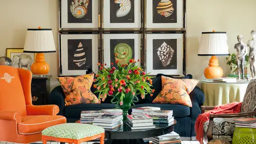
t and that's where remember the cold vaults and that malachite started coming into play even like in this s o really interesting to start seeing it's very similar to the prehistoric palate, but it just starts introducing a little bit of color here we won't belabor some of these because I get a little bit boring because it gets a lot more fun when you have color but look what happened with that vermillion red so here was the actual substance that they were making this die out of which is very, very bright, but look at what it looked like even in drawings I mean even in the wall are that you see in pompeii and I don't know if any of you have been there, but I've actually visited pompeii and it's really interesting and look how vibrant that color is and it still looks like that today it has really stood the test of time even in the ancient ruins there you can see all of that strong color palette and what they were able to start achieving, which is really fun to think about um let's see here's a little bit of of ancient greece there's still not a lot of color happening, but they were starting to play with pattern and make things interesting with repeats and look at what a source of inspiration that is for many of the things that we used today patterns and fabrics and textiles on and you'll see that all the way throughout history, so let's say we won't look at all of these but I think it's fun to just start saying this is like the byzantine this is the the hodja sofia it's a church and this is what the byzantine period brought with mosaics and so they now had the opportunity use the royal blues and that a malachite green and all of those things to start really playing with color I think saffron was starting to create that yellow color for them so they were starting to use their resource is to create things here's a piece of malachite right here if you want to understand what that looks like so it's a it's a natural material that was used to start making dyes and pigments for coloration andi I even referenced the malachite piece a box in a client's house so it's also now a motif that people use where they try to mimic the look of that stone not just in the color but in the pattern as well. This is a man's silk theatre costume from the baroque period and so very, very, very ornate. But isn't that really sort of a precursor to all the damage patterns that I use all the time? And then you were starting to see those colors uh happened coming to light their michelangelo was one of the people who really brought such a wide range of color and that's where we saw those the primary colors in green and he was a master at mixing color on it it's amazing to see also in person which I'm sure many of you have had the opportunity to visit that but you know what else was really interesting to me is even like in the baroque period and then into the renaissance period because they didn't have access to a cz many pigments for paints and things will michelangelo was starting to really understand that aa lot of what was happening as people were weaving tapestries as artwork and we know we see there was there were a couple of reasons for tapestries one thing one reason was at the added warmth in their palaces to and so they were even used on the wall but this is where you can think about when we're talking about layering textures this is a wool and silk tapestry and they were dying fabrics and using those to make these amazing artworks and huge wall hangings on all their palatial palaces and buildings and architecture and everything church is obviously you can all go back and look at this later I think it's there's so much information here but the regency period we start seeing all sorts of things that you get a glimpse of where all the hollywood regency style started teo jump off from but a lot of reds and then we talked about we're going to see more of um in a minute ah lot of striping and a lot of black and white stripes and very much influenced later on in america the film industry and what was happening in hollywood style the's a regency too so there's strong red so look at all the color in that space and complimentary color strong reds and greens it was very ornate um and really, really vibrant okay, so let's move ahead a little bit and get into something okay? Just a couple of pictures of art nouveau and then the aesthetic movement and remember we were talking about how it was ah period of much more muted colors but it was all about the patterns and they were very very organic organic patterns so vines and leave beliefs and ah lot of this like the swans were used in that so that metro subway stop in paris looks very much this style and he thought in all sorts of architecture er ah and an influence fashion as well but then we get into what has really influenced me in many ways which was the american interior design movement and here's elsie dewolf the one of the women who was credited with starting interior design in america as a profession s so she was very, very instrumental and starting to bring all sorts of things to be a fluent particularly in new york pattern and material I even see animal print there so lots of things we used today represented in her work but still fairly muted tones pretty um pretty settle and um then let's see we start to see oh, color boom! So, francis? Well, even elsie dewolf here's one of her first, I mean, one of the pictures we have of her starting to introduce look at the purple in the blue in this rendering that she did so this was a space that she was starting to bring in those analogous pops of color, but a lot of things happening here, that the structure of the space still looks very, very traditional and very much rooted in english influences in america. But she was starting to play with color. And it was not long after this that some of her colleagues, their predecessors like francis elkins and then on to dorothy draper, which we will see in a moment really embraced strong, strong color, even on the wall. So they were using things like latticework in large rooms to mimic sort of an outdoor garden feel, and we've seen many of those images and that's kind of what's happening here with the all of the pattern on the wall and you all can jump in. I know this gets a little a little dry a little bit, but it's not going to feel very long. So here is dorothy draper, one of my design idols, and you will see instantly it's about to get exciting right at this minute because this is the kind of work that dorothy draper did so can you see it? Let me get over here can you see an influence even on my work of some of the things that she was starting to do? So she was really embracing a lot of the hollywood regency style with the stripes and huge pattern and scale and so one she did a lot of hotel projects including and I think this is it the greenbrier, which is a very, very famous hotel that she designed but look at the mix of color and pattern in that space very, very daring but that's interesting. So this is where this is where interior design got really fun in america and here's another one of her spaces maybe the reason that I didn't realize I love black and white so much so much of what she did she achieved through contrast and then look at this space it's all complimentary red and green ah and I guess if you you could see how it might be associate id socially now in america and other places with christmas the christmas holiday but it doesn't really look like that to me it looks very has a lot of that regency style underneath it and she was starting to use huge patterns often in chance and more ray and other kinds of materials to really play with sheen and texture and depth ah in her work, which I definitely am excited about black ceiling isn't that dramatic so she was all about drama and she was bringing this kind of color to people's homes too not just a huge hospitality project is that she was doing hopes let's see I notice how in the last one she used there was hints of pink and then the next one was really a bright bowl paint and look at this one finish your carpet um turquoise chairs and then all the walls or grand season that as other periods reflected here I mean this almost even has a little bit of an art nouveau influence in it but you're seeing how ah lot of these designers were starting to study and be influenced about things that were happening all across the world and the history of design ah lot of a lot of the history of american design originally as you can imagine it was influenced by england and france uh okay so then we start getting into things like um the sort of that greatest generation idea of the forties and that the house forties house life and what her interior looked like and I think we can see a little bit of a dorothy dr weir influence here as well with the stripes but I think that's really fun this is supposedly in nineteen forties take on mediterranean style s o just like my clients today who have an experience or or fall in love with a certain kind of ah um location or a style they want to bring it to their home this was starting to happen even for american house lives which I think is kind of interesting and fun. Um let's see here some more uh things from that period so we're seeing uh this is from the other forties purple and sharp truce that could also be today this is pretty bold for the forties but we were coming out of a more muted tones in the light eighteen hundreds and a lot of people you know, really industrial revolution before that and we were moving into a period that was really successful for people in america and people were starting to make more money before the war. World war two was about to break out and say you saw a lot of color and then we see it toned down again in many ways even before we start getting into all the bright color of the fifties which is really fun. Okay, so but every color really is already being represented here. Um so what happens what happens next? So look at the fifties what's starting to happen there's every color in the rainbow there and many have us love this kind of style it is kind of what you see even in in mad men and we're starting to see like debra's wearing today a lot of turquoise and red used together very strong color and that's where many of us live in homes that had all the crazy fixtures and colors so that was a way to start making a design statement was your toilet and your tub and your sink we're now pink or blue or turquoise or yellow on dh people were starting to really have have fun bringing color into people's everyday home how many of you had this uh in your own house? A lot of us did we actually have those exact two pink sinks and one of the projects that I showed you where the client was inherited it from their grandmother and uh the one with the purple ceiling in the dining room we had these exact sinks in their daughter's bedroom before he renovated which was really fun paint cars turquoise cars s o it was more other product design besides just interiors where people were really starting to use a lot of color to particularly automobiles on dh then the mid century idea that we now all love was really what was happening in furniture styles um and that's that madman era for sure and you all conjunction at any point if anything that you like or want to say or anybody hot on the web is actually the web you've got this whole thing off we're not we haven't run dry we're just using out years did ty this is fascinating I need to him or okay, good does that encouraged you just keep talking? Yes, a whole dorothy draper bored on my pinterest and now that I'm hearing you I think, well, no wonder I've been drawn to your work because that is one of your loves that really comes in cross I think and they were huge scale and if you and even going back and studying dorothy draper alone and I have a great book on dorothy draper and understanding some of the things she did like she would take influences that we're from the baroque or a cocoa period that really intricate detail ing and she would enlarge the scale. So it was these huge a campus leafs on the corner of some of her iconic pieces of furniture so you can even look at her work and follow back through this whole timeline and understand how most periods are either an enhancement of something that happened before them are complete reaction and kind of a revolt against what was happening before, but she really has a lot of influence in very classic um architecture from greek and romans and then also the italian baroque period that you can see really easily in her work. So then let's look at sister parish this is her with her dogs, which is hilarious and so cute but she really became known for as the tastemaker and for the a fluent in new york city s so it was kind of this slew of women working in this industry like elsie dewolf and francis elkins and then dorothy draper and the sister parish was really after them and she also then took on young albert hadley which is this him is he was older recently as a partner in her business and so you were starting to see men really get into the interior design profession as well because before that they had been working as architects and other things but you didn't hear of them as much as the iconic figures in interior design it was really sort of a women's industry it was kind of like a ah housewives you know new york housewives not like the ones today that would hire people like dorothy draper inside mr parish but you can also look at sister parish who looks very conservative and buttoned up in her photograph but then look at the work she was doing and even she was being greatly influenced by her predecessors and people like dorothy draper and the black and white from the regency style and look at that chevron floor I mean that could almost be today couldn't it which is when it really starts getting fun I love this image on dh using bold color on the wall again here's another sister parish black wall cut wall treatment but look what she did the furniture is toned down the wall is really really dark and the furniture is toned down so still the same kind of rules about color and balance and how to play with that in your space look at this one with the pink dry free um so high contrast but embracing those past ills and you see all sorts of furniture history in that one space from very french cabriole legs and then bringing in something really dramatic like the dark wall the flooring almost even looks like a m um his prehistoric kind of look to it can you see that has a pattern like an egyptian sort of pattern on the floor but moving into very much the brady bunch era which a lot of us had homes that looked like this so muted tones like avocado green and definitely the iconic shag carpeting that we had in the seventies true brady bunch really is look look at this can't you see this right here? This concept reflected in my work even on like that black and white sosa or on a pillow so and and even in the lamps that kind of takes on the feeling of some of the other pieces of use of course I'm a child of the seventies so and I was influenced by this look a cz well during a question that came in from walter lewin toby says do you ever combine eras in your designs or do find that they clash or look awkward you definitely can and I think that's a great question, so if you're going to embrace something like mid century modern from the sixties um you either want to commit to it one hundred percent because it's hard to mix it with other things and really pull it off or you might take an iconic piece like the eames lounge chair or a french arne jacobsen egg chair something and bring it in as just an accent piece so you can certainly combine them but I think what's hard is teo sort of go fifty fifty it's a little you know you lose a little bit of that whole madman mad men kind of men's mid century look, if you don't jump into it all at once and what it's gonna look really awkward as if you have a house wherein one room you have the sixties and the next time you have the seventies and the next time you have the eighties so either just a pop of an accent piece here there throughout your interiors because you happened eleven and give a nod to it or I think you have to sort of jump in with both feet and really embrace that here's another seventies peace where there a little bit still, though dorothy draper inspired our a lot actually with the floral fabric um and the pink on the wall and in a moment when we look at current design and some of the images you were even oohing and eyeing over yesterday I see a lot of influence in this in the work of jamie drake is a current designer who's really much cleaner than this? But you all were loving his closet yesterday or the day before that was all tons of pink and orchids and lacquer and it really could sort of speak back and then we looked at a monochromatic pink room of his that definitely influenced by this kind of a time period of course then the eighties brought things like mario buatta who again is known as the prince of chance and started he was bringing pattern on pattern on pattern, on pattern on pattern like florals mixed with other florals mixed with other florals. But it becomes about the layering again very ornate though and very traditional ah and it's hard to even pick up on all of it there but there's a lot happening in that space. Holly has a comment on the previous black world one but actually, ever since then we've had a sort of a reddish wall and we've had the green wall, so I think it's still pertinent I really love the black walls a very dramatic the problem is that while I do own my house, this is not my forever house and I always have to think about being out of cell what do you think about that? But I don't think there ever house concept this is just living what you want to live now? Well, you know, if she owns the house, I would say go ahead and paint it and you can always paint before you sail before you move. So how are you going to live there? And how long is the forever house? The last house I live in lived in? I would lived there for six or seven years that's a long time in your life that you might want to be really happy and inspired as opposed to not embracing something you love. Um, one of the things, though that's interesting that that that I am that you were kind of speaking to was what was starting to really happen in particularly in america, but in europe, too, when interior design became a real profession, one of the first things people have started embracing was strong law color because we see it with all of these people, they made their statement often by what was happening on the wall on and it's, certainly not what we're experiencing right now and a lot of interiors where we have very neutral walls. But think about when I said what happened in the nineties was everybody started becoming their own, their own decorator, the d I y movements and I think that really was where a lot of the should I go safe like you were just asking started coming into play so when you're working with the design professional a lot of times there holding your hand saying we're going to go bold, we're going to do something crazy and they can envision it so you can trust and leave with them, but when everybody started doing their own interior design, I think that might have had some influence on the fact that they weren't willing to try some of these bold and daring things or maybe they were trying it and they were getting it wrong and so that was the last time they tried it they never were going to try it again hey let's, look at a couple more nineteen eighties mario water room so look at how much is happening in that space ah pattern on pattern on pattern on pattern everywhere and huge floral arrangements and interesting because he was is still working and he has a new book coming out even I think but very very popular very, very successful and I would look at the hiz spices and think they were extremely feminine but he was working for couples and men and women and you know it fluent society people is well and this was the kind of interior that they were living in in the eighties here's another one so how many of you remember these kinds of interiors or did any of you live through or your mom have these kinds of interiors in the woods, floral and floral wallpaper and for laurel chairs? I even think of more like jessica mcclintock and fashion and remember how a lot of her floral looked like this, didn't it? So it really followed along this sort of from a fashion and an interior standpoint? I see we have a couple that that speak to that one one in one way and let me have a d mandy says and site let's use this one is an example. If somebody put that in a scrapbook and said, I just love this, but how do you look at past trends and use him as an inspiration to ring reinvent something in a current project? So how would you take that and interpret that? Well, what? I think it well for me, I would probably, you know, I guess there is some influence in my work in this, in a sense, because you see how I will take, like, a large floral print and use it is all the drapery in a space, and even in a better room, I just shows you in that all blue house you saw that I did the wallpaper and the drapes and the headboard all upholstered, but it was all in the same floral. So for me, I would tone it down by maybe not having ah lot of different prints happening at one time, or I might mix it with with a geometric. So I'm probably a little more influenced by somebody like dorothy draper because we saw that she was using floral in a big way, but she would put a stripe on the wall or a stripe on the floor. Now, I do have some friends that I mentioned yesterday that have this fun business called madcap cottage, jason and john, who are interior designers, and they love nothing more, but to create this kind of look and they do it in a fresh way and the way they really bring it, a more current vibe is by using more current color so they might take something that's really trendy and strong and execute this look, but in a more forward way because of what colors they're using is that in the neon example, perhaps it was day one when you had a sort of a similar it was almost chintz here it was, shin was a or something, and you had it in leon pop, right? So think about this room, but being done in neon, it has a totally different field isn't advising pressure. There's one other question could also use that one on shaves me is how would your strategy change if the client wanted more of a minimalist aesthetic? So what if they brought you that and said I just love something about this but I made minimal okay well that's polar opposite and that actually happens sometimes and in the same way that we said sometimes people will come and tell you what their favorite color is like red screaming red but then all they want is a relaxing retreat and you're like, well, that's gonna be a little bit of a disconnect here so we have to get to the root of what people want now very few people are going to bring this to you if they really want a minimalist look but there are times when we have to peel back as I call it some of the layers and see what it is about the space because maybe what they really like is how much furniture he was able to put in the room so it allowed for multiple seating areas there's something else about it? I mean, if we think it takes a long time to study my interiors think about how long it would take to understand the nuances of this interior because there is so much happening there but I think it's really it's really fun and interesting in a lot of things about it um, I even particularly love like the furniture layouts and like some of the placement of artwork on the wall on the driveway, on the window and of course that love wallpaper, so I like to put pattern on the wall as well. So so that's interesting, so let's look at some a little more current versions of interior, so that gave us just a little glimpse into what was happening here is a little bit of a fashion glynn it's for the nineties too, but let's, look at what makes more sense for most of us today people that are currently working in interiors and we'll be able to see some of those influences in a lot of their style. So jamie drake um actually in a moment to we'll get to a few at the top that I went back and added because there were a couple other designers one whose name is billy baldwin and he was working around the time in the forties of some of the others we've seen and he was working in england also david hicks in the seventies, and we've spoken about both of them. And so well look, in a moment of how we can see their influence on people because I would say jonathan adler, which you'll see in a minute was greatly inspired by david hicks for sure even uses some of his exact motifs. But I mentioned earlier jamie drake and this is one of jamie drinks rooms so really, really clean and simple, but it could look very much like some of the rooms from even the men's mid century period or even prior to that in the forties and a lot of ways and the color palettes that we were starting to see there coming into his work he definitely uses and hopefully I have one here but I know we had some of this lodge yesterday ah lot of the pinks on orchids in his work. Um, and then we see someone like suzanne casler who was very influenced by french design and even back all the way teo the road coco period, another very ornate things when you look at some of these influences in the gilding but andi and it's almost akin to even what was happening in that the eighties but without the pattern, so the furniture styles and the whites places is very much mario buatta, but it just doesn't have all the floral on all the pieces of furniture. So she's a very, very popular current designer and she's a lot of neutrals in her work here's another one of her of her room's very neutral let's see, we'll wake you all up here so we saw kelly wearstler yesterday who does something like this with color everywhere which is more akin to say that seventies period wouldn't you think on dh then you see her do something totally different like this next one that is very much inspired by even the regency period and a lot of english design as well so very, very different from one another but by the same designer and then we have um thank you for bearing with me this is kind of a little bit more challenging to follow than some of our other sessions but I think it's fun tow have point of reference to think so jonathan adler loves everything sixties and seventies and you know the tulip chairs and very mod um elements like even this in this funny this little poodle statue very vintage and retro and he does it really, really well but also tongue and cheek so he has this whole idea of flimsy behind his designs intentionally but then he moved to someone like miles read his a young designer now he's my age or younger um he actually does the home design collection for oscar day llorente but he uses very daring color so you see again and I see probably ah lot of influence by someone like dorothy draper even in this work with the bold colors and a lot of the black and white right here in the contrast so really, really strong and these air rooms that are being done today but in a sense that looks very much also like an albert hadley or a sister parish face so it's almost if we put them side by side it would be almost hard for you to tell which one was then in which one is now and you might even guess that if we picked that chevron floor that that one was now and this one was uh you know, back from maybe the fifties or sixties so it's where timeless design starts coming into play and that's where I think for the person who just ask about mixing styles someone like miles red would be a perfect person to take cues from because he's putting a whole lot of things in one space that was can't kelly worse there actually ah and really making it work because of some color decisions uh that tie it all together then we can look at someone and I don't know how many of you are familiar with barbara berry but she is really almost it's not really minimalist but in a sense because of the lack of color and how simple her lines are it becomes very clean. This is actually a little fussy for her because she doesn't always do let me look at another option because she is very, very clean in her design and very little color tiny little hints of color in her spaces very simple, very glamorous but a lot of her influence is hollywood glamour but it looks really different than hollywood glamour did back then it looks more updated but still extremely clean here's a little bit of david hicks for us he can see how he was an influencer of jonathan adler look at the pattern on the floor and ah lot of the retro color palette that was happening at the time it went in retro it all because he was it was it was current at that moment what we use these ideas in our language tio embody the idea of retro that floor super cool and amazing. Yes so what kind of and then here's another david hicks look at this talk about pattern on pattern on pattern but this is more the way I use pattern because mario mario buatta would have had one pattern on the wall one on the drive one on the bed but he embraced this crazy pattern almost as a neutral you know how we talked about color as a natural? This is where pattern covers every single thing in the space. So it's actually sometimes less busy than if it was contrast id in a way like mario buatta would with a whole bunch of different fabrics happening in one room what was the name mrs fer fer trays me of barbara barbara barrie, barbra berry um also mark hampton, a designer that was in primarily the eighties and ah lot of these designers worked for other famous designers throughout history either english designers are american designers so they were protegees of a lot of those people that he became very um well known and now his daughter he's deceased but his daughter um carey is about my age and she carries on the mark hampton business alexa hampton and we'll look at some of her stuff in a moment but this is a um are camped in look from probably the eighties but he was greatly influenced by what people were doing like francis elkins and some of those people women that originated interior design in america because they would create thes garden rooms like this but with that instead of doing it with wallpaper like he's then they would actually take lattice work and create a trellis pattern on the wall and paint another color behind it so you've seen some of the famous garden rooms in hotels and you could search them and find them but this is what mark hampton was doing more in the eighties and um so and here's his manhattan suite um so so what kind of questions do we have about this and then we can look at some more current trends I think from the discussion online what people really find useful type b is when you taken interior and help us understand how you take from that interior and interpret it in a style for today okay, so perhaps if you could cause that gets a lot of great faith back if you could grab uh perhaps a sister parish or maybe one of the yeah, so even let's look at these because I added these later as I told you cause billy baldwin, who was a designer that was more in I think he was in the forties, you know, because there's a nineteen forties picture of his right there and so he was having strong influence even in england during the same period of time that we're seeing some of the other like parish hadley and some of those designers but I think that you can and he was really known for I'm using some of these rich colors, particularly chocolate on the wall which was very daring for him and then he would keep all the sofas and things neutral so that you can see influences even that red entry that I did where it was a strong color on the wall and then neutral other pieces in the space. We also see a pop of color like look at this this's one of his renderings obviously the space but it's the same difference is looking at a real room so we have a pop of green here on the lamp shade and on these little shin watari tables, I think you could totally see that particular room as potentially one of rendering that could be a design that I was working on can't you see that graphic? I love also a lot of times I use artwork in a grid and that's very much inspired by a billy baldwin concept of hanging the artwork or the gallery wall here's another one of his pieces that one of his rooms that I think stronger color than me on the wall for sure but this is gonna influence some of the great designers of today like friends of mine like jamie drake that I was just mentioning I see him use this palette all the time there's a lot going on in that space actually to there's an interesting one here from bethany which perhaps you could speak to toby she says she's big confused two days ago we learned that current modern palette was becoming cleaner and more simpler but these photos now very busy like theeighties so again they are showing it what you pulled from that these air so this is another perfect one. So look at that window treatment I would totally use that idea of a window treatment and if you even noticed in that dining room I did with the chocolate walls I made appel mint over with is which is what this is called this cornice over the window and actually had brown piping but and you often see me use classic chairs like this dining, sharing a space but using him in a simpler way so as opposed to having this pattern on the wall you would maybe seymour look and many many of my window treatments you've meant you all have mentioned like the banding and the trims trimmings so it's about for me studying this work and taking parts and pieces of it that I fall in love with but maybe not taking it in its entirety and also being able to see beyond something like this really busy chinese while covering which I also would potentially use I just finished creating a ah a dining room with the gorn a hand painted wall covering but it's in a very current trendy color which is like a teal with some lavender accents here's another room I think that all of these air billy baldwin that the pointed one that you just showed that's interesting because we had a question yesterday which was about in terms of you looking at space on walls about murals, and I was thinking that probably the oscar the question was thinking about trump wall of things where you know you get visual illusions and murals yes do you use that sort of thing in your work? I used them and when I do it's usually in wall coverings as opposed to a hand painted mural I have done hand painted murals before that that speaks back to something that's even more inspired by say, even, you know, the italian kind of renaissance period even the sistine chapel and I'm enjoying something that's more bold even like the one we just looked at which a lot of times for me comes from the like gracie wallpaper company or nagourney wallpaper company who had who are have asians handpainted techniques that they used to bring that idea teo current colors and current interiors and this is a good example of that don't you think in many ways this room could look really current? I think we could see someone like a mile's red using something like this today when he's doing work for us let's look at that. So this was in the forties but let's go back. I think this is a great answer to what's confusing them to show keep that room in mind and then let's go back and look at something um like these bold so you see some reminiscent color there he doesn't have the pattern on the wall but I can see some strong influences of that other image we just looked at and then looking at something like this which is done today um and pattern on the sofa but definitely deriving colors from the other the other work I wish I could put them side by side force but that's hard to do um and in just a moment I'm gonna go out to another board and show you some other current trends, so but let's, look, just for a minute, because I think some of the ones that have influenced me let me go back just a little bit and look at not only the billy baldwin rooms, but, um, let's revisit something like this sister parish space. Um, so I think I could totally have used this idea to show you very similar to something I would do, like a big pattern grounded on the floor, and then she has this black and white print on chairs and on the sofa pillows and it's moving your eye around the space and then look which what she did here to keep the drapery really clean and crisp and white because the walls had these strong turquoise color on it. So I have studied all of this work, but I'm not always looking at it or channeling it when I'm creating my own designs. It's just I think it influences you overtime and it's important to start looking at some historical references, I think to see even why designers what make choices they do today based on what has been tried it's sort of like not reinventing the wheel because you can see where people had great success using pattern and every other thing let's, look, I want to show you right before I flip over to the other trends board one more time let's look at mark camped in a room because then I'm going to show you what his daughter does today and she's very also very famous and she's carrying on his work but let's see let's look at one of his spaces. So we saw this one, um, which is the green kind of garden trellis space that he created and then there was one more of his bedroom and then let's look at how she re interprets that interprets that look for her, um, her designs today because she's really carrying on the legacy of his eggs actual actual design firm and it's still called mark hampton limited our mark hampton inc. So let's get one has a question. Okay, how long do you see trends or styles tend to last before they look dated? And are there certain looks you think a timeless yes to all of those? But as we said earlier, the train life cycle is maybe even two years now in a sense. So it comes in and goes out, but then often they come back in so quickly that we didn't even really know that they went away because everything is really kind of a possibility and design now here's an alexa hampton just first to see so her dad, mark hampton, was using pattern and she's using it in a stronger way, but okay, so what was the second half of that question? It was which way? Thinking the more timeless. Okay, so think about how timeless is going to be something that stays in in fashion for a long time. So think about something like the chevron on the floor and sister parishes room and then the chevron in my pictures from morocco that were done many, many, many years before that clearly, and then we're seeing chevron today, so certain styles like that could stay in in fashion for a long time, but we get tired of them sometimes because they can become overused or even wider down, like we talked about, because they get to be not the highest quality of that. So I would say, if you were going to continue to use chevron, even though you see it everywhere, if you were doing it in a way, that it was a really high quality, uh, then it's going to last for a long time. But even to your point yesterday, you were like, oh, I love this idea of dame is going to temple in it, but she did the scale too small, so it looks. Boring or even dated, and you kind of want to get rid of it. If you had really embraced a traditional scale of damage, you might have used it for years to come, just like some of these faces we can look at and go, is this now? Is this nineteen, eighty or is it nineteen forty or it's? Hard to tell here's where you see something like, ah, lot of things that were happening in her dad's spaces like big, bold pattern? We saw that big garden trellis, but she's bringing in like a current color trend. This was just at market last week, so that sort of minty green and the ama thiss color palette, but definitely so a new or what I would consider looks like a new, fresher version. But then again, we saw that kind of pattern in a david hicks room on the floor. You know something bold and repetitive like that from the seventies. So it's more about the scale in the balance, and the quality of the piece is not necessarily just just the pattern itself or just the color itself.
Class Materials
bonus material with enrollment
Ratings and Reviews
1st Carpet Cleaning Ltd.
Very convenient and creative! Continue In that way!
a Creativelive Student
Fantastic Course!!
Student Work
Related Classes
Interior Design