Lessons
Day 1
1Class Introduction
10:02 2Color Models 101
26:46 3Color Schemes 101
45:39 4Debunking Color Fears
44:02 5Debunking Color Fears Pt. 2
25:23 6Evolution of Tobi's Color Style
42:37 7Evolution of Tobi's Color Style Pt. 2
44:12To Trend or Not to Trend
12:47 9Color & Design Trends
31:36 10Color & Design Trends Pt. 2
25:37 11Tobi's Color Inspirations
22:09 12Tobi's Color Inspirations pt. 2
23:29 13Using Inspiration Boards & Q&A
19:43 14Psychology of Color
36:34 15Color Meanings
17:04 16Psychology of Color Q&A
12:55 17What to Consider Before Choosing a Color
26:20 18The Right Color: The Entry & Living Room
19:27 19The Right Color: Family/Dining Room & Kitchen
21:19 20The Right Color: From Bathrooms to Outdoor Spaces
20:05 21Pairing Textile Elements for Success
28:49 22Pairing Wall Color, Pattern & Texture
24:42 23Floorings, Furnishings, Art & Lighting
19:04 24Intro & Top Color Palettes: NYC Showhouse
24:41 25Top Color Palettes: Hampton's & Richmond Showhouses
21:31 26More Top Color Palettes
33:46 27Layering Color Palettes in Your Home
38:16 28Transitioning Color Palettes in Your Home
28:08 29Historical Overview of Color in Design
16:47 30History of Color in Design Examples
43:59 31History of Color in Design Examples Pt. 2
16:32 32Color Mistakes to Avoid: 1-6
31:20 33Color Mistakes to Avoid: 7-10 & Final Q&A
40:06Day 2
Day 3
Lesson Info
Color Models 101
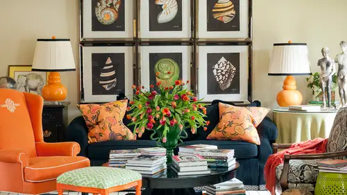
So why are basic color principles important? I mean, why do we even need to know color terminology? Well, for one thing you're going to see over the next few days when we start realizing that color is more complex than we think you're gonna want to be ableto analyse either rooms you've already created or create a plan for moving forward, and you're gonna want to know what the terminology and the kind of color rules are behind what you're doing, and even when you get ready to break a rule, which we're going to talk about doing cause I love breaking rules, you have to know the rules before you can break it, and when you don't, it becomes just sort of a haphazard piece milled hodgepodge of a space and that's probably why a lot of you are not feeling like you're having success because you're almost there, but maybe you really don't know that the terminology or the basic rules behind what you're doing to really know if they're working so it's, really important colors everywhere, as as the l...
adies were saying this morning, it's in packaging for our makeup, it's in our cars, it's in branding for every kind of commercial that comes on television, it's in what people wear, and we're gonna have a fun time also talking about so color psychology. Because we can create moods and emotions in our own homes and spaces or we can even get a mood or on emotion from someone or don't we even in a sense not meaning negatively, but just assessing other people kind of had formed an opinion based on how they present themselves with color or not um, you know, like I love you, you're wearing bright colors today and you're in kind of muddy neutrals and you're in like, classic dinner and all of those things say things about you, I mean, like a shiny silk, bold green shirt, you know, doesn't that say something about each person and maybe their color style? And it'll be really fun over the next few days for you to see if the way you dress really is how you build your color style and your interior? Because for some people they're the same and for other people there completely different, like some people love to go out and wear bold color, but when they get home, they want arrest, but that serene and really kind of, you know, neutral and warm, so so we're going to talk about all that but that's, why it's important on dh there's the whole idea of color studies and colors change when they're next to each other, so you could look at this green by itself and think, oh, that's, kind of a lime green, but you could put it next to another color, cya blue, and it might turn a different color. It might look more yellow or it might look another color, so we're gonna learn what happens in just a second when you pair colors with each other and what that does for really making something show up because it's more contrast ing or maybe blend in because they're very close to the same and it's all really important in helping us achieve those design goals. So if you want a serene retreat, if you want a space that's really energetic and fun and for entertaining, or maybe if it's, not even a home, if you're using this in a corporation or some other workout facility or something else you want to know about what color can do to help you achieve those goals that you set for yourself and will even talk a little bit about what your goals are. Um so what is color? Well, most of us think color is what will later in a few minutes, learn eyes, really hugh so but what color really is is the way light is perceived by your eye, and I love this thought because think about it we all thought everybody saw color the same way that we see it but each person sees color completely different, because all of our eyes are different and shaped different and the color of our eyes and the age of our eyes and also sorts of things affect how we see color and color is really that perception of light by the human eyes. So isn't that interesting? Like right off the bat you already think? Well, wonder how she sees color? Did they see this the same way? And you think about someone maybe his color blind is saying that they can't see certain certain hughes or tones dance that's kind of the same idea. We all see it differently. So light is a siri's of electromagnetic waves, and we're not going to get too techie like, you know, you don't really care. Ultimately we're going to talk about paint color on the wall, but this is why color is perceived in something it's not truly a quality in a physical property of an object it's how light interacts with objects, which is fascinating to me, but that seems all boring and complicated, and we're really not going to get too much into that other than just us starting to understand that we all see color very differently, so color, plus the eye plus light, plus the object. That's complex right way think who knew? I thought I was just playing on the wall and that's kind of what we're going to see when we get into even looking at fabrics because they have texture and different fabric content and plus the light plus the eye plus all of the things so it's really complicated we're going to make it fun but it's sort of a little bit slippery to understand all of those details so let's just look at a few of the basics sort of ideas so we talked about this really it's the visual sensation produced when lighters reflected our admitted so again we're not goingto the labor this it could get boring but just a little bit of technology I mean a little bit of history if you want to know in a little bit of kind of the wise and house and we think sir isaac newton for figuring out that light is what really helps this perceive color so color is not just a zay was saying a fixed physical property of an object, but we think it is we think this shirt is green inherently it's green but it's different green for all of you makes me want to be inside all of your heads right now seeing how you what color it looks like to you isn't that fun and it's really just a relationship or an interaction between I love the word, my, my eye, your eye, your eye, you're and what we're looking at at any given time, and we're gonna talk about over the next few days. While what? Why light in any given room, um, can change something and why you're going to want to look at sight, paint colors at different times of day, and I can tell you about cem disasters, love, head and design, where I made something one time, I made a pair of roman shades three different times for a show house, because and hang them in the morning, and I'd come back in the afternoon and they didn't match any more the next time I think we were like midday, when we're installing them, they looked great in the next morning, they look terrible. So, you know, it's really interesting that it is truly a complicated process. It's, not black and white, it is a myriad of things that go into color and light at any given time is one of them, and then of our eyes are the same. So let's, look for fun at some color models, and again, we're not going to go crazy on some of these the cm, like a model, some of you, if you're in printing, you know that that it is used for printing and some of us have heard like if you have a printer in your office and you need a sigh in cartridge or a magenta cartridge or yellow cartridge, those are the primary colors for that kind of color model and then there's the rg be model, which a lot of you use for like websites this and other things I'll tell you about a cool ah little sight you can go out too and play around with a color and it'll tell you exactly what the cm like a in the rgb and all these different models are if you want to use it for websites and it uses um red, green and blue for their primary colors but we know in the model that we're used to that you learn in elementary school the r y be the primary colors are red, blue and yellow right s so that's what we're going to talk about for our purposes because that's pretty much what we all know and have been learning at least in in america and at least since the time we were toddlers we knew that primary colors were red, yellow and blue, right? So that's what we're going to talk about today on dh to not make it boring but make it fun let's look att what um how color will comes together so primary colors for this model we said our red, blue and yellow, um, and you can't mix any other colors to get these these air the starting point, the pure hues that are used in this color model, but you need these colors to make every other color in the rainbow they mixed together on. We're going to talk about next what happens when you make certain ones, but again, thanks to sir isaac newton, he arranged these force. He did all the hard work for us and put it on a color will and should he showed us really the relationship of what can happen when we mix them and you think about mixing color like, as in mixing paint to create a wall color, but I think about mixing color as opposed to, like blue on the pillows and red on the floor, you know, the rug and green on the wall and what happens when you mix colors that way? So we're gonna talk about all of this, and it gets really, really fun and exciting when he mixed the primary colors with one another around the color. Will you get secondary colors on dh? It'll be fun to see which you love, but already, for me, my favorite color start getting represented a little more when you start mixing color because I love green, I've always loved orange. On we all sort of know what our favorite colors are and we're going to see later if our favorite colors actually get to make the cut for our own house based on some kind of our color goals but for me these air getting really close to something that I really love and you make you khun continue to create colors by mixing each of these and that goes to the next level of tertiary colors and I happen to really love these I've always loved fuchsia aqua you know so summit lime so some of the things that we think of as basic colors are really already a little more complicated because they've been created by mixing and combining on building gorgeous hughes through this method of combining around the color will so when you continue to do that all the way around you get this gorgeousness right here andi I think this is what I mean as a child that I'm drawn to this is why use color in my work nothing is more beautiful to me than seeing all of those colors and actually having all of those is a possibility in my life um you know it would be so hard for me to pick the ones that I love the most and were even in just a second going to talk about the difference from the lightest values and tents and tones all the way out to these rich colors on the end but I hope you're as excited. Yes, that's. A little geeky, but I'm very excited about the color wheel, um, and what its possibilities are in our home. Um, so one of them important things for us to start noticing about the color will is really understanding what color's air warm and what colors air cool. Because we started talking about how it's important for us to know things about color so we can achieve a certain goal or a mood or a look, and our house is andi don't think it's that conflict go. Yeah, I just wanted to be relaxing, but how many of us are really going all the way to the point of okay to get a relaxing look? I really need to get very deep into color when I want to understand how to achieve that. Well, it's really true, starting right at the beginning with the difference and warm and cool colors, and it looks pretty obvious to us. You know, you think warm colors are more sunny, kind of colors, they kind of radiate heat. They give that warmth into space, and I think of cool colors, like a pool, a swimming pool because it's cool and relaxing on dh, so if you use kind of those rules of thumb, you can usually figure this out on your own, but of course the closer you get to the center line. It's really borderline on whether some greens like like a lime green is a warm green it's much warmer of a green than, say, a bluish green. Does that make sense to you? Well, and I know this sounds pretty basic, but it's ac actually really important for a number of reasons, warm colors are very active and they advance, they don't recede, they're not relaxing cool colors air very, very passive, and they recede, and I'm going to show you an example of one of my projects when we go later this afternoon through toby's history of color on I'll reiterate this story again in a moment, but are this afternoon, but when I was younger, like light twenties, early thirties that lived in a nineteen fifties ranch style home with the pink tile that we've all you know, many of us have had and I thought, oh, this is so fun! I love color. I'm going to create this room that's, red and pink because I found a beautiful fabric that has red, orange and pink ride over here on this really warm side of the color wheel, I painted my walls bright red. I'm really bold and strong, and I'm gonna paint a bright red in my ceiling was pink and I tied it all together and it sounds crazy, but we'll see a picture of it. It was really kind of fun until I came home from work every single night and felt like I was in a straitjacket and wanted to, you know, be suicidal jokingly not I mean, I'm not really, but I'm joking, but you know, so much energy, no opportunity to relax in that space. So it's really truly important how color psychology can really affect you in that way. So knowing whether they advance our recede is really important, and then we talk about how to combine colors, complementary colors are the colors that are opposite of one another on a color wheel, and a lot of us know this from school, right? Don't you like purple and yellow are compliments and blue and orange or compliments, and red and green are compliments there they are an exact contrast of one another and there's a lot of reasons why we achieve things with contrast were going to intentionally contrast sometimes in our rooms and were going to talk about that too, but knowing what the compliments are important, we see, like the red and green that's, how the christmas holiday colors came about because they're a perfect complement and red we're going to even talk about the psychology of red and white bread is important in retail and it makes people want to spend money and buy things but really that's one of the reasons why those two colors are represented in that traditional holiday motif because they're complementary to one another if you combine these colors if you combine compliments, they create this murky, murky brown um and I remember, you know, when you were a kid and you had all your paints on the palate but you'd mix them all together and it and it was this hideous like brown black grey killer that's what happens when you when you mix complementary colors okay, so not to get too bogged down in this cause we don't want this to get, um to get boring but just a little bit more information before geeking out on color with you. We're not bored thing I was talking last week to my mom because I was in the throes of this and we were really close and I used her as a sounding board and I was thinking, okay, no one in the entire world besides may probably cares about any of this stuff and she said actually I think you're wrong I think everybody cares about this and even more so this week as we get into why we're gonna want to know this stuff so again yet a little bit tedious toe lay this groundwork but it's going to get really important as we move forward to be able to go back and remember oh yeah those were those were compliments or those were highly contrast ing or that is important for this space because it's relaxing and cool and calm design diva says this is awesome no way it's boring thank you designed eva so you know if you put thinking about starting to use compliments in a room every color this is really fun actually every color creates an actual visual craving for its complement and you khun do this at home are you khun do it later when you're not here if you stare at a color for a long long time like say blew our safety sarah orange for a long time and then you turn your eyes and look at a white piece of paper you're going to see blue your eyes craving it's compliments so the white paper will look a slightly bluish color of white which is interesting another reason why it's important when you start combining colors and you know how I was saying earlier when you put a color next to another color it changes the way it looks sometimes it's because of the after image that your eye creates from looking at a color and then seeing its complement s so that's really, really interesting and s o f you have the the confidence if you're bold enough to put compliments in a room, you're really giving the eye exactly what it wants it's really, really pleasing, and we're gonna look at some spaces in just a moment, one of which is mine on you kind of think whoa, blue and orange that's really bold together like, wow, I don't know if I could do that, but we're going to show you how it can work, and it starts to be more about not the purest, boldest color of royal blue and the purest, boldest color of orange that may be a tent or a tone, which I'll tell you what that is in a minute or a version of some of these colors that makes it really, really work together and and really beautiful. Um, but the caveat, as we just kind of mentioned it isthe very dynamic and very contrast ing most of the time if you put compliments in the same room, so I know that you're going to be taking a bold and daring step if you do this now, as we go through the next few days, we'll see that putting two colors in the room and a room together does not mean that you're going to paint your entire wall cobalt blue and have a vibrant orange sofa city against it that's pretty much what I would not recommend doing in most cases, unless you're really, really skilled at this and have a very specific plan now, anything can work there's always an exception to the rule, and I'm even going to give you some tools and tricks of how to make things transition and what, which is fun, but typically we're not saying a new entire room and a wall is this bright, bold color, and as you'll see, people look at my work and even debra, you were saying, toby's, a master at color and she's all these bright colors, but when you really start dissecting and understanding, my space is a lot of times, what you find out is a room that you glance that that you think, oh, that's, a really great orange, toby fairly room, the entire palette, the envelope, the walls, the floor, the ceiling are often beige, or a neutral and it's, because we place color strategically that it reads as if the whole room is that color, which is fun and that's going to be one of the things that I hope you love to take away from this, but just knowing that dynamic and contrast ing or two of the things you're going to get when we start this combination of compliments so let's, look at this example, but that's a compliment blue and orange, but isn't it great? And we're going to understand more about this as we go. But as I was just saying, look how there's very little orange and there's very little blue in this space but doesn't read is the blue and orange room it's really a white room, and we're gonna talk more and more about how that is accomplished and why, but I seize those strong warm colors and look just to test what we were just learning. Look how the orange advances like that's. The first thing your eye goes to its warm, and it really kind of screams color and the blue recedes, doesn't it? It's softer and of course we picked a tone of blue it's mixed with white meaning it's a powdery blue. So we'll talk about that and just a set, but I think this is a perfect example of starting to test our color one on one knowledge of seeing warm versus cool compliments together and really seeing the difference in receding versus advancing and the energy that comes from that if we had reversed this and the tables were blue and there was just a little pop of orange it would be a much cooler space not as energetic on dh part of what makes this room dynamic and you think of something that's dynamic it moves it has energy is the combination of the two colors together the compliments, the blue and the orange so do we have any questions yet? Anybody about color one oh one really? I just wanted teo to stop because I think that's really cool tio take that moment to analyze this and start applying the color theory wanna one? But can we tell me again? Like where with the yellow where's the yellow on the color wheel and is that place in the room for the flowers? That's a great point and I love that you picked up on that because throughout this week we're going to see that color can be completely achieved. Just threw accessories are just threw flowers honestly an entire neutral room with the papa fuchsia flower still looks like a no longer a neutral room s o yellow is is very close toe orange on the color will and so you imagine like the colors of a rainbow. A lot of you know, like the roy g ive it bib little trick red orange yellow blue indigo violet so that is similar to I mean already is it's how the color will is is arranged so red, orange and then yellow s o orange and yellow are analogous, which is a little sneak peek at what we're about to talk about on the color wheel there, side by side, they are kind of one in the same. They're an extension of each other, um and that's. Why you feel that sonny warmth from the tulips? Yeah, you know, it's interesting, we've got a lot of interior designers as well as armchair design enthusiasts watching, but we also have graphic designers and photographers and digital skillet says as a photographer, this is awesome. It really helps on how to set up an image to communicate what you want, and it helps on how to style and with colors that complement each other, which I get I hadn't really thought about mean, kenny, you're a photographer I hadn't thought about photography is the styling thing. I was thinking it more of his interior design thing, but well, you know, that's, a great point two and one of the reasons that I'm fortunate tohave people like house beautiful published my work often andi it's, part of what's really built you know my name in the business, which is great, the exposure of getting um, photographed often, I think part of the reason that I am successful is that at that is because I approach every interior design project, even just the room itself, whether it were never to be photographed like I'm looking through a photographer's, lindsay came roslyn so around a particular room, I will isolate almost a vignette or a snapshot and see the color positioning in the balance and all of that stuff, so I completely can understand why a photographer is is mentioning this already, and a lot of my success and the way that my work has brought to you, even for this course, is having a beautiful relationship with a top photographer that really understands what I'm trying to achieve, and the same for me. Um, and it is often about that color, balance and placement, even on the screen, and whether we move the flowers over to this side, or that this saturday, pulling forward, or what color they are, as as important as deciding what color the flowers are in a space, you have a question, spaces before I've taken pictures of them, because I think I look at the room completely different when I see a photo versus walking into it, I agree, everyone does, which is an excellent point as well, so when you take a picture of a room, particularly even if it's completely finished, they never looked like this with the professional lighting and all of that stuff, but don't think suddenly look really unattractive when you take a picture of them, you're like, oh my gosh, I thought it looked I thought it was a way farther along this decorating process than that, and it just looks awful, but there's something that happens putting a space into dimension as to put as opposed to seeing it in the room. So we're when we're in the room, just like we were just talking about with our eyes, our eyes can't perceive all sorts of things in three dimension and death and relationships and color relationships, and you don't get any of that benefit and that help when you put something into dimension when you put an image flat, so but it is the best way to start studying and correcting what's not working, I think that's, exactly right, and we do that all the time. In fact, for our work, we photograph every space from every single angle as it before and often we even photograph it in the middle so it's not that you aren't skilled at decorating just because you have to use these tools, even the pros do this. And we see how the balance is coming along and what it looks like on film and then you ultimately we photograph are we do photograph it again, right before we bring in the professional photographer so we can get things just right? Did I answer your question cannon on the yellow flowers? I loved what was the reason? Just understanding how that little piece plays exactly just coming back into the I mean, when you started to talk about the orange coming forward and the blue receding, I hadn't I hadn't thought about it in that way, so I think this is what I love about this course. So you think, like I said this morning, how in the world world can we find three days worth of content to talk about? But honestly, before you came into this room, you probably would just go oh yeah, blue and orange tree. Now you are already seeing there's so much more that's it at work here and the percentage of each color in the room and whether it's on the wall or not on the wall on you know what, how it's accessorized and what other colors come into play and we're going, we're going to break all of that down all the way to the nitty gritty in that same bolts over the next few days, so we understand all of those little details, but it's a lot more complex than you would initially think, right, all those wise behind it. But I really appreciate digital skillet in there and and other photographers, because it is so critical to photography, so many different aspects, and so the ability to see differently when you're creating that and well. And as your photographer audience knows. And you said you came from the photography world, right? You all know there's a lot. There's a big difference in photographing rooms versus photographing people versus photographing nature. And a lot of all of that is about the color of all of those things. Gets skin tones versus a room and natural, either so many pieces of it, and a lot of that hinges on color. It really does.
Class Materials
bonus material with enrollment
Ratings and Reviews
1st Carpet Cleaning Ltd.
Very convenient and creative! Continue In that way!
a Creativelive Student
Fantastic Course!!
Student Work
Related Classes
Interior Design