Lessons
Day 1
1Class Introduction
10:02 2Color Models 101
26:46 3Color Schemes 101
45:39 4Debunking Color Fears
44:02 5Debunking Color Fears Pt. 2
25:23 6Evolution of Tobi's Color Style
42:37 7Evolution of Tobi's Color Style Pt. 2
44:12To Trend or Not to Trend
12:47 9Color & Design Trends
31:36 10Color & Design Trends Pt. 2
25:37 11Tobi's Color Inspirations
22:09 12Tobi's Color Inspirations pt. 2
23:29 13Using Inspiration Boards & Q&A
19:43 14Psychology of Color
36:34 15Color Meanings
17:04 16Psychology of Color Q&A
12:55 17What to Consider Before Choosing a Color
26:20 18The Right Color: The Entry & Living Room
19:27 19The Right Color: Family/Dining Room & Kitchen
21:19 20The Right Color: From Bathrooms to Outdoor Spaces
20:05 21Pairing Textile Elements for Success
28:49 22Pairing Wall Color, Pattern & Texture
24:42 23Floorings, Furnishings, Art & Lighting
19:04 24Intro & Top Color Palettes: NYC Showhouse
24:41 25Top Color Palettes: Hampton's & Richmond Showhouses
21:31 26More Top Color Palettes
33:46 27Layering Color Palettes in Your Home
38:16 28Transitioning Color Palettes in Your Home
28:08 29Historical Overview of Color in Design
16:47 30History of Color in Design Examples
43:59 31History of Color in Design Examples Pt. 2
16:32 32Color Mistakes to Avoid: 1-6
31:20 33Color Mistakes to Avoid: 7-10 & Final Q&A
40:06Day 2
Day 3
Lesson Info
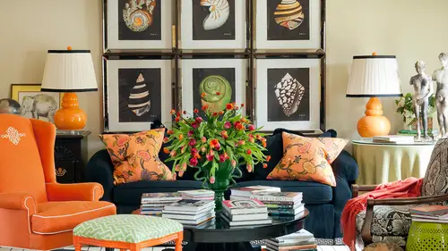
Color & Design Trends Pt. 2
Think about how read really became not so trendy over the last few years, so maybe ten or fifteen years ago, everyone had the red dining room like it was the trendy room in your house to paint red right on. And then we all got so sick of it because it was like, if I see one more red dining room like that was clever the first time in the second, and like the fourteenth time that you saw it. But after every single house in your neighborhood out of red dining room, it was became boring and even to the point of us moving away altogether from a lot of reds, and I'm seeing them come back now and everything from that sort of tomato coral we saw earlier today to like a pinky raspberry red all the way to the back to the eighties, jule tone, burgundy towns, and they're used in a different way now maybe they're used with soft graze, even like in this so that all mostly and this is from a few years ago for me, but that's really almost leans toward that richer, kind of burgundy tone mixed with gray...
. Definitely about the textures and a lot of these burgundies like in this space the richard tones are being used with the really dark wood tens so not a lot of contrast there it's not like burgundy with white trim it's all moody and smoky and dark and sexy onda lot of that was just a market and then as we were just saying a lot of blues everything from a more electric turquoise here, but particularly into so this is more even like a deep teal kind of tone to navies and definitely cobalt blue which gonna look at in a few minutes when we go out to pinterest but not yet mixing them with compliments of orange even this would tone almost becomes a blue an orange kind of situation there because you see all that amber kind of town in the wood and then, um lots of gold not just gold metallics but gold again harvest gold seventies james bond gold the sofas you just saw that I used in the the chancellor hotel where a punchy gold mixed with gold mixed with dark wood everything from a lot of gold medal and brass xas application to with pieces one of the pieces I just selected out as a trip style spotter for the high point market, which is also one of my on pinterest you can see like rich would tens with brass piping on pieces of furniture that looks really great it definitely is kind of that brass of the eighties too like brass and meddle brass and I mean not breast metal metal and glass brass and glass s o we're going to see that in just a moment we get a pinterest and then still gray and for me gray has been really the color for interiors the neutral color for several years now but I still feel like ah lot of the public is just now really starting to move into grey is they're neutral everything from soft soft graze to rich char coals and we're even even seeing that a ton and every kind of fashion and nail polish um so definitely grey um here's that kind of mint green jadeite idea like retro it looks great with purple there was a lot at this market though I would have called amethyst and mint um alexa hampton who was a very famous designer dad was a famous designer mark hampton had gorgeous furniture collections at market all done and like an eggplant mixed with this kind of mint green so a totally fresh and different kind of spin on green and purple a lot of us have seen green and purple before and maybe it was a line with sort of a medium purple and now it's maybe eggplant with mint green totally different freshens it up by just playing with what color of purple and one color of green and that's what I love to do is go what combination of these seems fresher and newer indifferent tham what I've seen before and then a lot of black and white thank goodness because clearly I now realize I use it in every single project ever do black and white who knew but very very popular and we're going to look at some of that in just a minute and a lot of it mixed with single pops of bright colors not unlike well that there were actually two colors in that jonathan adler room it was black and white with yellow and turquoise but a lot of black and white with turquoise, black and white with kelly green black and white with a pop of yellow in the break someone here was saying my houses all yellow and it's a rental property and I can't change it what do I do to cover it up? And I said actually, what about embracing it and bringing in a ton of black and white and making it really cool and chic and kind of new york and that was kind of a clever approach to thinking about how to really lean into yellow and then some some mixtures of certain colors particularly golds and graze and I think it's kind of that idea of mixing metals like if you even think about your medal finishes silvers and crooms and nichols with brass if he translate that to a color palette it's, it's, gray and gold or gray and sort of yellow too. So let's, go out and look at, um, several of these on our pinterest board let's, look at a few of these so let's look at red, which we think of as a very classic color, but one that really kind of died off for a while and see how red khun b fresh could be fresh with gray. Um and look at the proportion there's very little red in that room, but the red is what you see and it's a cool space really being a great town, but I love the graphic nature of it s o mixing, you know, if if you've changed all your neutrals to gray, how do you warm that up or make it exciting? Maybe it's with a little pop, a red here's, a totally embracing rid and a room by designer miles read I think, and that's red is a neutral who knew red could be a neutral? You think that red's the opposite of a neutral but literally of course it doesn't look like a neutral, but you know what the point being like rafting a room color, wrapping a space on dh, really making it be the backdrop in the story there on dh then I love red and, um as accents and especially looks good when it's in a lacquer it it brings back that old classic chinese lacquer idea um, but it looks really exciting and fun. Um, showing us a few of scott macon woods design paces and just wanted you to know that on twitter scott mason wood is watching you giggling and loving out I had a lot of friends of course I surround myself around myself with designers who love color so it's sort of like we're in a club together because no one else quite understands us and we're willing to jump out and embrace these wild tents. Um so let's look at a few blues there's everything from this soft, powdery, gorgeous pastel blue with a black pop of black and white, which is entirely different from something like let's see ah this which is bold classic navies, but because that pattern is so enormous and strong it looks really fresh and interesting to something like this complimentary color scheme of um blue and and the kind of warm tones and with a neutral wall even that wood grain kind of football look, which is really interesting um is that wool? Did you choose that as a color in it and put it in his a timber was that it just wasn't my design is auntie si his space? This is not enough, we know who the designers I'd like to give shoutouts to the people that when we can but I don't so I can't I can't speak to it but it looks like a lot of of of homes I know in different parts of the country have like picky cyprus or different kinds of materials that are very native to that part of the country, particularly like in the carolinas and other places that it would this would be a fun way just take something that's really rustic or traditional and punch it up with color so I'm not really sure where this space is it could be a vacation home outside of the country and it could be a million places but really interesting and then let's see if there's anything copal so this kind of cobalt color that we see in fashion right here's what we're starting to see come into a lot of interiors as well um which is really bold and fun and then here's like an analogous that when you were saying like, what do you do with purple that's purple that's from a royal to purple on and that's really interesting to me um everything from this being really blew right in here to let all shades of purple even to the magenta but that's would be an analogous harmonious color scheme uh it would be very hard to achieve for an amateur when you look at all the different blues and purples would agree that that but gorge a certain skill set for sure I agree with you um here's a here's a strong blue on the wall um and again there's a lot of layer of some kind of analogous color schemes from teal to cobalt even intestine purple since that one looks a little more um collected though in a little easier to achieved anything cause it's a little more casual and not so perf if it's not so matched as this one eso at all sorts of things happening in blue which I think it's fun there's something super classic like this that's still really gorgeous then I actually had a question while you well, you flip through that one from bethany who says on tv decorating shows designers replace it brass hardware with silver nickel dark but home magazines are showing brass again what do you predict? His coming out of your ass is everywhere and I've been using it for a while I would say three or four years and again that's part of that whole trend cycle, which is what we're talking about here so nickel not that any of those around but what really became popular with homeowner home owners and television shows and has trickled down on it's still being purchased is like the bronzes and all of that oil rub look and designers that air really forward have been moving back to brass for away while three or four in fact most of us never even moved away from it ah lot of us didn't we always knew that it was classic like something like this I adore the stair railing and brass and that is so classic that could have been in a hospital hotel for years and years and years and so again it was really great classics never go out of style but if I heard once I heard a thousand times when I was first starting my design career are my first starting my business ten or fifteen years ago so I have to get rid of all my brass are we getting rid of all the breasts I remember at the time saying it's not about looking at a trend and people saying it's out so you instantly rip it all out of your home it's more about do you like it doesn't work for you does it support what's happening in your space is it classic is it quality if it's cheap yeah maybe we want to get rid of it but you know how does it how's it represented in your space this is another great rob castle show house in new jersey and there's the lavender and gold together which I think is really, really sort of edgy and urban in new york um, which is where he's from, um let's see, look at this gold cabinets who could embrace that? I think that is amazing mixed with the gray marble very edgy. Definitely going to be a long time, if ever before that trickles down to the common household. Ah, very, very edgy. This also very edgy, but this is not really what we mean. These air sort of like the show house runway version, but more to the gold sofa I was showing you earlier. And some of that space is the one we just looked out from. Rob that's more about what gold's looking maybe even this but that's still a little strong for most people right now, I don't know that that kind of camel gold color was really in for a while, so I think most people could could work their way back to this because it's really sort of that neutral route that they came from. Yes. So I was wondering because I've seen this on the ceilings a little bit and then we looked at it in the kitchen are those like, ah, wallpaper painter, what gives you that look? The best the metallica go that those were probably metal cabinets, the cabinetry okay, andi, like these metal light fixtures, this is the kind of thing that I saw all over market metal used in fixtures like this in fact that just was talking on the break about a penthouse I just finished and I can't can't show anybody yet because I'm sending it to some magazines but I've used cobalt in that house and I also used some giant gold pendants over the island that air fantastic um but the the cabinetry was metal um some things you could do with um you could certainly there's some beautiful wall coverings that you could get sort of that gold lemay if you want that on the wall peace is the ceiling was that was a phillip jeffries metallic wall covering and hey as everything from silver leaf to gold and everything in between another thing is this a lot of even pieces like these that have a wood grain look but done in a metallic finish very very very popular right now on the very trend forward seeing those at markets and and other spaces let's look quickly at a few gray's um and a few and I love this grave for all the molding no contrast that the door facing zehr great everything is great you could you could paint an entire house all the same color gray just like you would imagine painting something cream or white on it could be really, really gorgeous or it can become layered in and all ways to add interests and pattern from metallics to matt finishes and woven sze um to something like um say yes we have I love this it's brick I love painted brick too, but that's a great idea of how to get fun texture into space so if you have a brick wall, even if you have like, a red brick wall and you want to really update a space and make it become a backdrop, don't be afraid to paint the sheet rock or panelling or whatever you have and the brick all the same color because you still get interesting dimension and form and death but you don't have the contrast that you would have if if that if that was a different color yes, so gray makes me giddy like I love gray in houses. What what are no interior? What do you what do you like to pair great way? I mean, I know you compare it with a lot of things, but look where you're just with the orange. This is like a member right here, but that gives you a tiny little hint of what great with orange looks like great with yellow is tastic certain graze even charcoal lt's, charcoal and wide, almost like a black and white with a pop of cobalt eyes fantastic, it looks beautiful with lavenders and peaks I mean there's almost nothing that it doesn't go with, it depends on the shade of grey I mean it can look great with green avocado green and like gray flannel could look really you know warm and rich as well so again um almost anything goes with it really um right so awesome even gold and likely I strangely that one trend like the gray and gold so you think about well that's the one thing great doesn't go with is like gold or brown tan but it does if you are thoughtful and how you connect them together in prison then let's look at this um mitt or jadeite in interior so I think this is fun this is kind of my idea of black black and white with everything it has a definite retro sort of vibe but I can think it's really fun refreshing and fresh too even chanel um is embracing that kind of mit color let's look in an interior it khun goto everything from sort of ah martha stewart passed stale teo just like this is really fun and meant to metal chairs with a reclaimed rustic table so pop of color on those shares but really interesting in what in the middle or something let's find a rule of this one on the wall again see how much and we're gonna look at black and white next but look how much interest you khun get pairing black and white with just a single color whether it's yellow are meant or pink or something else um, let's, see if any of these are good examples here's, the space that I did several years ago, but it's so it's a softer version of tone's, intense of those sort of minty greens and that's with gray. Um, which looks great, um and here's my mom's kitchen cabinets at christmas and a bright mint green and it's very retro and ah, a little fifties asked which we love. Um and then finally, I think the last one we can look at this black, the black and white trend and then we'll take questions here's the idea of black and white with the pop, this was the piece I just found that market a few days ago. Um, so that bright yellow with black and white, um, black and white with no other color can be totally chic and sophisticated. Still, I mean, just almost can't go wrong. I love this look at the floor pattern in this mark earlier from someone in the chat room who said I can never get tired of black and white it's just so classic it's so, so classic, but lookit, I mean, something fun like this mixing it with those woven shades really adds, I'm cem depths and contrasts and a little bit of nature not so serious I'm so again the moods like black and white could be formal like a tuxedo but it doesn't have to be depending on what else goes with it and it's so fun to use it use it in a graphic way because it just lends itself because it's such high contrast to create some really strong motifs and statements and design but it's definitely still very, very popular on trend in stripes and patterns and there's just almost no no color combination like black and white that can help you achieve some of these bold dramatic contrast ing patter turns out one of the questions came in and I know I'm seeing this on your next side but was how do you feel about this was from jessica arnold how I feel about the trend of using cow hide is that on a away very very forward and trend right now some of the other things that saw um cobalt cobalt with orange mint with am assist even a red and green not like christmas red and green but like rich olives with like a pop of a brick red um so I kind of think like army fatigue green with like a little bit of a brickey rid um and right and greener compliments so you can see how that works in and there's all kinds of things like motifs like lots of butterflies for a while there was a lot of birds ah and design so seeing lots of butterflies lots of rich dark wood finishes which really work is the color in your space if you're putting a dark chocolate rich shiny um finished piece of furniture it's going to read as a piece of furniture and I mean is a color and then lots and lots and lots of cow hide hair on hide on everything from entire sofas, entire chairs covering um cabinets, bureau's bedside chests and not in the typical color so I think that's another flashback from the eighties because remember how leather got really weird in a sense because it came in every single color and now we're back to using like colors that leather doesn't really come in like teal or you know all kinds of colors and so you're saying that in the the cow hide the hair on hyde meaning it's not leather that has been um, you know, tanned it has the actual cow hide on it in colors and so an entire sofa done and navy hair on high just a few days ago and it was gorgeous. Um so my quickly my rules of thumb just is a reminder for using trends don't incorporate too many and one word I'd be have some restraint because they can't all be a focal point, so make some decisions on which ones are most important for the space and why you're putting them in there s o and not even overboard on a single trance like you don't need tohave it in every single room of your house just because you introduced it in a space let it kind of have a piece or two that are really conversation pieces and that's really enough use some restraint there, um, think quality so a lot of times when transfers come out, remember it's the most beautiful form of them on the beginning of the trend often are at a really high quality level, so ask yourself, has this been watered down? And then most importantly, don't let a trend get in the way of good design in either direction, meaning that you won't take it on because you think it's trendy or, uh, or you're creating too much of your scheme and you're good design sensibility around a specific trend um, so incorporating it in that cohesive design plan is the best result for trans so awesome! Toby has been a jam jam, but a like goodness my head is is a little bit exploding. I know we've we've talked about trying tio you have ah ha's that allow us to simplify perhaps our have more freedom, as kirsten was talking about earlier in the day, seeing all these choices, but also I think there might be people out there like me who are like how now where do I start so after today if you're that person, where do I start with what you've taught us today? S o it's kind of like my rule for being on twitter listen first before you speak, so just start taking all of these ideas in and start becoming more self aware of some of you were saying noticing if you if you're being a dick falling victim to certain fears or if you're being haphazard with the way you combine colors it's more about kind of becoming a a kn observer of your own style and everything that's happening around you first uh so just being becoming more thoughtful before you leap into any one area and then start prioritizing what's important to you is important for me to start bringing color to my walls or maybe some new trendy a version of something like which of those things excite you must because we want you to have fun and again like you said earlier, repeating what I said who wants to live in an uninspired space? So what inspires you most and what inspires you and you and you and you and me are all going to be different um and so really I want you to start to take that first step towards crafting on paper what is my personal designs, style and color, style and sensibility look like that's the first it we have. We have plenty of time to start by. You know, everybody wants to run out right this afternoon from this course and start ordering hair on hide, and jay died and purple. And, yes, but remember what we talked about all day. Plan, plan, plan and forego that instant gratification so that you can really build an interior that is exciting and a reflection of you.
Class Materials
bonus material with enrollment
Ratings and Reviews
1st Carpet Cleaning Ltd.
Very convenient and creative! Continue In that way!
a Creativelive Student
Fantastic Course!!
Student Work
Related Classes
Interior Design