Lesson Info
3. Selecting the Right Type for the Job
Lessons
Bonus Video with Purchase: 'Custom Letterforms - Gerard Huerta'
1:05:31 2Beginning of Typography
14:15 3Selecting the Right Type for the Job
40:00 4Text vs. Display
23:10 5Type Hierarchy
21:13 6OpenType Demystified
29:56 7Taking the Plunge with Type
15:28 8Think Like a Type Designer
23:10Lesson Info
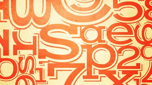
Selecting the Right Type for the Job
The first thing we're going to talk about this morning is selecting the right type for the job. Okay, this is one area that's very a daunting to a lot of people on dh it's absolutely critical to to a job in fact, the time spent doing what I call a font exploration you could never spend enough time doing that because once you select the right font or fonts, you sometimes are fifty percent there in your design you could have the best design on the planet, but if you're not using the right fonts it's not gonna work on the other hand sometimes the selection of the fonts or typefaces and I'll explain that a little bit a little bit later than the actual difference. Sometimes it helps a piece actually design itself because the type speaks to you, it speaks to the message and then it makes things a lot easier. Okay, so type you know, as as I've been starting to say, type has the power to make or break a job, every typeface has a distinct personality more or less could be biggs personality coul...
d be a small one and conveys a different mood message or feeling, but before beginning your typeface exploration, the most important thing is to know your goals remember, your primary objective is to serve your clients needs not your own and this is really, really because there are a lot of designers and a lot of people in the creative world who think I want to make this great statement, I want this to express me. This is all about what I think designed should look like, or I want to enter this in such and such competition. So I want to put everything I know into this piece and make this killer piece no that's, not the way that's, not your job as a designer if that's an offshoot of what you're doing that's fine, but your primary goal is to serve your client's needs and not your own. If your primary motivation is self expression, be a fine artist, okay? Because then you're not trying to serve, you're not getting paid to solve a problem, okay, every job requires a different approach. For instance, an annual report usually requires high ledge ability, and usually it has to capture the spirit of the company. Ah, book cover as opposed to a book interior, needs to be eye catching and tell a story. Tell the story in a split second now that the thing you should think of if you're doing a book cover, for instance, is although a lot of people buy things online, if you go into a bookstore, okay, you're inundated with book covers. You should be able to tell, even if you're in a foreign country where you can't even read the language, you should know where the romance section is. You should know where the history section is. You should know where you know what the other the technology section, perhaps, or the novels just by the way the cover is designed. And by the way, the covers design means that the typography is fifty percent let's, say, and sometimes one hundred percent of how that looks so it's not just about also it's, not just about making something that looks good on your computer, you have to consider the environment is going to be viewed at. So for instance, if you're doing a book cover and you really want to see how your idea works, take it to a store and see how it looks on the shelves next to other other covers. This is what magazines do if you ever designing magazine covers, for instance, it's not about what looks great in the studio on a blank wall, it's what's going to attract it tension compared to what it's next to okay, so these air things as an intelligent designer prior to even thinking about the typography that you need to establish at the beginning. If you're doing a travel brochure obviously it needs to do things such as evoke excitement and the flavor of the foreign country because that you want somebody to to to buy into an experience a foreign experience so both the typography and the images and how they work together are very important it's a point of purchase kind of things something or it might come in the mail it's something it has to say you want to get somebody to not throw it in the trash okay, so it all has to work together on the other hand something like a textbook or a novel we're talking about the interior and this could also apply to a magazine or emmanuel or something like that needs to use pleasing ledge a ble text okay attacks typeface that doesn't tire the eye so text typefaces which we'll talk about in a moment are different from display typefaces and the purpose is to make it easy for a person to read and to not have their eyes tire from reading too much so it's not supposed to have a lot of personality which we'll talk about in a moment so these are the things you need to determine first before you start picking your type and determining what your designs going to bay the second thing is to know the demographics of your audience who is your audience okay? And if you don't know who your audience is ask your client this is the point where there's got to be lots of communication before you start doing anything okay, for instance, if you're designing for children you want an easy to read type face something that is child appropriate with simple shapes you don't want to get complicated letter forms when children are first starting to read and it's not easy for them you know it's you wanted to be engaging and pleasant for them if you're designing for seniors and seniors could be somebody in their sixties or somebody in their nineties okay? We all have different things that happened to the way we read the way we see as we get older so find out who that audiences seniors usually require designing with clarity and ledge ability very often a taller excite in a typeface creates more ledge ability and makes it easier to read if you're designing something for teens such as a book or a magazine, you can probably go with something that's more edgy and and mohr expressive designs I've noticed some maybe not so much novels but magazines for teens they're really hard for me to read but I I don't think that's the point because teens air more retracted and I'm not a teen obviously so it's not important for may then I want me okay? They want somebody to go oh that that expresses my sense of whatever rebellion, grunge, whatever, whatever the audiences to be something different, a teenager doesn't want their magazine toe look like what mom and dad are reading okay, so you have different considerations when you're picking typefaces and you're designing for teens you should be asking yourself how much reading our you're asking your audience to dio the reason I say that is once again as much as as a type specialists I think ledge ability and the message is the most important thing it might not always be because some of these edgy teenage magazines it could be a rock poster it could be a logo using type for somebody that's very counter culture and edgy they might be more interested in the look and attracting the audience to buy the magazine and just interested in how it looks and how cool the pages are and all this is great did you see how you know so that might actually supersede how much you want them to read so you might be choosing a typeface that isn't so easy to read for the average person but might be just fine for the teenager or that particular audience. You also want to ask yourself what information do you want them to walk away with again, that could be super critical? What if you're designing something for seniors that's instructions for medication or instructions what to do in case there's a fire or something that's really important for them to know? Van it's it's incredibly critical that how you design and how you set the type is really easy to read the important elements might have to be highlighted you have to put yourself in the shoes of your audience, okay, again, it might not be as important if it's a movie poster and the main thing might be just the title and just the image, maybe all the information on the bottom which relates to who directed who, who, you know, it might not mean it might be very important, but all the other credits on the bottom might that not be that important? In fact, you'll see in movie titles or credits, sometimes things move so fast you can't read them, they're less concerned, perhaps with that, because sometimes things have to be there legally, sometimes there's little legal information on the bottom of a piece that they don't actually even want you to read. It just has to be there, okay, so things have different levels of importance of hierarchy, which you're going to talk about. So these are the things this is the homework you need to dio before you start to embark upon selecting typefaces and designing your piece, okay, so you're basically going to approach your design with all of these factors in mind that I just mentioned that's, how you start any and every job one thing you'll hear me talking about a lot of two terms you'll hear me use our ledge ability and readability, and there actually is a difference. And although remembering this is not going to make or break your career, it is important to understand the concept of the difference because there is a language and design in language and typography. And although we like to think of ourselves as visual people, we do have to understand the context of some of the language in order to not only so you could do a better job. But if you need to talk to a client or talk to your boss or sway your boss or client as to why one choice is better than the other it's important for designers to understand how to speak the language of type and design even though it might be a challenge. Okay, it is important and it will set you apart and above other people in your office in your studio looking for that job in your school. Okay, so what is the difference between ledge ability and readability? Ledge ability refers to the actual design of the typeface. Readability refers to how it is set or how the type is arranged. So ledge ability relates to design characteristics, including things such as character shapes, the x height, which is the height of the letter x compared to the caps ah wait so whether you're using a very lightweight a medium weight or a bold weight is going to effect the ledge ability so for instance, you might have a typeface that is considered very ledge a ble for book typography but you're not going to see book set in ultra thin you're not going to see a book set in heavy or ultra bold because they're not is ledge a ble in general as the book weight and the name book way tends to come from the fact that it's all often used for books could be book could be regular could be medium those tend to be the weights that are more ledge a ble the size of the counters counters are interior closed spaces in characters so for instance the inside of the veggies the b any character that has an enclosed space that negative space is called a counter and that's a good terminology to remember because again it's going to help you two sound like you know a lot when you're talking to people who don't, you know and again it could be your boss a client or whatever so they say, but I like that why don't use this? Well, this typeface is more open counters and it's a lot easier to read and you're going to capture your view so I mean it sounds like b s but it really isn't it's really truth and you really uh I feel that as a designer you often have to educate your client as well as your boss in order to get your point across in order to get them to choose the most appropriate solution upstroke contrast relates to things like some sand saref smite there's not a lot of thick and thin as they might be all this it might be model wait they might have a modified stroke contrast then you could take something like a modern or you know a dedo which has very extreme weight contrast and has very thin thins next to thick strokes okay those air not going to be is ledge a ble so while they might work well at large sizes for headlines you're not going to want to sit taxed in that because it has reduced ledge ability so that's another aspect that contributes to the overall legibility of a typeface um this one is I guess a little controversial is a serif typeface or sands and this comes up all the time everyone there's always this debate what's more ledge avila sands or a serif okay in general they can both be extremely legend it depends on the individual details of the design but I will say that in book typography and in magazines you're mostly going to see typeset in sarah of typefaces except form or experimental publications and one theory about that is what we read most we read best so for instance in the us in this country most people are reading sansa of typefaces and books and magazines so it becomes easier for us were more comfortable with it we'll more used to it. Yes well, you may be getting into this but we have some people wondering could you explain quickly the difference between sarah finn san sarah okay the sarah ifs are the little extensions this this is a sand serif typeface so I actually will be showing in another screen but I'll just I'll just say right now it's probably coming up very quickly a serif typeface is a typeface that has little feet or little extensions that come off the bottoms or the tops or different aspects of the character okay, you've all seen them not everyone might be familiar with the terminology sands which means without sand saref means it doesn't have any of these little extensions so all of the characters that just sort of straight characters they don't have any little details but as I said I'll show you in a moment what the difference and then and then that's important to know um okay, so again sarah of sands it really does does depend um and as you become more familiar and more comfortable with typography you will have a sense of when you might want to use a sense and when you might want to use a serif and when they could appropriately be combined okay so that's ledge ability ledge ability relates to the characteristics of the design of the typeface readability on the other hand relates to how the type is arranged basically you can't control the readability of a typeface where is the type designer controls the ledge ability of a typeface so the factors that contribute to readability include the point size or that's almost not even use that much if you're a web designer it's just type size okay, so I don't think boyd sizemore relates to print um letting which is another word for line spacing the spacing from baseline to baseline line length we're going to be talking about all of these things in detail over the next two days um line length mostly relates to how many characters in the line not the physical with of the line okay alignment whether you set something flush left flush right centered or justified that effects readability letter spacing which is the space between the letters which you might think you don't have control of because the fun is when you get a fot that set with a certain letter spacing but I beg to differ I'm going to teach you how to notice the difference and when you should consider changing the letter spacing and how to do that okay the same thing with words spacing that's the lets the space between the words and most of us don't even think we should or can why should we even think about that? Because I buy a foton I assume it has the right space between the words not always so and it might change as type is used a different sizes so I'm going to tell you when and how to approach considering if word spacing should be changed and actually how to do in the software because it's sort of a secret that most people don't know about that. Okay, so these are the factors that contribute to readability as opposed to a ledge ability so gets a little confusing but alleged will typeface which is one that is drawn by the type designer to be ledge a ball can be made unreadable or less readable by how it is set. Are you okay? Conversely, a typeface with poor ledge ability can be made more readable by how it is said I'm not saying it could be made fantastic I'm saying things can be done to improve, eh typeface that doesn't have great ledge ability by you the designer by how you said so this is an example of a typeface called eitc flora, which is actually a beautifully designed, very ledge a ble typeface which is made somewhat hard to read or less readable by how it's set primarily because the leading or the line spacing is very tight okay the same typeface is a lot easier to read even though the point sizes smaller the leading is a lot more generous so if you kind of go back and forth what you see on the left is a very dense texture that's not inviting and it might be conscious or unconscious it's a little more challenging to read but when you see on the right it's a beautiful typeface made to look the way its supposed teo as I repeat even though the point sizes smaller because of the way it is set because of the generous line spacing can you see can you guys see the difference is hopefully at home you can see so you do have control over certain aspects that can increase readability okay now I'm going to show you a bunch of or a few examples just showing some appropriate uses of type styles of type faces for a particular audience so this is a dr seuss collection this is what I would call a child appropriate treatment a child appropriate typeface the letter forms are easy to read they have a child like feel but they don't look like a child's hand right okay so we're not looking to score gribble like a kid you just wants something that speaks to a child and also speaks to the parent or the person buying the book you know its marketing as well that looks inviting here's another one again and and you know learning how to use type appropriately is not just picking the right typefaces clearly involves the design. It clearly involves color. It clearly involves a lot of other aspect. Pss um and so you know this this is lovely it's, colorful it's inviting it's definitely eating the title is very easy to read. I don't know if we can see that clearly on the bottom but this this is a sand serif typeface. This is a serif typeface and I will have some better example. So if you can see down here, um, if you see there's little extensions on the top of the beyond, the time on the bottom of most top and bottom of most of the characters and so that's a serif typeface this's a classic stories and picture by maurice sendak's so even all caps which sometimes they're considered to be not so easy to read in small doses in the right type face, um works beautifully and it's important to integrate the right type, facing the right treatment with the other images or with the image in this case, so everything integrates beautifully the type and the image and the type is easy to read. It does it's not childlike but it's very informal it's warm, it's friendly it kind of says, I wanna buy this book I want to read this book so that's an effective use of a typeface for this particular audience another lovely book here you can see that you can really see the serif swell on this if you look at the word flora even though it's highly decorated you see all these little curves that come off here thes airil sarah if you can really see it on the flamingo thes little extensions if they went away you would still see the used to be able to read the character okay but this is a category a large category of typeface called sarah of typefaces and here it's actually a good pairing of fonts which are going to talk about in a few minutes a cz well what again it works well for this audience even though the first word is highly decorated it doesn't compete with the image because even though the image is right in the centre, the image is doesn't have a lot of it's absolutely lovely but it's not super busy there's a lot of white space or a lot of pink space is well if you want to call that white space so the word flora actually becomes a real attractor to that cover and in fact if that word was set the same style is flamingo it would really take away a little bit wouldn't have that same impact because the setting and the treatment of the word florida becomes a focal point of this cover which is appropriate for this audience um a section of another of a book and this this is not a child's typeface I mean, this is an upright script on and you could use this for a lot of other things, but yet it's very ledge a ble it's set in a way that's, very readable. It's very appropriate for this. It has that kind of dreamy script connecting piece on and it works beautifully with with the rest of the elements. This is a cover on this and I believe the next one designed by jim species. And even though there are three different type treatments, they still speak to children, even the big abc it's it's. I mean, it has a kind of a vintage kind of a look, but it definitely you would know that this is something for children, even in if you didn't know the language. Also the appropriate use of color placement and not too much business. I mean, this is a strictly typographic cover. There's no image and there's a lot of pieces you can work on, whether you have a low budget or its most appropriate, where all your using his type and the goal is after today in the next session is to get you comfortable enough with typography that you could even contemplate doing a design without any images, if that's what you wanted to do in some cases it's absolutely appropriate here's another piece by jim species who also did the illustration as well as the type treatments now these three typefaces might be difficult to read if there were quite a lot of of of text to read but since there isn't and the idea this is a menu the cover of a menu so the concept is again to attract the attention toe let people give the feeling of this french bistro aunt tohave the type integrate well with the image for that particular audience for that demographic for that purpose which is a menu in a restaurant so it's not so much that it's needed to bring people in although it might be if this becomes sign itch of this becomes the sign in george the logo of the restaurant it has to serve two purposes so that's another question if you're doing an identity for yourself your own business or somebody else you want to know every instance is going to appear okay, I need a business card is it going to be on the website? Is it going to be on a menu is it going to be on you know whatever it is you need to ask all the questions so that you can design something that while it might not be one size fits all, it might be something that could be adapted for every use this is one half of a spread in a teenage girl magazine oh, our magazine for teenage girls on dh this treatment you wouldn't see this what they're doing with the with the headline on the bottom I think it says all that jazz they're all that something it has another picture wasn't important to include the rest of it on now this could be an actual typeface and what you see in black it could be something that was altered to look that way it probably started as a typeface, but this is not going you're not going to see this in, you know, newsweek or something that's going to be more serious and attracted different audience. This particular look in this magazine is intended to attract this particular audience, and the whole magazine speaks to that and in fact what you find with magazines sometimes every month or every issue, they will take a typographic approach and they will carry it through as a theme throughout the whole issue. So this type treatment did appear in other editorial features in this magazine um, this is a very sort of a warm, friendly, inviting type treatment in the kitchen with celebrity chefs. Now this is something I don't remember the publication this is absolutely appropriate for this magazine, this could have been people magazine, for instance, okay? And it might have been you probably wouldn't say this in a high end food and wine and bone appetit eat kind of thing because it might not be as sophisticated as they want for their audience. Perhaps. Okay. So even if the same title appeared in a different different purpose, you have to find out what the rest of the look of the magazine is. What exactly who and what is it supposed to look like? Is it supposed to be warm and friendly? Is it supposed to be highly sophisticated? Those are things they're going to help you make the decision on how to pick the typeface and howto work within. And that, then that your proposed treatment okay, I want you to take a look at this book cover. First of all, take a look at the type in yellow. Is it a typeface or is it hand lettering? What do you think? Okay, why do you think it's a typeface? Because I've seen it. Oh, you've seen it. Okay, well, what if what if, um, what about the rest of you? Do you have a different opinion or a different reason for thinking? You think it's a typeface? Because all the letters, like similar letters like the ease the a's, they're all the same. Exactly. Exactly. So you know, these days there's so many styles of typefaces that you can't always tell and that's not always the the the way to tell me that is the best way to start telling first of all if you see if you look at the three e's and they're exactly the same design and you look at the two a's or similar characters if they are the same design it's most likely going to be a typeface on the other hand if they were different it doesn't mean it's not a typeface because as you're going to learn when we talk about open type later today today's current font formats can have many alternate in the funds so there could be twelve different ease in afonso sometimes you might think it's hand writing and it's actually fun but in this case it is a fun so why do you think this how do you how do you think this typeface was chosen and why do you think it's effective for this particular cover if you can describe what it looks like and maybe you know what what do you think holly rod is would seem to be eastern and the way she's dressed is it? I think it's a great fund tio tio evoked that emotion of that you're going deeper than I want you to europa over thinking a little bit which is which is fine because all along I've been telling you to overthink a lot of things before you begin your not wrong I just want I actually wanted to be a little simpler what kind of a book is this? It's a novel it's okay, I'm gonna murder mystery okay, what do you see going on in the image? What? What? What do you see in the villa typeface that might sharp edges. Okay, it's got sharp edges and where else? You see a short bej the shadow and the shadow on the right you see a knife or a shadow of a knife so that typeface is highly expressive off the with the pointy edges off knives and daggers and danger and that kind of thing. So again, even if this was in a different language or sometimes we like to say even if you turn the book cover upside down you would still have a sense. This ain't no romance novel. Okay, this is not about the history of europe. You would have a sense and hopefully be intrigued based on the choice of that particularly expressive typeface for this for this book cover. Okay here's another another one but this one this one actually shows it might it's the strange case of so it's it's humor it's sort of mystery and humor. Okay, and the illustration is rather simple, but the type totally integrates with the illustration and they don't compete with each other. They sort of blend and work well together here's another a treatment for okay the teleportation accident so it has some kind of a mystery about it it has a very retro look because the story actually takes place in the thirties so the type treatment and the illustration beautifully represent and speak to what what the content of this book is about so that's why you're not necessarily if you had a book cover to do you're not necessarily expected to read the book but you usually get a blurb so you do have to read you can't just take the name and say all right I'm going to come up with something you want to get as much as possible because it's really important for public in publishing that the book cover accurately portrays what's inside the book okay, whether it's in a book store whether it's on amazon or any website where you might purchase a book and the thing to remember also was if you're getting things on the web they're not going to be this big they're usually really small so one aspect in designing a book cover I can tell you having you know had my book and in four editions and and that they want something that looks good small almost more important than big because most people these days you're looking at it small so that's another thing whatever you're designing you want to find out what scale it's going to be if it might actually be used for different different sizes not every type treatment has to be crazy. Wild, expressive. You know, dag aries. That kind of thing. Ah, lot of times it can be very, very simple and be appropriate, because sometimes the image is what speaks first in a design. And you have to know that. Okay, whether you designed the whole piece or you were given that illustration or illustrations you have to determine. And again, we're going to talk about that this morning. In terms of typographic hierarchy, you have to know what role the type plays in the hole sense of the overall design. So here the very appropriate typeface choices. You know what, it's, really easy to see you. I don't know what you see first, that big a image, really intriguing image. But you really do see, though a pile of the book in the middle and that's good design looks easier than it is to create. So if it looks like it's easy, it probably wasn't. I mean, this designer could have spent a whole day trying to find the right type face on the right treatment on the right placement. Um, not not a complicated typeface. It's a slab kind of ah, kind of a, uh a little bit of a geometric slab and where is normally you're told not to set type on side not to break that rule or not to do this or not to do that sometimes rules are meant to be broken as long as it is it is ledge a ble and readable okay and it works well integrates well with the image love this simplest simple this is one typeface in a roman and a metallic, but this is true creativity and it also sometimes means stepping away from the computer and perhaps I don't think that was done in photo shop I don't know for sure my guess is that type was set and printed and somebody took a razor blade or an exacto knife and cut that out and then re scanned id or took a photograph of it and used it is art so you know very often I always tell students and people interested in typography step step away from the computer, step away from photo shop, step away from the screen and try to think of sometimes thinking of something really creative and really different and then bringing it into your computer environment can be an extremely effective solution not complicated typography but elegant and beautiful and intriguing clever it's kind of a similar idea again you've got to read a perfect is not a lot things don't have to fill up every square inch of space so there's a lot of white space and actually white space what white space does as it serves to focus into a tabby I zoom in on the actual live matter so if the lamp were made bigger the lamp would become too important if the type we're made bigger and filled up the whole page it would it wouldn't be as effective as it is now so here simple type a perfect mess. Okay, so how do you demonstrate a perfect mess? Everything looks perfect except for the f that's dangling off the baseline and the lamp a little bit askew so everything is perfect except is a little bit of mess so it's clever I mean you could see this from walking into a store and look at that and it might be something you like that's interesting and if it drives you to it then it's successful similar to the other one again simple typeface treatment here's another serif typeface for those that are still trying to wrap their heads around that you can see all the little extensions or feed off of it's easiest to see on the large letters again this is all set in one type face a little bit of a talic uh not complicated uh but in order to they're using type is an illustration so it says the disappearing liberal intellectual so how do you illustrate the word disappearing without an illustration make some of the characters disappear as long as you can still read the word so I mean these are things that to me they really blow me away because it's easier for me to talk about them I don't know if it's is easy for me to design them and so it's not I don't think any of things are easy they really require thinking outside of the box considering the opportunity to use type as an illustration instead of a real illustration and to convey the message in the meaning of the cover um this one requires a little more challenge of the reader um what sometimes it makes you want to read it so it's changed the way you see everything okay well we're having to change the way we read this because we have to read right to left instead of left to right and it's if there were many more words I would walk away but I think it's just enough so that it's it's not too much work another completely typographic treatment. So the last days of publishing a novel by tom angle heart okay, so these are some of the marks that you couldn't see very well on that first thing I showed you over the her bluebell unmarked up uh ty proof so this is and this it could very well still be done by people proof reading where you print things out and then you know that that could be a line break. You're inserting the word of I've seen, and the three lines under the tea on the sort of lower right means make it a cap. But to actually use some of these old methods, and, again, there's still being used, I still do them, because I can't proof read every single thing on the on the computer. I like my hands involved. I like to get down and do it that way but so that's, a great concept, because it's, talking about the last days of publishing well, the last days of publishing, hopefully that's, not really. The last days probably involved mohr pen pencil proof reading than doing things on the computer. So it's engaging it's, illustrating the concept of what the book is most likely talking about.
Class Materials
bonus material with purchase
bonus material with enrollment
Ratings and Reviews
a Creativelive Student
Ilene's courses on Typography are jam-packed with excellent information that will elevate the quality of your work in print. She knows what's current, but also what's important in long-time standards, and why. Just an incredible amount of information! you will enjoy watching, but you will want to purchase because of the sheer amount of useful content.
a Creativelive Student
This course is packed full of the answers to questions I've had at the back of my mind for a long time. Ilene teaches with great clarity, her material is well organised, and she teaches at a good pace - with a bit of humor to lighten it up. I found it really useful.
shiran
This course taught me very well about Typography. I knew almost nothing before taking it (I barely understood then the difference between Serif and Sans-Serif...). And now, I feel that I really understand a lot. It is a very good starter to learn when, how and why to use type. Plus, Ilene is a great teacher with a big sense of humor and a lot of experience in Typography. A must have for everyone who want to understand something about types and fonts.