Introduction to Color Grading: Preparing for the Shoot
Lesson 1 from: Transform Your Images with Color GradingLindsay Adler
Introduction to Color Grading: Preparing for the Shoot
Lesson 1 from: Transform Your Images with Color GradingLindsay Adler
Lesson Info
1. Introduction to Color Grading: Preparing for the Shoot
Lessons
Introduction to Color Grading: Preparing for the Shoot
18:35 2Shooting for Color Grading: Clean Timeless Beauty
37:56 3Shooting for Color Grading: Simple but Dramatic Look
15:44 4Shooting for Color Grading: Gold Elegant Look
05:33 5Intstructor intro - Toning Intent
08:29 6Basic Color and Toning in Lightroom
09:03 7Toning with Selective Color Photoshop
07:51 8Color Look Up Tables in Photoshop
06:24Lesson Info
Introduction to Color Grading: Preparing for the Shoot
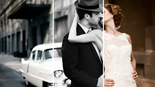
uh, What I'm going to be talking about today is actually something that I kind of forgot in the scheme of all I teach two teach like it's one of those things. That's a bigger deal than I realized until recently. And so this this idea is color great. I would explain what it is and why it's a bigger deal, but it's how you could make a shot that looks all right, look real expensive. And that's what I want to take it from. Like I took a competent photo, but I make it look real fancy. And so I'm going to do that with color grading. So I'm going to jump right into it so you guys can see what I am talking about when you think of color for me as a fashion photographer, it's so powerful, cause I use color to capture your attention or to set the mood or to direct the I in the frame. But there's more to it than that. And I remember one of the classes I have here is ah, skin. Wanna one? I talk about getting the correct white balance and getting the correct cracked colors of the skin and I still wa...
nt to do that. But often in my photo shoots, I get the correct color, and then I mess it up on purpose. I've got to get rid of color casts. I've got to get rid of any any weird shifts. But then I tone it for mood. And so that's what we're really talking about today, and I've actually got this. The word and the idea has come from the movies. So if you actually look when they create ah, Hollywood production, if you looked at the raw footage, it's flat. It lacks contrast. It lacks saturation, and when you look at, it actually looks kind of like It's not so. It's not so good. And so if you have seen in your cameras, when you got those those picture styles in the back where you can pick like portrait or standard. So there's a version that they do in the video. Kind of like neutral, which means not in adding any contrast, not adding any saturation, not adding any sharpness. And so when you look in the back of your camera, it doesn't pop and so you feel like you're doing something wrong. But the reason that they do that is because when you don't have too much contrast, you've got all your details in the shadows in the highlights because you didn't pump it up and lose it. And then you don't have to worry about over sharpening things you can selectively sharpen. And then you don't have to worry about selling being too saturated because you can go back in and bring out that saturate or change the color. So the point is they purposely shoot it flat. Low contrast. Low saturation because it's easy to transform and they give it new life. This is what you'll see when you search. You conceived like it's called color grading. You'll see it for like the Matrix, for example. And if you watch The Matrix, it's all green. They didn't shoot it green. That was done after the effect. And so these are the types of ideas I'm talking about now for photography. This this is kind of what I'm saying. The picture on the left is straight out of camera, but if you look at it, I've got my detail in my shadows, have got my detail in the highlights, and then I can start playing with it and I can get it kind of close to correct color or I concolor grade it from mood like this is not correct. White balance. Their skin is way to warm its way. It's it's, Ah, a little bit too saturated. But who cares? Like it's? And this is why I always used to think. Okay, I got to get my white balance right. You do. I want the right color so don't have weird shifts and then I can make it really, really creative. So this is kind of the idea behind what I'm talking about, where this is a shoot that I did this really cute little girl. And if you look at it, this has been color graded or toned in three different ways. All three are completely relevant. The one on the left is really neutral on dramatic. The one in the middle is all cool tones, and the one on the right is war. It's the exact same shot three different ways, all for three different moods. And so that might be. If you want something to be softer or more dramatic or more mysterious, you choose your colors because of that, And so this was kind of the lead image for the class. This is what I'm talking about. This one's playing with Thiel's. We got black and white. This one's really warm. All of them are right. All of them are wrong, like they're all different interpretations of it. So color grading is this. It's altering or enhancing the colors of a still usually to set the mood or to express part of your vision. Now in the movies, it can be color correction. But what we're talking about really is the artistic effect. Like we got to get the color correct first because the injuries I'm saying this. If there's like a weird green cast and then you go to add mood, there's still a green cast like you gotta neutralize it, get it right and then go from mood so that sometimes that's what color grading is, and then you could do it in different places. Global means you do it to the whole photo. You can warm up everything or for me. Ah, lot of times it cool down everything like I had blues to the shadows and make it really mysterious. Or you could do it localized cause maybe that blue looks really bad in the skin, so you can cool it down to the clothes in the background in the environment. Look blue, but it's not affecting the skin tone, so you can think of it both ways. And in the movies, they do this all the time. So, for example, this is an editorial that I shot, and this is what it appeared like in the magazine, the one in the middle. And I remember everyone was saying to me like online, Oh, my gosh, how did you like that? That's what I look like, how to camera. It's not actually the lighting. What that was is this this light right here? One giant soft umbrella and this large umbrella with diffusion for me is my pop of window. The window I could take with me wherever I go, just get big soft light so the straight out of camera white balance looks kind of cheap, but not not expensive. Whereas I move over into other moods and other interpretations. It ups the production value a lot, so if you look at, say, an any Liebowitz photo, it's still beautifully lit. But that extra something. It's it's the colors. A lot of times, it's the way that they're toning it in adding, color is not cheating like it's not like, you know, people say, Get it right in camera. Well, I got it right cause I got it correctly exposing got the right white balance. So I gave myself the base that I can then play around with. So when it's get it right in camera, getting it right means giving you the raw materials, not getting the color Exactly how you envision, because I want to build to change my mind like maybe I'll look at it later and go man know that needs to be cool like it looks much better with cool tones. So I get everything neutral, correctly exposed. That's that's what I'm talking about here. So there's not really any correct color graders, endless solutions. This is a beauty shoot that I did recently. Eso straight out of camera was on the left, and then what I did is I was playing around with making really, really blue. And then what actually ended up with was a picture on the right. Her skin tone is not a skin tone, but clearly this is not actually four correct white balance, but it's it's moody and its mysterious, and it looks expensive, and the picture on the right just looks on the left over there. It just looks like a nice, flat lit portrait, but I think this one looks really mysterious. So this is This is what I'm talking about. This is what you get out of color grading. Fine, expensive is is what I'm trying to achieve in post processing a lot of what I dio. I either go super dramatic or really subtle. I'm like that tends to be my personality, like I try to keep it really natural or super over the top. But that's just that's just makes like when I photographed models. I'll shoot like deathly pale or super super dark like I love dramatic extremes, and I do the same thing with color. I like things that are like black and white and graphic or loud in your face color. So when I talk about subtle, here's an example of subtle color grading. A lot of times, when I photographed darker skin tones, there's a lot of red to our skin tones or skin tones or red yellows and oranges. And sometimes it's just toning down that read a little bit. That's what's done in this photo is basically I d saturated the reds and pump the highlights, but it is just got a little bit more polished to it, so you could be super subtle. That's not like a heavy retouch. Or you could be super over the top in an example here. So this is actually not composited or anything like that. The picture on the left was what I captured in camera. Picture on the right is after it was color graded as you notice when I see color grading the thing that you assume is color and obviously you see color right. It's blues and I change the reds and but it's also darker. So it's the next thing that you want to keep in mind. Remember how I said in the beginning, you shoot it flat, low contrast not sharpened. It's kind of like a in the middle kind of picture, because it's not just color. It's also your exposure that you play within the contrast that you play with. So even though it's called color grading, it's not just talking about color. It can be your exposure as well. I think it was one of one of ah Chris Knights classes yesterday. Somebody was asking about Do you ever darkened things down to make it moodier, even though you kind of captured it later? That's what color grading is as well. You can darken it down and pop the highlights, and it makes it look more mysterious. So yes, so this captured on camera color graded and post both color and contrast and exposure. These are all things that I'm going to show you today. So let's go back to the movies again. I recommend because I can't do that. This for this class. Look up color grading in the movies on YouTube or online because I can't show other people's work and film up here. It's fascinating because you can see the before and after, and you can see where it started. But you also see coming common ways to color on. And there's this one video that it blew my mind and you'll never be able to un see it, which is the yellow, orange and teal combination. If you look this up in every movie. They make the skin, especially action movies. I mean, not every movie, but most actions or, um, or superhero movies or that kind of thing. They make the skin tones really yellow, orange and everything else really blue and teal and everything pops and and so I'll show you what we're talking about. But if you look that up the blue teal orange combo, you'll never be able to un see it. And you will see on every movie poster you ever look at forever. So, um, so when you take a look at the different approaches you can take, what they usually do in the movies is the standard color wheel. Such cholera on Google find it. Also, adobe color cooler color. It's k u L E R. Get a color wheel up there and check out different color combinations. What they often do in the movies is when they tone it. They pick colors opposite one another on the color wheel, and what they do is a tone one for the highlights in one for the shadows. That's a very common color grading approach of what that means is yellowish orange for the highlights, bluish for the shadows like That's how they're toning things a lot. So e mean again. Look up the super hero movies. Other times they do analogous colors were Everything's all in one kind of tone. So this is like matrix, right? Kind of the greens and yellows. That's all matrix. Where, as, um, what was the Mad Max? It's all right here that the oranges and reds and they picked that color tone, so either they often go opposite one another, or they do analogous ones that are side by side on. And so we'll take a look at toning that a little bit later. So the most common is this pair. Is these two right here? The orange and the blue teal. That's what you'll see over and over again. And I didn't know this. I watched this little color grading thing and guess what I dio toe like, Ah, a huge proportion of my photos. I didn't know why I was doing it, but it makes your subject pop because if they're bright and yellow against a bluish background, they're going to stand out more. I never knew why did it until I saw that they did in the movies that I felt like I knew what I was doing, even if it wasn't intentional. Um, okay, so the next thing if you've watched me present enough online creativelive one of things that here we talk about is the purpose of the photo. I just said that there's no right or wrong way to color Grade a photo. You can make something cool. We could make something warm. You can go now. This color go complementary colors. But the whole thing is you got to figure out what the purpose of your photo is. And that is the number one thing number one thing that separates people from being good photographers and great photographers is actually knowing what you want. Like because a lot of times people, they're experimenting and there's not purpose. They didn't know what the purpose of the image was. So the pose doesn't match the purpose. The clothing doesn't match the purpose and the background doesn't match the purpose. And it was just like, Oh, this poses cool. That background school, that dress is cool, but they don't fit together. The exact same thing comes into play with color because if you want soft and and dreamy and romantic. Maybe you want something warmer. And if you want something kind of stark and mysterious, maybe you want something cooler. So the most of the techniques actually aren't that challenging. The challenging part is what do you actually trying to dio and then be purposeful about your color choices? So everything you do when you figure out the purpose, the mood, the color grading, the styling, all of that supports your concept. So there's a book out there. I think it's called Let's Start With Why figure out your Why not your how? Because we photographers, we start with how figuring out How am I gonna like this home again, a color grade this instead of why did I shoot this and then deciding how to color grading how to like so just the advice. If you want to move up in your level of where you are with photography, this is something I'll demo later. Most often, I either warm something way, way up, cool something way, way down, go to complementary or shift the mood. These are all things that we just talked about, what you will actually see in my demonstration as I'm going to shoot things. And in camera they look not super exciting, the lights pretty simple. It's pretty timeless, not a lot of color, not a lot of contrasts. And then we'll choose these appropriately for in post. So I told you, it's not just about color. This is what we'll talk about later. I'm just giving you a preview. So what you can do in light room what you can do in photo shop? There's actually a thana stuff that you can do. I know which one's my favorite. Selective color is my favorite, but there are so many different approaches, and then you figure out which one works for you. So we will visit that in Segment two. And then, of course, there are tons of plug ins and presets and actions that can help you along the way. And one of the reasons sometimes people like the plug ins and the actions is because you don't know what you want so you can scroll through and it shows you options, and then you have an idea of what to choose. Whereas if you don't know what you want and you're trying to do it in photo shop, you're starting from scratch. So sometimes a plug ins air Really nice, because you can kind of just mouse over. And oh, it looks good, like that effect. And then you can tweak it if all of those different things So coming back before we shoot one more time to the purpose of the image, Ask yourself every single time because when you figure out the concept, then you can choose appropriate styling, appropriate lighting and appropriate color grading, and they all should work together. So you'll see that in my shoots today. And I'll explain to you what my concept was. What my idea was explain why I chose the modifiers, why I chose the light. And so will this be walking step by step? I'm going to be shooting three or four little vignettes so you guys can see ah, variety that'll tone later in different ways. All right, so this I mentioned in the beginning, I want my photos to look expensive. One of the reasons I want to look expensive as a fashion photographer usually brands. They want people to know why they're investing in that brand, whether it's the purses of the eyelashes or whatever it may be, but as a portrait photographer, I don't shoot commodity like I you know, I don't have people coming in and out. I shoot much fewer, but I put time and effort in. I wanted to look expensive cause I am, you know what you know. So it doesn't actually have to be expensive. It just has to look expensive. And I want to give you an idea of how I do this. I love this quote is that elegance is the Onley beauty that never goes out of style. And so a lot of what I'm doing, but I'll be photographing is not super over the top are often guard when I create over the top imagery. The point of it is because we're all seeing so many photos all the time. It's so hard to stand out. So a lot of the times my more over the top photos or to get me to stop, get you to its ah, school stopping right, let get you to stop in your instagram scroll or your Facebook scroll, but the ones that last the test of time or honestly, most the time. Just elegant, timeless elegance. And so I'm going to use that in some of my lighting, a lot of times alighting, simple, the styling simple, the concept simple. And that's what lasts beyond the scroll. So we'll talk about that as well. For example, I posted this last week to my instagram, and a lot of you really, really liked it. Like I've got a lot of response from it. It's a large umbrella. I'm gonna show you how to do this and agreed on the background. So it's two lights real simple. That's what it looked like at a camera. The color is not so fancy, doesn't have a lot of polish. But this is where it ended up. Yeah, I retouch some things. I lowered her shoulder, noticed that lowered her shoulder cause we love long necks. I cleaned up the bun on the hair a little bit, but it's actually really just the color like that's what's kind of giving it that look. So that's what color grading is, and people say it's expensive. It was in this collection on Amazon for 14 99. That was how much her shirt was. So I'm gonna some of the things I have today, we're really inexpensive, like 14 $15 on Amazon. If it looks expensive and photographs expensive, who cares if it actually is expensive? Or another example? This is something that my friend and designer Laurie sons check her out. She designed this headpiece, and I think it looks really expensive and cool and funky. It's a headband with black zip ties and hot glued on, uh, gems. So it's like, you know, like 25 bucks or so, But it looks expensive and it looks funky. So again, like there's not really any excuses for that were. Here's another example. It looks like I have this really often guard like feather neck piece. And I was $25. dollars, a feather trimming on Amazon. And then we put it behind her head and pinned it, and it looks like this feather collar. So it's simple, simple lighting. That's one light, simple design. It was a string of feathers, but it's toned in a way to make it look expensive.
Ratings and Reviews
Sean
Fantastic course. Lindsay Adler is a such a photography Rock Star. She can do it all, shooting in and out of study, lighting, posing, teaching and very amazing, Photoshop guru. Thanks for getting Lindsay, in the beginning I never knew that she was so skilled in all these aspects. As you progress in your photography, you learn lighting, skin tones and white balance, then skin retouching, then you learn color grading and analogous colors, complimentary colors, color triads, etc. Color Grading is so key to that final polished and "expensive" look. Lindsay did a terrific job teaching this course. I watched it 3 to 4 times to really pick up how to use these tools. Lindsay is a phenomenal teacher and photographer. Thanks for getting her Creativelive.
Elizabeth Haen
This is a great class to learn many options for color grading images. Lindsay gives comprehensive options for use in both LIghtroom and Photoshop. She has a style of teaching that is easy to follow and does an excellent job of summarizing each technique after introducing it to help the process sink in fully before she moves on. I love how she goes over everything she does thoroughly in a way that clearly explains each step without assuming everyone knows what she is doing. There is never a time when I thought "wait, what did she just do there?!:". Just really great information that is well taught.
David Babcock
Awesome class - Lindsay is a wonderful teacher. It might be nice to have a list of the equipment used, I had to go back a couple of times to find all of what Lindsay was using. Excellent and well done!!
Student Work
Related Classes
Portrait Photography