Lessons
Primer and Intro Must Watch
35:14 290 Second Advanced Edit On Signature Color Image
05:24 3Soft Skin Color
07:15 490 Second Advanced Edit On Soft SkinColor
04:27 5Vivid Color
11:28 6Black Crush
08:40 7Vivid Black Crush
07:55 8Glam Ciolor
05:562 Minute Advanced Edit On Glam Color
06:21 10HDR Natural Color
07:12 11HDR Vivid Color
08:17 12Soft Pastel Color
07:57 13Signature Soft B&W
09:18 14Vivid B&W
09:53 15Clack Crush B&W
08:45 16Vivid Crush B&W
07:43 17Glam B&W
08:07 18HDR B& W
08:14 19Fuj i400h
09:41 20Fuji 400h Plus HDR Fade
11:45 21Fuji 400h Plus Rich Tones
06:03 22Fuji 400h Plus Rich Matte
06:25 23Kodak Portra 800
10:09 24Kodak Portra 800 HDR Fade
07:55 25Kodak Porta 800 Rich Tones
07:21 26Kodak Portra 800 Rich Matte
07:20 27Illford HP5 Black Crush
10:12 28Illford HP5 Lifted Matte
07:41 29Ilford HP5 Deep Black Matte
09:01Lesson Info
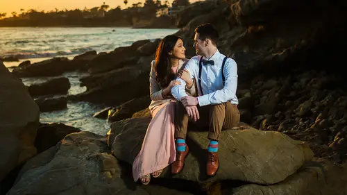
Kodak Portra 800
I love me. My Kodak portray 100. And in this tutorial, we're going to creating the Kodak portray 100 preset mixology right here. We're gonna use the preset system, and they're gonna talk a little bit also about what's going on in these funky donkey settings over here on the right side just to give you guys an idea of how the preset works. So if you don't have to presets, maybe you can think about possibly getting them. All right, We're gonna play to this image, and we're gonna get from this lovely little before to this final after I love Portrait because it has this beautiful soft warmth to it. It's just a fantastic film, and it's one of my favorites. And so the reason why I didn't include, like, any of the other version of portrait except that 800 of the most unique in comparison to say, Fuji 400 h, the other ones are kind of to me they're a little bit at least similar. I thought portray Hunter was the most different and that's why I included it. And I love it. So let me show you my v...
ersion of Porta 800. Okay, I'm just like all three of these images. I'm gonna go ahead and press control, shift our or command shift, are just to reset them all and will start on this lovely little image right here. Okay? So once the image loads, I don't think I selected it. I selected. I press d to get back in the develop module and nothing is happening. Let's see here. My computer. It needs a moment. Let's let it meditate. There we go. Ok, thank you. I appreciate you working with me, Mr Computer. It's very nice. All right, so the portrait 800 it's gonna have this nice soft look to it, where all we gotta do is just kind of brighten it up a little bit and then just tweak our temperature to taste. Now I like my stuff, Brian. You can see that we're going up one stop in the exposure right here. If I press j, you'll see that we're still retaining most of the highlights. Except for the very, very bright highlights of the water where we're basically reflecting direct sun. So this is what I love about this Pre says we have all this definition from the shadows to the highlights. We have everything still retained. Yet we can get it into this very bright, beautiful, high key and kind of pastel. Look to the image. It looks gorgeous. Okay, so what we're gonna do here is create this preset. Now, let's go ahead and we're gonna press control, shift our command shift our and remember that I had 5300 here, dialed in for my temperature. And I had one exposure here. So I'm gonna set this as my before by going to the history. Right? Clicking under my last adjustment and selecting copy history Step settings to before. Now, let's go ahead and get started. Let's put seconds on the clock. I'm gonna go ahead and open up my panels because, uh, my team is going to try and kill me if I go over. Actually, we don't need stylization we don't need based on. We're not gonna make any adjustments of those. All we're gonna do is start with Kodak portray 100 and ah, from there. What I like to do personally is at a little bit more softening to it, and then also add a contrast boots. So I'm just gonna go to medium contrast boost and that's it. That's it for my Kodak. Poor tra 100. This is my version of Porta. Okay, so hopefully editors. I didn't go into the penalty time if I did. I'm sorry. Sorry. Not sorry. Hash tag. Sorry. Not sorry. All right, so I love this look. And from here, we can basically tweak and dial in our temperature to everyone. I might want to just a little bit cooler, but I love the warmth that it gives it in the skin tones. I love the overall look that we have and let's talk about the settings here on the right side. So in our based settings, where we have a standard s curve that's basically boosting overall contrast, we've also pulled our highlights are whites while raising our shadows and blacks. This is what we refer to as the shadow lift, and it preserves highlights. So that way, we're not just like blowing out highlights and lifting up shadows and making it look all funky. We've also added quite a bit of contrast and pulled clarity down. So again, this gives it a very soft toning. And with the base portrait, we're reducing vibrance and saturation just a bit too kind of mute. The colors a little bit more So Poor Tre. The area kind of differs from Fuji is that Fuji has more of a green bias where the greens kind of going to this teal look, whereas Portrait kind of maintains a little more of the warm that still has some of the Thiel's. But it has a more warm kind of quality overall to us. We have more yellows, more everything. So when you look at the Hughes and the saturation and the luminess, you'll see some similarities. But you also see some differences, so we're not pulling saturation down as much in reds, oranges and yellows and greens are pretty similar. But then we also aren't pulling saturation up a much from Aguas tomb. Agendas were also not making as significant adjustments on luminous, and we're making bigger adjustments. Basically on, I think the greens up here in the hue so there are subtle differences in If you want to compare those, you can always go into the color toning, and you can compare back and forth. Just if you have curiosity. I set my food if ordered H right here and here is Kodak Portrait muted right here so you can see there's a pretty big difference between the two in overall tonality and what we're basically preserving and so forth again. These are my interpretations of these films stocks. Okay, I've basically taken my favorite pieces of those film stocks and left kind of the rest out, and I've really biased it towards skin tone and towards Portrait's because I feel like that's what most people will be using it for, and that's what I use it for. So that gives you an idea of what's going on in the eight yourself. You'd like you composite dial those things in your totally fine. Okay, so under detail, we have reduced sharpening with zero. We've added a bit of noise reduction, and we've added a little bit of grain again. This is what softens that image. So when we zoom in and we go close, we don't see super detail. That is a dead giveaway of a film present applied over a digital image. Okay, you obviously. By the way, there are some camera calibration tweaks that come along with this portrait. 100 film, Age of Cell and calibration. Okay, so you can see that as well. So let's go on now to our other images again for the kinds of looks that I love For these, it's the same thing. Anytime I'm looking toe work with film anytime. I'm looking for that effect in that look I'm looking at using natural light. I'm looking at finding scenes where have beautiful direction of light. But I also have some high, some hard highlights, some deep shadows to give it a really cool look to the image I love when the clothing and the styling matches that vintage vibe when we have a boho or a vintage look because it really helps pull off the overall look. So it's going to select this lovely image of my beautiful bride. She is absolutely gorgeous, and I'm gonna go ahead and apply my mixology, so let's go ahead just around to the top. We already have that mixology saved out again. You all know by now how to dial in and how to save out mixology, so I'm not gonna keep repeating it. Let's go to court act, portray and I love that look right there already looks fantastic. And I love the skin tones. I think everything looks great about it. I'm gonna leave it actually, right there looks really beautiful again. I love these images to have a very bright kind of high key look and feel to him again. Here's a little idea If you want a different tone curve If you want a more matte finish going, select the mixology and apply a matte finish. Or do a bright Matt or do whatever you want to the image and that curve to customize the look and then save that out as your mixology. But I'm gonna leave it right here. I love that beautiful kind of high contrast. Look, I think it looks gorgeous for this image, though I will put in a radio blur. I'm just gonna press shift em after selecting the radio and pull this right over her face. And you know what? I think this is an image where we can go with a little bit more heavy of a radio blur. So I'm gonna use the plus plus or just the plus to kind of down a little heavier. You'll notice that the shapes of the radio blurs air different, and that's what helps to kind of preserve a more natural look to the effect. So it looks like it was done in camera as opposed to in post. You can press shift em or just select the radio filter to close it out. And here is the before and the after for this image. Oh, that looks gorgeous. I love it. My team sometimes makes fun of me because when I get em like fitness and like other types of shoots, I still talk like a wedding photographer. I understand. It's hard for me, okay? It's hard. I'm gonna like Kodak. Poor Tre. We're gonna brighten this up is exactly what I mean. I love the beautiful, bright highlights in these types of images and what it does to the overall look. And I love reducing contrast because it creates that bleed look that bleed around the subjects. It looks really cool and also softened skin. So has a great look to it. I think for temperature wise, I'm pretty actually solid. I like it a little bit on the warmer side with this particular image, so I'm gonna leave it right there. What I'm gonna do here is Let's enhance our sun flare More flair Bell. Let's drop that in right there. Boom, More flair, Boom! More flair. You gonna you can always ah, control Z to undo anything. Or if you wanted to dial back the amount of flair, hold down older option, click the pin and drag to left. So if you want to just kind of tweak the amount of flair you totally can as well what I'm gonna do with this flares, I'm actually gonna pull it from the top, Right? So that way, it's kind of a little bit more, actually, No, it because we have the sun kind of hitting right there in the image. Let's just put it right there. And I'm just making a little bit smaller and drop a little pin in. And gorgeous. Beautiful 11. Okay, I'm gonna brighten it up a little bit, too. A little more rights. You know, brining up images is fantastic because you really can't. I want to say you can't really go wrong to an extent with brining an image. Of course, you don't blow things out, but brining image makes for a very soft skin tones, and it looks fantastic. and your bride's gonna love you for it. You're the ladies love the bread skin. I'm just saying I'm not a lady, but I'm speaking for them in this manner. I'm gonna reset this out just by President Control shift our or command shift are so that way, we can go ahead and go down to our reset settings down here. Click this into our before and now let's go back to our last adjustment. So now we can see that before versus the after. So here's the before. Here's the After this image, we get this beautiful, bright, warm, still kind of very past. Ellie, look with the Kodak poor tra 800. So that's it for this tutorial. Hopefully you all enjoyed, and I'll see you in the next video.
Class Materials
Presets
Ratings and Reviews
Gonzalo Blasco
Cool presets, but the course is a little slow...
Taras Onyshchuk
The importing by copying and pasting the presets into the directory doesn't work for me in Lightroom Classic.
a Creativelive Student
Pye and his website courses newsletters and teaching style and education are 2 nd to none! I have his presets and some courses Brilliant stuff !