Retouching: Color Correction
Lesson 35 from: Skin 101: Lighting, Retouching and Understanding SkinLindsay Adler
Retouching: Color Correction
Lesson 35 from: Skin 101: Lighting, Retouching and Understanding SkinLindsay Adler
Lessons
Day 1
1Skin Essentials: White Balance
30:57 2Shoot: Setting White Balance Demo
10:13 3Skin Essentials: Mixed Lighting, Color Contamination
41:10 4Camera Settings: Files
20:48 5Camera Settings: Color Spaces
42:51 6Color Management
19:03 7Exposure
16:14Shoot: Quality of Light
25:03 9Direction of Light
27:48 10Makeup: Basics
28:46 11Shoot: Contouring
27:27 12Retouching
19:12Day 2
13Shoot: Oily Skin
18:07 14Shoot: Wrinkled Skin
23:55 15Shoot: Blotchy or Blemished Skin
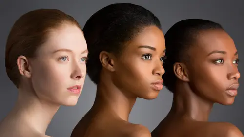
26:58 16Skin Challenges: Pale and Dark
16:31 17Shoot: Dark Skin
17:57 18Dark Skin Q&A
22:09 19Shoot: Pale Skin and Multiple Skin Tones
38:48 20Shoot: Dark Skin in Sunlight
21:56 21Shoot: Mixed Tones and Pale Skin in Sunlight
15:55 22Skin Challenges: Dark Skin Outside
23:45 23Skin Challenges: Multiple Skin Tones Outside
16:08 24Shoot: Male Fitness
33:59 25Shoot: Female Beauty
25:48Day 3
26Retouching: Workspace Setup
28:11 27Retouching Skin: Removing Redness
29:24 28Retouching Skin: Basic Tools
25:21 29Retouching Skin: Frequency Separation
37:45 30Retouching: Contouring
15:20 31Retouching Contouring Wrinkles
14:45 32Retouching Skin: Oily and Freckles
16:42 33Retouching: Mixed Lighting
16:07 34Retouching: Color Casts
22:38 35Retouching: Color Correction
26:52 36Retouching: Shaping the Face
37:04 37Retouching: Beauty
36:14Lesson Info
Retouching: Color Correction
let's do color correction in general and there are a ton of different ways to do it so this is in general just trying to fix color cast not color contamination but just like the shadows aren't the right color the highlights just shifted in the wrong direction I'm going to show you several ways to do this and what to do also if it's both it's really extreme so this is going to be my intense recovery okay because you have to basically stripped the color and add it back in and the other ones were goingto go the other direction we're going to make it a little easy on ourselves all right so let's open this the photo of this gentleman and this was also something a portrait that somebody submitted to me online to work with here okay so looking at this individual I know that it's not as vibrant as it should be the color is not right but maybe my eyes like I don't know from me a lot of times I can't quite tell what's wrong I just know it's not right whereas the color contamination I can tell in...
stantly like okay there's that's messed up I need to fix that part and you can usually tell if it's if it's greener it's blue but something like this is it's cool that maybe there's agree I don't know so that's why there are some tips to see if auto works sometimes or some auto that helps you out and I try it just in case because sometimes it's great but it's actually not as obvious as it looks all tell you that one and then we can also try by the numbers so let's do that I am going to go to my adjustment layers and I am going to open up curves all rights have opened up curves here what I don't want to do is hit the auto here because auto here well didn't do much anything auto did nothing because what it's looking at is it saying well overall the exposure's find they've got a true black and I've got I mean I've got a true white and I've got a true black so that's not really the problems of nothing nothing happened there one of the ways that you can color corrected you could try to call her correct by your eye and how curves works is you actually can go into each color channel and start making changes so maybe you think okay well it's going to read if I drag the red up it makes the picture more rent if I do the opposite remember the c m y k r g b what's opposite a red diane so if I go opposite allowed more sayin and you can go into the photo and you can kind of tweak it that way s o people that are doing really intensive color corrections you could actually color correct each and every part of the photo this way because I could take my little finger here it's a little finger and I could select one part of the frame and it puts a dot on that and then I could say okay well I think that's two blue just that part of the photo so I could click and add more red just to that part of the photo so like there's a lot you khun dio in curves for color correcting it is a little more complicated I'm goingto do the simple first let me delete this right here is the way to try auto color correction but small bit smarter in photocopies and curves all right we're gonna hit the adjustment layer and go to curves and then what you need to do is you need to click on the little fly out menu in the top right and what you need to do is click otto option's right so auto options you want to try these different buttons and see if one of them gets closer so see enhance monochromatic and that didn't do anything per channel contrast and do much hand slate and dark that helped a little bit okay maybe that maybe that helped with tiny bit let's see before and after okay that improved it a little bit you know maybe that's getting me a little little bit closer can you see that kind of warmed it up a tiny bit not huge all right but okay it helps a little bit I think I'm gonna have to go further sometimes it works awesome instantly and you're like I'm done so just one more times you don't miss that you want to go into the flyout menu auto options try the different buttons on top and try it with or without the snap neutral mid tones sometimes it just makes it brilliant and perfect usually not as easy things usually don't all right so the next one we're going to hit curves let's try it a different way all right so this is this is using curves that you're letting curves and photoshopped do a little bit of work for you but you're still making a couple decisions here so what I want to dio I want to go to the top left hand corner of the curves and have these I droppers I have a black eye have await and I have a middle of gray in neutral gray so what I want to do is try to identify those things in the scene and when I do that I'm helping photoshopped out to make some decisions okay well for me um I sometimes can't tell what's wait or black and the scene or what's the true way because what'll happen is let's say that you pick something as black and it's not it's going to mess up the contrast because you're saying this point let's let's say I say his shirt right here is black when identify that is black if it's not actually dark enough to be black it turns it to black and the whole picture gets darker so I want to figure out what actually is the darkest part of this photo so there's a tool that helps you out with that click on the background and I'm going to go up to image adjustments and threshold what threshold lets you do it's it's basically taking them in light room when you could go ahead and see I think it's if you hold down older option or whatever when you drag it in the highlights will show up as they start to have detail in the shadows start to show oppa's they have detail it's just a way of doing this but in photo shop so if I dragged the photo or the slider all the way to the left that means that this is a true black and if I dragged all the way to the right and start pinching it in a little bit this over here is going to be a true white the first thing that's more than like a single pixel because it's easy more than a single pixel but like the first thing that's pure white right there is going to be my white point so I can figure out what needs to be the white and black point so I don't actually shift the contrast in my image but I can't really remember exactly where that is so this is where those color samplers come into use so if I go back to other side all right so that was my true black down there so if I hold shift and click in that area it's going to put a reference so you see it's hard to see it put a little dot that little cross hair with number one so it's just a marker okay so I can reference that he later so that that works let's go to the other side again okay all the way over here and let's drag into the first first white points this all pretty white so hold shift again and click there when you're doing this one of the things you don't want to select as your true white point is speculum highlights so let's say that somebody has on silver rimmed glasses that are hit by the light it's going to show up as they dragged the slider is the first thing that's white will probably already be white but it has no detail in it you can't actually color correct based on appear white had to have had some information for color originally in order for you to make an adjustment because if it's two fifty five all the way across because it's so overexposed then photoshopped thinks oh well then there's no color cast but that's just because it's so over exposed so it needs to be something that had some type of color detail originally some kind of tonal range all right so you don't want to hit okay because then it does this for your photo don't it okay all right so I've still got my my to what points there so now I can go back into curves and I'm going to grab my black sampler and click on the darkest point just a little click my white sampler and click on the white point all right so I kind of locked those in place which is more what's important and then you got that middle and the middle one is the hard one because there's not really a way to know this what you want to try to dio is you want to try to click on something that should be neutral it shouldn't have a color cast in some photos you don't really have that some people would go to for me is I try there eyeball because sometimes like kind of supposed to be white and it gets me close and then I could tweak it a little bit with him I think this shirt is supposed to be black and the reason I'm thinking that it's because since I think the picture looks too cool I'm guessing that means there's too much blue so I think that's probably so speed black I'm gonna grab my middle I drop her there and click on it and now I have like gorgeous color now it really warmed it up if I didn't click on the black and white point originally it starts to shift because those weren't kind of defined point so I defined them and then I'm able to use the middle eye dropper for white balance so that definitely was a lot better so those so far like those are the two to kind of easier ways to handle color correction but if you notice none of that required none of that required knowing color but that last part would be the kind of guessing part so if you're looking in a scene and there's like a street usually streets are pretty neutral tone like a like a sidewalk is pretty neutral toned and pavement like anything like that that's usually neutral you can try to look for something that is a common neutral if you have any defined in there and defined elements like a color checker then you don't need to see color whatsoever so that's one way to do it I'm gonna keep going with more some of these work in some situations and don't in others so I'm kind of getting in progressive difficulty all right so I'm gonna I'm gonna pick a different color since we fix this one so I don't I don't need to fix it again let's find a different one all right um e we could try that one that's not that bunch of a color cast to it that was kind of color cast e all right a lot we could do that that's when those photos that hyler and says this is lorenzo's contribution here if I have my raw file what I try to do at least get myself close right away and I could grab my eyedropper and it doesn't have to be white it doesn't have to be but it needs to be something that should be neutral so probably her dress should be neutral and it's still hit it again it's still an ugly color of light but I got rid of some of the cast or maybe I'll try like that bowtie maybe should be neutral but none of them are really doing it for me so I think I'm gonna have to go into photo shop and be more intensive but let's make it even harder on myself and let's just assume I don't I don't have the raw file I've got this j peg this is what I have to work with so let's open that up in photo shop photo added in for the shop and I'm definitely gonna try first off to see if that auto helps me out at all because I'd rather do that so let's keep going progressively harder but let's try this curves the flyout menu auto options kind of like it before so this guy I mean this helped a little bit the auto is getting me a little bit closer so I got rid of some of the color cast by using auto so but get something to help me like I'm gonna have it help me all right well let's try try the other one let's see if the other method can help me out open up curves and let's see I'm gonna do that threshold thing again got to be clicked on the background image adjustments threshold but see what is my black point the back of his head I think the black point is going to the back of his head over there someone on hold shift and click there all right and let's try the other direction see what the true white point is what is this take a look at that and I'm gonna hit before and after I wanna see what I'm clicking on so that part of her dress in the back of his head by black points in white point if I just pick something randomly and they were actually true black and white are the white point in black point then it's going to shift my exposure all right so I've got those two references single back into the curves select this black as the black point and so I'm probably a little office shouldn't shift it without lunch means like it'll be a little bit more careful or zoom in and this is so that shows you kind of why you need to be really precise we kind of click around and look for the least amount of change okay I was good it was a true black point all right let's grab the white and slept right there on the right highlight okay so it's getting one that's what's this is what we got so far I'm getting rid of some of the color cast there and then how about the neutral what should have what should be neutral and her dress should be white right so let's select here click around a little bit thinking address here is probably the closest so so far it was able to get me that far that's about the extent of it I don't actually know what her skin tone looks like I know that it was not that green um I know that it wasn't that that tone so it could go ahead and go into selective color and I could try around move around some neutrals and see what's moving me in the right direction so it looks kind of science to me it just looks kind of kind of cool and maybe a little bit of red helps and I definitely didn't look magenta so I don't I don't underneath that could add magenta so how about maybe it's maybe a little too yellows there's something in that range so I can kind of tweak around that way as well so what we have or how far we were able to get was there something like that's not bad I think that the color of light in the room it just is bad you know I could build to get it perfect let's try one more option for how we might color correct I'm going to try this in levels alright in levels there's a quick way and I'm not as quick way to do this um I could try auto and see what happens with the work it's worth a try alright the next thing that I can do is I can go into individual color channels and I can see if there's any that are like really shifted like maybe see that that that blue there's a lot of dead space over here so if I see like a big expanse is the big open spaces with no information then it means that color shifted one way or the other doesn't have anything to extreme rights let's try one more option I'm goingto they would know how to clear your color you're colored samplers they don't want him there anymore I got to be someplace appear mmm mmm mmm mmm yep I'm so smart hold shift okay anyway it was a guess okay um anyway so what I can do or what I want to do is I want to do the same thing it's anymore all right so I want to make sure that I still have the highlight area and the shadow area to find so I picked the highlighted picked the shadow point and I'm gonna open up and I wantto see this information over here okay on the right hand side so I have a random one thrown in there ignore number two okay I wonder if you click on the league no it's okay anyway so let's open up open up curves again and I've got a white point number three defined and a black point number one to find so I meant to open up a levels two levels okay so what we're going to try to do is we're trying to get it so that all of the different color channels are equal in the highlights and shadows all right so what does that mean all right I'm going to look at dropper number three which is my highlight so drop your number three I've got two forty three to forty two and two thirty four since this is a highlight I'm gonna pick whatever the brightest number is so are the brightest value which is red two forty three as my marker and I got to make the other one's match it so what that means I got to go over into green and play with green until it reads to forty three right there I don't have to do much to that and then going to blue and dragged the right hand side and make that match as well ok so what you want to do that will definitely screw up if you don't do it is you're not judging these numbers like the ones that you're seeing right here you are judging over here on your color sampler you're judging the change you made not the input output numbers okay so let's see what I got so far okay so I've gotten I've improved the highlights a little bit okay that's good but let's go to these shadow area all right so in the shadow area blue has no color detail red has a and you actually want to pick the lower number so let's see if I can get them to kind of match let's try my lowest number for the first one is blue so let's try to get green to match it not green it's going to be exactly there's let's try to get red to match it so so I'm just kind of tweaking and trying to get them toe all match so now look that it's all zero close to zero it's pretty much the same so able to improve it a little bit and what that lets me do it let me lock in the shadows is neutral on the highlights is neutral and then you have that in between of what you want to do with the mid tone and you could do this exact same thing with curves it's a the same concept you actually just physically type in the numbers versus dragging it it's literally the exact same thing you just have more flexibility and curves but the last part is saying all right let's try clicking on things that should be neutral and try to get a little bit improved color much like you can with selective color I can hope I'm meant to be on this one on the main one so this is the main um thie master the rgb so I'm clicking around to try to get good color so let's much improved it's definitely significantly better but I can also go into these individual color channels and say okay more red let's add more red it's the same thing as the curve right if I if I play with sliders of the mid tones in each of these different color channels it's changing the color so I can also tweak in that way so it's going to be tweaking the mid tones and I can figure out what just right okay so I know I think we have almost no time so I'm going to do one more super intense one oh always a good idea okay this is the one that has no color origen like no desirable original color at all because that's just like crazy crazy color ok so let's open this up and it doesn't matter what I do in light room I'm not saving that like that I can try to cool it down a little bit maybe add a little magenta like that helps like maybe I could do that with her skin that's what I'm seeing in there but let's just try and photoshopped maybe you have this jpeg which is very painful if you just have the j peg but okay in this particular photo what I'm going to try to do is I am going to try toe like cancel out the color in her face and then add some back in and I haven't tried this before so you might see me struggle but you'll see what I try so I think that's valuable right let's give this a try here what I think I want to do is try to just neutralize it get rid of it a lot so I'm going to duplicate the background and comm command I is going to give me the opposite and if I go halfway that's that would give me gray but that cancels out all of the highlights and chefs and I have a great frame which doesn't do me that much good so what I really wanted to do is neutralize out just the color so I could do something a little bit like that so I've neutralised out my color and I can play around with the opacity and figure out you know where that color looks a little bit more manageable all right so I could say something like that some kind of stripping out some of that color the next thing that I know for sure I have really really really bad shift in the greens and yellows let's see if I can try to change that in selective color so I know that my neutrals I've got a ton of green opposite of green are you yeah so let's give us let's give this a try here let's try and I think it's it's green and it's also a little bit yellow so actually I see some yellows let me go opposite yellow and an opposite of green can add some magenta in there and so that's looking closer is looking a little bit more manageable I still see some green in the shadows so let's go over to the blacks and let's do opposite a green I've gotta add some magenta tze when I do that however it changes the color of her shirt so I can go ahead and mask that off of it and I can paint off where it's affected her shirt and change the shadows a little bit and I'm also looking at her skin in the neutral tones and I want a little bit more warmth so add a little bit more red there and lighten up just a bit so I maybe maybe need to like mask off a little bit in the background but I can get get a lot closer and I concert tweaking that and I can see on top of all that if auto curves helps it all on let's dio auto options see if any of those have any idea what to do with it mmm mmm mmm maybe that one a little bit so I would kind of play around and see if anything helps get me a little closer so it probably would do something around something around there that was the original actually this is the original right here and then that's kind of roughly where I can get like the good color information isn't there to really work with you've got to kind of tweak it all right so that would be the intensive color correction that I would do I've one more thing they'll dio later on kind of matching some skin tones but I think a lot of what I'll do is either answer leftover questions and then do a final black and white conversion and a beauty bri touch soon see black and white how to make skin look good and beauty how far it would go also maybe how I might mess with color with dark skin tones to make some cool color effect so you guys let me know which ones are most important but uh that's the direction I plan to go sweet love it I love it I mean it's cool so basically this is what people would use when this kind of technique you've covered over those last two images what people would use if they've got like they need to color correct and there's color cast all in the same image and they just need to get everything right yeah they're just trying to save it because because I opened it up like I opened it up without getting myself even anywhere closer in light room so the image will fall apart because it's a well and it helps that it's a sixteen but but they're just not the correct color information there and so I am shifting the colors and it starts to degrade so that's why if you can try to get it at least close with the raw file then you don't have to worry about the color crumbling as quickly
Class Materials
bonus material with purchase
Ratings and Reviews
Aliah Husain
Lindsay is an INCREDIBLE photographer and teacher, and also seems like a wonderful person! This class is great for beginners and more advanced photographers, as well. She goes into tons of detail on all the technical stuff like lighting and editing, and it is fascinating to see her interact with and shoot her models, work with her equipment, and photoshop like a pro. Huge amounts of information for what you pay for. If you are looking to improve your skills in photographing and retouching people, purchase this class!!
Kirsi Todd
Lindsay is probably my favourite instructor (and that is saying a lot, as there are many incredible instructors). She is so clear in her teaching and she also seems like such a nice and humble person despite her incredible success. This course is one of the best courses I have ever seen. Thank you Lindsay and Creative Live!
Andrew Lederman
Great course. Lindsay Adler is one of the best instructors for any creative live classes that I have seen. Simple and easy to understand, clear workflow, very friendly and non condescending like some other instructors. Could you put a link (maybe I just didn't see it) to where to download the actions used in this tutorial?
Student Work
Related Classes
Portrait Photography