Camera Settings: Color Spaces
Lesson 5 from: Skin 101: Lighting, Retouching and Understanding SkinLindsay Adler
Camera Settings: Color Spaces
Lesson 5 from: Skin 101: Lighting, Retouching and Understanding SkinLindsay Adler
Lessons
Day 1
1Skin Essentials: White Balance
30:57 2Shoot: Setting White Balance Demo
10:13 3Skin Essentials: Mixed Lighting, Color Contamination
41:10 4Camera Settings: Files
20:48 5Camera Settings: Color Spaces
42:51 6Color Management
19:03 7Exposure
16:14Shoot: Quality of Light
25:03 9Direction of Light
27:48 10Makeup: Basics
28:46 11Shoot: Contouring
27:27 12Retouching
19:12Day 2
13Shoot: Oily Skin
18:07 14Shoot: Wrinkled Skin
23:55 15Shoot: Blotchy or Blemished Skin
26:58 16Skin Challenges: Pale and Dark
16:31 17Shoot: Dark Skin
17:57 18Dark Skin Q&A
22:09 19Shoot: Pale Skin and Multiple Skin Tones
38:48 20Shoot: Dark Skin in Sunlight
21:56 21Shoot: Mixed Tones and Pale Skin in Sunlight
15:55 22Skin Challenges: Dark Skin Outside
23:45 23Skin Challenges: Multiple Skin Tones Outside
16:08 24Shoot: Male Fitness
33:59 25Shoot: Female Beauty
25:48Day 3
26Retouching: Workspace Setup
28:11 27Retouching Skin: Removing Redness
29:24 28Retouching Skin: Basic Tools
25:21 29Retouching Skin: Frequency Separation
37:45 30Retouching: Contouring
15:20 31Retouching Contouring Wrinkles
14:45 32Retouching Skin: Oily and Freckles
16:42 33Retouching: Mixed Lighting
16:07 34Retouching: Color Casts
22:38 35Retouching: Color Correction
26:52 36Retouching: Shaping the Face
37:04 37Retouching: Beauty
36:14Lesson Info
Camera Settings: Color Spaces
I am going to tell you that I'm not going to give you totally definitive answers I'm going to explain which color spaces you would want to work in and why but you still kind of have to make the decisions for yourself so let's jump into that as well color spaces okay what does it mean and why do I care because I totally didn't care until my pictures printed out not like they were supposed to and then I tried to figure out why what I was seeing my monitor and my camera was not what was printing out and I did color calibration it wasn't right it was my color space that I was choosing so let me explain here okay so the main color spaces that we work with or that you have seen would be s rgb rgb in pro photo the rgb that we work with is called adobe rgb nineteen ninety eight was actually a couple other ones ignore those you want theodore b rgb nineteen ninety eight the one you want okay these from left to right is small color space the usual color space and I gigantic color space we have th...
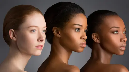
e ability to display and print more colors then appear and s rgb like there's more information we can print than s rgb has most the time we're printing our prince often are rgb or we have monitors that can reach rgb pro photo is so so big that it's much bigger than what we can print and much bigger than what we can see on the monitor all right so let's just start with the fact that you want to x this out noesi rgb ever for any reason unless when you're exporting its for facebook as export or for printing toe a lab that wants us our gp I'm going to go into that and a little bit more death but the same thing is before like yes we sometimes have to we have to output a eight bit okay yeah we have two output it s rgb sometime but I want more information to work with as I'm making changes I need to start bigger and then fast export smaller I will so it's hard to be is the no in our cameras you can go ahead and set what color your color space you're in s rgb or rgb you want to make sure that it sets our g b but if you are shooting raw you're still capturing all that information anyway it's more important if you're shooting with the j peg for some reason that you need to make sure it's set to rgb in your camera when you cook when you actually have a raw file you're using a color space that is more like pro photo that raw file has a ton of information more than we can even possibly use but you have to make a decision when you go ahead and edit in photo shop for export to a lab or export for whatever other reason you have to make a decision what color space you want to be in so what color space do you want to be in the bigger the space the more color you have you have more accurate colors and smoother transitions so a lot of that color banding that I had in the skin with iran s rgb it would be a hundred times worse because they don't have them much color to work with it would improve as I goto rgb and even better at pro photo the biggest space the more flexibility so the same thing as I'm moving colors around and changing white balance and everything when I work with a bigger color space it's giving me more flexibility to work with so here's my analogy okay the dress analogy so I'm in a wedding my best friend from college her wedding is in two weeks and him in her wedding and I had to pick a dress out like six months in advance okay ladies knows this stressful because they're going to fit it all right so so if I go ahead and get the small size it looks really sexy but I might be like fallen out a little bit you know not quite fitting the way that I should well it might kind of work but it probably is not the best look okay so that's how I'm saying yes rgb you could probably get it to work but not everything fits okay so so this was my decision I went ahead and said ok no s rgb dress or I could say the size but we went to the slightly larger said ok the next size up is the rgb dress or the next dress up is the one that you know it's it's probably a little bit bigger fit it probably is goingto everything that you need but maybe you're a little worried that you're going to need a little bit more like if it's a six month out right you might put on a little and maybe you want to be able to tailor it so maybe you want a bigger dress so you can expand where you need pulling where you need the flexibility so that you know if you want to make a change you can't like it might be possible that if you got a smaller size you can't make that change that you need to tailor it just perfect so the pro photo spaces the big dress that you're goingto have to push and pull and have more flexibility it sounds as if maybe pro photo sounds like a good idea you're giving yourself a ton of fabric to work with aa lot to manipulate to fit your size the problem is you got to figure out what to do with that extra fabric let's assume like you got to either cut it off or try to move it around so it actually does apply this all goes in the same way because for the kgb you're gonna have more colors than srg displays so you you want something bigger you want to be able to show all of your colors rgb most of the time is showing a lot of colors for prints and on monitors but then pro photo has so much information your monitor can't even show it so you can't even see it but you're giving yourself more flexibility if you want to shift colors and if you have a lot of grady and has even more color in the radiance there and has more color in red's which is skin tones so my answer is it kind of depends if you were more of a novice or if you are a working professional that just wants good color but you want ease of use generally rgb is going to be the better way to go there's a less concerns and less places to go wrong however if you really are color expert you are working colors extremely important to you you want to be able to do drastic changes you want flexibility and you want to work at the highest end of your file then pra photo is that but you have to make choices when you go ahead and export for a print print can't possibly show pro photo a monitor can't show it so when you're exporting this you've got to decide what to do with all that information which can cause some problems you can never deliver to anybody a pro photo file they they don't want to do with it you would never do that it would always be in rgb or noth rgb so it kind of depends when I spoke with I spoke with some of the folks over x right and I was talking to them and in general most photographers they recommend rgb you're going to be fine you're not going to see a drastic change in color it's going to be good enough quality for what you do however I have friends that are more discerning for example eddie tap he does everything in pro photo from start to finish because he has more of a discerning eye for color he prints his own work he wants more control so you have to decide what's more important to you I most of the time working rgb unless I know I have an image that has like for example that dark skin woman then I was working in pro photo because I knew I needed more color information but most the time I am over here in rgb um what else do I want to emphasize on that oh the important thing is where I'm going to show you to change all the settings you have to keep her settings consistent because it is possible that you open up your file is pro photo but you're working space and photo shop is s r g b and then you out rgb and that's where the mess happens so whatever you choose whether it's rgb or pro photo keep it consistent throughout your working space and in your settings so how was that that kind of makes sense yes question so with pro photo does that mean it requires more closet space computer bigger it is bigger but not sizably it's not like you need to double the size your closet okay unless you want teo lindsay yeah so just some confusion from people in the chat room you know there is some questions of like for pro photo if you can't if it has to be squeezed back into rgb then why even use it in the first place and people talking about jen smith photo said if the monitor can't handle it how are you even editing it properly and pro photo right this's part of the issue there are I'm going to show you there are very expensive monitors we'll talk about later on that can show you a lot more so there actually are if you want to invest in a monitor you can show a lot more of those colors to work with it's the same example and how I compare it is the same example of the dress by being in pro photo you're giving you that larger size so that you have more color and information to work with so that if for example I need to pull a blue from here I want this and I need to change the colors I can shift them and move them and in the end it's still going to be the same silhouette of dress but I just have more fabric to work with to make it flexible to fit what my my silhouette is um so it just gives you more information in general this is why some people stay away from it is because there's a little bit more thought that you have to put into how you choose to handle your files but as I said you know like any time that's what he does for using all of his files because he wants that much more color fidelity the way that the color spaces work the way the computer seasons it's actually a three d space so whenever the the colors are outside of the color space that the computer is trying to cram those colors and andrew that three d space so it's not discerning the different color so you won't really see the great dance between you know the grains l like urine or the yellows in between that so I think I have that kind of will demonstrate but not the three d version a little bit more simple so let's dump into this ok so let's put this into well if you've done college bases you've kind of seen this may be kind of had a glance all right so you've got this is all the visual you concede but exactly like he says this isn't flat it is actually a three d there's depths because it's it's plotted on guys know hugh saturation luminant so the hue of it the saturation of it and the luminous is the brightness so you may have seen that as sliders that you can change in light room or an adobe camera raw well that space is mapped out over those different tones based on the hue the saturation eliminates but this is the knife smaller way to show this it's a little bit more in depth in this okay so first while your monitor is going to be a place of limitation less expensive monitors show you even last color more expensive monitors will expand it a little bit but it's still not going to approach the full full visual range of colors okay then the next thing is you have srg be color space here your monitor all many monitors can show more than srg bi and a lot of times you can even print more than s rgb so you're limiting yourself why not give yourself a little more information so that you can have the richer colors or the better color tonalities son you have your adobe rgb which in some places and certain colors and you khun if you want to look this out there certain colors that rgb shows that's beyond monitors and blues and things like that but anyway rgb is about the size of a lot of monitors and a lot about the size of a lot of printing capabilities is going to depend on the printer and depend on the paper and then when it comes down to it you've got your paper which is someplace in there so pro photo is huge even goes beyond some of the visual spectrum it captures all of this but you can't print it and you can't show it on the monitor but it gives you more flexibility to change things andi we're going to talk about how you choose how you're how photo shop what it does with those colors kind of the criminal in there how you decide how it's crammed in there because that's what it does it would go ahead and say ok pro photo we want to make it rgb and it crams it in there but you could decide how it does it all right so that's usually what we see and so that's why you can decide what was going to work better for you I told you about this you never deliver pro photo files nobody has any idea what to do with them um so this is what I recommend your workflow is in light room and your raw processing your working with raw it is a sixteen bit file and you are working with pro photo like already like that's that's what a raw file is you're working with everything when you converted to rgb it's making a decision of what's getting thrown out you want to then process it over into this is your working file photo shop you're making changes you want to be working in terre for psd both are fine you want to be working in rgb or pro photo giving his most color information as possible and you want to be working with sixteen but you want to keep it as big as possible when you export but a lot of times people make you export it to smaller spaces however ah lot of people like way way way okay so if I'm starting big but I got to throw out the information what's what's the benefit so it's a couple of things like I said with the dress analogy you're moving things around it gives you more flexibility and also as you make these conversions our processors in photo shop and a lot of the export processing does its very best to keep them as similar as possible it's more important the fact that you're working with this in your working file your photo shot file let sam opening up from light room I'm not working in photo shop whatsoever and I know that I am going to be putting this on the web then you can just export as this you can just export as a j p s rgb eight bit but it's the fact that if I'm going to open up this file and I'm going to start changing the colors and the exposure and doing some re touching I need more information to work with when I get it how I want then I can say photoshopped do your best conversion to hold as much information as possible for me and fitting into these parameters so you gotta start big go as little as you have to um saying it's like I said you got all that information be consistent all right so here's where we want to check your file settings and this is a part of you want to write down because this is where you like not having set up okay you need to check in both raw later man photoshopped that you have all the right things set so first one late room under light room preferences external editing so if you go to the little light room preferences external editing this is what you see and this is saying when I open this up in an external editor whether it's photoshopped or I mean whatever else other editing people use she's photoshopped what file format do you want it to be you want it to be a tiff or psc we're going to be editing on things you don't want it to be a j peg here is where you decide what color space you were going to be working in you can set it as adobe rgb nineteen ninety eight which is the easier way or you consider as pro photo if you want the most information possible you said your bit depth here so this is this kind of one of the places with a reset if you do up updates he said sometimes it resets make sure again this is set too sixteen bit not a bit so this is when you do inform in light room you know right click photo editor in an editing photoshopped this is telling it what do you want those settings to look like so you got to check their take on look at it some other places you have to check light room if you export if you were exporting if you're exporting for the web the's wouldn't be the same settings you could export for web settings but if you're exporting so that you can get them all these these files ready to send off to re toucher maybe you want to have as much information as possible so if you're exporting here's where you also go to file export file settings you want to have tips rgb you're pro photo and sixteen bet like I said if this is being exported for web that wouldn't be the same information but this is if you plan on working with those files in photo shop for passing it off to a re toucher something to that effect okay so those are the two places to check and light room definitely check them right away okay the next one is if you're working in a dhobi camera raw so that's if you have a raw file you double clicked open it up and this is what you see in the bottom thiss blue link is where you decide when it opens up in photo shop what bit depth and color space you're in so you need to set it there and so when I double click or when I click on this this hyperlink down here it opens up my work flow options so I consent my color space and my dip my bitch depth and resolution so now it will stay that way for a future time like in the future when you open raw files unless you change it so for some reason you change it back to eight got to go back and change it sixteen so check this for adobe camera raw this is something you need to check if you're for some reason using multiple for multiple versions of photo shop or multiple computers you gotta check it on all of them it won't it won't hold up in the file it's gotta hold in the um in that adobe camera okay now photoshopped here's another one you have to set the work space of photo shop so you're picking the color space that it's working in so if you've ever had those file warning mismatch pop up when you open up a file it means that your photo that you've just opened up let's say it's an s r g b and maybe you're working spaces are g being it's telling you these don't these are not the same and photo shop is doing you a favor because member hi said consistencies what's important it's telling you hey you're not being consistent you're going to have a problem here they aren't going to match so what you want to dio is whatever you've chosen for your your color space you said it here so it's under edit color settings working space and you would change it here to the pro photo or adobe rgb nineteen ninety eight and it sets that as the working space for photo shop okay all right so I'm gonna pause there to take questions before I move on to something different for a minute anything major go ahead in the studio audience he talk at all about the c m waking killer space during this I was going to avoid it okay wait okay so we should just ask about the white color space so you geographic sign don't you yeah I actually had the um retouch some stuff for a magazine and I sent it over and their legal your colors just be saturated when we switched over teo seemed like a sow my quick answer without really going into it that is supposed to be their job they're supposed to make those those decisions you're supposed to give them a functioning rgb you know sixteen bit tiff and then they make the conversion is based on how they're printing so they're just don't know s so because that's why I was asking about graphic design is this is something that's more applicable for people who are printing to printing presses or print runs of magazines and books and things like that but for photographers were usually printing for argue be and it's the job of the printer to actually make that conversion typically lindsey so you had you showed us light and talked about what not to do if you're doing web or facebook or things like that can we talk about what the best this is a question from the quirky bu can you show the best conversion for facebook or something like the web or we're going to get into that so I'll mention real quick and then on day three I can actually show more literate but the idea is you don't really want to leave it up totally to facebook to make the decision of how to handle the files and you guys see what happens to the colors so what you're doing is you're saving for web and you're changing the color profile so that you're giving it something it can handle because when you give some facebook something with a really large color space and a lot of information it just throws up whatever the heck it wants and then it looks really bad so you're saving for web and you're changing it to an s e g b eight bit j peg if you try to give it a larger color space it won't work and saving for webb what it does is it allows you to see what colors you're throwing out and try to get it to a file that facebook can manage so on day three all demo something manageable facebook's like still going to butcher your photos like it's it's still does that but there are ways to help in the process well we're talking about people's uploading to people's websites and things like that not just facebook but just web in general great thanks lindsay absolutely okay so here we go we're jumping around a little bit so we kind of did our color space a little bit and we talked about a bit and and sixteen bit and so another thing that you might consider is another camera you can get even more information to work with skin besides just using pro photo besides just using sixteen but you can actually use another camera system for even more information so I'm going to tell you why you might find the need to upgrade or rent or utilize a medium format digital back system in new york for shooting beauty campaigns makeup ads they're not usually using a thirty five millimeter camera no often using a five day mark three in general they're going to use the hospital on the digital hasa blad or they're going to use ah phase one or a leaf system and they're a couple of reasons for this okay so let's start with this more thie medium format digital back to meet informant digital systems have more accurate more faithful colors the way that our thirty five millimeter cameras sensors are built is that they allow for s o sensitivity but the way that the bear pattern and you know the colors in the censor the way that it's built is in order for tohave eso sensitivity light sensitivity it's not totally color accurate and sometimes the colors seep into different channels that's like the really basic way of saying it however a lot of these phase systems or digital back systems they're not built to be able to shoot at you know two hundred thousand eso instead you would shoot a lower iso but the color is going to be true so it's it's called a tight pattern versus a broad pattern for how the sensors built that doesn't really matter to you just know the color is more accurate it that's just the way it's built has greater dynamic range so again a lot of these cameras have dynamic range is meaning the exposure that it can capture in one frame it can capture a fourteen stop range I mean it can capture almost with the human eye can see I mean it's huge from the darkest shadows to the brightest highlights so it gives you a couple capabilities one of the benefits of course dark shadows in the skin you want to bring it up it's not going to fall apart if you were bringing up shadows captured with thirty five millimeter cameras sometimes you start to get those weird colors in the shadows not the same thing happens when you're shooting one of these cameras same thing you could bring back highlights that you khun retouch them and work with them but this is particularly important or it's particularly noticeable when working with darker skin tones and darker exposures so here is a I'll explain that second as well so this particular camera that I'm going to use in like one minute it's a fifty megapixel camera has fourteen stop dynamic range has cool touch interface in the back that has nothing to do with skin it's just cool and I like it um but here's how it works with dark skin tones all right so when you're shooting with a thirty five millimeter camera and you photograph a really dark skin tone in a really dark area very dark skin tones have almost no blue information and very little green like an rgb most of the time dark skin tones are mostly read in the shadow and for in the shadow areas you basically just working with the red channel and there's very little information so as soon as you want to have a greedy int or lighting it up for thirty five millimeter camera you have one channel in this much information because it's not reaching into the shadows there's not that much information but when you upgrade a system to a medium format digital back for example since you have that much more dynamic range it reaches much further into the shadows and much further into the highlights which means yeah you might only have that red channel but you've got a lot more information to work with so you can lighten it up or darken it down and it will give you a smoother ingredient so I see one of the biggest difference is is when photographing skin it's true our color to what the skin tone actually looked like it has insane detail crazy like the details absolutely amazing but it really really helps them photographing darker skin tones especially in shadow areas there's more information there from the color range and how those sensors work so I have a little bit of a sample I know we're looking through a low resolution feed so it's quite possible not be visible but this over here on the left is the five day mark three and over here on the right is the face system you can see a lot more of this kind of green yellow in the shadows of the dark skin tone and when I zoom in this is the image shot with the phase and this is the amount of not only tonal detail but also skin detail compared to the five day three so if you want to be able to and also you can also see a little bit smoother ingredients and more accurate skin tones to what she looked like the five day three files I shot this exact same settings exact same setups only it was different was the compression of my lens didn't have exactly matching lenses everything else was identical to the five three didn't have a smooth transitions in the shadows and it was a little bit of a flatter file and clearly you can tell what has more detail I am not by any stretch of the imagination telling everybody that you need to upgrade to a medium format system however if these are things you're concerned about where you're shooting beauty campaigns you want more faithful color or you want all that detail then that would be a reason why you might upgrade eso with I'm shooting beauty images or dark skin subjects this is the camera system that I would opt for so see and there's another kind of like you can see every single eyelash it's amazing okay all right so I am going to shoot a couple frames with that system so my every my lovely model out here hi lovely yeah I'm ready the face we'll start with that thank you all right oh okay maybe I'll start with the other one because we need to get this one set up for a second we need pocket wizard and stuff just grab that one um okay I'm gonna pass this through for a second to mine officials that first I'm going to shoot a couple frames of her with the five day three and honestly you may not be able to see the different difference based on the monitors and things were looking at but you might be able to do so and you're okay can you do me a favor and get get that up and rolling for time's sake thank you and I still have this on my custom white balance have any of you guys photographed with a phase somewhere yeah right okay there rubbing their fingers together it's so is it the size of the sensor that's giving them or detail it's the side of the sensor that does give you more detail the lenses are really sharp on dh soas faras the detail that's detail the color is this it's the sensors in the tonal range the dynamic range so I brought I've been working in pro photo but then I bring in a texture and it says it's rgb am I hurting the image by bringing in that texture that is no great question okay so what's best is that if that texture doesn't have any color to it then you have no problem it's not going to cause any issues because you could just say yes convert what you would say in that little dialogue that pops up say convert to working space and then you can just drag it and they'll talk to you tell they're no problem it's when it does have color and it doesn't match because you're putting and srg being a pro photo and now it doesn't quite line up so you're mismatching profiles which can cause a problem most the time I'm going to stay with textures you're usually okay because it has very minimal caller information anyway so it's not a huge deal it be more like combining pieces of multiple photos like if for some reason I'm grabbing on and I bought a lot of this photo and putting it on the other that's when you're for sure run into color problem because it's not representing colored the same way think textures you're okay and I'll take some questions from online this is a little bit off topic but mama swan since said since we're talking about setup in camera do you have any recommendations for picture style in camera that is better for skin tones oh that's a really really really good question so the question was picture style and with nikon it's called what creature control is that right where you can set it so like monochrome standard I think it's called picture control I can tell him cannon sorry okay I'm gonna say it's picture control anyway so what picture control does is it changes how your j peg preview is interpreted so if you actually look when you select like standard it's showing you what it's doing to the saturation sharpness like you see numbers of the zero zero zero three to whatever and it gives you different previews so you might have landscaping might have standard and I have portrait it is on ly changing your j peg preview and nothing else so the whole point is if we're shooting in raw it doesn't affect the end photograph anyway um I use issue in standard so it anyway I will tell you this is something that not many taught like not many teachers say they do I will put it in monochrome black and white if I'm shooting in black and white because I like to feel to see the preview because I see the way the light it's following on the face better I'm not distracted by color information if I know for sure that I'm not going to end up in color but when I do this I'm not shooting the image in black and white all showing me is a black and white preview on the back of my camera the second it goes in the light room it's a color file again perfect and I'm gonna grab one shot regular and they may have a color checker for one please my light does look a little different like it's not ideal of the moment okay perfect all right and I'm going to do actually can you grab me my one fifty macro let me talk about lenses just for a second um one of the things that people talk about are sharpness of lenses but sharpness of lens doesn't really just have to do with is it in focus or not it has to do also with the amount of detail that it can capture it's not just like oh for example sigma came out with a new fifty millimeter macro lens that I just got in the mail and it's meant to be insanely sharpen its it's meant to be completely different than the old fifty well I have the old fifty and it's my pictures or sharp but it's not about in focus it has to do with the amount of detail that it can capture is well it is a sharper lens so just know that so if I'm going in really really close for detail like insanely close I will pick a sharper lens so one of the lenses I like to shoot for really close detail is a macro lens and I like to shoot I have the signal one fifty mac roland it's a very sharp lens and also because it's macro it lets me get even cliff I'm not like right there e I saw her eyes get big like uh so it's going to let me get a lot closer which is also going to allow one to one raise one to one magnification so I can see a ton of detail I'm not going to go that close I'm gonna stick to maybe uh maybe here okay perfect another point that I wanted to make a swell is if you are super concerned about white balance which you all should be but actually maybe you've seen this different lenses capture different color some lenses are warmer than others some are cooler than others sometimes they have a more magenta image so technically when he it's complicated but just so you know technically when you're creating a custom profile it needs to have been shot with the lens the same lens is your profiling so let's say that you're shooting a wedding and you shot some of it with the seventy two hundred and some of it with the one fifty macro the lenses do technically capture color differently so you are supposed to capture a picture of the color checker for each different lens I usually don't do that I'm not that discerning I'm just telling you you may see differences in color which is also carry different cameras see color differently you can calibrate them but I'm photographing a wedding with him were photographing the exact same wedding together if we don't use color checkers or we don't calibrate you will see drastic color differences between our two systems so it's another reason is if you're photographing with another partner or a second shooter another reason to get your white balance on dure calibration set I swear no one more than I'll flip over and I'll just real quick ok here we go yeah in your face okay excellent so I could get even closer than that but you guys get the idea so the macro lens with a seventy two hundred I can crop from maybe here to here with one fifty macro I can fill the frame with julie closer than even her eye that works awesome for skin in detail pass this back to you maybe not okay such alright I'm gonna grab the other arm going well that's okay that part we can handle has got make sure both the batteries are in okay seem to be okay so far oh sorry I'm totally not in a frame or anything well you know how it is huh so put comment while you're doing that lindsay olaf berglund who says hi from gothenburg sweden wanted say hi I I believe your mom is in the chatroom because then mom number one fans said hi ole up I will tell her yep well your runs in there my mom yep that would be mama actually I learned in sweden yeah I I I was pretending I could speak swedish shows good they believe me ok all right so anyway it should be fine now all right so it has a touch screen on the back super cool and fancy but I said something camera settings there in my white balance to flash I would still go ahead and take a picture of a color checker but I said flash amusing flash so one hundred trying to match it similarly I would actually change my camera settings up here so one one twenty fifth of the second and are shooting what f ate seven point one okay all right wonderfalls okay in a couple of things about this system it is heavier we're sure not maybe not on yet okay maybe say another thing what if you've never photographed with a medium format back it is more challenging to focus you have a significantly narrow word depth of field when shooting at the same exact aperture and with the same lens is like the same focal length equivalent so know that that even if you were shooting say it has to do with sensor size even if I'm shooting say at f eleven I might only have a few millimeters of short tack sharp focus on the face when I'm shooting with a macro lens so one of the things that's really nice about the system is on the back what it has has something for focus speaking any of you have seen this on newer point in shoots or also video cameras we'll let you do is when you take a picture on the back of this screen anything that's in sharp focus it lights up with a green outline if you actually change with the outline is so I can see ok was I focused accidentally on the temples or am I focused on the eyelashes to the eye so I have the ability to see if I was in focus it also lets me zoom all the way in so I can check the focus is well the other thing that is one of the one of the benefits one of things they say the selling point of the system is that it uses an editing software called capture one and it has a lot of similarities to light room but also has a lot more advanced features and so it was made by the phase people there one in the same kind of the same not the same company but they're intermingle and anyway so part of that is there's a lot more advanced features that are made specifically for that camera there's a lot of interesting presets on dh I also have the ability to go in there and select a particular color tone how far it reaches into other color tones and then change the hugh saturation luminous of that so it's a little bit more advanced and what I can achieve say in light room so I really really like that but you don't have to use the capture one just with phase files you can actually use it with other raw files but you can't take phase files into light room or photo shop without capture one shifting um this isn't the camera or the this seventy men you how often do you use the white balance shift bracket where you can actually okay so I personally never used white balance shift bracket because that's like me making a decision that I don't have I'll have enough information on if you are calibrating your camera and you go through a camera calibration which the data color system that I had over there it's called the spider for elite actually has a camera calibration built into it that might be a reason why you would use that the canon cameras don't even have it in that kind of way that you do but that's the which one is it the seventeen yes so the ones that I've seen people use it more for us like the d a hundred do you ever use it the way the shift yeah because I'm just making like arbitrary changes unless I'm calibrating my camera
Class Materials
bonus material with purchase
Ratings and Reviews
Aliah Husain
Lindsay is an INCREDIBLE photographer and teacher, and also seems like a wonderful person! This class is great for beginners and more advanced photographers, as well. She goes into tons of detail on all the technical stuff like lighting and editing, and it is fascinating to see her interact with and shoot her models, work with her equipment, and photoshop like a pro. Huge amounts of information for what you pay for. If you are looking to improve your skills in photographing and retouching people, purchase this class!!
Kirsi Todd
Lindsay is probably my favourite instructor (and that is saying a lot, as there are many incredible instructors). She is so clear in her teaching and she also seems like such a nice and humble person despite her incredible success. This course is one of the best courses I have ever seen. Thank you Lindsay and Creative Live!
Andrew Lederman
Great course. Lindsay Adler is one of the best instructors for any creative live classes that I have seen. Simple and easy to understand, clear workflow, very friendly and non condescending like some other instructors. Could you put a link (maybe I just didn't see it) to where to download the actions used in this tutorial?
Student Work
Related Classes
Portrait Photography