Live Edit 1: Using Layers to Build the Scene
Lesson 2 from: Retouching for Interior Architectural PhotographyMike Kelley
Live Edit 1: Using Layers to Build the Scene
Lesson 2 from: Retouching for Interior Architectural PhotographyMike Kelley
Lesson Info
2. Live Edit 1: Using Layers to Build the Scene
Lessons
Lesson Info
Live Edit 1: Using Layers to Build the Scene
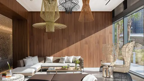
So I'm going to show you one of the more common scenarios that I deal with on a regular basis, and that is simple room, bright daylight outside. We might not have the luxury of waiting for perfect light for whatever reason. Maybe we only have the afternoon to shoot, or we've got more important photos scheduled at better lighting times so we have to make it happen when we have to make it happen. And what I'll do is I'll mix flash and the ambient light. When I don't have flash going off in the photo, I'll just refer to that as ambient-only frame. So an example of an ambient frame might be this. This is obviously way too dark, but I would consider this ambient light. This is what the picture looks like with only ambient light. And it's okay. I mean, I look at this and I see a number of issues. Like the colors are a little bit wonky, the light feels very flat and dull and sort of not at all interesting, and I think we could do a better job of selling the space as a light, bright living roo...
m. So what I do to sort of aid me is I will add a flash. And if you have a room that's a box, you have nowhere to hide the light. Like I said, I don't want light coming from behind the camera, so I'm not going to put any flashes behind this table, and it's going to bounce this way and flatten everything out. I'd love to put a light here, but if I put a light stand then I pack and head and it's going to be in the frame. Maybe I could put one over here, but I don't really think that's where the light is coming from. I want to, again, replicate this natural light, but give it some more snap, give it some crispness, get the color correct. So instead of putting light stands and everything here, I'm just going to use myself as a light stand. I have a Profoto B1. I'm going to bounce it into the ceiling. But I'm trying to replicate the natural light, right? So if I were to have all the light coming from the right hand side of the frame, it would look totally fake. Because obviously our light source is here. It's this big, soft window. What I'm going to do is I'm going to bounce it off the ceiling. And it's going to be pretty similar to this clear story window up here. Bounce it off the ceiling. It's going to give us a nice bit of contrast on the furniture and room itself. But obviously I can't leave myself in the photo, so I'll do another shot and I'll leave, and then we're getting there, a little further. I come over here, like my booties, right? And I'm going to composite these two or three flash frames together with those sort of natural ambient frames to keep it feeling natural but also clean up the color casts, get a nice view outside, give it a nice bit of sparkle and pop, if you will, and make it feel a little bit more lively and inviting. So here's my exterior view. Again, this is a situation I've described 10 times previously. We have one two-hundredth of a second out here, half a second inside, kind of blend it all together. And this is a very quick, simple way to sort of make this happen if you haven't done it before. So what I'm going to do is I'm going to go through and I'm going to find which images I like, and which images I don't like when I do my final composite. So what I mean by saying images I like, it means basically just pictures that I know I'll probably use. I like this light. You can see it adds a nice contrast over here. But I have to get myself out of the photo. So if I take myself on the left and then take myself on the right, and then sort of erase myself out, I'll layer them together and hide myself. But I also think these natural light shots have a great quality to them as well. So I'm going to blend them all together so it doesn't look too fake and flashy. It looks natural, but it's going to have nice, cleaned up colors. So what we'll do is I'm going to find a frame here that I want to build everything upon. So in this case, this looks like a good medium frame here, if you will. It's a little bit underexposed inside, a little bit overexposed outside, but it's a good place to start. So maybe it's one of these frames here. I'll say this is a little bit too bright for me, this is a little bit too dark. I think I'll use, I'll probably just go ahead and use this one as my base layer, and I'm going to add flash on top of that. So next thing I need to find a frame that will work for the outside. This feels a little bit dark to me. Again, this is just a bracketed, one stop apart series of exposures. This one feels pretty bright. So I think I'm going to take these three frames here of the bracket, and then like I mentioned earlier, my flash frames, which I'll use to composite the interior. So I'll just select these photos here. I'm going to right click on the Lightroom guy. I'm going to go to Edit In, Open as Layers in Photoshop. Okay, so here is our image. Everything is sort of lined up, and if you notice, in Lightroom, right click Open as Layers in Photoshop, it automatically creates this layer stack, and because I'm on a tripod, and hopefully not breathing too heavily or walking around like an ogre, everything is aligned perfectly at the pixel level. So I can just zoom in and I can turn off all these layers, and you can see that everything is pretty much aligned perfectly, which means we'll have a very easy time of masking our frames together. So again, the concept here is to blend these ambient frames with these flash frames to create a final pictures that has a nice contrast, because the light is kind of muddy with overhead outdoor sunlight. Nice color, because the flash is getting rid of the sort of greenish yellow color cast that the room is picking up from the wood floors and the green outside. And I want it to have a nice sort of natural feel. I don't want to nuke the room with flash. I want it to feel natural. I just want it to look a little bit cleaned up, sharper, and more contrasty and color correct. So I'm going to blend these flash and ambient layers together in order to do that. So the first thing that I'm going to do is I'm going to hide everything except this base layer, and this base layer is what I'm going to build all of my remaining images around. So the first thing that I need to do is I need to identify the problems with this base layer, and for me, the exterior is a little bit too blown out. There's not really much detail out there. I do want to see that nice terraced poured board formed concrete back yard. That's a really cool feature. I want to see it a little bit better. And again, the color is a bit washed out. It's a bit muddy. So what we're going to do is start adding and building our scene here. So I'm going to rename everything as I go. I'm going to rename this to Base Layer just to keep everything in mind as I'm working. I'll probably end up using this as my exterior view, and this, I'm very little with my names, so maybe also the exterior, a little dark, but we'll see. (students laughing) And I think that this is probably way too dark. I brought it because you never know. Maybe not. And then we have our flash frames, right? So like I said, I tend to overshoot, because we're not burning through film. It doesn't cost me two dollars every time I expose the camera, the film inside there, sorry. So I have these three frames. I really think I only need two. I think I need myself on the left here, and on the right, and I can line them up and hide myself in each one. So I'm going to call this Flash from the Right. And I'll call this Flash in the Middle. I might use it, but I don't think I will immediately. And I'll call this Flash from the Left. And the first thing I'm going to do is, again, hide all my layers, and I'm just going to start kind of working in that flash, massaging it in until I'm happy with my result. I'm just going to keep building one piece at a time. This is all improvisational. I kind of went over it the last few days before. But every time I edit something, there's no answer. Every room is different. It's a little bit improvisational, but hopefully you can take these techniques and kind of apply them on your own shoots. So what I'm going to do here is I'm going to use a layer mask. If you guys aren't familiar with the concept of a layer mask, it's basically a non-destructive way to edit together multiple layers in Photoshop. So if I have Layer One and Layer Two, and I want to see Layer One, I can erase some of Layer Two, but it's non-destructive, which means I can erase and reveal and hide and show, and I can go back and forth between layers without really using the eraser tool or editing destructively. I can always undo what I've done. So what I'm going to do is I'm just going to make sure all I have is the flash from the right and my base layer visible. Here they are lined up on top of each other. I'm going to click this Add Layer Mask button down here in the bottom right corner of Photoshop. Now, the critical concept of layer masks is that a black paintbrush painted on your layer mask will hide or erase, and a white paintbrush painted on your layer mask will reveal that layer in the mask. So if I take a, again, I'm going to hit B for my brush tool right here. If something else is selected, make sure you click and hold and select the Brush tool. And make sure that your foreground color is set to black. And I'm going to, you can change the brush size using this little dropdown box. You can change the shape and everything. I prefer to use the brackets on my keyboard. I can tap the right bracket to make it bigger or the left bracket to make it smaller. And you can hold Shift and the right bracket to make it harder or softer. So what I'm going to do is I'm going to go Shift, left bracket, and make it as soft as possible, and then I'm going to hit the right bracket just to make it bigger. So it's a big, soft brush, and what I'm going to do is start again, painting myself out, hiding myself, using that black foreground color. If your foreground color is set to white, you can click these little 90-degree arrows or you can click X and switch between them back and forth. Make sure you have a black foreground color selected. Now I'm just going to start painting myself out. Right? And what we have is that natural ambient light where I was standing. And again, you can get interesting with your brush here. When I use a hard brush, this is obviously an issues. I want it to blend together very seamlessly. I want to cover my tracks. So again, Shift, left bracket, using a soft brush. Always using the X key, X as in X-ray to shift back and forth, switch back and forth between foreground and background, and just sort of gently chiseling out my Statue of Liberty pose over there. Now I think I can take this flash from the left frame and we'll do the same thing. We're going to add a layer mask using that little circle in a box. And with my foreground color set to black, I'll start painting myself out. And you can see what's happening is I'm now revealing the flash from the right layer below. And we're kind of doing a pretty good job so far of getting ourselves out of the photo. We've gone from a sort of muddy, messy ambient shot to a much more snappy flash shot. Now, this might be a little bit much. It looks a little unnatural, like up in the ceiling. I don't know how well you guys can see that, but it's a little bit bright. There's a big flash hot spot up there. So what I'm going to do is I'm going to see if I can't use my ambient layer again. I'm going to drag these so I can see a little better. Use my ambient layer to sort of cover my tracks, right? So I'm going to duplicate this base layer. This Base Layer Copy. I'm going to rename this Natural Ambient Feel. And I'm going to drag this on top of my flash layers. Now like I said, there's some good things about this. I really like, for example, this soft, natural light coming in from those upper windows. I like the soft feel of it, but the colors are a mess and it's a bit muddy. I'm going to use some of it, but not all of it. So instead of just adding a layer mask, I'm going to Alt, and I'm going to click the Add Layer Mask button. And what this is going to do is create a layer mask filled entirely with black. So everything is hidden. And I'm going to start gently revealing that layer using my brush, so I'm going to put my opacity to, say, 30%. Again, you can use your number keys or just drag the slider back and forth. 30%, that way I can very gently sort of work back in, sort of like adding brush strokes until I get a nice results. So big soft brush. Again, I want to add in some of the nicer parts of that ambient frame to chill out some of the over flashy results. So here you can see I'm bringing in a little bit of that ambient light, that natural feel, to chill out some of that flashiness. And if I turn it on and off, you can see it feels a lot more natural, and I've removed that sort of flashy feel from the ceiling, okay? So that's looking pretty good. I really like the light, but the color is still a little bit wonky. So I'm just going to try something. I'm going to change the blend mode of this layer from Normal, and I'm going to try changing it to Luminosity and see how that looks. So what happens here is I essentially remove the color information from that ambient layer and I leave only the brightness information. So the color is the color from the flash frame down here, but the feel of the light, the brightness of that natural light is all that comes through when I change that blend mode to Luminosity. And there's all kinds of different blend modes you can try. There's color, if I want to just retain the color information. There's Lighten if I want to keep the lighter things, but for this case I think I just want to keep the Luminosity of that natural layer. All right. Now I can see it on my screen. I don't know how well it looks on yours, but I feel like we can do a better job blending our flash frames together. So I'm just going to, again, select the brush. 30% opacity, and again, keep sort of chiseling out those flash layers until I think everything looks good. And you can see how that color gets cleaned up. And I can actually see myself in the shot, so I'll have to edit that out. Oops. All right. We're getting very close. There's something going on with that ceiling that feels a little bit wonky with the colors. Let's see. You see how that flash, it removes the three dimensionality of the ceiling? It feels very flat compared to the natural shot. I want to make sure that I keep that there. So what I'm going to do again is duplicate that base layer, and just keep adding it. This time I'm going to keep it in the normal blend mode. I'm going to, again, add a black layer mask. And I'm just going to go maybe 10%, 20% on the opacity and blend it in very, very gently. So it feels natural, but we get the benefit of the flash. But I don't love, I do get that color cast, so in this case, because we have so much yellow stuff in the room, right, I'm going to add an adjustment layer, this time the Hue and Saturation adjustment layer. So if you click on this half circle with a line through it, or full circle, whatever you want to call it, and add a hue and saturation adjustment layer, we're going to work on this a little bit this way. So the reason I'm adding a hue and saturation adjustment layer instead of going to Image, Adjustments, Hue and Saturation or whatever, is because when I click it from this menu here, it comes with a layer mask built in. So again, I can edit non-destructively. And what I'm going to do is again, it feels a little bit yellow to me because we have a lot of yellow furniture, we have wood, we have green, a lot of yellow going on here. I'm going to grab this little scrubber, this hand tool, and click what I think is too yellow. And I'm going to drag that to the left, and I'm going to subtly remove some of that yellowness from the scene. And now it's looking like we've blended this together pretty perfectly. The one problem that happens is that I lose some of the saturation in this table runner here in the wood. So because I have that built in mask, I can take my brush and set the foreground color to black to hide that layer. And I'm just going to paint out some of that desaturated yellow in the wood and the pillows. So now we have somewhat the natural color of the furniture and the wood, but we've kept it off the ceiling. The ceiling still feels white and bright. It's the actual sort of paint color of the room. So we're getting there. We're getting pretty close. The last thing I want to do here, almost last thing, is take care of this exterior. I still think it's a little bit bright. So what I'm going to do is find my exposure. Like I said, that's too dark. That feels pretty good. I think we're going to go with this shot here. That feels pretty natural. I'm going to use the pen tool. I could be quick and use the lasso, but I'm going to use the pen tool because it's kind of an oddly shaped window here. And again, I'm happy with how it looks through these windows. Those windows act as sort of neutral density, but I'm going to zoom in, and I'm going to make a select around the window frame here with my pen tool. Just kind of clicking, and if you do, or if you are afraid of the pen tool, if you want to be an architectural photographer, I highly suggest that you learn it. It's indispensable and I use it on pretty much every picture that I'm blending exposures together. I can just do this quick and dirty, but you can jump in here and sort of outline the pillows. Now you can see if I were to use a big soft brush, I would never be able to blend those sharp edges together and it would look a little bit rushed, or a little bit off. I'll show you in a second what that looks like. So here's my pen path completed. I'm going to hit Command Enter. That's going to turn that into a selection. Now what I can do, it's a pretty cool trick, I can turn my layer on, that selection will stay there. I can make a mask out of a selection instantly by again, hitting this square with the circle, Add Layer Mask button, and boom. I have pen tooled in that window. It feels a bit more natural. Now, if I were to try to use a brush to do this, and I wanted to paint in that window, well, let's see what happens here. Alt click, and I can get in here, but I'm not going to have very sharp edges, and you're going to get that sort of burnt look around the windows. You might be able to get away with it. You could spend all the time in the world sort of coming in here, but you're not going to get a perfect view, and again, I have to just get smaller and smaller and smaller. And at this point I've already spent more time doing this than just using the pen tool, using the brush going back and forth. So my suggestion is, again, if you have an accurate selection to make, use the pen tool, and you'll get a perfect sort of window view out there. And that might feel a little dark, so I'm going to select this layer and I'm going to back off on the opacity just a little bit. So I can use my number keys up top, and I can go to 90%, 50%, 70%, until it feels pretty natural. I do like it when it's a little brighter. So maybe we'll go to 50% opacity there. And that to me is looking pretty good. The last thing, or almost the last thing I want to do is clone out myself. So I'm going to make a quick selection. I'll just use the polygonal lasso, which is L, to constraint my clone tool here. I'm just going to go down, and I'm not perfect. This happens on all my shoots. And just sort of clone out my shadow from the flash. And you guys know how to clone, so I'm not going to spend an absurd amount of time on this. But we'll get it passable, right? All right. So there is my pretty done scene. I'm going to at this point just add a little bit of contrast. I'm going to hit my Add, what is this, Adjustment Layers panel tool here. I'm going to select Curves. And like I said earlier, I'm kind of a lazy guy. I like to use the presets that are built in here. So I usually just use the linear contrast or the medium contrast preset. The medium contrast makes the wood feel a little bit dark. So I'm going to stick with the linear contrast. And I think I'm a very low contrast kind of guy. Again, minimal editing. Very natural, that's kind of my mantra. I've used this. So I'm going to keep that at linear contrast, and the last thing I'll do is I'm going to hit Command Alt Shift E, which flattens all my layers to a new layer, and I'm going to make sure that my vertical lines are vertical and my horizontal lines are horizontal. And I'm going to do that by dragging out some rulers. And you can see I'm a little bit off, so I'm going to use the Transform, so hit Apple or Command T. That brings up my Transform bounding box, and I'm going to use the Skew tool to get in here and make sure that all my vertical lines are vertical. My horizontal lines are horizontal. So I was pretty close in the camera. I obviously slowed down for this one. And we'll get that dragged out until everything is looking pretty good. So I'd say that's pretty close. We'll hit Enter to commit those changes. And Command or Apple S to save. And there is our final photo. So again, if I undo all of my edits, it's a lot of very subtle changes to go from that to this, right? And I would say that that's a pretty nice improvement. It's not like anything insanely groundbreaking, but it's all these small little moves that we use to correct the color, add some contrast, add some snap, and pull in those windows to make everything feel the way it does in real life. So that's image number one. Any questions on that before I move onto the next one? I just had two questions. Yeah, sure. How do you determine when to use the pen tool to cut something out versus using luminosity masks or something like that? So sometimes luminosity masks, I'm going to talk about that in the next picture. They're not perfect. When you have a very complicated scene or the wind is blowing and leaves are moving, things don't always line up perfectly, so the pen tool really gets in there. And also in low contrast scenes, luminosity masks don't do a great job of making selections. So if you can sort of master luminosity masks and the pen tool and the lasso and the brush, you can get pretty much everything looking good. It's just kind of an experience type of thing, but low contrast scenes line this with lots of white don't really do so hot with luminosity masks, but if I have a high contrast scene with a dark interior and bright exterior, it's a bit more helpful. And secondly, if this was the exactly same scene but the walls had like a yellow tint to them, like an actual yellow color cast, would you have lit that any differently? Well, what I would have done is I would have used a big white card, whether poster board or foam core or something like that, and I would hold up, or my assistant would hold up a card for me to bounce the light off, so that I'm getting pure white light on the scene rather than the flash picking up yellow and then sort of bouncing yellow light onto the scene. And I might not use it at 100% opacity. If the walls are yellow, the room's going to look yellow, so I might blend it with a little less strength. So you get some accurate color, but you also see the natural color of that yellow in the room. So it's all about just finessing and control. Another question. If you're going to deliver this image, how much of the wall acne would you clean up? Switches or panels or things like that. Or do you usually leave that in because that's just part of the scene? Depends on the client. Sometimes the iPads and stuff, it's like a feature of the home, you want to leave it in. Most of my clients want me to zap outlets, some things that are built into the building code. It just so depends on the client. I'll ask them ahead of time. I have one client who's like, if you see a handicap ramp, take it out, because I didn't design it. I was forced to put it there by the law. You know what I mean? It's not part of my design. And I have some clients who are like, no, the building is exactly as it is. I want this almost to be documentary. I just kind of ask the client ahead of time. Most of them want outlets and light switches taken out unless it's some integral part of the design, like they designed a custom light switch or the outlet has been built in a certain way. That's generally on a client by client basis. But I'll usually, things like sprinklers and red fire alarms, I'll just go ahead and take them out.
Ratings and Reviews
a Creativelive Student
Amazing class. Mike is a great artist - I've been following him for sometime already and he has a great eye not only for architectural photography but for all depth geometrical image capture. His commercial airplane posters are a delight.
Molly B
A MUST -- If you shoot interiors. I loved this class. I have been dabbling in some non-serious real estate shoots for some time now and have been asked to shoot some more professional spaces. While I have gotten away with "winging it" for some time now, I knew I was missing an entire block of information when it came to certain shooting and editing methods. I loved how short this series was too and did not even need a live shoot (taking up more class time) to get the concepts down. The only thing missing is that I would like to know what lens would be best for most interiors. Some wide lenses have distortion, etc. So this would be my ONLY question. Mike is easy to listen to, entertaining without trying too hard, doesn't deviate on random stories that have nothing to do with the class hah (as some instructors do). I am going to go dig up other classes by him. Thanks for such a well put together class.
a Creativelive Student
Great class... and just to be a smartass: The Quote is from Antoine de Saint-Exupery and goes like this: Perfection is achieved, not when there is nothing more to add, but when there is nothing left to take away...
Student Work
Related Classes
Architectural & Real Estate Photography