BONUS VIDEO: Marketing Template Demo - Single Page
Lesson 25 from: Promote Your Studio with ShowreelsSue Bryce, Hailey Bartholomew
BONUS VIDEO: Marketing Template Demo - Single Page
Lesson 25 from: Promote Your Studio with ShowreelsSue Bryce, Hailey Bartholomew
Lesson Info
25. BONUS VIDEO: Marketing Template Demo - Single Page
Lessons
Day 1
1Class Introduction
15:48 2Hailey's Background and Story
32:32 3Hailey's Tools
19:33 4Idea Development and Preparing to Shoot
17:08 5Shot Examples and Morning Q&A
1:06:49 6Show Reels and Music
34:16 7Editing to Music
21:34Shooting Births
21:40 910 Steps for Getting Your Video to Turn Out
10:35 10Afternoon Q&A
50:09 11Slow Motion
31:52Day 2
12How to Make a Fusion Video
37:36 13Preparing for the Shoot
15:52 14Shoot: Video Demo Test
20:26 15Shoot: Balloon/Confetti
54:28 16Shoot: Powder Paint
20:19 17Editing a Fusion Showreel
1:14:08 18Creating and Sharing Showreels
1:11:37Day 3
19Telling Client Stories with Video
1:06:37 2020 Ways to Market Your Business
1:04:54 21Designing Marketing Pieces with Templates
56:19 22Marketing on the Periphery
16:54 23Social Media Marketing
27:14 24The Light That Shines - Jill's Story
50:14 25BONUS VIDEO: Marketing Template Demo - Single Page
04:49 26BONUS VIDEO: Marketing Template Demo - Pricelist
05:35 27BONUS VIDEO: Marketing Template Demo - Design
06:53 28BONUS VIDEO: Marketing Template Demo - Gift Voucher
05:10 29BONUS VIDEO: Marketing Template Demo - Gift Voucher 2
04:30 30BONUS VIDEO: Marketing Template Demo - Brochure
03:45Lesson Info
BONUS VIDEO: Marketing Template Demo - Single Page
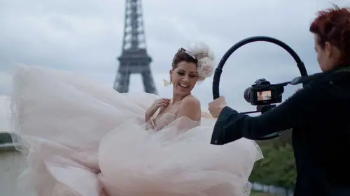
A single page design just a real simple let's say you have taken a beautiful shot this is kind of like water water macking shot this could be your cover to your pdf this could also just be something you want to send out to people you drop the shot on with four blade we go command tea so I want to resize it because I like my images I crop in camera so I want to fill that frame like a magazine I bring my image up and my aspect ratio is set so I keep that and then I accept it now that embellishments going over her face is not gonna work I can do two things I contend the embellishment off reckons pick it up and move it let's say I move it and I think oh, it looks nice down there and then I keep designing and I think now it doesn't look good that now it doesn't go there no, no way will dilate that uh this this wig? No, no, I'm not a big and alicia but a lot of people are it works when it works and when it doesn't get rid of it take the apace city down sometimes that looks fantastic know doe...
sn't work for me we go to the tics we have tea for ticks or the ticks tour which is on left inside this looks like a t k t is the short cut on the keyboard you click over photographer name and you hit, uh, command a which selects the entire front of the entire ticks, and you resize it to the size you want. And you choose a font that suit you. So I'm going to sit right about here. These are my favorites. I have lots of favorites, and we'll try a bold we'll try a bold one so photographer's name we see. All I have to do now is a name in here, so I've chosen a nice, bold font. I'm gonna sleep, eh? Since you select there, you could just start typing surprise photographer obviously didn't want to put my name on your pressure or I'll get your wig. Okay, there you go. Except so there is something that I would like to show you when you are overlaying takes over over images, that's, the design thing that I've always loved doing. I definitely like to use white, and I like to play with your pastry, but let's say, I know that there is over the image I don't like boxing in design, I like my images to be full bleed. I think it looks more stylized, more magazine, so what I'm going to do is I am going to change my fund and I can change size. They can change anything I want, but what I want to do is put a little white bar in their bottom, make my name smaller so it stands out more. I think the smaller stands at more than the larger and then I am going to go to that backdrop and what I can change the color to read if I want I mean, there's a million things I could do, but what I want to do is change the backdrop, not the word. So if I click down here, okay, I'm just gonna bring it down, you could box it in like that, but I think that looks lame. I think it looks like a cheaper design into me. It doesn't look like a magazine design because the magazine wouldn't put a word down the bottom and then put a bar and then put an image they would fall, bleed the image and write the word over them. That's a very classic magazine cover, isn't it to have vogue written on your forehead? So what I wanna do here is I am going to create a new layer, so new layer I'll go the menu way, I'm going to do it selection across there, and I'm going to eat it fill on that new layer white and what it's going to do is give me a barrel on the bottom and then I go to a pay city I swiped the word oh pace it is a short cut I drop it down so you can see through it and what then does is it just I can still see the image through there and that's a really well it's a well executed really cool thing to use and designer works you can do side bars that just have ticks in them because it brings your eye to the tics but it does it in a subtle way that the image is still full bleed it's a contemporary way to design it's so easy you can change the color of that hope a city and it works every time and I really like it and it's really simple and I really I think it looks good may guide or something that's a little bit more me let's try so many fronts so many great funds now if you want great funds go to de fund d a if au nt er just amazing you can get free fun shaken by funds if you on the character box if you just touched the funds and the era up and down the keyboard you could just go through multiple fonts and find one that suits you and when you get one that's got you you you can accept it and there it is there's your design you can also make this box bigger and put more ticks in there. If you want to bring attention down, they're beautiful.
Class Materials
bonus material
bonus material
Ratings and Reviews
a Creativelive Student
So I watched this teach over a year ago and just got around to actually editing and shooting a promo video for our wedding photography company. A fellow photographer and I just created a new wedding photography business and we really needed a concise, fun way to let people know who we are and show them our personalities. We have gotten SUCH a great response! It was an easy, non-salesmany (totally a word) way to get hundreds of likes and shares as well as drive traffic to our new site. It isn't the most technical teach, but it absolutely gave me all the tools I needed to shoot this! And I edited it in iMovie. It was definitely a labor of love, but I am so thrilled with the result! Sue, as always, was brilliant and Hailey is someone brimming with creativity and full of a palpable passion for what she does. Thanks to Sue and Hailey for putting together such a great teach! http://www.bridesanddolls.com/blog/2014/10/11/our-promo-video
a Creativelive Student
This course is NOT very technical, but that's really the point. Instead, it focuses on ideas and inspiration, with a bit of gear and technique overview, some great marketing ideas, and boatloads of inspiration. Hailey is an incredible artist who shares her process generously and genuinely. Sue Bryce focuses it all with tremendous marketing savvy, showing you how to apply it directly to your business. This course is the perfect complement to 28 Days with Sue Bryce, also here on Creative Live. Both are really enjoyable, really inspiring, and really, really useful. Highly recommended!
a Creativelive Student
Great way to learn film making. Excellent way to learn from a film maker like Hailey Bartholomew who gives her 100% into every second of what she loves doing. Thank you Sue Bryce for introducing us to Hailey and thank you to Creative Live for keeping Sue back on CL. I reckon this as the future of education.