Black & White Workflow
Lesson 6 from: Post-Processing Workflow for Portraits and LandscapesBlake Rudis
Black & White Workflow
Lesson 6 from: Post-Processing Workflow for Portraits and LandscapesBlake Rudis
Lesson Info
6. Black & White Workflow
Lessons
Lesson Info
Black & White Workflow
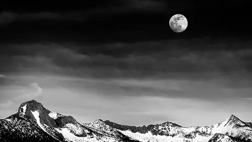
In the last image I wanna talk about a black and white workflow because I really like black and white images, but a lot of times the stars of the show are missing. What are the stars of the show in black and white image? Black and white, right? So we need to make sure that black and white are seen in our photograph, that there's a nice high contrast between black and white because if we don't have black and white, we have medium gray. We have mediocrity. We don't have the nice contrast that we're looking for. When you think black and white, we think Ansel Adams. Those robust, that's what I think anyway; unless you're maybe a portrait photographer and thinking about somebody else, but I think about these robust landscapes with these really deep blacks or blues that become almost a black. So what I'm gonna do here, my preliminary image; it's a little bit on the dark side, but that's okay. I didn't want my highlights to blow out. I gave myself plenty of room to work on this image. So that...
's my preliminary. That's my before I even start the post-processing, I'm thinking about the things that I'm gonna do with this image going in to post-production. Now if there's anything that I need to clean up here, which I know there because I shoot mirrorless; and if anyone else shoots mirrorless, you know that we get really dirty sensors. So I'm gonna go ahead and go into the spot removal tool and go to visualize spots, and I have this really cranked up; so when I zoom in back here, I can see that I've got a spot right here. So go ahead and click that, move over here, spot right here. Maybe cleans these guys up; I don't know, ew. Don't take that; take that. There you go. Take that, okay, cool. And then, spot right there, spot right there. You're like, man, dirty sensor. Yeah, I guarantee your sensor's dirty too. We all have dirt in our sensor somewhere. That was a, that was a psychological joke; and then click on them. We've got a little more; okay, cool. So then I'll go ahead and turn visualize spots off, make sure I didn't ruin my image when I did that; and everything looks pretty good, okay. So now I've done the boring stuff, the boring preliminary stuff. If I had to straighten a horizon, I would do that now too; but now I'm gonna go ahead and move on into setting myself up again for that image that I want. So here I might go into those, the tone and the color here because the black and white to me; black and white to me is not where you start. Black and white to me is an effect. It's one of those things that you get your image technically correct with tone and color, and then you move into the effect of black and white, okay? And if you ever, anybody ever, even you at home, you at home, is thinking about telling me that if the image doesn't look good in color, oh, I'll just turn it black and white. Oh boy, yeah; don't ever say that because a good black and white image should have its baseline in the color that you're modifying. And you're gonna see how this works as we edit this image. So I'm gonna go ahead and go ahead maybe just boost up my exposure a little bit, drop down those highlights a little bit, look at my white point, boost that up; and again, I'm getting a lot of that preliminary tone stuff out of the way, maybe even boost some contrast here, brighten that up a little bit more. And I know that I'm gonna go into black and white on this so I'm really just getting a minimal tone here because I'm gonna use color to modify my black and white image. I'm gonna use all the colors that are available in this to modify my black and white photo. So I might even look at the tint and temperature at this point, maybe make this a little bit more on the blue side, add a little bit of green to it, boost up the foreground there. And then I'm gonna go into my hue saturation adjustment layer because here is where I can start, you know, boosting some of the saturation in those blues, maybe making those blues a little bit darker, again, modifying going in from tone to color at this point. Get those blues a little bit darker, maybe even look at my aquas; aqua, I call it cyan. Aqua fuzziness, that'd be a good thing to put together; and then I'll go into maybe my yellows, boost those up, maybe boost the saturation in those yellows and the greens. The thing about yellow, the cool thing about yellow, is that yellow is really present in your greens in your image. So if you ever take a landscape photo and you're like, man, this is really green. Don't go near greens; go into your yellows. Your yellows are really what control that area, and don't be afraid to make your yellows a little bit more green; it's okay. We aren't gonna go circus vomit green, but we are gonna go a little bit more green. That was a really bad visual, sorry. So, so we just wanna go a little bit more green with those because the viewer; I'm gonna tell you, the viewer wants to see green. They don't wanna see yellow blades of grass; they wanna see green blades of grass, but they also don't wanna see vibrant, electric, shocking blades of grass either. They wanna see a nice color green. So that looks pretty good right there. I'm gonna go ahead and open this up and press open image here, and I'm gonna talk a little bit about black and white conversions when I talk about this; and to do that, I have to open up the color wheel. I love the color wheel because with this, with most black and white conversions, if you say convert to gray scale and you, you lose your color data. You lose all your color data because you're telling your image to take on gray scale tones. You're not telling your image to map themselves out into the appropriate tones that they should be based on the color values that are present because that's a little bit too much, but what you're telling them is to all turn just a gray value. On the flip side, if you go into a hue saturation adjustment layer and slam down your saturation, you're telling all your most saturated forms of color to now become 50% gray. So there's a better way to do it, and the way I like to do it is what we call a gradient map; but one of the things here is that if you go into this hue saturation adjustment layer in Adobe Camera Raw and you click convert to gray scale and you were to bring this into Photoshop, yeah, you get all the sliders here. But what sliders do you have here? What's happening with your reds? You get one adjustment, the luminance value of the color red; and that's it. So you could make your red brighter or you could make your red darker. That's great; it's great control, but it's not enough for me, all right. We can really control those reds, especially with some of the workflow stuff that you've seen already. Go into the oranges, same thing. We could make it darker, and we can make it brighter; but if you were to open this up in Photoshop, in Photoshop and you go up to image and you go to mode, it's gonna be set to gray scale with no color data. So after you do that, it's gone. You have no color data anymore. So we need that color data; so I'm not gonna do this. I'm gonna uncheck that, and I'm just gonna go ahead and open this image in Photoshop because I'm gonna show you the other, the other thing here is that if we look at our color wheel, we take our hue saturation adjustment layer, bring it down; we get all values that are basically 50% gray. They aren't very dark. If we were to do the other mode, which you're like, okay, Blake, well, how about that black and white adjustment. I'm glad you asked. If we go ahead and add a black and white adjustment layer, what does this look like to you? This is Adobe Camera Raw, right. We get one, we get one color property to adjust; and that's the luminance or the value or the brightness of that color, which is a very powerful thing to do. And notice how that this blue is actually pretty dark, which is good; but this is all we get to modify it, right. So what I like to do is something called a gradient map. And what the gradient map does is if we change this to black and white, I talked about this in the color theory course; look at how much darker this blue is. It's saying because the actual tonal value of that color blue is a very dark color, let's make it as close to black as we can get it; and because yellow is really bright, let's make it as close to white as we can get it. So now when we take that concept and we combine it with something like the hue saturation adjustment layer underneath that gradient map, we have complete control over our color in the black and white process. So let me go ahead and do this on our landscape image here. So we open this up. If we go into our gradient map; again, we're gonna change this to black and white. The reason why it's doing this; you're like why isn't it just going to black and white anyway, Blake? Well, because right here in my color palette; I didn't have my default colors set. I had other colors set. So if I set this; see my colors there are white and blue? If I set this to D, to default, and then press my gradient map; ah, now we have a black and white image, okay. So this looks pretty good as a black and white. I'd be pretty happy with this. Could we stop here? Maybe. But the effect that we're gonna promote here is really pushing this into a really nice, high contrast black and white image. So I've also made an action for this too. So if you go into your actions, you'll see down here we have the black and white; you'll also see some of the radial spots. Those radial spots and the radial color spot, those are things that I did in the last image that are already there for you and already set up for you. So if you just press play on it, it's gonna give you that radial spot. So with this, we have the black and white adjustment here. If you press play on that, it's gonna give you a gradient map; and then underneath it, it's going to give you a hue saturation adjustment layer. It's not gonna do anything. I don't like to make things for you that do things because then you're gonna think that that's the way it should be done. I like to make things that set you up with a workflow so that you know that you need to modify this stuff. So the cool thing about this, the wicked cool thing about this, if I click on this tone, this targeted adjustment layer, and then click right up here, it's gonna tell me that those are my cyans. And what I can do with that is now I've got three color properties that I can modify underneath that black and white adjustment layer, right? So I've got hue, I've got saturation, and I've got lightness; but the really cool thing that I have here is this slider right here. And you're like, oh no, don't go into that, no, no. This slider is really kind of confusing. It's got all these colors on it and stuff, but it's a really easy thing to think about. This is the range of the color, and this is the color that you're targeting. So because we're targeting our cyans, it's off like this; but notice that if you took the color theory course that this is basically the color wheel that we've wrapped around essentially. So if we modify the hue of our cyans, we can make it darker up there because we're getting our cyan to be actually more blue right now. If we bring our saturation up, it's now more dark. So if you really want that Ansel-esque, that Ansel-style black and white photograph, you can almost get to near pitch black in those blues up there to get those really nice rich, black and white images. We can come over here to our brightness. It's gonna, it's gonna negate that, right. But one of the cool things about this is that we can, we could really target the range of what that cyan is by using this adjustment at the bottom. So if I move this over, notice how it's accepting more blue up there because I'm telling it that, yeah, you told me that that's cyan; but I want cyan to incorporate more of the colors around it. So I'll move that range over to make it more blue. If we turn this gradient map off, eek, right? We don't necessarily strive for color at this point because what did we get to? We got to a point before we started doing this that we could've had a pretty good image before we went into the black and white process or the effect-based process, right. So, we adjust the range here; we make that blue get a little bit more into the greens, which probably, or the cyan I should say. The really interesting thing about this is we can now use the targeted adjustment tool and click on any other color we want. So now we're in the greens, and we can modify the greens; look at that. So you see how we can start modifying tonal contrast with saturation, increasing the intensity of that color to make it brighter. Then we go down to the value of that color to add, or the luminance of that color to add more white or more black. I say value because in the painting world, you add black and white to your image to make, that's the value. So sometimes I bring that into a discussion with my former background. And then you can change the hue of that color also. So if you start going through here, you can pinpoint all of these colors and isolate these colors underneath your black and white layer to add contrast and depth. Look at that. We take those yellows and we say, you know what, get a little more intense yellow, maybe even get a little bit brighter yellow, maybe a little bit darker, or maybe we modify what yellow is and get a nice big spread so that now where we really couldn't see this little highlights in these trees; we're now navigating through our image by segregating those colors underneath that gradient map. Now what does it look like? Not very good if it's a color image, but now there's that adage; if it doesn't look good in color, change it to black and white, right? But you can't use that because you need that color information underneath to make a better black and white photograph. Now, if we turn this off and I come over here and I make a hue saturation adjustment layer and I change this down to; look at that. That's what people call black and white? Where are the stars of your show? Where is black; where is white? You're giving me 50% gray. You'll say, hey, look at my gray photo today, you know, like the gray photo challenge that's going around Facebook right now. Here, we have that higher contrast. Now you can see that up here in the sky, we are losing some of our clouds; and we could get those back if we wanted to just by simply going back into that color up there, that's our cyans, and just tapering it back a little bit. Okay, don't go that far; don't go that far, boy. But we do have the ability to go back in there at any time and do that. So, this is the way that I would suggest you do your black and white images at this point. But at the same token, there's other people that do other things. Like you could throw any other color adjustment layer underneath here. Maybe hue saturation intimidates you; put selective color underneath it. Use the black and white underneath it. Use any of the other adjustment layers that modify color underneath that black and white layers so that they all operate underneath the shell of black and white to create a more dynamic black and white image. So the biggest thing I want you to take away from this whole series is it's a four phase workflow; but even if you wanna walk out this door, or shut this down if you press a little X online at home, you can throw out that whole blueprint idea and you just stay with tone, color, effects. I don't care where you do it; I don't care how you do it: tone, color, effects. So that the next time you open up an image and you're scratching your head. It's midnight and you got a deadline. What am I gonna do with this photo? Well start with tone first, then go into color, and then go into effects; and I guarantee you you're gonna come out. But the effect part is where I want you to incorporate your artistic style. The technical perfection part is the tone and the color. The technical adjustments is the tone and the color. That could be a stopping point, and very well could be a saving point where you save it, export it out, and then you get into your play world, your experimentation world, the time that you get to experiment with those colors or the tones or the effects to make your tone, color, and effects-based effects. So does anyone have any questions? In Lightroom in Adobe Camera Raw, the difference between saturation and vibrance. I know this is slightly off-topic, but I feel like you're the man to answer it. It's like fuzziness. The difference between saturation and vibrance, like the actual technical term for vibrance, is that it's gonna protect your skin tones while making all other colors a little bit more vibrant; but it's like a governor for saturation. Actually, if you even go into Photoshop and you use the vibrance adjustment and use the saturation in there; that saturation will not let you get to the saturation of this one. This one is like go big or go home. That one's gonna give you a little bit of a governor. So the actual technical way that vibrance works is it protects, I believe, it protects your skin tones while making everything else more vibrant first, depending on which direction you pull it. But saturation is definitely like everything gets ramped up. Closer to like the 0 to 255 scale of that color, it gets more on the 255 of red or more on the 255 of blue or more on the 255 of green. If you wanna follow me, I operate on f64 academy. That's my site that I built for free tutorials and stuff. The best thing that you can do though is go to f64.co/cl. And if you get on the email list, everything I do funnels through that because I'm in a lot of places. I'm on YouTube; I'm on Facebook. I do Facebook Live; I've got f64. It's the list goes on and on and on when you get into an educational realm like this. So the best you can do is go to the site and put your name and email, and you'll get content from me in a more streamlined fashion.
Class Materials
Bonus Materials with Purchase
Bonus Materials with Purchase
Ratings and Reviews
a Creativelive Student
Great class, great instructor. Fast, to the point and on target. Lots of useful good info. No stories, no fluff, just down to business. Well worth your time and effort.
richard-frederickson-fnlcr-nih-gov
Great class to bring you from self-taught (or free online) to professional-level performance! I’ve been working in ACR (via Bridge) for years and this material has provided me with confidence in my current workflow, tips on how I can refine my workflow to become more efficient, and given me actionable stepping stones to move up to the next level. Thank you!
user-a38fe8
Gagh! Amazing! This is a fast paced class but the topics he teaches will change how I edit my photos. Great class! If you want to make your pictures pop and understand how to use color and tone....get this class!
Student Work
Related Classes
Portrait Photography