Correcting Color in Faded Images with White Balance
Lesson 8 from: Adobe Photoshop Mastery: Retouch and RestoreBen Willmore
Correcting Color in Faded Images with White Balance
Lesson 8 from: Adobe Photoshop Mastery: Retouch and RestoreBen Willmore
Lesson Info
8. Correcting Color in Faded Images with White Balance
Lessons
Class Introduction
03:50 2Tonal Rescue & Noise Reduction in Adobe Camera Raw
14:04 3Retouch a Hazy Image in Adobe Camera Raw
07:33 4Recover the Brightness Range with Levels in Adobe Photoshop
11:34 5Use Curves to Restore Details on Vintage Images
48:12 6Color Rescue & White Balance in Adobe Camera Raw
10:12 7Selective Color with the Adjustment Brush in Adobe Camera Raw
06:29 8Correcting Color in Faded Images with White Balance
13:02Correcting Color in Faded Images with Levels & Curves
26:02 10Additional Examples of Color Correction
14:26 11Retouching Images with the Spot Healing Brush
14:27 12Fundamentals of Retouching Vintage Images
30:29 13Overview of Retouching Tools
46:51 14Refined Adjustment Techniques
21:29 15Refined Channel Adjustments
05:31 16Refined Texture Adjustments
07:16 17Refined Compression Adjustments
06:57 18Adding Color to Vintage Images
12:32 19Adjusting the Background of an Image
13:48 20Audience Questions & Final Tips
15:44Lesson Info
Correcting Color in Faded Images with White Balance
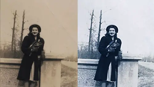
But let's get into images that need help the camera is not going to help us with he instead these we're going to need stuff in photoshopped this image I noticed that already been adjusted this and let me first get rid of the adjustment if you ever notice ah file that has this little icon in the corner that means it's been adjusted with camera raw I just want to start with whatever the original picture looked like and if you wanna wipe off any setting she right click on the picture was a choice called develop settings and that's where you're going to find his clear settings clear settings means act like I've never adjusted it with camera raw any cameras studies that have been applied wiped them off and I did that by right clicking on the image I went to a menu called develop settings and that's right fineness it does working yes in light room you there's also a similar icon it's not exactly the same it's not a circle but there's a I comment means it's been adjusted and if you right clic...
k on it you will find a choice called develop settings and you can clear the senate is that different than reset uh no reset you should do the same thing so this image needs some color help it's faded first off you noticed around the edge she looks more blue I'm assuming that that means the image was matted where was framed most likely the matting covered up that portion of the photo so light didn't get to that area sometimes that means that whatever is out there is the colors that should have been in the picture other times though the materials that were used to matt it we're not archival quality and whatever it is the material touching the picture caused that part to fade as well but let's, take a look at what we can do here when I see color issues like this I don't usually use camerata fix them I only use kameron when the colors in the photo are from the actual scene where the photo was taken in any problems with that photo are due to either the settings used in the camera or the lighting used in the scene they don't have to do with changes that happened over time to a picture that's been printed and if it's changes that have happened over time, you know fading that kind of stuff I avoid camera raw, we just need something that thinks about images differently in this image I'm going to try to get it to ignore the edge because the edge was where the matting covered up the image and it doesn't look the same as the center the center is the important part of the image to do that all grabbed my marquee tool and I'll make a selection in here that avoids the stuff I'm going to retouch later, which means the edges around the picture in these little missing parts, then here's one way of fixing color I'm going to do either a levels or a curves adjustment layer. It doesn't matter which one because the feature we're going to use this found in both all use levels just cause I gotta pick one of them. I'm not going to mess with any of the sliders that are found in levels. Instead, I'm going to go to the upper right corner where I find this little icon that icon indicates there's a menu that I can access by clicking here and when I do there's a choice called auto options that's what I'll choose that tries to do automatic color correction, but it gives me some control over the process, so choose auto options and this comes up remember to get to it I applied levels or curves in the upper right I clicked to get the little side menu and it was called auto options that's what brought this up now a default settings this is set to enhance brightness and contrast and all that means it's going to make sure that your image has an area close toe white and has an image close to black on an area that's not goingto do anything for the colors you want to switch between two different settings in here to see which of the two will do a better job in the two settings you want to try our enhance per channel contrast and the choice called find dark and light colors they depending on the image they'll either look very similar where you can't tell the difference or you'll see a alright difference between the two but you want to switch between the two and see which one you like better and I see a difference in the face on the right side with the top one the faces I think a little more magenta ish with the bottom one it's just a little bit less colorful in the face and I actually like the bottom one after firing out which of those two gives you a better looking and result the next thing you want to dio is down here you want to turn on this check box and see if it helps on some images it will make a dramatic difference on other images that just one help so turned on and then just turn off and compare when it's on I think their skin tones like more brown when it turned it off they look a little bit more I don't know magenta or even bluish so on I think their skin tones at least to my eye look a little more natural now just so you know in the studio audience here this screen is usually adjusted so looks good on camera and that means it doesn't look exactly like my screen here, so sometimes I'll adjust images and you guys will look at him going she's that thing looks to brown or something and that's because the camera might ever make everything look a certain way and they adjust this s o anyway, I'm going to do that and I'm gonna click ok then just like before do you remember when we had an adjustment where I think what we were doing was we were trying to get the history am to ignore missing parts of the picture like white corners or an edge in the way we did? It doesn't mean we made a selection before we went in, but when we were done we wanted the adjustment to a flock apply to the other image and we had to do one of two things either fill the mask with white, which allows the adjustment to affect everything or throw the mask away either way, so I'm gonna just throw the mask away, drag it to the trash let go, I'll say don't just don't show again and click a delete now that's affecting the entire picture in salt turned off and on so we could see before and after so eyeball off on and usually for faded photographs that will help dramatically sometimes though it faded photos you'll find that you get too large of a change in contrast and if that's the case you remember the trick we had before we're adjusting the brightness of the picture and we didn't like what happened to the color remember we did something to a tinted photo and suddenly it was like all way too colorful we're going to use the opposite of the setting that we used earlier that means that I have the adjustment layer active I'll go to my layers panel and there was this menu and before we were using the choice cold luminosity and that means on lee effect brightness and if I choose that right now we'll go back to the original colors that were in the picture and now if I turn this adjustment they are often back on you see it's only affecting brightness but I want the opposite of that I wanted to only affect color and so the opposite of luminosity is called no color you have human color let's just so you know the difference hugh means basic color ignoring how colorful the are it means that he's this area red or blue or green but ignoring is it a vivid red? We're barely read it all you means basic color regardless of how much of that color you could say color means hugh and how colorful it is that means actually these two qualities human saturation put together in so color is what we want in this case but he was a good guess so I'm gonna choose the choice code color and now let's turn off that eyeballs we see the original picture there's the original and then I'll turn out adjustment back on and now it's only affecting the color in the image it's not affecting the brightness and so we have to decide what's better the choice called color or the choice called normal depends on the picture in this particular case I'll just choose undue look at their hair a lot more detail in the one so then we could always make a second adjustment on top of this to control the brightness I'll come into here into a curves adjustment and I know ahead of time I don't want this curves adjustment to shift the colors around I'm only going to try to brighten her dark and things so before even start messing with the curve, I can go to my layers panel and I can change that menu the luminosity so now anything I do with this curve just won't affect the colors on lee the brightness I can come in here then and say well now where's the dark area the picture may appear it bring it down just talking up a bit I might find a bright area in the picture maybe the shirt bring it up just decide how bright I want that in I don't always look at the entire there I should say I don't try to get it until every little piece of the image is all right because let's say that the face on the right becomes too bright but the rest of the photos looking pretty darn good well I'm ok with the face on the right getting too bright you know why? Because I can grab my paintbrush tool right afterwards and you remember if you paint with black paying with black were removed the adjustment but the opacity setting at the top of your screen means how much of that do you want to remove if it's not one hundred you to remove all the adjustment and then the face of pride look way too dark I'll try yeah, but if I dial in for opacity maybe thirty percent that means I'm going to remove her or reduce the adjustment by thirty percent wherever I paint and therefore of the face got a little too much I just come in here that pain on the face maybe this area between them on their shoulder I can't even pay in a second time here that will build it up so it's more like we race thirty percent twice you know that kind of thing and you could apply mohr of these adjustment layers if you found you wanted to pull out detail and only one particular area creating new curves adjustment layer remember to pull out details always two dots one of the dark part one of the bright part you adjust them and then you could paint it in before I fix more on this picture because I want to fix what's going on around the edge. Let's, just try the same techniques on a few other pictures to make sure it's not just this image and see if we deviate from that technique on occasion. Another image. Now, if the image has blown out detail meaning an area in the bright areas that is so bright there's absolutely nothing in it whatsoever, I would usually make a selection on the image that excludes that that means the reflection on the chrome that's down at the bottom of the car, possibly the sky behind her head. It's hard to tell if there's any detail left over and they're not. So if you have those blown out areas, just grab a selection tool. In this case, I use the lasso in select the parts of the picture that contained the detail that it's not blown out just trying to get most of the image on back up here to the head. This election does not have to be overly precise, is that just needs to exclude the areas that might be blown out to no detail whatsoever I'm gonna use that. If you want to get a better sense for what I've covered up, uh, you know, this is not necessary for the technique, but just to help you if I type the letter. Q. Do you see the cover, the area's colored and read? Those were going to be ignored. Q means quick mask mode, and it covers up the areas that are not selected with an overlay. You could just type it a second time. Uh, I could be more precise, there's, a little area in between her arm here that could be one of those really bright areas with no detail, if I wanted to, I get rid of it. But if it's, that tiny it's not gonna matter.
Class Materials
Bonus with Purchase
Ratings and Reviews
a Creativelive Student
Wow! That is pretty much what I thought about the course. It was my first live studio experience and it was fantastic! Ben is a great instructor because he presents the information in a straight forward manner that is understandable, detailed, and concise all at the same time. I have a couple of his other classes and the handbooks his wife creates are exemplary and make going back and reviewing the rebroadcast so much easier. Also, I want to give a shout off to the Creative Live team...Kudos! They are an excellent host...they are professional and fun at the same time! The content they produce has helped me tremendously to expand my knowledge and skills and mostly importantly they are affordable!
Wilson Blackwell
Super class! Ben is the best at explaining Photoshop and how to make full use of it. This class included techniques I've never seen or heard explained in other photo restoration classes I've taken. And the accompanying book, while I've only glimpsed through it so far, is expansive, well laid out, attractive, and looks to cover everything Ben went over in the class - it's a valuable resource as well (thank you, Karen Willmore, for all the effort you put in to produce a worthy complement to what Ben teaches.)
Old_Redeye
Ben is one of my favorite instructors on CreativeLive. (That's saying a LOT because they are all so good!). Besides being very thorough and understandable, Ben sets himself apart with two things. 1. He thoroughly demonstrates a process, then does a recap of all the steps he just took. That makes it much easier to remember. 2. His wife takes notes during the broadcast and creates a handbook which is available to download when you purchase the course. Some people find it easier to learn by reading than by re-watching the video. I like it because I can find information by using a word search. I feel so fortunate that I was able to sit in the audience for this class. It was great to be able to talk directly to the instructor and interact with the other students.