What Makes a Good Black and White Photo?
Lesson 2 from: Mobile Photography: Creating Black & White Images Using Lightroom MobileLisa Carney
What Makes a Good Black and White Photo?
Lesson 2 from: Mobile Photography: Creating Black & White Images Using Lightroom MobileLisa Carney
Lesson Info
2. What Makes a Good Black and White Photo?
Lessons
Introduction
02:44 2What Makes a Good Black and White Photo?
05:49 3Capturing in Black and White with Lightroom Mobile
06:49 4Processing Black and White Part 1 - Profiles
10:09 5Processing Black and White Part 2 - Color Filter Profiles
01:50 6Processing Black and White Part 3 - Processing Color
03:49 7Processing Black and White Part 4 - Processing Light
05:24 8Processing Black and White Part 5 - Effects
04:54Lesson Info
What Makes a Good Black and White Photo?
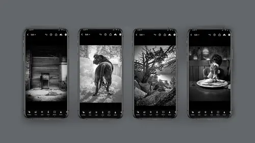
what makes a good black and white photo? Well, this is a very personal decision, an idea and thoughts. So I'm having you ask yourself what makes a good black and white image so that you know what kind of editing to do, what kind of decisions to make. So if white is the starting point and black is the arrival point, what do you do in between? And when you remove color, you know, sometimes the I think the story just really emerges without distraction. This is my opinion, and you want to pay attention to lines and shapes and textures and contrasts. So how do you do that? And why do you do that? You do that. So you know what kind of editing to do, what kind of choices to make. And I'll tell you, I really like to look at other people's works to get inspired and getting ideas. So things like ceremony ceremony in was just a huge inspiration for me when I was first. Starting out in photography. There's something about her tone and even the color she puts in black and white that that sepia tint...
she has and an Brigman early 19th Century 1900. Sorry, a photographer from 19 twenties. Really beautiful. Look at this piece of hers. The blacks are Matt. They're completely mad. There's hardly any white in this image, and it's very staccato, very out of focus and soft and romantic, and for me that I respond to that. So I'm going to look to do those kinds of edits to my own personal work. If that's evocative storytelling to me, Fan ho oh so beautiful fan whose work is all about the light, so much so that he'll even crunch up his blacks. There's no detail in his blacks, but there's detail in his whites. So his stories about the light and this would inform how he would edit or print his stuff because he is from the 19 fifties. But for you, it would be how you do your editing in light room. So Sally Mann again look at her beautiful work, her her blacks are pretty dark as a general rule, and her whites have a little bit of a glow to them. Well, how do you do that light room? You do that by the clarity slider. You slide it to the left and that will soften up your whites. But you can have your texture slider to the right and still have information. It's so interesting how you can mimic these effects or looks in light room. You just have to know that that's what you're looking for. Okay, let's look at some other inspirational. These are more up and coming people who I find totally inspired, inspiring. Johnny Edwards is amazing, and I asked him if I could show this and he said, Absolutely. He really runs the gamut. Look at his work here. He's got middle grays and then he goes high key, low key. He does black backgrounds. He does white backgrounds. He does all of it. And he really has an extensive range in his work. I find that very inspiring. Sarah Stefan Oh, God, I love her work. You can find her on Instagram in her handle is camera in hand photo and again she's just starting out. But look at her work so inspiring, so evocative and great storytelling. And I just encourage you guys to go check out these and other folks to figure out How might you want to edit your photos? And it'll just inform your decision making. And don't forget about the original Masters. Magnum photography So amazing from the 19 thirties. Cartier Bresson You've got Eve Arnold from the sixties. Some really great work can be found there, and their work often revolved around film. So let's talk about that for inspiration. Film. Do you want to use, like a plus X type look, which was a really slow, fine grain film, Really smooth or Gee, are you more into that kind of hardcore rock and roll? UH, T. Max 3200, which had a golf ball sized grain. Huge contrast. Not a lot of mid tones or, jeez, Polaroid Polaroid had a slide film back in the day, so Beautiful had a little bit of a green tint to it and had a really big grain to it. But it was still kind of soft. Didn't have that hard crunch that Tri X has. So if you can think about these film types that will help inform editing. So what are we talking about? We're talking about tonality. How much gray value is in your image? White, black, grey talking about contrast. What's the range between those dynamic range you know the full spectrum of those luminosity. How much brightness or darkness? And then, of course, grain grain is supremely important in black and white photography, I think, and these are gonna be things you want to think about while you're doing your editing, so you make good conscious decisions. So I'm going to be really kind of daring and suggest that maybe you consider using the Ansel Adams film system of the Zone system, which was for printing and exposure. And it's all about checking your images from pure black all the way to pure white. And in Digital, you can do the same thing. The numbers are just a little different from 0 to 2 55 versus the standard notion of 1 to 10, but it's actually more. How do I want to say that it's more than I want you to think about this? You don't actually have to do any calculations, but if you look at your image, do you have that full zone in there? And it's a great way of evaluating how your contrast is, and if your tunnel range is good for you and where you find that, by the way in The editing module of Light Room is under the light module, and one of the things I find people don't remember or realize or see is at the very bottom of the light module are the whites and the blacks, which will help you do your clipping for your ends on the zone system. So there's so much to be had in this dark room in your hand. I just want you to think about film types tone contrast zone system even before you get started with your editing.
Class Materials
Bonus Materials with Purchase
Ratings and Reviews
Gretchen Shepherd
This is one of the BEST classes on Creative Live, and I have a Creators Pass and have taken tons! As a retired teacher I really appreciated Lisa's teaching style and the clear use of tech aides (circle, highlights etc) to lead me through the steps used on LR mobile. Her clear descriptions make the class easy to follow. I have also used LR mobile for several years and learned at least 3 new things in the first few minutes! In addition Lisa's in-depth knowledge of BNW and how to apply the principles of BNW to color conversions was wonderful. I have shot BNW for years in film and digital and also taught darkroom at the college level (ages ago) and Lisa's teaching and skills rank up there with the best. I learned even more the second time through and will come back to this class frequently and grab any others that Lisa Carney teaches. Highly recommend!
nancy brindisi
I have always loved black and white photography and so many of the other courses I have taken on Creative Live touch on black and white but it is never as in-depth as I would like it so I was very excited to see this course offered in Lisa's mobile series. I love how explains the black and white presets you can shoot pictures through in the LR camera, the profiles and then the presets in post. Her knowledge of light and how color adjustments even on a B&W photo affect how that light is shown is very informative. This course finally gave me more detailed knowledge and inspiration to do so much more with my B&W pictures. Thank you for another great class!
Deanna Gordon
I loved the information, the tips and tricks and the delivery. I cant wait to do some more of her classes.
Student Work
Related Classes
Mobile Photography