Lesson Info
13. Common Traps and How to Avoid Them
Lessons
Introduction
01:41 2Minimalism - A Few Words to Start
01:31 3The Power of Negative Space
12:08 4Learn to See Visual Clutter
08:40 5Isolating Your Anchor
05:47 6Composing for Better Minimalist Photographs
09:27 7Choosing Gear to Create Minimalist Photographs
13:16 8Black and White the Classic Approach
08:41Working With Color
09:06 10Location Session - Apex Beach
11:50 11Apex Beach - Wrap Up
02:24 12Timing and Weather
08:24 13Common Traps and How to Avoid Them
10:29 14Post-Processing - When I Use it and Why?
17:41 15Print Your Work and Harness the Power of Minimalism
02:13 16Three Easy Exercises to Kick Start Your Journey into Minimalism
02:55 17Location Session - Sled Dog Portrait
04:05 18Sled Dog Portrait Image Review
07:34 19Sled Dog Portrait Key Takeaway
03:33 20Location Session - Arctic Drone Flight
05:14 21Arctic Drone Flight Image Review
06:36 22Arctic Drone Flight Key Takeaways
03:31 23Snowkiting In the Canadian Arctic - Location Session
06:07 24Snowkiting Image Review
08:32 25Snowkiting Key Takeaways
02:52 26Summary
03:08 27Wrap-up
01:18Lesson Info
Common Traps and How to Avoid Them
we've talked a lot about creating minimal photos and stripping things down to the bare essentials and the essence of an image. I want to talk a little bit now about when maybe you can go a little too far and some of the common traps to avoid. When we're taking this journey towards cleaner, more simple images, just because we can strip a photo back to its most essential and Bear doesn't necessarily make it the most interesting version of that photo. Sometimes we're shooting for something so simple that it becomes dull, it lacks depth or shape. It's just kind of an interesting and boring. There's gonna be a fine line sometimes between what someone considers boring and what someone considers meaningful and that's up to you to figure out what you want to shoot and where that line is for you. It's gonna be different for every creator. But if you personally find that your images are falling a little flat, here are some tips that can help you build a little bit more interest and depth back in...
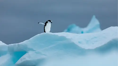
your scene while still remaining quite clean and still powerful minimal concepts. Let's start with this little gentoo penguin in Antarctica here. It's a pretty clean, simple, minimalist image. You've got your gentoo little guy here in the middle. Lots of negative space. Not a lot of contrast. It's not really, it's not really popping. So to me it feels a bit flat and maybe I could fix some of that in post. But I don't know, there's there's just something missing kind of from from this image. If I was trying to tell the story of this penguin and his environment, it's not quite doing it for me, even though it is technically a very stripped down, bare, minimalist photograph, compare that to our second image here of a little chin strap and he's riding high on this iceberg of life. There's like some beautiful negative space up top. Lots of lovely negative soft negative space here in the front. And that's a function of that telephoto that I was mentioning before. You're kind of shooting passed with wide aperture so you can soften that foreground. It's not distracting. You got the mid ground here, another layer of depth, that's got your sharp focus, You've got your little chin strap taking most of the attention. There is a little bit detail here in the middle, but that's okay. It helps tell the story of the environment and then this peak in the back to kind of balance out the weight, the visual weight of the penguin over here, but not so much. And focus that it really draws our attention. And then like I said, all this lovely clean negative space up here. So, this is an example, I think a good example of shooting a penguin in its environment, still holding onto and retaining some of that minimalism and that clean composition that we were talking about using the tips and techniques and tricks. Uh that doesn't feel fell at. It feels like there's depth there layers. It's more engaging, just a stronger image overall than the simple, albeit more minimal photo. Another thing you're gonna want to avoid, I'm going to show you this example from that town walk again, it's a slightly different version where the bird had flown off the light here, but something when you take all the color and you have a very basic composition that's relying heavily on shape and line and pattern and stuff like that and form. It's gonna be easier to notice when those things are out of whack. So you want to be very, very careful about things like straight lines for example. So you see here that there's not a whole lot of information in this photograph other than these polls, these lines in this bird. And to me I can see that these lines these polls are tilting and that's a function of they may have been a little bit off access just the way they were in the ground. But mostly it's because I was pointing my camera up and there's that weird distortion happening with the lens. But you can see if I draw straight lines down how far off these polls are. And even though it doesn't seem like that big a deal, it's just enough of a big deal for me to notice. And it's going to take viewers out of their, they're gonna look at it and be going, there's something off. I don't know exactly what it is but it's not it's not as calming and soothing and pleasant to look at as it should be. So you want to pay attention to that and uh try to fix it either in post or be aware of it when you take your shot in the field. Here's another example of those straight lines that I was talking about and I've laid that grid on this image of just the side of a building in Greenland. I just loved that simple single window in the in the middle of the frame and all this nice dark textured space in the background. Uh It's simple, it's clean but when you lay the crop over you see how off this line in particular is the window itself is out a little bit down here and again it's like one of those things that you're not really gonna notice that much but it's gonna be just enough sometimes to pull your viewer out. Um, and here's a simple fix in light room where I just use the crop tool and uh, some lens correction to basically get that line straight again, straighten up these lines down here and it's, it's just more pleasant and pleasing and it's something now that's just more pleasing and calming and probably hang on a wall and not demand my attention to want to fix and straighten all the time. Another thing you're gonna want to look out for is unnecessary black and white conversion. So just because black and white can make an image more simple and minimal doesn't mean you should make an image black and white. Sometimes images and color are the right choice and color works really well. There's a whole lesson here about why we should use color to create minimal images. But as photographers and I'm one of them in the beginning, you're gonna probably want to use black and white a lot because it is the easiest way to get minimal images right out of the gate. Uh and it's not always the best option. So here's an example from walking around in a Halloween, the beautiful bright buildings so colorful. I love the geometry here and I love the color of green and yellow. It just really pops for me. Um if I convert that, the black and white, I still retain all that contrast and again, not a bad image, but just doesn't seem to have that same energy is the first one uh here with the colour. So basically just converting it in light room Photoshop, the black and white isn't necessarily gonna make your image more compelling. It might make it more minimal, but not necessarily more compelling. Another example from walking around town again, just geometry, shape. The thing that really sells this image for me above and beyond the nice shape and geometry of these buildings is the color. I mean that's a beautiful yellow, blue, red uh sequence here. And if we convert that the black and white you lose that color. You still have all the geometry. Arguably like some of the lines are easier to see, but I prefer the color image and if I was to print this and again hang it or or do something with it above and beyond. Just taking the photograph, the colour version seems to be the better option in this situation and I have one final thing that I want to go over with you guys. This is my friend Sandy. I shot this just on location a little while ago in Nunavut's as an example, a demonstration of how you can with the like, just like the penguin shot, how you can take a minimalist image that looks flat and kind of dull and just lacks that depth and dimension. So you can start out one place and work the scene, work the subject and the location to create depth and hopefully still end up with a minimalist image with a little more expression and a little more depth. Welcome to the beautiful frozen sea ice outside of a caliphate here in nunavut up on baffin island. I'm out here with my friend Sandy Finn and we're going to try to do three images tonight that demonstrate three different styles to shoot a similar subject going from basically the most cluttered or visually distracting to super stripped down and minimal. Getting rid of all the clutter anything that's not essential to tell our story. And then from that were the third image. Try to build a little more depth back into our frame. Uh just keeping the most important stuff and adding to it, just in the anyway that we can to sort of strengthen that image and make it a little less one dimensional, a little less flat, you both look great right now. So here we are with this first image of Sandy and I wanted this first shot to be just a typical nice shot of Sandy and perhaps charlie on the ice. Not really paying attention at this point to getting things nice and clean, basically, a standard shot that I might take, or any of you guys might take if you were out just having a nice night with friends. Oh, as you can see, there's still quite a bit of clutter in the background with all that misshapen ice that's kind of pushed up and it's sort of cutting into sandy here in the middle. There's also quite a lot of uh distraction and the footprints in the snow where we were out there, sort of just looking for an angle and the dog was walking about. So I want to try to clean all that up with the second shot for the second attempt. I knew I wanted to get Sandy a little higher. I also knew that I was going to need to get lower myself. I wanted to shoot her against a nice clean sky. I worked a couple of different variations and angles, some with the dogs, some without. But the idea was to get my subject up high and against a clean backdrop, with very little distraction in the foreground and certainly not having any of that ice cutting into her form. Yeah, yeah, you can see here we have a very clean sky. The ice shelf isn't cutting into the subject anymore. And Sandy is a strong anchor in the middle, so it's a cleaner image, but perhaps not an interesting image. The plan with this final image was to use some of the shapes and the ice itself as foreground and framing with this wide aperture. I knew I could get that ice close to the lens and it would photograph soft, keeping Sandy up against the sky like this and having her sort of stay on that piece of ice. Make sure that we still had a clean backdrop. Yeah. And then it was just a matter of moving inches left and right until Sandy and now charlie came into my frame. This last image feels more interesting to me. It still has loads of negative space, still very clean and simple, just a little more crafted. And we've introduced some depth back into this shot, so it feels like your images are following the beat. It feels here's some tips and common things that uh Mhm. I was off camera, It's okay.
Ratings and Reviews
user-3b9448
This is a brilliant course which I can highly recommend. I have done some Minimalist photography but still found the lessons very interesting. I enjoyed the discussion on colour vs. B&W. My favourite part was to learn how long it takes to plan a shoot, wait for the right conditions, even change the subject if the initial idea doesn't work and see the other images taken during the shoot before (or after) the final image. The presentation is excellent - love the cat :-).
Bradley Wari
Great Job! Great course! loved the bloopers, had a few laughs. I really enjoyed how he showed a little of how he worked the scene of a few of his images. showing multiple images and how he got to THE shot.
Deb Williams
Great class, good length and easy to follow along. A fantastic way to challenge yourself to look at composition differently and a course full of useful tips to try out.