Lesson Info
11. Basic Adjustments
Lessons
Introduction
01:59 2Lightroom vs Lightroom Classic
05:07 3Lightroom Overview
27:08 4Lightroom Mobile Overview
15:16 5Lightroom Web Overview
06:14 6Importing
07:22 7Organizing Images
18:49 8Searching for Images
15:00Lesson Info
Basic Adjustments
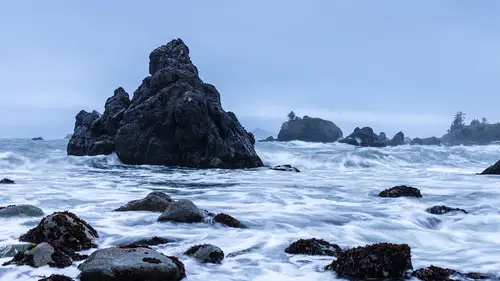
Okay, so now I'm back at the edit panel and I'm going to start working on the image because I've changed the profile and that helps me see what the general photos going to look like and now I'm going to start adjusting it. So the first thing that we're gonna do is we're gonna adjust in the light area. So this is all of your brightness and contrast and all that kind of stuff. And I'm gonna start by adjusting the exposure because the exposure is actually, what's the mid tones, That's all of these rocks. That's some of the rock up here. So I'm going to play around with the exposure first. That's going to give me a general sense of how bright this photo is going to be and I don't want the photo to be super bright. So I'm just bringing it up just a little bit and I'm not going to mess with the contrast because when you play with exposure and highlight and shadow and white black, all of these things are the contrast there. What changed the contrast? And so I play with the exposure first. Onc...
e I've got that where I want it, then I'm gonna come down and I want to deal with. So I started with the mid tones. Now I'm gonna go grab the top end and start grabbing the white and bring it back. So I'm gonna go down to the white and I'm gonna bring white back in. So I want that white, I don't want a super bright sky because this isn't like, you know, phoenix Arizona and so I'm going to bring these whites back down and actually you can see the exposure is still pretty bright. So I can grab the highlights and bring them down a little bit too. So I want you to see what's being worked on by each of these sliders. So the exposure is that middle area, so you can see how the mid tones are shifting around. So that's the first thing that we're doing, and then when we go to white, we're actually dealing with the very top. Do you see how just the top of the history Graham moves? And then after we do the whites, we go up to the highlights. Now the highlights is it's the brighter areas in the photograph, but see how it controls more. It controls the bright whites, but it also controls the kind of darker whites. And so I can play with both of those. Bring white down and that brings my brightest whites down and then I can take the highlights and bring them down and that further kind of mutes all of those bright areas in the sky. So that's pretty good. And then I'm going to start playing around with these shadows and black. So I take the shadow down and up. I like bringing the shadow up because I see information here in that rock and that's really what I'm looking at that to be my major indication of whether I've got the right amount of darkness and then let me play with the black and see if I can I like a little bit of richness to it, but I don't want to get too dark. Um and so I have to be careful not to get too dark. Plus once I've got a general look, which this is pretty good um then I can always go into the point curve or the tone curve and play around with uh further um undulations of the tones and I can do that in two different ways. I can either do it just with a curve. So this is just a normal curve, like you might see in Photoshop or I can go to this other icon here which has these squiggly curves on top of a circle. If I do that. Then when I go hover over this um curve, I'm controlling different segments of the curve. So these are the shadows in the curve. These are the darks, these are the lights, these are the highlights. And so I'm playing around with four different points on the curve. So I can say I want to bring up the darks, so that's like the very dark areas of the photograph. I'm bringing those up. But I want to bring the shadows back down so that they're nice and rich see that. So I can actually play with the curve but in big chunks and I can actually choose where those dividing lines between highlights shadows, Darks and lights are here. So I can take the shadows and say I want the very shadows to actually be represented by a much smaller subset of shadows. And so I can take that down and I can take the highlights up so they're only represented by the really, really bright areas. So I can be much more subtle about this photograph in choosing exactly where those tones are going to be. I can also go in to the point curve area, which is represented by this gray dot. And I can just add points to the curve. So I can bring the entire shadows down. Or I could bring them up a little bit. Um I could bring the highlights down a little bit, see how I'm kind of now I'm muting the contrast here so that it's not quite so contrast. E just like that helps to give it like this muted look. So then I can go into each individual point curve. So this is red vs sion and this one is green versus magenta and this one's blue versus yellow, which means that I can take all of my highlights and I can make them much more blue, see what I'm doing is I'm saying, okay, this one says neutral between blue and yellow equals neutral, so there's no change, but then if I take this highlight, I can make all the highlights more blue or more yellow, so I can also leave them exactly as they are. So that the brightest highlights stay fairly neutral. But say the white areas get a little bit more blue. And so now it's not the brightest whites that are getting bluish. It's kind of the other whites that are getting that blue. And then I can go in and say, but I don't want the shadows to get any bluer. So I could bring them back down or I could even warm them up. So you can see how the shadows are getting some kind of some weird greenish yellow to them, which is not what I want, but you can see what's going on there. So I want this to stay fairly blue. I'm gonna give the shadows just a little bit of blue, but I'm going to make the mid tones and the highlights really get quite a bit of blue. Now I can double click this and get rid of it and then just take the highlights and bring them over so that they all get fairly blue. So you can see that. I can actually change this photograph quite a bit by just playing around with different point curves, whether it's the entire point curve, which is just for the tonality of the image. Or I can work on red, green or blue curve to kind of play with the actual uh coloration of the image
Class Materials
Bonus Materials with Purchase
Ratings and Reviews
Jean McMillan
Thoroughly enjoyed your class, have learned so much about how take my Ipad to another level, now can't wait to put it all into practise!
Red Tulip
Sometimes it's hard to know what the instructor is pointing to so it's easy to get confused. Better job is needed in explaining what you are pointing to.