Lessons
Lesson Info
Adding Tonality
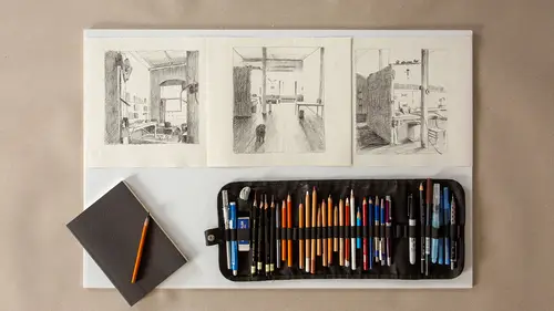
So once you establish your linear drawing of an interior like this, the next step for me is sort of one of the most beautiful things, which is adding the light and shadow, which can change depending on the time of day and depending where you are. We're in a situation right now that has both natural and industrial light. Natural light coming through the door. Industrial light coming from above. Sometimes it's a mixture, sometimes it's one or the other. So lighting preferences aren't always up to you, especially when you're working outside the studio. In the studio, we can navigate that a little bit more directly, but often sometimes just drawing on location, you just have to be really reactive and go with the changeability that's going on around you. So right now the light, however, is pretty steady. And I'm going to show you some ways to create beautiful drama with charcoal. So this scene is, it's one of my favorite parts of the building because you've got this glass block window. This...
sort of retro glass block window. The light's coming through, it's creating like a pretty intense silhouette to the divisions in the glass blocks, but then also the wall becomes almost silhouetted. With such bright light coming in from the window, often the wall that contains the window ends up being rather dark and silhouetted. And then there's variations on the stairs as well. So we'll work into some of those ideas. One thing, so I've got, I always like creating a really stable foundation before I start working with tonality because then you're just really adding in the lights and darks. We want to think about pushing the darkest darks as dark as we can and also reserving the lightest lights as the paper color. I'm working on kind of a buff charcoal paper, which holds the charcoal very nicely. And the first thing I'm going to work with though however is I'm going to create a tonal gradient. A five part tonal gradient. This might seem extra in terms of just wanting to get to the drawing, but it actually depending on the material you're using is a really important step, so I'm going to do that really quickly. Because it's going to show me how dark I can actually make this charcoal. And it's also going to show me what my mid tones might be. Because this scene involves all of that. So just down at the bottom of my page here I'm going to create just a very small band. And I'm going to divide it into one, two, three, four, five little sections. And I actually do this with almost every drawing that I'm going to work with tonally. And in the fifth section, I'm going to put as much pigment down as I can. I'm really going to work it. I'm going to make lines going up and down, across, and really try to create this as velvety and black as I possibly can. In the first section here, I'm going to just leave it the paper because my guess is that the glass blocks are not going to really end up receiving any pigment at all because they're really one of my brightest brights. Two, three, and four are my mid tones. So two might be pretty light. A two might be somewhere on some of the lighter facades of the fronts of the stairs. Three is going to be just a tiny bit darker. And then my fourth tonality is going to be almost as dark as the five. So we want these, we don't want any huge jumps in between these. We want them to have sort of like stepping stones from light to dark. And by doing this now, I know the tonal potential of the tool I'm using. So let's start adding some tonality. So mark making with charcoal, especially with architecture, I rarely use any curve lines. I usually use hatching marks, like straighter marks. So rather than using like curved marks, I tend to use more sort of (drawing sounds). That sounds nice. Marks with a straighter quality because to me that sort of represents maybe more like what the side of a wall would be doing rather than a curvature. So the first thing I'm going to look at is maybe some of my areas of darkest darks. So I can kind of create that first, so I have a polarity. Like a drama to work with. Because if I don't push my darks as dark as I feel they should be, then my mid tones don't really have a place to sing. Right, if your dark isn't dark enough, then your mid tones aren't going to be able to have variation. So I'm going to work into this corner. And I'm actually, if you look at my eyes, I'm squinting down. I do this a lot when I'm drawing, especially tonally. If you squint your eyes down a lot, it obliterates a lot of the detail. I mean I could certainly be seduced by every single brick in the wall, right, every little texture. But to me, that's really not my focus in this drawing. It's not what I'm really inspired by. I'm more inspired by the light. So squinting down helps you lose all that detail and helps you really get to the point with the drawing. So I'm going to start by maybe darkening some of my pencil lines. And then I'm going to start to add in some hatch marks here. And it's really all about relationships. By adding in, and you can actually see how this paper has, it's called a laid paper. It has lines in it. It's just how the paper's made. And that also helps it grab the charcoal pigment and hold it a little bit more. So I'm pushing this wall that holds the window. I'm pushing it a little bit dark because I want the window to feel like it's glowing, which it is. And if I only made the wall let's say this dark, it really wouldn't make the window feel like it was having light come through it as dramatically and beautifully as it is. So I'm working here. I might make a few lines that cross hatch over just to kind of darken that up a little bit. I'm just going to focus on one section here for now. I'm gonna sort of focus on the corner. And then as I turn around, the brick here, I see an even darker area that's really facing away from the window. So you notice how like this wall right now is more like maybe a two or three, but this section here is a little bit more like a four or a five on my tonal scale. So already I have a lightest light, almost a darkest dark, and mid tone starting to develop. And then I can start to carry this over into other sections. And the other thing that starts to happen is that where previously line started to delineate sections, now adjacent tonal shapes start to do that. So that in some ares, the line gets sort of swallowed up by the tonality. And shadows also tend to spill and get lighter as they move away from the light. A little bit darker where it gets blocked by the wall, and then a little bit lighter as it comes across the floor. I'm also not using a whole lot of smudging. Like a lot of people with charcoal they like go through and smudge it down. I'm actually working with line directions. So the floor to to me is directing this way out across in front of me. The wall is really a little bit more up and down. So not that smudging's bad, but I feel like when you're starting to learn how to do mark making with tonal rendering, it's nice to sort of go along the direction of the form. And that actually helps build more dimensionality. Another thing that is useful, especially when you're working with charcoal, is you can see how here I'm already starting to, I mean I don't mind getting dirty. See the bottom of my hands are sort of dirty, but what can happen though is like you've done a lot of work on the drawing, and then all of the sudden you get really into an area and you look back and you've smudged it all out. And that's not a great situation. So I often take a piece of paper or trace paper, and I'll, if I'm working on a particular area, I'll lay this down under my hand. And that way it'll make it so I'm not smudging out like the work that I did previously. So it's just a simple thing that you can do to help save you from that event. So I've started to work up this corner. I've made my tonal scale. I know there's a bunch more to do, but I've seen sort of parts of the tonal range. And in working up this drawing further with tonality, after you know a little while, you can really start to create a sense of atmosphere and a sense of drama with the way the light's coming through the window. And really to me once you start to move past the linear drawing, which can be really beautiful, what starts to happen is there's a sense of, there's like a feeling that it evokes. There's a feeling of a place that really is dictated by the way the light falls or the time of day. So I encourage you to work with that and work with different materials. Like do you like to make tonality with charcoal or do you like to do it with graphite or pen or whatever it might be? And certain places that you draw might sort of inspire you to use different materials to build tonality. So strong foundation drawing. Linear drawing is a really fabulous place to start. Good choosing of materials, depending on the feeling you want to evoke. And then really asking yourself what kind of lighting situations are most inspiring to you. And just trying it out, and over time this kind of drama, both drama and then sometimes subtlety will become much more fluid and easy.
Ratings and Reviews
Nora Masters
Inspiring and fresh. Amy does a wonderful job of teaching me information efficiently, showing the beginning of processes and the more finished process, as well as lots of alternative ways of approaching the practice. i love the student work shown as well to reinforce the lessons.
Marcus
A miraculous teacher, with very refreshing talk. But to me has not become clear completely as with the Perspex disc functions practically without achieving absolutely shaky results. Could one not have shown this still briefly?
Student Work
Related Classes
Illustration