Lesson Info
12. The Vocabulary of Composition Part 1
Lessons
Day 1
1Class Introduction
23:23 2The Nature of Landscape Photography
29:02 3Finding Your Eye
28:36 4Gear Bag
23:02 5The Creative Trinity
11:15 6Scale
39:20 7Light and Timing
29:26The Technical Trinity
15:06 9Metering, White Balance, and Depth of Field
32:17 10Shutter Speed
10:24 11Focus
15:04 12The Vocabulary of Composition Part 1
32:20 13The Vocabulary of Composition Part 2
36:58 14Techniques in the Field: Scouting
16:23 15Pre-visualization
25:41 16Bracketing
28:11 17Tilt Shift Lens
26:47 18Long Exposures
26:49 19Post Processing: Importing into Lightroom
20:39 20Lightroom Catalog Setup
17:43 21Color Correction
23:35 22Develop Module
31:40 23Basic and HSL Panel
23:35 24Filters - Regional Dynamics
27:46 25Merge HDR Images
17:26 26Stitching Images and Manual Blending
24:12 27Converting to Black and White
27:41Day 2
Lesson Info
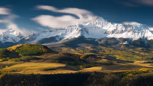
The Vocabulary of Composition Part 1
This is the part that is probably, I don't know, you could say the most difficult. I think that of all the things that I try and teach it's the most difficult to teach. To get across these points is really not easy because a lot of them are subjective and theoretical, but essentially, technique and those settings and all that stuff is a lot of science, but this is totally different, this is aesthetics. Things that make us enjoy something, versus not. And that gets into a different region, and that's perception, okay? The way we perceive something. And I talked about that with the story, a little bit early on, about our little friend who had thought we were talking about a grand cannon rather than the canyon. And so, that's just another example of what I'm mentioning here. So, we've all heard that composition, the rule of thirds, and that's something that is pretty much general, everybody's talked about it and we all kind of understand it. And the other thing that we have heard over and...
over is whatever you do, don't center it. Because what's happening is, everything that you're looking at is centered, and there's no dynamics in the picture, there's nothing else to look at. So I wanna talk about centering things. Also, as landscape photographers, we are challenged, because the first thing we look at in many pictures, and this has been proven actually, are eyes. So we connect with the eyes. Not only people, but also wildlife. If you go into wildlife photography, one of the greatest, or the most important aspects of capturing animals in the wild to make them have more impact is getting those eyeballs to look at the camera. So it's very important in everything but landscape photography. So again, we have a challenge. Because we don't have any eyeballs to help us in landscape. So what I wanna do for landscape is give you this vocabulary of composition. And these are things that, as you're walking around through wherever you are, a park, thinking about taking a picture anywhere, these are the things that should be ringing through the back of your head. Maybe not all of them at once, but at least some of them. All right, so, I've got the list here. Aspect ratio, shapes, edges and corners, arrangement, format, line and focus. And you're gonna get this list also at the end of the course. Foreground/background, viewers path. That's something I was just talking about in regards to what you look at first. Point of view and texture and detail, and then gradations, negative space, contrast. And then finally, I've separated out, because I do think I'm gonna start there, and that is color. And it's another separate item that you can look at differently. So, mix all those things up, and then what you're gonna take out first for this example is color. And there's a way to do that in your cameras. You can set the picture control or picture style to monochrome. And then what you're gonna get is a preview on the back of your camera of the black and white scene. Now if you're shooting a raw file, you're also going to get the colors. So you don't have to worry, it's not gone, you're not just getting a black and white picture. What's happening is, the camera's projecting the jpeg. And the jpeg is taking into consideration all those settings. So in this case it's gonna make a monochrome. And this helps see things, like shapes. And the edges. As you look at this picture, and as it switches to color, your eyeball is gonna go to different places. So really the difference, one of the big differences between color and black and white is not only the colors, but it's also the viewers path. Where your eyeball goes first. And that's because of some of the differences in hue of the green and the red trunks. Look up in the branches right up here. As I change back to black and white, you'll see that your eyeball no longer goes to that region at all. You're simply focused on the area of greatest contrast. And so that element of color is confusing sometimes, especially if you're starting out, trying to see these shapes and forms. What you wanna do is take that color out. Unfortunately, it's something, or fortunately I should say, it's something you will still have in your files, as long as you're shooting raw files. Okay, so just another example. This was the shot I showed you earlier, about astronomical twilight and how it radically changes as you add color. Your eyeball just takes a different path to get there, and that's the key element why I wanted to show you those. So, with black and white, then it's considerably easier to start seeing not only the shapes of things, but also some other elements, like the lines in here, and the depth and the focus. All those things become more apparent, primarily because we're not judging the color. 'Cause our eyes are really sensitive to color. And so in addition to shapes and sizes we're also not making that the first read. All right, so the first thing I wanna mention in composition is the very basic, which is your aspect ratio. And years ago when, I think it was when the Leica camera came out, there was a fellow by the name of Oscar Barnack who basically created the two by three aspect ratio, which is what we're still using today for, I dunno, 90 percent of the cameras. It's not up until recently that the micro four thirds cameras came out, that we changed that. Or it's being changed. So it's kind of interesting. You also have the option in a lot of your digital cameras to switch to a one to one. And it's built in there. It might have, depending on your camera, a four by five and a 16 by nine. So those are some of the options you can change the camera to, and it'll help you, again, see that composition in that aspect ratio right away. 'Cause a lot of times these things are hard to find visually. You could easily say, well I'll just crop it later. But that's gonna change the composition when you're standing there, dramatically. And you might not see something that was really in the corner or the edges or potentially the line that's created by the edge of that picture. All right, so my favorite aspect ratio for landscape is not the golden rectangle. Which is one point six whatever by one. That is the golden mean, and I know a lot of you have heard that. It's basically the perfect proportions, as they call it. And I'll just leave it at that. It is a fun aspect ratio to use in Lightroom. You can create that crop setting and use it. But the one that I prefer for a lot of landscapes is the two to one. And so I just enjoy seeing images this way, and composing them that way. You can see, I picked this one as an example. I've got the corners beautiful with these pools in there, and people way down in the far corner on the right. And then of course it's framing the rainbow and then the shadows and in my mind, I don't want it more panoramic because then it will devalue the height of that, or deemphasize the height of that rainbow. So there's a lot of reasons in addition to the rainbow why I like this aspect ratio. Sometimes it's just a personal preference. That's the way you see. You might see in the shape of a square. You might see in the shape of four by five. But I bring that up because you're not trapped to two by three. That's just the beginning. So the next one is shapes. As I said, if you take the color out of it, it's considerably easier to see these shapes. And believe it or not, there are quite a few shapes in nature. You've got triangles, pyramids, squares, lines, circles, you name it. These are some of the more Isn't that, incredible graphics that I created for you guys? The nice oval with the gradation, that's beautiful. All right, so you get the picture. The real key here is that these shapes are in nature, and one of the more profound ones is of course the circle. That one is something that is ingrained in our minds by probably our history and our lineage. And as you try to tackle the problem of composition and trying to figure out shapes and sizes, you know, those Greeks figured some of this stuff out years ago. And so, in my research I've determined that these guys had figured out ideograms. And they're kind of interesting, you know, if you studied Greek. Each shape, letter, carried the meaning in such an efficient way that there could be no other. And so, the most interesting one I think is the combination of the circle and the line, which is omicron and lota, and that creates phi which is the thing on the top of your camera, which is resembling nothing other than a quantity of light bisecting a space, which is a circle. And so that's what they figured out, apparently years ago. I guess that's why it's on the top of our cameras. Kind of interesting symbols. So, the other thing about shapes is that we're constantly thinking of how those shapes relate to us. And many times if you ask somebody to define a space, they'll use their hand and kind of make a circle. If a woman's pregnant, she'll do the same thing about the womb. And so these things, these gestures we use are all, I think, related back to our history of nature and affecting the way we see the world. Even our childish drawings. You know, it's kind of interesting, when you're a child I don't think you have analyzed a picture that was taken at F22 of a sun star to know there's rays. Where did that come from? Where did the first drawing of sun stars come from without a camera? Kind of a conundrum, I'm not sure. But one of the ideas is that since that line is representing light, that originally that was just how it was represented before the lens and before a camera. So in order to represent, in shapes, the concept of light being emitted from something, it was just as simple as adding a line to it. These are a couple other interesting symbols. And of course alpha, which is the A, is a combination of the solar radiation coming down from liquids in nature, and then of course the primary force, which is the triangle, and then combining those two is the A, which is why it's called the alpha. But the best one I think, is the M. And the M I don't have correctly here, it actually comes all the way down in the middle. I didn't get the right typeface. But essentially you get the point. It's two lambdas connected. And the interesting part about that, what it means is that it's double the amount of light coming from above so that we can see. Kind of interesting. And I like the association, since my name is Marc Muench and there's two M's. Sorry, that's really bad. It was late at night when I figured that one out, and I was working on this. And then of course that impacted me on how I see the landscape. I finally found this symbol in the world, and it's up in the Sierras. This was on a trip and basically I almost tripped when I saw it. But it is real, it's not photoshopped. That's a big quartz M up in the mountain. So I call that Marc Mountain. Sorry, another really bad analogy, but it's just a fun thing to look for. And I talked earlier about finding things that are alive in the shapes of things. Well a lot of that vision comes from the ability to be conscious of looking for these things in nature. That's what I want you guys to be thinking about. You don't look at it as a mountain. You might find one with your initial on it. So keep looking for that. Keep looking for that line, and keep looking for those circles. All right, so, here's an example in Glacier National Park. There's a beautiful stream running through this strata rock, which is a really colorful rock. And in conjunction with the blue water from the glaciers above, it just made a beautiful color scene. So I did wanna show you this in color to add that to it. But essentially, behind that color are all the shapes. And this is sort of what I was thinking as I was going through this process. So what you have here is what caught my eye originally, and that's this triangle right in the foreground. And you can see I've taken the camera and kind of tilted it down, I don't think I'm looking straight down. But I'm trying to capture that one triangle. It's all I saw at that point. Something in addition to just the color of the rocks and the color of the stream. But it wasn't enough of a picture, so I kept moving around, without falling in, 'cause it's a lot of water gushing by, 20 feet below me, and then I found another one. So just in the opposite direction you can see the other triangle coming down. And then I realized that there are many more shapes to this are I started studying it longer and spending probably the course of, I dunno, 10, 15 minutes just looking at this, and looking at a couple other elements which I'm gonna get to in a minute. And then I made another adjustment. Just moved to the right. Or left, sorry. You can see this line right here can actually become another triangle if I use the edge of the aspect ratio or the frame. And so there I'm utilizing that edge to make a shape, in addition to the shapes that are already there. So again, the triangle in the middle, which is what first caught my eye to this spot, and then, in addition to the triangle in the middle I started looking around and I composed this one. And what I didn't like about it in addition to the fact that it didn't create that other triangle was that I had this centered subject matter. And I didn't like that either. I think it brought a little too much attention to it and took away from some of the other shapes. They weren't as apparent as I thought they could be. And so, therefore I moved the tripod to the left, took that out of the center, created more triangles, and still captured the color of both the creek and the rocks. So that was kinda the process, the thinking, the workflow through taking this picture. All right, so you have the edges and the corners. That's something that's kinda hard to see with these little LCDs, as big as they are. Remember the old Canon 20D? It was about the size of two thumbnails. If you ever used that camera. It was just the time, that's what we had. Now they're actually quite large, the LCDs. But it's still really hard to see the edges and the corners. One of the tips I give people is get yourself one of those Hoodman loupes. And if you really wanna do this right, get your eyeball in there to the LCD and study those edges and corners. Because that's the only way to really get a good view of that part of the picture, in the middle of the day, when you're looking, if it's bright and sunny, when you're looking at that LCD. But the significance of the edges, I pointed out in the other shot but I'm gonna give you another example here This is basically, looking at the left side, with this composition, I think there are a couple problems. One is, this tree looks a little, doesn't have as much impact, because it's set away from the edge of the frame. I've created all this dead space up here. And then in addition, you hardly even see that little tree that's hanging out over this river down below. It's just kinda lost in there. So, by moving or zooming in, which is what I did on the right, I was able to bring more attention to this tree by getting it closer to the edge, and then also eliminating some of that dead space. And then, our eyes go to the corners often in pictures. Now that little tree down there is really close to the corner of the frame. And that I liked. The other benefit to this composition is that it created a nice diagonal line. And that diagonal line is obviously not, or it's bent here in this left composition, but on the right, as I cropped out that part of the mountain, now the edge of that mountain becomes a nice, strong diagonal. So those are some of the reasons why just zooming in a little bit in that composition helped. So, this is a processed file, but the reason I'm showing it is that you take all those things into consideration in a particular spot, and then you move around and continue trying to capture the same kind of scenario. So I have the nice diagonal mountain above. I have the corners filled in the frames. I have something interesting in the center, and some of these beautiful lines here, and there's even partial circles and ovals in there. But I really haven't changed everything. I've just taken that same scenario and that same set of compositional tools and I've moved up the stream. And that way my little brain doesn't get confused and I can start concentrating on finding that same thing out of all that chaos that's there. Arrangement. I want you to be thinking about this because I think it's another important element of composition. And the way you arrange shapes makes a difference in the way you not only see the depth of it, but also the way it creates a shape in and of itself. And so, this is just a couple silly illustrations to show you how arrangement changes our perception of what we're looking at radically. One of the things about arrangement that comes up often in landscape photography is what I call the tangency. And that is right where this little point, where the ball meets the square in that case. Believe it or not, right at that point that's called a tangent, your eye will be drawn to that spot. Now it's not bad that you have one. The point is that you acknowledge it, and you can actually use it to your benefit, or move something, rearrange something so it's not there. Often times in the landscape, I think, most of the time it's something close. An so a movement of literally a half inch or an inch will alleviate this from becoming an issue if it's an area in the picture you don't wanna draw attention to. You can see here, I just moved it away. Of course I took the yellow arrow away as well, so your eye won't go to it. All right, and then, the leading lines. And the interesting thing about the Greeks is that, you know, they looked at the lines as a read from top to bottom. And so what we're doing, typically, with leading lines in the landscape, is we're reversing that read, and we're telling people to read from the bottom up. And that's what's significant, typically, about those leading lines. So it's really hard to reverse that. Well as I mentioned, it's nice to be able to take something and tell somebody to create their viewers path to go from the bottom up. But it doesn't always have to be that way. You can find leading lines at the top. Might be a tree, could be anything, you name it. You just have to look for them up there, and it's rare, and I don't see it happening all that often, and that's why I bring it up. Because it can save you in a place where nothing's happening, you're walking around trying to find a picture. You can always have leading lines coming from the top or the sides. Size, size can create depth. As we talked earlier about the use of people in the landscape, and I talked a little bit about how I changed their position, it's basically to change their size. In addition, I talked about changing the position of the camera, so that that actual tree gets bigger or smaller, not only in ratio to the camera but also to itself and the other subject. It makes a big difference as far as depth. So here's a practical situation. You're out at the beach and you see a couple rocks, and it's kinda nice with the misty water floating around it, and you kinda like the composition, but what are you gonna do to make it any better or worse? Well if you consider things like the arrangement, then you're gonna start thinking about that relationship. And what happens to make a relationship very obvious or more obvious is creating an equal distance between the subjects. In this case the rocks. And that also creates a pattern. And both of those things attract our eyes. So a relationship and a pattern are very similar as far as attracting our eyes and getting attention. So here I moved just a little bit further. I still have a relationship, though. Even though this rock's a little further away than those two, it's close enough. We kind of understand that that's a grouping of rocks. And this one's a little different. I still have that arrangement and that group of rocks, but I have something different. I actually have a visual path. So I gave one more element, and that's this distant horizon, which is on the beach, I dunno, a half mile away. And now your eye starts somewhere and finishes. So it's not as static as the other pictures with just the rocks. Just the rocks floating in the water. And then, you can add another element, and this is why I like adding to the vocabulary. In this case you have not only the relationship, the visual path, but then you also have leading lines. And so what made the difference here was just, once I got the composition, then it was a matter of waiting from the right waves to go in and out and create those leading lines. So, format. This is different than aspect ratio but it's kinda related. Format is nothing other than horizontal or vertical. Something to point out though. I personally am not crazy or fond of the two by three aspect ratio in the vertical format. It just seems too narrow. So my preference for verticals is to shoot in four by five aspect ratio. So whether you crop it or not, that's just my personal preference. I can't tell you exactly why, other than the fact I think the vertical is too narrow. So, something to think about when you're composing. You can actually use tape on the back of your LCD to create that, or you can change the camera into the other format. When you shoot for a magazine publication on portrait, what does the magazine look for in terms of the format size? Are there still magazines? No, I'm just kidding. Yes. Eight and a half by 11. That was it. And some magazines were a little different so they would tell you those aspects. Most of the time, though, they wouldn't give you that detailed of an assignment. So if somebody said go shoot skiing somewhere, you know, of course, I would love to have my picture on the cover, so when I'm out there then I'm thinking, oh I've gotta get this shot in vertical format. The interesting thing is that, as time has evolved, about format, there was a post that was kinda crazy, and his point of view was, I think it was a guy, said that really, you shouldn't shoot vertical anymore. Everything is horizontal, because that's the way we look at our screens, that's the way 16 by nine is created. And of course it had a bunch of flack and a bunch of responses. But it was an interesting point of view. Only that it was limited. Once you start limiting somebody's potential visuals, then they're gonna get upset. But the funny thing is that what we're trying to do when we're out photographing is we're trying to take out some of these options so that we can isolate a range of conditions that we can work within. Because when you're starting out there's just too many things. Format, aspect ratio, lines, circles, shapes. So I'm trying to give you just a little example of, when you're looking at things in vertical, you might choose that you like square better. And so try and concentrate on that aspect for a long time. So it's a little different, sorry, I elaborated a little bit on the whole concept of shooting for a magazine cover. But if I were shooting for a magazine cover, then definitely I would ask them exactly what their dimensions are. And that's what you'd go for. And a lot of times, you know, they would love a picture like this. 'Cause they could put all their type in that big open space and not mess anything up and then the banner would go right in the middle of the beautiful waterfall. Or they would move the pyramid. But oftentimes graphics were always doing that, trying to fit in not only the title but the other headlines around the subject matter. So, another element is line. And I've hinted a little bit before, but it's not just leading lines. In this case, we have leading lines, and I kinda like the way sand dunes give us quite a few leading lines. It's a great way to use this concept and illustrate this concept. It's essentially just steering our eyes right to wherever those lines are going. It's pretty simple. The hard part, oftentimes, is looking at this as a line rather than a dune. And so that's why I'm just gonna keep mentioning that. Another example, leading lines. I put the lines on it here, and essentially you're taking the horizon as one line and the edge of this brick wall and the top of the old fort. This is down in Dry Tortugas National Park. And what I've done is I've framed it so that those leading lines start in the corners. And that was important as well, because that gives it even more movement and utilizes the very edge of the frame to take advantage of all that space, or that limited space we have in our pictures. So the other part of lines, other than just a leading line, is what's called the visual line. And that's where you're not looking so much at the physical line, but the implied line of elements in the picture. In this case, there is a physical line of the edge of the water shimmering and giving us that nice highlight of the wet sand, and then the birds. And the birds, because of the contrast, are actually changing this line, and I think they're creating what I would call a visual line between not only the edge of the water, the birds and the top of the mountain in the background. So those little birds are actually looking that way, and that helps as well. I know it's a subtle thing. But those are the things that you're looking for. You're trying to find something that is going to help aid that viewer make the connection between those two subjects. And that's where the visual line comes into play. Another use of the visual line is just nothing other than pure aesthetics. You're looking at things in nature, like this facade of the mountains up in Glacier National Park. And it just creates these beautiful lines all by themselves. And there's no real definition or I have no explanation as to why that line works better, other than the fact that they are part of this scene. Those edges of those ridges and the way they're shaped is part of this scene, and I wanted to emphasize that that line continues all the way up to the corner of the top of that mountain. And I didn't crop out the mountain because I wanted that mountain to be as high as possible, so that it gives you that vertical lift. And so I'm using that line to guide your eye up to that very corner so you know how high that mountain is. 'Cause it's literally from that lake, St. Mary Lake, to the top of that peak, it's probably 4,000 vertical feet. And how do you emphasize that? How do you emphasize that depth and that height? With line, that's one way to do it. And this is my favorite example. This was a shot I took years ago with a four by five camera. And it's taken in Capitol Reef National Park. I had the four by five, if this were the ground, or this were the pool, I had the four by five an inch above the water. It was just a natural platform for the camera to go right next to the pool in the exact right spot. And I put the four by five there and took the picture, and it's basically a beautiful example of lines. This was the first triple gape fold I had in the Geographic Magazine. And it was about national parks. But I think one of the reasons that I like it so much is that it's the closest thing I have to showing the powerful use of lines, and something close to a fractal. So a repeating pattern that adds interest to a picture as well.
Class Materials
bonus material with purchase
Ratings and Reviews
Jeff McPheeters
This was my first class with Creative Live and also my first exposure to landscape photographer Marc Meunch. I've been a photographer for many years, an educator in science and technical fields for more than two decades, and a lifelong learner of the craft of making photographs. I am pretty picky when it comes to educational resources and when it involves recommending something that I want to reflect my own standards of excellence. That said, I came with an open mind, with some expectation that I would learn a few tricks, but also with the understanding that after spending thousands of hours in books and online courses as well as direct workshop and tutorials from a range of photographer workshops, Adobe training, KelbyOne and other professional organizations, that some of what I'd hear would be stuff I'd already known. My first impression was positive, as I think Creative Live did a good job explaining the purpose, intent, and scope of the workshop, as well as giving me a good idea of the speaker's credentials. As the session begin on Day 1, I was immediately impressed with the quality of the technical aspects of the live feed. It was like I was there. The sound quality was outstanding. The video streamed effortlessly and I only have wireless access to the Internet. I'm not on high speed wired cable. The bandwidth can fluctuate, yet it worked extremely well. The speaker, Marc Meunch, was relaxed, engaging, professional, and possessed such a comprehensive and deep understanding of the topic that I felt extremely lucky to have been told about this workshop. I don't think I've ever been able to watch someone who was so masterful in their presentation, so thorough in their organization and outline, so enthusiastic about their work, so passionate about the craft of landscape portraiture, or so articulate and engaging with the audience; at least in the realm of Photography. I'd jump at any chance to listen to Marc Meunch again; and especially to attend one of his outdoor workshops. One of the unique aspects of this workshop was that Marc uses some video clips from his outdoor workshops to illustrate what he's talking about in the classroom. Very effective. And the slides he chooses to share are effective and easy to understand. It's very inspiring to watch Marc present ideas and illustrate them through his own work, showing before and after and alternate compositions to demonstrate the point he's making. Day 1 was so good that before it was over I'd already purchased the two day workshop. I was that certain it was worth the cost. Frankly, I'm not sure I'd find a class like this for under $100/day. This is a pretty good deal. Day 2 was equal in usefulness and inspiration as Day 1. The discussion of gear selection and scouting techniques along with the introduction to his Lightroom and Photoshop workflow was very helpful and would be especially apropos to someone getting more serious about their landscape work but not very experienced with Lightroom or Photoshop, even perhaps a little intimidated by the prospect of needing to learn those two software giants, because Marc shows the power and easy of learning them. I was pleased I was able to attend and even more pleased I can watch these over and over and study points I didn't quite grasp the first time through. I highly recommend this course. The viewer will be inspired and encouraged as a result. Marc doesn't make it look easy; rather he makes landscape photography look fun and exciting and worthy of the effort and time to find ones own style and vision, clearly imparting the practical how-to's to aid each person in their own journey to make it more enjoyable and satisfying.
a Creativelive Student
I don't like writing reviews. Seems like everyone just wants to hear that everything was... awesome. So, let me try to be specific about what I liked: I thought that the concept of the creative trinity was brilliant. I thought that Marc's presentation on composition was the best I've ever seen. His ideas on having a theme for shooting was inspiring because it was simple. He also had some great tips on light. The other thing I appreciated about Marc's presentation was the wide variety of locations shown and his knowledge of them. I also am always interested to learn more about the people that have inspired presenters. Sometimes, it feel like CL classes are aimed at the lowest experience levels. But, as someone else said in review... there is always a nugget or two and review is beneficial. I wish Marc was more animated. He's obviously very self contained and reflective -- gotta be who you are, right? I have purchased Marc's class, the Shive class, and Art Wolf's class. All have had different benefits. I wish they would do others and take complexity up a notch -- specifically, helping others understand the planning necessary... how they find reliable contacts to guide them and what those things cost. How they are transporting all the gear they carry. More specific information on permits, camping gear, dealing with adverse conditions, etc. And, more information on how they get different images of frequently photographed locations.
Sitka
I happend to stumble upon the course by an email. I clicked on it and realized that Mark had come to my town (Sitka,Alaska) to do a trip with my good friend. So I thought I'd watch a bit. After awhile I realized this is good, way good. So I shot a lot of that day just eating it up. The director would come on every bit and say there was a show price. I thought well I'll just watch. Then on the second day he did some things that the announcer said he had never seen. I thought the same thing. So I bought. I have been shooting for 40 years and I still LOVE to learn. A noted psychologist said "We are happiest when we are learning" and I couldn't agree more. Thank you Creative Live for offering these courses. I live on an Island in Southeast Alaska with 14 miles of road. BUT I can be a front row student with some of the best teachers in the world. Thank You! Also a Huge thank you to Mark. It takes a ton of time to do this, and Im sure you get tired of the same questions again and again, but it truly changes the lives of us who love this type of life.