Forming Lowercase Letters
Lesson 4 from: Introduction to CalligraphyFullosophie, Bianca Mascorro
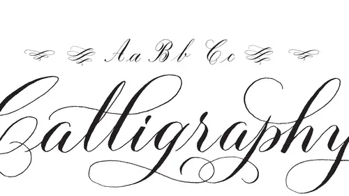
Forming Lowercase Letters
Lesson 4 from: Introduction to CalligraphyFullosophie, Bianca Mascorro
Lessons
Lesson Info
Forming Lowercase Letters
Now that we have this all taken care of, we're going to talk about actually the letters so what I want to do is just do it really quick example of each letter so uppercase receding lower case first then upper case um and one thing I'm realizing that I should definitely mention to you is to make sure that your vent hole is covered with ink I didn't mention that before but that's that's basically your field level so you don't want it to be but partially covered or under it anything thought it's got to be actually covered up so um so we're gonna start with the lower case off of that first we're gonna do a shape obviously because that's how we started alphabets um again is this is going to be just that oval shape with that you shape attached to it so once again so that's your b there's gonna you're a and your b I'm actually gonna start another lying down um just so you guys know what I'm following along here so basically these guidelines were telling me what um how my letters they're going...
to fit in here so I refer referenced the angle before but this actual guys sheet is giving me the spaces and I supposed to be using for my letters so my lower case save just fit in one of these lines here might be is actually and take up three um and then the lower case letters and take up three but going the other way so you have your basically your letter height and then you have your first ascender space here on your second a center space and then reverse on the d centers so that's basically the guy chief that I'm following and you can actually download that um well off this the creative live web site and then also um I think I have maybe two versions of it on my website are my blogged and you can actually print these out on like a laser paper and practice that way just make sure it's laser pay because inkjet feathers so cover oh sorry that's feathering is when basically I was like try to write on this it just kind of just spreads out so that's going to happen like on a lot of like the more caught any papers but not even that just, you know, like the more like loosely compiled papers so it's just not you know, this one like I actually recommend this because it doesn't do that whatsoever. Um what else is really guide like the bristol papers? Those don't do that at all, which we'll get to a little bit later as well, but yeah, so that's feathering um basically you're not going to get a nice hairline when that happens or anyone's for that matter um back to the alphabet here so like I said, the b is going to take up three letters and yes, this happens all the time in my life, so just the smudging everywhere so be it's just going to go from your base as he's made from their bottom line here, up to those very top us under there and you come up that's actually being out of the u shape on that bottom and then just a little pressure down. So a lot of people make the mistake of with herbie's they want us to go in like that, but you're just going to actually have a u shape, so just go directly up and come back down again for your c very simple, but again, you're going to see that oval shape right in there. So again, is the c d your oval shape again, and then you're going to start with that first ascender and come back finish with e u shape? Um e is just like your c just has a little bit more of that stroke here. So basically, if I was to come back to my c and add that in life I had done the c, right? Actually, the better example eso there's your c shape if you add that in there's yuri shape, so there a lot of these shapes air, really they're very similar to each other you know the relationship was pretty strong between a lot of them so you can just sort of see how you like take him apart put it together it's like that'll make sense, right? So the again oval shaped right in there uh f is going to be just you go up to that second ascend erred down to the first one g that oval shape again excuse me that a shape again h is you know you're just gonna have that shape and then just gonna add on an upside down u shaped basically I just that you shape with the dodds user j again all going down in that second ascender space if I don't quite take it all the way because it looks a little bit sloppy but it does go up to that top space uh your k which is typically not a favorite among people that airs starting to do calligraphy and I completely understand why um why it's just it could be it's not quite as I think it's because of that like not two parts step there um you do we're talking absolutely but it's just sort of like trying to get those proportions right? So I recommend well there's two ways you can do it really um there's that first way and then you can do it without having that connector at the top so you can just do a little bit like that and that's a little bit easier for a lot of people myself excluded so that's to me never been the best way to do it for me so um l very simple is just basically, you know, that first stroke on your age call it we're finished I should say by that u shape I'm actually start another line here since I'm getting crammed so l shape is very simple and my bank is getting a little tight so and what does that mean when I just need to add a drop of water basically is just not quite coming off of my it was nicely as I'd like it to so you khun definitely always add water to your ink I was keep you know, like I said, the dap and dish depth and pronounced ah and a eyedropper they're always right next to me so that way when I like I said my ankle tighten up same thing with like the colored inks, any of that stuff it will just it starts to dry up. I mean, this thing is open on my desk all the time so it's going to start to evaporate a bit so there's always water that nearby just to add on to it um and then it should flotus toe a little bit better um here we go okay, so the am is just going tobe isamu shapes here or excuse me upside down u shapes that's where consistency really comes in followed by the upset any shape and then when I'm doing larger letters like this um basically instead of like doing basically like how you'd want to do just a normal handwriting just, um that's not quite home handwriting so you know, a lot of just movements on one row or one movement I should say so I do I actually break this up into three movements so versus like dragging the ink back up through here actually stop lift my pen and start at this point um and that way I'm not dragging my ink backup to make kind of ah you basically get like a messy hair line there so part one part two and part three and I still managed to do that right there so that's just something that you'll want to watch out for this paper actually, um it doesn't absorb like whatsoever so the ink really to sits on top and it can be a little bit tricky to do these sorts of things on a cz much as I love it it's still, you know it's still it's just one of those things where I just kind of seemed to drag around the ink a little bit more than I would like to um but like on you know, more absorbent paper it's just it's not going to get quite a cz much so it's kind of just it always depends on what you're working with. The end shape is just like that am shape, but minus one movement finishing up with that you shape the oh make the basic oval shape, and then I'd to justin little movement down just to get that sort of dot right there do that one more time um, more casual way of doing it would just be a little bit like that. The p shape. I like the letter p as long as I'm doing one like a double p who like all right, when I write happy, it just just never comes out the way I wanted to, but well, so we'll just do one so that's actually going to go just a little bit above the baseline and by baseline of just again mean these two lines so it's our sorry that's, your excite and that's what your shapes their infinite there so that's one of the letters that goes just above that baseline there, and then an easy way to do it is just to come in taking that reverse crescent shape, bringing it right into here and then coming back up one p that's it, and then your cue shape pretty straightforward um it's just kind of like you're a but you're going to go all the way down okay so the our shape is another one of those tricky ones because it does have essentially three processes on the way down and for such a simple looking letter it's actually not quite that simple to do in the beginning but once you get used to it it just comes naturally so you wanted do your hairline of and then you're gonna go again above that excite apply a little bit of pressure and then your lighten up and that's the tricky part because a lot people forget that part and they'll do pressure down and then once again pressure so instead it that's instead of doing pressure all the way down um that is not the right way to do it so well just up a little bit of pressure lighten up pressure again and then that you shape um s also goes just a little bit above that excite and there's a couple ways to do this one I like to finish it off with a little bit of the pressure point here bring it back can also dio in a more casual way like that and then for the tea again use can see that you shape I like to stop mine about midway through that first ascender space versus going too high up think it looks a little um at proportion to go too high so again just that down stroke and then cross it and then that you shape that we've seen so many times, it's. Just basically two of these lines right next to each other. The rate that's the next one. Uh, here we go, it's. Actually, when my personal favorite letters, I don't know why, but, um, that that's another one where I think people have a tendency to bring in like that be shape. You have a tendency to bring that back in this way, but you really you just gonna want to go right back up. Don't do that one again. So and then just a little bit of a pressure down here and never be w just like the you, but with that one extra u shape and then same thing on this one, I just like to finish it off with that little, um, pressure there. And then for the ex, this one, um, can be a little tricky. It's just not like I think. It's that line this way that a lot people have trouble with. I just try to keep it, um, in line with, you know, this overall slant basically so but it can be it can be a little difficult, you can also d'oh make it just a little bit more stylized. Doing a little curve like that. So it's just sort of it's one of those letters that might need a little bit of work to help it along be a little bit more graceful looking. It took me many, many years to actually nail the x, which is so strange, and you really write all that often, so I'm probably a good thing in my case. Why it's? Just that reverse u shape or upsetting the shaping? And I'm going to go all the way down to that line. Z okay, so that's the lower case? Does anybody have questions on that? We've got a call, right? Yeah, um, I just have a real quick question. You you kind of touched a little bit on the double letters like the l l or the pp and said, how do you adjust to heights? And the d senders ascended strokes with with doubles, so we'll definitely talk about that, um, when we get into doing words, uh, just kind of pairing those to the others and alternate forms eso that's something I'll definitely answer in that case, um, you know, initially, you're probably just gonna want to d'oh the same letter next to each other, just like when you're starting also is just like let's keep it simple and then once you feel more comfortable with those letters you can start to bury them on day we'll get to that for sure so but yeah that's a good question it's a it's a consistency thing and so if you're consistency is not quite there yet but just you know something that you're just gonna always practice right so that's where it shows up a lot it's just like two letters right next to each other it's like that one's a lot different than that one so if that's why I have trouble like I said with the peas because it's like for some reason the double p is tricky but like two l's next to each other it's going be a lot simpler for me but it does it depends on you know how you good you're which letters we all have our difficulties and we'll have like our favorite letters so through um maybe we don't know maybe it's just me but yeah so there's I'll definitely get teo waste to sort of carry them out you know put them next to each other and like make him a little bit more like fitting into each other so we'll get there for sure what determines like how higher how low you go for example that d was just to the first center and a lot of the other ones were to this second so it's just a personal thing are I think it's partly personal but it's mostly like they're actually the rules that you follow so like the d like you're not going to want to bring it all the way up because it's just there's no unless you do like a loop which you know well premed up and like we do them in the next class which is you know the alternate letter forms but so I was to do like an interesting loop on the d I would definitely bring it a pyre but just with that one sort of short down stroke if you think about how that would look going all the way up it would be like that was really weird is huge so it's just it's really more of a I think you'll you'll be able to tell as you're doing it but definitely like I would say the d and the tea those and go all the way up and then like the f I don't bring it all the way down to that second d center space so it's just one of those things like if you um I think in that exemplar that's downloadable that shows where they all fit in like in that guide sheets so basically it's going to be this sort of guide sheet with the letters in there so you'll be able to sell from that point but again, you know it's just sort of one of those things that yes, there are guidelines but not you're gonna want it like you know as you like develop your own script style that's probably gonna change a little bit how long did it take for the ink to dry and like do you end up smudging a lot and how do you avoid that type of thing? I smoked all the time so if I want to save something very careful so obviously it's not dry um for shark here but it's it depends on the paper it depends on the ink this ink if I'm using it unlike a crane letter envelope for example which is one hundred percent cotton it's going to absorb a lot more it probably will dry within like five to ten minutes when I use this paper and I use it all the time but when I do something that I'm scanning in basically it I leave it alone for like half an hour and then I come back to it and maybe then it's dry but it also depends on how much pressure you're applying, so if you're applying a lot of pressure with your pen, you're going to releasing a lot more ink and obviously when you release that much more ink it's gonna take a lot longer to dry um but again, you know depends on the paper depends on the ink this isn't the quickest drawing um I think the critics are definitely, they drive a little faster, so sort of, if, you know, if you see any puddling, definitely leave it, there is still, this is thiss drives very shiny, sorry, I should say, assuming contrives has, like, a sheen to it, so it might still look a little bit wet, but it might be dry. It sort of one of those things where you get, you sort of get to know it sank a bit, and then you're like, ok, it's definitely drive right now. But if I do something, like I said for reproduction, I will sort of do like a little tiny touchdown. And if my ink, if doesn't show up on my hand, probably good to go.
Class Materials
bonus material with purchase
Ratings and Reviews
Catherine Moore
I was immediately drawn to this class because the camera work caught the find detail I was looking for. Love the calligraphy style itself and seeing each letter drawn with Bianca's explanation of why certain things are done, such as relationships to lines, was very helpful. I had been looking online for very specific information on pen angle AND nib angle, and this video cleared up some questions I had. Also, information concerning how much ink to use (covering the vent hole) solved another issue I was having. I also like that Bianca emphasized the basic strokes for daily practice. Also Bianca explained how she stops and starts for specific letters and this helped me figure out some issues I was having. This is my favorite of 5 online calligraphy courses I have done online! Thanks for offering it.
James McCullough
I would recommend anyone interested in Calligraphy to take this course. I liked that she took the time to explain the basic strokes and the importance of practice. I also enjoy her being authentic letting me know that with all her years of doing this she still does warm up strokes before tackling a project.
a Creativelive Student
I found this class incredibly helpful. In fact, after this class I hand-addressed all of my wedding invitation envelopes using the calligraphy skills and materials I learned here. They turned out beautifully, I got a ton of compliments, and I didn't have to pay a professional hundreds of dollars to do it! The course itself is focused and packed with information. I liked it so much I bought another course from the instructor. I haven't taken it yet, but I'm looking forward to doing it this fall when my work schedule eases up a bit.