Creating Hierarchy with Style and Font
Lesson 6 from: InDesign Typesetting: Design a Restaurant MenuMichael Stinson
Creating Hierarchy with Style and Font
Lesson 6 from: InDesign Typesetting: Design a Restaurant MenuMichael Stinson
Lesson Info
6. Creating Hierarchy with Style and Font
Lessons
Lesson Info
Creating Hierarchy with Style and Font
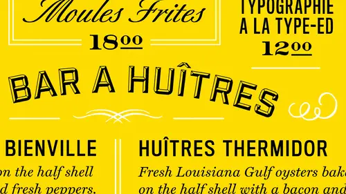
The next thing is is to get all the text you know kind of zeroed out and maybe start some style sheets hey, I've already got some still shoots going for this character styles I want to start with so in my character styles if you'll notice here I mean it pretty simple I've got them based in group on each section okay so right now I just want to get everything two body copy level he always want to start with the body copy for fitting like this so I just want to pick the common one let's say um the ingredients for everything okay, let me go back and you change the preferences for this so we can see it and that would be here changed agreed type below two too so we can actually see the type again ok, so my ingredients is my smallest level of my most common type so over here it's nine over twelve and a half my baseline great has said it six so I may want to redo this lead to you know twelve instead maybe if it works just for now so we can stay in harmony with baseline grid so we want to star...
t there ok? So everything's kind of setting this character already so the type that I've kind of chosen for this so typeface choice for this we've got french and where are usually try to start with typeface choice is relevance french menu uh french thai face the first one that comes to mind is dedeaux right? But we can't use dedo at a small size because it's kind of a display face so we may want to just decide between sarafin stands zero so france seems to me a little bit more classical right? So we may want to just stick to the classic full and then we'll add a collective typefaces to it to give it a little bit more fun you know feel to it because this is kind of an eclectic layout menu with the way the brand's been designed. So what kind of course were just interpreting here, but as far as typeface choice you want to just make it relevant at first in readable, right? They always want to think of the reader or the diner in this case of put yourself in their shoes to see what they're going to be reading. So in this case I've choosing it chosen a typeface called harry attacks and you can use anything here um that may work for your typeface choice but hopefully it's relevant so we have how popular text in here miller miller I believe it is a modern which dedo is a modern classification as well, so that might work um but if we were looking for classically night, try a humanist classification for sheriff which might work well like a remind so for now I'm just going to use harriet for this and I'm defining if I go back to my content, I'm looking at the common type that's going to be used so the body copy in this case would be these descriptions the lowest common denominator as faras body copy range, okay? And right, harry already has it italic so that works well for us. So the next step is to get the type going it's going to be used for the entrees. Okay, no noticing here that we we have some comments and everything after the entrees so or that in this case and why in my character styles over here, aiken slug to see what I've already chosen and we can we can choose these anything to do as faras layout, which I should want to go back to here is is ever have the branding colors here, but when I'm doing layout, um, I always urge my designers and the way I've been taught is to go back to black and white for now just to keep color out of the picture. And if anything, I'm just gonna make these great and block for now because all I want to deal with this weight and emphasis, ok, so I'm going to change that so the whole menu is kind of black and white now and I can always come back to that but I want to deal with uh just wait an emphasis for hierarchy right now okay, so then we could start moving to the you know, the dash and right now we've got really heavy knockout in here and so I have a gothic with a uh a serif okay for now just to see the difference in emphasis and I can always go back and change those which I will so for now I'm working backwards like I was showing in my lecture before I've just creating a division of hierarchy between the dish and the ingredients so if I go in and change all these bright and then as I work through this I can also you'll come back and do my header in the dishes well just for now so I can see a different okay what I may want to take a uh sometime tio take care of right now is all these prices since I'm noticing them as I go along here that air ah have all the zeros on them so what I can do is go to my find a change and leave it at zero and change all those I have to go here maybe or not let's see here I have to select a mall that's not the place it's not finding those for some reason we've got oh did I figures here we go so changes all those typed it in iran it does have sense down here in one spot let's just say for now that I talked to the chef and he's going to make it twenty three all right, good I make more money um just to keep everything consistent because many is like this you know you want to keep consistent right? Nothing to address is that when we're looking at the content here is that when we're reading the content we're noticing we have um you were you actually using french language but we also have a lot of numerals and so when what I try to do when I see numerals and continents to know I'm going to pick a typeface or a sheriff that has an old style numeral in the default and that's why I picked harriet the beginning here because harry it's default for its numerals are old style which is what you use in reading content typically typefaces will come as a default with lining numerals which are the all caps versions and I'm a ought to use those in the end because if I stay sarah if here and I have a long leader line in the numbers are all out there right it might be harder to see the lower case or the old style over to the right so but with this subhead system that I have the prices are on this usually typically on the same line so here my price is going to be emphasized with the dish ok? Typically what happens here is that these would all be emphasized with the dish the same but that this content would go below and then the price would come back up to that line. So these air kind of office forest how the content works, you have to put him up on this line and then add style there okay, so this content would go below this content comes back up and emphasizes that the dish in the price of the main tube ingredients, if you will for the information and this is just some a decision that you know is made when we're talking about how the men used to be displayed with chef hey dish so I'm gonna want to go through all these and fix these and get those to be have a system now so now we have a rhythm of dish in price and then below that is your ingredients and that's that's really the system that we're trying to set up here. So how I divide this number there's lots of stylistic ways that we can get into that when we get into that um and I'll take all these comments out and one on one shot when I get there so heirloom tomatoes salad, this is a dish and this is going to be the dis I'm gonna take this out so we have this kind of rhythm that's going on I'm doing this in these boxes for now because, um we're going to actually put this in the tables when we get into that which I'll do next just keep this rolling along so this is our system they were starting with the type of graphic a simple um just to start out we haven't really decided on stallion I'm just trying to look at emphasis, tradition price versus the ingredients and then I actually just put the header for now in the subhead kind of range I forgot a header already staked out for these ok, so let's, go ahead and actually try toe get this organized in a in a table so I'm gonna pull these aside for now and just go back to that table structure I was doing before even the headline here and get this going for riel so I put in one text box I'll get my table in here for now I'm just using this get everything zeroed out as far as the borders and when I go into amusing command option b for the text instead here I just throw that out okay and then appear um at the top here I try tio if you if you leave this default, at least it'll it'll keep the cells moving, like kind of like, um microsoft excel does so if I do a cell and I'm typing the soul will increase in size as I'm going so I try to select all the cells and do exactly so then I predetermined what the depth of those cells are so when I type it'll give me a red dot in the lower corner there knowing that I have over set text ok and that's just one way working us where I've always worked so for now I want to get these boxes going you know to migrate here so this might be this is for my my head or here and you'll notice I'm still working in points and pikus so what tables if if I'm gonna have a header and I'm probably gonna have it centered under this spanner here I could go up here and combine the cells emerged the cells into one so from there I start pulling in the content that I have and putting it in this cell that needs where it needs to go so I can actually set it up and center it and then within that cell if I select entire sellem hitting command question mark ok so up here you can see it's it's arrangement in the cell line bottom and then center if you want okay and then so I'm gonna arrange these cells to the grid like I would want and get the set up in you know, reflective of my grid here I've got four so in order to take out roeser columns that's one thing to go over with tables with you two if I select a bunch of cells down this side I can hit shift and delete you don't take them all out four rows and you can select in this way if you hover over the top usually don't give you that row all right? Call him I'm sorry or if you go to the left here and you command delete it delete the whole row so collins in euros for and then individual cells so for me I want to you know take out this column here so I'm just selecting that and hitting chef delete okay and then from here I go back to my grid and we're gonna pull this to the end now let's back to center and then I want to I'm going to pull this one to this line and pulled this one too this line and so on just a start and I can also always divide these cells which I will here in a little while so for now I've got the cells where they need to be okay so now I can pull in the content so my appetizers were here and they actually go in this area so now to combine cells I just merge sells again they're so now I can just put my content where it goes and this one goes over here this is the main entrees, so I'm going to select these to emerge those too and in place. My content in there, usually or not, there goes, and then this goes in this area. This in this one, this nissen. All I'm doing is copying, pasting, and now I have my whole table structure in one box laid out. Okay, so now that content will move, however I wanted tio ok, now it's and it's, its own little area now.
Class Materials
Bonus Materials with Purchase
Ratings and Reviews
a Creativelive Student
InDesign is a program I use on occasion so this class has been great for a quick refresher on making it work for me. He keeps it clear and concise so it is easy to follow. Even if you are using a newer version of InDesign this class will help you.