Lesson Info
29. Editing Using Presets
Summary (Generated from Transcript)
The instructor, Pye Jirsa, demonstrates how to edit engagement photos using presets in Lightroom. He shows how to adjust exposure, shadows, highlights, and sharpness, and also explains the use of split toning and lens corrections. He emphasizes the importance of knowing your gear and shooting with intention to achieve desired effects. He also discusses the importance of creating a cohesive look and feel in a set of images for a wedding album or story.
Lessons
Class Introduction
12:56 2Posing Guidance for Him
08:14 3Posing Guidance for Her
09:02 4Foundational Posing
05:11 5Posing Touch Points
05:55 6Couples Body Language
09:52 7Posing Three Point Check
05:22 8Posing Tips with Demo
08:05Verbal Cues for Posing
06:27 10Mood Board Tips
06:59 11Posing Questions
06:54 12Camera Settings Quick Overview
18:32 13Location Scouting
02:24 14Seeing the Light
17:34 15Shoot: Natural Light in Studio
14:50 16Homemade Soft Box
12:43 17Shoot: Wrapping Natural Light Around Couple
10:56 18Shoot: Flat Natural Light
06:24 19Special Effects Intro
09:13 20Shoot: Backlighting
18:07 21Shoot: Using Sparklers
09:59 22Shoot: Sparklers and Spray Bottle
13:01 23Shoot: Backlight with ND Filter
12:38 24High Speed Sync vs ND
04:27 25Shoot: Fog and Spray Effects
15:28 26Simple Lightroom Workflow
25:10 27Processing Black and White Images
16:50 28Culling and Presets
09:34 29Editing Using Presets
13:04 30Post Processing Q&A
05:46 31Flash + Ambient Balance
13:25 32Photographers Need to Practice
09:00 33Outdoor Engagement Location Scouting
12:22 34Meeting the Clients
11:27 35Basic Engagement Shots
16:59 36Getting into the Creative Shots
17:43 37Using Photo Mechanic to Cull
12:41 38Culled Edits in Lightroom
17:25 39Editing After Using Tilt Shift Lens
22:05 40Photoshop Editing for Print
23:34 41Engagement University Shot
21:35 42Daylight + Flash
23:44 43Engagement Picnic Scene
19:42 44Composite Street Shot
10:47 45Day For Night Engagement Shot
06:27 46Natural Flash/Bounce
04:10 47How to Make GIFs
17:22 48Simple Composite - University
09:38 49Intermediate Composite - Downtown
18:40 50Simple Background with Reflector
17:05 51Final Thoughts
10:53Lesson Info
Editing Using Presets
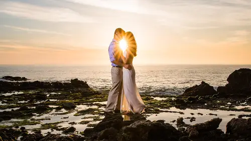
I want to work on some of these images. Let's do, ooh, I kinda like that one over the faces, that's cool, let's see. Let's take a look at these. Let's pick one of these and let's do our favorite and kind of create like a really nice signature look. By the way, this is without the backlight. I love this effect just naturally, just as is. I think it looks fantastic, especially if you're shooting a sunlit scene and it kinda looks like beads of light hitting the lens. It looks great. The best way to do this, I'll demonstrate real quick how we would do in the studio, is when our people see something like this they go "Okay, we're just gonna go black rush." Then it just pumps up the image. You'll notice that it just adds our contrast, it does all those things on the right side, we get to basically that final look, and all they might do is grab a radial filter and then drop this right over the center to kind of bring the attention right up and into them. It felt like a poltergeist took over m...
y mouth for a second, like went all crazy. That's how we process, so let's actually do that by hand real quick. Again, in general, we don't touch the contrast slider until the very last if we need to make an adjustment there. What I'm gonna do is I'm gonna brighten up the image a bit, I'm gonna add some shadows to the image. I'm brightening up because I know that adding shadows darkens down the image. I like my highlights and whites, I'm just gonna pull them down a tiny, tiny bit and then soften up the image as well. We're gonna go to about 10. I'll use my highlight alert if you want to just to see where the clipping is going. I don't mind the bottom of the frame getting a little bit clipped, it's okay when it goes to print to have a little bit of pure shadow, a little bit of pure highlight. A lot of people freak out about that stuff but I don't know, is it really worth freaking out about, honestly? Nah, you're supposed to say no. Then this is an image that would look fantastic, also, with a little bit of, maybe a matted curve. We generally would be doing this as kind of an effect over a scene that we're looking for light and airy, that kind of a look. You would see a lot of matte processing and that kind of stuff in that scene. I'm gonna bring in the highlights a little bit, pump down the shadows a little bit and bring up my shadow clip, perfect. I know we're going a little bit quick, but let me know if we have any questions and stuff. If you want to target any of these tones and take them out that's fine but I think it really kind of makes the image, I like it. I'm gonna add in my split toning. Okay, go to 60, if you just want to keep a rule of thumb, like 60 10, it'll add a bit of yellows into it. 60 five is a better number so 60 is the hue number, five is the saturation number. This is like a very typical one that we'll use, or 50 and five. If you want to just keep those two things in mind. A tiny bit of blues and teals in shadows, I find it adds a lot of interest to an image. I'm gonna ruin every movie for you right now. I find that this happens to me, every time I learn about something like new lighting and then it kinda ruins movies because I want to go watch movies, I just think about that one thing. Have you guys heard of the orange teal color toning? So if you haven't heard of it, this is gonna bug the crap out of you but go watch pretty much almost any movie. 80% of them use orange teal split toning. They're putting orange in the highlights where the skin tones are and they're putting teals, greens, and blues and stuff into the shadows. Go back and pause Transformers or any other movie that you're watching and you're gonna see orange teal all over the place. It's one of the most used split toning effects. It actually works really, really well and it creates a very nice look to images, hence it's done a lot. Every time I see a movie that has orange teal, I'm like "orange teal." That didn't really ruin the movies. For people who actually are just joining us later in the class, what was the effet that you used to create this image? Where did that flare come from? If you're just joining us, if you're just joining us by this class. (laughs) I'm just kidding, if you're just joining us the effect is coming from holding a sparkler over the front of the lens. You can do it with a sparkler, you can do it with LED lights, you can do it with really whatever you want but we're holding a sparkler that's shooting off sparks right over the lens and we're shooting at, I'm gonna press I to bring up information. 1/80 of a second at 1.4 and ISO 50. It's just that open, wide open shutter letting it bloom and kind of add that look to open up and it creates this really cool look to an image. That get it, we get it? Yep. Split toning off, split toning on. I can see it on my side, I kinda like that look. I'm gonna bring up the highlights saturation a little bit, I dig it. Add a little bit of sharpening. I'm not gonna really zoom in and kind of test these things just because these are, oh by the way, if you want to write something down too, our general sharpening settings for portraiture is 70. We'll do like 1.3, 20, 60. We'll zoom in, why not. That gives you a nice outline and it gives you nice sharpening effects over edges and everything without going too far. Our general noise reduction setting for portraiture is 15. There you go, so if you're just tuning in, there's a little nugget for you. Lens corrections, one of the questions I often get is do you enable profile corrections on everything and we always say no. I'm gonna show you why, it's gonna ruin this photo as soon as I apply a lens correction for it. The reason that it does this is I know my gear, we always say go out and practice, go out and test your gear, know your gear. I know my gear and I know that if I'm shooting wide open on a particular lens that I'm gonna have vignetting around the edges. I know that it's gonna be soft, I know it's gonna be certain things. I know those things and so I'm using it for my composition. There's a reason why we're shooting wide open and I like that look because it has that natural vignette and it has that pulling and it has the softening effect. When you go apply profile corrections, this now makes me have to go back and do that again to the image. Now it removes my vignetting, because it detects what lens I used, removes the vignetting and now I gotta go do it again. It saves me a lot of time just keeping that off. The other reason is that when you're shooting at a wider angle lens, even like a 50 mil, a 35, a 24, you always position them in camera so that it looks good based on the distortion that you're seeing. If you go and shoot a shot, you position them and you're like "Okay, they're too distorted on this size, I'm gonna place them right here." If you have this enabled for portraiture when you go into post, it can automatically stretch them a little bit and distort them a little bit to correct for what you were seeing in the camera but you shot it with that intention in camera. We say for portraiture, you generally leave this off. Apply on a an as-only needed basis but leave it off otherwise. The things that we will use is sometimes we'll use manual distortion corrections or lens vignetting, vignetting? Lens vignetting corrections, we'll do this because these are actually really nice subtle adjustments and I know that we have lens vignetting effects down here but these are very heavy handed. This lens vignetting right here, it's a gold mine because what that's designed to do is just correct the natural vignetting on your lens. That's why it's under lens corrections. It's the correction vignetting. It has a very subtle handed kind of look where we can adjust the amount in the midpoint to basically create a radial filter. We used to do this nonstop in previous versions of Lightroom before they added the radial filter option. Now that we have the radial filter it's just as easy to go and pop that in wherever we want it, so we have that. Since they're in the center anyway on this image and that's what I was gonna do with the radial filter, we'll do it with the lens vignetting. The pose crop vignetting is heavy handed so you guys gotta be careful with how far you're going on these. Aw yeah, 1980's. (audience laughter) Was that the 80's or the 90's when these were, remember with this kind of a look? A roundness kinda like that, nice feather like, aw, that's sweet, right? If you're just tuning in, that's how to post produce. (audience laughter) Let's take it away now, I'm just kidding. Post crop is a little bit strong and by the way, that's a really good point, remember that style? It's so definitely attached to a certain decade, where like oh my gosh, that was 1980, 1990, whatever that was. Those are things that we want to be really cautious of, at least we try to be really cautious of in the studio. If a client comes in, they're like "I want filmic" we're gonna shoot it with vintage props, with vintage everything, we're gonna shoot it with that mindset, that it's gonna look like film and it needs to emulate film. That way, when you're looking back on the image 20 years from now, you don't identify it as oh, that was because I see the Ferrari right there with a vintage photo applied to it. Rather, if you do it with everything correctly, I hate using the word correctly but if you stylize the shoot so it's vintage, nobody knows if it was 2010 film or if it was actually 1970s, right? That's what we try and tell our couples and stuff, we educate them. We already applied that, let's do one other thing. There's sometimes, I like to do a little detail enhancement and we're gonna do a little detail enhancing on this. What this does is it pumps up contrast highlights a little bit, it also adds clarity and saturation and sharpness around the image. What I'll often do is paint this over an image, so we paint it on everywhere, hold down alt or option and just subtract if off skin. These effects are designed to come in, we designed them in the presets to come in very subtly and that way if you want to enhance or strengthen the effect you can, but if you don't want to then you just paint it off where you don't want it. The effect that it leaves is very subtle and transitional. Let's take a look at this now, the before and the after for this. Here it's a little bit flat, here we get that nice poppy look to the image. Looks nice, looks lovely. I think we only have a few minutes left so I want to show one of the other images. This was lovely, this one. I bet we can take that same setting and let's just copy it over. Where was that image, this one, yeah. Control + Shift + C, Command + Shift + C, let's copy it all. We'll take it and apply it over, I like this one. Then Control + Shift + V, Command + Shift + V if you're on a Mac. This is gonna make us have to do a couple adjustments. We need to go in and grab our, oh, we didn't do a radial filter, did we. We did the lens vignetting, so let's just hold down alt or option and just click reset on that one thing. Let's go ahead and grab this radial filter. We're gonna do an exposure burn right over this. The only other thing we need to tweak now is that painted effect. If you hover over this and you can either do this by pressing O, you can see where the mask is, or you can just hover over it for a second and it'll show you where the mask is painted. We're just gonna paint it back on everywhere and then hold down alt or option and then paint it off their skin again. Cool. That fun? Fun. Thanks guys. Okay, the day for night stuff, it's not really day for night it was like, indoors night, but look at how different that looks as we start to change the white balance in camera. The cool thing about this is you can always change it in camera and decide later if you don't want it. If we warm this up, has a completely different look and vibe to it than that cool nighttime look. Couldn't his look like, if I was, we do a lot of nighttime portraiture because our couples love the nighttime, we'll do sky, we'll do all those kind of things. We're gonna have that course where we do nighttime stuff in the city. During those, these are the perfect times to shoot stuff like this because in an album, that actually looks like it could be the moon, it could be stars, it could be a lot of things, so if you have a wide shot of the ocean and them standing there with this blue sky with the stars up in the sky and then you have this shot next to it, it actually fits really well. Kind of think of those things, when you shoot a shot, I know what we did over there was kinda cool, it was effects and stuff like that, but I want you to think beyond that, think towards the final product, the album, the story that you're trying to tell and think how they fit cohesively because I wouldn't want you guys to go into a shoot and start doing things that don't really look like they should belong in a set of images just like, you've got this beautiful scene out in the field and then one shot that sparkles.
Class Materials
Bonus Materials with Purchase
Ratings and Reviews
CPR Photography
I think Pye Jirsa is one of the best, if not the best, instructor for photography on Creative Live. He is very personable, smart and approachable. He has a perfect blend of personality (comments, laughs, tangents..) to the amount of instruction. He asks the questions for you, because he knows you are thinking those questions right then. He's very good about identifying settings, gear, etc.. and not leaving us in the dark about how he "got the shot". He goes into great detail. His instructions flow, but are linear, which is helpful. He's very organized, and you can tell that he really put a lot of work into his presentations (slides, video, test shoots, live teaching, graphics, etc..) I have been listening to him for like 10 hours straight, and still haven't gotten tired of him. He keeps things moving, He's very funny too. Nice job, I've learned so much. :)
a Creativelive Student
This course was AMAZING. I'd say int he past year or two I've fallen into a slump. Uninspired by my surroundings and uninspired by my clients. As a result, it showed through my work. My posing suffered as well and more than a handful of times some of my shoots became more than awkward. Then I bought this course and watched most of it in the course of a day. I walked away inspired, blown away, and renewed. The next day I walked into an engagement session confident. I gave my couples a quick overview on posing and then we just had fun in front of the camera. Immediately afterwards they texted me about how amazing their shoot was and how relaxed I made them feel about posing. The photos turned out fantastic to say the least. I've since shot several more engagement sessions and each one of them has been amazing. If anything, this course should inspire photographers to think outside the box and provide you with the necessary skills to take incredible engagement photos. Thank you Pye and Creative Live! I cannot speak more highly of this course. I should also state I purchased Pye's Natural Light course on SLR Lounge: this course is a wonderful addition to that. If you already own the natural light course and are hesitant about purchasing this one, don't. Buy it and reap the benefits!
Lisy
This is by far one of the best courses I have taken. Pye makes learning fun and easy to understand. I feel like I have learned so much throughout the course, that I have truly advanced my photography skills. I am so excited to get out there and try so many of the techniques that he showed. I would love to take another course of his. The pricing for the course doesn't even compare to how wonderful the education truly is, I really got more than my money's worth on this one.
Student Work
Related Classes
Portrait Photography