Lesson Info
39. Editing After Using Tilt Shift Lens
Summary (Generated from Transcript)
The topic of this lesson is editing engagement photography after using a tilt shift lens.
Q&A:
What are the recommended settings for shooting with a tilt shift lens?
The instructor recommends using an aperture of f2.8 to f5, depending on the desired tilt shift effect.
How can you ensure that a photograph is properly exposed?
The instructor advises checking the histogram and adjusting settings to push the range as much as possible.
What should you do if a photograph breaks a rule but is still good?
The instructor encourages keeping the photograph and not throwing it away, as long as it is still a good photograph.
How can you capture all the details in a photograph on the fly?
The instructor suggests slowing down the shoot, practicing, and participating in constructive critique to improve the skill of seeing details.
How do you choose the right gel for a flash?
The instructor explains that the choice of gel depends on the desired color scheme and complementary tones in the scene. In this specific example, a full CTO gel was used to match the warm highlight in the background.
Lessons
Class Introduction
12:56 2Posing Guidance for Him
08:14 3Posing Guidance for Her
09:02 4Foundational Posing
05:11 5Posing Touch Points
05:55 6Couples Body Language
09:52 7Posing Three Point Check
05:22 8Posing Tips with Demo
08:05Verbal Cues for Posing
06:27 10Mood Board Tips
06:59 11Posing Questions
06:54 12Camera Settings Quick Overview
18:32 13Location Scouting
02:24 14Seeing the Light
17:34 15Shoot: Natural Light in Studio
14:50 16Homemade Soft Box
12:43 17Shoot: Wrapping Natural Light Around Couple
10:56 18Shoot: Flat Natural Light
06:24 19Special Effects Intro
09:13 20Shoot: Backlighting
18:07 21Shoot: Using Sparklers
09:59 22Shoot: Sparklers and Spray Bottle
13:01 23Shoot: Backlight with ND Filter
12:38 24High Speed Sync vs ND
04:27 25Shoot: Fog and Spray Effects
15:28 26Simple Lightroom Workflow
25:10 27Processing Black and White Images
16:50 28Culling and Presets
09:34 29Editing Using Presets
13:04 30Post Processing Q&A
05:46 31Flash + Ambient Balance
13:25 32Photographers Need to Practice
09:00 33Outdoor Engagement Location Scouting
12:22 34Meeting the Clients
11:27 35Basic Engagement Shots
16:59 36Getting into the Creative Shots
17:43 37Using Photo Mechanic to Cull
12:41 38Culled Edits in Lightroom
17:25 39Editing After Using Tilt Shift Lens
22:05 40Photoshop Editing for Print
23:34 41Engagement University Shot
21:35 42Daylight + Flash
23:44 43Engagement Picnic Scene
19:42 44Composite Street Shot
10:47 45Day For Night Engagement Shot
06:27 46Natural Flash/Bounce
04:10 47How to Make GIFs
17:22 48Simple Composite - University
09:38 49Intermediate Composite - Downtown
18:40 50Simple Background with Reflector
17:05 51Final Thoughts
10:53Lesson Info
Editing After Using Tilt Shift Lens
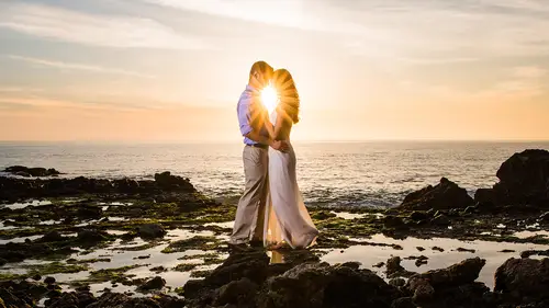
1/1000 at 2.8 and ISO 100, we're now in the tilt shift. So now we've gone over the tilt shift, we're at f2.8, so we make that adjustment over in our shutter speed. I know there's a lotta people online that were asking about settings. So I wanna make sure we cover those settings. Notice that I'm still making sure that my histogram, we have pushed all the range possible, we can do anything we want with these photographs. There's that shot. Look at this. Poopy light on this face. I don't like it but guess what? It's a good photograph. I'm gonna let it go. This is where your judgment needs to come into play, right. You broke a rule, fine. It's still a good photograph, don't throw it away. It's very him too, I was like lift her up, I actually wanted him to do this. But he did this instead and I was like, hey, that's really cute, I like that. Okay, this one, the light on her face actually blocks the light on his. So it's a fantastic shot to place their backs to that light because she's gonna...
put him basically into good light when they do that. Okay. 1/500, f4.0, ISO 100. We processed this very similarly, let's go ahead and do one of these guys. Let's go ahead and zoom in, check your sharpness. He's a little bit soft, she's alright. I'm cool with it. Is that gangster? Is that the photographer, this is like the photography version of gangster. Letting him be a little soft. I'm friggin' gangster. (laughter) It's alright guys, just call me gangster. Gangster Pye. Okay, do you guys see the crop? I actually made this crop as a, can we just jump back in and be serious for a second, guys? (laughter) Gosh! Gangster Pye, okay. I pressed R, and this is one of favorite things to do, I press R to go into my cropping tool. And then I go right down to my crop over here, and once again I wanna mention that, you know, we're going through Lightroom basics and kind of covering this kinda stuff. The actual Lightroom courses are like eight to 10 hours long. Then we go through development courses teaching you every single style that are eight to 10 hours long, we clearly do not have eight to 10 hours to spend on each of these sections. So, if Lightroom is a big area that you want additional guidance, we have the Lightroom Workshop series that actually goes through everything from A to Z, teaches all the styles and so forth. So, alright, there's only so much time in the day, peeps. It's unfortunate, I've always wished there was like 36 hours in a day like Men in Black style. Okay, so at two to one crop, all I did was enter custom, you put two right here and you go one, okay. Now it sets this to a wide aspect ratio, which I really love for scenes like this. And one of the cool things about that is again, we mentioned this. A two by one crop, most printers don't do, most consumer printers don't do that kinda stuff, right? So again, they come back to us and they go, "We need a custom blown up 60 inch canvas." And I'm like, yeah, you do. 'Cause I suck it to you with the two by one crop. I don't really do that. I just like, it works for this composition, right? And if it works for the composition, then do it. I want them, the thing is that I wanna maintain my artistic vision when they're going out and doing their own prints. My artistic vision for this was a wide angle shot, it's a two to one ratio shot. So, I'm not like playing tricks and playing games just to make them come and print with me, I'm actually just delivering something that fits my artistic vision for it. And I'm saying that if you want a print that fits that vision, you need to come to me to get it. Plus, if you blow this up without going to an awesome printer, that's kind of a waste of money. So, we're gonna set that crop, make sure it's all good, and straight and so forth. By the way, Lightroom, the new Lightroom has these auto-correct tools which are great if you have a visible horizon line. They tend to freak out if you don't. On this one it's kind of okay, it kinda straightened out these columns but I feel like it pulls it a little bit too much. So I'm gonna bring it back just a tiny bit. Okay, so if you have a very blurred out horizon line, just know that the auto-correct sometimes isn't gonna get you there. Okay, let's bring up the exposure. I'm gonna go up by about one stop, I'm gonna leave this on the bright side. Let's actually produce this for maybe a different look. Let's go, let's say this entire session we're gonna go for like a light and airy type feel. Let's produce this to be light and airy. I'm gonna bring up the exposure quite a bit, like let's go up to like 1.5. Watch this, I'm gonna flatten my contrast. I'm gonna pull down contrast to -25. I'm gonna bring the highlights down, the whites down, just to kind of even it out a little bit. I'm gonna raise the shadows, raise the blacks a little bit. We've already started to flatten out an image, right. Now I'm gonna go to my tone curve. I'm gonna pull down from the highlights by holding down shift. And someone asked yesterday too. When you see me adjusting and it's going in larger increments versus smaller increments. That's holding down shift. So if you hold down shift when you press up or down on your keyboard, it'll go by three time increments versus just pressing up and down that goes by one size increment. One size does not fit all. Why do these things come to my head? I don't understand. What's wrong with me? Okay, so grab the tool, the tone curve at the top, we're gonna pull down to mute the highlights. So what this does is anything that's above this point, notice, look at the histogram, look at what it does on your information. This is why post-production will make you such a fantastic or a better photographer, I should say. When it's up like this, do you see how we have detail that goes all the way up to that side. Watch when I pull this down, do you see how it's pulling back detail. So what this is telling you is now above that bright point, above that level, there is no detail there. And what it's doing is depending on how far I pull this down it's saying that anything above this, simply goes to a gray. The brightness of that gray just depends on how far down or how far up I'm pulling it. So a five to 10% pull, you can write this down too. Generally, when you're pulling on your tone curve, if you look at these numbers, a five to 10% pull is enough. 10% is on the high side. If you wanted to be subtle, it's around 5%. So you see the number right there when I mouse over it? It says 194.1, that's just a mathematical heads up for ya. That's some pi coming at ya. You know like, this is mathematical pi, 3.14. It works on two levels, Kenna. Most of my things only work on two levels, it doesn't happen three levels off. Okay, I'm gonna bring my shadows back into this, I'm gonna pump up the mid tones a little bit, pump up the highlights a little bit. I'm adding back a little bit of contrast, so what I'm doing is I'm, I used one set of sliders to pull everything in, I used the second set to basically fine tune and tweak, okay. So now we create this flattened out look with a little bit of contrast in our image, very bright, very airy. Very lovely. Lovely. Okay, I'm gonna warm it up a tiny bit, I'm actually use my split toning to warm this up. Split toning, can we have a song for split toning? Maybe. Anybody at home like to sing a song? I'm down. Just add a little bit of blues in here. I talk to keep it less awkward and I find like my talking makes it more awkward. That's cool, work with it. Okay, drop the contrast a little bit, brighten this up a little bit. And then I would probably do this in, if I was gonna go in and actually prep this for a canvas. I'll go and knock out this little grass area. So I don't have a little grass area in the corner, just make it concrete. And call the good guys, so here's that bright and kind of airy version of our image. So let me go Shift + Tab just to knock out all of our panels. We're gonna turn out the lights, I'm pressing L. And then there's the before and the after of an image like this. The point of this is to show you that with a properly exposed image, you can take this any direction that you want to. If you wanna go to the bright side, cool. You wanna go to the dark side, star wars reference. The light side, the dark side, okay. So you can go to the, you know, the dark filmic look, you can go that way. You can go for that modern vibrant look. You can go anywhere in between this with that properly exposed shot. Cool, did we go over the settings for that one? I don't know if we did, let's press I and turn on the lights. 1/500 a second, f4, and ISO 100. Quick little note, Jade, if it's handy, can you grab the tilt shift? If not, no worries. It's in the lens bag. In the lens case. So on a tilt shift lens, your aperture, a tilt shift is designed technically to correct perspective distortion, right. You're actually using it to correct things like the lines that go up on an architectural building when you shoot bottom-up on it. That's what we're, that's what they're technically designed for. So when you actually close down the aperture to like f11, f14, your image is actually gonna be sharp from top to bottom. So, that's what it's designed to do. It's designed to go out and shoot buildings, so you can correct that perspective. And as you go up to like f14, and you tilt it and you shift it, it's gonna look sharp. So, one of the things that, there's a couple different ways to use this guy, is you have control of how much you're tilting. So the idea here is that the more that you're gonna tilt from one side to the next, the more you're bending the plane. And the more that we bend the plane, the more the effect that we're gonna see. Generally, if you're up close or if you're shooting portraits, it's really difficult to bend it all the way and to get them sharp. The plane is so razor thin. So you have two options, you either bend it less, like go to maybe like halfway. Or you raise the aperture a little bit, it goes to f2.8. So that's as wide open as it gets. So if you go to f4, we're basically decreasing a little bit of the tilt shift effect. As we go to, so I can have this on the most wacky kind of tilted effect. And when shooting straight forward, you can see how tilted it is. I can have it on that setting and reduce the effect a little bit if I need to by going to f4. Or then to f5, f5.6, whatever you need. But as you get to like f11, like that's why I will do some tilt shift shots with an ND filter. Because if you're trying to do the whole wide open stuff, you need to be wide open to get the tilt shift effect or at least around f4, f5, you know, those numbers. If you go up to f14, to get your synchronization speed on your flashes down to 1/200 per second. Then you don't have any tilt shift effect, you might as well just not use this lens at that point. So if you want the look and you wanna use it with flash, you have to use an ND filter over it. Does that make sense? That's a fun lens, okay. Let's go ahead and go down, these are some of the shots that, let's see, these are some of the shots that we did against the wall. So these are just on the 50 mm, this is the, I know it says the Zeiss, it's actually the Sigma 50 mm. Okay, so these are just the different shots that we took. 1/400 a second, f1.4, ISO 100. Very basic RAW processing done to these. There's what it looks like straight out of camera. And then that updated the setting on it. So you can see like this is the before and it's loading the settings. And that's the after. We're not going too far, not going too crazy. Let's talk about this guy. So, this is the edited shot, right. These are the edited files, let's go ahead and look at the RAWs, so you guys can see what they look like. So let's turn off our flags. And let's look, this is number 62. That's number, oh, I changed the file names. I think it should be this one. Mkay. So what did I kinda clean up from this shot? Look at the, if we zoom in, let's go ahead and just compare these two. So I'm gonna hold down shift, left-click, to compare both images. Press C to go into the compare view. Okay, so in this, you see that little flyaway that I just popped out? Grab that flyaway, throw it out. The car, we can fix that if we'd like, I left it in 'cause I didn't wanna spend the time to do it. And there was this little guy. How annoying was that, I'm like, oh my gosh, there's a friggin' water bottle in the corner of the frame. It takes time to like see all these, there was actually a question about details, what was it about details, who said that? I love it how they all save their questions for me for like between the class. (imitating students) Like let's do that in class. So my question was how do you capture all these details in the viewfinder on the fly? For me I feel like I'm so rushed when I'm trying to shoot and I'm just going through the motion of everything. When I watch you shoot it's kinda like, okay, I already see the hair falling where it's not supposed to be already (mumbling) So how do you capture those on the fly so quickly? A straightforward answer is practice. And then, what you wanna kinda get used to is slowing your shoots down. This is a big thing as photographers, we have this tendency to go in and just like wanna shoot, shoot, shoot, shoot, shoot. And we forget the whole concept of like less is more. Delivering 10 amazing images is better than 20 average. Delivering 10 amazing images is better than 50 average images. We need to kinda slow our shoots down, that's step number one is to slow it down. Step number two is to practice and keep doing it a lot, and every time you shoot, you zoom in. And number three is to be okay with missing stuff occasionally. Like I didn't go to the very edge of this frame to check the shot. And so I missed that little water bottle. It's okay for stuff like that, those are easy fixes, you know, in general. But we don't wanna miss things over our subjects, we don't wanna miss things in the shot that would actually make or break a photograph. And so I'm always looking at it. The thing that happens is with that continual practice, have you guys seen, there's a recent Canon commercial actually that features a friend of mine, Joel Grimms. He's looking at, he's looking at a photograph and it compares his eye lines to that of an amateur photographer, and that of a consumer. And the eye lines, so when a photographer, when a professional photographer who has experience looks at a photography, the complexity of the eye lines increases. And so he's looking in, and when he sees an image, it's 8,000 movements or something like that, it's something ridiculous number of movements. Versus the amateur photographer that saw maybe 1,000 movements. So they looked through an image and maybe 1,000, they see like 1,000 different points basically in that time. The consumer sees maybe 100 to 120 or whatever it is, I don't know the exact numbers but that's the discrepancy. So, at this point when I see an image now, my eyes just read through an image very, very quickly, looking at different points, looking at highlight pieces and stuff 'cause I've done it a lot. One of the best things to improve that skill is to participate in constructive critique. And that's why we say join that constructive, the SLR Lounge community group. Because that's where we do a lot of constructive critique. And as you critique other people's stuff, you're gonna notice that you go, oh, my eyes are like bouncing around, and you're gonna get quicker at it, you're gonna see more things. And then when you go shoot, you're now, when you look at the frame, you're not only looking at the couple but you're checking out different pieces of the frame, the composition, everything. So, that's the short and the long of it, kind of in seeing the detail. With the, you'll actually see if we zoom in, you'll see that there is a stand behind them. I'm placing the stand fairly low on the ground and I'm kind of getting it in an angle where we try and minimize the appearance of it. 'Cause we know we're gonna remove it in Photoshop afterwards. Generally we, if it's very minimal, we won't remove it until they request a print. Because, you know, if they're gonna, again, if we're recommending to them that they keep it as a four by six. If this, on my screen this is about the size of a four by six, right, and I can't even see the stand. It's a five by seven, a four by six, it's totally fine. If they're gonna blow it up, we want them to come to us anyway. And so we say things like retouching and that kinda stuff is all included but you need to print through the studio. And then we'll remove it and we'll take care of it. If they order an album, it's taken out of, it's removed. Albums, engagement books, that kinda stuff is all taken care of. Cool, let's actually work through, go ahead Kenna. We weren't able to get to it earlier, can you explain a little bit on this image about the gel that was on the flash and how do you choose when you're using a full, or a half, or all those things. Totally, so my thought here when shooting, let's take a look at the settings, we didn't even, I don't think we talked about the settings either. So it's 1/200 a second, at f2.8 and ISO 200, right. My thought is, and we can actually look at the as shot kelvin too. Let's see where our kelvin was as shot. 6,100. So I left it at pretty much on the very warm side. And I noticed that when I took that shot that, do you see how blue this light is on the outside? You know, the sky is like super blue. The stuff touching the outside is very blue. But I noticed this highlight in the frame. And I'm like I'm gonna place the couple over that highlight. And because that highlight is yellow, I'm gonna use a full CTO on it. So, a regular flash. Jay, do you want to grab me a flash too. I like to hold stuff, you know what I mean? Like if I'm gonna talk about it I wanna hold it. I like holding things. Makes me feel good. So, a regular flash just at daylight temperature is, I'm sorry, without a gel, thank you, sir. This is 5,500 degrees kelvin, right. A straight flash. This is across the board on a flash, like a pocket strobe like this and a full strobe. Whether you're using a studio, whether you're using a small guy. The only difference is the amount of power coming out of it. This guy is maybe, if you were to base it on watt equivalent, that's how they measure studio strobe is watt seconds. This is like 50 to 60 watt seconds. A studio strobe like a B1, that's a portable studio strobe is like 500 watt seconds. Something bigger is like 800 to 1,200 watt seconds. So, this guy, you'd need six, eight, 10 of these to make up one of those other strobes. And so at certain points, it makes more sense to go to the studio side because you save on just buying eight of these guys. But the light on all strobes is coming out as 5,500 degrees kelvin. So when we wanna modify that we'd use a CTO gel. And this takes it, you can buy CTOs in full CTO, quarter CTO, half CTO. You can take a CTO and stack it on top of each other, so this is, this is gonna take the flash temperature to around 3,600 degrees kelvin. So it becomes very similar to that of an indoor tungsten light. Like you know the light bulb type lights that we have in our homes. Unless you have daylight light bulbs, but you know, the warm lights. If you put two on it, it goes to around 2,000 to 2,500 kelvin. If you double stack CTOs. So my thought was that the light that's hitting that back wall was very warm. So I'm like why don't we kind of work with this color scheme that we have. We have blues, and do you guys know that, we're gonna get into like advanced thought processes. Color theory, right. So, color theory, if you have blues in the scene, you want something to look complementary, you make it, yellow. Yellow is the, orange is close enough. I'm like you, we're all color blind. We're good. (laughter) Orange is yellow. But complementary colors on the color wheel are just colors that are opposite of each other. So if we see a lot of yellow present in a scene and we want to make it look complementary to something else we'd add blues and that's, those tones are what's known as contrast tones. So, in your color schema, you have complementary tones. Complementary colors like blues and yellows, they create contrast. But it's good contrast. You guys seen like the bad contrast where they put like a funky red over like something strange and it like creates that weird unsatisfying feeling in you? Where you just need to like go pee or something? I'm just kidding, you don't need to go pee. I don't know why I said that. It's just sensations that are odd, they're uncomfortable, right? Okay so, I like that you guys are getting uncomfortable for me. And that I'm having a great time right now. So. So, these complementary tones, so if you go opposite the color wheel, it creates contrast values. Okay, we're creating contrast but they're complementary pieces of contrast. When you go analogous, analogous means that you're going next to each other on the color wheel, right. So, a yellow to an orange, orange buddy, yeah, okay. From orange to red, those are analogous tones, they're next to each other on the wheel. Those create harmony in a photograph. So if you look at an image and you're like, "Man, everything in that image just ties together so well." Most likely, the color scheme is a harmonic color scheme. They might have used earth tones to go and shoot inside of a field scene. We do that a lot, we'll have them dress in earth tones, we'll have picnic baskets, and those browns and a little bit of yellow, and a dress that's a little bit of yellow and everything looks like it's just harmonic with the scene. And then you want someone to pop. I had a bride that was like, "I want a shot of me standing over the ocean, "and I want it to look incredible and poppy." And when we were talking about wardrobe I said do you have a yellow dress? She's like, "I love yellow." That's the actual color that I wanted to use and I am like, what we're gonna do is shoot with a telephoto lens, I wish I had that on my thing to talk about, I didn't think we'd get into this but. We shot at telephoto, up high, so all you see behind her is blue, and then you see this yellow dress of her, and it just pops right against the blue. And it's, that's creating contrast. But contrast that fits, we don't want contrast that doesn't really look good. So when you look at this photo, one of the things that you see here is contrast colors. You see blue tones on the outside and I saw that yellow bit of highlight and I'm like let's create a little bit more contrast, let's make it fit by adding a warm gel to match the tone of the highlight in the background. Wouldn't it have looked a little bit more odd if there's a highlight behind them that's yellow and then the flash behind them is blue? That'd look a little bit like not quite right, right? So, that's the thought process there.
Class Materials
Bonus Materials with Purchase
Ratings and Reviews
CPR Photography
I think Pye Jirsa is one of the best, if not the best, instructor for photography on Creative Live. He is very personable, smart and approachable. He has a perfect blend of personality (comments, laughs, tangents..) to the amount of instruction. He asks the questions for you, because he knows you are thinking those questions right then. He's very good about identifying settings, gear, etc.. and not leaving us in the dark about how he "got the shot". He goes into great detail. His instructions flow, but are linear, which is helpful. He's very organized, and you can tell that he really put a lot of work into his presentations (slides, video, test shoots, live teaching, graphics, etc..) I have been listening to him for like 10 hours straight, and still haven't gotten tired of him. He keeps things moving, He's very funny too. Nice job, I've learned so much. :)
a Creativelive Student
This course was AMAZING. I'd say int he past year or two I've fallen into a slump. Uninspired by my surroundings and uninspired by my clients. As a result, it showed through my work. My posing suffered as well and more than a handful of times some of my shoots became more than awkward. Then I bought this course and watched most of it in the course of a day. I walked away inspired, blown away, and renewed. The next day I walked into an engagement session confident. I gave my couples a quick overview on posing and then we just had fun in front of the camera. Immediately afterwards they texted me about how amazing their shoot was and how relaxed I made them feel about posing. The photos turned out fantastic to say the least. I've since shot several more engagement sessions and each one of them has been amazing. If anything, this course should inspire photographers to think outside the box and provide you with the necessary skills to take incredible engagement photos. Thank you Pye and Creative Live! I cannot speak more highly of this course. I should also state I purchased Pye's Natural Light course on SLR Lounge: this course is a wonderful addition to that. If you already own the natural light course and are hesitant about purchasing this one, don't. Buy it and reap the benefits!
Lisy
This is by far one of the best courses I have taken. Pye makes learning fun and easy to understand. I feel like I have learned so much throughout the course, that I have truly advanced my photography skills. I am so excited to get out there and try so many of the techniques that he showed. I would love to take another course of his. The pricing for the course doesn't even compare to how wonderful the education truly is, I really got more than my money's worth on this one.
Student Work
Related Classes
Portrait Photography