How to Set Up
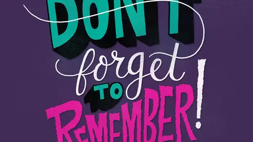
Lesson 2 from: Illustrative Stylings: Lettering and More with PhotoshopChris Piascik
How to Set Up
Lesson 2 from: Illustrative Stylings: Lettering and More with PhotoshopChris Piascik
Lessons
Class Introduction
01:42 2How to Set Up
04:20 3Letter Styles
07:21 4How to Start with Lettering Basic
04:37 5Create Style Through Shape & Word Connection
10:31 6How to Get Creative w/ Script Lettering
12:08 7Tighten Your Composition
17:00 8How to Work Hand Lettering Into an Existing Design
05:29Lesson Info
How to Set Up
So first we're gonna get into how to set up so I'm gonna be working on a welcome sinti ik you don't necessarily have to use ah synthetic you can use a regular welcome tablet or even any other tablet that you'd like to use. Um, I like to have mind set up as close to analog as possible, meaning that I spend most of my career working with just ah marker on paper and then I would scan in and then color and photo shop, so to make things more efficient, I switched over to a tablet and I've wanted it to feel its closest possible to the way he used to work. So, um, I'm gonna show you the stuff that I use this is my style is it's a regular welcome stylist? But I used their felt tip nibs, which you can buy severally they're not necessary they come with a plastic nearby just prefer the felt nibs because they feel closer to the markers that I used to draw with. I also use this ah, fancy little glove, which is kind of embarrassing, but I'm gonna show you guys how it works, so I use this glove right...
here the reason I use this is because when I'm doing longer lines, airstrips, lettering it allows me to slide smoothly across the glass screen if you may have ah maybe clammy or even moisturized hands like sometime my hands get a little little sweaty when I'm working it'll get hung up on the glass so this allows you to have a nice smooth um flow so I draw directly and photoshopped um what I like to mention is the fact that I use kind of the bare minimum of photo shop I try to make this as close to analog it's possible, so to get started I'm going to open up a new file I'd like to have my file pretty big um that way there is plenty of resolution so that we can see detail for zooming in and when you're doing lettering some lettering you might want to have some really tight detail a nice crisp clean lines so you want to have as much resolution as possible if you're working on us specific client project, he might have to use a certain size, but when you're just starting to play around with lettering and you don't have an idea, I would recommend something around this I'm going to go with twelve by twelve and three hundred d p I and you can choose rgb or seem like hey, if you're going to do this project for print, if you wanted to maybe print this out or if a client needed for print you two seem like a but if you were just gonna do it for the web rgb is fine I'm going to stick with our g b because I'm not planning on printing this and it will be a little closer toe what we'll see on the screen so if you're using a synthetic, you want to make sure your displays calibrated I'm noticing right here there's a little bit of a distance between where my pen is touching the screen and where it is so when I want to go ahead and calibrate that real quick so if you go into system preferences you can choose we come tablet and then calibration and she's calibrate so then you're just going to tap the center of these little targets anyone I just pay close attention so you get it is lined up as possible. All right, so now you can see there's not much of a difference between where my pen hits and the brush on the screen is so as I was saying I like to keep it as close to analog as possible so I used brushes that that look just like the way that I would work my hand so I used brushes by kyle t webster he makes some amazing brushes and we actually have an offer for you guys too get twenty percent off his russia's from his shop a creative market you can find a link in the bonus material there's a lot of really cool brushes that he has from pencils and thinking in watercolor. I most of my work is just drawing with. I don't really do anything that looks too painterly, so I basically just use his s ultimate sketching pencil, and I use some of his thinking brushes. They're all pretty good. Some of them just have a little more variety between six and thins, et cetera. So that's, basically my set up.
Class Materials
bonus material with purchase
Ratings and Reviews
user-3a9318
This was very interesting. It would probably be best for beginners. It's always nice to see process. I feel very confident about jumping into lettering now.
a Creativelive Student
Love this class. I would like to see more like this class.