Examples of Client Projects
Lesson 14 from: Illustrative Stylings: Lettering and More with PhotoshopChris Piascik
Examples of Client Projects
Lesson 14 from: Illustrative Stylings: Lettering and More with PhotoshopChris Piascik
Lesson Info
14. Examples of Client Projects
Lessons
Class Introduction
01:42 2How to Set Up
04:20 3Letter Styles
07:21 4How to Start with Lettering Basic
04:37 5Create Style Through Shape & Word Connection
10:31 6How to Get Creative w/ Script Lettering
12:08 7Tighten Your Composition
17:00 8How to Work Hand Lettering Into an Existing Design
05:29Lesson Info
Examples of Client Projects
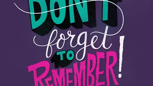
Okay, so now I'm going to show you some of my client projects that incorporate hand lettering in so that maybe you could see how a lot of these skills that we've talked about and that you've been practicing could be used in the real world so I briefly showed you guys this in the intro but this is some, um packaging I did for charlie's clinchers they're based in new zealand um but they really wanted him letter into the focus of their branding and give it a more, um approachable and friendly feel this is a campaign I worked on for a converse about how making your shoes your own and um they wanted a six word story so this one is kind of about me like a little artist syria's ad campaign where is like don't slow down and draw stuff every day and it's kind of important a mantra for me or it's just like tryingto keep up the work and keep drawing my favorite thing to do and it helps me get better keep working on cool projects so this is an example of some really drippy goopy letters I did this...
poster for converse rubber tracks poster siri's um this is ah concert poster for joey badass and um just wanted some kind of crazy monster illustrations and drippy type just seemed toe really flow and let it feel cohesive in the overall composition so one of the lettering to be part of everything and not just be an afterthought that got put on the illustration or it all to feel like one thing. Okay, um, so this is ahh magazine cover that I did for dig bmx magazine. Um, this was an awesome project for me because bmx has always been a big part of my life, and it was kind of like a dream project for me, so they just wanted all of the contents from the magazine to be brought together and kind of wrap around this sort of graph. And here you some texture on here to tie it in with the the grainy photo in the background. So this is a way that using texture on top of letter and could tied into an existing design. Okay, so this is a children's book cover that I recently worked on, um called I am drums as you can see the lettering again. It's part of the illustration in it. Um, I wanted to make it really fun and playful for kids to really jump out at you. So just really fun, playful lettering that looks like it's just coming out of this drum. This is a book I worked on for a chronicle called I love my bike, it's ah, a series of photographs of people all over the country and their bikes um there's really important to bring out the personality of each person so there's a little description about who they are and a quote so we decided that bringing in some hand lettering would make it feel more personal. So I hand letter to quote from each of them along with their photograph in their name which really added to the composition where it's not just like a photo and some text next to it it really kind of brought the information in the photo together in the personality from the person um so this is ahh backpage just going a little some hamlet hand lettering of the heart with the bikes and then a fun thing we did with all the lettering since I had illustrated everyone's name for the book as I put them all together and make a pattern for the fly sheets on the book. This is the campaign I worked on for j c penney where they just wanted it to have ah retro kind of seventies feel um so hand lettering kind of related back to the psychedelic posters from the sixties and seventies also added in some texture here to kind of make it feel more vintage and tying better with the we photograph um this is an album cover I did for mayer hawthorne this is super simple but it's just a little punch of letter and that kind of really emphasize this. So the name of the album this, how do you do? And having them on his signature glasses was a kind of fun little element. It was also ah, nice exercise and getting type toe work in a specific space as we did one of the other lessons. This is an illustration I did for rachel ray magazine. They wanted to have a chalk board feel. Um, this also plays in on texture and how you can work with that actually did this with the with the pencil brush that I use for all of the sketching in this class I did in white, I did it in black, and then I just inverted it. And when you invert the pencil color on black, it looks just like chalk. And then I use, um, chalkboard texture that I took photographs of total relate on top of that. So playing with texture and using these brushes is a really good way to get your digital work looking really analog. So that's the poster I did for a theater and alabama, they used quotes that related to a play to do a whole campaign for all there their shows for the year. So this is just super playful type popping out some letters, um, showing what's emphasize using punchy colors. They're more posters for a theater in new haven where they want in hartford actually, hartford, connecticut um and they wanted the title of a play to be the real focal point, so I tried playful ways to kind of bring the type in, um, this one was just fun to get to put a swear word on a poster, a funny story behind that is they originally wanted to use that actual word there, and I went through all the way through the process, and then at the end, we had to change it because they're like, I'm sorry we can't do it, and I didn't think they were gonna do it anyway. So for the understudy, I tried to keep it simple but also emphasizing the un an understudy. What about the person who is not actually the actor and that's, the main focal point? But this was another image for that j c penney campaign again, uh, kind of psychedelic letters that warp around each other using little texture to tie it in using a color palette that was taken from the photograph tried to take some colors from some of the clothing that their advertising another j c penney piece same overall feel an idea she's in color from the clothing to emphasize it, um, this series of ads I wanted to include because they're for ah, home development they build homes and it's not where you think hand lettering would show up, but it's just good to show that hand littering could be in any kind of field doesn't have to be very specific. Um the reason they wanted to use hand lettering is because they were advertising these set of homes based on the fact that they're very close proximity to a school, so they wanted it to feel more like a kid's book showing that, you know, it's close to school and, um, you know, and make it about the kids so there's that one this one they're all about the proximity to the school and wanting to have a children's book feel, but have the headline be the main focal point, so having really playful, hand drawn type incorporated with some subtle, illustrative elements was a good way to do that for them. This is cover for a rhode island monthly. They just wanted to have all the content illustrated on the cover. And, um, the issue is about secret gems in rhode island, so having all the type kind of wrapped around and mixed in with illustrations was kind of like a play on the hidden gems um, in a completely different area, um, this is illustrations from a children's book that I'm working on called the salty avocado and how lettering could he usedto emphasize the sound effects and you know how the type can wrap around the words and just you know different than a typical um children's book or the type of set on its own in the in a typeface this is more fun and playful another spread from that book um there's some packaging for coffee company they do these limited edition iced coffees fun working type into specific shapes and incorporating illustrative elements as well as we did in one of the other projects um this is an illustration for a bleacher report her had to incorporate an illustration and type and have them kind of feel to get um phil cohesive and then finally this was ah very large mural but I did for a design agency called think that they wanted to have keywords that relate to their studio and different treatments for the name think brought into it so you can see hand lettering can be worked into a huge variety of different kinds of projects that doesn't have to be one specific thing like only for t shirts or posters but it could be for housing development for mural could be for children's books it could be two straight advertising could be anywhere so hand lettering could be a benefit to any kind of project that you're working on. If you have any questions or want to find me on the internet, you can tweet me some questions at crispy asic. The name is spelled in the score, so you can look at that. Or you can find me on my website, which is crispy asic dot com. So, thank you. I hope this helps. And I hope you start playing with some illustrated lettering on your own.
Class Materials
bonus material with purchase
Ratings and Reviews
user-3a9318
This was very interesting. It would probably be best for beginners. It's always nice to see process. I feel very confident about jumping into lettering now.
a Creativelive Student
Love this class. I would like to see more like this class.