Lessons
Lesson Info
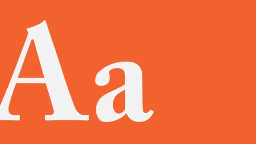
Styles: Visual Qualities of Text
So, this is really all about the visual. Language, it says stuff, but it also looks a particular way. And just like any kind of painting or drawing or sculpture or collage, it's visual stuff and it needs to be treated with the same kind of consideration as you would for the quality of line or the selection of graphical elements and forms within an image. So we'll look at that. So you have to think about the type as though it's a picture even though it also has to be read, but keeping in mind that every visual decision you make will also affect its readability. Sometimes that's a good thing and sometimes that's not a good thing. And then you have to be able to decide. Did this visual change, which made the text so much more interesting also cause the text not to be able to be read properly? And then you can't do that because there is no time, ever, that you can do something visual to text where the result is a loss of information or a loss of navigability because then you're taking away...
the purpose of the text. Then it's a painting. Hang it on the wall, don't ask people to read it. What you're generally after is something that is not only easy to read, but that is dynamically interesting in a visual way, is a composition, and where those two things balance each other out. And of course the further you get towards visual interest, the less passive the text becomes, the less straightforward, the more expressive it will be, but sometimes you just want the text to be clean and clear. So even in this very passive, almost minimally treated text, there's a little bit of contrast in size, there's contrast in weight, and also posture that separates pieces of information, the spacing is considered relative to the height of interline space or leading measurement. It's very simple. It's very beautiful. Thinking about the text in a visual way works in both directions, to both ends of the spectrum in terms of crafting it to be as comfortable and thoughtful as possible and also to be as dynamic and visual where the change in visual qualities may support the voice of the text, or the tone of it, or call out information, concepts that are important or speed up or slow down certain passages in the text. When we read we hear it, we speak it, in our heads and you get a sense for the author's voice because people don't always talk at the same speed over and over again and when they write they do not intend that it should be read at the same speed. Because sometimes somebody talks really fast and then they pause. For a second. And then maybe they'll be a little more contemplative in the rhythm that they're using. But perhaps some of the information is very, very precious and it's quiet. And other information is very evocative. Or loud. So the visual changes also create the perception of sound and time difference. You have to think about the text as interacting with imagery in the same way that the parts that are in that image are already interacting with each other. So the image here I've diagrammed as a configuration of angles and different kinds of light and dark distribution. And against that you can see kind of angle shapes that have been applied to the text and this sort of alignments against heavy verticals, alignments between text elements top to bottom, this kind of movement of the diagonal. The stepping that occurs in the cityscape is also evident in the stepping that occurs in the two words. There's also a detail to mass, or smaller to larger, background to foreground relationship that is expressed here. So the text here is perfectly legible, it's navigable, it has a clear hierarchy: you know what to read first, what to read second, and what to read third. And it also is part of that composition. It's not a separate entity. It's not foreign, it's not alien. Is the urban and the fire, is that the same typeface? It is the same type family, but this is the super-condensed light and this is the super-condensed medium weight. So when we talk about this visual quality, it's usually referred to as the typographic color and that just means, like we would say for example, that this poster, or this advertisement, is very typographically colorful even though it's in black and white. That just means that it's got a lot of lively contrast between type space and open space, between different levels of gray value, between very, very massive dark elements and small, rhythmic dark elements, detail and blast of color. These are studies of what happens with changes in weight that create color, changes in leading or interline space that darken or lighten, what happens when you tighten or open the letter spacing within a word and does it actually support or conflict with the actual sense of what the word is saying. The overall shaping: whether the text element expresses itself as a horizontal form, as a square form, or as a vertical form. And then whether or not different kinds of possibilities as a comparison will generate different kinds of impressions. What happens when you combine this kind of rhythmic change is that you get this kind of speeding up and slowing down of the language as you're reading it. So you're always after color. Those kinds of colors, that texture, is something that you can derive from the language itself, from the structure of it, that is applying visual changes to a part of speech like just the verbs and the noun so that you create a new kind of a reading order, an emphasis for important ideas within the text that you interpret the audience or the readers of that text might find useful or interesting to call out. It doesn't disturb the sequential reading of the text. You will of course read these four words first before anything else, followed by these and then after you've taken in that overall picture, your eye will go to the place where you expect to start reading which is usually the upper left-hand corner of the text shape. You can also think about the sound of words. Many words are descriptive. Adjectives in particular have kinds of feelings and sometimes sort of audible qualities to them. This is a couple of studies in which tinkling, crunching, and vrooming are expressed through the typographic form. You want to think about alignment relationships and again, this kind of relationship between where stuff is, where it starts and stops, and what is not there. That is, how elements align and the interplay between masses and voids. The void, in typography, is often said to be more important than what's in it. Is that it's the space that helps direct the eye, it's the space that allows the viewer to appreciate differences or similarities in shape. It's the space that allows you to compare an aligned edge and an unaligned edge, or ragged edge. It's the space that creates compression and opening, movement, energy, rhythm, and near-far perception. You'll find here a lot of alignment things going on where spaces replicate the mass, where there are alignments from internal elements that are really driving the bus, and sometimes unexpected uses of line details that will correspond to other kinds of elements like the baseline of the two. This upper edge corresponds to the baseline of the M. You're really always interested in trying to break apart the text in a way that will not only activate space and move the eye around the format in a way that's not passive, like meh where you have essentially a similarity in the vertical and horizontal areas of the format and the type is just sort of stuck in the corner. It's one mass, no difference in the information. It's just floating there. So that you get a much more complex rhythmic relationship, the opportunity to appreciate vertical elements in contrast to horizontal ones and where the breaking apart of the text actually supports the fact that there are different pieces of information. And that all comes down to the visual being verbal, that is, you are in command of the information as well as what the type looks like. So what you really want to do is be able to establish a hierarchy. When the reader, when the user, when the viewer comes to the design experience, to the text, they need to know what to look at first, and they need to know how elements relate to each other, and they need to know how to get from one place to another. And so usually really bold contrasts are a good way to go. Anything that's bigger and bolder than everything else is going to advance, is gonna confront you and that confrontation says, "I'm the most important thing "and then this other stuff in the background, "this other stuff in the background, not so important." But that doesn't necessarily mean that's the only strategy for creating a hierarchy. Changes in weight, creating emphasis and de-emphasis because of tightening and opening the widths of columns, creating alignment relationships between particular elements, changing gray value are all kinds of strategies you can use to differentiate the levels of information in a text and these are those. It's kind of a catalog of the basic changes. It's a lot of different kind of changes even though it doesn't seem like that and the effects of them, especially in combination, can be really powerful. In a weird way, stylistic relationship among elements is kind of important in establishing hierarchy and in establishing the text, in that if the stylistic combinations are too radically divergent from each other, even though the size and weight and positioning hierarchy or aspects of the text might be perfectly fine in terms of determining what's related to what, what's to be read first and second and so on, is that the fact of all these different kinds of details and movements and stroke proportions becomes very distracting and the text will actually seem to kind of disintegrate as kind of an idea. So that the hierarchy, even though in terms of proportion size, it might be perfectly useful is that there's so much stuff going on here that the hierarchy becomes almost obliterated. So here, maintaining generally the same kind of weight and size relationships, but now narrowing the selection of typefaces down to only a few, and bringing in details that correspond to each other, but still maintaining the same kind of idea, you're able to achieve the same sort of ideas of contrast or shaping and still be able to sort of navigate this text and feel like all the parts belong to each other. The sense of belonging of the parts also affects our perception of the hierarchy as something that's continuous, something that is crafted and built together at the same time. You always wanna sort of think about the scale difference between largest to smallest or boldest to lightest in a way that seems proportionally related to the space that it's in and to the amounts of information. Sometimes if you have a really extreme contrast, really big and bold and really small and light, there is also a kind of a disconnection between parts of information. So when you're dealing with something like an environmental kind of typographic experience like an exhibition or even a large poster, you wanna be sure that there's some connective tissue between biggest and boldest and smallest and lightest or most delicate, that there's a kind of a middle ground that acts as a kind of bridge between how present and how reserved some of the elements are. And last we can talk about the effect of color 'cause type and color is a marvelous thing to play with but it's dangerous as you can see here. Color affects hierarchy because all the relationships that we talked about in the last segment are brought to bear on the typographic elements in the background. This is an example of how easy it is to either use color to advance and support the hierarchy. This particular panel reads in the right order because of the degree of contrast between value, temperature, and saturation relative to the orange background and relative to the sizes of the individual elements. So even though these numbers are not set from left to right, you will read them: one, two, three, four, five. On the other hand, this shows you how easy it is for color to screw your hierarchy up royally because in that example, you will read that text: Five, two, three, four, one. Choose wisely. Test it out. So these are examples of some color for a website using an analogous palette, using lesser contrast and similarities or analogous temperatures in hues to group pieces of information together and also to pull information into the background so that other information with greater contrast, here an extreme difference in temperature against the background allows this element to pop out. You can also use color to code information. Here there's a kind of a navigational bar where pieces of information that are listed here, this is a book about a journey through New York City, and this is a kind of a timestamp, this is a schedule. So as you're turning the pages and you go from first time period to next time period, is that the color grays out so that you know that you've been there, almost like a used web link. And then the color for that thing is actually applied then to the text so what this text says, the experience that it's relating is occurring at that time. And last, color can be a really amazing thing to use in typography. Type doesn't always have to be black and white or gray. I think people are afraid of using color in type just for the reasons I talked about is that it is very dangerous but it can be a very beautiful thing. And it's so refreshing to see type in color in an ocean of black-and-white text. This is a webpage for a symphony with their seasonal schedule. This is actually the scroll area, the live area of the browser so the entire page scrolls and you get this kind of change in color relationships as it does that. This is the entire page from top to bottom. Or most of it, there's more down here but that's all I could fit. So in each case using value, strong value contrast and lesser value contrast to create separation between foreground and background, creating kind of individual palettes for each area, overall kind of warm-ish, overall kind of cool, and then alternating between those. Creates this very, very dynamic almost musical sort of experience, but on a visual level. It's sort of like synesthesia. It's a condition where, condition? A facility where people can see sounds and hear feelings, tactile sensations, hear touch and so on, so the senses kind of crossfire. So that was the goal to generate a kind of musical vibration out of the color and it's a wonderful thing to be able to work with. Try type in color next time you work on a project. And that brings us to the end of that.
Ratings and Reviews
athina k.
Great class! The lecturer was so descriptive...to detail...and at the same time so relaxed and funny. I loved him and understood better things that i' ve heard before, but never cared that much to paid attention to...!
Deb Green
Excellent! I will never look at typeface and daily examples of typography design the same way again! Brilliant teacher who animates the 'deliciousness of an optimal text setting experience' in such a hilarious and engaging manner.
Brenda
Wonderful class. I have a much better understanding of how to use text in my work. I will be revisiting this class, I am sure! Highly recommend it.
Student Work
Related Classes
Design Projects