Lessons
Lesson Info
Color as Meaning
Up until now we've been talking mostly about the optical qualities of color, how to create a compelling experience and how to make it look nice, but we can also talk about using color for meaning. So you can use color to code things, like different kinds of, different versions or variations of a product in a line of products, like different flavors, different scents, different functionalities, shampoo versus conditioner versus moisturizer, or exfoliant versus, you know, something else. And you can also color code sort of different product ranges, as is happening here in these brochure covers for a home builder, kind of a design build company that produces custom homes, but sort of geared towards different sorts of styles, in which the blueness is being associated with French and the red terra cottaness is being associated with Mediterranean, but the same colors are being used in both pieces, just at different levels of intensity. Color comes with associated psychological responses that...
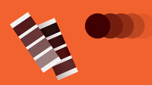
people have an emotional response to color, which is very much wrapped up in one's culture, specific cultural background, and also in personal experience. While there are some baseline sort of general and relatively reliable assumptions you can make about how people will respond emotionally to color, it's really a kind of a dangerous game to play, because between the color, the culture of the specific audience you're talking to as well as their own personal experiences, sometimes that color psychology is likely to shift a little bit aside from this. But here's a kind of a selection of, you know, the sort of the basic primary, secondary, and tertiary hues, as well as the neutrals and black and white, with some description of sort of generally the cultural associations of those colors in the Western world. And here's just a kind of an example of sort of two examples where you can see some of the color ideas, the psychology being sort of brought to bear, one for an album cover, actually, they're both album covers. No, one's an album cover and the other one is a brochure for a hotel, where the mood of each piece is so radically different, primarily because the color psychology in effect. Color can affect our perception of language. So when you apply color to type, it will change the meaning. Sometimes using sort of intuitively the opposite color of the intended verbal or conceptual effect can be very, very powerful, as in the case here where the word quiet, or the idea of quiet, the perception of quietness, actually increases by setting the type in an intense and very dark value, orange. Color has associations that are kind of universal. If I were to ask you which one of these dots is the earth and which one is the sun, I'm sure you would all give me the same answer, without any question. You have to be careful about how you apply color or how you alter the color of elements in photography, especially when the photography is presenting food or people, because color, some color shifts, especially towards the green range, will cause food to look rotten or people to look sick, sickly, or dead. And last, you know, culture assigns meanings to color for us. We encounter colors in a context of different kinds of experiences, and so very often there are conventions that a designer has to be aware of with regard to what kinds of colors or palettes that you're looking at when they're trying to communicate on behalf of a client in a particular industry or they're trying to evoke a particular time period or particular cultural area in the world, or if they're talking about a particular kind of product area in particular. So here's a kind of a sort of a set of palettes that are really just kind of distillations of colors that are most commonly found in communications for particular kinds of, in particular kinds of contexts. So, for example, moods are here. Refreshing, artificial, organic, and elegant and romantic and comical and friendly and urban. Here we have a split. Here are cultural regions, sort of Africa, South America, the Middle East, and Japan, versus seasons, spring, summer, autumn, and winter. Here we have time periods and art movements, from art nouveau to the swinging '60s to new age millennials, teens versus young or mature adults, and then a variety of industries, men's grooming, women's luxury apparel, pharmaceuticals, automotive, electronics and gaming, traditional bath accessories, and so on. And if you were to do a kind of a comprehensive survey, yes, you would find some variation within that field, but for the most part, if you were to put the branding elements or the advertising or the websites of, you know, 50 or 100 companies within this particular sector of that industry, you would notice that they would pretty much all have the same color feeling, within reason. So the convention can be very, very useful so that you are sure that you're using color an appropriate way that will resonate with the audience in a way that they kind of expect, but it can also be dangerous and a little bit limiting, because if the color palette does actually respect that convention too closely, it may be likely that the communication will kind of get lost in the competition. So sometimes fighting against that convention by going for orange in a bath environment or for bath products could be an interesting possibility. But, you know, with every kind of change or any kind of attempt to break a rule, if you will, you're gonna gain something and you're gonna sacrifice something, and you have to be kinda certain what it is that you're gaining is actually more valuable than what you're losing. So color can be really, really profound in terms of adding additional meaning to form and image elements for typography and for overall optical experience.
Ratings and Reviews
fbuser 2574504b
This class is totally on trend. I can see it being VERY popular. CreativeLive obviously loves him & his (awesome) topics, as his classes are often available for limited time (for free). Speaker is well versed/uber knowledgeable on the subject/techniques; obviously very passionate & a creative/visionary. I would suggest for him on future verbal teachings, to work on the elimination of the verbal tick of saying "uhh" so very often. Otherwise, A++++. Thank you.
Gary Harding
I've studied color in various ways (for both graphics and painting) for 15 years and I can recognize this is really good information. That said, it's only a high-level overview; it's not meant to teach you everything you know, but rather cover the highlights only of color theory. It's still a good class. Timothy is a great lecturer, but this is not a hands-on deep dive, which would take hours, if not days.
Øyvind Hermans
Precise, clear and interesting course. The course gave me the insight I was looking for, I love it.
Student Work
Related Classes
Design Projects