Lessons
Class Introduction
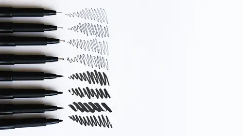
06:19 2Demo: Pen Tools
06:15 3Demo: Pen Tools & Paper Surfaces
09:56 4Demo: Scratch Tools on Scratch Board
17:53 5Demo: Color Pen & Marker Tools
06:44 6Demo: Surfaces for Colored Pens and Markers
09:36 7Demo: Marker Tonality
06:28 8Demo: Build Color With Pens & Markers
10:57Lesson Info
Demo: Marker Tonality
Here I have two sort of tests that I wanted to do with creating a ball and a cube with the marker. And basically what I was trying to test is two ways that one uses marker. One, which is sort of creating a smooth tone and the other where I'm trying to use line work. And both ways are valid but I wanted you to see how it looks. I also did a little tests here with the Faber-Castell Brush Pen and the Pasco to see how it worked on the surface. This particular pen, the Pasco, works really, really well if you leave it alone. If you try to rub too many other colors on top of it, it reacts and pills up the paper. So this is really not meant to be, I would use it like, for example, over here. I'm gonna use it as a flat, clean tone on the surface. I'm not going to try to blend it with another color. So for flat color, these are just gorgeous. Once they're dry, you can also do marks on top it, not while it's wet. So it's a really gorgeous pen. But you have to know what the limitations of these to...
ols and what they will and won't do. And that's where I'm sharing these, just talking about the brands because they really are very, very different. So I created a tonality on this side of the cube with the Faber-Castell Brush Pen and this is the Pasco. And I'm doing this because I want this to be opaque and I want it to be a little lighter pink. (pen brushing) And I think that it's a pretty effective tone, I'm trying to keep the tone pretty consistent because I think that that's going to look nice on this surface. But I'm gonna try to build this with maybe line and color. And my goal when I work on these, the cube or the sphere is to try to make something look like it has a form, light and shadow. And that's just a basic thing in art. You want to start with observation, you want to start with making things look perhaps more dimensional or real. But then certainly from there stylizing your work, using this for black shapes of color, using it for making comics or what have you, against an edge of a line. I haven't really talked as much about that or demoed but basically when you think about how line will work and what the color will look like next to it, you want those two things to combine really beautifully. So that's another thing to consider is what's working well together and you almost can't go wrong with any of these materials, as long as you're keeping the line clean and separate from the color and the interior. Try not to run these markers over the black line. There is a possibility of smearing or with the Copic pens, you're gonna block that line right out. So my recommendation is keep those two things a little bit separate. Now let's see, we have white. This is again the Pasco Marker. (pen brushing) It has a little bit of blue in it. I don't know, I might even use that for something else. I'm going to use, it's too dark, I'm gonna look for a super light pink tonality for this light side. So I'm using several different tools to accomplish my task here. Now that's too fine, I want something that's a little bit fatter. So I'm gonna choose, maybe this pen. Yeah, that's the one. And this is a super transparent, this is the Copic Marker. Super transparent color. I can see right through to what's underneath. Now this is a zowy color. What do you think, Hannah? Do you like this color? Beautiful. So this how, I've used three different markers, but I'm treating them all very similarly in that I'm trying not to show the streak of the marker. I'm trying to make a really solid tone. And as I go over it, you can see that the line of this marker disappears as I brush right over it. So it's quite a beautiful, this is the Copic. The Copics are really nice for creating a gentle, flat tone. And as I build on top of it, it actually makes it pinker and more vibrant and reddish. So this is a really nice color. It also shifts color a little bit as it dries. It's very much like watercolor in that way. Some people actually think about markers kind of like watercolor but contained in a pen. And I can see why people would think that because it's a very transparent medium, except for the Pasco Markers, which are opaque. So it can be used kind of like watercolor. I'm trying to again, I'm trying not to show the mark of this marker. Here I want to show strings of color the way I tend to work with the markers here. I'm trying to use it like a flat paintbrush. And I'm turning, I'm beveling this, which means I'm turning this on its side to get the maximum surface area of this marker. That's pretty yummy. But you can see, look how red it is. And you can see what dries a deeper tone. Again, I'm not sure that's visible from the camera, but it starts out really almost orangy tone and then it dries in the paper sort of pink tone. So this is a complete little cube. I have three different pens. I used the Faber-Castell for the darkish shadow. I used the Copic Marker for the middle. And then I used the, excuse me the Pasco Marker for the middle tonality. And then I used the Copic for the lightest. And I just tested to see which one was the darker and lighter value. That's all I need to make sure they would all work together as a single color, but also the value range was there. So I tested down here and on the side. And you can do the same.
Class Materials
Bonus Materials with Purchase
Ratings and Reviews
Donna K. Fitch
A great overview class for those who know nothing of the variety of pens, markers and papers available. Mary Jane is an accomplished teacher, and I look forward to putting her teaching in action.
Student Work
Related Classes
Illustration