Demo: Charcoal & Chalk on Colored Paper
Lesson 9 from: Getting Started with Charcoal & ChalksMary Jane Begin
Demo: Charcoal & Chalk on Colored Paper
Lesson 9 from: Getting Started with Charcoal & ChalksMary Jane Begin
Lesson Info
9. Demo: Charcoal & Chalk on Colored Paper
Lessons
Class Introduction
06:11 2Types of Charcoals
07:44 3Demo: Stumps for Charcoal
05:48 4Demo: Erasers to Create Lines in Charcoal
05:48 5Demo: Add Chalk to Charcoal
06:10 6Surfaces for Charcoals & Chalks
11:42 7Demo: Tonality on Spray Fixed Surface
07:01 8Demo: Pull Pigment From Non Spray Fixed Surface
06:22Lesson Info
Demo: Charcoal & Chalk on Colored Paper
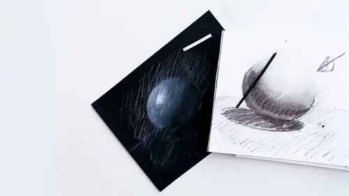
The final one I would like to do is work on the cube. And again, I'm gonna wash my hands so they're fresh and clean. And this is a really different kind of surface because it's vibrant. You know, it's brighter than the colors that my students worked on, and it's certainly brighter than the surface here, so it's gonna create a more interesting mark. Because it's a cube, again, I like to match the tool shape to what I'm drawing, and here, I'm going to use my square tipped tool. And you can see, I'm actually gonna turn this this way. You can see that there's a lot of texture to the surface. It's not this, this doesn't really have texture at all. It's the surface of the actual paper itself, and this is Canson paper. It's pastel paper, but pastels and charcoals are really similar. They're pigment compressed together into stick form, or pencil form. Now again, I can leave this really grainy like this, which is kind of fun. I might just do it. My compunction, of course, is to put my fingers o...
n there, but I'm gonna try to resist and use my pencils to get into the corners of this. And I just want you to see that there's a variation. I have something I have to erase right here. There's a variation of the types of marks you can make, from the super smooth, the linear kind of line work, or the really textural sort of tone that you can get when you just let the pastel, excuse me, the charcoal pencil or the charcoal stick sit on the surface. Now, you see that I'm not grabbing that vine charcoal, and the reason is is because it has a pretty limited use. It's fabulous in the classroom for quick studies on newsprint, but beyond that, it's such a light tone, there's so little range of value that I'm not a huge fan for, you know, finished kinds of work, what I'm doing here. (pencil squeaking) Hear that sound? (imitates squeaking) (laughs) Again, I have students who are like, don't make me use a pencil on a paper like that! This, you know, the pencil itself makes that sound and there's no way of getting around it. The harder you press, the louder the sound. So, if you try it and you're like, I can't bear that sound, use the stick, or work on a surface that's not quite so toothy. So, we're imagining that this cube is, and you can see I'm using little circling marks to get into the little crevices to make sure it's a more even tonality. I'm going to imagine this is like stone. Moon and stone here. Now, this is maybe the dark side of this cube. I'm going to erase out where I kind of waddled out of my lines. Okay, and then I'm going to try to create a cube that has three different sides, all as if they're lit by, you know, a light source where this is probably the most shadowy side. And again, I wanna try to fill in those little blanks there. The pencil is a more refined tool. I can get noodley into these spots. Okay. Now, what I can do is to graze across the top of this to create a lighter tonality, and I can use a different kind of directional mark. Now, some people will try to make all of their marks very, very, everything should be a circular mark, everything should be... Well, the only problem with that is if you're always going in the same direction with every mark and every mark is the same size, it gets really boring. So, I'm of the mind you should kind of mix it up and play with different directions, different kinds of marks. Just make sure, you know, it's cohesive. You want it to all work together, you don't want it to look like, you know, it's a mishmash, but you also want some variation on a theme. So, I'm trying to keep the weight of my hand pretty consistent. I'm gonna go in a different direction to get this tonality down, and then I'm gonna pull the chalk into this story. I'm gonna try to keep it as textural as possible. The second that I start to push too hard on this, the more it gets a little darker, and I'm going to sharpen this pencil and hope I don't break it. Charcoal breaks really easily, and of course, because I don't want it to, the tendency to break, oh, it didn't break! All right. So, this is... I'm gonna do a few more swirls so it connects a little bit more to this side here, then I'm gonna use my chalk. So, again, you know, it has a really different feel by comparison to these two because I have not rubbed the color into the surface. All that I've done is try to use the texture of the paper and the texture of the tool to create my tonality. So, I'll try to use here... And I might wanna make a little clean edge, eraser here. Let's imagine maybe it's like a metal box. Now, I'm gonna use... I'll just get in this one. I'm going to use chalk to talk about this side here. I'm not gonna use the pencil initially because the sound is quite unpleasant, but I am going to use, and look at that white, how it reacts to the orange. Oh my gosh. I'm pressing this in pretty hard and I'm trying to let it sit on the surface. Hold on a second while I erase this. Again, charcoal, like pencil, is pretty forgiving. And I think I might add a little bit of blackness to this, a little bit, because I feel like I want this to be kind of a gray box rather than... I might just use my finger a little for this. A little bit more, so what I'm gonna do is add a little bit of grayness, and then I'm gonna use this tool to kind of stir it around. And there's a color reaction actually happening with this gray and this orange. Can you see it, Kenna? Would you be able to describe what that color is that it looks to your eye? It's white mixed with black. What's it look like as, if you could guess, a color? Like a pewter? Yeah, it's pewter, it's kinda like metally green gray. Yep, that's exactly right. There's a lot of powder sitting on this surface. I have this strong desire to rub this in, but I'm not gonna do it because I want you to see variation, but that's my own obsession, like I love smooth transitions. But I want you to see the crispness of this mark and the texture of this mark, and I'm going to fight my instincts for wanting to make this more modeled, the way the ball is 'cause I'm trying to instruct you. But like I said, we all have our weird obsessions about what just feels right and feels good, and that definitely would be mine. Okay, I'm gonna blow it, but I'm gonna blow it away from the black. Try not to breathe in. Yeah, that, you could see why it's not something you'd wanna be breathing in all the time. It's dust, and it's not just dust, it's part of the pigment. Okay, so this is the more textured side. I'm just gonna bring this right along this edge here. And this one's just about ready here. So, one of the things, you know, I'm trying to resist doing is rubbing it in, but I also feel like, to integrate this, I would have a tendency to want to bring a little bit of this color on this, because I feel like there's too much of a separation between this white now and these two tones, but I'm not gonna rub it. I'm just gonna graze this across the surface and leave that texture, but let it be a kind of gray tone instead of a really black tone. And it almost looks blue-gray. Can you see that? It's like a grayish sort of, but it's almost green. It's really vibrating, at least closeup for me, it's really vibrating against that orange, and that is not a bad thing, I think it's a really good thing. It's reacting to the ground. Yeah, for me, that feels a little more integrated, and that's, again, you know, I can't know that till I see it and say, well, I thought this would work, but I'm gonna try this to make it work a little better, and that's part of art, you know? You're always reassessing what you have. Is it good, is it not good? Okay. And then I kind of wanted this edge right here to be like a stronger edge. I'm using the edge of the tool to go right along the edge of that box. Sort of blending the black that's under there with my chalk tool, and then getting rid of that little black line back there. Now, I still feel like, okay, that's working much better. It almost looks like that pewter metal cube that Kenna mentioned, which is kind of cool. And I'm trying to get rid of the orange underneath so it's consistent tonality. But I do feel like now this doesn't integrate. Okay, that's not working out. So, what I'm gonna do, I'm gonna graze very lightly this chalk on top. If I go too heavily, it'll match that tonality and it won't look like a cube because this and this will be the same tone. So, all that I'm doing is dragging this, I'm not using a pencil, I'm using the chalk because it's a larger surface and I'm dragging across this as gently as I can, as lightly as I can. I'm gonna shift to a circle kind of mark marking and it should integrate pretty well. I'm also using what's called varied quantities of opacity. Very opaque, semi-opaque, almost transparent. Okay. So, this starts to take a form, I think that bears a relationship to what I've done before but has a different kind of mark making system. And you can see, this did not take very long. This is a pretty quick exercise. This is a very immediate kind of medium. It's not labor-intensive like oils can be or acrylics can be, or even colored pencil. This is really, it's meant to be a fast medium and immediate medium and that's why it's often used for preliminary studies but charcoals can also be beautiful for finishes, particularly on like super nice paper. Okay, so I think this is almost ready to go. So Kenna, did we have any further questions from our audience or questions you have? We did have a question that came in from Ryan who was wondering if the cube in the sample were casting a shadow, how dark would you want that shadow to be? What would you do in that scenario? So, we can try to test it right here and see what kind of shadow. Now, that's where I probably would leave the texture really soft for a shadow shape. But we, first of all, would know we have to figure out where the shadow is. And when I look at this, you know, I can see that the light must be hitting in this direction so it's gonna tend to cast a shadow this way. You know, if you think logically where is it gonna fall. It might go further back that way, but I'm just gonna assume the light is hitting in this direction and it's casting a shadow over here. So, the question again from Ryan is... How dark would that be? Would a shadow be relative to kind of what you have going on there? Okay. So, I would have a tendency to think that the shadow is really dependent on how bright the light is. And this light looks fairly bright, shadow is gonna be darkest closest to the object and the further away from the object the lighter the shadow. So I'm gonna graze deeply as I get close a little further. I'm not gonna make the shadow so much darker than the cube itself because it doesn't make sense to me. It's going to cast a shadow but it isn't necessarily gonna be a lot darker than the object, just a little bit darker than the object. I'm also gonna try to make it really smooth and I'm gonna use the white, I mean the tone of the paper to help define that and I can lighten up. To me, that shadow looks too dark and the reason it might look too dark is because it's so much darker and blacker than the object itself. Now, does that mean I'm gonna add white? Nope, I don't wanna add white because the white, it's defining the light. And if the white is defining the light, there wouldn't be much light in the shadow. There might be a little reflective light, there's not gonna be that much. So, I'm just going to and I might even, oh, what did I just do? Oops. My tendencies are strong, too. Smooth things out. So, I'm just gonna cast this back in here, a little shadow shape. I think what I'm going to do is maybe pull up with my kneaded eraser some of this shadow because it's extended further beyond the shape of this cube. So, I'm gonna keep it angled maybe a little this way. And you're gonna notice that it's a lot darker closest to the form. I'm using the paper to kind of keep this fairly light and lighten it as I move further away from the object. So, the question of it being like how dark should it be? Generally speaking, the shadow's gonna be one of the darkest things, unless there's a lot of reflected light from some other area. If it's one strong direct light, the shadow will be likely the darkest thing in the piece. If there's reflected light, it's gonna be a little bit lighter. So, I'm trying to keep it darker than the cube itself in any way, but not ridiculously that much darker than it becomes, you know, this black shape against this gray sort of box. I think I feel like I'm gonna lighten it just a little bit more. I want it to be darker, but I don't want it to be quite so dark. It's also the shadow is somewhat transparent by comparison to... The cube is all a lot of opaque colors, so there's a variation, too. So, you can see, I'm sort of lightly grazing my kneaded eraser 'cause I don't wanna strong mark, I just wanna a little light pulling off of tonality for that shadow shape. I want that shadow shape to feel accurate. One thing that's bugging me is that it looks like it's floating because the edge of this box should have a very dark tone to it because if it's sitting on a surface it would also have a little bit of shadow if we're thinking about this dimensionally. A little bit of shadow underneath the box itself, if it's literally sitting on the surface. So let's just draw it in there and this is where I'll a stomp, my finger is much too big to fit into this little area. We use the stomp for that. And Ryan, this is where you're gonna have a really dark shadow, too because there's not much light underneath the object and the object is blocking the light. I might even use the stomp to kind of integrate this color over here and I'm grazing it very, very lightly. So, the darkest tone is going to be your shadow. It's not going to be as dark as, say, that. It's gonna use some of the tone of the paper and it's gonna gradate from the darkest dark to a lighter tonality as that shadow moves away from the form. If we were working in color, some of the color of the object itself would land in the shadow and that's kind of a trick of color that a lot of people don't seem to realize. There, that looks fairly, it looks like it's kind of sitting on that surface. I hope that answered Ryan's question in a long-winded way. Absolutely, thank you for doing that. All right, well, any final words about our chalks and charcoals? Well, basically I wanna say that, you know, I love this medium because it's immediate, because it's malleable, because it's not expensive to enter the zone. None of these materials are very expensive and you can even use just bristle paper, you don't have to get the more expensive Canson papers to make this work. The fixative is great because it holds the tone on the paper. I personally like value range as color black graze whites to create an image. I think that there's so much too black and white work in photography, in illustration, in painting. So, I love it as an entry point for people who are a little nervous about using color. This is a great set of materials to use because you're not really dealing with color, you're dealing with black and white unless you work on a toned paper and it's already there for you. So, I think the immediacy makes it a fun material. Yes, you do get your hands dirty and there's no real way around that unless you wear rubber gloves which I can't imagine, but some people do. So, I would encourage all of you to test this. It doesn't cost much as an entry point to see if you like it. And if you do like it, you can expand to get more varieties of stomps, try it on the color toned paper, use your erasers, see if you like that. But that's what I have to say about chalks and charcoal.
Class Materials
Bonus Materials with Purchase
Ratings and Reviews
Student Work
Related Classes
Illustration