Lessons
Class Introduction
19:06 2Storytelling & Ideas
27:34 3Universal Symbols in Stories
03:19 4Create Interactive Characters
02:16 5The Story is in The Details
04:13 6Giving Your Audience Feelings
05:49 7Guided Daydream Exercise
04:20 8Elements of Imagery
02:19The Death Scenario
01:47 10Associations with Objects
03:01 11Three Writing Exercises
06:39 12Connection Through Art
30:35 13Break Through Imposter Syndrome
07:40 14Layering Inspiration
23:13 15Creating an Original Narrative
07:42 16Analyze an Image
04:12 17Translate Emotion into Images
04:31 18Finding Parts in Images
06:02 19Finding Your Target Audience
04:05 20Where Do You Want Your Images to Live?
12:01 21Create a Series That Targets Your Audience
32:43 22Formatting Your Work
06:08 23Additional Materials to Attract Clients
07:24 24Which Social Media Platforms Will be Useful?
04:17 25How to Make Money from Your Target Audience
11:27 26Circle of Focus
07:55 27The Pillars of Branding
06:18 28Planning Your Photoshoot
09:05 29Choose Every Element for The Series
07:38 30Write a Descriptive Paragraph
09:37 31Sketch Your Ideas
17:27 32Choose Your Gear
02:50 33How to Utilize Costumes, Props & Locations
26:18 34What Tells a Story in a Series?
13:06 35Set Design Overview
01:43 36Color Theory
19:50 37Lighting for the Scene
12:05 38Props, Wardrobe & Time Period for Set Design
06:00 39Locations
04:31 40Subject Within the Scene
07:26 41Set Design Arrangement
05:46 42Fine Art Compositing
03:46 43Plan The Composite Before Shooting
10:29 44Checklist for Composite Shooting
18:52 45Analyze Composite Mistakes
12:11 46Shoot: Black Backdrop for White Clothing
10:42 47Shoot: Black Backdrop for Color Clothing
08:36 48Shoot: Black Backdrop for Accessories
08:17 49Shoot: Miniature Scene
09:59 50Editing Workflow Overview
01:57 51Add Fabric to Make a Big Dress
08:35 52Edit Details of Images
08:09 53Add Smoke & Texture
10:47 54Blend Multiple Images Into One Composite
24:58 55Put Subject Into a Miniature Scenario
17:55 56Location Scouting & Test Photoshoot
22:10 57Self Portrait Test Shoots
22:30 58Shoot for Edit
04:21 59Shoot Extra Stock Images
10:01 60Practice the Shoot
25:07 61Introduction to Shooting Photo Series
03:33 62Shoot: Vine Image
10:40 63Shoot: Sand Image
09:50 64Shoot: End Table Image
04:59 65Shoot: Bed Image
06:18 66Shoot: Wall Paper Image
05:54 67Shoot: Chair Image
08:02 68Shoot: Mirror Image
06:57 69Shoot: Moss Image
05:48 70Shoot: Tree Image
07:33 71Shoot: Fish Tank Image
04:09 72Shoot: Feather Image
09:00 73View Photo Series for Cohesion & Advanced Compositing
07:35 74Edit Multiple Images to Show Cohesion
36:55 75Edit Images with Advanced Compositing
29:33 76Decide How to Start the Composite
09:35 77Organize Final Images
21:37 78Choosing Images for Your Portfolio
08:19 79Order the Images in Your Portfolio
16:28 80Why do Some Images Sell More Than Others?
16:03 81Analyze Student Portfolio Image Order
11:42 82Framing, Sizing, Editioning & Pricing
02:19 83Determine Sizes for Prints
16:44 84How to Choose Paper
13:56 85How to Choose Editions
07:18 86Pricing Strategies
18:59 87How to Present Your Images
13:26 88Example Pricing Exercise
09:39 89Print Examples
08:23 90Licensing, Commissions & Contracts
04:44 91How to Keep Licensing Organized
06:07 92How to Prepare Files for Licensing
07:28 93Pricing Your Licensed Images
12:33 94Contract Terms for Licensing
12:07 95Where to Sell Images
04:55 96Commission Pricing Structure
08:23 97Contract for Commissions
12:17 98Questions for a Commission Shoot
08:45 99Working with Galleries
08:58 100Benefits of Galleries
07:39 101Contracts for Galleries
10:32 102How to Find Galleries
05:22 103Choose Images to Show
08:53 104Hanging the Images
03:38 105Importance of Proofing Prints
08:04 106Interview with Soren Christensen Gallery
21:59 107Press Package Overview
04:35 108Artist Statement for Your Series
18:20 109Write Your 'About Me' Page
09:04 110Importance of Your Headshot
03:55 111Create a Leave Behind & Elevator Pitch
20:19 112Writing For Fine Art
04:44 113Define Your Writing Style
14:49 114Find Your Genre
06:41 115What Sets You Apart?
02:25 116Write to Different Audiences
05:10 117Write for Blogging
39:57 118Speak About Your Work
14:21 119Branding for Video
07:37 120Clearly Define Video Talking Points
14:27 121Types of Video Content
31:45 122Interview Practice
13:22 123Diversifying Social Media Content
22:32 124Create an Intentional Social Media Persona
24:48 125Monetize Your Social Media Presence
18:46 126Social Media Posting Plan
04:01 127Choose Networks to Use & Invest
02:57 128Presentation of Final Images
19:13 129Printing Your Series
09:16 130How to Work With a Print Lab
13:39 131Proofing Your Prints
10:11 132Bad Vs. Good Prints
03:32 133Find Confidence to Print
10:50 134Why Critique?
06:55 135Critiquing Your Own Portfolio
10:39 136Critique of Brooke's Series
16:18 137Critique of Student Series
40:07 138Yours is a Story Worth Telling
02:09Lesson Info
Critique of Brooke's Series
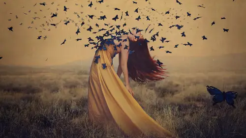
This is my series that we have taken a look at in print, and the reason why I'm bringing this up is because I started this journey with all of you guys going through this class start to finish. I came up with a series idea, photographed the series, edited it, printed it, and here we are. Now, aside from the fact that I already printed it, which hurts a little bit since I'm about to get critiqued by you guys, what I wanna know is what your critique would be. If I were to bring these prints in to you and set them down in front of you, and I'd paid for a critique, so just imagine you've got my money in your pocket now. And you have 15 minutes to tell me what I should do differently or what I did right. What are you gonna say? So we're gonna look through these one by one, and as we do, you guys are forming your opinions, good and bad, please. Well, you don't have to say good things, but certainly say bad things. So here they are one by one, just so that we can look. And I'll critique this ...
as well, because it's important that we know how to critique ourselves. And I'm actually just gonna refer to my checklist here, 'cause that's nice and handy. So I have a checklist based on color cohesion, lighting, compositional cohesion, character interaction, location choices, wardrobe, time period, technique, depth of concept, flow of images, things like that. So we've got the first one, and I'm just gonna zoom through so that we can see very quickly all of the images in the series. Okay, I'll go back to the beginning. And there are certain images that stand out to me. Certain images that I like better than others immediately. And it's very hard to separate yourself from if it's because I was there on set and I had such a good time or if it's because I'm really being objective. I love this sand picture. It's one of the favorites from the series. Let's see, another favorite is this one with the vines. And finally, I have a lot of love for my fish tank there. And those are some of my personal favorites from the series. Now if I had to pick out the ones that I think are weaker, I would probably end up saying let's see if we've got the mirror. The mirror image is a little bit lacking to me because of the pose. So if I had to say what was wrong with this image, I think the pose is just too stiff. I think that it didn't quite have the right feeling. She doesn't really look like she's about to run into this painting or anything like that. So this one falls short because of the pose. Too stiff for me. Let's see, I do like the feather. And I think the bed one is the other one that doesn't quite sit right with me simply because it doesn't flow through the series as well as the others do in my opinion. So those are the two that I would pick out as being maybe slightly weaker. And you guys might strongly disagree. Now I don't want to take all of your words away from you and critique myself too much in case you're thinking any of the same things. So who wants to start with my critique? I've just paid you a lot of money, so you better give it good, okay. This is neither a good or a bad thing. It's just an observation. Great. As somebody who's been following your work basically from the beginning, I think that some images are very similar to some of your past images, just in pose or in environment. And that could be good or bad. I agree. That's a really, really good point. And it's very interesting for someone to critique you who knows your work previously. That's a very, very interesting point to make because I do have a tendency to rely on what's going to work, what's going to be easy. And I completely agree with that. And I can easily pick out the ones that I feel are a little too similar to what I've done before. Okay, who else? Mine was more of a question. Yeah. If you could elaborate on the choice of purple. Yes, the choice of purple. Okay, specifically in the one with these vines? Yeah, okay, so why did I choose purple? And this is really good, because when you're in a critique situation, it's very likely that the critiquer would ask you questions like this. Why did you do this? What was this choice for? How come this and not this? And so it's good that you asked me, because it gives me a chance to explain. It might change your mind. This one won't, but it might. And it gives the person who's reviewing a chance to just see how my brain works and where I might be coming from. So why did I choose purple? The short answer and the terrible answer that I would probably never actually give someone who is critiquing me is that I didn't like the color green. Bad answer, right? Because that shows that I did not have any forethought about this. It shows that I didn't have a good conceptual reason, right. So I could make something up, which I wouldn't also do, but I could say, oh, well, I felt like we moved from something green into something more fantastical from one to the next. And then you might be like, oh, yeah, I can see that. Yeah, maybe, I don't know. (laughter) Okay, so the real reason is that I didn't like the color green that I captured. I felt like it just looked too realistic, and that picture was too boring because of it. But when I turned it purple, I felt like it looked more fantastical. And that just attracted me more as a single image. Now does that work from one to the next? Not necessarily. Also when I originally edited these images, this picture with the mirror that we used was all purple, and it matched that image really well. So there was that cohesion. I then at the last minute changed these colors, as you guys know 'cause we talked a couple weeks ago. And that left that as the only purple one. So, is that something I should change? Probably. I would argue that no, no, no, it was good. It was a really good thing to point out. I would argue that that image doesn't quite flow through the series like the others do. There's something a little bit more simple about it, something a little bit more almost fashion-y about it in a way. And it doesn't have the same color palette. So I appreciate you bringing that up. Who else? I also have a question. Can you speak to the intent behind the series? Yeah, definitely. When I was creating this series, I was thinking about, first I thought how can I make Creatives Lives' life as difficult as possible? (laughter) No, I didn't really. But I knew that I wanted an abandoned space, and I knew that I wanted a room to work in. Some sort of old, decrepit room. And that's where this started. The series started by thinking about why am I so drawn to abandoned spaces? Why is it that I feel such a connection to things that are falling apart and dying? And I thought, it's very interesting to me because as a metaphor for our lives, it's sort of like being stuck in our own life, feeling like you can't escape the situation that you're in. And as such, you feel like you're being pulled down, pulled under, pulled wherever it is that's decay and sadness for you, which sounds really terrible. And that's what I wanted to portray here. Somebody who was so stuck in their situation that they're almost becoming part of the things that are decaying around them. I wanted to use natural elements because I felt that that would pull in this idea of the outside coming in and taking over. Something natural versus something constructed, which, in my opinion, is a lot of how we deal with life. We construct this reality that isn't necessarily what's real. And so that's why I wanted to create the series. Do you feel like you accomplished that? I feel that the me of even just a few months ago accomplished that. I feel like the me now did not accomplish that because I'm in quite a transition of moving into this space of wanting to be darker and show things more viscerally and have more of a visual emotional feeling toward an image. I feel that these are a little bit safe, like there's something very sort of photographic about them in that clearly some of these were set up rather than something that you would really find in that space. So I think that I would've been extremely happy with these images just a few months ago. And now I feel like this was resting on a little bit of what I know instead of experimenting. Which, of course, is part of the class. I had to produce something for you guys, right. So I couldn't do something so crazy that I wouldn't get anything from it. But also if I were to go back and do it again, I would probably do this in a much more disturbing way, yeah. Okay, any more critiques? You guys, you're not really critiquing me. Here you go, here you go. Here you go. There, you take that. You take that and you ask me questions that you need to ask me, if you feel it's relevant. Now I understand if you're just like, "I really got nothing to say." because I've been in a lot of critiques where we just sit there silently for way too long, and it's super awkward, like right now. Okay, so after hearing the intent behind your series, I would argue that the bed photo doesn't make sense within the series. Because it's not in an inside space. Exactly, that's my feeling toward it as well. And it was interesting, I ended up liking it on a visual level. In some capacity I thought that it was nice. I thought that it, well, we put a lot of effort in it. I love it as a stand-alone image. I think it's great. Yeah, but it doesn't quite fit. It doesn't fit. I know, I agree. Okay, this is something small. Okay, so it's maybe two questions. There's the mirror that is in a different world, a different reality that she wants to jump into. I was a bit surprised of the size that you chose at the end, and I'd like to hear why this size and not another. Yep, so I chose to fill almost the whole space, one for visual balance, so that the colors that you saw were in balance with the rest of the room so it wasn't like you were just trying to see this one little frame. But also because I had wanted, and this did not end up working out, but I had wanted this image to come toward the end so that it was getting more surreal as you went on so that the bigger the mirror was, the more you would believe that she could step into it. And were I to do this again, I would probably have her actually climbing into it or something to really push that further. But I didn't do it, so my way of doing that was to just have a bigger mirror. And I came very close to not even putting that in the series, but I decided at the last minute to do it. Thank you. Oh, you're welcome. Okay, any others? I would love to know about the warmth you chose for the sand room. Yeah, so the sand room was an interesting one to edit because it had a different feeling than the rest. And I think that this stemmed from my initial choices in editing. I had edited first, I can't remember now. I did it on air, so it was, what, I forget if I started with the dress or the sand or the sand or the dress. I think it was the sand and then the dress. I can't remember. But either way, I made them very yellow, very warm right away. And that was my instinct to do that. And at one point I experimented with the light coming in the room and having that be a little bit more cold. And the contrast I thought I would love of there being blue elements in the room with the yellow sand. But I ended up feeling like it just didn't look believable. Like that light just couldn't be cold. And I already didn't want to change the sand to be cold. And I liked her dress matching that to sort of flow into it. So I ended up creating a very warm image there. Which you could definitely argue is the warmest one of the bunch and doesn't necessarily match. So this is an interesting question then of at what point does something not fit anymore? Even when you intend it to, even when you have the best intentions, when does it not fit? And there are two answers to that. One being that if you have a gut instinct that something shouldn't be there, then don't put it there. Like I had with the bed. I had a gut instinct that that was not meant to be there, but I did it anyways. The other answer is that it is what you say it is. So I could come to you and be like, oh, that's the warmest image because this is about the passing of time, like the sun setting on your life, right. I just made that up, but I could say that. And you wouldn't really have any chance but to either believe me or think that I'm full of it and say, "Na, I just don't believe you." And probably more often than not you're gonna believe me because I'm the one telling you authoritatively that's how it is. So it's very interesting to draw attention to what fits and what doesn't fit because I can make something up that's based in reality, not just coming out of my imagination. I can make something up that fits and then make you believe that or I can just agree and say, "You know what, it doesn't work." Either way. So I would argue actually that for any one of these images you could say that something doesn't work. Something doesn't work. In the moss maybe it's the color palette. It's more of a natural green versus the green in the vines. And then we've got the feathers, which is just a simple image compared to many of the other pictures. We've got the fish tank, which brings in a water element that you don't see anywhere else. So there's always something that you could say doesn't work. And that's why I encourage you to go into a review with answers already prepared, with your opinion already formed. Because what will happen is I'll go in, if you guys are reviewing me, I'll go in to you and you and you and you and you'll each say something different to me. And maybe you'll say that bed doesn't work. And maybe you'll say the mirror doesn't work. And you'll say the moss doesn't work. And then I'll come out of it like, I have no more photos, oh, my gosh. And the fact is that I could remove all of them and it would be fine. I could keep all of them and it would be fine. And that's why it's so important that we critique ourselves first. So I went through this, and I know that the mirror and the bed are not my favorite images in this series. I know that. I still like them as images, but they're not my favorite in the series. You guys have different opinions. Some of you have the same. It's cool, but I now have to decide what I take and what I leave. And you've given me a lot to think about, which is really good. Although here we are, I'm presenting them as a series. We're too late, oh, my gosh. (laughter) But thank you, I think that that's really valuable just to be able to see what the interaction is on this series. And honestly, you guys might not be gallery owners. You might not have a seat at a table where you're critiquing someone during a portfolio review, but at the same time, your qualifications to critique someone are pretty much just as good as anyone else's. Your opinion, the way that you emotionally feel toward something is just as valuable. So when I ask you for critique, I hold that at a high standard just like I would anything else. And I think it's just as important.
Class Materials
Bonus Materials with Purchase
Ratings and Reviews
April S.
I tuned in for most of Brooke's lessons in this course and watched some of them more than once as they were rebroadcast. First I want to say that Brooke is a very good instructor. Her easy-going, friendly, down-to-earth, somewhat quirky manner cannot be mistaken for unprofessional. She is very prepared, she speaks well (not a bunch of hemming and hawing), she is thoughtful, she is thorough, she is very relatable and at ease, and she is definitely professional in her presentation. I really thought when I first tuned in that it would mostly be background noise while I was at work, sound to keep me company. Not because I didn't like Brooke but I really didn't think I was into fine art photography nor did I think I cared about the business side of things much. Not now anyhow. I was really wrong. Brooke sparked a deep interest in me to delve into fine art photography, to consider creating images for myself, from my imagination. In fact, I realized that this was something I'd been thinking about for a couple of years though I hadn't put a name to it (the idea of creating pre-conceived images based on my own creative goals). I gleaned many little treasures from her about image sizes, working with printers, different types of paper, selling, interacting with galleries, and so much more. I may not need all of what she taught right now because I'm definitely headed in another direction at the moment, but she planted ideas and information in my head that I know will be useful at some point. Things I may not have thought of on my own, but that seed is in my head now so when the time comes, I'll know. I'd really like to buy her course but at the moment, with the holidays right around the corner, it's not in my personal budget. I'm grateful to have caught the live and rebroadcast lessons though, and her course is on my list to own. I think it's a great reference to be consulted over and over again, not watched once and forgotten. Kudos Brooke for really putting together an excellent course.
Ron Landis
I'm retired now, but spent decades in the people and training business. Brooke is extraordinary! Even though this course is extremely well organized and she's left nothing unattended, she moves through it with friendly conversational manners and without a sense of it being stilted. It's as though we are all her friends, not students, as she shares her heart and passion with us. What a joy it is to listen to her. And what a clear, unambiguous command of her subject. Wow! She explains it with such ease using explanations and techniques that won't overwhelm artists just starting their portfolio or the Photoshop-squeamish among us; but despite its simplicity her resulting art is breathtaking and beyond original. I wish more of my professors at school were as engaging. This was by far my best buy at Creative Live yet.
Angel Ricci
When the title says comprehensive, it means comprehensive! I loved every part of this course. It's inspirational, motivating, and insightful towards creating art work. Even if you are not necessarily considering a fine art specialty, the concepts discussed in this course are applicable to many areas! I find this super useful as a videographer and photographer and look to apply all of these exercises and concepts for my personal and business work moving forward. It is lengthy, but you will not regret a single minute. Brooke Shaden is an amazing artist and educator. I recommend keeping up with her work, presentations, and any future courses that may come in the future.