Sharpening
Lesson 47 from: Fine Art Conceptual Photography from Shoot through Post-ProcessingBella Kotak, Pratik Naik
Sharpening
Lesson 47 from: Fine Art Conceptual Photography from Shoot through Post-ProcessingBella Kotak, Pratik Naik
Lessons
Class Introduction
04:47 2Artistic Vision and Inspiration
17:06 3Personal Projects
18:59 4Creative Motivation and Defining Your Story
15:15 5Organizing Your Inspiration
16:26 6Building A Character
03:19 7Creating Wardrobe and Props
33:59 8Location Scouting
12:55Resourcing a Team
17:52 10Working with Talent
06:39 11Building Community
05:06 12Scouting Location Pros and Cons
11:29 13Camera Gear and Modifiers
10:03 14Shoot Set Up and Styling
11:34 15Test Shots With Model
06:04 16Location Shoot: Model in Red Azaleas
26:04 17Location Shoot: Composite Pieces
16:35 18Plates Extending the Scene
07:11 19Set Concept and Design Overview
08:31 20Demo: Equipment Overview
04:39 21Shoot Set Up
08:12 22Shoot: Test Shots
15:08 23Shoot: Standing Against Flower Wall
06:47 24Composite Pieces: Hair
05:31 25Shoot: Overhead on Flower Wall
22:22 26Adjusting Images With Composite Shots
07:25 27Color Theory
11:40 28Capture One: Image Selection and Color Toning
19:42 29Moving from Capture One to Photoshop
17:01 30Compositing Hair
15:52 31Healing Brush Tool
06:42 32Dodge and Burn Tool
08:14 33Liquify Tool
12:01 34Adjustment Layers of Color Toning
35:05 35Blending Modes
10:44 36Channels and Channel Mixer
05:16 37Selects for In Studio Image
08:57 38Compositing Background
13:58 39Compositing Additional Elements
09:49 40Gradient Maps
15:51 41Color Toning with Controlled Light
21:32 42Adjust Skin Tones
17:27 43Retouching Skin
17:12 44Spot Healing Brush
06:11 45Clone Brush
03:47 46Dodge and Burn
18:49 47Sharpening
10:42 48Critique
15:40Lesson Info
Sharpening
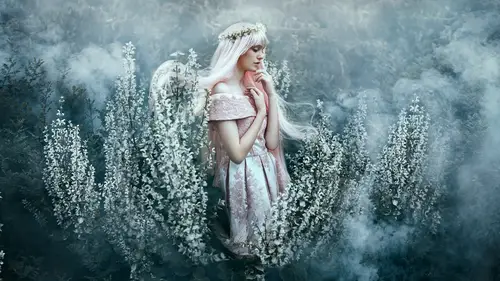
Aside from that, I want to show you a couple of other things that are really useful when it comes to the final polishes of dealing with an image, such as sharpening, such as bringing your eye to different areas of the image. I always like to sharpen things like little details to make it pop a lot more. It also allows the skin to look softer than it is without sharpening everything. Now, the areas that I'm gonna be sharpening are the jewelry, our unicorn ... What's it called? Unicorn horn. Horn, yeah, unihorn. Yep. You can sharpen the little teardrop-shaped gem as well. Perfect. So, what I will do is, I do have this action here, but I'm gonna show you how it runs. What that action is is basically, this Merge Visible Stamp. As we mentioned before, that Merge Visible Stamp takes everything we've done and puts it on its own layer. That's right. It's a copy of everything, so I don't have to flatten it. It flattens it for me and puts it on the top, the Merge Visible Stamp. Next, ...
I'm going to go to Filter, Other, and High Pass. The High Pass itself will actually give me a map of texture, in a sense, so if I adjust this radius, it will outline the details of the image. When it outlines those details, I can use that information to my benefit, and I'll show you how. This figure will always change based on your image. Sometimes you won't need it this low, sometimes you'll need it higher. The sharper your image is, the less you'll need this. So, I'll say OK. Now, once I have this done, this is basically like a Dodge and Burn map. You can see the dark areas here, and bright areas. They're gray. Now that they're gray and you can see an outline, I'll come down to Overlay and it pops out the definition of those items. Or, I can go to Soft Light as well, or Hard Light. I'm gonna stick to Hard Light, because it gives me more of a contrast point than Soft Light does. So as I mentioned, I'm not gonna apply this to the whole image, because that would be too much, but I'm gonna apply it to the fine details, so I'll hit Option and I click on the mask. What that does is gives me a black mask by default. Now, with the Brush Tool, I am going to bring my flow and opacity to 100% or so, and I'm gonna start brushing. And this is my favorite part, so watch this. So as I brush, you see these details come out? Let me turn that on and off so you can see. So you see, it just pops. It's quite subtle. It is. So when I go back over here ... Would you notice something if it had been over-sharpened? Yeah, you'll see pixelation, and that's a big giveaway of over-sharpening. And it's pretty amazing, because the photo was already quite sharp to begin with, but the outline of how it looks is incredible. Even the eyes, I can bring that out over here, so what happens is, suddenly, the details of the eyes come out, as well as these little guys here, our little friends. They're sugar crystals. And anywhere you want to emphasize the detail. Wonderful. So would you do this at the end? Yes, that's a good point, because this is something that you can easily do and undo, and because you need to Merge Visible to actually apply it, I'll wait for the end, and I'm not really particular about how precise I am, as you can see. I'm just doing it really casually. Great. So here we go, turn that on and off. The other step that I like to do at this point in the process is also, optionally, some additional contouring, so if you want to make it stand out even more, I can easily go back to my Actions, click on my Dodge, I can be like Enhance Highlights. So we can use the Dodge to dodge more of the brightness, so if I want more attention to certain areas, I can do that now as well. So I can bring a lower flow. If I want them to be totally iridescent, you see just quickly adding pops of reflectivity ... That's very good. Across the image. And make it more magical. Right? Just depending on what you want. The same thing goes for additional highlights. Like so, on the lips, maybe. We can even darken the lips at the edges, so we can give the appearance of it being fuller. And then we can go back to our highlights and enhance the middle. So what it does, it kind of gives you an illusion of them being fuller as well. So let's take a look at our quick before and after of this section, so you can get an idea of where we started and where we ended up with. So, as you can see, I kind of went in the way of the same color palette, because I saw that the lips needed to match closer to the eyes. I think it works really beautifully. And the pastel tones of the eyes. Yeah. I increased them to match the make-up. So what happens if the make-up artist isn't happy? Then I change it back. Okay. Then I'm like, "I'm sorry, undo, here you go." There you go, so that's what I do. And that's why you see the order of operation, so if I had a client like her, and she's like, "Undo this, undo this, undo this," with shortcuts, you can't. With this, you can, and that's why I do that. So again, like I mentioned, this is just a brief sample of kind of what my workflow is. I have a lot more to show, and that's why I have a whole course on my website dedicated to retouching, which I think you should also check out, as well as CreativeLive has a bunch of courses, and I'm gonna leave you with that, and I'll ask if anybody has any other questions as well. I just wanted to ask how detailed you prefer to get in terms of hair retouching on flyaways, things like that, and working with wigs, both of your perspectives on that. Okay, so I guess for me, when it comes to wigs, look at this. Look at this beautiful mess over here. I would definitely spend some time cleaning that up. When it comes to flyaways, it depends on the look you're going for. In this case, we did have her hair put out, but again, I would just go in there and tidy up anything that I find distracting, so I would probably tidy this up over here, 'cause I find that a bit distracting. There are some lines over here I might consider not so much getting rid of as much as I would just subdue them a little bit, with maybe a Burn layer, and I'd probably just tidy this up a little bit as well, just so that it flows nicely with the rest of the braid. So it just depends on your personal preference, really. It's different for you, because you are working with clients, and you have to change ... It's not about your vision, it's about theirs. It's about me. And so basically, it's the same process. I would go into the Clone Brush here and just continue on with some of these bigger flyaways like this, and flyaways are just like environment pieces, where yes, if you knew that I did it, you would know, but as you can see, you can't really tell. So I do it that way as well, just continuing on and piecing it together. But it's interesting, though. How would you know, and I've asked you this before ... Right. What flyaways to keep, and which ones to get rid of? When I zoom out like this, I'll pay attention to the ones that really stand out. Like, this is really annoying. I would probably go in there and try and get rid of that really quickly. Okay. Right? Yeah. And I would just continue from there, really. Okay. But aside from that, I try not to do it so much, because when you get that overly perfect look, it gets a little bit crazy, unless you're doing beauty campaigns or hair campaigns. Then you have to be really, really intricate, and that's just a whole other ballgame, too. Yeah. I do think hair flyaways are an interesting topic that you did bring up, and if you're not sure how far to take it, then just collect a bunch of images of flyaways that you actually like the look of, and then just have them there as reference to see how far they've gone, and then you can kind of use them as a guide for your own work, 'cause yeah, it is a tricky one. Do you use frequency separation, and if you do, what situations do you use it? That's so funny you mention that. It's a pretty hot topic right now. Some of you know what I'm talking about. (Laughter) You can laugh, yes, it's hilarious. The reality is, I don't need to as much anymore, at all, if ever, because as you saw, I got really far doing just Dodge and Burn and healing, so all of my clients, I just stick to healing and Dodge and Burn, just to show people that you really don't need it at all. But if you want to do it, I don't think it's bad, as long as you are happy with the results, as long as your clients are happy with the results, and you're satisfied with what you're able to get out of it. Again, it's all artistic preference. I don't have a position either way, but in my own workflow, I don't really use it that much.
Class Materials
Bonus Materials with Purchase
Ratings and Reviews
Kathleen
Great class and great instructors. Genuine and informative. Practical tips to create stunning images. Seeing them work through the process from shoot to finished image was great and I loved that they shared the thought processes behind the creative decisions. Definitely recommended!
RoxSpiegel
Truly a remarkable duo. Bella is so down-to-earth and humble for a photographer with such a strong beautiful and ethereal voice. Her explanations of her process really inspired me--I was sketching concepts throughout the class. Pratik's process really opened my eyes to "smart" retouching--understanding what can be done in fewer brush strokes and slimmer PS files. All in all a really unique and inspiring class that makes me excited to realize my next conceptual shoot. They're also adorable together!
Mai Her
I've gained sooooo much from this I can't even contain my appreciation and excitement! So much inspiration and so much generous advice and tips to help me! Thank you so much Bella and Pratik and Creative Live!