Liquify Tool
Lesson 33 from: Fine Art Conceptual Photography from Shoot through Post-ProcessingBella Kotak, Pratik Naik
Liquify Tool
Lesson 33 from: Fine Art Conceptual Photography from Shoot through Post-ProcessingBella Kotak, Pratik Naik
Lessons
Class Introduction
04:47 2Artistic Vision and Inspiration
17:06 3Personal Projects
18:59 4Creative Motivation and Defining Your Story
15:15 5Organizing Your Inspiration
16:26 6Building A Character
03:19 7Creating Wardrobe and Props
33:59 8Location Scouting
12:55Resourcing a Team
17:52 10Working with Talent
06:39 11Building Community
05:06 12Scouting Location Pros and Cons
11:29 13Camera Gear and Modifiers
10:03 14Shoot Set Up and Styling
11:34 15Test Shots With Model
06:04 16Location Shoot: Model in Red Azaleas
26:04 17Location Shoot: Composite Pieces
16:35 18Plates Extending the Scene
07:11 19Set Concept and Design Overview
08:31 20Demo: Equipment Overview
04:39 21Shoot Set Up
08:12 22Shoot: Test Shots
15:08 23Shoot: Standing Against Flower Wall
06:47 24Composite Pieces: Hair
05:31 25Shoot: Overhead on Flower Wall
22:22 26Adjusting Images With Composite Shots
07:25 27Color Theory
11:40 28Capture One: Image Selection and Color Toning
19:42 29Moving from Capture One to Photoshop
17:01 30Compositing Hair
15:52 31Healing Brush Tool
06:42 32Dodge and Burn Tool
08:14 33Liquify Tool
12:01 34Adjustment Layers of Color Toning
35:05 35Blending Modes
10:44 36Channels and Channel Mixer
05:16 37Selects for In Studio Image
08:57 38Compositing Background
13:58 39Compositing Additional Elements
09:49 40Gradient Maps
15:51 41Color Toning with Controlled Light
21:32 42Adjust Skin Tones
17:27 43Retouching Skin
17:12 44Spot Healing Brush
06:11 45Clone Brush
03:47 46Dodge and Burn
18:49 47Sharpening
10:42 48Critique
15:40Lesson Info
Liquify Tool
The biggest thing, I think, is that we did two shoots. One of them is our other shoot that we're continuing. The reason that we did two shoots is because, in studio, the way that colors are interpreted, I think are a little bit different. Yeah, I think so. I think, when you're on vacation, especially, there's a lot more scope to really go wild with colors, I think. And maybe, it depends how you shoot your studio shot as well. It really does. But, I find that when I'm on vacation I have a lot more scope to play around with color toning, and that's why we decided to do one so that I could use it as an example to go through the different color toning tool sets that I like to use. And processes as well, just because, we've got a bit more room to push and pull the image. And then we'll go into a studio shot and I can show you how I use some of those tools in a more finessed way for that studio portrait. We are going to, come back to our image, and we're gonna just group this. So I'm gonna...
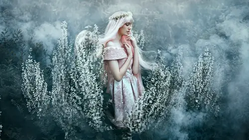
select one layer and then, holding down the shift key, select another layer that I want to be within that group. Press command and G, and name that group dodge and burn. So I know what's in there, so it's all very tidy. Also, is when we have this action here, in the future, we did this manually, but with these actions you can hit dodge and burn and it will automatically set up that dodge and burn construct folder for you, so just to let you know. And is that included in the? Action set. Yes, there you go. Alright, so now we are going to, how do you call it, merge visible? We also have an action as well, but just over here, and merge visible stamp is basically a copy of everything you've done on its own layer, so that way you don't have to flatten. I've actually seen some people flatten before they liquefy. Don't do that. You can have your own layer stack as well. And also doing it manually, we just hit shift, option, command+E if you're on a Mac. If you're on a PC, it's control, shift, alt E. Just a side bit. But you have your action here, so, we'll just keep that on top. And then do it from there. Yeah, and we're gonna name this liquefy. So, I'm gonna go to filter, I'm gonna go to liquefy. And this is where I really like to craft the image a little more, just fine-tune it and finesse it to suit my artistic eye. And again, this is where people really have fun, I think. There's no right or wrong way around it. Do you want to explain some of these? Well I think the best thing about the way that you liquefy is that it's quite simplistic. Even though there's so many options nowadays, especially now that they have these weird filters for eye size and whatever it is, but we don't tend to use these over here as much. We tend to stick with these basic brush options. That's right. And depending on which version of Photoshop you have, it's aligned differently. Some versions will ask you to click on Show Advanced, or advanced mode, before some of these options are available but the main thing we're looking for at the moment is first ensuring that our forward warp tool, I don't know what it's called here. Oh, the forward warp tool, there it is, is selected. Followed by going over to our brush size, which will change. That is adjusted by the bracket keys by your short board if you're on a English version of the keyboard. And some versions of computers don't actually have the same layout, so don't keep it in stone of what the shortcuts are. It's depending on what versions you have for your computer and where you live. The next thing is going to be density. This is kind of like the softness of the brush. We keep it approximately 50, because it's in between, it's not too soft. It's quite easy to use. And lastly is the pressure. If you have your pressure set to default, it's 100. Usually, pressure is quite hard to adjust because at 100 it makes it really difficult to fine-tune. That is great! That's great, I think you're going for the abstract look, so that's good. So you'll undo that, command Z. And we'll go down to say, five. And we'll keep it there, because it's like flow, it's really gentle and easy to work with. So I think that's what we'll go with. Okay. So I'm just going to zoom in, actually. Here we go. Holding on the command and plus button on my keyboard as a shortcut to zoom in. And I'm gonna bring my brush size a little bit small. There we go. I want to start off with her eyes. Again, this process is entirely subjective. Everything I'm doing here is my own personal preference. So yeah. It is very subjective, and that's fine. You can get creative with it. I'm gonna just tidy up the lines here a little bit. Bringing her wrist in a little bit. I love elongating the neck a little bit as well. Something like that. I like to have a gradual set of lines. I'm just going to soften this edge over here a little bit more. There we go, okay. So I'm gonna come up here. And work on her hair. And just give it a bit more volume at the top. So I always do this anyway, because I always find somehow the hair always gets a little bit flattened, so I'm gonna bring that up. Also, bonus is that you make the flowers bigger too. Yeah, see, you can make the flower a bit bigger. You don't want to go too wild because you are warping the pixels, essentially. So that's something also to be very conscious of when you're liquefying, which is why the pressure is quite low, and here we go. Let's make that a bit bigger. We can drag that out a tiny bit more, great. And one thing to also keep in mind is that any areas that are being liquefied in the background is okay because we have masks, and we can also mask that out to prevent anything that's being warped. So I quite like that, I'm just tucking her in a little bit here, not that she needs it. This is actually a really easy photo, because she looks lovely in this scene. Are there any common areas that you normally would focus on liquefying across the board? I would always look at the eyes, the shape of the lip, for some reason I find that very sensual, so I'll always spend a little bit of time on the lip. The nose, the hair, and whenever there's neck I always like to elongate the neck just a little bit. It just exaggerates it a tiny bit, what lends to the photo. I don't know, it's just a personal preference. Arms as well, at the moment over here her arm is pressed actually against her, but if I had actually asked her to move her arm out, that line there would be a little bit slimmer and streamlined. But it was all part of the moment and I think it's fine as well. It looks beautiful and translates really nicely. I always spend a little bit of time in the hair. Okay. We might tuck the hands in a little bit more as well, and that's pretty much it. If I wanted to, I could tidy her nose up just a tiny bit, but I don't think she needs it, I'll be honest with you. Just something like that, but she doesn't really need it. There we go, okay. Oh, and something I also like to do now and then is the corner of the lip. Because sometimes some girls when they're posing their lip turns down a bit, and that little difference of just twisting that corner of the lip up a tiny bit, lends to a really beautiful expression. So I don't know how I discovered that, but once I did, I've always noticed it. It just changes the mood of the expression. So you might like an expression, and you might just want to turn that up a bit. Before we go any further, I wanna just mention that you can actually show backdrop to see exactly what the before and after was by clicking show backdrop and bringing opacity to 100%, you can get an idea of what the before and after was and how far you've gone. That's right. I just, real quick before you go on, what exactly did you do to the eyes with liquefy. It was kind of hard for me to tell. I'll be honest, not much, because her eyes are closed over here, so I just dragged them out a little bit more to just make it a bit bigger, longer. Yeah, see? I just dragged the lines a little bit to make them a little bit longer. But for the studio image that we will be retouching later, the portrait, you'll see me spend a bit of time crafting the eyes there. Perfect. Alright, I'm gonna hit the (unintelligible) And again, the goal was to bring out the hair and the lines. Yeah, I've just emphasized some of the features that were already there. So, for example, I just made the hair a little bit bigger, and also, now, when I go back and forth, and this is what everyone should do really, is have a look at the edges. Because normally, whenever you're liquefying the edges are what gives you away. Especially when you're quite casual with it, like I often am, and that's why I use a layer mask as well. So open up a layer mask, have a look at the edges, and say for example I feel like I've squashed the flowers over a little bit too much. I will use my black brush tool and lightly, make my flow 9%, and lightly brush in there so that it doesn't look warped. Brush back what was there before, yeah. And it's a soft brush tool, because the edges are quite soft over here. There we go. Okay. And no one will know you liquefied. Except, everyone who's watching. Except everyone who's watching. Now it's beautiful though. It is great. There we go. So I'll do that from time to time as well. 'Cuz right now the flowers are quite forgiving, but if you're shooting for example in a woodland area where you've got lines, that's what will give you away. Like, for me, those lines are warping. So that's when you would want to open up a layer mask and just tidy up around what you liquefied. Okay, so we're gonna hit command+S. We can save. Always make sure you keep saving, because Photoshop crashes and it doesn't recover, which sometimes it doesn't, you'll be in trouble. Yeah.
Class Materials
Bonus Materials with Purchase
Ratings and Reviews
Kathleen
Great class and great instructors. Genuine and informative. Practical tips to create stunning images. Seeing them work through the process from shoot to finished image was great and I loved that they shared the thought processes behind the creative decisions. Definitely recommended!
RoxSpiegel
Truly a remarkable duo. Bella is so down-to-earth and humble for a photographer with such a strong beautiful and ethereal voice. Her explanations of her process really inspired me--I was sketching concepts throughout the class. Pratik's process really opened my eyes to "smart" retouching--understanding what can be done in fewer brush strokes and slimmer PS files. All in all a really unique and inspiring class that makes me excited to realize my next conceptual shoot. They're also adorable together!
Mai Her
I've gained sooooo much from this I can't even contain my appreciation and excitement! So much inspiration and so much generous advice and tips to help me! Thank you so much Bella and Pratik and Creative Live!