Blending Modes
Lesson 35 from: Fine Art Conceptual Photography from Shoot through Post-ProcessingBella Kotak, Pratik Naik
Blending Modes
Lesson 35 from: Fine Art Conceptual Photography from Shoot through Post-ProcessingBella Kotak, Pratik Naik
Lessons
Class Introduction
04:47 2Artistic Vision and Inspiration
17:06 3Personal Projects
18:59 4Creative Motivation and Defining Your Story
15:15 5Organizing Your Inspiration
16:26 6Building A Character
03:19 7Creating Wardrobe and Props
33:59 8Location Scouting
12:55Resourcing a Team
17:52 10Working with Talent
06:39 11Building Community
05:06 12Scouting Location Pros and Cons
11:29 13Camera Gear and Modifiers
10:03 14Shoot Set Up and Styling
11:34 15Test Shots With Model
06:04 16Location Shoot: Model in Red Azaleas
26:04 17Location Shoot: Composite Pieces
16:35 18Plates Extending the Scene
07:11 19Set Concept and Design Overview
08:31 20Demo: Equipment Overview
04:39 21Shoot Set Up
08:12 22Shoot: Test Shots
15:08 23Shoot: Standing Against Flower Wall
06:47 24Composite Pieces: Hair
05:31 25Shoot: Overhead on Flower Wall
22:22 26Adjusting Images With Composite Shots
07:25 27Color Theory
11:40 28Capture One: Image Selection and Color Toning
19:42 29Moving from Capture One to Photoshop
17:01 30Compositing Hair
15:52 31Healing Brush Tool
06:42 32Dodge and Burn Tool
08:14 33Liquify Tool
12:01 34Adjustment Layers of Color Toning
35:05 35Blending Modes
10:44 36Channels and Channel Mixer
05:16 37Selects for In Studio Image
08:57 38Compositing Background
13:58 39Compositing Additional Elements
09:49 40Gradient Maps
15:51 41Color Toning with Controlled Light
21:32 42Adjust Skin Tones
17:27 43Retouching Skin
17:12 44Spot Healing Brush
06:11 45Clone Brush
03:47 46Dodge and Burn
18:49 47Sharpening
10:42 48Critique
15:40Lesson Info
Blending Modes
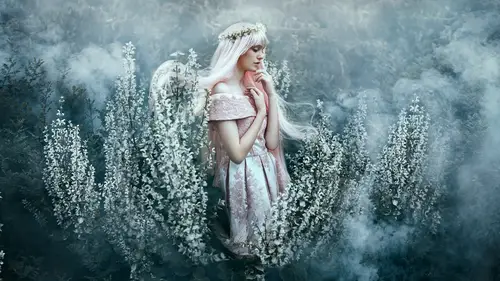
Let's take a quick recap of our process here, what we've done so far. And let me undo these really quickly. So, first, you had your black and white. I did. Which was just to desaturate a little bit. We add your selective color, and we adjusted the reds and we brought a little bit of richness there. The color balance then went a little bit further and added more luminosity adjustments along with the reds. And the curve itself went a little bit further. Again. Now this is where you really started tightening it up and the reds started to pop considerably around the image and the saturation leaves in the background and the flair as well in the hair. And then, finally, we changed that green color to compliment the scene. That's right. Okay. Okay. So, a little trick, I think I might show you a little trick. Yes, let's see it. (laughing) Let's see all the little tricks. So, this is something that I don't often share, but you're gonna see it today. And it's probably because I am ...
quite shy about it. I hope you don't think it's a bit strange, but bare with me. Now and then, if I am struggling to decide which color direction to go into, and that does happen, or if I think, well, let me just have a little play and see what happens, what I will do is paint different colors on top of a blank layer, and then I will use a blending mode to see how the different colors affect different parts of that image. So, I don't know how I thought of doing this. I just, I don't know. But right. Here we go. So, we're gonna take some yellows. I don't do this all the time, actually, I just have a layer that I just jump into. Just as a blank layer, so far, set to normal. Nothing's different. Yeah, yeah. So, I'm gonna paint yellow here. I'm gonna paint, it's gonna look really wild. Slowly. Oranges. No, I don't really want that. Oh, actually, yeah, maybe. Going to select like a blue and say okay. 'Cause it's complimentary, I assume. Yeah, it'll go quite nicely in the shadows, wouldn't it, so, well, I don't know. We're gonna find out. Okay. Maybe some on top. And, we might even go for, oh, maybe a green. It's just gonna color that end, or wherever. Doesn't actually matter, really. There you go. 'Cause I'll tighten this up. So, this is it, we finished color toning. (laughing) No. Looks '70s. I know. So, I'm gonna go over here and these are all my blending modes. Now, each of these things does something very interesting to the layer. So, for example multiply. What does it do? It basically affects the contrast, doesn't it? Yeah, it's darkening the image by you, while also using the color, as well, to change the hue. Yes. You can go to color bone. You can go to linear bone. And essentially, what I would do is encourage all of you to just have a little play. My favorite is overlay. I would drop the opacity of that to about 30%. And I will turn this eye on and off, and start seeing what's happening in this picture. So, we zoom in. I will also, at this point, press Command U, and that opens up my hue saturation. And another way to access this is, op, I think it's gonna show you. This one. And then we are going to, instead of applying it directly to a layer itself-- Yeah, does the same thing. We are going to hit Option or Alt in between the two, and click. So, what happens now is if we then adjust the hue here, it will adjust what we've just painted without actually having to repaint anything. And if we decide we don't like it, we just turn off and on. Yeah. Yeah. So I'm gonna bring that up a little bit so we can all see. So, now, I'm looking at the skin. So, what skin am I happy with that looks lovely. Maybe this one. I quite like the skin there. I'm gonna turn this off and on to see what's happening. Okay. Nope, sorry. Double clicked. I'm gonna actually drop the opacity of this of and that's fine as well. And now, on that layer, while I've got that layer selected, I'm gonna go back to my brush tool. And pressing this icon here. And essentially, hang on a second. I'm gonna use my Option tool to select different colors that are on that layer, actually no. Hang on. Go to my eye dropper tool, change this sample to current layer. And now selecting only the colors on that layer. Right. So, I'm gonna select, yeah, the yellow for the skin, making sure I'm passing 100 flow at nine. The skin is brushed the color I want it to be brushed. And let me grab some of this blue, and I'm just gonna brush it here and see how I like it to look. Turn that off. There you go. Hmm? No. I'm gonna go back and forth, 'cause again, we're going by eye. Okay. I quite like the red. How the colors have affected the image. See, on this side, it looks a bit bright, and on this side, it looks a little bit muted. So, there's a color here that I quite like, and I have a feeling it's this orange, which I'm going to select. Hang on. Eye, layer, yeah. Hmm? No. Why is it selecting green? I didn't think there was a green. Yeah, you painted green there. Oh yeah, there is a green there. I want this one. So, I'm gonna grab that. Color that in a bit, here. So, the eye dropper is basically only seeing the layer she's on currently, and not the image. That's why the eye dropper is looking much different than the image itself. 'Cause she's sampling what she's already painted to keep on going continuously. Yeah. Essentially, what I'm doing is I'm using the paints. The colors that I've painted, to just craft the colors in this picture a little bit more, and I'm placing them exactly where I want them to be. Yeah. So, the skin tone came first, 'cause I always feel like that's the most important bit. And this is where you really get to choose the colors you want, and I use the overlay blending mode because I quite like that. There we go. I love that. And if I'm not happy with how that looks, and I can always, and if I prefer something in the layers before it, I can always open up a layer mask, and just brush out or brush in what I liked. So, for example, if I turn that on and off. Mm-hmm. Let's see. And I wanted some dark in her hair, I can always just bring back, there we go. Making sure my brush is on black. Can always just bring back some of the darker tones in her hair, but I don't need to, 'cause I quite like how that looks. Okay, One thing I wanna show everyone really quick is what that layer looks, by itself, so that we get a eye of what's happening. So, I'm gonna turn that layer on and off really quick, as well, so you can see the visual change is that the skin, I think you warmed up a little bit, and well as the impact of the surrounding scene got richer, as well. Now, by itself, let me just quickly show you, if I set it to normal, so there's no blending would apply, and 100%, that's what it looks like. So, it's basically a bunch of colors that are being painted everywhere, but when you change it to overlay, you see the impact is quite intense. And then we shifted the hue a bit with this clipped hue saturation, because we changed it. But also, we brought the opacity down to 20%, hitting two, and what that did was the impact is much more gentle. Yeah. Beautiful. Yeah. I like the impact of that right now. You can also see what it looks like at 25, see what it looks late at 30. 40. And yeah, sometimes I'll spend time here. So, I should quite like at 25. Yeah. 23. (laughing) 22.7. Sometimes that happens. If I can't decide if I like it at between 20 or and I'm tossing out between the two, I'll just make it 25 and move on. And would you say that in the beginning, you were as keen to these shifts, and/or like you said, it took a long time to learn that. Takes a while to learn. So, it's just like photography. Color toning is a practice that also takes a while. Yes. But the beauty of this is that we're also gonna be including this PST and everything that we work on in the extra material, so that, when we have a chance of polish it up in a couple of days, we're gonna include it, so that you can play with this and go through the layer step-by-step, and all the blending modes and how they interact, and really get in there so you can learn from experience, as well.
Class Materials
Bonus Materials with Purchase
Ratings and Reviews
Kathleen
Great class and great instructors. Genuine and informative. Practical tips to create stunning images. Seeing them work through the process from shoot to finished image was great and I loved that they shared the thought processes behind the creative decisions. Definitely recommended!
RoxSpiegel
Truly a remarkable duo. Bella is so down-to-earth and humble for a photographer with such a strong beautiful and ethereal voice. Her explanations of her process really inspired me--I was sketching concepts throughout the class. Pratik's process really opened my eyes to "smart" retouching--understanding what can be done in fewer brush strokes and slimmer PS files. All in all a really unique and inspiring class that makes me excited to realize my next conceptual shoot. They're also adorable together!
Mai Her
I've gained sooooo much from this I can't even contain my appreciation and excitement! So much inspiration and so much generous advice and tips to help me! Thank you so much Bella and Pratik and Creative Live!