Lessons
Day 1
1Introduction
18:50 2Optimizing Your System
11:30 3The FCP X Interface
43:20 4Importing and Organizing Media
1:05:14 5Projects/Timelines
43:06 6Working with Clips
37:22 7Editing Audio
1:00:09J and L Edits
15:49Day 2
9How to Dissect an Edit
1:24:19 10Let's Edit Something For Real
1:18:45 11Introducing Music
1:18:56 122:45 pm - Audio Mastering
1:22:18Day 3
13Introduction
05:14 14Color Tools and Effects Part 1
1:07:44 1511:00 am - Color Tools and Effects Part 2
1:07:44 16Effects and Titling
1:17:04 17Exporting
47:49Lesson Info
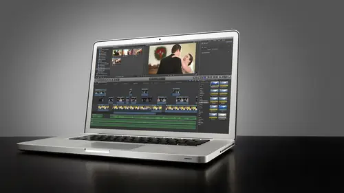
11:00 am - Color Tools and Effects Part 2
What I want to do in this segment is just take some footage and I wanted first illustrate what the rgb parade will do for your actually know what I can actually use this footage teo to do this same footage we're using before just to get an idea of how color balancing could be made easy to make sure you're getting consistent color across your images so let me just go down into our color correction and greeting project will open this up and what we have that's not it okay, so we these shots here that I'm going to reset the color that we had done before okay and just let's balance some color here this's very yellowish kind of red and I know we kind of pointed us out before and if we look here on the way for monitoring you know we lost a ranked our increments there let me get our guys back up you can see our our mid tones are where they should be naturally this is a well exposed image her hands are the right brightness or focus exposure but the color is a little off now I can easily if I w...
ant to just come into my color palette here that's actually the reset I just reset the color that we did before that's the actual color right there and I could just do this by eye if I wanted teo all right or I could come into our rgb parade and do some minor adjusting here using the rgb parade and the way this works is since it's showing the individual channels of red, green and blue I can notice differences in color just by looking at this looking at the mid tone range which is roughly right in here let me just change that readout toe I ari again between twenty five and seventy five somewhere around there are the mid tone range is you can see we have a new abundance of red and not as much blue and green seems to be middle of the road so if we wanted to eyeball we could or we could use the rgb parade to sort of do what we have to do here now since I'm going to be affecting mostly my mid tones because the highlights tend to look balanced and definitely our shadows or balanced you can see down here that right across the board we've got equal amounts of red, green and blue and that equals gray grayscale when you have equal amounts of red, green and blue you have grey right and when when you have equal amounts in shadows like we do here we have black and that's good and there's no way you can see there's no color casting are black it's crystal black looks good it's fine but I'm more concerned with skin tone so using the rgb parade and my mid tone puck I'm just going to move more to that toward that red yellow orange is kind of area and pull down slightly just a little bit I'm just trying to get it normalized I don't want to pull too much because then you're going to use a lot of green you're gonna notice a lot of green starting to sneak in to our shadow areas okay? We don't want to see that so it is pulling that down slightly and then maybe we'll introduce a little bit of blue you know, just a little bit there we go and again we could have gotten the same effect by eyeballing it but if you're doing this across multiple clips again your eye's gonna get tired and you might misjudge things use your scopes and the rgb parade is great for balancing you know the levels of hi highlights mental channels so it's one to touch on that that was something that kind of belong in the last segment but we ran over so any questions about what we've shown you so far here now let's move on okay, cool so let's talk about look looks talking about mood let's talk about the sexy part of color greeting which is look building there are many, many, many different plug ins that you can purchase and create stylized looks it's like instagram for video. Okay, there's, the really are there's a lots of different looks. Red giant magic bullet has ah siri's of looks that are pre set and you can customize your own I d purchased a set off of ah website called my f c p effects dot com really cool stuff, man. Sheep plug ins like forty nine to seventy nine dollars. And it was sixty percent off on top of that, depending on how much you bought. Yeah. What was that? What say my f c p effects dot com it's stuff that was so cool. I'm gonna walk you through some of them very soon. But basically the art of look building is just giving our footage of distinct look. This is tico this's, our dog he's a pekinese he's, about eleven years old and he's just the sweetest, most docile dog in the world. And I've got some beautiful four k footage here of him and we have really nice light in these shots. And I really wanted to exploit the four k functionality of this camera with some beautiful light and then doing some look building to kind of give these stylized looks and what we do. Do with this so let's, go in and get rid of our green cast footage. We don't really need that anymore. And maybe we'll hold on to this one and I'll reset the color parameters. They're just so we can work with two different clips and have some matching going on. But my goal here is to show you how we look. Build. Now, look, build once you have color balance which you look at the rgb parade of the shot that is almost perfectly balanced. There's nothing wrong with that it's shot flat there's. No color cast. There's, no dominant color. It's very even across the border. Skin tone is national ticos farris natural that's his natural color. That looks really good. White sir white grazer gray. Blacks are black that's a balanced image. Now we can start adding some moods and color. Let's, let's, start playing around here. This is one hundred percent of subjective. You don't like what I'm doing here. I don't care this's what I do and this is what you might do. Something completely different. That's fine. This is just some ideas of what you can do. It's really part of your brand, tio what you decide ultimately day with your color grating and mood building in your look? Absolutely. And there's no right or wrong way, it's. Just artistic subjectivity. So don't be afraid to experiment. Don't be afraid to play around. I will warn you of one thing. If you do apply a heavy looks heavy color cast just be wary of what it's gonna do to your image is that skin tones? Just keep that in mind. Keep in mind your end viewer. I mean, you can color caste and color and look build all you want. But if it makes people look ugly, you're not really doing your job. Okay, so we want to try to keep people looking good, but at the same time, give it a stylized look. So a couple of ways we can do this, we do it right in final cut pro. We can simply just take our color tools and we can start adjusting. So I've got this kind of green tone hear in the background and overall we have, like, a nice, earthy feel, almost like a vintage kind of feel. And if I wanted to just warm that up, you know, I could simply just take my shadow or I'll take my mid tones. This kind of boost those mid tones up a little bit toward helps when I have the right clip so sorry about that it tones and just kind of warm it up and just by doing that we've added a new mood to it now we were indicating it's a sunny day you know, a really nice beautiful warm sunny day very simple, very simple and if I wanted to go the opposite way, you can cool things down a little bit too green may be a little bit more toward the blue you know it's a very simple thing just give it a little tiny like a slight cast I like looks that are very subtle I do not like heavy looks I'm not the kind of guy who likes to really crunch things down like this a lot like blockbuster cinema stuff kind of has that look that really punchy and that's cool I mean if that's your style and that's what you're going for that awesome be careful with dslr footage because of the compression of the file formats the more you crunch those darks more noise you're gonna introduce possibly if the image was shot at a high rise so so you want to just be careful about what you're doing there other looks that I like to do for example I like I like warmth I do like warmth in my image and slightly saturation sze so something that's very vintage e like that I just discovered this plug in that I'm thrilled about it. I have to show you this it's called classy. Look, let me pull up this footage here. It works best with footage that sort of outdoorsy, and it was shot flat because what it's going to do is give things like a very, very like anne of green gables type of look, that vintage e kind of feel. So this is how plug ins work in final cut. If we click on our affects browser, we're going to open a dialog window, and a lot of these are the built in effects. If I could go on all, I'm going to see every effect, every video effect in every audio effect built in orjust right now, every video effect I'm sorry, built into final cut there's, tons of them and final cut has their own looks, and if I just scroll my mouse over each of these, he could see some of these. I'll never use you have like, these individual effects that can apply, okay? They have their own looks built in like that would be they call that in the red, and they have one called half tone her glory, which gives it a very like, dreamy type war movie esque kind of feel I don't really use any of these these air just under showing you that they're there they can all be adjusted individually they all have parameters they could be adjusted I tend to like to go for specific effect, so when you install plug ins in the final cut they will show up in solving correctly they'll show up in your video effects list here so I've got a couple that I like to work with so the first one I want to show you is classy look and I'm just going to apply the default plug in is by double clicking it or dragging it over and watch what it does to my clip if I just well, first of all I just scroll scroll overlook what it does and I think that's really visible there it gives it this very nice tone it's around really? Yeah, just right off the bat and there's nothing special about this footage it's just pure white you know it's cool it's balanced footage that was shot the right color temperature not much saturation not much contrast not much sharpness either. The sharpness is turned down because, you know, when you add contrast you add a little sharpness too so you want things that look overly sharpe so I'm just gonna apply this to this and right off the bat you see the nice looking game it really vintage e okay it's meant to what this is meant to do is emulate old film stock three strip processing of film, which is really just an awesome technique, but it's not cost effective anymore if you're not, you know, film in itself is not cost effective anymore, so I can adjust the parameters of my plug and simply by going out to my inspector under effects and you'll see now I have the classy look filter applied, all right? And I'm gonna scroll this down and there's a lot of different features about this I really like I think this plugging was on ly like seventy nine bucks, which isn't a lot for a nice plug in that's going to nice color grading for you and I would use this for a wedding such as this like outdoorsy, kind of and I want that vintage feel, and I would probably do this over the entire video. This would probably make this a consistent look and just make it blend nicely. Maybe my reception footage would look a little different cause we're in a totally different scene, but for anything I think place outside, I could give it this look to keep consistency, so we're gonna just our black level just by dragging this down, we can add some contrast in our blacks, or we can make it look even more faded so it's basically taking the functionality that's in the final cut color board and just giving it to you in specific details that allow you to individual each just parameters, which is really nice we get really faded out, we can adjust the gamma to kind of get the brightness level that we want, and I might or might not look at the way form during this and just kind of see where my levels are. You can see now it's it's very compressed, right? Aren't we lost a lot of dynamic range when we apply this plug in that's, the original and that's the, uh, that's the affected and to begin with, there wasn't much in the way of shadows and dark areas because we shot so flat, but it compresses it even further here and that's just again that's a stylized look, once you've got your image balance, you can do whatever you want to do stylized, and it doesn't matter now what's happening here, you're just trying to make it look a certain way. What I really like about this is that you can adjust the individual intensity of different channels, so if you look at the barn in the background there by adjusting the red density, I can kind of adjust the faded nous sort of of that barn it's, very subtle. But it's, nice to kind of give it you can adjust individual tones of the images just really nice greens too. We have a lot of greens in this image, so I can kind of make them look a certain way, and they're very minor adjustments, which you know is good, we can cool or warm it down if I want to really warming up there you go. So rather than having to go through and adjust these primers individually on the colored board and try to come up with this effect and save it is a preset it's done, and I can't even see that as a preset to use later on, which is fantastic, you know, just attentive to give a little more green. So I just like this plug, it's it's very much humanize me very much of your style well and that's actually an important thing to mention if you are doing both photo and video under the same company in the same roof, you probably want your photos in your video to match and be more of a cohesive brand and a coke piece of product that you're offering to your clients, you know, little things like that, and brand awareness and brain consistency that build trust with their clients is going to be beneficial, so yet look at your photos. Trying to get video to be similar or, you know, at least not the direct opposite. So that's really cool. Andi, you can see here that final cut is now rendering into the background also. Okay. So as I stopped working it's just going to whip through it is going to render my effect. So now we should play back in real time with no stuttering looks really nice when we can actually get into stabilization later on, we'll make that shot look silky smooth, which is really cool. It's a steadicam shot. We can really make that look nice. So now I've got a matching shot here, you know, from the same scene. And if I really love it, if I wanted to just copy and paste the effects, it may not look the same because there is there are slight exposure differences here, so we might have to do some adjusting. So if I just command seat a copy shift command via to paste attributes into selective effects, classy look include paste we've not copied it over, but the difference here is, since that other image had a lot of yellow tone. I mean that's still nice don't get me wrong, but is a little bit too yellow he for me. A little bit too much red happening there if we look at our vector scope we can really see where that falls okay very yellow red right faded not very saturated if it was more saturated it would be out here but you know what we can do just to fix that we can just adjust of saturation just take that down we're gonna adjust our red density or green density just couldn't just a sort of backing off a little bit uh city sometimes it just takes a little trial and error to get where you want it can you adjust the overall like the overall capacity of the plug in on top of the plugging on top that's good question let me see if this one actually has yes there's a mixed slider there you go very coarse and now and now we have a little bit more consistency there's actually a bit more green in another image I can actually put up some more green on this one a little more green phil and tent more susan if you go to the rights agenda to go to the left on screen so it's all just you know matching by eye and getting it to look the way you wanted to do but that's a really fun plug in I like that one a lot and that's how plug ins worked there basically just drop him on just the parameters and you can save it out as a pre set if you want to so basically I could come down um I'm sorry you could just actually because I don't even know how to do it on this one sometimes is a little pre set but this one doesn't have a preset buttons some plug ins to have a preset buttons some don't this one apparently does not another cool thing about this it has a vignette which I don't go crazy with vignettes beacon might be able to see it they're slightly just giving it a little bit of a scope look it's kind of cool and what I really like is and we haven't gotten into this year but the anamorphic widescreen that I had to my films can be done right within this plug in which is really kind of cool if I click on widescreen it crops the image two two thirty five to one anamorphic widescreen and has an offset slider for me to adjust where I want the image to fall within that wide screen and later on we'll get into how we do this over an entire project and then when we export how to get it to export on lee that the crop parameters that's cool that's one plug in that I really like let's go back out here going back teo running movie watching for you um robin I have actually caught where they forgot to add widescreen some of the clips oh, no, that was funny. It was actually on itunes download yeah, that we downloaded a movie and it's supposed to be all anamorphic well, I mean, they actually the tele seen version with digital movie theater version would have totally been cropped and sent but this one, I guess for itunes they had to have it in a full screen format to make it work with video kodak and they forgot to put the widescreen on some of the shots and they look so weird back and forth kind of like this right now. It's what it reminded me of because you have only had it on one clip like they had a full screen version and a wide screen version and then he mixed up shots between them. Well, that's a little strange was avengers we think it was something like that. All right, cool. So that's just one plug and I wanted to kind of show you I want to walk you through. This is that other one I was talking about before called my f c p effects and they have some pretty cool stuff if I click on this this is like instagram which these get some of these get really crazy what you may or may not cringe at the thought of you and they can all be adjusted I mean, they mean these air really stylized looks there's a couple of my actually like I don't know if it'll generally work that's kind of nice. Yeah, again, I'm really kind of picky when it comes to what I what affects that really the same way we need by actions you know, for me and a photo shop, I'll buy actions and I have, you know, kevin kolb, oda's actions and totally red action set and flora bella and I have all these actions and I used like, two from each set of this true, you just gotta find what you like and use that, avery, you kind of look right there. Yeah, so it all depends on personal taste and how you want to use these, but they are very simple to use very simple to install they're kind of cool. Let me show you one of my favorites. Actually, this one made by new blue is called color fast and color fast is an all encompassing video tool that allows us to really get nice quick results. If you're in a rush or you need to get things done fast, it applies just like any other uh, any other plug, and I'm going to reset it to none by default. It puts it on this this kind of a weird blue, sky looking thing, so we're back to zero with our image here and I can a sign what I want the program to think is white so if I need to do color correction quickly, I could just steer this towards a different color to adjust the overall color tones so if my image is very warm I could cool it down by most pushing toward the yellow and warming up by pushing toward the blue and right there right there I can get kind of like that warm vintage he looked really fast and then I can adjust individually give us a second to catch up some plug ins don't run super smooth in final cut and you might get the spinning beach ball wheel of death as well. I'm sure we're all familiar question you get a question can you stack plug in? They're so whenever you put that second one on top, was it going on top of the classy look plug in? I have removed the classic like you can absolutely stack as many filters as you want to keep in mind it's gonna be a lot harder to push it for your system and push it right? Do you ever have issues with plug ins that you're applying messing with the original color correction that you did manually? Do they ever have sliders that air like messing with that? Yes they do and you have to be careful and you have to remember the purpose of color balancing using color correction one under our color board is to just get anything back to zero white just to get even natural color based on that color temperature. Okay, so if your color temperatures fifty six k, you want to get your balance toe? What? Natural fifty six cape? It looked like white is white. Black is black, and the other tones are more for balance for daylight. So the fact that you know, for this one, for example, color fast does effect, you know, can affect the color correction. You could use that as a plus or a cz you know, it might be a negative. So if you wanted to do your color correction just in the plug in, it gives you that option too. And maybe that works. If you have pretty good footage overall that was captured clean and consistent, you could just quickly do your affect their in your correction on the one plug in. Yes, you absolutely could. And that's what new blue is and that's why I'm gonna demonstrate here? Like, if you just want to do it all one quick, like, same day edits. I don't have time to do that whole color correction process. I don't have time and if the cameras were wrong I've got a fix it quick and I use new blue to do that and that's why I love and I do a lot of same day at it so there is invaluable for that kind of thing I'm going to jump there's a different version of that color fast is giving us a mission not a big deal new blue also makes one called video essentials one they have the pack of video central's one plug ins and the one I like to use which is another quick color fixer tool is called color fixer plus and by default it does this ugly blue don't worry we'll just reset that's none not a big deal now this is really fast if I want to just adjust correction I could take a sample of my image okay it's not affecting the image yet I'm just choosing a color so if I wanna warm this image up I would pick a color around the blue range somewhere in the cooler color a pallet and then use this correction slider right here watch this it'll start warming it up now it's warming and more toward the greens I have the wrong color selected I'd probably want to go a little more towards science let's try that there we go, we get a little bit warmer and I know that the monitor is probably not completely accurate what I'm seeing here but you get the idea you can quickly warm things up that's really nice. We can also adjust our saturation we could drop saturation down or pull it up to make it even more saturated if we want or we can adjust our brightness and the nice thing about the brightness in this plug in is it it's for the most part non destructive it's not going to add a lot of noise? It uses an algorithm which is fairly subtle. I guess you could say that it's not only a technical term, but it doesn't really destroy the image that much and you make very minute. This is great for matching exposures between shots if you have one shot that's too bright one shot that's too dark just by using this little slider, it'll really help you to just do that and it's nice just, you know again for speed, if you're especially doing same bed it like rob mentioned it's nice to have all of this in one panel is opposed to tuggle ng you know, just from your exposure to your code correction you just have it, you know, one right below the other saturation correction brightness just little things like that make things quicker yet just a little toggle or a little click of the mouse but every time you take some of those steps away just makes things faster for you, right? For example so if I was doing the same day at it and I'm sitting here and I just got my film built I can drop on color fixer plus go back to reset to none choose a sample a I said reset the nun pleas e said reset point two callbacks and there we go I could just choose a sample, get it around the blue and then quickly do some correction once it cooperates it doesn't stop freaking out on me there you go okay so really quick really quick color grading fast I mean not the optimal way to do it by any means and if I'm working in my studio and I have time I'm going to do things the right way it looks good I like the film gamma that you can add using this has got this it's not a contrast slider it's film gametes just adjusting the gam of the image and giving them if you want to make things a little bit more punchy without boosting the overall contrast of the image it's great for just punching up those shadow areas and just giving it a little pop I really really enjoy using color fixer for that it really is fantastic you also have a mixed slider which allows me to mix it with the originals that's the original and then that's my affected original affected that's great real quick boom same day and it's just slap that on there you could even copy the effect across multiple multiple clips on a timeline and just go through the each one just just even individual parameters if you want to whatever floats your boat whatever is whatever works for you to make that to make that work so I bet a lot of people in the chat rooms have plug ins that they use themselves so wouldn't hurt if you use plug ins that we haven't mentioned want to share them threw them in the on topic chat you know share your plug in this chair you know basically different different ways you do things because there's definitely a ton out there absolutely get a copy of pieces went over to this other club and see how fares back and forth it's a little too bright so the colors spot on it is copied the effects of this clip to this clip colors are spot on but it's a little bit too over exposed so I could just drop that my brightness well mike pulled on us on the saturation little bit and you finally have a chance to catch up to me because it's not happy there you call I shall have to insist is a color fast that's a little too bright let's just drop it now that's what I meant to do there you go so it's all personal preference color grating is totally subjective and it depends on your style but those are those are some cool plug ins we're gonna get to some really great park plug ins I've got a noise remover plug in before we start the film I want to show you some secondary color options because we talked about the first part which was color correction and balancing talked about the sick part second part which is look building now I want to focus on some of the shape masking and isolations that we can do that it really really cool so let's bust out this really cool red epic five k footage okay, this is really fun stuff this is a shot from axiom images we want to thank axiom images for supplying the shot thiss we're playing this back is that powerful system is we're playing this business full five k footage and if I play this back full screen yeah, I mean at home you're not gonna be much of a difference the just the quality of that is just disgustingly sick and that's right out of the camera flat okay, that doesn't have any wreck seven or nine what rex seven or nine is if you're gonna show dailies of a film, you apply a wreck seven or nine quick contrast booster and it just kind of takes flat images and gives him a little bit of pop just so you're whoever you're shooting, the film for doesn't freak out when they see how ugly the images, but this doesn't have any wreck seven or nine on it. This is simply just right out of the camera. The cool thing about working with red footage in final cut is that we're using red hardware in here and final cut, understands and helps us tow work with that by using we actually have raw controls, just like if you would if you were having raw using raw images in photo shop or light room, we could do something really cool stuff if I open up this red raw five k panel and by the way, just to prove that this is red raw footage, red raw five k fifty one, twenty by twenty, seven hundred and twenty three point nine eight huge vintage that's insanity, I can grab a still from this and put a twenty by thirty image, right? Probably around there somewhere, maybe depending on the frame I've been spending on the shutter speed. It may not be crisp, but it would still be an image that you could blow up in the resolution would be pretty pretty big with school, so we have this cool, red, red settings I can actually go in here and change because there's so much data on this, I can actually change. Effectively what amounts to the s o of this image just by changing the so of this raw so if I wanted to do in hd our process of this with multiple exposures you know I could have my high exposure I could have my middle exposure and I could have my low exposure I could stack them on the timeline now I am not an hd our artist so I'm not going to attempt it I'm not trying to claim that I am all right but you could essentially stack these three different sizes and doing hdr process to it sick sick stuff really yeah what's really nice is beginning just the native cabin temperature this is just warming and cooling okay we have a tent feature we can actually and we're adjusting ross settings here so we're really getting into some serious stuff shadow detail highlights gamma that sort of thing saturation contrast exposure really really cool and you know it's funny is if there's a time for us you're watching you're looking at this feel like I've been able to do that in my raw or you know however long but with video footage this is like groundbreaking for us to be able to get our hands on this video because you know when you're working with normal even high def taney ten, eighty footage it's like working with a small j peg you know any adjustments that you do? We're just going tio you know, I heard the quality of the footage but this it's amazing, you know, it's something that might seem a little bit well, that's raw tiger this's like video stuff and you know, obviously the expensive cameras produce images like this but it's so cool this is under her hair under color space we have different color space profiles for red cameras. Rex seven o nine is what I was talking about for if you're in the indie film making and you have dailies that you want to show your clients and shooting what red, you just pop on a red seven o nine and it just boosted a little bit of ah saturation in there just a touch of contrast this that made the image look a little bit more natural and not so flat for all that dynamic range. So rex seven or nine is built right into this, which is really, really nice. Okay, so what's the theater vantage to working with images like this while we have a lot we can do with color and exposure, this is a really well exposed image. All right? I don't have to do too much in terms of of ah adjusting exposure and contrast in that sort of thing however let's just open our scopes and take a look at this the way for miss still very compressed all right, we have a lot of dynamic range here, but the way form is still very compressed. If I go into my color board on this clip, I can expand the dynamic range even further if I want and I probably would just to really get this exposure up, so basically, I always use my global to adjust you see, when I was adjusting the mid tone level of focus exposure on the face was always using the global puck always use the global part just to get my focus exposure up to where I want and you could see the clipping there in the sky raw is really resilient look at this. We're not losing much detail past one hundred, but watch it clip up here bam! It hit the shelf, right? I mean that's just pure a super white right there, but we're good. We're not believe it not we're this is not there's, not much detail in the sky anyway, but if there were detailed that wouldn't be lost, it wouldn't be lost here. Okay, now let's bring down our shadows just getting it down to right where that zero mark is and let's just get our highlights just tweaked a little bit just give it a little extra pop if you bring those mid tones up touch, we look at the difference okay, I know this is simple stuff but to do that with video not blow out details and we're not losing any days and there's no noise absolutely no noise in this image it's fantastic let's see if let's let's test the system see if it'll play back now it's rendering right now so let's give it a second will take a question or two and it could be about anything while we're waiting for this to render because I want to see if this system can actually push this curious sounds great and this is a moving stuff question from bluestone once you've added a plug in look um magic bullet for example how do you delete it from the inspector? Just highlight anjali it is highlighted very soon you could also disable him you can just disabled by checking off the blue box you can just disable it if you let's say you want to keep it applied but you don't want to view it cause maybe it's slowing your system down you get just disable it and then go back and re enable it later we'll take another question we're about halfway done with the render here but it was wanting to know if you use cannons highlight tone priority all shooting I don't I don't I don't know but it's not even really on my radar I just shoot flat and what does that exactly? D'oh yeah the highlight term parody basically it helps you not blow out your highlights essentially but what it does is you can't go any lower than two hundred on your s o so I know you're especially with video wanting to go low as you possibly can to reduce any noise because noise is so much more noticeable you know in in the footage than an image you know when I'm outside I want to be a one hundred one sixty I know it's cool okay we're done we're done rendering here let's give this a shot let's play back full screen let's check out the beautiful quality of this uh it's like a way we've done a lot of color processing this clip and it's it's struggling to push it I mean this is a huge file in here but I showed you before oh the actual file size of the cliff is a really good question actually what's going here and I have to kind of dig it up in my member as I could just type it in and when you import red raw comes up is a document it's not even really uh so we'll just got revealing find her if you ever want to know where a clip is stored on the hard drive just go reveal and find her this is eight hundred and thirty eight megabytes and red red footage comes is a raw file it's in our three d extension it's got associated files with it, and in order to view this, I'm pretty sure all of these have to stay together, you know? You can't just separate this one, the arthur defile and open that you have to have these associated data data files with it, especially the rmd file, I think don't quote me on that, I'm just I don't have too much experience, but rather this is just this is play time for me, it's really fun, but it is cool to see how final cut processes and handles all this stuff, and of course I can optimize this media, and if I wanted to optimize it to something different than for two to, I'd have to go outside of final cut and do that. But if I could, if I wanted to optimize it to a different setting, for example, if I wanted to create a project with different projects settings, for example, if I click on my project in the project library and click on the little wrench over here, it brings up some project settings, and I know we're digressing from the celebrating a little bit, but this is cool. If you are working with red, this is good information, you can set a project and it'll get to be whatever you want. You know see if ten eighty this is what we're working on with dslr to k four k five k other you khun set a custom setting if you want here's a resolution of our clip frame rate so you could compress it you khun your render format I have this set to un compressed ten bit for two to if I wanted to I could go outside of the program it actually made teo this'd be it's still a huge file on compressed ten four to two but I would be able to work with it in front of in that render format or I could just use high quality for us for for for for much higher data rate but it's still compressed and it's still workable and it might be a little bit easier to move it around in the system because as you saw when I tried to play that back it was really laghi you know there's a huge files man it's really really big stuff it's trying to process so I did want to run you through that kind of thing if you do want to import red footage in the final cut you do need the money up in port plug in they could download off of red systems website it's just a plugging that allows you to important native red raw files into into final cut so that's cool ok so let's move on let's go to our film from yesterday now what I'm gonna be doing in here essentially is trying to make this film look like I said, the exposure is a really good I'm just trying to make it look even across the board I'm not trying to go crazy with looks and stuff on this one I like the natural look of this film I might when I'm done decide to go back and add some sort of maybe a wash to it or maybe some sort of ah, maybe something that boost the saturation a little bit across of it across it but what I gotta do is get all my exposure set and I really got it I just want to get things even like that looks really beautiful to may I don't think I would need to change anything about that shot I really think it's fine if I look at the rgb parade of this shot you see that there's a little bit more red in there than anything else. Well that's coming from the skin tones that's coming from these areas back in here you can see his ears got a little bit of a red tone to it the light and there was very warming our color balance was we're kelvin's probably around thirty five thirty six somewhere there but it was very warm and the lights coming around here and then you have these blue speculators all throughout this image which is making up some of you know some of these speculators on the blue channel so there's not much I really need to do here if I wanted to tweak this I could I'm not too worried about it and the matching between these shots isn't bad either we might want to look at the detail that we see in his jacket here with light fall off and then look at the detail we don't have here okay this is purely because of the light maybe this camera was at a different setting it's possible when I handed handed to the jib operator he didn't have it on the neutral profile setting or the custom profile setting so you know he's contrast is a little higher here we could make compensations for that's not really a big deal this shot was shot really flat as you can tell okay so we would definitely want to try to get that to match the overall look of this we're also going to add a mood to a shot like this because this is very very milk toast very very plain it doesn't have any sort of visual pop to it so we're going to apply some color tony and sharpening to that to sharpening will get into for wide shots just to bring in a detail in wide shots and things like that so we have a problem shots like this look look at the no, bloom away form on the shot. Okay, now, granted, this shot is not meant to be bright and airy. It's contrast the sidelight. This is what makes this shot dynamic and interesting. Is the light on her face here? Okay. They're paying attention to something bright in front of them and we have this bright area here. We can see the mid tone trace here that probably needs to come up a little bit. I already can tell you the second I admit tone to this image. I'm gonna get a lot of noise because our s o and here was probably said to about fifty, probably twelve. Fifty to sixty hundred. And on a five day mark to which is what? This was shot with this shot. That's gonna that's gonna be a problem? This image isn't so bad. A little bit more contrast. You not too bad. This image is a little bit too warm. We might have to cool that down. Just a touch. Then we have these shots, which we got to do, some color affecting to. And then this whole scene right here, I wanted to have a different look. To give it a time of day sort of field to its let's go ahead and do that. So when we need to do is go into our compound clip here just so we can access the individual files and again let me disclaimer this by saying this is how I do it if you want to do it a different way that works for you that's totally cool. Okay, let's, start with our first shot here I do go linear leaf through the project some some of my editor is actually like the color green all the ceremony first and then they do all of the all the reception, maybe two toasts all at once and you could do that to six and one half dozen of the other with whatever's faster and more enjoyable for you for me color greetings and enjoyable process. I'd like to actually sit I've got my cup of coffee and I'm sitting behind my computer and just color grating and it's just it's just like almost therapeutic because I could zone in and I don't have to worry about messing things up because I've got my scopes to guide me through and I can just chill out and I love it all right? So let's start with this shot, the first thing I want to do is set my focus exposure looking at my loom of values here I could probably get a little bit more dynamic range it is shut, it is flat okay so I'm not too worried about it having too much contrast but I am let's go ahead and bring up those levels just so the highlights air hitting that a top mark up here and let's bring down our shadows I was do my shadow's next and then my highlights to adjust and if I just show you the difference here it's not much it's just a slight little pop just to bring it up and added a little bit more interesting dynamic range to the shot now I can go in and set saturation if I want to give it a little bit more pop there you know if I really wanted to get bold I can bring it up just leave it alone let it be like a midday sort of shot I want to kind of get the feeling of evening now because the ceremony was in the evening and it's cold outside and it's snowing so lots of things to consider here artistically when we do this so couple different ways I can do moves let's just try taking it down into a cooler color just something like that now just denotes evening twilight something like that we can get a little bit more or less crazy with it just give it a little bit okay again lots of different ways we can do let's show you the original will go back to this much bigger difference right different mood different feeling as the snow comes down and that sort of goes hand in hand with shot that we have later on right here okay and that's the end that's the natural color of that shot that's cause michael, I think I was down like twenty five hundred on the on the color balance when I shot that it wanted it to be really cold in blue. Is this what I was thinking that you have during bride's perhaps you have nothing to do waiting for a bride to get dressed sometimes going like shoot some cool stuff. All right, cool. So now the difference here is we're going to this really cool shot. We're transitioning into the the indoors which we have a much warmer tone here. Overall, we have some purple trace here we have some purple colors and if I look in my vector scope, it'll kind of tell me yeah, you're leaning more towards the blue overall but you do have skin tones where they should be and that's the first thing I look at where my skin too jones the skin tone trace you can see that's the color of her skin falls right on long nut flush line that's perfect I'm totally happy with that. The transition of dissolved transition here from an editing theory and storytelling perspective takes us from one location to another okay, you see that a lot of tv shows when they well depends on the tv show it's high drama a lot of things are quick cuts if it's more of like a sitcom, we'll see the outside of a building that is after the inside to show the passage of time and change location I'm using that as a story vehicle to bring me into my next shots here, right? So let's just uh just let's just get these kind of where I want them to be and if I double click on this shot and I always look at my loom away form first, okay, this looks really nice actually it's really heavily shadow down here but that's all this dark area if I wanted to increase the dynamic range of that shot simply by bringing up my spring up my shadows a little bit mid tones, minor adjustments maybe bring it down a little bit more and there is very minute really these don't need a whole lot, but you see how I don't I'm not losing all that detail now in the seating and I see that kind of the people a little bit more I would probably make that call I think that looks pretty good I would go with that, I'd like to see a little more detail now I'm seeing more detailed that matches the detail that you see here from shot to shot and that's just sort of the way I do it now this shot here we've got some very natural skin tones I think that looks really good. Skin tones are falling in the sixty I r e exactly where I want it. Vector scope right along the skin tone line perfect that's exactly where I want it. These other these other trace tones that's fine it's all these different colors in the image and it matches the shop pretty well. Not too worried about the waveform on this one, I could probably boost a little bit more dynamic range if I want to be careful not to overexpose this image though her skin tones are already speculator. So we gotta be real careful about this. The contrast gives us a little bit more pop and then I'll show you the difference just a little pop it's all it takes just to bring it out, and now it matches mohr of the lightness of that image. Okay, really simple stuff, right? But notice the workflow always doing this, you know, the focused exposure first and then working on the shadows and highlights. Now we have a natural match here because this shot was already a little bit brighter and exposure than this one originally wass so we've already got this matched pretty well I'm happy colors in his jacket are identical right there and right here, slight hint of red, just a touch, but yeah, that works for me good. And now this shot was our problem shot. So right off the bat here, I'm seeing a lot of color noise right in here if you guys could see that on this monitor over here that we're looking at in the studio a little bit more contrast, you see, you may not see it, but I'm seeing a lot of color noise there and when I boost this up just to kind of bring out some dynamic range and gain a little bit more detail, we're definitely going to see more noise. So let's go focus exposure just a little bit, looking at my way form, get those mid tones up, drop down those shadows, get my highlights up and again, I don't want this to be so I don't want super high dynamic range in the shot, because if I do that, if I push this too high and then drop down my shadows, I'm gonna get a lot of noise in there and the blacks get crushed, not looking to do that. Just a little pop gives us a little different image just slightly and this need some color work and we'll get into that a little bit later, noise removal be very effective on this when we get to that point now, this matches the shot a lot more too. If I were disable the affecting we just did and go to the shot. It's not too bad faces a brighter in the shot and by a applying this color effect, in my opinion, just by my eye, I see a little bit more of a match there color tones a little off a little different, so let's see if we can match these because we have different light and if you really want this is me getting perfectionist, I understand you don't have to go this crazy. This is I'm just showing you what you can do if we look at the vector scope on this shot. Skin tones fall along this line and they're they're a little bit less saturated, but they slight differences there. I think her skin tones, aluminum or peach and their skin tone is a little bit more pale, so I don't know I can make a judgment call here if I want to do something with this just by slight color tone in the mid tone, adjust a little bit warmer than it was before, just slightly just slightly. But definitely noticeable to my eye now we're leading into a warmer shot here this is a highly saturated shot mainly because of all the lights that were in the room it really wasn't so much the camera on and I definitely now that I'm looking at it think the camera was not set to our flat setting that's pretty pretty noticeable right there if I wanted to again I could just simply come in here to our saturation exposure all that stuff just look at our way for monitor you can see the dynamic range here I'm not going to push the dynamic range I'm just gonna open up my shadows a little bit and just crunch things down a little bit else elsewhere just to kind of even it out and saturation wise I might pull out a little bit of sat and again very minute adjustment but I don't want I don't like crushed blacks I used to I used to do a lot of crushed blacks in my films books I used to just take color fixer and that was my whole method of color grating before I learned this method and I would just go color fixer crushed the film gamma all the way up and just push the brightness that the face gets gets brighter and it looked okay it was a very distinct look and I got tired of it now I'm looking at things and I like more natural looking things like the I would see like if you look at me, I'm wearing a dark colored shirt but you don't see just saturated brown you see, you know, a lighter color brown shades of gray sort of thing going on there and when I look at that black tablecloth with all this white light on it's, not jet black it's got detail and it's got a little bit of gray scale brightness to it so in this color transmission from the floor, so I like things to look more natural like that in my films now that's pretty much it now this guy opposes me some issues his skin tones very pink and that's because his skin tone is very pink s so I can choose to ignore that if I want the bride's face looks good and I'm or just doing what the bride looks like him, but if I wanted to address that, my approach would simply be and I'm looking at the dynamic range on the way form here looks pretty good I have to be real careful not to blow out these highlight areas, so I'm not going to do much there I might push my mid tones a touch and then drop my shadows a little bit and I noticed that noticed the because the focus is on him how much he really stands out in this image that's what troubles me if the focus was on the bride I wouldn't worry about his skin tone too much but he's really right out in front sometimes a little just dip of thie saturation in the mid tones is all it takes like that now watch this I'm gonna show you something really interesting we can use secondary color corrections to really fix problems like this if I come back out to my color palette here in the effects browser and I choose this eyedropper tool for color mask we could have a lot of fun with this this is great for perfect for for for situations like this I can click and drag on this part of his face okay and I can remove saturation on ly there fixed just by and you know even on that monitor is still a little bit to saturate but yeah point down there in the mid tones a little bit more he looks a little peek if you got to be careful not to compete if I want to change the color of his skin away from pink or peach or pale done minor adjustments minor adjustments but final cut is still powerful when it comes that's the original that's the grated okay so I'm not really applying a look here is much as I am this fixing color tones getting these look really natural and nice and neat and then if I wanted to I could get nuts and go okay great I'm not that I would do that with this whoa oh you know some of these air really awful um but you know it all get it all depends on what you're what you're trying to do this is a neat one these air cool plug ins actually these air skin smoother plug ins by that at by f c p effects dot com which this is so cool it's like walking through a makeup store watch this down here it has all these different skin tones I'm sorry kind of like the mac counter right? So I can kind of choose what the skin tone is of mike of my subject and and fix that let's go ahead and demonstrate that using let's use stuff is again this was problematic this kind ofthing so again I could do this a couple different ways and this is trial and error here I could actually pull her skin tone out and no notice how I'm adjusting also this color tone too which is a little saturated in through here and I can pull saturation out just to make it look a little better and then I could do my focus exposure not there you want to do it on a different layer sorry let's go back out here at another color corrector push it up on the top and then do our focus exposure okay this way or skin tone is not to not as, uh red as it was before. Ok, so it's one way to do it or we could go back in history settle that well, delete this color correction and this is what that person was asking before you can never delete correction one but you can delete any masks that you apply just by clicking on them like that. So her skin tone and if I put my play head down on a clip here it should show me when I hit one that's more her skin tone is one okay that's more like it right there so well, ha, there we go apply skin tone and now it masks or skin tone out so I can adjust it solely brightness skin contrast source brightness. Okay, and then I can uncheck isolate skin and it just murders it with the original image. All right, so my f c p effects dot com cool stuff. I mean, that's great. If you got jersey prize, you want to see jersey broad color, there it is. They're this not even getting naughty. I've used that before. Skin tone number thirty. Yeah it's pretty awful, but it's not just say that the bride says look that color in real life, but on camera when you took an image, I'm fine with fluorescent lighting or tongue unattractive lighting just highlights it you don't want them to look a right. I want to touch on a couple other things. Color grading lies. Let me just let me remove this color mask here and let's just I think the best way to do this let's let's take a color mask here and we could use color master, dude, some really cool stuff. We can change the color of certain things in her image. Let's say we want this. We want this ocean to be different for the grass to people for the grass to be purple way could simply just highlight that out in no color mask it for me and that I could come in here and literally change the color of that water to be more deep blue if I wanted to be more turquoise just by simply picking the color I want to isolate look at how much different that looks now, all right? And then on top of that, using secondary couple, that technically is a secondary color, but if we wanted to go in and then do our focus exposure, we could simply his drop on another color corrector and I know it's probably backwards. I understand don't beat me up and we could do our we could do our focus exposure, they're so really cool stuff now watch, I'll show you the difference between that mask without it really cool stuff and of course it always benefits here have red raw footage but even with dslr with color information you can still do all the same things I'm showing you're using these different plug ins stuff real quick I want to cover shape masks because she ate masks air really cool for drawing your attention into somebody in an image so let me come in here actually perfect let me let me find a good shot to work with here because I wanted to tell what I'm looking for is a shot that has some background you know what that would be great let's use that okay I'm looking at this shot it's a beautiful shot but there's a lot going on in the background and it's all sort of the same color tone okay and let's say I really want to focus my my groom slightly out of focus my bride shot attack sharpe okay well let's say I really want to focus in on her on this image I can go ahead and click too much and too much this little button here is shaped mask okay after I've done my focus exposure I can click on shape mask and draw this mask just over the area that I want to effect okay? The inner circle or oval here is where the mask is applied this outer line is the feather okay and what this is going to determine is what I do two in here so a with with shape mask on I go into correction and now I can pull up some saturation on her and it just draws my I instantly to her okay some sometimes people will do shape masks and then blur slightly blur out the other area just so it's a four step the field almost and you're just kind of bringing the eye into that into that one part right there you know and just to show you the difference of what I'm doing here that's what that's what the mask looks like okay but just a slight variation there and then I can choose whether I want to affect the inside or the outside of the mask outside saturation it doesn't look very flattering but you get the idea I just want to kind of illustrate what it does and if I just uncheck the get the mask off sorry I'm a little illiterate when it comes to that there's a difference right there so that's it I mean obviously that much even much more even image like that but just if you want to isolate it out and just to focus on her you could do that that's great for dialogue over the shoulder dialogue scenes and things like that which I don't have any of here but you kind of get the idea shape mask suit could be used in other things as well check this out I love using shape this is really primarily what I'll use a shape mask for I'll take an image lake this okay let's remove this bogus color correction that we did earlier you can get back to our original imager just by clicking the back arrow I can use a shape mass to really enhance the color of this image separately so let's go and grab a sheet mask here let's shape it off to the color that's basically to the sky something like that and bring the feathering in sort of like that and color correction one saturation really pump it up and maybe we'll give it a really deep blue sky it's falling off in my house a little bit too much so I'm just really enhancing the sky and then I can use a second one and it's nice is applying it to the entire image which is fantastic let's bring in a second color correction and he's another shape mask down here and I'm just roughing it here guys, I'm not going crazy original pumped anyone's nice about that issue didn't you know kill kill I was walking in skin tones are in there because if I just boosted the saturation of just that alone I mean ticos very you could look at the dog here on the ground he's very yellow now it's really high high saturation so it's just you know personal preference again it's all subject all subjective but that's sort of how I like to do it that's cool so you can disguise like that you could do nights guys like that anything colored tones you want to pop out color tones you could do that too. So when you play that if you're panning or something what's going to happen well that's sure that's you I use this on lock down shots or shots that are not moving yeah, if the camera was moving the camera if you have the camera's moving it's not gonna look good because it's going to be it's going to be placed on different parts of your image so let's say I want to make the sky blue let's go to the beginning of this image okay? We could actually use a color we gonna use a mask here to make the sky blue we'll do this first like this just to illustrate the point that's ugly I know, but watching out if I move this it's going to go over their heads you don't want that but we always use a mask in this case because that would make a lot more sense if we can just go what happened there what's this reset all that sorry I'm getting a little trigger happy again okay, so I could just use a mask I don't want to pull that I don't want to add color to the bride's dress I gotta be real careful here, all right? Seo kind of selected it there because it's the same white but in a nutshell, I was probably the best shot to do this with and I could go into a compositing program and definitely make that work a little better, but essentially yeah could I can come into my highlights and just I mean, that doesn't look very good, but you could definitely take some more time to go in there and mask out the parts that you needed to and make the sky blue in this way when when you move the sky states blow okay, I know that's rough and ugly and I'm not trying to do it the best way I can, but that gives you the idea, so you see how shape masks and isolations becomes secondary color correction, so we're doing focus exposure, we're doing all of our exposure and balance the look goes on top of it and another, you know, real quick looks don't always work on every clip the same way so don't get attached to one because that class he looked one that I really liked doesn't look it on this image, I have to do something I have to do some work with that it's really too punchy for this image okay, so, you know, I can probably go in there and change it ineffective, but don't get married. Toe one. Look, you know, I definitely have a bunch of your disposal and use him to your advantage. Yeah, in the two clips that you were working with earlier where you were adjusting skin tones, there were elements in the background that you were changing color at the same time. Is it possible to do both a color mask and a shape mask so you can really just affect the color without worrying about affecting color in the background? Alan stripe let's, give it a shot. See, I want to say I believe so. So, let's go to you were talking about these shots. Yeah, exactly where you were working with the minister. Bear the efficient but got the bride was changing all of it. Okay, so, yeah, right, because if I adjust this, you're definitely going to see some variations in all of them. So alright, let's let's put a shape mask on top of him. All right? So let's put a new correction and I don't even know this is the right way to do it. I'm totally guessing here I'm gonna be totally honest, place it on top. And then okay, so I see where I'd have to do so I would have to apply a shape mask and color mask the same one so we do our shape mask first cause we're only gonna work with this area and then we apply a color mask now it shouldn't affect that let's see if it does yeah it's only affecting him so yeah, the answer is yes cool I thought so I just hadn't had a chance to use it like that before at school and the other questions and what's the rule with skin tones are different being that in the same the rules different ethnicities, ethnicities if you actually google it no there's actually scales I don't have one with me on I don't have it memorized there's actually scales that kind of tell you what values in your trace in your way form here are for different ethnicities and where they should lie toe look natural given the color balance of the shop ok there are scales and I guess on dh then your vector so I mean the flesh tone line is my gospel that's where I'm staying I'm using that just to make sure that that's where they should be think zach's right? Right yeah, I would start doing a search by ansel adams own system and then you might come across other resource is there's some great web sites out there that are based solely on color grading just dude I mean this great stuff that takes it way beyond what I can show in this program and the theory behind color grating for films and moods and looks and things like that so it's really cool actually I just wanted to touch real quick because I promised I wouldn't want to make sure I fulfill it um real quickly I want to zoom in here to where our maid of honor was doing her thing okay now these shots were kind of a nightmare because the light in this room was okay with sidelight but this one shot I've got really is very contrast and I want to kind of give this mood that it was morning so I think I'm not going to my focus exposure on these right now I just want to kind of give it a mood and this is where color fixer plus comes really in handy for doing quick mood applications so if I just grab color fixer plus and dragon on one of these now that's way too blue obvious obviously I'm not going to use that but if I go into my color fixer and reset it to none and now make a sample of my film or my clip in the yellow range I can now adjust that the coolness freaking out on me just to bring it down a touch just to give it that little mood and I don't know, I didn't go, I have to go crazy. And now let's just let's copy and paste didn't see what happens here. We won't have to make slight adjustments, just copying and pasting the attributes. Just a slight cool match gives it that morning look, same thing here really quick move, move, move making and I mean, yeah, I mean, don't get me wrong, there's nothing there's absolutely nothing wrong with the color right there. But it's telling me it's more midday and it was midday. I'm trying to give you the illusion was more like in the morning ban that storytelling right there in color, so much fun, and I use that all the time in my films all the time. I think you actually in this film, I actually left of the original color. I don't know, I I I actually like this better might go back and change it. Well t c did you say you just loving your sound effects? No and rob gets it when he's like I surprise myself. Sometimes I actually do know how to do that. Yeah, so you could see I've applied it now to this clip and it gives a much different mood than that. Look how warm and fuzzy that is. This is a little bit cool it's morning of the wedding. Her skin tone is still pretty natural, more porcelain, like it's, a little bit cooler, but that's, the light transmission coming in from the window outdoors. Light is blue, right? So when it hits, it comes through a window like that, you have a nicely, you know, a little bit more of a cooler tone.
Class Materials
bonus material with purchase
Ratings and Reviews
Crispino Dourado
I've been using FCP since 2013 or so I thought! Until I went through the lessons here and boy was I hooked on! I've learned a ton of stuff that I can use from this course! Really awesome course for beginners to professionals and a must for wedding cinematographers! I loved every bit of this course! Thank you.
Ryan Pierson
Rob Adams and Vanessa Joy are incredible speakers and thoughtful educators. In three days, they take you through the basics of editing theory and explain everything you need to know to dive into FCP X. Rob even details how to do advanced color grading at a pace that is clear and easy to understand. Without a doubt, this course has done more to improve my personal and professional use of FCP X than five years of experience working with video and audio. A+ great course.
a Creativelive Student
Thoroughly enjoying this course! I have seen all of Rob & Vanessa's creativelive workshops to date and am constantly and consistently learning something new. Thank you for sharing your wisdom. I am really looking forward to working this into our company with our first cinematography wedding in May! Courtney Liske Photography
Student Work
Related Classes
Final Cut Pro X